Forum Replies Created
-
AuthorPosts
-
Hi,
Unfortunately, we don’t provide support for third-party plugins as stated in our support policy. You may need to contact the plugin developers and ask them to inspect the site.
Best regards,
IsmaelJanuary 15, 2026 at 5:01 am in reply to: Subject: Favicon not showing in Google SERP despite following all forum recommen #1493931Hi,
Thank you for the update.
(removing the custom code and using only the Enfold Theme Options field with a 512x512px PNG)
Have you tried using an actual favicon or .ico file instead of a png? Again, we checked the site on a favicon validator and it can properly detect the icon. It’s also visible in the browser tabs.
We found these markups, which might be conflicting with the default favicon. These are not generated by the theme.

Best regards,
IsmaelHey SurigliaStudio,
Thank you for the inquiry.
The input fields on the login and registration pages don’t have that feature or option by default. It’s a custom icon implemented on custom login pages and it’s not a default browser feature. Let us know if you need more info.
Best regards,
IsmaelHey Tia,
Thank you for the inquiry.
The text is actually part of the youtube video. Please edit the slider and make sure the video is muted so it can play automatically without displaying the video title. Let us know the result.
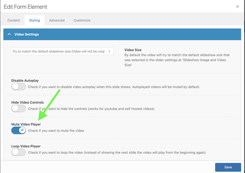
Best regards,
IsmaelHi,
Thank you for the info.
In the ACF field termin_datum sorting block, try to adjust the parameters using the following code in order to sort the posts with the ACF field by the meta value.
if ($avia_config['avia_custom_query_options']['orderby'] === 'termin_datum') {

    $query['meta_query'] = array(
        'relation' => 'OR',
        array(
            'key'     => 'termin_datum',
            'compare' => 'EXISTS',
            'type'    => 'DATE'
        ),
        array(
            'key'     => 'termin_datum',
            'compare' => 'NOT EXISTS'
        )
    );

    $query['orderby'] = array(
        'meta_value' => 'ASC',
        'date'       => 'DESC'
    );

    $query['meta_key']  = 'termin_datum';
    $query['meta_type'] = 'DATE';
}
Let us know the result.
Best regards,
IsmaelHi,
Thank you for the inquiry.
We understand you’re having issues working with the theme, specifically with the post navigation along with a slider’s default arrow navigation. To get around this issue, we recommend to adjust the position of the post navigation by adding this code in the Enfold > General Styling > Quick CSS field.
#top .avia-post-nav {
    top: 80%;
}
This should move the post navigation lower on the page or within the viewport. Where can we see the portfolio grid element?
Best regards,
IsmaelHi,
Thank you for the update.
The href attributes are now correct when we checked the grid again. Did you figure out what the issue was?

Best regards,
IsmaelHi,
Thank you for the info.
The Appearance > Widgets looks different and it seems that you’re using a plugin or made some customization for it. Have you tried temporarily disabling the plugin or modification? We also recommend updating all plugins to their latest versions; most of them are outdated.
Best regards,
IsmaelHi,
We tried to access the dashboard using the login token, but cloudflare blocked us. Please temporarily disable the access restrictions so we can login to the site.

If the widgets are not displaying on certain pages, such as the home page, it’s possible that their visibility is limited by specific conditions — for example, only when viewing a product archive, category page or the base shop page. You may need to use a third-party plugin to work around this limitation. Hope this helps.
Best regards,
IsmaelHey sarahd167,
Thank you for the inquiry.
The search icon is not displaying on smaller screens because of this css modification.
@media only screen and (max-width: 1366px) {
  .responsive #top .av-main-nav .menu-item {
    display: none !important;
  }
}
To fix it, replace the code with:
@media only screen and (max-width: 1366px) {
  .responsive #top .av-main-nav .menu-item {
    display: none !important;
  }

  .responsive #top .av-main-nav #menu-item-search {
    display: block !important;
    top: 4px;
  }
}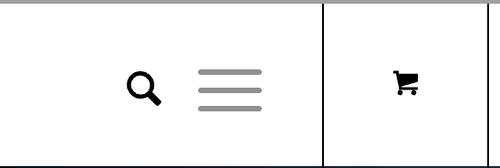
Best regards,
IsmaelHi,
Glad to know that this has been resolved! Please don’t hesitate to open another thread if you have more questions.
Have a nice day.
Best regards,
IsmaelHey Antonio,
Thank you for the inquiry.
You can use the Masonry element with the Styling > Masonry Settings > Size Settings set to Flexible Masonry. Another option is to use the Column elements to create rows of Image elements, allowing you to control which image size or thumbnail is used. Let us know if you need more info.
Best regards,
IsmaelHey dsyoon99,
Thank you for the inquiry.
Looks like the href attribute or the links of the portfolio items have been malformed. Did you add any custom modifications to the child theme that alter the attributes of the grid items?
Best regards,
IsmaelHey woogie07,
Thank you for the inquiry.
Unfortunately, it’s not possible to automatically copy or transfer the content of a PDF file into a table element. This must be done manually by editing each cell. You may want to look for and install a third-party table plugin, if one is available with the feature you’re look for.
Best regards,
IsmaelHey daninap,
Thank you for the inquiry.
Did you set the footer display in Enfold > Footer > Default Footer & Socket Settings? Please provide the login details in the private field so we can further investigate the issue.
Best regards,
IsmaelJanuary 13, 2026 at 5:31 am in reply to: cURL error 28: Connection timeout after 1000ms – Error accessing file for downlo #1493859Hey jessij87,
Thank you for the inquiry.
Where is the site hosted? The demo import is known to have issues with certain hosting providers, such as OVH, so that might be the cause of the problem. If that’s the case, please try to import the demo manually using the XML files. For more information, please refer to this documentation.
— https://kriesi.at/documentation/enfold/import-demos/#how-to-manually-import-a-theme-demo
Let us know if you need additional info.
Best regards,
IsmaelHey giacomopol,
Thank you for the inquiry.
Is the theme updated to version 7.1.3? If there are template modifications in the child theme, please make sure to update those as well. If the issue persists, try to downgrade to an older PHP version, such as PHP 8.1. Let us know the result.
Best regards,
IsmaelHey bdfuel,
Thank you for the inquiry.
Is the theme updated to version 7.1.3? If not, please make sure to download the latest version or update the theme via the Enfold > Theme Update panel. If there are modified files in the child theme, make sure those are updated as well. Please let us know if the issue persists.
Best regards,
IsmaelHey Tim,
Thank you for the inquiry.
We have found a few invalid css rules in the Quick CSS field and fixed them. We recommend reviewing the styles there and optimizing them further, for example by removing duplicate css media queries. We also added the following css code, which fixed the issue on a mobile emulation:
@media (max-width: 768px) {
  .responsive #top {
    overflow-x: visible;
  }
}
Please make sure to purge the cache before testing.
Best regards,
IsmaelHi,
Thank you for the screenshots.
Are the listings their own separate post types? We noticed there are two accomodaties post type (accomodaties and Accomodaties) which might be conflicting with each other. Have you tried removing the other one? For additional information regarding the issue, we recommend reaching out to the plugins developers to clarify how each post type is created.
Best regards,
IsmaelHi,
Great! Glad to know that the issue has been resolved. Happy New Year!
Best regards,
IsmaelHey safariinkenia,
Thank you for the inquiry.
Would you mind providing a screenshot of the issue or create a test page? You can use platforms like FreeImage, ImgBB, PostImages or Dropbox to upload and share the screenshot. Here are the steps to follow:
1.) Visit the website of your chosen platform, such as Savvyify, ImgBB, PostImages or Dropbox.
2.) Locate the option to upload a file or an image.
3.) Select the screenshot file from your computer or device and upload it to the platform.
4.) After the upload is complete, you will be provided with a shareable link or an embed code.
5.) Copy the link or code and include it in your message or response to provide us with the screenshot.Thank you for taking the time to share the screenshot. It will help us better understand the issue you’re facing and provide appropriate assistance.
Best regards,
IsmaelHey jocelynwasham,
Thank you for the inquiry.
You can follow these steps to zip files for custom fonts and remove the default MacOS files from the folder.
1. Place all your font files (.woff, .woff2, .ttf, .eot) in a single folder.
2. To remove the hidden MacOS hidden files, open the Terminal and navigate to your folder, the use the following commands.
cd /path/to/your/font-folder
find . -name ".DS_Store" -delete
find . -name "__MACOSX" -delete
3. Create a clean zip of your font folder by right clicking the folder + Compress (Mac) or Send to Compressed (zipped) folder on windows. Make sure the zip contains only your font files.
4. To upload it, go to the Enfold > Import/Export > Custom Font Manager.
Please check this link for more info: https://kriesi.at/documentation/enfold/typography/#how-to-upload-custom-fonts
Let us know the result.
Best regards,
IsmaelJanuary 9, 2026 at 6:17 am in reply to: Open custom portfolio link only works partially with "load more" function. #1493756Hi,
Thank you for the update.
It seems to be working when we tested it on our end. Please try to increase the timeout from 500 ms to 1000 ms or longer. If you can provide the login details in the private field, we’ll check the script further.
Best regards,
IsmaelJanuary 9, 2026 at 6:15 am in reply to: Color section not showing color or image background. #1493755Hi,
Thank you for opening another thread. We’ve replied to it here: https://kriesi.at/support/topic/section-background-image-set-but-css-outputs-background-image-unset/#post-1493746
Best regards,
IsmaelHey kurson,
Thank you for the inquiry.
Looks like the text alignment is not set and is defaulting to justify. Try to add the following css code to align the headings to the left.
@media only screen and (max-width: 767px) {

  /* Add your Mobile Styles here */
  #top #wrap_all .all_colors h1,
  #top #wrap_all .all_colors h2,
  #top #wrap_all .all_colors h3,
  #top #wrap_all .all_colors h4,
  #top #wrap_all .all_colors h5,
  #top #wrap_all .all_colors h6 {
    text-align: left;
  }
}
Let us know the result.

Best regards,
IsmaelHey Brady,
Thank you for the inquiry.
The site looks unstyled when we checked it. Are you currently working on the site?
To make the logo larger on mobile view or to make it full width, try the following css code:@media only screen and (max-width: 767px) { /* Add your Mobile Styles here */ #top #header_main>.container .logo img { height: 200px; width: 100%; } }Please check the screenshot in the private field.
Best regards,
IsmaelHey Antonio,
Thank you for the inquiry.
You can add this css code to switch the header to transparent in the mobile view.
@media only screen and (max-width: 767px) {

  /* Add your Mobile Styles here */
  .responsive #top #wrap_all #header {
    position: fixed;
    background: transparent;
  }

  .responsive #top .av_header_transparency.av_alternate_logo_active .logo a>img,
  .responsive #top .av_header_transparency.av_alternate_logo_active .logo a>svg {
    display: none;
  }

  .responsive #top .av_header_transparency .logo .subtext.avia-svg-logo-sub,
  .responsive #top .av_header_transparency .logo img.alternate {
    display: block;
  }

  #top #header.header_color.av_header_transparency .av-main-nav>li>a:hover .av-hamburger-inner,
  #top #header.header_color.av_header_transparency .av-main-nav>li>a:focus .av-hamburger-inner,
  #top #header.header_color.av_header_transparency .av-main-nav>li>a:hover .av-hamburger-inner::before,
  #top #header.header_color.av_header_transparency .av-main-nav>li>a:focus .av-hamburger-inner::before,
  #top #header.header_color.av_header_transparency .av-main-nav>li>a:hover .av-hamburger-inner::after,
  #top #header.header_color.av_header_transparency .av-main-nav>li>a:focus .av-hamburger-inner::after {
    background: var(--enfold-header-color-button-font);
    opacity: 1;
  }

  #top .header_color .av-hamburger-inner,
  #top .header_color .av-hamburger-inner::before,
  #top .header_color .av-hamburger-inner::after {
    background-color: var(--enfold-header-color-button-font);
  }
}
(see screenshot in the private field)
Best regards,
IsmaelJanuary 9, 2026 at 5:44 am in reply to: Videos (Youtube/Vimeo) no longer opening in lightbox #1493750Hi,
Thank you for the inquiry.
Looks like the site is restricted to certain countries as we can’t access it. Is this issue only happening in Chrome? Have you tried manually clearing the cookies and then refreshing the page?
Best regards,
IsmaelHi,
Thank you for the inquiry.
We noticed multiple strong tags in the heading “Onze diensten”, which is unnecessary and could be an indication of incorrect html, such as missing closing tags or similar issues.
<strong><strong>Onze diensten</strong></strong>To assist you further, please provide us with your login credentials by following these steps:
- Install and activate the “Temporary Login Without Password” plugin. You can find it here.
- Once activated, navigate to “Users > Temporary Logins” in the left-side menu.
- Click on “Create New” to generate a temporary login.
- Enter the email address for the account (you can use (Email address hidden if logged out) ) and select the highest possible role. Set the expiry date to around four days to ensure enough time for debugging.
- Click “Submit” to create the temporary account.
- In the private section, provide us with the URL that allows us to access the temporary login and assist you.
Please note that once your issue is resolved, you can remove the plugin. Alternatively, if you prefer not to use the plugin, you can manually create an admin user and share the login credentials in the “private data” field.
If you have any further questions or concerns, please let us know.
Best regards,
Ismael -
AuthorPosts