Forum Replies Created
-
AuthorPosts
-
And you don’t like to make it public? Perhaps other participants could also benefit from this.
Is it nearby my approach on: https://kriesi.at/support/topic/restricted-product-displaying-in-search-results/#post-1491770Then I sincerely hope that translation errors like those in “The Hungarian Phrasebook” don’t creep in.
https://youtu.be/grA5XmBRC6g?si=Mqnuk1FpjPJAipeQ&t=50Please leave technical terms untouched, as they are commonly used.
A button is simply a button, and you can hover it, etc. …If you absolutely want such translations, get the corresponding Lang file from the Lang folder (only po is needed to edit).
Open the po-file in f.e. poedit (free po editor) Search for your Phrase – f.e. “Show Fullscreen Button (HTML5 videos)”
Enter your translation and save (poedit will save the new po-file and generates the concerning mo-file too).
Upload these files to your child-theme/lang/ folder and put this to your child-theme functions.php:function overwrite_language_file_child_theme() { $lang = get_stylesheet_directory().'/lang'; return $lang; } add_filter('ava_theme_textdomain_path', 'overwrite_language_file_child_theme');keep the sequence of variables inside your translation.
F.e. :But we are proud to say that %s contributed %s entries already.
first the name of the author for %s – then the number of contributions for %se.g. for german translations:
Wir sind jedoch erfreut, dass %s bereits %s Beiträge beigesteuert hat.
and not:
Wir sind jedoch erfreut, dass bereits %s Beiträge von %s beigesteuert wurden.November 26, 2025 at 5:52 am in reply to: Different font colour for logged in and out users #1491818My guess is that WP Rocket is interfering again. I can’t see the font (or the arrows) with your code either, Ismael.
try to insert mine for testing.
the section is set to alternate_color and this is in your system set to :
.alternate_color { color: var(–enfold-alternate-color-color) }
and this is on your setting #000so this :
#top .av_inherit_color * {
  color: inherit;
}
will cause the font to be color: #000
November 26, 2025 at 5:07 am in reply to: Different font colour for logged in and out users #1491816i do not see where your code misses some settings:
f.e. where does this comes from?#top .av_inherit_color * { color: inherit; }try in your quick css:
#top .av-large-testimonial-slider .avia-testimonial_inner {
    display: inline-table;
}

#top .av-large-testimonial-slider .avia-testimonial_inner * {
  color: #FFF;
}

#top .avia-slider-testimonials.av-slideshow-ui .avia-slideshow-arrows a {
  color: #FFF;
  opacity: 1 !important;
}

#top .alternate_color .avia-slider-testimonials.av-slideshow-ui .avia-slideshow-arrows a.avia-svg-icon svg:first-child {
  fill: #FFF !important;
  opacity: 0.5;
}

#top .alternate_color .avia-slider-testimonials.av-slideshow-ui .avia-slideshow-arrows a.avia-svg-icon:hover svg:first-child {
  opacity: 1
}
Give your visitors a bit more time to read the testimonial – ( autorotation is to fast )
__________
btw:
you entered the custom class with a dot on Link
Enter it without
nevertheless it is added correctly to avia-testimonial-wrapperPS : If these products are assigned to a category that has the members-only function, then the code will of course also work with category exclusion.
just see the comments on the snippets with product_tag versus product_catfor ajax search it might be neccessary to have:
// ENFOLD AJAX-SEARCH: exclude members-only slug
add_filter('avf_ajax_search_query', 'exclude_member_products_from_enfold_ajax', 10, 1);
function exclude_member_products_from_enfold_ajax($search_parameters) {
    // Only for users who are not logged in
    if (!is_user_logged_in()) {
        // Parse parameters
        parse_str($search_parameters, $params);

        // Add Tax Query
        $params['tax_query'] = array(
            array(
                'taxonomy' => 'product_tag',  // or 'product_cat'
                'field'    => 'slug',
                'terms'    => array('members-only', 'premium'),
                'operator' => 'NOT IN'
            )
        );
        // Convert back to string
        $search_parameters = http_build_query($params);
    }
    return $search_parameters;
}
Unfortunately, I can’t test it myself, as I’m not currently managing any shop websites.
there are some Plugins that will offer such a function: CatalogX (Freemium) or WooCommerce Catalog Mode
or you might use code snippets – but it is not as easy as it sounds. There are still backdoors that can be used to find something.but this might give you a chance to exclude some Products by slugs ( f.e.: members-only or premium)
This is what an AI like Claude would give to you:
// 1. Hide from queries add_action('pre_get_posts', 'hide_member_products_from_guests'); function hide_member_products_from_guests($query) { if (is_admin() || !$query->is_main_query()) { return; } if (!is_user_logged_in()) { $tax_query = $query->get('tax_query') ?: array(); $tax_query[] = array( 'taxonomy' => 'product_tag', // product_cat → product_tag 'field' => 'slug', 'terms' => array('members-only', 'premium'), // Deine Tag-Slugs 'operator' => 'NOT IN' ); $query->set('tax_query', $tax_query); } } // 2. Visibility Filter add_filter('woocommerce_product_is_visible', 'filter_member_products_visibility', 10, 2); function filter_member_products_visibility($visible, $product_id) { if (!is_user_logged_in()) { if (has_term('members-only', 'product_tag', $product_id)) { // product_cat → product_tag return false; } } return $visible; } // 3. Block direct access add_action('template_redirect', 'block_member_product_access'); function block_member_product_access() { if (!is_user_logged_in() && is_product()) { global $post; if (has_term('members-only', 'product_tag', $post->ID)) { // product_cat → product_tag wp_redirect(wp_login_url(get_permalink())); exit; } } } // 4. Exclude from search (maybe an ajax pendent is needed too) add_filter('posts_where', 'exclude_member_products_from_search', 10, 2); function exclude_member_products_from_search($where, $query) { global $wpdb; if (!is_admin() && $query->is_search() && !is_user_logged_in()) { $where .= " AND {$wpdb->posts}.ID NOT IN ( SELECT object_id FROM {$wpdb->term_relationships} INNER JOIN {$wpdb->term_taxonomy} ON {$wpdb->term_relationships}.term_taxonomy_id = {$wpdb->term_taxonomy}.term_taxonomy_id INNER JOIN {$wpdb->terms} ON {$wpdb->term_taxonomy}.term_id = {$wpdb->terms}.term_id WHERE {$wpdb->terms}.slug IN ('members-only', 'premium') // Deine Tags hier AND {$wpdb->term_taxonomy}.taxonomy = 'product_tag' // product_cat → product_tag )"; } return $where; } // 5. Exclude from REST API add_filter('woocommerce_rest_prepare_product_object', 'hide_member_products_from_api', 10, 3); function hide_member_products_from_api($response, $object, $request) { if (!is_user_logged_in() && has_term('members-only', 'product_tag', $object->get_id())) { // product_cat → product_tag return new WP_Error('rest_forbidden', 'Zugriff verweigert', array('status' => 403)); } return $response; }i implemented the possibility to add a custom class set on the grid container (div.av-author-loop-container)
and implemented a css for that custom-class on loop-author.css to rule the column-count for all screen width :/* ====================================================================== OPTIONAL: AUTO-FIT GRID in filter for automatic responsive columns Use $atts['class'] = 'auto-fit-grid'; ====================================================================== */ #top.author .av-author-grid-container.auto-fit-grid { grid-template-columns: repeat(auto-fit, minmax(250px, 1fr)) !important; }this means: Each column must have a minimum width of 250px — the entire width is then filled with columns based on this basis.
_______________
in list view – if you do not like to show the featured image in cover mode – then add to your quick css:
#top.author .av-author-list-image img { height: 100%; /* === unset - will bring the image to top === */ object-fit: contain; /* === contain - will show the whole image without crop === */ }just for understanding – these are the default values from loop-author.php:
// Default arguments for Author Loop
$default_args = array(
    'type'              => 'grid',
    'columns'           => 4,
    'items'             => get_option('posts_per_page', 12), // WordPress setting, fallback: 12
    'contents'          => 'excerpt_read_more',
    'preview_mode'      => 'auto',
    'image_size'        => 'portfolio',
    'paginate'          => 'no',
    'class'             => '',
    'show_modified_date' => 'no',  // 'yes' or 'no' - shows "Updated: XX" if post was modified
    'orderby'           => 'date',  // 'date', 'modified', 'title', 'rand', 'comment_count', 'menu_order'
    'order'             => 'DESC',  // 'DESC' (newest first) or 'ASC' (oldest first)
    'fallback_image'    => 'placeholder',      //  'placeholder'  or URL to fallback image
    'post_types'        => array('post'), // Array: array('post'), array('portfolio'), or array('post', 'portfolio')
);

// Content Options for 'contents' parameter:
    // 'title'                  - Title only
    // 'title_read_more'        - Title and Read More button
    // 'only_excerpt'           - Excerpt only (no title)
    // 'only_excerpt_read_more' - Excerpt and Read More button (no title)
    // 'excerpt'                - Title and Excerpt
    // 'excerpt_read_more'      - Title, Excerpt and Read More button (default)
if you like to have it this way (grid, 4columns, exerpt with readmore, only posts ordered by date – newest first) you do not need to set the filter.
Then only the second part is needed inside functions.php.The filter could do more – you can even differ between authors – f.e by author name. :
// 1. Layout for different authors by ID
add_filter( 'avf_author_loop_args', function( $atts, $context ) {
    if( $context == 'author' ) {
        // Common settings for all author pages
        $atts['items']             = -1;
        $atts['image_size']        = 'gallery';
        $atts['contents']          = 'excerpt_read_more';
        $atts['post_types']         = array('post', 'portfolio');

	// Fallback-Image from Media Library (Attachment-ID)
        $fallback_id = 2052;  // Your image ID from Media Library
        $fallback_img = wp_get_attachment_image_src($fallback_id, $atts['image_size']);
        $atts['fallback_image'] = $fallback_img ? $fallback_img[0] : 'placeholder';

        $author_slug = get_query_var( 'author_name' );

        // Individual configuration for a specific author
        if( $author_slug == 'guenni007' ) {
            $atts['type']              = 'grid';
            $atts['columns']           = 3;
        }
        else {
            // default setting for the rest
            $atts['type']              = 'list';
        }
    }
    return $atts;
}, 10, 2);
the fallback image i get from media-library with the attachment ID
Advantage of this solution – the fallback image is based on the selected image size setting.see:
grid for guenni007: https://basis.webers-testseite.de/author/guenni007/
list for johndoe: https://basis.webers-testseite.de/author/johndoe/now my final solution is – to upload 3 files to the child-theme includes folder:
/wp-content/themes/enfold-child/
└── includes/
└── loop-author.php ← PHP Loop (loads the css once)
└── loop-about-author.php
└── loop-author.css ← all Styles (Grid + List)loop-author.php: https://pastebin.com/yaXj5Zfw
loop-about.php: https://pastebin.com/QQ84LGaw
loop-author.css: https://pastebin.com/zTJMtth9to style the author page now are two entries for child-theme functions.php
// 1. Configure layout and settings
add_filter( 'avf_author_loop_args', function( $atts, $context ) {
    if( $context == 'author' ) {
        $atts['type']              = 'list';               // 'grid' or 'list' Layout
        $atts['columns']           = 4;                    // columns count
        $atts['image_size']        = 'gallery';            //  image-size
        $atts['contents']          = 'excerpt_read_more';  // Content-Type
        $atts['items']             = -1;                   // Posts per page
        $atts['paginate']          = 'no';                // Pagination  on/off  (yes or no)
        $atts['show_modified_date'] = 'yes';               // 'yes' = shows  "Updated: XX"
        $atts['orderby']           = 'date';               // orderby : 'date', 'modified', 'title', 'rand', 'comment_count'
        $atts['order']             = 'DESC';               // order: 'DESC' (newest or Z-A) or 'ASC' (oldest or A-Z)
	$atts['fallback_image']     = get_stylesheet_directory_uri() . '/includes/fallback.jpg';  // an url or  'placeholder'
	$atts['post_types'] 		= array('post', 'portfolio');    	// 	count posts or portfolios or both
    }
    return $atts;
}, 10, 2);

// 2.  IMPORTANT: Customise query for pagination, sorting and post types
add_action( 'pre_get_posts', function( $query ) {
    if( ! is_admin() && $query->is_main_query() && is_author() ) {
        // Get the filtered arguments from above
        $default_args = array(
            'items'      => get_option('posts_per_page', 12),
            'orderby'    => 'date',
            'order'      => 'DESC',
            'post_types' => array('post')
        );
        $atts = apply_filters( 'avf_author_loop_args', $default_args, 'author' );

        // Set Query-Parameters
        $query->set( 'posts_per_page', $atts['items'] );
        $query->set( 'orderby', $atts['orderby'] );
        $query->set( 'order', $atts['order'] );

        // Set post types - IMPORTANT: even if there is only one type
        if( ! empty( $atts['post_types'] ) && is_array( $atts['post_types'] ) ) {
            // WordPress requires 'any' or an array with multiple types
            if( count( $atts['post_types'] ) == 1 ) {
                $query->set( 'post_type', $atts['post_types'][0] );
            } else {
                $query->set( 'post_type', $atts['post_types'] );
            }
        }
    }
}, 999 );
see result page : https://basis.webers-testseite.de/author/guenni007/
Unfortunately, no translation for But we are proud to say that %s contributed %s entries already. has been added to the (at least German) lang files yet. That is why it is in English on my example page.i tested all 3 blog styles – it works on all of them.
So far, it only displays posts – now I’m trying to implement a way to select the post type via
$atts['post_types']– so the author page could show all posts and portfolios from an author.
btw. Something that handles the standard file ‘loop-author.php’ in exactly the same way: it only displays the posts.
Will I manage to fix that too?PS – You can see that this method works well – but if you feel anxious about trying it out, please ask a mod to implement it for you.
Edit : see solution on: https://kriesi.at/support/topic/how-to-customize-the-author-page/#post-1491667
Edit : see solution on: https://kriesi.at/support/topic/how-to-customize-the-author-page/#post-1491667
I may not have solved it elegantly, but the pagination now works as it should.
Edit : see solution on: https://kriesi.at/support/topic/how-to-customize-the-author-page/#post-1491667
just a moment – pastebin code is edited now _ the read-more button is buggy. …
…. it is fixed now – download from above… maybe we should take out the readmore button – and place it as a sibling to av-author-grid-content. So we can then position it to always be on the bottom of equal height articles. … more to come
i try now to have a pagination by atts settings.
sadly the filter avf_post_slider_args is not implemented in the author archive.
It is ruled by author.php and loop-author.php.So we have to built a custom loop-author.php.
Edit: see solution …
the column count inside that snippet is added as custom-class – so we can react on it by css setting.
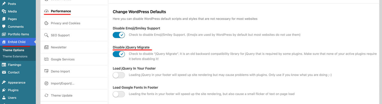
All my installations run without jQuery Migrate — all plugins and themes are up to date — I don’t think jQuery Migrate is needed.
You can test it
 November 19, 2025 at 9:33 am in reply to: Is there a way to install a new version without removing the old? (please read) #1491507
before you change anything – make a backup of the status quo of your page ( a good plugin even in free version is : duplicator
Especially if it is a major update (5.x to 6.x; …), I would advise everyone to follow this way. You always have a rollback in the background.
The advantage of this procedure is that it can be undone.
Uploading the new theme takes a little time; if all goes well, the site will only be offline for a short time (just for the moment of renaming).
Update via ftp- Download the “installable WordPress file only” file from themeforest (envato) and unzip it
- After that – you got a folder : enfold
- Rename this downloaded newest version to enfold-new
- via ftp: Upload that enfold-new folder to the themes folder
- via ftp: Rename the existing enfold folder to f.e. enfold-old
- via ftp: Rename your uploaded enfold-new folder now to enfold
- On Enfold – Performance – check mark and “Delete Old CSS And JS Files?”
- Check if your Website works to your full satisfaction.
- Yes – then stop here – Update is finished
- After a while of testing – you can delete that enfold-old folder via ftp
- No – delete or rename back the enfold folder back to enfold-new
- rename the enfold-old folder back to enfold
- check on enfold board if there are known bugs – or similar problems
November 17, 2025 at 11:34 am in reply to: instagram icon beside navigation in normal colours #1491398by the way: if you are on instagram page – they have as favicon a png file:
 November 17, 2025 at 11:11 am in reply to: instagram icon beside navigation in normal colours #1491396
Ismael’s suggestions work, of course, but they no longer have anything to do with Instagram’s corporate design.
Link: https://www.meta.com/brand/resources/instagram/instagram-brand/
But if you’re not too particular about the colors, you can also use the codes above.
November 16, 2025 at 9:21 am in reply to: Hamburger menu icon left, logo centered, search icon right #1491370next : if you have the burger icon on the left – maybe you prefer to have that slide-out too from the left:
.av-burger-overlay-scroll {
  width: 250px;
  left: -250px;
  max-width: 100%;
  transition: all 0.5s cubic-bezier(0.75,0,0.25,1);
}

.html_av-overlay-side .av-burger-overlay-scroll {
  left: 0;
  max-width: 100%;
  transform: translateX(-250px);
  transition: all 0.5s cubic-bezier(0.75,0,0.25,1);
}
November 16, 2025 at 9:11 am in reply to: Hamburger menu icon left, logo centered, search icon right #1491369to have the title you only have to make it visible by:
#top .av-burger-menu-main .avia_hidden_link_text {
  display: inline;
  font-size: 20px;
  line-height: 0;
  color: var(--enfold-header-color-meta);
  margin-left: 5px !important;
  position: relative;
  top: 2px; /*=== just to center horizontally - adjust to your needs ===*/
}
but for your header layout “Hamburger menu icon left, logo centered, search icon right” i would start from a different header layout – not the header centered – menü below .
btw. some topics under yours there is the same title of the topic “Hamburger menu icon left, logo centered, search icon right”
November 15, 2025 at 8:46 pm in reply to: instagram icon beside navigation in normal colours #1491366Sorry, no private content for me—I’m just a participant as you are. So you’ll have to wait until the mods respond to you.
November 15, 2025 at 12:21 pm in reply to: instagram icon beside navigation in normal colours #1491356so because – the original insta logo is to complex to insert it as svg file to the social media icons.
I would place the normal instagram icon via font-icon !
and replace that by css .maybe you upload two versions of that logo:

and for hover style:

then to quick css:
#top #wrap_all .av-social-link-instagram a:focus,
#top #wrap_all .av-social-link-instagram:hover a {
  color: unset;
  background-color: unset;
}

.social_bookmarks_instagram a {
  font-size:0 !important
}

.social_bookmarks_instagram a:before {
  content:"";
  background-image:url(/wp-content/uploads/Instagram_Glyph_Gradient.png);
  background-size:contain;
  display:inline-block;
  width:inherit;
  height:inherit;
  border-radius: 10px;
  background-position:center center;
}

.social_bookmarks_instagram:hover a:before {
  background-image:url(/wp-content/uploads/Instagram_Glyph_Gradient_invers.png);
  border-radius: 10px
}
see (the first in the row) https://basis.webers-testseite.de/
the second icon on the right is the svg icon (with its trouble to use the mask (or clipPath)btw. maybe your filter add_avia_builder_post_type_option had to be activated first.
add_theme_support('add_avia_builder_post_type_option' );Guess you had to know the exact post-type of your CPT
f.e. tribe_events or event etc. pp.then you can register this post-type for the advanced layout builder:
function avf_alb_supported_post_types_mod( array $supported_post_types ) {
  $supported_post_types[] = 'tribe_events';
  return $supported_post_types;
}
add_filter('avf_alb_supported_post_types', 'avf_alb_supported_post_types_mod', 10, 1);
can you try that first.
maybe this is an option too:
function enable_boxes_on_elements($boxes) {
$boxes[] = array( 'title' =>__('Avia Layout Builder','avia_framework' ), 'id'=>'avia_builder', 'page'=>array('page', 'post', 'portfolio', 'alb_custom_layout'), 'context'=>'normal', 'expandable'=>true );
$boxes[] = array( 'title' =>__('Layout','avia_framework' ), 'id'=>'layout', 'page'=>array('page', 'post', 'portfolio', 'alb_custom_layout'), 'context'=>'side', 'priority'=>'low');
    return $boxes;
}
add_filter('avf_builder_boxes','enable_boxes_on_elements');
change the alb_custom_layout to your post-type you like to add.
November 14, 2025 at 1:38 pm in reply to: instagram icon beside navigation in normal colours #1491333The problem this inserting it from media-library is – that inside the Original svg of Instagram a clipPath or mask is used. both – mask and clip-path are used via url and ID of that path. If there are more than one instance of the icon on the page – the ID is not unique anymore. And browser do not render them.
Enfold (as you can see in the DOM) on using Logo left – Menue below generates two navigations – the one is set to display: none on desktop and vice versa for responsive case ) svg two times in the DOM then clip-path won’t work.I have never seen such a poorly made SVG intended for the web. The shape could have been filled using a direct gradient, but the folks at Meta apparently didn’t want that.
November 14, 2025 at 11:06 am in reply to: instagram icon beside navigation in normal colours #1491327Some thoughts for DEV in private Content.
The most perfect method would certainly be to upload the original SVG offered by Instagram (Meta) to the media library. However, this is not possible due to its size. I have recalculated it to normal sizes for such icons. So now it is only 20 KB in size, instead of 11 MB. Unfortunately, the graphic implementation of the original is complex.
see here my svg file:

you are talking about this extra tooltip?
remove the title tag from the anchor by:
function remove_postnav_title_tags(){
?>
<script type="text/javascript">
(function($) {
	$(window).on('load', function(){
		$('a.avia-post-nav').removeAttr('title');
	});
})(jQuery);
</script>
<?php
}
add_action('wp_footer', 'remove_postnav_title_tags');
November 12, 2025 at 6:56 am in reply to: Hamburger menu icon left, logo centered, search icon right #1491225ismaels filter (ava_inside_main_menu) is a brilliant idea.
maybe it is easier to use if we insert a social bookmarks shortcode:
then we can use all those benefits of enfold options dialogs – and hover styling etc.function social_bookmarks_shortcode_inside_main_menu() { $social_args = array('outside'=>'ul', 'inside'=>'li', 'append' => ''); $social = avia_social_media_icons($social_args, false); return $social; } add_shortcode('social-bookmarks', 'social_bookmarks_shortcode_inside_main_menu'); add_action( 'ava_inside_main_menu', function() { echo do_shortcode('[social-bookmarks]'); });Quick css for your setting (left burger – logo – socials )
#top div .logo {
  z-index: 101 !important;
}

#top .main_menu,
#top .avia-menu {
  width: 100%;
}

#avia-menu #menu-item-search {
  position: absolute;
  right: 0;
  left: auto;
}

#top #wrap_all .av-hamburger-inner {
  display:block;
  top: 0;
  margin-top: 4px;
}

.html_header_top #top #wrap_all .av_logo_right #header_main .logo {
  position: relative;
  left: 50%;
  right: auto;
  margin-left: unset;
  margin-right: unset;
  transform: translateX(-50%);
  width: auto;
}

.responsive #top #wrap_all  .main_menu {
  width: 100%;
  display: flex !important;
  flex-flow: row nowrap;
  justify-content: space-between;
  height: inherit;
}

#top #wrap_all .menu-item-avia-special {
  display: block ;
}

.responsive #top #wrap_all #header .main_menu ul.social_bookmarks {
    display: flex;
}

#top #wrap_all .main_menu ul.social_bookmarks li a {
  height: 30px;
}

#top .main_menu .social_bookmarks li {
  width:40px;
  margin-left:5px
}

#top .main_menu .social_bookmarks li.avia-svg-icon img[is-svg-img="true"],
#top .main_menu .social_bookmarks li.avia-svg-icon svg:first-child {
  height:1.1em;
  width: auto;
  margin-top: 4px !important;
}

@media only screen and (max-width: 767px) {
  .responsive #top #wrap_all .container {
    width: 95%;
    max-width: 95%;
  }
  .html_header_top #top #wrap_all .av_logo_right #header_main .logo {
    max-width: 200px;
    transform: translateX(-57%);  /* === an individual correction - depends on how many social icons are present=== */
  }
}
see : https://elementar.webers-webdesign.de/
PS: for more than 3 social bookmarks it gets complicated on small mobile screens. So maybe in this case we set them to display none – or switch in this case to header meta solution
PPS: i tried first that option to show social icons via Header – Extra Elements – Header Social Icons : “display in main header area”
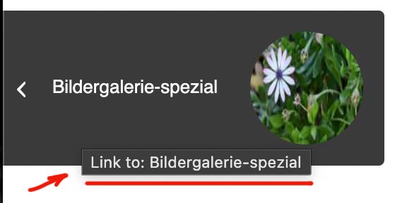
but this was to complicated to find the right css positioning options – especially on shrinking headers.sorry that “Link to: ” comes from Enfold – i thought that you had inserted it to the post title
-
AuthorPosts