Forum Replies Created
-
AuthorPosts
-
if you like to try a littel different solution – as said above – using socket social icons
see result on : https://pureinstall.webers-testseite.demy snippet for child-theme functions.php:
function social_footer_icons_to_hamburger_menu(){
?>
<script>
(function($){

  $('#header').one('click', '.av-main-nav-wrap', function() {
    var isMobile  = $('.av-burger-menu-main').css('display'),
      isHeading = "Social Bookmarks",
      social    = $('#socket .social_bookmarks').clone(true).addClass('sub-menu').css('display','block'),
      mobileMenu  = $('.av-burger-overlay');

    mobileMenu.find('#av-burger-menu-ul').append('<li class="menu-item-social av-active-burger-items" role="menuitem"><span class="avia-menu-text">'+isHeading+'</span></li>');

    if( social.length ){
      mobileMenu.find('.menu-item-social').append(social);
    }
  });

})(jQuery);
</script>
<?php
}
add_action('wp_footer', 'social_footer_icons_to_hamburger_menu');
this to quick css ( had to be adjusted to your needs)
#socket .social_bookmarks { display : none ; } #top #av-burger-menu-ul { padding: 120px 0px 0px !important } #av-burger-menu-ul .menu-item-social { display: table; width: 100%; } #top #av-burger-menu-ul .menu-item-social .avia-menu-text { display: block; width: 100% !important; padding: 15px 50px 5px; text-align: left !important; font-style: italic; }Yes – Rikard but they are here:

These icons are there : scroll inside your overlay menu – they are placed at the bottom.
on my opinion a nested ul should be inside a li element. Then it would be easier to position the sub-level element inside that List element.Next tip: i would use for it the socket social icons. If you do not like to see them – it would be easy to set them to display: none.
Because – we do not run into conflict with the header_meta social icons. : it could happen that on bigger mobile devices ( tablets ) when opening the hamburger and closing it again switching to landscape view social icons may not be visible on header_meta.The layer slider setting for the slider in question is really only suppressed for mobile devices – not for small screen sizes. Or was your slider indeed displayed on mobile phones despite the setting?
btw. you should change the font color on hovering the menu-items
f.e.:#top #header .av-main-nav > li:hover > a .avia-menu-text, #top #header .av-main-nav > li:hover > a .avia-menu-subtext { color: #FFF; text-shadow: 1px 1px 3px #000 }it shows now the same color as the background-color.
if you like to preserve your column setting – do not place an empty 4/5 and an 1/5 – just use a 1/1 container
inside an image alb with image position right. Choose the image size on entering your media.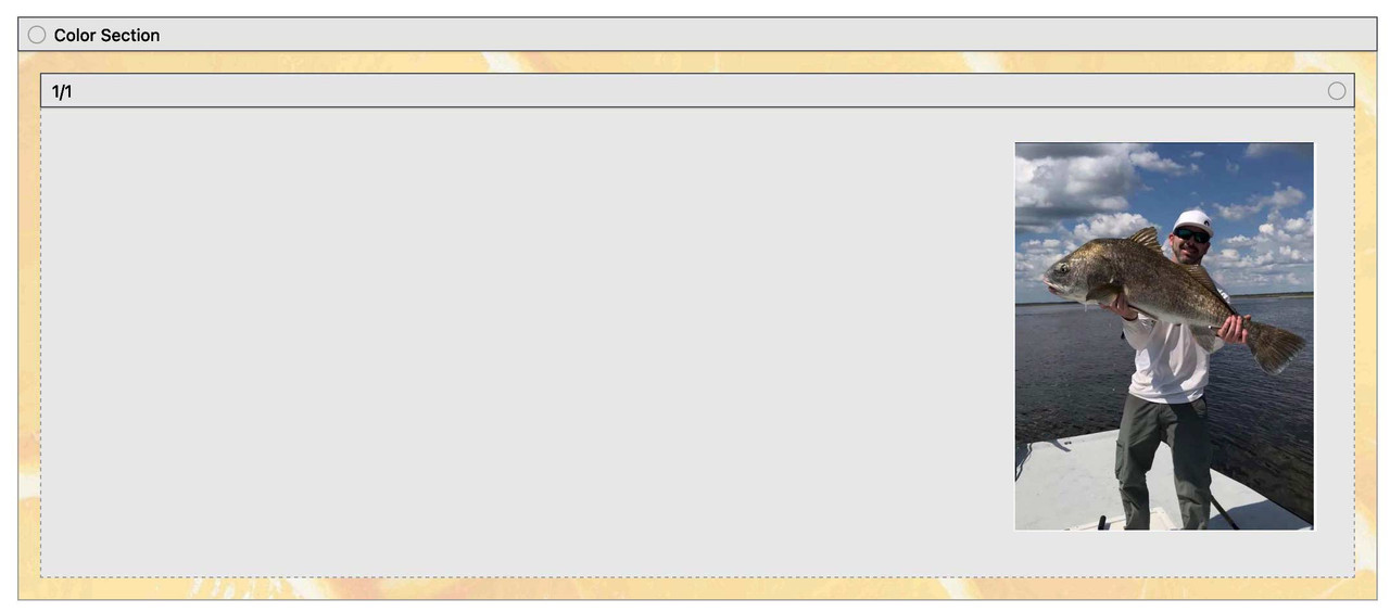
this is my css for that page : https://enfold.webers-webdesign.de/charlie/
in this case it might be the best to use a custom class – f.e.: image-right-top then:
#top .avia-section.image-right-top .container { width: 100% !important; max-width: 100% !important; padding: 0; } #top .avia-section.image-right-top .content { vertical-align: top !important; padding: 0; }do not try to put an extra container to that color-section.
Just place two background-images for that container.
so remove the image inside and place just a quick css :.avia-section.av-lkbs50gw-4f6252733029933ed3712caa877cf044{ background-image:url(https://asiantradeassociation.com/wp-content/uploads/2023/05/92d074ce-66c0-4850-8020-88c18c9d9ebd-231x300.webp), url(https://asiantradeassociation.com/wp-content/uploads/2023/07/pexels-karolina-grabowska-40221071.jpg); background-position: calc(100% - 50px) 50px , left top; background-size: 200px auto , cover !important; background-repeat:no-repeat; background-attachment:scroll; }see here: https://webers-testseite.de/multiple-background-images/
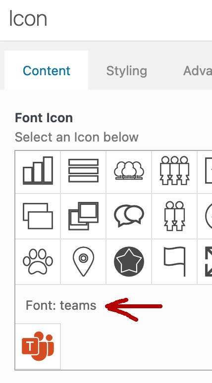
On import export you can see the font you uploaded

on that place where you see on hovering the font icon code there is no info on the font-name?
as a participant as you are – i do not see any private content message.
i do not know what is the name of your uploaded font for that teams icon!ok – now i tried to do it with a font file
i only uploaded that teams icon : font name is teams so i used:function avia_add_custom_social_icon($icons) { $icons['Teams'] = 'teams'; return $icons; } add_filter('avf_social_icons_options','avia_add_custom_social_icon', 10, 1); function avia_add_custom_icon($icons) { $icons['teams'] = array( 'font' =>'teams', 'icon' => 'ue800' , 'display_name' => 'Teams Link'); return $icons; } add_filter('avf_default_icons','avia_add_custom_icon', 10, 1);ok – your mentioned code – your font is called fontello or do you use the existing : entypo-fontello font.
then your code is wrong with the name of the fontnext : on docu there is an example code – using images instead of font icons . You will have the opportunity to have better social icon instead f.e:
from : https://iconduck.com/icons/185336/teams
( here with 40px icon – but adapt it to your needs )#top .social_bookmarks li, #top .social_bookmarks li a { width: 40px; height: 40px; } #top #wrap_all .av-social-link-teams a:before{ content: ""; width: 40px; height: 40px; display: inline-block; vertical-align: middle; background: url(/wp-content/uploads/teams.png) no-repeat center center; background-size: contain; }the link you can set in options on enfold
see: https://enfold.webers-webdesign.de/#footeryou are welcome
But:. a color-section has that fold/unfold option too !
so you can put your column layout and what ever you like to one color-section and do the same thing to it ;)
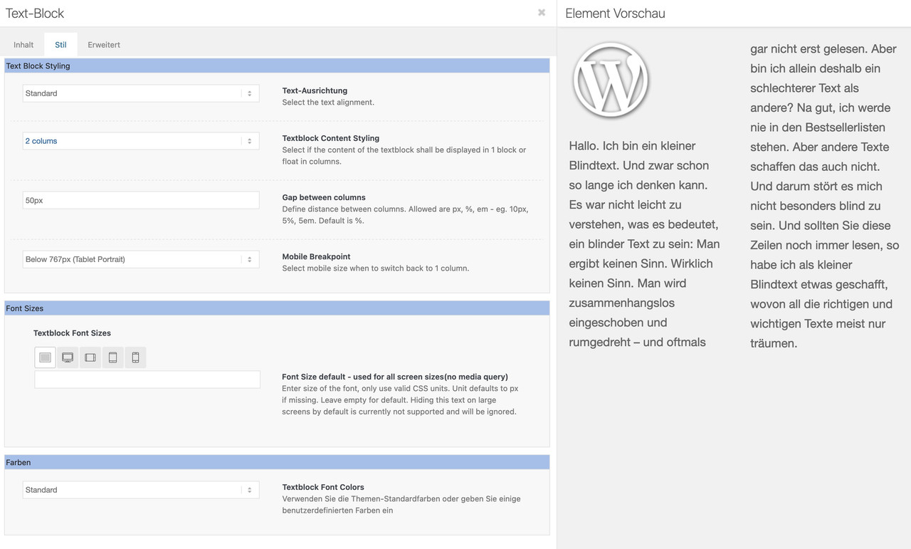
and use 1/2 columns as usualyou can surround your “blocks” (h6 p and ul) in text-mode by div with a custom class – f.e.: <div class=”no-column-break”></div>
and then :
.no-column-break {
  break-inside: avoid-column;
}
<div class="no-column-break"> <h6>Hvilke fordele har WooCommerce ift. at oprette en webshop?</h6> WooCommerce er en fleksibel og brugervenlig e-handelsplatform, der integreres sømløst med WordPress. Nogle af de primære fordele inkluderer: Brugervenlighed: Let at installere og opsætte, selv for brugere uden tekniske færdigheder. <ul> <li>Tilpasning: Et stort udvalg af temaer og plugins giver mulighed for at tilpasse webshoppen til dit brand og design.</li> <li>Produktstyring: Nem håndtering af produkter, kategorier, lagerbeholdning og priser.</li> <li>Sikkerhed: Regelmæssige opdateringer sikrer en pålidelig og sikker webshop oplevelse.</li> <li>Stor fællesskabsstøtte: En aktiv brugerbase og et stort udvikler fællesskab tilbyder support og ressourcer.</li> </ul> </div> <div class="no-column-break"> <h6>Hvordan adskiller WooCommerce sig fra andre e-handelsplatforme?</h6> WooCommerce skiller sig ud på flere måder: <ul> <li>WordPress-integration: Det er en integreret løsning til WordPress, hvilket gør det nemt at tilføje e-handelsfunktionalitet til en eksisterende WordPress-hjemmeside.</li> <li>Skalerbarhed: Det er velegnet til både små og store webshops, da det tilbyder en bred vifte af udvidelser og tilpasningsmuligheder.</li> <li>Åben kildekode: Det er baseret på åben kildekode, hvilket betyder, at det er gratis at bruge og muligt at tilpasse efter behov.</li> <li>Fleksibilitet: Det er let at tilføje og administrere produkter, integrere betalingsmetoder og udvide funktionaliteten via plugins.</li> </ul> </div> <div class="no-column-break"> <h6>Hvordan hjælper WooCommerce med at gøre styringen af en webshop nemmere?</h6> WooCommerce er designet med brugervenlighed i tankerne: <ul> <li>Intuitivt kontrolpanel: Et brugervenligt kontrolpanel giver let adgang til produkter, ordre, lager og andre indstillinger.</li> <li>Responsivt design: Webshoppen vises pænt på både computere og mobile enheder, hvilket er afgørende for en god brugeroplevelse.</li> <li>Indbygget betalingsintegration: Muligheden for at integrere populære betalingsgateways gør det nemt at håndtere transaktioner.</li> </ul> </div> <div class="no-column-break"> <h6>Hvilke udvidelser er tilgængelige for WooCommerce?</h6> WooCommerce har et bredt udvalg af udvidelser og plugins: <ul> <li>Betalingsgateways: Tilføj forskellige betalingsmuligheder, såsom QuickPay, Bambora, PayPal, Stripe og mange flere! Forsendelsesmetoder: Integrer med forskellige forsendelsesudbydere for at tilbyde forskellige leveringsmuligheder til dine kunder.</li> <li>Produktanmeldelser: Lad kunderne give anmeldelser, hvilket øger troværdigheden og tilliden til dine produkter. Salgsovervågning: Få indblik i salgsstatistikker og kundeaktivitet for at optimere din webshop.</li> <li>Hos ICONIQ bygger vi også moduler Gutenberg som er kompatible med WooCommerce, samt integrerer de fleste systemer du arbejder med.</li> <li>Hvorfor er WordPress et ideelt valg til at drive en webshop gennem WooCommerce?</li> </ul> </div> <div class="no-column-break"> <h6>WordPress er en af de mest populære CMS-platforme med mange fordele:</h6> <ul> <li>Brugervenlighed: Nem at bruge og administrere indhold, selv for dem uden tekniske færdigheder.</li> <li>Stor fællesskabsstøtte: En stor og aktiv brugerbase giver let adgang til support og ressourcer.</li> <li>SEO-venlighed: WordPress er godt optimeret til søgemaskiner, hvilket hjælper med at forbedre webshoppenes synlighed online.</li> <li>Skalerbarhed: Det er velegnet til både små og store webshops, da det tilbyder en bred vifte af udvidelser og tilpasningsmuligheder.</li> </ul> </div> <div class="no-column-break"> <h6>Gutenberg’s fordele for WooCommerce webshop:</h6> Gutenberg gør det lettere for webshop-ejere, at skabe en imponerende og kraftfuld webshop oplevelse uden at skulle ty til kompleks kodning. Med Gutenberg’s blokredigeringsfunktion kan du tage din WooCommerce webshop til næste niveau med visuel kontrol og kreativ frihed over dit indhold. Du får bl.a. følgende funktioner: <ul> <li>Visuel redigering: Se ændringer i realtid.</li> <li>Mere kontrol over layout: Nem organisation af indhold.</li> <li>Nem integration af indhold: Integrer WooCommerce produkter på flere måder med Gutenberg.</li> <li>Fremtidssikret: Fokus på kontinuerlige forbedringer og fokus på performance, uden du skal gøre noget.</li> <li>Mindre kodeafhængighed: Reducer behovet for kompleks kodning.</li> <li>Forbedret brugeroplevelse: Enkel og intuitiv brugergrænseflade.</li> <li>Hastigheden i top: Gutenberg sikre den bedste performance og dermed en bedre brugeroplevelse.</li> </ul> ICONIQ bygger integrationen mellem Gutenberg og WooCommerce og skræddersyr setuppet, så det passer til dit brand og udtryk. </div>and did you see the link : https://enfold.webers-webdesign.de/multicolumn-text-block/
by the way – you can hamper floating of lists-items to the next text-column or breaking p-tags :
https://enfold.webers-webdesign.de/multicolumn-text-block/in german tradition these stying mistakes are called “Hurenkind” and “Schusterjunge”
Hurenkind (whore child)
occasionally called son of a dog, around 1900 freak, since the 1980s sometimes widow. This is the name given to the last line of a paragraph when it is also the first of a new page or column. According to an old prejudice, “son of a dog” did not know who their father was – their origins were unclear. Impoverished, they begged on the streets. If the last line of a paragraph slips to the next page (or paragraph), when you turn to that page you don’t know what content that first line refers to. So the origin of the line at the top of the page was lost like that of a whore child.Schusterjunge (cobbler’s boy)
sometimes also called orphan. This is the name given to a line of a new paragraph at the end of the page or column, which is continued on the following page. In the past, it was often the cobblers who took in orphan boys for apprenticeship. These cobbler boys had to leave the household at the end of the apprenticeship and did not know where they could go afterward for the entire apprenticeship. Cobbler workshops were on the lower floor of the building. If only the first line of a paragraph still hangs on the page, when you read that lone line you don’t know what will happen next. So the continuation of the line at the bottom of the page is uncertain, like the life of a cobbler’s boy.thats exactly what Nikkos hint will do – just place a 1/1 column and choose 2, 3 etc column counts – very usefull and more magazine stylish:
just if another participant comes to this topic:
you can order your social media icons on setting them in the “Social Media Profile” in the right sequence – from top to bottom is left to right.
Unfortunately, you can’t drag and drop the fields into position.Well, Günter is already working on it for the next version – to include improvements that are related to ARIA:
https://kriesi.at/support/topic/wai-aria/
in the meantime test this quick fix:function wai_aria_fixes(){ ?> <script> window.addEventListener("DOMContentLoaded", function () { (function($) { $('.avia-svg-logo a').attr('aria-label', 'SVG Logo'); $('.avia-standard-logo a').attr('aria-label', 'Logo'); $('.av-main-nav .av-burger-menu-main').attr('role', 'menuitem'); $('#av-burger-menu-ul').attr({ 'aria-haspopup' : 'true', 'aria-controls' : 'menu2', }); })(jQuery); }); </script> <?php } add_action('wp_footer', 'wai_aria_fixes');the second filter – does it need all those arguments – if so it had to be:
OK – here we go
maybe a
tabindex="-1"will do a better jobtabindex="-1"means that an item is only focusable programatically.
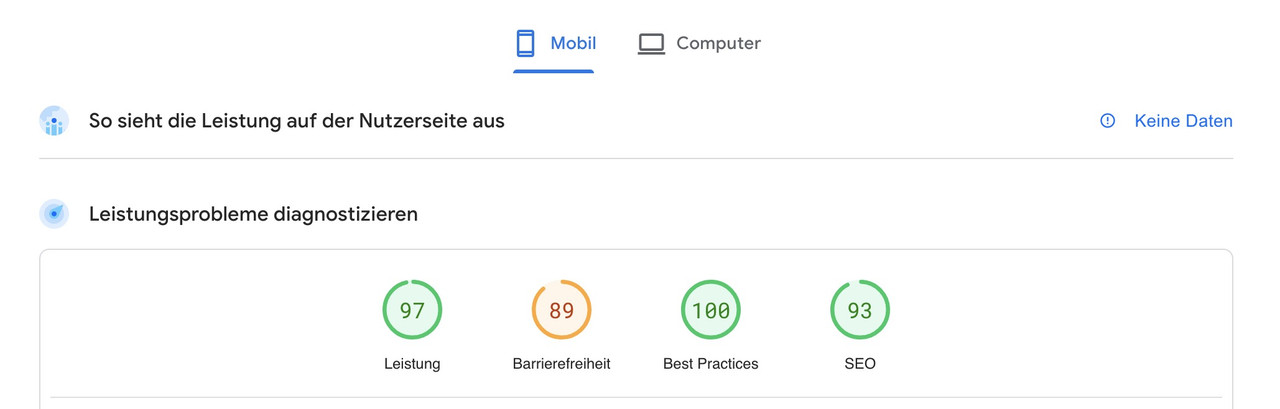
aria-hidden="true"means that item is completely removed from the accessibility tree.PS : pagespeed insight is not complaining about the missing alt title attribute for the logo but about the lack of the aria-label
Believe me, I didn’t go that deep into the matter either. The last time I had to optimize the pagespeed for a customer, I noticed the slightly worse value for accessibility (in the mobile case).
after I added some stuff via jQuery ( which is certainly not the best way) :
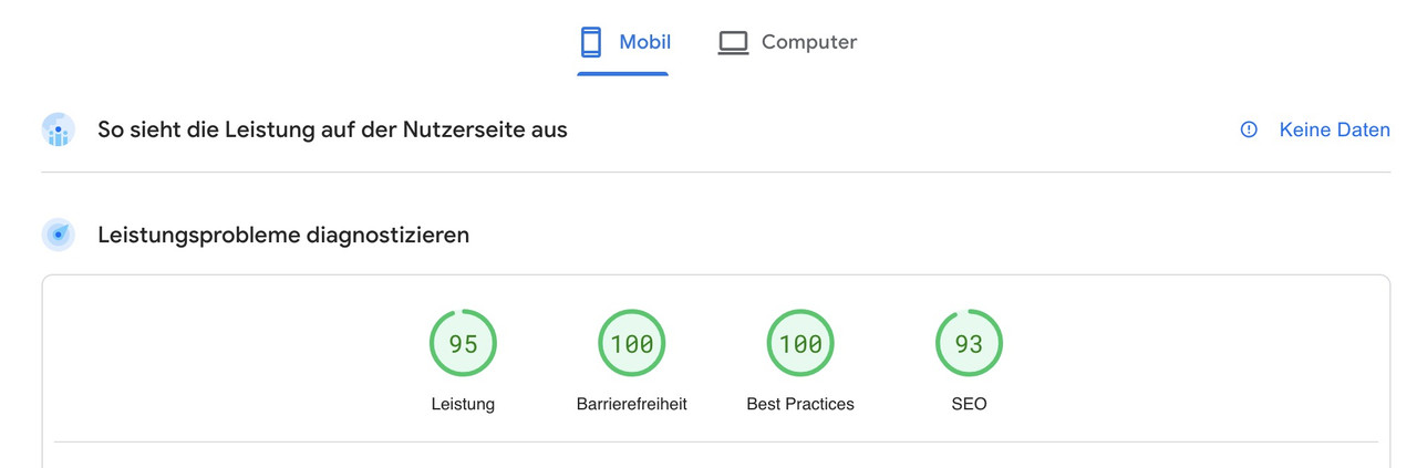
PS: there I have not yet installed an SEO plugin, which is why Meta Descriptions are missing – therefore there also not yet the 100%
see private Content Area
But you see that I have made it easy for myself
hm i changed my test page to have a mega-menu on demos ( https://pureinstall.webers-testseite.de/ )
but the widget is still inside the hamburger even if i click first on a mega-menu-item.I thought someone mentioned that it might be related to embedded colour profiles ;)
Anyway – It’s good that Mike found this error though.In the first link, the opening sentence and the comments actually say all you need to know. :
It is important that the immediate parent container of the elements (on which one should be sticky) is at display: flex
There are a lot of settings on flex containers – but this is the essential conditionon the image

you can see that for the sidebar (aside) the direct parent element is the div with the class: container.The sidebar itself got that position sticky – the top value determines the distance to top.
This for sticky position inside the parent container.But:
/*** the whole thing only works if top containers are set to: ***/ .responsive #top { overflow-x: visible; } #top #wrap_all { overflow: visible; }Yes that is a quick and dirty way:
A way to have there a widget :
/*** custom social bookmarks widget  ****/
function social_bookmarks_register_widget() {
  register_widget( 'add_social_bookmarks' );
}
add_action( 'widgets_init', 'social_bookmarks_register_widget' );

class add_social_bookmarks extends WP_Widget {
  public function __construct() {
    $widget_ops = array(
      'classname' => 'socialbookmarks-widget',
      'description' => __('A widget that displays the social bookmarks', 'avia_framework')
      );
    parent::__construct( 'add_social_bookmarks', THEMENAME.' Social Bookmarks', $widget_ops );
  }

  public function widget( $args, $instance ) {
    $title = apply_filters( 'widget_title', $instance['title'] );
    echo $args['before_widget'];
    //if title is present
    if ( ! empty( $title ) )
    echo $args['before_title'] . $title . $args['after_title'];
    //output
    echo $before_widget;
    $social_args = array('outside'=>'ul', 'inside'=>'li', 'append' => '');
    echo avia_social_media_icons($social_args, false);
    echo $after_widget;
  }

  public function form( $instance ) {
    if ( isset( $instance[ 'title' ] ) )
    $title = $instance[ 'title' ];
    else
    $title = __( 'Social Bookmarks', 'avia_framework' );
    ?>
    <p>
    <label for="<?php echo $this->get_field_id( 'title' ); ?>"><?php _e( 'Title:' ); ?></label>
    <input class="widefat" id="<?php echo $this->get_field_id( 'title' ); ?>" name="<?php echo $this->get_field_name( 'title' ); ?>" type="text" value="<?php echo esc_attr( $title ); ?>" />
    </p>
    <?php
  }

  public function update( $new_instance, $old_instance ) {
    $instance = array();
    $instance['title'] = ( ! empty( $new_instance['title'] ) ) ? strip_tags( $new_instance['title'] ) : '';
    return $instance;
  }
}
and for quick css:
#top .socialbookmarks-widget .social_bookmarks {
    float: left;
    margin: 15px 0 0 ;
    position: relative;
}

#top .socialbookmarks-widget .social_bookmarks li {
    float: left;
    clear: right !important;
}
but: these are only the social button you have set on enfold options dialaog.

Die Benennung war eigentlich egal. Du springst aber ganz schön, was deine Ziele betreffen – klar da steckt der Kundenwunsch dahinter, aber jetzt ist es vom Hauptmenu ins Top-Menü gewandert?
Und obwohl dein Kunde Platz sparen wollte – moniert Googles Suchmaschine wahrscheinlich, dass die clickbaren Element zu nah beieinander stehen und zu klein sind.
#top .av_header_transparency #header_meta {
  border-bottom: none;
}

#top  #header_meta {
  background-color: transparent !important
}

#header_meta .avia_wpml_language_switch img {
  width: 30px;
  margin-left: 10px;
}
wenn du übrigens sehr aktuell bist was Enfold und WPML betrifft gibt es nun eine neue Option unter: Theme Optionen : WPML Options Management :
By default all options are copied to a new added language
“Global Setting”: Option settings are always used for all languages.
“Global Layout”: If checkbox below is selected, option settings are used for all languages and also copied (!!!) to all languages. Deselecting will stop this behaviour and options can then be set for each language separately.
All other options have to be set for each language separately.Das ist eine interessante Neuerung. Da es nun möglich ist globale Spracheinstellungen wie z.B quick css Einstellungen nicht für jede Sprache setzen zu müssen.
bitte entferne mal das Snippet von Ismael: https://kriesi.at/support/topic/how-can-i-add-wpml/#post-1410409
und setze dann das Hauptmenü ( welches ja bei dir Burgermenu heißt) so wie beschrieben.
Da das Burgermenü ( das von Enfold) ja normalerweise eine Kopie des Hauptmenüs ist ( das von Enfold) müssen wir dann nur noch es dort ausblenden. -
AuthorPosts