Forum Replies Created
-
AuthorPosts
-
And you used the new code of ismael ? – because the ( ‘post_type’ => ‘any’,) is important for using it with CPT …
or explicitly name it as a post type:how did you embed your cpt to masonry?
function custom_masonry_cpt_with_sticky($query, $params) {
    $query['post_type'] = array('post', 'portfolio', 'your-cpt');

    $query['ignore_sticky_posts'] = 0;

    // Optional: if you like to adjust it
    // $query['posts_per_page'] = 12;

    return $query;
}
add_filter('avia_masonry_entries_query', 'custom_masonry_cpt_with_sticky', 10, 2);
and then try:
function custom_masonry_sticky_first($query, $params) {
    $query['post_type'] = array('post', 'portfolio', 'your-cpt');

    // Sticky Posts first
    $sticky = get_option('sticky_posts');

    if (!empty($sticky)) {
        $query['post__not_in'] = isset($query['post__not_in']) ? array_merge($query['post__not_in'], $sticky) : $sticky;

        $query_sticky = $query;
        $query_sticky['post__in'] = $sticky;
        $query_sticky['ignore_sticky_posts'] = 1;
        unset($query_sticky['post__not_in']);

        $query['_sticky_query'] = $query_sticky;
    }
    $query['ignore_sticky_posts'] = 0;
    return $query;
}
add_filter('avia_masonry_entries_query', 'custom_masonry_sticky_first', 10, 2);
enter your CPT for ” your-cpt” in the snippets.
try:
add_filter('avia_masonry_entries_query', 'avia_masonry_entries_query_mod', 10, 2);
function avia_masonry_entries_query_mod($query, $params) {
  $include = array();
  $sticky = get_option( 'sticky_posts' );

  $args = array(
    'taxonomy' => $params['taxonomy'],
    'post__not_in' => $sticky,
  );
  $posts = get_posts( $args );

  foreach($posts as $post) {
    $include[] = $post->ID;
  }

  $include = array_merge($sticky, $include);

  // convert values of the $include from string to int
  function sti($n)
  {
    settype($n, 'int');
    return $n ;
  }

  $include = array_map("sti", $include);

  $query['post__in'] = $include;
  $query['posts_per_page'] = 6;
  $query['orderby'] = 'post__in'; // sort items based on the post__in value
  return $query;
}
see Ismaels post on : https://kriesi.at/support/topic/sticky-posts-not-displaying-forst/#post-1230187
next the first section of your homepage
I can’t quite understand how it was set, because it gets completely out of hand in responsive cases.
maybe you have set a column to a min-height value that is not good for mobile view.but if it is that lonestar page – you had to adjust a lot of different things.
First : you might better switch to hamburger menu on wider screens – even wider than the other option of 989pxf.e.
@media only screen and (max-width: 1399px) {
    #top #header .av-main-nav > li.menu-item  {
        display: none!important;
    }
    #top #header .av-burger-menu-main {
        cursor: pointer;
        display: block!important;
    }
}
or you use a combination of hamburger switch adjust and on enfold option :
header – header behaviour – : Let Logo And Menu Position Adapt To Browser Windowtry – and read comments:
@media only screen and (max-width: 989px) {
  /*** depends on if a header_meta is present and the height of it ***/
  /*** header_main plus header_meta height value is needed ***/
  #header {
    position: fixed !important;
    height: 120px !important;
    max-height: 120px !important;
  }

  /*** synchronise with header height value ***/
  .responsive.html_header_top #top #main {
    padding-top: 120px !important;
  }
}

/*** necessary – because your header_meta will then have two lines   ***/
@media only screen and (max-width: 521px) {
  #header {
    position: fixed !important;
    height: 140px !important;
    max-height: 140px !important;
  }
  /*** synchronise with header height value ***/
  .responsive.html_header_top #top #main {
    padding-top: 140px !important;
  }
}
Ismael’s rules don’t work properly because a selector that I also thought was present is not there: html_mobile_menu_tablet
My notes on this case of sticky headers on mobile devices always included this selector too.ok – thanks for response – i romoved now the link to your video on my testpage. and replaced it by a video with 1920:800 aspect-ratio
https://webers-testseite.de/lara-video/it is the place where you have entered the text for that button.:
Open the slide itself – a new popup then will show the options for that slide. Click on the advanced tab. There should be a link settings – on the right side of the label there is the color of that button. Sadly there is no custom color with color picker option – but a lot of alternatives to your given choice.
If you have set the on styling tab to show “Use first slides caption as permanent caption” then you had to open the first slide.
_______________If that’s not enough, you would have to set the background color via CSS.
better way is to do it via a custom class on your slider – but try:#top.page-id-1104 .avia-slideshow .avia-slideshow-button { background-color: #026538; } #top.page-id-1104 .avia-slideshow .avia-slideshow-button:hover { background-color: #719430; }try :
@media only screen and (max-width: 989px) {
    #top .header_bg {
        background-color: var(--enfold-header-color-bg) !important;
    }
}
adjust media-query width to your needs
It probably wasn’t that important ;)
on your ngg page the content is limited to 1140px – enfold uses on that container a padding: 0 50px
so try:
.page-id-1562 #section-width .container {
  max-width: 1240px;
}
btw. enfold version looks better – because images are not cropped.
Are you using this solution?
https://kriesi.at/support/topic/image-title-on-hover/#post-1490549because there the selector is for all elements with title attribute ( *[title] ) – so this will include icons
have a look if you have already the svg usage of those standard icons. – the up-open icon is already a bold one – but you can make it bigger:
#scroll-top-link svg {
  margin-top: 3px !important;
  width: 40px !important;
  height: 40px !important;
}

#scroll-top-link svg path {
  stroke-width: 2;
  stroke: currentColor
}
see :
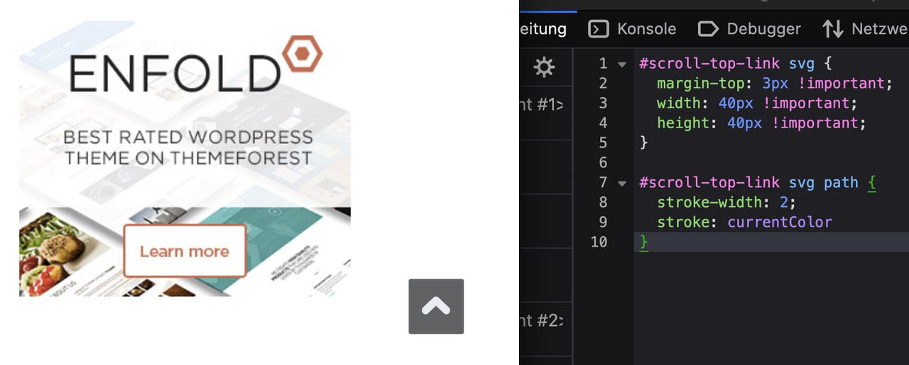
btw: on mobile ( better on smaller screens it is set to display: none )
@media only screen and (max-width: 767px) {
  .responsive #scroll-top-link {
    display: block;
  }
}
The reason for this is that many people know that double-tapping the top of the screen scrolls the window upwards.
you have to pay attention – there is a
masonry for posts on : Content Elements Tab
masonry and gallery for images on : Media Elements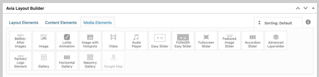
on your example page there is the use of portfolios.
on your ngg gallery you are showing images !
on your test page : https://peter-test1.co.uk/portfolio-item/test/
you are trying to show portfolios? – why not showing images masonry or gallery instead? https://peter-test1.co.uk/gallery/
And btw. why do you removed the css for the gallery ? You like to show now the full-width?ok – ?
if the auto group setting on : avia-snippet-lightbox.js should not be hampered globally – you can give a custom-Class to a parent element or the element itself ( f.e. a img gallery or masonry or the color-section with your images) e.g: noGroup
Then change the behaviour by child-theme functions.php snippet:
function conditional_disable_lightbox_gallery() {
?>
<script type="text/javascript">
(function($) {
    $(function() {
        setTimeout(function() {
            $('.noGroup a.lightbox-added').each(function() {
                var $link = $(this);

                $link.magnificPopup('destroy');

                $link.magnificPopup($.extend({}, $.avia_utilities.av_popup, {
                    gallery: {
                        enabled: false,
                        navigateByImgClick: false
                    }
                }));
            });
        }, 100);
    });
})(jQuery);
</script>
<?php
}
add_action('wp_footer', 'conditional_disable_lightbox_gallery', 999);
see: https://webers-testseite.de/image-masonry/
-
This reply was modified 4 months, 3 weeks ago by
Guenni007.
yes – but you can even remove those empty columns ( left and right )
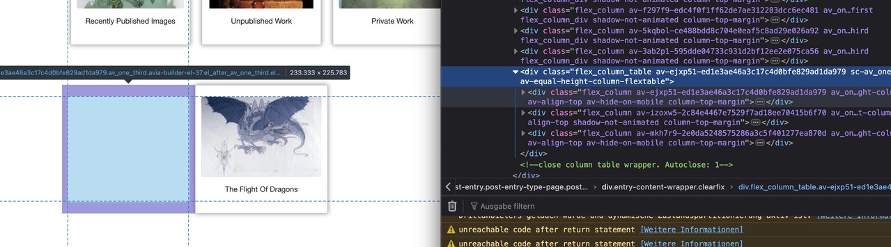
just place the “The Flight Of Dragons” the same way as the others – you do not need to fill up the last row with empty columns.
the better way would be over flexbox layout then …
you got before more than 12 columns inside that section with your images – that should be inside a section –
then the next color-section contains your heading – a separator (f.e. in one 1/1 column) and your videos – maybe inside 1/3 columns
see what happens if you place this to your quick css:#av_section_1 .container { max-width: 800px; margin: 0 auto !important; } #av_section_1 .entry-content-wrapper { display: flex; flex-flow: row wrap; justify-content: center; gap: 20px } #av_section_1 .entry-content-wrapper:before, #av_section_1 .entry-content-wrapper:after { display: none; } #av_section_1 .entry-content-wrapper .flex_column { flex: 0 1 30%; width: unset !important; margin: 0; padding-bottom: 20px; } @media only screen and (max-width: 599px) { #av_section_1 .entry-content-wrapper .flex_column { flex: 0 1 45%; } } @media only screen and (max-width: 359px) { #av_section_1 .entry-content-wrapper .flex_column { flex: 1 1 100%; } }you can now pull all your columns from your color-section: #section-width with your images to that first color section.
Do you really want it to be that narrow on small screens?
I would set the content differently to narrow. Therefore, remove:#section-width { max-width: 50%; left: 50%; position: relative; transform: translateX(-50%); }and set instead:
#section-width .container {
  max-width: 750px;
}
And here’s the next layout tip.
I would place different design elements in different color sections.
So all gallery images in one section (#section-width) – including the single one that comes last – without empty columns – then the films below in a separate section.If you have done that – i will give you a flex-box code to style your gallery.
try:
.responsive #top #section-container-width .container {
  width: 100% !important;
  max-width: 100% !important;
  padding: 0;
}

.responsive #top #section-container-width .avia-image-diff-container {
  margin: 0 !important;
}

.responsive #top #section-container-width .av-image-diff-wrapper,
.responsive #top #section-container-width .av-image-diff-wrapper img {
  width: 100%;
  max-width: 100% !important;
  margin: 0
}
your images are 1024px width – so you had to stretch them to the container width.
Yes – but that downloaded zip file from fontsquirrel is not the neede zip for uploading it to enfold fontmanager.
You had to pull out the fontfiles into a separate folder and compress that folder for uploading.i do not know if translatepress has a similar opportunity to set different logo for different languages like WPML.
for replacing the alternate_logo ( for transparencies) – you can try:
(in additon to ismaels replacement of the standard logo)function av_change_alternative_logo_img($header){ $currentlang = get_bloginfo('language'); if($currentlang == "fr_FR"){ $header['header_class'] .= ' av_alternate_logo_active'; $header['header_replacement_logo_id'] = 44238; } return $header; } add_filter('avf_header_setting_filter','av_change_alternative_logo_img');use the font-manager of enfold – it works great – even for variable fontfiles
first – if you compress your font-files on a mac (OSX) it will include even the typically non visible files on OSX folder. This is what you see – when you are talking about Font: MACOSX ( font-family: macosx ).
But your font-file of berthold should be there too.I do not know if fontsquirrel can convert otf files of variable Fonts to ttf or woff2.
just one moment – i’m looking for an older post of mine. …
https://kriesi.at/support/topic/how-to-submit-and-use-custom-fonts/#post-1470894
you can download that script app – just place it on your desktop – and drag & drop files there to zip.
Or use keka to compress your font folder. And do not include invisible files
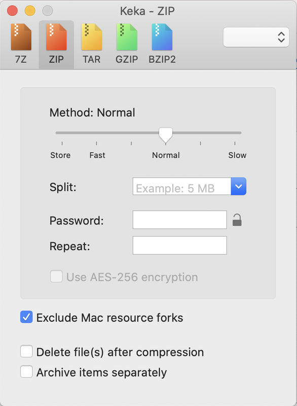
after compression it should show inside that font zip file only the fonts – and nothing else:

did you get this file from here: https://online-fonts.com/fonts/block-berthold
have a look at: https://webers-testseite.de/woodnest/
i placed the styles and script as inline codes in a codesnippet.there might be solutions if we have to put in one image column two content columns (f.e. 2/3 – 1/3)
if you would like to have it always visible just remove the hover pseudo-class:
here is the solution for sub-menu
#top .menu-item-has-children:hover:before { position: absolute; top: auto; bottom: -4px; left: 20px; display: block; content: "\e886"; font-size: 36px; line-height: 24px; font-family: 'entypo-fontello'; color: inherit; }maybe you can bring that arrow to your sub-menu container. But then you can not center it below top-level menu text.
But if you are satisfied by a fixed distance from the left (f.e. 20px ) this is a not so complex solution.or you set the avia-arrow-wrap and avia-arrow to show- and fill with background-color and border-color.
there is no extra class on top-level menu-item if a sub-menu is open. So this is probably only usable for modern browsers.
Maybe a solution to bring an extra class to top-level menu-item via script seems to be better.try:
#top .menu-item-has-children > a {
  display: flex;
  justify-content: center;
}

#top .menu-item-has-children > a:hover:after,
#top .current_page_item.menu-item-has-children > a:after,
#top .menu-item-has-children:has(ul.sub-menu[style*="visible"]) > a:after {
  position: absolute;
  top: auto;
  bottom: -4px;
  display:   block;
  content: "\e886";
  font-size: 36px;
  line-height: 24px;
  font-family: 'entypo-fontello';
  color: var(--enfold-main-color-primary);
}
see here on “our clinic” menu-item: https://basis.webers-testseite.de/
even if it is not the current menu-item?
-
This reply was modified 4 months, 3 weeks ago by
-
AuthorPosts