Forum Replies Created
-
AuthorPosts
-
I did not see on your page why the toggles looses their focus – on click all moves to the top. – this is not standard behavior!
Can you try to deactivte the total cache – refresh all cachings and merging of enfold.
Well with your Alias name and a little search i found your page ;)
and on FAQ everything works fine here in OSX Chrome
Edit : . You are right. I see – if you open the 5th or 6th toggle there are again this behavior.
Can you please remove the interims solution with toggle_wrap set to display: none
and refresh all cachings and merging please after that.I had to inspect where we can correct this. – on the enfold page https://kriesi.at/themes/enfold-2017/elements/accordion/ it works as i said as expected.
wow das ging schnell:
ist online – ps habt ihr das noch schnell eingebaut! wahnsinnfixed: CSS for chrome bug accordion toggles do not close properly and leave white space
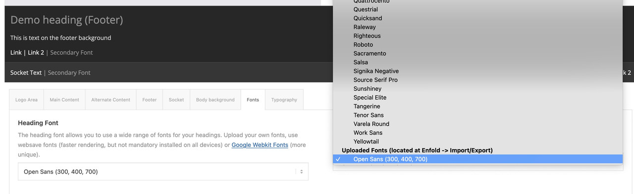
i think – yes you can shorten it – and maybe you use the css rule google offers – for those wanted font styles:
function avia_add_content_font($fonts){
    $fonts['Assistant'] = 'Assistant:wght@300;400;700&display=swap';
    return $fonts;
}
add_filter( 'avf_google_heading_font',  'avia_add_content_font');
add_filter( 'avf_available_google_fonts',  'avia_add_content_font');
the css definition will be :
font-family: 'Assistant', sans-serif;if you download the font from google there is the variable font inside too. The static fonts are in an extra folder. Did you upload the whole zip to enfold?
In this static folder there are condensed styles too!
_______
But one piece of advice from me is: don’t install too many fonts. The performance of the website will suffer.
As I mentioned in another topic, you should think carefully about whether you should include italic font styles at all. Especially with sans-serif fonts, the slanting of the font on the browser side is often almost identical to the italic font style.If you can do without the support of older browsers, then the variable font might be the better alternative anyway. There, all font styles would be included, and the memory usage is much lower. ( 1,1Mb versus 4,8MB ) .
Next offer modern font style types as woff2. The Google download do offer only ttf. You can upload it with the zip too – but the woff2 will be loaded.
Try this zip ( with only light, regular and bold style (woff2 and ttf) ) – this would be a good way for the most of the websites:
https://webers-webdesign.de/Open-Sans.zipDelete your uploaded font and use it instead.
think of to use them – these uploaded fonts are at the end of the dropdown list on font setting options
nicht dafür ;)
can you try
#top .av_toggle_section {
    clear:both
}
thats indeed a chrome thing only!
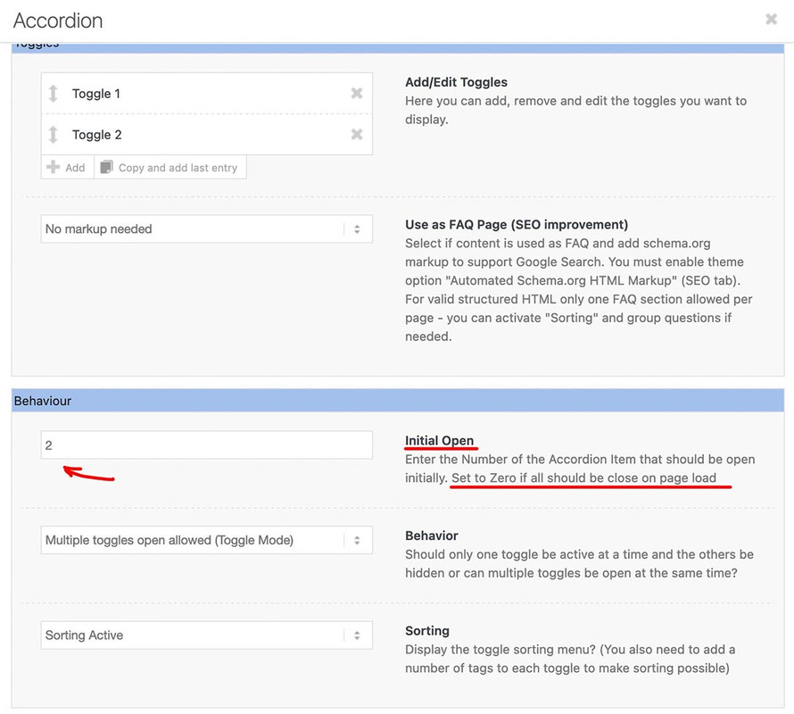
October 23, 2023 at 3:35 pm in reply to: Is it possible to hide the “All” sorting tag on the accordion? #1423421October 23, 2023 at 12:55 pm in reply to: Is it possible to hide the “All” sorting tag on the accordion? #1423399ok – as mentioned above – that is much easier because this element got an option to tell the frontend what opens first on load.
i have never seen the sorting option here – sorry.
if you like to get rid of the separator aswell – add to mikes code the first tag-separator:
( first-child will work too ).togglecontainer .taglist a:first-of-type, .togglecontainer .taglist .tag-seperator:first-of-type { display: none; }Thanks for info.
It sometimes happens that errors creep in when saving to the database. These can be very persistent. Therefore, it often helps to simply create a new page with the same content. For the home page, it doesn’t matter what the original page is called – the addendum will be removed from the permalink anyway. For other pages, you will need to delete the broken page completely in order to give the new page the same permalink.October 21, 2023 at 11:00 pm in reply to: Is it possible to hide the “All” sorting tag on the accordion? #1423271Sorry, I did not see that you were talking about the accordion. But we are talking about which folding element? the accordion has by default an option to choose the opening tab. There are no sorting options. You mentioned partner logos. On this element we do not have sort options. So my suggestion is that you are talking about Masonry or Portfolio Grid. So please clarify your request.
what happens if you are copying the enfold shortcode – and create a new page – and save?
What if you use this copied page to set as homepage?October 21, 2023 at 6:53 pm in reply to: Google durchsucht die Webinhalte nicht – Homepage nicht sichtbar #1423249hast du mal versucht in der Google Search Console zu schauen was die melden:
Anmelden und nachschauen für die Domains.
Ich melde dort alle Seiten die ich verwalte manuell an. Hinterlege dann dort die Sitemap. Und stoße die erste Indexierung dann manuell an._________
Have you tried looking in Google Search Console to see what they are reporting?
Login and lookup for the domains.
I manually register all the pages I manage there. Then I store the sitemap there. And then manually trigger the first indexing.https://search.google.com/search-console
PS : du darfst nicht erwarten das die Bots direkt nach erstellung einer Webseite drübergehen. – daher ist oft Geduld nötig.
Wenn du SEO mäßig gut aufgestellt bist und die Seite performant ist, sollte es nicht allzulange dauern bis die Ergebnisse da sind. – wie gesagt sitemap hinterlegen und index anstoßen hilf hier natürlich.________
PS: you must not expect the bots to go over immediately after creating a web page. – Patience is therefore often necessary.
If you are well positioned in terms of SEO and the page is performant, it should not take too long until the results are there. – As I said, storing a sitemap and initiating an index helps here, of course.Yes Mike – I can find the code there again – but the effect is built in very discreetly, so that you will hardly notice the darkening in the upper part.
October 21, 2023 at 2:04 pm in reply to: Is it possible to hide the “All” sorting tag on the accordion? #1423223ok – try:
for quick css:.all_sort_button, .all_sort_button + .text-sep { display: none !important; }for child-theme functions.php:
function open_second_sort_option(){
?>
<script>
window.addEventListener("DOMContentLoaded", function () {
(function($) {
    setTimeout(function() {
        $('.avia_show_sort:nth-of-type(2)').trigger('click');
    }, 300);
})(jQuery);
});
</script>
<?php
}
add_action('wp_footer', 'open_second_sort_option');
maybe you have to increase the time to wait til click is triggered
If you need that only on specific pages or specific masonries etc. give a custom class to the element and use it in the selector.
October 21, 2023 at 1:21 pm in reply to: Is it possible to hide the “All” sorting tag on the accordion? #1423217The Problem is not to hide it – but to open on load not the all_sort_button.
there are filter to change the first_item_name – but to initialize to open a different item than the first_item ? I do not know.on that php you mentioned – the if-clause:
if( strpos( $link[1], '@' ) !== false
eachtime for$link[0] == 'manually'
we had 3 times that check.and maybe it is better to replace it to:
return 'mailto:' . antispambot($link[1],1);
because i do not see any difference in the DOM when applying it without. Or does even the sourcecode show then transformed html entities
with the 1 i see:

the shortcode i have for emails inside text blocks :
function obfuscate_emails($atts, $content = null) {
    if (!is_email($content)) {
        return;
    }
    return '<a href="mailto:' . antispambot($content,1) . '">' . antispambot($content) . '</a>';
}
add_shortcode('email', 'obfuscate_emails');
i had to use then as
[email] (Email address hidden if logged out) [/email]with flyout mobile menu – you are talking about the hamburger menu?
And your social bookmarks are there on default?October 19, 2023 at 9:58 am in reply to: Background image in Color Section not always working #1422972can you try:
.responsive #top #wrap_all {
    background: #000 !important;
}
and i think this is set on default to #fff – that can cause the issue.
for the moment of starting transition this might be visible. Give it a try
Or if you are using curtain effect footer and try to force scroll on at the end of the page – that bg will be seen.
hamburger slide out etc. pp
PS: sometimes ( f.e. with fixed header ) the background of #main is visibleso try:
.responsive #top #wrap_all {
  background: #000 !important;
}
.responsive #top #main {
  background: transparent !important;
}
October 18, 2023 at 10:04 pm in reply to: Can I make the logo go outside its designated area? #1422939Yes of course. But first : what kind of header have you set up?
Logo left – menu right ? Shrink or not etc. pp. If Shrinking Header is set where do you start – where does it end ( standard 1/2) ?f.e.: if you have a header starting height set to 100px and you like to have your logo at 150% of that
then set the logo height to 150% and the max-height to 150px
(if you got a svg as logo set .logo svg).logo, .logo a { overflow:visible } .logo img, .logo svg { height:150%; max-height:150px !important }to know the starting header height is important for the max-height setting this should be the factor of height x header first height
e.g: your header is set to 150px starting height. and you like to have a 1.6 times higher logo then it is for the logo:.logo img, .logo svg { height:160%; max-height:240px !important }October 17, 2023 at 1:01 pm in reply to: Are my /EN, /IT, /DE subdirectories url extensions useful for Hreflang beacons ? #1422792a good multilang plugin should set those links in the head section. WPML does in this way ( depending on your choice – how to handle the multilang sites – as addendum – as subdomain or maybe as extra domains )
f.e.:<link rel="alternate" hreflang="en-us" href="https://your-domain.com"> <link rel="alternate" hreflang="de-de" href="https://your-domain.com/?lang=de">so inspect your head section if those entries are made.
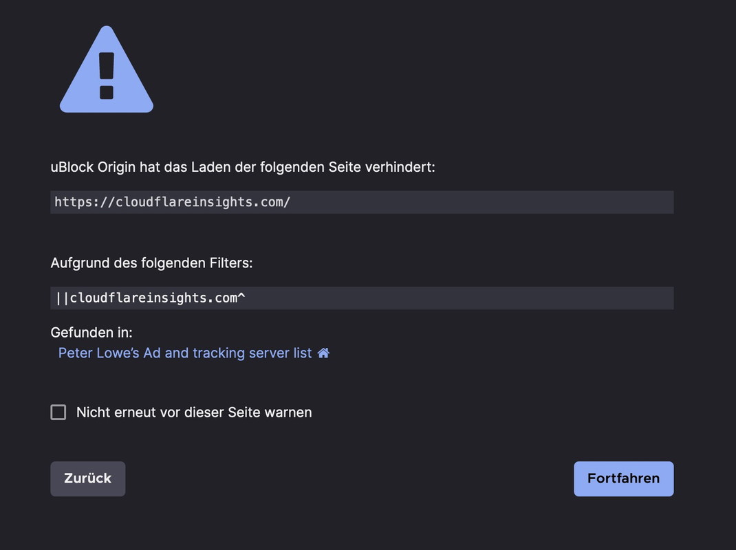
October 17, 2023 at 11:15 am in reply to: Blog page in portrait orientation iPhone 14 max pro sticks #1422773even if you are navigating to the domain itself: https://cloudflareinsights.com/ – they are on a AD tracking list. – i surf with ad blocker like ublock origin in my browser. I do not like ads at all. You may need to switch to a more reputable CDN provider.
but there are 3times settings for
'@'
do you think it is best to replace all of them ;)but this is only for manually inserted Links in ALB Elements?
Have you tested that ?Just beneath the Theme Options – Logo
there is a Toggle : “Transparency Logo Options”open for example: https://www.colorzilla.com/gradient-editor/
copy the given gradient code from my code:linear-gradient(to bottom, rgba(0,0,0,0.8) 10%,rgba(0,0,0,0.1) 30%);
under the preset gradient there is a “button” import css –
enter the code and click “import”
now you can play with the settings.the “to bottom” means the linear gradient is from top to bottom – so the left value is the top color.
the rgba value is the color with an opacity e.g.:rgba(0,0,0,0.8). is a black with 80% opacity
the value after the rgba is the position : here 10% ( top to bottom) from the top.this is a selfhosted video ?
( it is always best to see the corresponding site ).dark-overlay-on-section .avia-slide-wrap .mejs-container:after { content: ""; position: absolute !important; width: 100%; height: 100%; top: 0; left: 0; background: linear-gradient(to bottom, rgba(0,0,0,0.8) 10%,rgba(0,0,0,0.1) 30%); background-size: cover; background-repeat: no-repeat; }yes – but the custom-class is then on the section container ( that is in the DOM Tree higher than the avia-slideshow class)
f.e. dark-overlay-on-section.dark-overlay-on-section .avia-slideshow .av-video-slide .mejs-mediaelement:after { content: ""; position: absolute !important; width: 100%; height: 100%; top: 0; left: 0; background: linear-gradient(to bottom, rgba(0,0,0,0.75) 25%,rgba(0,0,0,0.1) 70%); background-size: cover; background-repeat: no-repeat; }how did you place the video? Inside a full-width slider?
Are there other slides inside the slideshow that should also have that overlay?
Give a custom-class to that slideshow f.e. dark-overlay and then use the after pseudo container to get the overlay:.avia-slideshow.dark-overlay .av-video-slide .mejs-mediaelement:after { content: ""; position: absolute !important; width: 100%; height: 100%; top: 0; left: 0; background: linear-gradient(to bottom, rgba(0,0,0,0.75) 25%,rgba(0,0,0,0.1) 70%); background-size: cover; background-repeat: no-repeat; }on the other hand – you could style the caption – to have a better contrast – f.e.:
.avia-slideshow.dark-overlay .av-video-slide .avia-caption-title {
  text-shadow:
    1px 1px 0 #c7c8ca,
    2px 2px 0 #b1b3b6,
    3px 3px 0 #9d9fa2,
    4px 4px 0 #8a8c8e,
    5px 5px 0 #77787b,
    6px 6px 0 #636466,
    7px 7px 7px #000;
}
see: https://webers-testseite.de/divider-on-sliders/
-
This reply was modified 2 years, 5 months ago by
Guenni007.
But he wrote that even css code does not work correctly. So – my guess is that there is a generall installation error.
the code he quoted above corresponds to what Google itself outputs as embed code. Therefore, this error can be excluded.or use a filter to show only on specific pages / posts etc. the breadcrumbs:
function avf_header_setting_filter_mod($header_settings) { if ( is_category() || is_archive() ) || has_category() { $header_settings['header_title_bar'] = "breadcrumbs_only"; } return $header_settings; } add_filter('avf_header_setting_filter', 'avf_header_setting_filter_mod', 50, 1); -
This reply was modified 2 years, 5 months ago by
-
AuthorPosts