Forum Replies Created
-
AuthorPosts
-
Yes, Ismael, the changes have to be made in avia_google_maps_api.js – but since you’ve set the ternary operator, it shouldn’t bother those who don’t need the filter.
The change (read comments on snippet) only concerned instructions on how to create a code that could be used for filtering from the json code created by Google from that page: https://mapstyle.withgoogle.com/April 20, 2024 at 6:29 pm in reply to: Using svg file for logo, align left, how can I make it responsive for all? #1440433open your svg code and have a look if it has width and height information inside on svg tag.
by the way – you can simplify your svg code on svgomg
choose on right options : prefer viewbox to width/height
maybe that will help
Edit: i tested my suggestion on uploading a svg file with width and height information. There must be something different.
There must be a css rule in your setting that prevents your svg logo from fitting into the surrounding container – in any case, i didn’t have to set any extra css rules to achieve this.Can you please leave the topic heading as you have set it. On the one hand, the meaning of the answers will then be clearer, and on the other hand, all other attendees can also learn from the questions of other participants. If a question has been answered for you, simply post it here in a new answer.
doch ich las es;
nur wollte ich im Gegenzug wissen wo dein snazzy json her kommt, denn wenn du dem Link zu snazzy folgst, und dort mal ein Styling durchspielst, dann erhält man am schluss auch wie bei Google einen json code, der geschweifte Klammern und Doppelpunkte enthält.
Daher wollte ich wissen woher dein Snazzy Code kommt.Außerdem war mein Kommentar oben ja:
Changes in avia_google_maps_api.js are the same – and because it is set by a ternary operator there is nothing to stop it being included for the next release – right?
Es würde auf Grund der Verwendung eines ternären Operators jene die das Filter und diese Einstellungen nutzen auch nicht stören, wenn man es in Enfold aufnehmen würde.
Da ich auch Borlabs Nutzer bin – wäre das sicherlich eine Bereicherung.
complete Code to set into child-theme functions.php:
( the changings in avia_google_maps_api.js stayes the same)add_filter( 'avf_gmap_vars', function($maps) { $googleStyles = [ [ "featureType"=> "all", "elementType"=> "geometry", "stylers"=> [ [ "hue"=> "#006cff" ] ] ], [ "featureType"=> "all", "elementType"=> "geometry.fill", "stylers"=> [ [ "hue"=> "#006cff" ] ] ], [ "featureType"=> "all", "elementType"=> "labels.text", "stylers"=> [ [ "hue"=> "#006cff" ] ] ], [ "featureType"=> "all", "elementType"=> "labels.icon", "stylers"=> [ [ "hue"=> "#006cff" ] ] ], [ "featureType"=> "landscape.man_made", "elementType"=> "geometry", "stylers"=> [ [ "hue"=> "#006cff" ], [ "saturation"=> "100" ] ] ], [ "featureType"=> "poi", "elementType"=> "all", "stylers"=> [ [ "visibility"=> "off" ] ] ], [ "featureType"=> "road", "elementType"=> "geometry", "stylers"=> [ [ "lightness"=> 50 ], [ "visibility"=> "simplified" ] ] ], [ "featureType"=> "road", "elementType"=> "labels", "stylers"=> [ [ "visibility"=> "simplified" ] ] ], [ "featureType"=> "transit", "elementType"=> "labels.text", "stylers"=> [ [ "visibility"=> "off" ] ] ] ] ; $maps['av_google_map']['av_gmap_0']['styles'] = json_encode($googleStyles); return $maps; });that it will work – i wrote as comment above:
//  all curly brackets had to be changed to square brackets
//  and the ":"     had to be replaced by: "=>"
so transformed is:
[
    [
        "featureType"=> "all",
        "elementType"=> "geometry",
        "stylers"=> [
            [
                "hue"=> "#006cff"
            ]
        ]
    ],
    [
        "featureType"=> "all",
        "elementType"=> "geometry.fill",
        "stylers"=> [
            [
                "hue"=> "#006cff"
            ]
        ]
    ],
    [
        "featureType"=> "all",
        "elementType"=> "labels.text",
        "stylers"=> [
            [
                "hue"=> "#006cff"
            ]
        ]
    ],
    [
        "featureType"=> "all",
        "elementType"=> "labels.icon",
        "stylers"=> [
            [
                "hue"=> "#006cff"
            ]
        ]
    ],
    [
        "featureType"=> "landscape.man_made",
        "elementType"=> "geometry",
        "stylers"=> [
            [
                "hue"=> "#006cff"
            ],
            [
                "saturation"=> "100"
            ]
        ]
    ],
    [
        "featureType"=> "poi",
        "elementType"=> "all",
        "stylers"=> [
            [
                "visibility"=> "off"
            ]
        ]
    ],
    [
        "featureType"=> "road",
        "elementType"=> "geometry",
        "stylers"=> [
            [
                "lightness"=> 50
            ],
            [
                "visibility"=> "simplified"
            ]
        ]
    ],
    [
        "featureType"=> "road",
        "elementType"=> "labels",
        "stylers"=> [
            [
                "visibility"=> "simplified"
            ]
        ]
    ],
    [
        "featureType"=> "transit",
        "elementType"=> "labels.text",
        "stylers"=> [
            [
                "visibility"=> "off"
            ]
        ]
    ]
]
will result in: https://webers-testseite.de/enfold-map/
it works in this manner with google json:
by the way Patrick : the original snazzy json code (https://snazzymaps.com/) is similar to google code – so where did you get your snazzy code?
add_filter( 'avf_gmap_vars', function($maps) { $googleStyles = // here is the place to insert the edited google styling json // all curly brackets had to be changed to square brackets // and the ":" had to be replaced by: "=>" // edited google json code comes here from : https://mapstyle.withgoogle.com/ // end of insertion ; $maps['av_google_map']['av_gmap_0']['styles'] = json_encode($googleStyles); return $maps; });the json method is used by google maps api long time ( in the meantime there is a cloud console for that) . https://mapstyle.withgoogle.com/ – they use a very similar json code like your “snazzy” one for styling.
is it possible to adapt that for the native google json?
Edit: it works with the google json aswell. In this case i do not name it snazzy.
But you had to edit a bit that output code of google json !
Changes in avia_google_maps_api.js are the same – and because it is set by a ternary operator there is nothing to stop it being included for the next release – right?
f.e.:
add_filter( 'avf_gmap_vars', function($maps) { $googleStyles = // here is the place to insert the edited google styling json // all curly brackets had to be changed to square brackets - and the ":" had to be replaced by: "=>" [ [ "elementType"=> "geometry", "stylers"=> [ [ "color"=> "#ebe3cd" ] ] ], [ "elementType"=> "labels.text.fill", "stylers"=> [ [ "color"=> "#523735" ] ] ], [ "elementType"=> "labels.text.stroke", "stylers"=> [ [ "color"=> "#f5f1e6" ] ] ], [ "featureType"=> "administrative", "elementType"=> "geometry.stroke", "stylers"=> [ [ "color"=> "#c9b2a6" ] ] ], [ "featureType"=> "administrative.land_parcel", "elementType"=> "geometry.stroke", "stylers"=> [ [ "color"=> "#dcd2be" ] ] ], [ "featureType"=> "administrative.land_parcel", "elementType"=> "labels.text.fill", "stylers"=> [ [ "color"=> "#ae9e90" ] ] ], [ "featureType"=> "landscape.natural", "elementType"=> "geometry", "stylers"=> [ [ "color"=> "#dfd2ae" ] ] ], [ "featureType"=> "poi", "elementType"=> "geometry", "stylers"=> [ [ "color"=> "#dfd2ae" ] ] ], [ "featureType"=> "poi", "elementType"=> "labels.text.fill", "stylers"=> [ [ "color"=> "#93817c" ] ] ], [ "featureType"=> "poi.park", "elementType"=> "geometry.fill", "stylers"=> [ [ "color"=> "#a5b076" ] ] ], [ "featureType"=> "poi.park", "elementType"=> "labels.text.fill", "stylers"=> [ [ "color"=> "#447530" ] ] ], [ "featureType"=> "road", "elementType"=> "geometry", "stylers"=> [ [ "color"=> "#f5f1e6" ] ] ], [ "featureType"=> "road.arterial", "elementType"=> "geometry", "stylers"=> [ [ "color"=> "#fdfcf8" ] ] ], [ "featureType"=> "road.highway", "elementType"=> "geometry", "stylers"=> [ [ "color"=> "#f8c967" ] ] ], [ "featureType"=> "road.highway", "elementType"=> "geometry.stroke", "stylers"=> [ [ "color"=> "#e9bc62" ] ] ], [ "featureType"=> "road.highway.controlled_access", "elementType"=> "geometry", "stylers"=> [ [ "color"=> "#e98d58" ] ] ], [ "featureType"=> "road.highway.controlled_access", "elementType"=> "geometry.stroke", "stylers"=> [ [ "color"=> "#db8555" ] ] ], [ "featureType"=> "road.local", "elementType"=> "labels.text.fill", "stylers"=> [ [ "color"=> "#806b63" ] ] ], [ "featureType"=> "transit.line", "elementType"=> "geometry", "stylers"=> [ [ "color"=> "#dfd2ae" ] ] ], [ "featureType"=> "transit.line", "elementType"=> "labels.text.fill", "stylers"=> [ [ "color"=> "#8f7d77" ] ] ], [ "featureType"=> "transit.line", "elementType"=> "labels.text.stroke", "stylers"=> [ [ "color"=> "#ebe3cd" ] ] ], [ "featureType"=> "transit.station", "elementType"=> "geometry", "stylers"=> [ [ "color"=> "#dfd2ae" ] ] ], [ "featureType"=> "water", "elementType"=> "geometry.fill", "stylers"=> [ [ "color"=> "#3300ff" ], [ "lightness"=> 40 ] ] ], [ "featureType"=> "water", "elementType"=> "labels.text.fill", "stylers"=> [ [ "color"=> "#ffffff" ] ] ] ] // end of insertion ; $maps['av_google_map']['av_gmap_0']['styles'] = json_encode($googleStyles); return $maps; });April 19, 2024 at 10:01 am in reply to: erledigt – Frage zu #1439344 – anderes Logo bei Mobilversion #1440345Nun dann teste das doch mal per ftp! Und gib Bescheid.
Wenn du das Filter (avg_logo) in deiner functions.php schon einmal für einen anderen Einsatz genutzt hast, käme es bei mir zu einer Fehlermeldung:
Cannot redeclare av_change_logo() …
Es könnte sein, das dein WordPress mit deiner Fehlermeldung das quittiert.
Du müsstest in dem Fall diese Sachen zusammen abhandeln durch mehrere if statements.___________
Well then test it via ftp! And let us know.If you have already used the filter (avg_logo) in your functions.php for another application, I would get an error message: (see above)
It could be that your WordPress confirms this with your error message.
In this case, you would have to handle these things together using several if statements.April 18, 2024 at 7:59 pm in reply to: erledigt – Frage zu #1439344 – anderes Logo bei Mobilversion #1440320Kannst du bitte den korrekten link angeben – nur die ID reicht nicht aus um das Teil schnell zu finden.
getting the whole phone-info in the center position it is only one additional quick css ( best is then to have no top navigation in addition)
.phone-info {
  float: left !important;
  position: relative;
  left: 50%;
  transform: translateX(-50%);
}
it might be necessary to have on transform a bit different value ( like on my page it is -47%)
April 17, 2024 at 11:01 pm in reply to: Blog url now has a “-2” on it – duplicate blog pages in “pages” #1440245I just wanted to mention that this has happened to me before. You press trash/bin and think the page has been deleted. But the permalink remains blocked until the trash is emptied.
it is in framework folder – php – class-gmaps.php line: 378 inside public function handler_wp_footer()
April 17, 2024 at 5:44 pm in reply to: Blog url now has a “-2” on it – duplicate blog pages in “pages” #1440217the “marin-real-estate-blog” exists?
If you have that page deleted – but not emptied the trash (bin) – the permalink is blocked – and a newly added page with the same name will get the permalink with an index.it is still the png as logo. you can just upload that file to media library and insert it to the logo input field.
Enfold will recognise that you have it centered on top – and will adjust the setting inside the svg ( preserveAspectRatio )because you merge the css and js files – refresh that on Performance – Delete Old CSS And JS Files? at the bottom
on your setting now try this in quick css:
.phone-info div > span {
  display: inline-block;
  float: none;
}
but such a code is hard to edit so i wouldn’t work with enfold-shortcodes here – but pur html will work too.
f.e in phone-number input field<a href="link1"><span class="map">Location</span></a><a href="link2"><span class="contact">Contact</span></a><a href="tel:+490221123456"><span class="tel">Phone</span></a>see here on header meta: https://webers-testseite.de/text/
after that the classes will do their job in quick css:
.responsive #header_meta .phone-info span { color: #aaa; margin-right: 15px; font-size:16px } .phone-info span::before { font-family: entypo-fontello; font-size: 24px; padding-right: 5px; position: relative; top: 2px; } .phone-info .map::before { content: "\e842"; color: #900} .phone-info .contact::before { content: "\e805"; color: #090} .phone-info .tel::before { content: "\e854"; color: #009} .phone-info .mail::before { content: "\e805"; color: #090}On my devices (iphone and ipad) the favicon is not visible. The problem only occurs with enfold, other sites have no problems.
That is the reason why i ask for a link to a page where it is working for you. ( not your site – but the one – without enfold where you can see on your iPhone what you like to have.) then we can inspect the differences in head section.
can you link to a page where the icons are shown, so we can have a look to the head section how the icons are linked.
Next iPhone – what kind of device you are using and what iOS is running? – And you are talking about Safari on iOS?I’m not even sure if they were ever in the url line. Apple Touch icons work well anyway. And even on my older iPhone with iOS 16.5, I can only see them when I look at the open tabs.

If you do a Google search yourself, you’ll see that it seems not to be an Enfold problem, but a general problem.
April 15, 2024 at 5:04 pm in reply to: Issue with Excessively High Values for Largest Contentful Paint on Mobile #1440039have a look at your enfold settings concering “performance”
do you use f.e. the option: Responsive Images ?
A slider set up for desktop can have images wider than 1500px – if you do not use the responsive image option these sliders will have on small screens the same image source.by the way – why don’t you use a svg as logo?
sharpness will be much better:
– you can download it here:
https://webers-testseite.de/savenergy-logo.svgComparison (with screenshot)

you had to adjust to the color you like:
#top .read-more-link .more-link { text-transform: uppercase; text-decoration: underline; color: #a6c626; }The flex-cell itself has an editor option. Click the edit button of that cell on the right. There is a tab with “styling” options. On Cell padding you see the comment:
Cell Padding
Set the distance from the cell content to the border here. Theme default is 30px.if you set that padding to Zero – you won’t have that white space
Wenn du trotzdem alle ( auch die manuell gesetzten Einstellungen) überschreiben willst, könntest du in das Quick CSS folgendes setzen:
___
If you still want to overwrite all settings (including the manually set ones), you could set the following in the Quick CSS:#top #wrap_all #main .container_wrap { border-top-width: 0px; }Welche Version von Enfold nutzt Du? Weil – ja es war mal so, dass die sections standardmäßig eine 1px top border erhielten; Seit man aber in den Einstellungen der Color-Section die Auswahl bei Layout – Border die Einstellung setzen kann, ist das wohl nicht mehr so.
Die Standardeinstellung ist nämlich die, dass dann die Klasse: avia-no-border-styling gesetzt wird. Diese Klasse sorgt dafür , dass die Regel:.container_wrap { border-top-style: solid; border-top-width: 1px; }nicht mehr greift wegen:
#top #wrap_all #main .avia-no-border-styling {
  border: none;
}
Wie gesagt, daher vermute ich Du nutzt eine ältere Version.
____________
Which version of Enfold are you using? Because – yes, it used to be the case that the sections had a 1px top border by default; but since you can set the selection in the settings of the color section under Layout – Border, this is probably no longer the case.
The default setting is that the class: avia-no-border-styling is then set. This class ensures that the rule:.container_wrap { border-top-style: solid; border-top-width: 1px; }no longer applies because of:
#top #wrap_all #main .avia-no-border-styling {
  border: none;
}
So I assume you are using an older version.
if you set up a rule on “Advanced Styling” for example for a h1 – the rule is noted as:
#top #wrap_all .all_colors h1 {
  font-family: 'brush script mt',Helvetica,Arial,sans-serif;
}
the selector got 2 IDs – so it has a high specifity (https://www.w3schools.com/css/css_specificity.asp)
and see how the specifity counts: https://developer.mozilla.org/en-US/docs/Web/CSS/SpecificityBut if there is another rule f.e. in quick css that got a higher specifity – or is set to !important – “Advanced styling rule” is ignored.
f.e. as:#top #wrap_all #main .all_colors h1
For this reason, I add rules to my Quick CSS with at least one ID (#top) that should “win”.
I try to avoid using !important.I hope I understand you correctly. You have inserted a table element (one of these Layout Builder elements). There you are trying to set a link to an external website in edit mode. What exactly did you insert into the table cell?
(Please enter this in a code tag so that we can take a closer look.)like this :
<a href="https://bridges2hs.org" target="_blank" rel="noopener">bridges2hs.org</a>by the way you can upload ttf files to : https://transfonter.org/
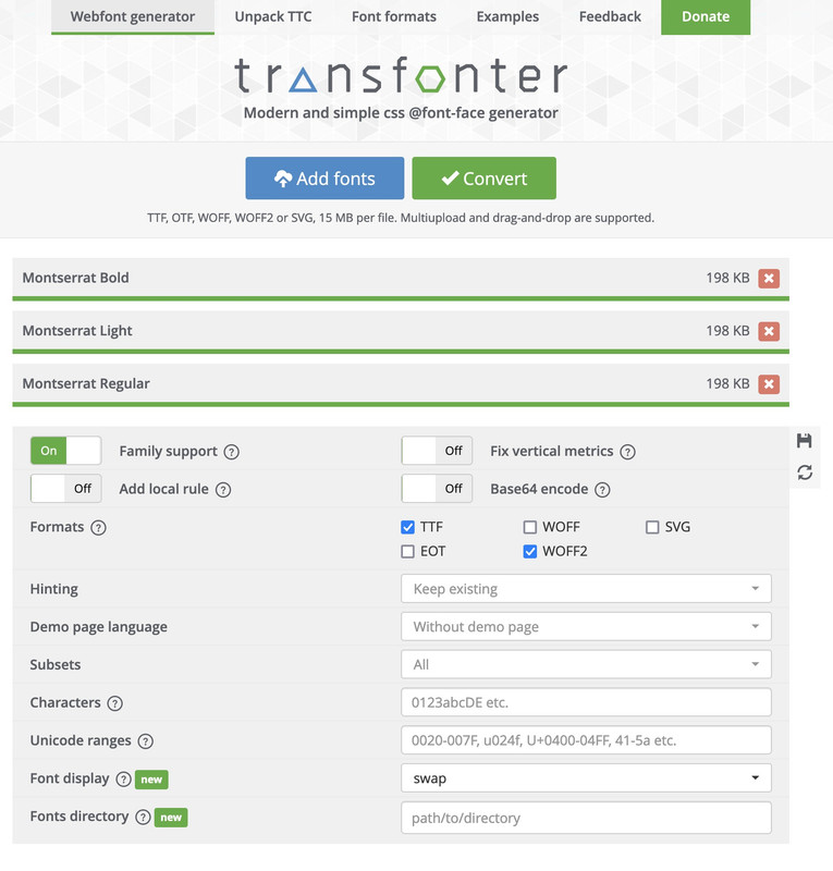
test this zip file f.e. – erase all your uploaded Montserrat zip files.
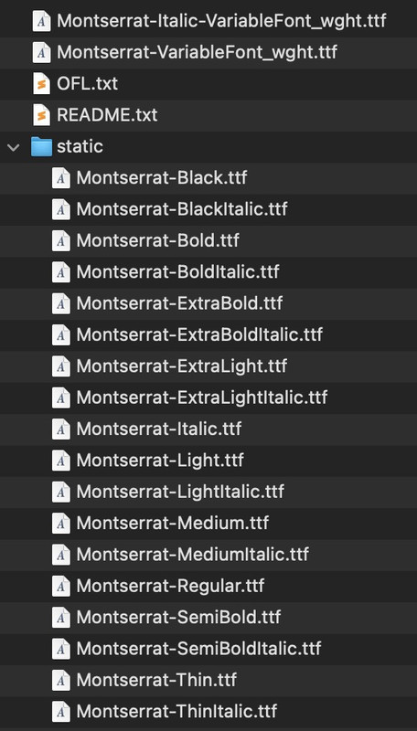
https://webers-testseite.de/Montserrat.zipif it is you page ( and your nick is very informative ) i think you have uploaded only that montserrat font (and gotham-pro) via the fontmanager – but you have uploaded the whole downloaded font zip file.
Inside that zip there are variable font files and in a subfolder the static font files.
your static font folder leads to the result that the Montserrat Font is listed as font-family: staticBy the way :
new Enfold can also handle these variable font files – but I would recommend uploading them separately.For example, put the Montserrat variable files in a folder and name it Montserrat-variable.
Pull out the static folder from the zip file and rename it to Montserrat.For performance reasons, it is now time to consider whether you really need all the fonts. The list is very long, especially for Montserrat. In principle, the variable fonts should be sufficient for all modern browsers.
However, if you only need, for example, light, regualar and bold, it may even be better to upload only the static fonts (woff2, ttf). In addition, Montserrat is a font where the italic variant hardly differs from a normal slanted font.
You could therefore live with the fact that only the normal font styles are uploaded and the italic fonts are converted by browser rendering.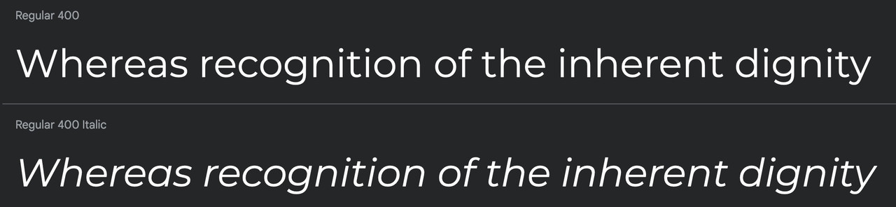
Then zip these two folders (please not in Mac Zip format – so without all the invisible files OSX packs in), but without the metadata. Betterzip also has a “zip for PC” option.
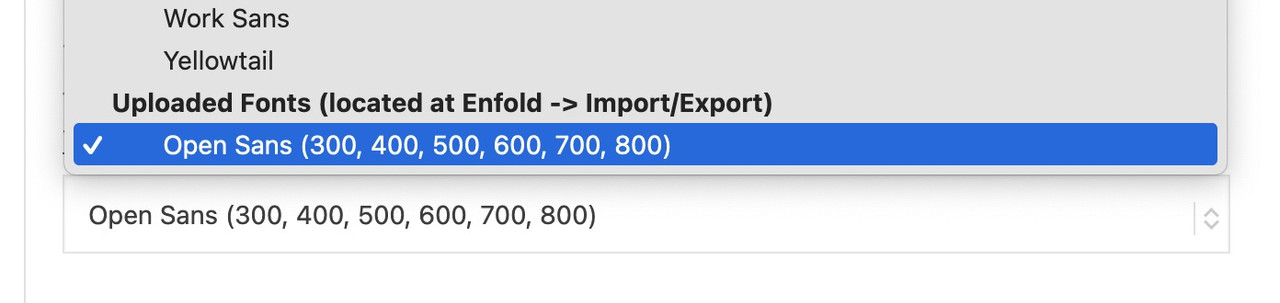
Then upload these folders to the font manager.PS: the uploaded Fonts can be found at the bottom of the font dropdown list ;)
sorry one error there is an extra attr for Logo ID: header_replacement_logo_id
so snippet has to be :
function av_change_alt_logo_img($header){ if(is_page(1313)) { $header['header_class'] .= ' av_alternate_logo_active'; $header['header_replacement_logo_id'] = 3951; } return $header; } add_filter('avf_header_setting_filter','av_change_alt_logo_img'); -
AuthorPosts