Forum Replies Created
-
AuthorPosts
-
May 2, 2024 at 8:03 pm in reply to: How to add packages with free symbols / Icons in enfold #1441982
PS: you can use all element options – f.e. background-color of the icon on iconbox-top – or animation styles – like pulse on hover.
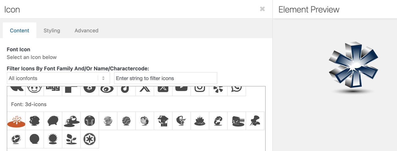
May 2, 2024 at 7:32 pm in reply to: How to add packages with free symbols / Icons in enfold #1441979I would upload an unspectacular iconfont. Here I have inverted numbers. Link
Then upload your coloured icons and make a note of the path for each icon.
now replace an icon of this font with the noted links of your coloured iconsthis comes to your quick css:
.av_font_icon {
    overflow: visible !important;
}

[data-av_iconfont="solar-icons"]  {
  content: " ";
  background-size: 100px;
  background-position: center center;
  background-repeat: no-repeat;
  border: none !important;
  color: transparent !important;
}

[data-av_iconfont="solar-icons"][data-av_icon="\e800"]{background-image: url(/wp-content/uploads/globe.gif) !important}
[data-av_iconfont="solar-icons"][data-av_icon="\e801"]{background-image: url(/wp-content/uploads/broken-spheres.svg) !important}
[data-av_iconfont="solar-icons"][data-av_icon="\e802"]{background-image: url(/wp-content/uploads/bubbles.svg) !important}
[data-av_iconfont="solar-icons"][data-av_icon="\e803"]{background-image: url(/wp-content/uploads/chrome-balls.svg) !important}
[data-av_iconfont="solar-icons"][data-av_icon="\e804"]{background-image: url(/wp-content/uploads/film.svg) !important}
[data-av_iconfont="solar-icons"][data-av_icon="\e805"]{background-image: url(/wp-content/uploads/glas-dots.svg) !important}
[data-av_iconfont="solar-icons"][data-av_icon="\e806"]{background-image: url(/wp-content/uploads/glas-waben.svg) !important}
[data-av_iconfont="solar-icons"][data-av_icon="\e807"]{background-image: url(/wp-content/uploads/green-world.svg) !important}
[data-av_iconfont="solar-icons"][data-av_icon="\e808"]{background-image: url(/wp-content/uploads/home.svg) !important}
[data-av_iconfont="solar-icons"][data-av_icon="\e809"]{background-image: url(/wp-content/uploads/hui.svg) !important}
[data-av_iconfont="solar-icons"][data-av_icon="\e80a"]{background-image: url(/wp-content/uploads/lotus.svg) !important}
[data-av_iconfont="solar-icons"][data-av_icon="\e80b"]{background-image: url(/wp-content/uploads/nachhaltig1.svg) !important}
Now – if you place your circled number 1 – you can see even in preview – the replaced colored icon:
And – yes even animated gifs can be inserted:
see replaced first icon : https://webers-testseite.de/abc/
PS: on that page with the snippets – you can see that i use the elements sizes for the icons – to generate the background-size :
https://enfold.webers-webdesign.de/colorized-font-icons/if you like to use that too – remove from css code above the background-size line
function transfer_fontsize_to_backgroundsize(){
?>
<script>
window.addEventListener("DOMContentLoaded", function () {
(function($) {
	$('.av-icon-char[data-av_iconfont="solar-icons"], .iconbox_icon[data-av_iconfont="solar-icons"]').each(function() {
		var iconLineHeight = parseInt($(this).css('line-height'));
		var iconPadding = parseInt($(this).css('padding'));
		$(this).css('background-size', (iconLineHeight + 2*(iconPadding))+'px');
	});
})(jQuery);
});
</script>
<?php
}
add_action('wp_footer', 'transfer_fontsize_to_backgroundsize');
May 2, 2024 at 6:38 pm in reply to: Enfold child function not working since upgrading website #1441977by the way – same thing on
.click(function() {it is now:
.on('click', function() {May 2, 2024 at 5:12 pm in reply to: Enfold child function not working since upgrading website #1441942and please think of since jQuery 3 the
(window).load(is deprecated – it is now :(window).on('load',
( purely cosmetic – I personally prefer to write all jQuery as $ – and redeclare it by wrapping it in a jQuery function. )function av_move_search(){ ?> <script type="text/javascript"> (function($){ $(window).on('load', function(){ $('#menu-item-search').detach().appendTo('#header_meta .sub_menu ul'); }); })(jQuery); </script> <?php } add_action('wp_footer', 'av_move_search');by the way: your cloudflare security blocks your website (on all of my browser – even on those where i do not run µBlock or private window only.
aha – the do_shortcode is the crux – i tried it with tags too and have only the $preview wrapped.
Thanks – but there seems to be an auto close on div wrapping – there are empty divs after the preview insertion.
btw. with p tags it does not work that wayThis is enough:
add_filter("avf_portfolio_grid_excerpt", function ($excerpt, $entry) { $id = $entry->ID; $preview = get_post_meta($id, '_preview_text', true); if ($preview) { $excerpt = "<div class='av-custom-grid-excerpt-container'>" . do_shortcode($preview); } return $excerpt; }, 10, 2);hyphens: auto will break words with a dash : Link
see on “can i use” the support for hyphens auto: https://caniuse.com/mdn-css_properties_hyphens_autoyou can use ismaels css in combination with hyphens
#main li { word-wrap: break-word; overflow-wrap: break-word; -webkit-hyphens: auto; -moz-hyphens: auto; hyphens: auto; }thats nice – because it is much easier to style this preview text than the excerpt field.
is it possible to add in this case a custom class to f.e. the output div grid-entry-excerpt entry-content ?
because f.e. ul’s do not have in that case that enormous line-height. And it is easier to select with a special class.No – I only “think” out loud.
As I understand it, only the order in which they are looped is different – how to solve this?in text elements – the inserted image floating left got a class: alignleft
you can increase the default value from 10px by
#top .avia_textblock img.alignleft { margin-right: 40px; }That was three years ago – but I think it works so far. Maybe I would do some things differently now.
lists in text Element – or lists from advanced layout builder element ?
Can you show an example page?May 1, 2024 at 6:14 pm in reply to: How to add packages with free symbols / Icons in enfold #1441622Thanks – Mike – I forgot to mention that the coloured icons have to be uploaded to the media library
PS – you can drag&drop the colored icons to fontello – in most cases they will generate a monocolor version of it.
May 1, 2024 at 5:13 pm in reply to: How to add packages with free symbols / Icons in enfold #1441615see here an example page – and code how i did that.
In principle, I misuse a specially uploaded iconfont for this (e.g. 3d-icons) – and then replace the monocolour icons with the coloured ones using css.However, I have made a little more effort and uploaded monocolour icons of the coloured ones to fontello, so that I can see in the icon selection what kind of icon I want to use.
 May 1, 2024 at 4:49 pm in reply to: How to add packages with free symbols / Icons in enfold #1441609
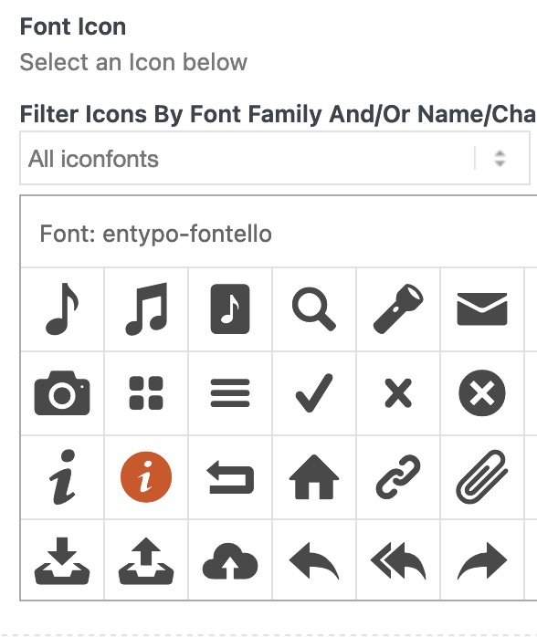
if you can download as svg – you can upload that to fontello.com
Using it as an iconfont it has to be not multicolored. the svg path’s had to be compound path.Follow Mikes Link
hm – on functions-enfold.php line 827 i found the orderby : post_date
and the filter avf_post_nav_loop_args – but have no success with post_titleMay 1, 2024 at 2:00 pm in reply to: How to add packages with free symbols / Icons in enfold #1441577And a little bit under Mike’s link there are the enfold fonticons used for their demos to download
https://kriesi.at/documentation/enfold/icon/#download-fontello-or-flaticon-icons-included-in-enfold-demosIn any case, it is questionable whether it is necessary to translate technical terms.
If the descriptions are translated, I think it is quite sufficient to translate a backend.ok – you have choosen a different testimonial layout:
try:
#top  .avia-testimonial-wrapper .avia-slideshow-arrows {
  display:  flex;
  position: relative !important;
  top: auto !important;
  bottom: 40px;
}
April 30, 2024 at 4:40 pm in reply to: erledigt – SVG Dateien werden im Frontend nicht angezeigt #1441467PS: du könntest diese svg auch zu fontello.com hochladen, und so dir ein eigenes fonticon set machen.
die svg sollte man jedoch zuvor zu einem compound path vereinen ( Illustrator alles auswählen dann : Objekt – Zusammengesetzter Pfad – erstellen )lade dir das zip mal hoch unter : Enfold-Child – Import/Export – Iconfont Manger
https://webers-testseite.de/manfred-ergott.zip
Dann hast du den Satz als Iconfonts zur Verfügung.April 30, 2024 at 3:10 pm in reply to: how to use avf_dynamic_css_additional_vars and avf_dynamic_css_after_vars #1441458thanks – with
function my_vars_outputs( $output ){
  $output .= "--my-variable-font-size-theme-h3: min(max(18px, calc(1.125rem + ((1vw - 3.2px) * 1.1864))), 32px); min-height: 0vw;\n";
  $output .= "--your-font-size-theme-h4: 20px;\n";
  return $output;
}
add_filter('avf_dynamic_css_additional_vars', 'my_vars_outputs');
it works – but with avf_dynamic_css_after_vars i can not see a change.
Edit:
This illustration may help you to better understand how to use it.function my_vars_outputs( $output ){ $output .= " #myID { font-size: 28px; } .myClass { font-size: 20px; } "; return $output; } add_filter('avf_dynamic_css_after_vars', 'my_vars_outputs');Edit: – ok now i see – but what benefit has that after_vars ?
April 30, 2024 at 2:29 pm in reply to: Change dimensions of featured image in single blog post #1441455Try first only my solution without redefining the featured image source – this will only use a different image-size source for that featured image.
And because masonry image-size is a non cropped size – use that.________________________
btw: on your copyright link in the footer you have made some mistakes.
i would only insert that line:© Copyright - NSW Dowsers Society. All Rights Reserved.and add to my child-theme functions.php:
function new_backlink(){
	$kriesi_at_backlink = " - <a href='https://xfactadesign.com' target='_blank'>Xfacta Design</a>";
	return $kriesi_at_backlink;
}
add_filter('kriesi_backlink' , 'new_backlink');
or maybe clearer in that way:
function my_own_backlink($link){
  $no = "rel='nofollow'";
  $slogan = "Website Design by - ";
  $theme_string = "Xfacta Design";
  $backLink = "https://xfactadesign.com";

  $link = "{$slogan } <a {$no} href= {$backLink} target='_blank'>{$theme_string}</a>";
  return $link;
}
add_filter( 'kriesi_backlink', 'my_own_backlink', 10, 1);
that snippet set the new value for the backlink. in this case you do not need to add the shortcode [nolink]
April 30, 2024 at 1:57 pm in reply to: Contact form doesn’t send emails after recent update #1441454but you can use the enfold contact form – but with WP Mail SMTP
The free version is all you need. – It has many mailer options
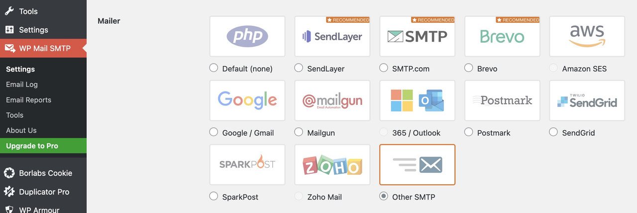
You just need to find out from your provider which smtp server settings you need to use.
By the way: Incidentally, the spf-record is probably the most important thing here if, for example, the e-mail address used in your installation to send the contact form does not match the domain.
e.g:
SPF Include Example
For example: If you have “include:_spf.google.com” in your SPF record, and emails are sent from a Google IP address, it will be considered an authorized email sender because the originating IP is found within the “include” mechanism of that domain’s SPF record. As a result of this, the email will successfully pass through the server before reaching its intended recipient.
To authorize google as a verified sending source, this should be your SPF record syntax:
v=spf1 include:_spf.google.com ~allthat means : f.e. if your wordpress domain is your-wordpress-domain.com but you try to send your e-mails via contact form by (Email address hidden if logged out)
you had to go to your provider of your-wordpress-domain.com and set a txt record with including the url : your-name.com to authorized email sender.Ask your provider what setting might be the best for your installation.
this differs from provider to provider. For example – on former times i had my domains on hosteurope.
so i had to set a txt record : v=spf1 a mx include:spf.server-he.de -alletc.
April 30, 2024 at 1:13 pm in reply to: erledigt – SVG Dateien werden im Frontend nicht angezeigt #1441447Als Participant sehe ich den Inhalt des Private Content nicht. Daher musst du dann in dem Fall auf einen Moderator warten.
Nun bei deinem Nick ist es allerdings nicht allzuschwer die Domain zu finden.
Eventuell ist die Einstellung: Dashboard – Enfold Child – Allgemeines Layout – Fixiertes Seitenleisten-Menü : “Fixieren, wenn Seitenleiste kleiner als die Bildschirmhöhe ist, ansonsten scrollen”nicht uninteressant: so bleibt dann dein Menü sticky – und man muss nicht ellenlang scrollen um wieder eine Auswahl zu treffen.
No – please don’t.
I only come here occasionally and give my opinion on topics, but I have enough projects of my own at the moment – so I don’t want to take responsibility for other people’s projects.for so few posts within a category, I would rather install a plugin that supports a custom post order to quickly find a solution. There you can customize the order of the posts by drag and drop.
Such a plugin would be, for example, Simple Custom Post Ordertry:
#top .av-large-testimonial-slider .avia-slideshow-arrows a { top: auto !important; bottom: 0px; }by the way – is see we do not need to go over the before pseudo class :
this will work
#top [data-av_icon] {
  background-size: 100% 100%;
  background: var(--wp--preset--gradient--cool-to-warm-spectrum);
  -webkit-background-clip: text;
  -webkit-text-fill-color: transparent;
}
and to have that on iconbox_top: – without gradient on icon:
#top .main_color.iconbox_top .iconbox_icon { background: var(--wp--preset--gradient--cool-to-warm-spectrum); -webkit-background-clip: unset; -webkit-text-fill-color: unset; }yes – thats why i wrote “if you like to have gradient fillings for icons on enfold you can use that background-clip: text ”
as I used an inverted icon in my example, it was misleading – sorry
it is the structure of your titles – they formed with numbers ( your years ) there are options of natural sort order (SORT_NATURAL) etc.
the trouble is if you like to sort by titlel and titles are f.e. A1, A2, A10, B1, B20, B3 etc.
does a sort order could be A1, A10, A2, B1, B3, B20
i do not know if this has influence on that filter ?April 30, 2024 at 8:25 am in reply to: Change dimensions of featured image in single blog post #1441394masonry image size is a non-cropped size too. ( or use full images )
so – if you use that snippet in child-theme functions.php it will use that image-size format:function av_remove_featured_image_link($image) { if (is_single()) { $image = get_the_post_thumbnail( $current_post['the_id'], 'masonry' ); } return $image; } add_filter('avf_post_featured_image_link','av_remove_featured_image_link', 10, 1);Yes – if each post belongs to exactly one category, it should work. But what if the current post belongs to categories A and B – where should it be linked to then?
Multiple categorisation is not unusual. -
AuthorPosts