Forum Replies Created
-
AuthorPosts
-
First try it with one photo that you have allready uploaded by which you notice the loss of quality described above (darker etc.)
Open the image in Photoshop, reduce it to a maximum width of 1500px, for example, and save it as sRGB. Upload this image and compare it with the existing library image. If the image is much better, you can do the same for the rest of your photos.the browsers work with the s-RGB color profile – many photographers save their photos with adobe-RGB or ProPhoto RGB, sometimes even with 16bit per color channel.
When you upload these images to the media library, they are treated as if they were s-RGB images. Embedded color profiles are not taken into account in browser rendering.Next: If you upload images from your professional digital camera without recalculating them for web use, most of them will be too large.
Wordpress will first convert them to a size of 2560px – and use this as the source for the other image format calculations. – It is therefore better to do the web optimization yourself in a program of your choice.See a comparison : https://webers-testseite.de/image-comparison/
Allthough the ProPhoto RGB Color Room is much bigger than the sRGB – they will not be rendered in a correct way.
this is your slideshow test 2 page?
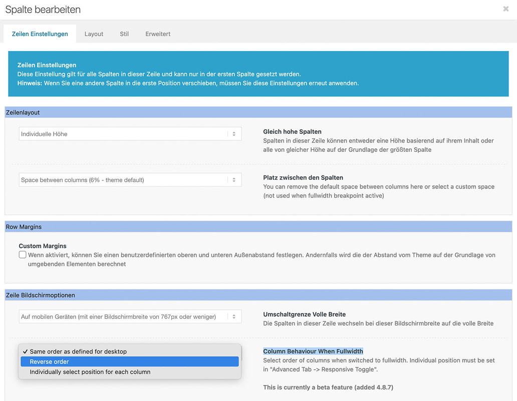
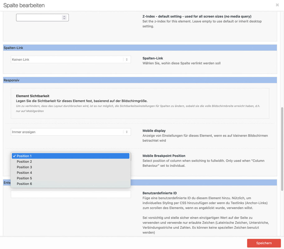
responsive on enfold means: the columns goes to 100% width. Then the order is determine by the mentioned above.
if you like to reach that of your screenshot – you had to place these 3 columns best in an extra color-section. That is easier to handle.
Then best a custom class is added to that color-section to better select that columns. A custom flex layout should then be set by css.
Means – after first responsive break – the one flex-item will have 100% – the others will have 50% width.If it will be a slideshow – you like to have an event on those arrows under the image? what is the function of that X in the middle ? – and on the right side the counter should count the images automatically?
see here with a possible css code : https://webers-testseite.de/slideshow-test2/
July 24, 2024 at 10:02 am in reply to: Post ID Formatting on new Post Data feature on Button Element #1462833may i ask you just a question – what benefit has a button label with the ID – That’s not very meaningful for visitors. Perhaps I am overlooking the usefulness of such a button.
This is only needed if you got date columns with uncommon format. Like Dots ( 10. 12. etc. Jan. Feb. ) or fullnames of the month.
I guess a normal format like 24-07-2024 could be handled without that way.on editing that post :
is it just me? – or only that answer due to the shortcode ?do you know how to get the avia shortcodes for that element?
Just style your partner logo element on a f.e. new page without any wrapper elements ( espacially color-section )copy that code – f.e.:
[ av_partner heading='' type='slider' columns='1' navigation='arrows' control_layout='av-control-default' nav_visibility_desktop='' nav_arrow_color='' nav_arrow_bg_color='' nav_dots_color='' nav_dot_active_color='' size='no scaling' img_size_behave='no_stretch' border='' img_border='' img_border_width='' img_border_width_sync='true' img_border_color='' border_radius='' border_radius_sync='true' box_shadow='' box_shadow_style='0px,0px,0px,0px' box_shadow_color='' padding='' padding_sync='true' animation='slide' transition_speed='' autoplay='false' interval='5' heading_tag='' heading_class='' img_scrset='' lazy_loading='disabled' el_id='' custom_class='' template_class='' av_uid='av-lyyz7l6u' sc_version='1.0']
[ av_partner_logo id='1225']
[ av_partner_logo id='1224' id_dynamic='' hover='' link='' link_dynamic='' link_target='' linktitle='' av_uid='av-lyyz76rg' sc_version='1.0']
[/av_partner]
and insert that code to your footer widget. If you don’t use that element on your pages – it might be neccessary to activate that option on enfold – performance: “Scan Widgets For Theme Shortcodes”
Attention: You must replace “[ av_…” with “[av_…” (remove space between “[” and “av_…” )
i solved it with the help of moment.js script ( with locale settings ):
function fix_for_sorttable(){
?>
<script>
window.addEventListener("DOMContentLoaded", function () {
(function($){
    $('.avia-table.sortable').each(function(){
      // this is the heading of the column with dates - you had to adjust to your needs
      var dateTableIndex =  $(this).find('thead th:contains("Dat")').index();
      var dateChildNumber = parseInt(dateTableIndex)+1;
      $(this).find('tbody td:nth-of-type('+dateChildNumber+')').addClass('date');
    });

    $(".date").each(function(idx) {
        // change the locale setting to your needed language - spcifications may occur like de_at - for austria
        moment.locale('de');
        var datum = $(this).text(),
        // this is the code for my used german date format like : 16. Mai 1962
        datum_formated = moment( datum , 'DD. MMMM YYYY').format('YYYY-MM-DD');
        $(this).attr("sorttable_customkey", datum_formated);
    });
})(jQuery);
});
</script>
<?php
}
add_action('wp_footer', 'fix_for_sorttable');
the format YYYY-MM-DD is sortable
see: https://webers-testseite.de/sortable-table/I think the childtheme table.php is not needed as we can trigger this by giving the data table the custom class: sortable
I have tested this and there should be no problems for standard tables.
______________Unfortunately, it looks different for tables that are to be sorted by date. As long as you use standard english date formats you are probably on the safe side. Unfortunately, in Germany we like to use the dot as a separator and the month names are of course different.
So e.g. 16. Mai 1962 etc. is then not sorted correctly.here is my snippet to give to each td under a “Datum” ( my trigger heading word )
see solution on the next posting
However, this does not have the desired result either, because here too, for example, local date format entries are not taken into account. The result is that a NaN is returned for e.g. Mai / Dez etc or 16.05.2001.
Or in other words – how do we get a date field to have a sorttable_customkey attribute in the form yyyymmdd ?
and that with a given local date formate like 16. Mai 2001July 22, 2024 at 3:35 pm in reply to: Magazine Content Element: Place the “title” above the “categories” #1462681brilliant – I didn’t think of this little trick to use it again as $header_content[‘cats’].
So – definitely use this snippet. I see you know how to get rid of the word “in”.July 21, 2024 at 9:50 am in reply to: Magazine Content Element: Place the “title” above the “categories” #1462596i think there must be a way to reorder an existiing array .
inside magazine.php there is on lines 1545ff :$header_content = array( 'time' => "<time class='av-magazine-time updated' {$markupTime}>{$time}</time>", 'author' => $author, 'cats' => $cats, 'tags' => $tags, 'title' => "<{$titleTag} class='av-magazine-title entry-title {$titleCss}' {$markupTitle}>{$title}</{$titleTag}>" );And that is the reason why the cats are placed over the titles.
Edit : code erased see snippet from Ismaelbut: as mentioned above – maybe there is a very easy way to reorder that array.
July 21, 2024 at 7:54 am in reply to: Magazine Content Element: Place the “title” above the “categories” #1462593mayby a mod knows a method to influence the generation of that sequence – perhaps via filter: avf_magazine_header_content
but here is a quick jQuery function for child-theme functions.php:
function change_position() { ?> <script> (function($){ $('.entry-content-header').each(function() { movedElement = $(this).find('.av-magazine-title'); targetElelemt = $(this).find('.av-magazine-cats-wrap'); $(movedElement).insertBefore($(targetElelemt)); }); })(jQuery); </script> <?php } add_action('wp_footer', 'change_position');you mean in the logo of the example demo page?
There are a lot of suitable candidates. One of the better-known commercial fonts is probably: Avenir Next LT Pro
(In GillSans or Helvetica New, for example, the centre E stroke ends on a line with the other ‘arms’.)
If you like to know which google font is similar to that – see here f.e.: https://similarfont.io/3-google-fonts-similar-to-avenir-next
See Prompt: https://fonts.google.com/specimen/Prompt?preview.text=ENFOLD&query=Promptthis is the logo for transparency / glassy headers.
You can find a switch on Theme Options : Transparency Options (Contains options for transparency header)
here you can replace that logo or set the color for menu items for transparency headersJuly 17, 2024 at 2:15 pm in reply to: Advanced Layout Editor button gone after update to WordPress 6.6 #1462269a note : my Wordfence scan shows that after the last WP update, old files from the previous version remained in the folders – and these are mainly related to the editor files!
July 17, 2024 at 12:26 pm in reply to: Advanced Layout Editor button gone after update to WordPress 6.6 #1462253try to start in that mode with the “automatic” click on that unseen button:
function trigger_alb_on_load(){ ?> <script> (function($){ $(window).on('load', function(){ setTimeout(function() { $("#avia-builder-button").trigger('click'); }, 300); }); })(jQuery); </script> <?php } add_action('admin_head-post-new.php', 'trigger_alb_on_load');they got a nice docu – i think there is no special trick for it: https://krpano.com/docu/embedpano/#top
Why don’t you assign an additional special category to these portfolios? “Guest”
As far as I know, no further intervention is necessary then!
The Portfolio Grid is now: Whether you have selected the sort option or not, this taxonomy appears there as the class on grid-entry : XYZ_sort
In your case then guest_sortalthough I believe that it is rather good if visitors can interact with autoplay videos. Turning it off is certainly better than leaving the website because a video is annoying!
July 14, 2024 at 9:18 am in reply to: Unterkategorien von Seiten / Subcategories of pages (Sidebar / Widget) #1462003Super : i didn’t think of that: https://img.savvyify.com/image/Enfold-Support-6295.9iVHK !
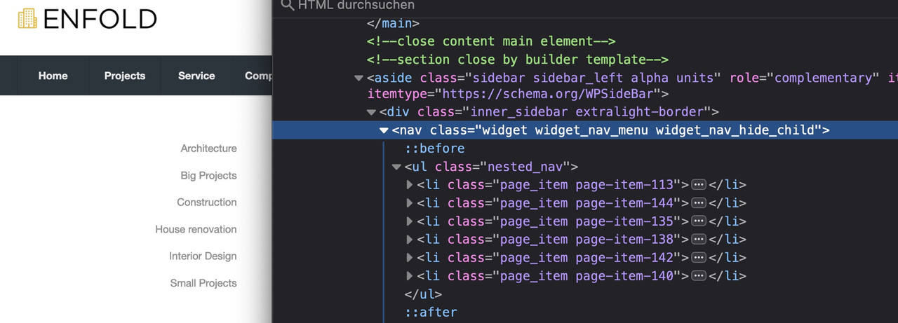
and this is the way the class: widget_nav_hide_child comes to the menu.July 14, 2024 at 9:10 am in reply to: The flag of languages not appear in phone burger menu. #1462002besides that : this is the shortcode for polylang lang switch:
function custom_polylang_langswitcher() {
  $output = '';
  if ( function_exists( 'pll_the_languages' ) ) {
    $args   = [
      'show_flags'    => 1,
      'hide_if_empty' => 0,
      'show_names'    => 1,
      'echo'          => 0,
    ];
    $output = '<ul class="polylang_langswitcher">'.pll_the_languages( $args ). '</ul>';
  }
  return $output;
}
add_shortcode( 'polylang_langswitcher', 'custom_polylang_langswitcher' );
there are a lot of args you can use to manage the way it looks like:
/**
* @param array     $args {
*   Optional array of arguments.
*
*   @type int      $dropdown               The list is displayed as dropdown if set, defaults to 0.
*   @type int      $echo                   Echoes the list if set to 1, defaults to 1.
*   @type int      $hide_if_empty          Hides languages with no posts ( or pages ) if set to 1, defaults to 1.
*   @type int      $show_flags             Displays flags if set to 1, defaults to 0.
*   @type int      $show_names             Shows language names if set to 1, defaults to 1.
*   @type string   $display_names_as       Whether to display the language name or its slug, valid options are 'slug' and 'name', defaults to name.
*   @type int      $force_home             Will always link to home in translated language if set to 1, defaults to 0.
*   @type int      $hide_if_no_translation Hides the link if there is no translation if set to 1, defaults to 0.
*   @type int      $hide_current           Hides the current language if set to 1, defaults to 0.
*   @type int      $post_id                Returns links to the translations of the post defined by post_id if set, defaults not set.
*   @type int      $raw                    Return a raw array instead of html markup if set to 1, defaults to 0.
*   @type string   $item_spacing           Whether to preserve or discard whitespace between list items, valid options are 'preserve' and 'discard', defaults to 'preserve'.
*   @type int      $admin_render           Allows to force the current language code in an admin context if set, default to 0. Need to set the admin_current_lang argument below.
*   @type string   $admin_current_lang     The current language code in an admin context. Need to set the admin_render to 1, defaults not set.
*   @type string[] $classes                A list of CSS classes to set to each elements outputted.
*   @type string[] $link_classes           A list of CSS classes to set to each link outputted.
* }
*/
some quick css:
.lang-item {
  display:inline;
  padding-left:5px;
  list-style:none;
}
July 13, 2024 at 7:36 am in reply to: The flag of languages not appear in phone burger menu. #1461959You have installed WPML now, haven’t you?
because: https://kriesi.at/support/topic/the-flag-of-languages-not-appear-in-phone-burger-menu/#post-1432364July 13, 2024 at 7:23 am in reply to: Transferred website to new URL, now I can’t open the dashboard anymore #1461958a few minutes ago i could open the url
http://www.lzau.at/wp-login.phpand it opens some kind of login page – try to login to that page.
(it seems that they forget to install a working certificate). I guess you now are working on that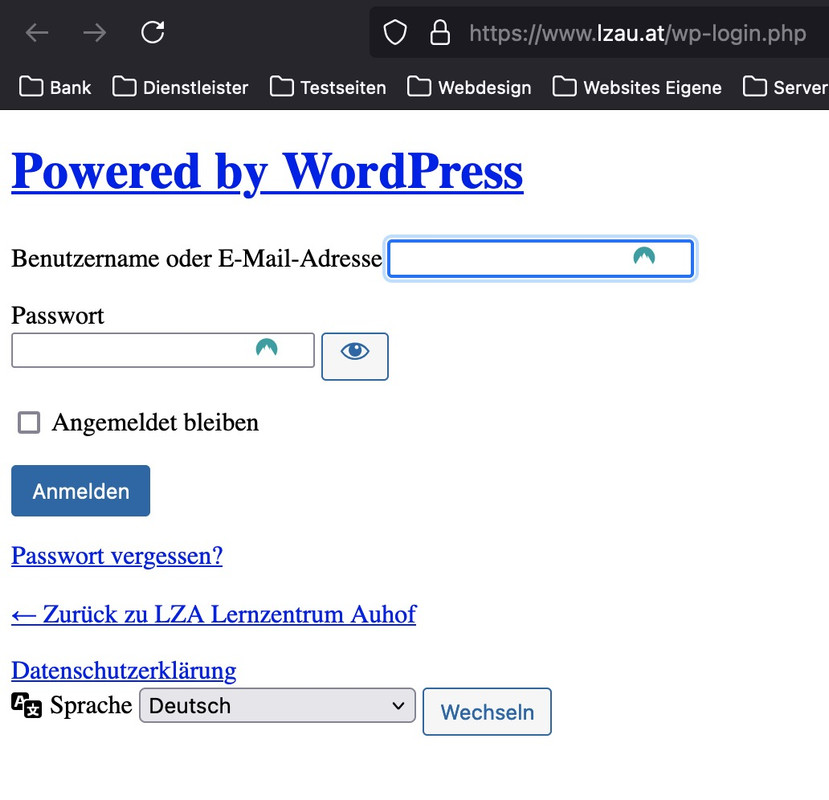
Try in quick css:
@media only screen and (max-width: 1050px) { #top #header .av-main-nav > li.menu-item { display: none !important; } #top #header .av-burger-menu-main { cursor: pointer; display: block !important; } }yes – or if you like to have on responsvie case first the menue then the copyright info use instead as media query:
@media only screen and (max-width:767px) { #socket .container { flex-flow: column-reverse wrap; align-items: center; } #socket .container > * { display: inline-block; width: unset !important; } }put these two snippets inside your child-theme functions.php:
add_action('ava_after_footer_output', function() {
  echo '<div id="subsocket" class="container_wrap subsocket_color"><div class="container">';
  echo !dynamic_sidebar('subsocket');
  echo '</div></div>';
});

function subsocket_color_set($color_sets){
  $color_sets['subsocket_color'] = 'Subsocket';
  return $color_sets;
}
add_filter( 'avf_color_sets', 'subsocket_color_set', 999 );
after that go to your widgets and create a new widget area named: subsocket
the first snippet is to have a new widget area – the second snippet is for having your own color styles for that area by enfold options.

Inside the new widget area you can have all widget you like to have.
to have less height and paddings etc. just a little css:
#subsocket > .container,
#subsocket .widget {
  padding: 0;
}
#subsocket p {
  margin: 0;
}
#subsocket .av-special-heading {
  margin: 10px auto;
}
for changing the position of copyright info and footer menue – the idea of Mike is perfect:
#socket .container {
  display: flex;
  flex-flow: row-reverse wrap;
  justify-content: space-between;
}

#socket .container::after {
  display: none;
}

#socket .sub_menu_socket {
  display: flex;
  align-items: center;
}

@media only screen and (max-width:767px) {
  #socket .container {
    flex-direction: column;
    align-items: center;
  }
  #socket .container > * {
    display: inline-block;
    width: unset !important;
  }
}
July 12, 2024 at 1:45 am in reply to: Unterkategorien von Seiten / Subcategories of pages (Sidebar / Widget) #1461885Wenn Du es nicht in der Sidebar möchtest stell doch auf den Seiten oben ein menu ein : Content Elements : “Full width submenu”
das kann man auch auf sticky setzen ( standardmäßig scrollt es aber im responsiven Fall dann weg )July 12, 2024 at 1:29 am in reply to: Unterkategorien von Seiten / Subcategories of pages (Sidebar / Widget) #1461884aber das auf deiner Beispielseite ist genau so ein widget menu:
PS: das wäre so ein menü shortcode:
function print_menu_shortcode($atts, $content = null) {
    extract(shortcode_atts(array( 'name' => null, ), $atts));
    return wp_nav_menu( array( 'menu' => $name, 'echo' => false ) );
}
add_shortcode('menu', 'print_menu_shortcode');
so einzusetzen:
[menu name='menu_name']PPS: sticky sidebar: https://webers-testseite.de/sticky-sidebar/
-
AuthorPosts

