Forum Replies Created
-
AuthorPosts
-
January 28, 2026 at 11:16 am in reply to: Need columns with different width oder table without frame (in text block) #1494425
by the way – you can see the declarations on positioning inside a grid-layout on :
https://css-tricks.com/wp-content/uploads/2022/02/css-grid-poster.png
f.e. if you like to have the years left-aligned – change it to:
.my-listings li strong {
  font-weight: normal;
  justify-self: start;
}
January 28, 2026 at 11:01 am in reply to: Need columns with different width oder table without frame (in text block) #1494424make a unordered list in a textblock – give a custom class to it – f.e.: my-listings
mark the years and make them bold via tiny-mce button
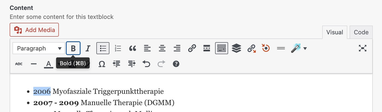
then just put this to your quick css:
.my-listings ul {
  list-style: none !important;
}

.my-listings li {
  display: grid;
  margin: 0;
  gap: 0 30px;
  grid-auto-flow: row;
  grid-template-columns: 140px 1fr;
  justify-content: start;
}

.my-listings li strong {
  font-weight: normal;
  justify-self: end;     /** now your years "float" right. **/
}
and:
/* === responsive styling === */
@media only screen and (max-width: 469px) {
  .my-listings li {
    grid-template-columns: 1fr;
    justify-content: center;
  }

  .my-listings li strong {
    font-weight: normal;
    justify-self: start;
  }
}
see your list including css code on : https://webers-testseite.de/joeconnert/
making the years bold will set the html to :
<li><strong>2011 – 2012</strong> Medizinische Trainingstherapie (Diemer & Sutor)</li>
So we have the option of selecting them separately. And bring them in a grid-layoutThis:
grid-template-columns: 150px 1fr;
determines the “column” width – the first one (the strong years) will have width of 150px – the other “column” fills the rest (fr: means fraction)i can’t see your described troubles. –
But did you know that even a whole column can have a link?
See on column – advanced tab – column link
then the whole column is clickable – not only the headingThe selfhosted Font-Files are the the gold-standard in beeing GDPR compliant. ;)
Why don’t you post the page in question? It’s much easier to give advice that way.
As mentioned above, unfortunately there is no demo page where this hamburger variant is set.find the menu-item ID and :
.menu-item-556 .av-submenu-indicator {
  color: green;
  font-size: 40px;
  opacity: 1;
}

.menu-item-556 .av-submenu-indicator:before {
  content: "\E875";
  font-family: 'entypo-fontello';
}
the last rule is for heaving a little bolder icon
you like to have the oswald font for them? How did you embed the font? via Font-Manager / selfhosted or just by choosing it form the drop-down on Enfold – General Styling – Fonts ? i do not find any @font-face rule
i can find a redefinition of ::root { --enfold-font-family-heading:'oswald',Helvetica,Arial,sans-serif }but if there is no loading of oswald then the Helvetica is loaded
by the way – what is hu-blocked – i can see a block of google webfonts – maybe that is the reason for it.
PS i can reproduce it – before consent – and after reload – one looks more condensed than the other one.
PPS: i recommend using a selfhosted font – by font-manager of Enfold
You must be referring to the arrows that open submenus. Unfortunately, none of the Enfold demos have this type of hamburger navigation. Otherwise, I could tell you the selectors based on that.
try this in child-theme functions.php:
function custom_replace_burger_anchor_with_button( $items, $args ){
    $pattern = '/(<li[^>]*class="[^"]*av-burger-menu-main[^"]*"[^>]*>)\s*<a([^>]*)>/is';
    $items = preg_replace($pattern, '$1<button type="button" $2>', $items);
    $items = preg_replace('/<\/a>(\s*<\/li>\s*$)/', '</button>$1', $items);
    return $items;
}
add_filter( 'wp_nav_menu_items', 'custom_replace_burger_anchor_with_button', 9999, 2 );
BUT: Please note that in this case, you will no longer need to assign all styles to the a tag, but rather to the button tag.
In this case, it might be better to use role=”button” and class=avia-button.function custom_enhance_burger_anchor_regex( $items, $args ) { $pattern = '/<a href="#" aria-label="(.*?)"/i'; $replacement = '<a href="#" role="button" class="avia-button" aria-label="$1"'; $items = preg_replace($pattern, $replacement, $items); return $items; } add_filter( 'wp_nav_menu_items', 'custom_enhance_burger_anchor_regex', 9999, 2 );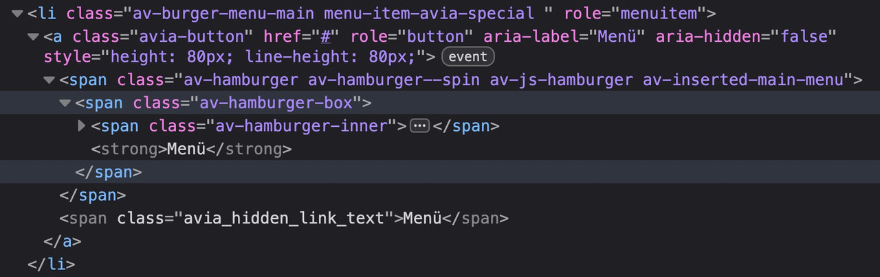
No CSS break: Since it remains an anchor-tag, all Enfold styles for the menu continue to work perfectly.
A11y-compliant: With role=”button,” we tell the screen reader: “Ignore that there is a link here; treat this element like a button.”maybe it is better to not add the class avia-button because it might come into conflict with some stylings.
use a different class there f.e.: avia-burger-button
then you can easily select it via this class.First of all, the icon is marked with aria-label=“Menu,” which is best practice.
And to understand your question correctly, they consider an anchor tag with such a label to be misleading?
So you would prefer it to be like this?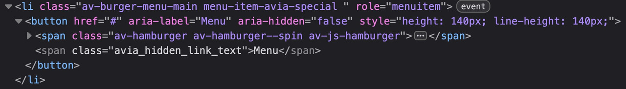
by the way – all enfold buttons do not have the button tag – they got that extra-class : avia-button
January 26, 2026 at 12:40 am in reply to: Having one toggle open at time across several accordions #1494300try in your child-theme functions.php:
function ava_custom_toggle_behavior(){ ?> <script type="text/javascript"> (function($) { $(window).on('load', function() { $('.toggler').on('click', function() { var $current = $(this); // Short delay so Enfold can set its own classes setTimeout(function() { if ($current.hasClass('activeTitle')) { // Find all other togglers on the page that are active $('.toggler').not($current).each(function() { if ($(this).hasClass('activeTitle')) { // Simulate click or remove classes manually $(this).trigger('click'); } }); } }, 100); }); }); })(jQuery); </script> <?php } add_action('wp_footer', 'ava_custom_toggle_behavior');and what about the next tab :
or even better – just use the team-member element as it is and parse a popup by your own.
see with snippet on that example page: https://webers-testseite.de/teammember-vitae-2/
PS: It is always best to examine each individual case closely, as this is the only way to offer a customized solution. Otherwise, one indulges in speculation.The last solution has the advantage that you only use the pure Enfold element for team members and then create your own lightbox with it. Disadvantage: you would have to rebuild your page and discard our previous design. In the window on the right side of the page, you can see that only plain text is entered in the Description Input Fiele — the Lightbox retrieves the image, name, and position from the existing DOM elements.
To change the aria-label – just edit these lines:tPrev: 'Previous Biography', tNext: 'Next Biography',i remember we made for your “leadership” members an own popup script f.e.
if you only want to change that aria-labels of that popup script – then the solutions above are not neccessary. Only change that inline popup script
so try to replace that script inside the functions.php snippet by (remove temporarly the observer script above)window.addEventListener("DOMContentLoaded", function () { (function($) { $('#people').each(function(){ var that = this; $('.flex_column', this).each(function(i){ if($(this).find('.mfp-hide').length){ $(this).find('.bio-link').attr('href','#bio-'+(i+1)).addClass('no-scroll'); $(this).find('.avia_image').attr('href','#bio-'+(i+1)).addClass('no-scroll'); $(this).find('.mfp-hide').attr('id','bio-'+(i+1)).addClass('white-popup'); } }); }); $('#people .flex_column').find('a[href^="#bio-"]').magnificPopup({ type:'inline', midClick: true, removalDelay: 500, mainClass: 'avia-popup mfp-fade people', gallery: { enabled:true, arrowMarkup: '<button title="%title%" type="button" class="mfp-arrow mfp-arrow-%dir%" aria-label="%title%"></button>', tPrev: 'Previous Biography', tNext: 'Next Biography', }, }); $('#people .flex_column').find('.avia_image[href^="#bio-"]').magnificPopup({ type:'inline', midClick: true, removalDelay: 500, mainClass: 'avia-popup mfp-fade people', gallery: { enabled:true, arrowMarkup: '<button title="%title%" type="button" class="mfp-arrow mfp-arrow-%dir%" aria-label="%title%"></button>', tPrev: 'Previous Biography', tNext: 'Next Biography', }, }); })(jQuery); });better see next solution
PS you can get rid of style part – and place the css inside quick css.It depends a little on how you want to use it. If you only want to change this to “next bio” and “previous bio” for certain custom classes, we would need to rewrite this code a little.
f.e. if you have a gallery – then you can give a custom class to that gallery element (f.e. team-member)
function add_magnific_popup_aria_labels() {
    ?>
    <script type="text/javascript">
    (function($) {
        'use strict';

        if (typeof $.avia_utilities !== 'undefined' && typeof $.avia_utilities.av_popup !== 'undefined') {

            var originalOpenCallback = $.avia_utilities.av_popup.callbacks.open;

            $.avia_utilities.av_popup.callbacks.open = function() {

                if (typeof originalOpenCallback === 'function') {
                    originalOpenCallback.call(this);
                }

                var self = this;

                setTimeout(function() {
                    // Determine labels based on the gallery container
                    var prevLabel = 'Previous image';
                    var nextLabel = 'Next image';
                    var closeLabel = 'Close lightbox';

                    // Check if the clicked element (currItem.el) is inside a container with a custom class
                    if (self.currItem && self.currItem.el) {
                        var $link = $(self.currItem.el);

                        // Find the parent lightbox container element
                        var $lightboxContainer = $link.closest('.avia-gallery, .av-masonry, .av-horizontal-gallery');

                        if ($lightboxContainer.hasClass('team-member')) {
                            prevLabel = 'Previous person';
                            nextLabel = 'Next person';
                            closeLabel = 'Close biography';
                        } else if ($lightboxContainer.hasClass('products-gallery')) {
                            prevLabel = 'Previous product';
                            nextLabel = 'Next product';
                            closeLabel = 'Close product gallery';
                        } else if ($lightboxContainer.hasClass('projects-gallery')) {
                            prevLabel = 'Previous project';
                            nextLabel = 'Next project';
                            closeLabel = 'Close project gallery';
                        }
                        // Add more conditions as needed
                    }

                    $('.mfp-arrow-left').attr('aria-label', prevLabel);
                    $('.mfp-arrow-right').attr('aria-label', nextLabel);
                    $('.mfp-close').attr('aria-label', closeLabel);
                }, 50);
            };

            var originalChangeCallback = $.avia_utilities.av_popup.callbacks.change;

            $.avia_utilities.av_popup.callbacks.change = function() {

                if (typeof originalChangeCallback === 'function') {
                    originalChangeCallback.call(this);
                }

                var self = this;

                // Update labels when changing images
                var prevLabel = 'Previous image';
                var nextLabel = 'Next image';

                if (self.currItem && self.currItem.el) {
                    var $link = $(self.currItem.el);
                    var $lightboxContainer = $link.closest('.avia-gallery, .av-masonry, .isotope, .av-horizontal-gallery');

                    if ($lightboxContainer.hasClass('team-member')) {
                        prevLabel = 'Previous person';
                        nextLabel = 'Next person';
                    } else if ($lightboxContainer.hasClass('products-gallery')) {
                        prevLabel = 'Previous product';
                        nextLabel = 'Next product';
                    } else if ($lightboxContainer.hasClass('projects-gallery')) {
                        prevLabel = 'Previous project';
                        nextLabel = 'Next project';
                    }
                }

                $('.mfp-arrow-left').attr('aria-label', prevLabel);
                $('.mfp-arrow-right').attr('aria-label', nextLabel);
            };
        }

    })(jQuery);
    </script>
    <?php
}
add_action('wp_footer', 'add_magnific_popup_aria_labels', 999);
you see this line includes masonry etc. if you like:
// Find the parent lightbox container element var $lightboxContainer = $link.closest('.avia-gallery, .av-masonry, .av-horizontal-gallery');I remember the team members very well. Didn’t we write an extra pop-up script for that? Maybe it would be better to add a call-back there.
You could also try hooking into the magnificPopup script and using the callback function to insert the aria labels.function add_magnific_popup_aria_labels() { ?> <script type="text/javascript"> (function($) { 'use strict'; // Extend the existing MagnificPopup callbacks if (typeof $.avia_utilities !== 'undefined' && typeof $.avia_utilities.av_popup !== 'undefined') { // Save the original open callback function var originalOpenCallback = $.avia_utilities.av_popup.callbacks.open; // Overwrite the open callback function $.avia_utilities.av_popup.callbacks.open = function() { // Execute the original function if (typeof originalOpenCallback === 'function') { originalOpenCallback.call(this); } // Add aria-labels to the navigation arrows setTimeout(function() { $('.mfp-arrow-left').attr('aria-label', 'Previous Bio'); $('.mfp-arrow-right').attr('aria-label', 'Next Bio'); $('.mfp-close').attr('aria-label', 'Close Lightbox'); }, 50); }; // Also add a change callback to ensure // that the labels are still present when the images change. var originalChangeCallback = $.avia_utilities.av_popup.callbacks.change; $.avia_utilities.av_popup.callbacks.change = function() { // Execute the original function if (typeof originalChangeCallback === 'function') { originalChangeCallback.call(this); } // Ensure that aria-labels are present $('.mfp-arrow-left').attr('aria-label', 'Previous Bio'); $('.mfp-arrow-right').attr('aria-label', 'Next Bio'); }; } })(jQuery); </script> <?php } add_action('wp_footer', 'add_magnific_popup_aria_labels', 999);January 23, 2026 at 2:17 pm in reply to: When is 7.1.4 Available? Enfold: Cross Site Scripting (XSS) vulnerability #1494228Solutions
This security issue has a low severity impact and is unlikely to be exploited.maybe it is not so urgent ;)
____________________
Perhaps it’s time to introduce a nonce solution for all Enfold scripts?
(for my own i have written a small plugin that will bring to every script/inline-script a nonce-key; and my csp directive says:
script-src ‘nonce-key==’ ‘strict-dynamic’ ) that is the best against XSS – and check f.e. on: https://securityheaders.com/?q=https%3A%2F%2Fwebers-testseite.de&followRedirects=on )there is a globaly set rule on enfold :
.container_wrap {
  clear:both;
  position:relative;
  border-top-style:solid;
  border-top-width:1px
}
Personally, I consider them unnecessary. This is what I set on my installation:
#top .container_wrap {
  border: none !important;
}
But that’s actually a well-known problem.
PS – if you only want to avoid that on small screens the slider images will be less height then the inner content. there will be an option to have a min-height for it:
the fullwidth slider is a responsive slider. That means – the images are set to 100% width and height depends on aspekt ratio of your image.
so if you like to get a fullwidth slider to be 50% height of the image – then your images must have an aspekt ratio of 2:1if you force the slider to have 50vh height …. then you will have on smaller screens a space between the slider and the next section:
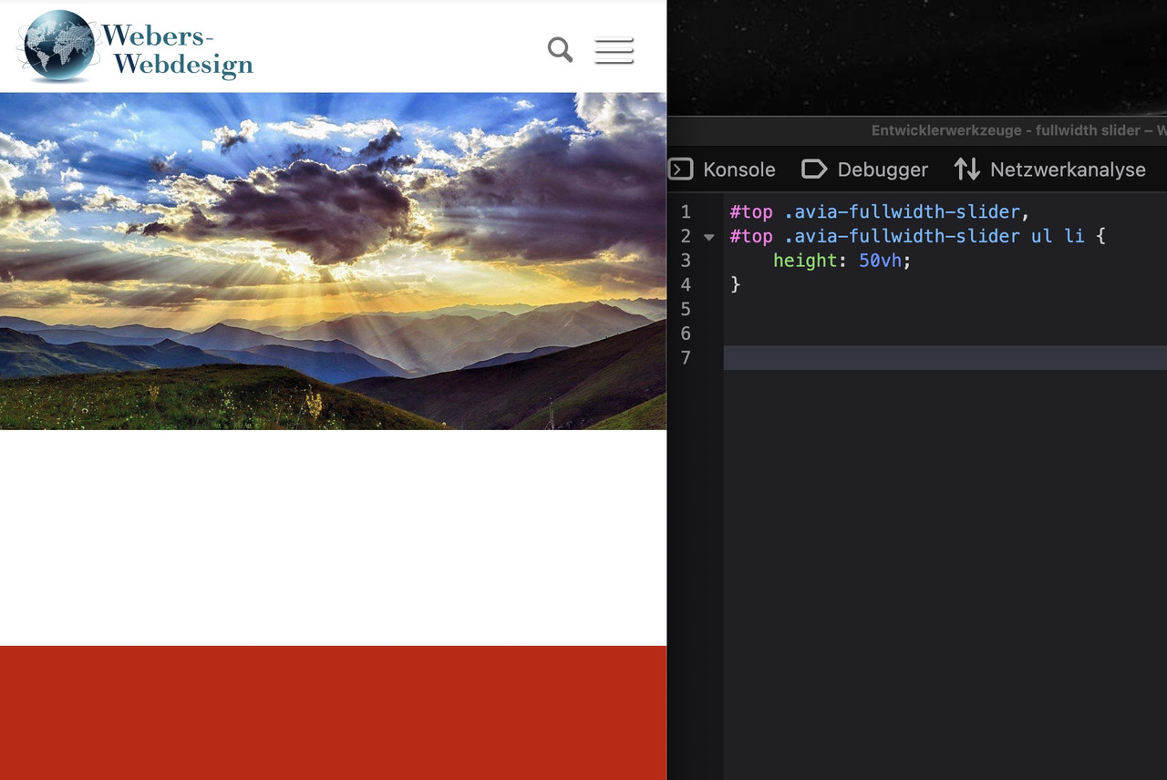
or to force that behaviour – you will then have a distortion of the images – see:
https://webers-testseite.de/fullwidth-slider/
and pull the browser-window bigger and smaller________
this is a fullscreen slider forced to be that way – but then images are cropped.
https://webers-testseite.de/full-screen-slider/January 22, 2026 at 8:04 am in reply to: Code Block with CSS Animation Only Works on One Specific Page #1494165Which content in the code block does this refer to? That animated typwriting heading?
nice …
In addition to the important settings mentioned above by Ismael (spf-record, DKIM1 and DMARC), you should definitely follow the recommendation to send via SMTP.
If you wish to send the form using an email address that does not belong to the domain, it is advisable to include this domain in your SPF record for the domain from which it is being sent.
by the way –
 January 17, 2026 at 2:32 pm in reply to: Change sentence in “Search Results” (German Version) #1494035
PS diese alternative funktion:
function my_text_strings( $translated_text, $text, $domain ){
  switch ( $translated_text ){
    case 'Suchergebnis nicht zufriedenstellend? Versuche es mal mit einem Wort oder einer anderen Schreibweise'  :  $translated_text = __( 'neue Phrase', $domain );
    break;
    case 'eine andere Ersetzung'  :  $translated_text = __( 'neue Phrase Nr. 2', $domain );
    break;
  }
  return $translated_text;
}
add_filter('gettext', 'my_text_strings', 20, 3);
funktioniert natürlich nur, wenn du auch die de_DE.po nutzt und nicht die Formale Variante oder gar gar Österreich, Schweiz
January 17, 2026 at 2:29 pm in reply to: Change sentence in “Search Results” (German Version) #1494034was meinst du mit “mit Dreamweaver eingesetzt” ?
(ich kenne Adobe Dreamweaver – aber warum mit dem hier arbeiten? poedit speichert doch die Files ab?)die po files sind übrigens nicht die, die herangezogen werden – sondern die mo-files die po sind zum editieren gedacht. ;)
kannst du deine child-theme functions.php mal posten?
January 17, 2026 at 7:45 am in reply to: add description to video elements for accessibility #1494028by the way: if you like to have the hight of the descriptive box ruled by enfolds text-block fold /unfold setting – just remove that height and overflow styling inside the snippet (// 3. Output the result)
and if you like to have that text only for SEO pupose – use that setting for invisibility from my page
if you like to have it only for SEO : use that setting globaly:#top .yt-desc-box { border: 0 !important; clip: rect(0 0 0 0); height: 1px !important; margin: -1px; overflow: hidden; padding: 0 !important; position: absolute; width: 1px; }January 16, 2026 at 9:30 pm in reply to: add description to video elements for accessibility #1494026sometimes the way via youtube api v3 does not work – even if you have connected your billing details with that api.
place a snippet to your child-theme funcions.php:
– Registering the shortcode for the descriptive text (without api use – and google costs ;)/** * Final Version: Fetches YouTube description and converts links correctly * preventing double-tagging or broken HTML. */ function get_yt_description_final($atts) { $a = shortcode_atts(array('id' => ''), $atts); if (empty($a['id'])) return 'Video ID missing.'; $v_id = esc_attr($a['id']); // Use a fresh cache key to overwrite the broken HTML in your database $transient_key = 'yt_desc_v3_clean_' . $v_id; $description = get_transient($transient_key); if (false === $description) { $response = wp_remote_get("https://www.youtube.com/watch?v=" . $v_id, array( 'user-agent' => 'Mozilla/5.0 (Windows NT 10.0; Win64; x64) AppleWebKit/537.36 (KHTML, like Gecko) Chrome/115.0.0.0 Safari/537.36' )); if (is_wp_error($response)) return 'YouTube connection error.'; $html = wp_remote_retrieve_body($response); if (preg_match('/"shortDescription":"(.+?)"/', $html, $matches)) { $description = $matches[1]; // Decode unicode characters $description = json_decode('"' . $description . '"'); // Clean up backslashes before storing $description = stripslashes($description); set_transient($transient_key, $description, DAY_IN_SECONDS); } else { return 'Description currently unavailable.'; } } // 1. First: Escape the raw text to be safe from XSS $safe_desc = esc_html($description); // 2. Second: Convert URLs into clickable links using a more precise regex // This regex matches URLs starting with http or https $pattern = '~(?<!["\'>])\bhttps?://[^\s()<>]+(?:\([\w\d]+\)|([^[:punct:]\s]|/))~'; $clickable_desc = preg_replace($pattern, '<a href="$0" target="_blank" rel="nofollow">$0</a>', $safe_desc); // 3. Output the result return '<div class="yt-desc-box" style="white-space: pre-wrap; word-break: break-word; background:#f9f9f9; padding:20px; border-radius:5px; border:1px solid #ddd; height:350px; overflow-y:auto;">' . $clickable_desc . '</div>'; } add_shortcode('video_description', 'get_yt_description_final');after that – place a shortcode under your embedded video:
[video_description id="youtube-ID"]see: https://webers-testseite.de/videos/
( there you can easily copy&paste the needed code – and see examples )because i do not believe that this is GDPR konform – i block it til you accept to see the youtube video.
January 16, 2026 at 2:39 pm in reply to: add description to video elements for accessibility #1494020but if it is a youtube video – why not implementing descriptive text on uploading it to yt?
I use vimeo – but i can insert on the vimeo backend a lot of info to the videos.Subject: How to add a descriptive text to your YouTube uploads
Yes, there is a dedicated way to do this! When you upload a video, you use the “Description” field. This is one of the most important steps for making your video discoverable.
Where to find it:
During Upload: In YouTube Studio, the Description box appears right below the Video Title.
After Uploading: You can edit it anytime by going to your Content tab in YouTube Studio, clicking the pencil icon (Details) on your video, and updating the text.
Why it matters:
SEO (Search Engine Optimization): YouTube’s algorithm uses this text to understand your content and show it in search results.
User Engagement: You can include links to your website, social media, or products.
Accessibility: It helps screen readers describe the video content to visually impaired users.
Best Practices for your description:
The Hook: The first two lines are the most important because they appear before the “Show More” button. Put your most vital info or call-to-action here.
Timestamps (Chapters): If you type timestamps like 02:15 – Chapter Name, YouTube will automatically create clickable segments in the video player.
Keywords: Use natural language to describe the video, including words people might type into the search bar.
Hashtags: Add 2–3 relevant hashtags at the bottom (e.g., #Tutorial #Vlog) to help with categorization.
Pro Tip: If you want to save time, go to Settings > Upload Defaults. You can save a template (like your social media links) that will automatically appear in the description box every time you upload a new video.
January 16, 2026 at 2:13 pm in reply to: Change sentence in “Search Results” (German Version) #1494019du kannst ein child-theme language file hochladen (musst allerdings beide files hochladen po und mo file).
Je nachdem welches lang file du nutzt – ich gehe mal von Du (nicht förmlich) aus. Dann musst du das file de_DE.po bearbeiten.
Das geht ganz gut mit poedit: https://poedit.net/download
Damit öffnest Du das file und kannst nach dem String “Suchergebnis nicht zufriedenstellend” suchen. Es gibt wohl nur eine Fundstelle. Das ersetzt du und speicherst dann ab. poedit generiert automatisch die dazugehörige mo datei.
Beide files lädst du in dein child-theme/lang folder hoch ( der existiert nicht – erstelle ihn) –
danach setzt du in die child-theme functions.php folgendes ein:function overwrite_language_file_child_theme() { $lang = get_stylesheet_directory().'/lang'; return $lang; } add_filter('ava_theme_textdomain_path', 'overwrite_language_file_child_theme');von da an wird nun das file für die Übersetzungen genommen.
________________________
PS: wenn es nur um diese eine Übersetzung geht (oder ein paar mehr) dann kannst du die Phrase auch so überschreiben – ohne ein child-theme lang file zu haben:
function my_text_strings( $translated_text, $text, $domain ){
  switch ( $translated_text ){
    case 'Suchergebnis nicht zufriedenstellend? Versuche es mal mit einem Wort oder einer anderen Schreibweise'  :  $translated_text = __( 'neue Phrase', $domain );
    break;
    case 'eine andere Ersetzung'  :  $translated_text = __( 'neue Phrase Nr. 2', $domain );
    break;
  }
  return $translated_text;
}
add_filter('gettext', 'my_text_strings', 20, 3);
bei solch langen Phrasen – geht das, da man nicht Gefahr läuft das die zufällig woanders noch auftauchen – schwierig wird es bei kurzen Begriffen.
@spooniverse: I understand that, but it would be nice to check whether my code above works; since I don’t use CPT, I was reluctant to install one just to test my assumptions above.
12 years ago ? this seems to be deprecated.
anyway: on the images of your slider – you have set on: advanced tab – link options – lightbox ? -
AuthorPosts