Forum Replies Created
-
AuthorPosts
-
i thought you like to have the first level only in that style.
ok – get rid of the bold setting for parent theme
( via : #top #header .av-main-nav > li.current-menu-item > a )
and use:.header_color .main_menu ul li.current_page_item > a > .avia-menu-text { font-weight:700; color: #000; }Do you use Safari Browser ?
see: https://kriesi.at/support/topic/enfold-back-end-not-working-in-safari-on-sequoia/#post-1468431
well – be more specific in your selectors – change your rule to :
.header_color .main_menu ul:first-child > li.current-menu-item > a > .avia-menu-text {
  font-weight:700
}
the greater than (>) indicates that only the direct descendants are meant, and not grandchildren etc.
or you can do that by enfold – under advanced styling there is the choice to style only “main menu links” and that means only first level items.
what was the solution? first snippet or css bug fix?
or it belongs to viewport height bug on safari mobile.
try instead in quick css:
.avia-safari body { height: 100vh; } @supports (-webkit-touch-callout: none) { body { height: -webkit-fill-available; } }Unfortunately, due to a lack of developer tools, mobile browsers cannot be tested in the same way as desktop browsers. Unfortunately, the emulators aren’t accurate enough.
Since scrolling is triggered by a swipe (touch), I suspect that you could, for example, slightly touch a button which then gets the focus.
This is very speculative, but worth a try.Try ( in this case only for that page-id of https://coralstarfish-com.stackstaging.com ) in your child-theme functions.php:
function blur_all_avia_buttons() {
if(is_page(22)){
?>
<script type="text/javascript">
window.addEventListener("DOMContentLoaded", function () {
(function($){
	$('.avia-button').addClass('btn-blur');
	$('.avia-button.btn-blur').on('mousedown touchstart', function(){
		$(this).blur();
	});
})(jQuery);
});
</script>
<?php
}
}
add_action('wp_footer', 'blur_all_avia_buttons');
Please delete the caches, especially in the mobile device itself.
To get the best help here, try to describe your project as well as possible.
Where are the lists? Are they in text blocks – or have you used the Enfold Advanced Element: ‘Icon List’?It would always be best to see the relevant page. If you don’t want to make them public, there is a private content input field that only mods can see.
to influence the native list-point only – there is no way. Even a list-point color does not exist.
You can only influence the whole list item, it is not possible to influence only the list-style-type.
you do not need to set the color – then it will be inherited from text-block.
Are these red points dots? “disc” – so get rid of color property – and adjust the font-size to your needs.if you just want to increase the font-size of the list-items select them by the li element and set the font-size property:
#top .avia_textblock > ul > li {
  font-size: 18px;
}
Your wording and topic title led me a little astray. If only you had written: Font-size of the list – that would be clearer

by the way : did you enable it on the glossary terms – settings page for post-types ?
to influence the native list-point only – there is no way. Even a list-point color does not exist.
But you can set the list-points to display: none – and put in front of the list-items a different icon:
see an example here with all the code you need: https://webers-testseite.de/list-point-styling/try
<?php echo do_shortcode( '[contact-form-7 id="1234" title="Contact form 1"]' ); ?>and what template do you use? single-portfolio.php
maybe to get it on both ( classic styled portfolios and advanced layout builded portfolios) it will be better to hook into footer.php for only portfolios.
try instead in your child-theme functions.php:
add_action('ava_before_footer', function() {
  if (is_singular( 'portfolio' )){
    echo '<div class="container">';
    echo do_shortcode( '[contact-form-7 id="1234" title="Contact form 1"]' );
    echo '</div>';
  }
});
October 8, 2024 at 3:03 am in reply to: Custom Slider Element only lets you upload one photo. #1468614Why does the alb_custom_layout not have the advanced layout editor.
on classic editor there are all alb possibilities too – then only via the drop-down menus, so you could make the same mistakes here as with the Advanced Layout Builder.in other words – shrink only the logo the rest stays on position – white line erased.
#top #header_main > .container, #top #header_main > .container .main_menu .av-main-nav > li > a, #top #header_main #menu-item-shop .cart_dropdown_link { line-height: 244px !important; } #top #avia-menu::after { transition: opacity 1s ease; } #top #header.header-scrolled #avia-menu::after { opacity: 0; }ok – nice to have the page link (on your other topic it is shown):
there are links on the images too – but they could not be clicked because there is a full overlay of the grid-content
so no need for a script here#top .grid-content { pointer-events: none; } /*** if you do not like to have that image white overlay:*****/ #top .grid-entry .image-overlay { display: none !important; }__________________________
this will work too – but it is not needed herefunction transfer_first_link_as_link_to_article(){ ?> <script type="text/javascript"> window.addEventListener("DOMContentLoaded", function () { (function($) { $('.grid-content').each( function() { var LinkSection = $(this).find('.grid-entry-title a').attr('href'); var LinkTarget = $(this).find('.grid-entry-title a').attr('target'); if (typeof LinkSection !== "undefined"){ $(this).on("click", function(){ if (LinkTarget === "_blank"){ window.open(LinkSection, '_blank'); } else { window.location.href = LinkSection; }; }); $(this).css('cursor','pointer'); $(this).find('.image-overlay').css('display','none'); }; }); })(jQuery); }); </script> <?php } add_action('wp_footer', 'transfer_first_link_as_link_to_article');October 7, 2024 at 8:48 am in reply to: Custom Slider Element only lets you upload one photo. #1468544ok – the filter will bring it to me ;)
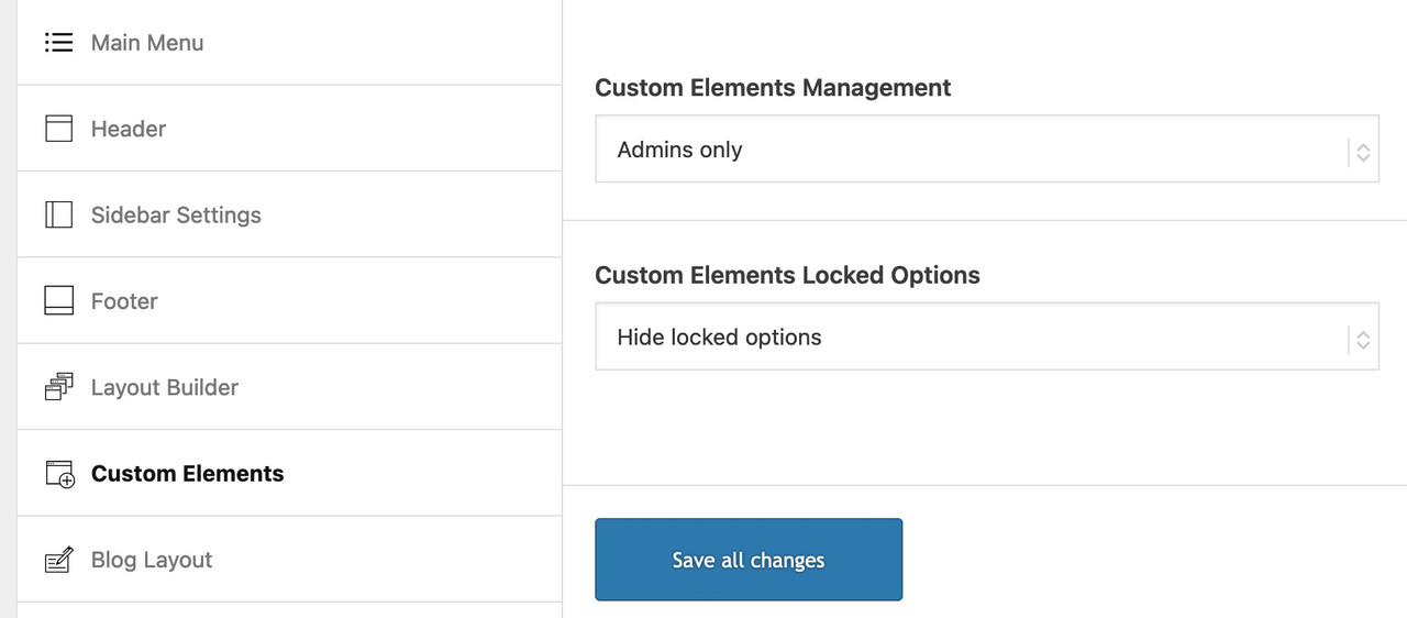
October 7, 2024 at 8:38 am in reply to: Custom Slider Element only lets you upload one photo. #1468543What I would also find useful is if the Admin or Editor (if included in that role) could also see and change the blocked items. And the setting to hide blocked items only affects the other roles.
 October 7, 2024 at 8:04 am in reply to: Custom Slider Element only lets you upload one photo. #1468541
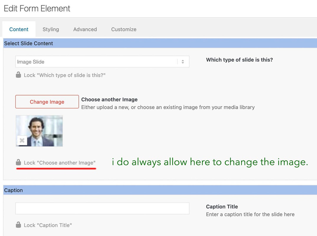
When creating a custom element, the aim is to make settings for this element in advance and, if necessary, to block them directly for non-admins (possibly) editors (depending on your pre-selection see screenshot).
Ultimately, the aim is to define as many settings as possible in advance so that an author no longer has access to many of these settings (headings tag, position of the heading, captions etc., background-colors etc. . The image that you enter on creation of the custom slider is only used to set default settings for this slider. You can here hamper for example that the author got the possibility to insert videos to the slide.
Once your custom element has been created and is ready to be inserted into the layout, authors can insert as many images as they like using the predefined default settings.
And only the nonblocked Settings are editable.The child theme name does not appear in the frontend. So why rename the child theme?
Just to obfuscate the Enfold origin – this involves much more than just changing the name.By the way – it is a good idea – to have a backup on this. And perhaps if you rename child and parent theme to save your theme settings file and maybe the quick css.
As long as you do not change the reference in the style.css of the child theme to the parent element, you can rename it as you wish.
Enfold even offers you the option of renaming the stylesheet of the Theme using a filter.
but read here carefully on the docu: https://kriesi.at/documentation/enfold/personalize-theme/function avia_change_filename($stylesheet){ return 'myfilename'; } add_filter('avf_dynamic_stylesheet_filename', 'avia_change_filename');by the way dear dev/mods: on docu this snippet is listet with myfilename.css – this will lead to myfilename.css.css – so above only the name is neccessary – the css extension is added to the filename by default.
I must say, however, that those who are able to examine such things more closely will always recognise the basis of the theme.
non c’è di che
if you want it 5 columns on desktop and on mobile always 2 column:
#top .settore-attivita .entry-content-wrapper {
  display: flex;
  flex-flow: row wrap;
  justify-content: space-between;
}

#top .settore-attivita .entry-content-wrapper:before,
#top .settore-attivita .entry-content-wrapper:after {
  display: none !important;
}

#top .settore-attivita .entry-content-wrapper .flex_column {
  flex: 0 1 19%;
  width: unset !important;
  margin: 0px;
}

@media only screen and (max-width: 767px) {
  #top .settore-attivita .entry-content-wrapper .flex_column {
    flex: 0 1 48%;
  }
}
}
you see how it works ?
Thanks but I did exactly as you told me:
no you did not !
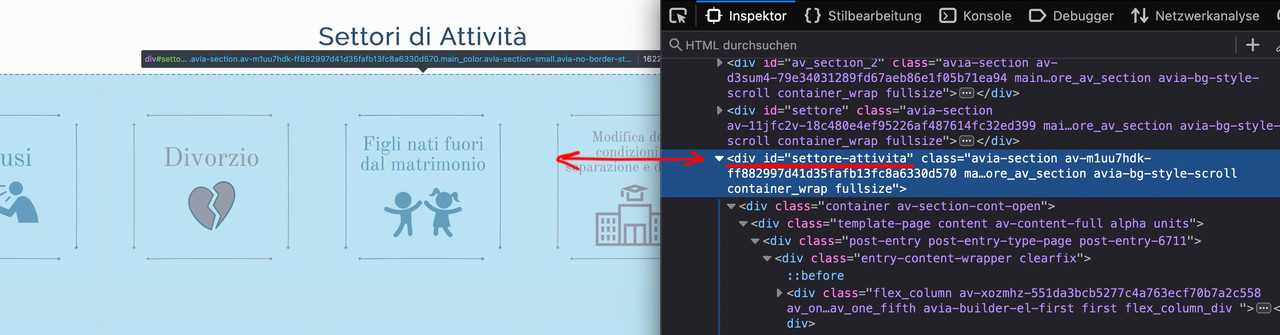
look to the layout image again – the color-section with your columns should have the custom-class : settore-attivita
you gave to it an ID : settore-attivitaAn ID is not a class
Why i choose for it a class:
An ID had to be unique on the page.
If you like to use it on that page again for a different section – you can use that class again. An ID not-
This reply was modified 1 year, 6 months ago by
Guenni007.
look to the layout image again – the color-section with your columns should have the custom-class : settore-attivita
you gave to it an ID : settore-attivitaIf you like to have only 2 columns beside – even on mobile phone just get rid of last media query rules:
@media only screen and (max-width: 549px) { #top .settore-attivita .entry-content-wrapper .flex_column { flex: 1 1 100%; } }because i do not see private content – i guess your page is like this:
https://kriesi.at/themes/enfold-2017/blog/blog-default/ – and you like to have the link for the whole (Image, heading, excerpt and read-more)
if you like to have it more specific – use custom classes or page-id’sthis snippet transfers the first link that could be found in the articel to the slide-entry:
function transfer_first_link_as_link_to_article(){ ?> <script type="text/javascript"> window.addEventListener("DOMContentLoaded", function () { (function($) { $('.slide-entry').each( function() { var LinkSection = $(this).find('a:first').attr('href'); var LinkTarget = $(this).find('a:first').attr('target'); if (typeof LinkSection !== "undefined"){ $(this).on("click", function(){ if (LinkTarget === "_blank"){ window.open(LinkSection, '_blank'); } else { window.location.href = LinkSection; }; }); $(this).css('cursor','pointer'); }; }); })(jQuery); }); </script> <?php } add_action('wp_footer', 'transfer_first_link_as_link_to_article');If you have looked at my suggestion, I will remove your pictures.
the ID is only for a anchor navigation if you likeOK – that sounds good. Thanks for the clarification. And does this also apply to all other images? And if necessary – if we receive such a warning – could we also provide this evidence through you?
can you please exclude the text-block with the heading to an extra section before that section with all those “Settori”
by the way – why don’t you use for a heading a heading element instead of putting the heading inside a text-block element?after that – we can handle the whole container as a flex container
no need for a second color-section handling the other layouts for responsive design.October 4, 2024 at 5:22 pm in reply to: Can you have a fullwidth menu bar with boxed layout #1468441This is just a boxed layout with fixed header.
The header could be stretched to full width ( fixed positioned elements are on default out of the box ):.html_header_top.html_header_sticky #header { position: fixed; width: 100% !important; max-width: 100% !important; left: 0; background-color: #FFF !important; }i got no troubles on classic editor – only if i switch to advanced layout editor – i had these glitch
but indeed the clearing option is much better. so use instead:
function admin_head_mod() { echo '<style type="text/css"> #postbox-container-2 { clear: left; } .index-php #postbox-container-2 { clear: none; } </style>'; } add_action('admin_head', 'admin_head_mod');aber du beziehst dich nicht auf die bei hover gezeigten Titel wie hier: https://kriesi.at/themes/enfold-2017/elements/masonry/
well it is in the enfold folder : includes.
If you make a subfolder to your child-themes folder : includes and put the edited loop-search.php inside that folder the search results page will show featured images.
here is on basis of enfold 6.0.4 the edited file:
see: https://pastebin.com/3nAyB6Gr
Changes are made on line 50ff . I inserted some classes to better select them and put the link on the image too.
download: https://pastebin.com/dl/3nAyB6Gra little css is needed
.search-result-image {
    display: block;
}
.search-result-image img {
    width: 120px;
    border: 1px solid #aaa
}
.search-result-image svg {
  width: 120px !important;
  height: auto;
}
.search-result-image img {
    width: 120px;
}
.search-result-image {
    float: left;
    margin-bottom: 20px;
    padding-right: 30px;
}
PS: on line 52 you can see that i took the medium image format as source (and not the thumbnail image) – you can change that to anything you like – but medium got one advantage – it is a non cropped image format.
-
This reply was modified 1 year, 6 months ago by
-
AuthorPosts