Forum Replies Created
-
AuthorPosts
-
it is only for masonry gallery – not for masonry entries !
by the way: see the difference on one page with that snippet – the other without
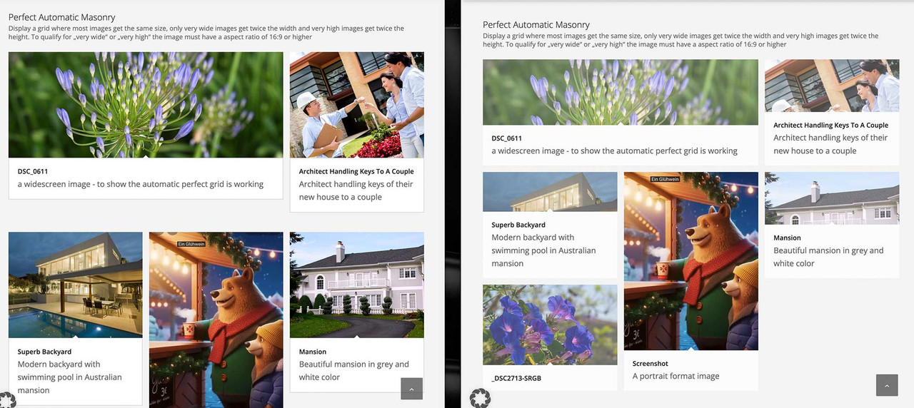
the flexible masonry is identical to the other page – but grid and automatic grid :
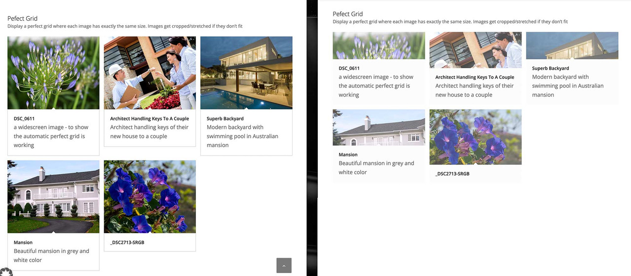
https://webers-testseite.de/masonry-with-captions/
https://webers-testseite.de/masonry-with-captions-2/
Hmm – you’re giving up early. I’ve now created the final version and inserted it above; or rather, I’ve made it available on my page for copy & paste. As you can see, it works for me – and even when Masonry switches to a single-column layout, the perfect grid now looks like the flexible grid. Image by image with the captions underneath.
Your decision.I cleaned up the snippet a little, as the flexible Masonry Grid option already behaved this way! (Captions below the image)
But i’m currently try to optimise the snippet for the masonry that goes to a 1 Column layout on small screen – so wait for a complete solution – i try my best.
Have you tried making changes yourself using CSS? Because the spacing between the images is not the Enfold standard spacing when set to “large gap.”
so in total : replace the snippet by:
( btw. i changed the code on my page too – if you hover the snippet there is on top right of the codeblock a copy button)/** * Enfold Masonry Caption Fix - NUR für Perfect Grid * Schiebt die Caption unter das Bild, ohne es zu verdecken. */ function enfold_masonry_perfect_grid_caption_fix() { ?> <style> /* ======================================== PERFECT GRID CSS ======================================== */ /* Erlaubt der Caption, über den Container hinauszuragen */ #top .av-masonry.av-fixed-size.av-masonry-gallery .av-inner-masonry, #top .av-masonry-gallery.av-masonry-gallery-fixed figure.av-inner-masonry { overflow: visible !important; } /* Positioniert die Caption direkt unter das Bild-Quadrat */ #top .av-masonry.av-fixed-size.av-masonry-gallery .av-inner-masonry-content, #top .av-masonry-gallery.av-masonry-gallery-fixed figcaption.av-inner-masonry-content { position: relative !important; top: 100%; background: #ffffff; /* Hier ggf. deine Wunschfarbe für den Hintergrund */ } /* Korrektur für Tablets */ @media only screen and (min-width: 767px) and (max-width: 989px) { .responsive .av-masonry-gallery .av-masonry-entry .av-masonry-entry-title + .av-masonry-entry-content { display: block !important; } } </style> <script> (function($) { 'use strict'; function fixPerfectGrid() { // Nur für Masonry Galerien mit festem Raster (Perfect Grid) $('.av-masonry-gallery.av-masonry-gallery-fixed, .av-masonry.av-fixed-size.av-masonry-gallery').each(function() { var $gallery = $(this); var columnCount = 1; // Spaltenanzahl ermitteln if ($gallery.hasClass('av-masonry-col-2')) columnCount = 2; else if ($gallery.hasClass('av-masonry-col-3')) columnCount = 3; else if ($gallery.hasClass('av-masonry-col-4')) columnCount = 4; else if ($gallery.hasClass('av-masonry-col-5')) columnCount = 5; else if ($gallery.hasClass('av-masonry-col-6')) columnCount = 6; if ($gallery.hasClass('av-masonry-col-flexible')) { var $items = $gallery.find('.av-masonry-item-with-image:visible'); if ($items.length >= 2) { var firstTop = $items.eq(0).offset().top; var itemsInFirstRow = 1; for (var i = 1; i < Math.min($items.length, 10); i++) { if (Math.abs($items.eq(i).offset().top - firstTop) < 10) { itemsInFirstRow++; } else { break; } } columnCount = itemsInFirstRow; } } // Maximalhöhe der Captions finden, damit die Zeilen gleichmäßig bleiben var maxCaptionHeight = 0; $gallery.find('.av-masonry-item-with-image').each(function() { var $caption = $(this).find('figcaption.av-inner-masonry-content, .av-inner-masonry-content'); if ($caption.length && $caption.is(':visible')) { maxCaptionHeight = Math.max(maxCaptionHeight, $caption.outerHeight(true)); } }); // Abstand unten einfügen, damit das Masonry-Layout Platz für die Caption lässt if (maxCaptionHeight > 0) { $gallery.find('a.av-masonry-entry, .av-masonry-item-with-image').css('margin-bottom', maxCaptionHeight + 'px'); } }); // Layout neu berechnen $('.av-masonry-gallery.av-masonry-gallery-fixed, .av-masonry.av-fixed-size.av-masonry-gallery').isotope('layout'); } // ======================================== // INITIAL LOAD - Nur auf Bilder warten, nicht auf die ganze Seite // ======================================== (function() { var $gallery = $('.av-masonry-gallery'); if ($gallery.length && typeof $.fn.imagesLoaded === 'function') { // Wartet NUR auf die Bilder in der Galerie $gallery.imagesLoaded(function() { setTimeout(fixPerfectGrid, 200); }); } else { // Fallback für den Notfall setTimeout(fixPerfectGrid, 600); } })(); // Nach Enfold Events $(document).on('av-masonry-complete', function() { setTimeout(fixPerfectGrid, 250); }); // Bei Größenänderung $(window).on('debouncedresize', function() { // Reset Margin $('.av-masonry-gallery.av-masonry-gallery-fixed .av-masonry-item-with-image, .av-masonry.av-fixed-size.av-masonry-gallery .av-masonry-item-with-image').css('margin-bottom', ''); fixPerfectGrid(); }); })(jQuery); </script> <?php } add_action('wp_footer', 'enfold_masonry_perfect_grid_caption_fix', 999);i also replaced the on load event by:
// Run initially
$(window).on('load', function() {
    $('.av-masonry-gallery').imagesLoaded(function() {
        setTimeout(fixAllMasonryModes, 200);
    });
});
and implemented the enfold debounceresize function on performance reasons.
If you make the browser window a little bigger or smaller, you will see that it works. It seems to be a timing problem affecting your page.
So try changing the timings:Try to change inside the snippet the values of :
// Initial loading: Wait longer for images
$(window).on('load', function() {
    setTimeout(fixAllMasonryModes, 600);  // 300 → 600ms
});

// After events: A little more time
$(document).on('av-masonry-complete', function() {
    setTimeout(fixAllMasonryModes, 250);  // 100 → 250ms
});

$('body').on('av-isotope-finished', function() {
    setTimeout(fixAllMasonryModes, 250);  // 100 → 250ms
});
by the way:
Different Solution – even the captions will have the same height on perfect Grid
However, this does not look so good in some cases if the captions are of too different sizes.I’ll remove that because it doesn’t make sense. As soon as one caption is very long in all Masonries, all the others are pulled up to the height of that caption—it doesn’t look good.
It would be different if he adjusted the same caption heights in a row—but I can’t think of a way to do that.See : https://webers-testseite.de/masonry-with-captions/
but there is a second snippet – but:
Different Solution – even the captions will have the same height on perfect Grid
However, this does not look so good in some cases if the captions are of too different sizes.February 2, 2026 at 5:40 pm in reply to: Need columns with different width oder table without frame (in text block) #1494594du kannst es auch so lassen. Da mit dem bold klick ist halt schneller als eine Farbe für das Jahr dann auszuwählen. Ebenso wenn du nur einzelne Worte im Text rechts als Link haben möchtest ist es leichter das kanze auf kursiv zu klicken und dann den Teil des Satzes verlinken. Das mit dem Kursiv setzen ist aber nur nötig wenn du eine kleinere Auswahl vom Text rechts mit einem Link versehen willst.
February 2, 2026 at 5:34 pm in reply to: Animated Countdown with different dates per language (WPML) #1494593do you think of that perhaps?
https://enfold.webers-webdesign.de/3-columns/February 2, 2026 at 4:22 am in reply to: Cross Site Scripting (XSS) security issue warning from Solid Security #1494569Sometimes it’s surprising that the company websites of such security tools – such as the former iThemes Security – have all their doors open themselves. ;)
https://securityheaders.com/?q=https%3A%2F%2Fsolidwp.com&followRedirects=on
https://securityheaders.com/?q=https%3A%2F%2Fwebers-testseite.de&followRedirects=on
February 2, 2026 at 3:28 am in reply to: Need columns with different width oder table without frame (in text block) #1494568ok – du hast jetzt statt bold das mit der Farbe realisiert, das die Jahre in einen eigenen tag kommen. Das wäre so nicht nötig gewesen.
Denn die Farbe hättest du dann generell über dieses den strong-tag setzen können; so wie ich es auf der Beispielseite tat. Den bold style hatte ich dann ja mittels css zurückgenommen.damit meine Setzungen greifen, könntest Du jetzt eben das über dein span-tag machen:
#top .my-listings li {
  display: grid;
  gap: 0 20px;
  grid-auto-flow: row;
  grid-template-columns: 120px 1fr;
  justify-content: start;
  margin: 0;
  margin-bottom: 10px;
}

#top .my-listings li span {
  font-weight: normal;
  justify-self: end;
}

#top .my-listings li em {
  font-style: normal;
}

/* === responsive styling === */
@media only screen and (max-width: 469px) {
  #top .my-listings li {
    grid-template-columns: 1fr;
    justify-content: center;
    margin-left: 0 ;
  }

  #top .my-listings li span {
    font-weight: normal;
    justify-self: start;
  }
}
Das mit dem Kursiv setzen für den rechten Text brauchst du nur wenn du einzelne Begriffe dort verlinken möchtest. Wenn du immer den kompletten rechten Teil verlinkst, wie es in einem Beispiel auf deiner Seite war ist dies noch nicht mal nötig, da dann der ganze linke Teil in einem a-tag steht.
Diese Einstellung hier bestimmt wo die Jahre bündig sind:
#top .my-listings li span {
  font-weight: normal;
  justify-self: end;
}
wenn du z.B die lieber linksbündig hast, dann stelle justify-self : start
(ps kopiere und ersetze die my-listings Regeln komplett, da ich noch das margin-left der enfold Standard Einstellung damit überschrieb. Der #top selektor garantiert hier noch das ich keine unnötigen !important Regeln setzen muss um bestehende Regeln von Enfold zu überschreiben.bei deiner Schriftgröße würden für den linken Teil der Jahre auch 90px reichen:
grid-template-columns: 90px 1fr;wenn du die Jahre jetzt auf einen Schlag verändern willst, dann könntest du jetzt setzen ( bold und andere font farbe)
#top .my-listings li span {
  font-weight: bold;
  justify-self: start;
  color: #3f9681 !important;
}
(ps hier ist das !important nötig, da du einen inline-style gesetzt hattest – mit dem Einfärben im Textfeld)
wenn du der ganzen Liste ( also dem ul tag ) nur noch eigenschaften geben möchtest :
#top .my-listings {
  padding: 5px;
  background-color: #f8f8f8;
  border: 1px solid #3f9681;
  border-width: 1px 0px 0px 1px !important; /* unterschiedliche Border Weiten für : Oben, Rechts, Unten, Links */
}
Resultat wäre dann:
wenn dir der Abstand der Zeilen ( der li elemente ) zu groß ist, dann ändere diesen Wert bei den
#top .my-listings liauf z.B. 5pxdu siehtst, über diese custom class my-listings – ist dann alles geregelt. Sobald du eine Liste einsetzt, und den text-block mit der Klasse versiehst, wird die darin enthaltene Liste so dargestellt.
_____________
Responsiv ( für Mobile screenweiten im Hochkant Format)
 February 1, 2026 at 9:36 pm in reply to: Need columns with different width oder table without frame (in text block) #1494566
you are not using the list element :
on code view of the text-block it looks this way on my text page:
you have all p tags ( by line-break ) .
you know how get a unordered list?
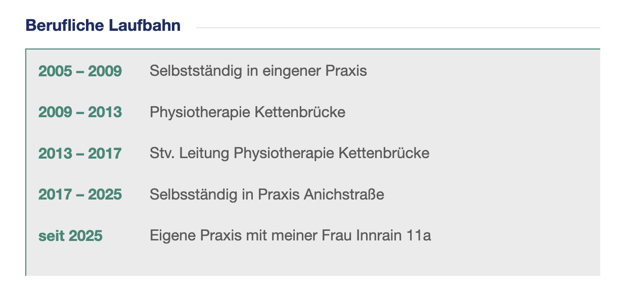
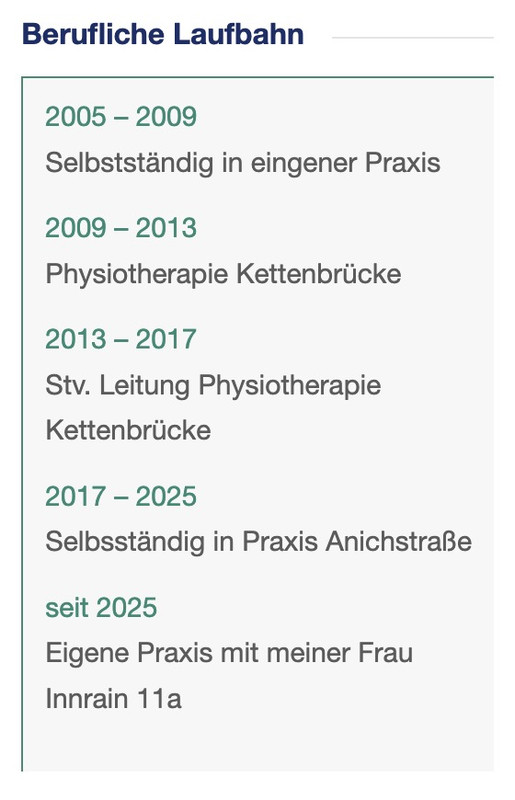
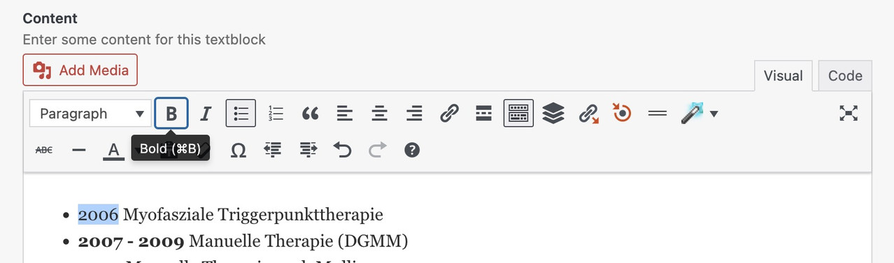
just enter your text – make all years (the wohle years-block f.e. 2007 – 2009) bold.
Then highlight the wohle text and klick “bulleted List”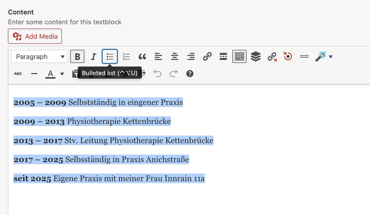 January 31, 2026 at 9:40 pm in reply to: Need columns with different width oder table without frame (in text block) #1494548
PS: i see you. got some links on the text- see that it works even then on my testpage above if the whole text is the link ( as on your about page).
We can overcome this by setting the entire text on the right in italics using the “I” key, and then highlighting the individual word that should carry the link.
See the setting on the example page below the css code – (without that custom-class: my-linstings)
This may sound complicated, but it avoids having to set all “tables” as HTML. Use only the text block element. Also, take a look at the responsive behavior.Before you change anything, create a backup copy of your site’s status quo (a good plugin, even in the free version, is: duplicator)
I would recommend this approach to everyone, especially for major updates (5.x to 6.x; …). This way, you always have a rollback option in the background.
The advantage of this method is that it can be reversed.
Uploading the new theme takes a little time; if everything goes well, the website will only be offline for a short time (only for the moment of renaming).Update via ftp
- Download the “installable WordPress file only” file from themeforest and unzip it
- After that – you got a folder : enfold
- Rename this downloaded newest version to enfold-new
- via ftp: Upload that enfold-new folder to the themes folder
- ftp: You now have the “enfold” folder (the older version) and the “enfold-new” folder side by side.
- via ftp: Rename the existing enfold folder to f.e. enfold-old
- via ftp: Rename your uploaded enfold-new folder now to enfold
- On Enfold – Performance – check mark and “Delete Old CSS And JS Files?”
- Check if your Website works to your full satisfaction.
- Yes – then stop here – Update is finished
- After a while of testing – you can delete that enfold-old folder via ftp
- No – delete or rename back the enfold folder back to enfold-new
- rename the enfold-old folder back to enfold
- check on enfold board if there are known bugs – or similar problems
PS: I’m not sure if the new Enfold also has requirements for the PHP version number.
Log in to your hoster and check which PHP version is set there.
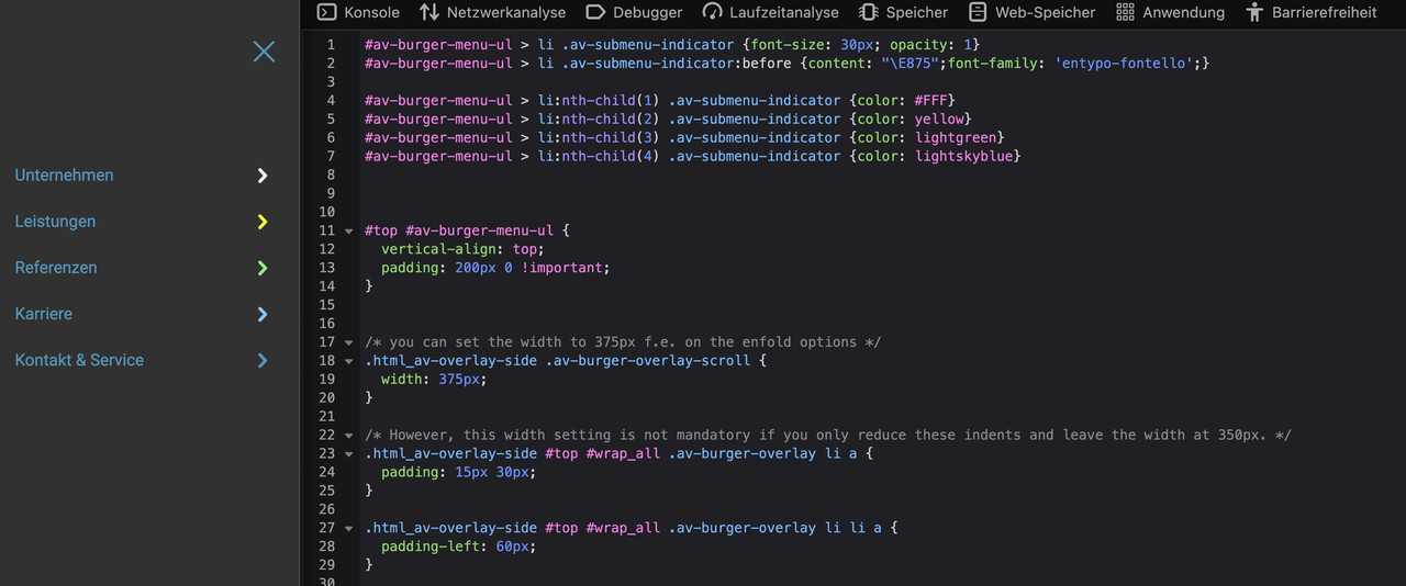
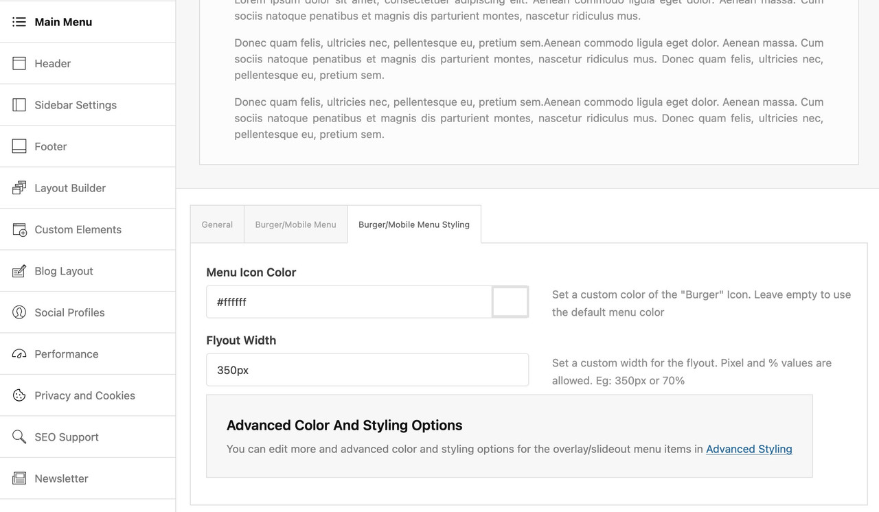
Most hosts will show you which PHP version they currently prefer (8.2, 8.3—some even recommend the 8.4 PHP version).With these larger and bolder icons, you will now see a shift when opening the submenus (“Services”), which you can prevent by widening the whole thing (e.g., 375px instead of 350px). You could also reduce the indentation of the menu items (paddings).
/* you can set the width to 375px f.e. on the enfold options */
.html_av-overlay-side .av-burger-overlay-scroll {
  width: 375px;
}
/* However, this width setting is not mandatory if you only reduce these indents and leave the width at 350px. */ .html_av-overlay-side #top #wrap_all .av-burger-overlay li a { padding: 15px 30px; } .html_av-overlay-side #top #wrap_all .av-burger-overlay li li a { padding-left: 60px; }January 30, 2026 at 11:10 am in reply to: Need columns with different width oder table without frame (in text block) #1494519ich weiss ehrlich gesagt nicht warum du dir das leben schwer machst.
Einfach eine Liste anlegen innerhalb eines Text-Blocks – die Jahre fett setzen, und dann nur noch diese Text Element mit einer Klasse belegen.
Den Rest macht das CSS. Da musst du nicht einmal html code setzen – oder ein Tabellen Plugin nutzen etc. Pures Enfold.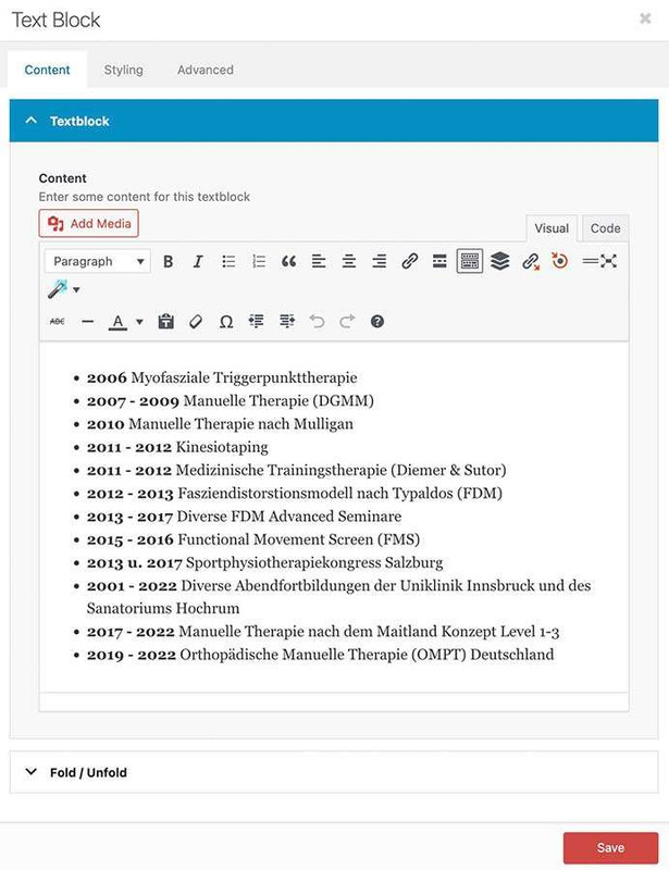
css auf der Seite: https://webers-testseite.de/joeconnert/
_________
To be honest, I don’t know why you’re making life difficult for yourself.
Just create a list within a text block – put the years in bold, and then just assign a class to this text element.
The CSS will do the rest. You don’t even have to set any HTML code.

CSS on the page: https://webers-testseite.de/joeconnert/
by the way – if you like to have only one toggle open at a time – put this to your child-theme functions.php:
function only_one_submenu_open_on_burger(){ ?> <script> window.addEventListener("DOMContentLoaded", function () { (function($) { $('body').on( 'click touch', '.av-active-burger-items > a', function () { $(this).parent('li').siblings().removeClass('av-show-submenu'); $(this).parent('li').siblings().find('ul').slideUp( "fast"); }); $('body').on( 'click touch', '.av-active-burger-items .av-width-submenu > a', function () { $(this).closest('.sub-menu').siblings().find('li').removeClass('av-show-submenu'); $(this).closest('.sub-menu').siblings().find('ul').slideUp( "fast"); }); })(jQuery); }); </script> <?php } add_action('wp_footer', 'only_one_submenu_open_on_burger');get familar with dev tools of your browser. point to the menu-item and choose on context menu : inspect or similar .
or you can just count the li’s without knowing the ID’s:
#av-burger-menu-ul > li .av-submenu-indicator {font-size: 30px; opacity: 1}
#av-burger-menu-ul > li .av-submenu-indicator:before {content: "\E875";font-family: 'entypo-fontello';}

#av-burger-menu-ul > li:nth-child(1) .av-submenu-indicator {color: #FFF}
#av-burger-menu-ul > li:nth-child(2) .av-submenu-indicator {color: yellow}
#av-burger-menu-ul > li:nth-child(3) .av-submenu-indicator {color: lightgreen}
#av-burger-menu-ul > li:nth-child(4) .av-submenu-indicator {color: lightskyblue}
maybe it is better to set this burger menu to be placed at a top position – try and look what is better:
#top #av-burger-menu-ul {
  vertical-align: top;
  padding: 200px 0 !important;
}
January 28, 2026 at 11:16 am in reply to: Need columns with different width oder table without frame (in text block) #1494425by the way – you can see the declarations on positioning inside a grid-layout on :
https://css-tricks.com/wp-content/uploads/2022/02/css-grid-poster.png
f.e. if you like to have the years left-aligned – change it to:
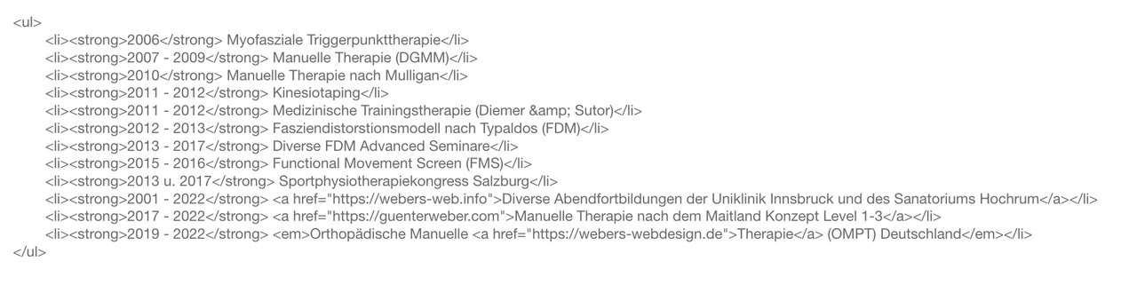
.my-listings li strong {
  font-weight: normal;
  justify-self: start;
}
January 28, 2026 at 11:01 am in reply to: Need columns with different width oder table without frame (in text block) #1494424make a unordered list in a textblock – give a custom class to it – f.e.: my-listings
mark the years and make them bold via tiny-mce button
then just put this to your quick css:
.my-listings ul {
  list-style: none !important;
}

.my-listings li {
  display: grid;
  margin: 0;
  gap: 0 30px;
  grid-auto-flow: row;
  grid-template-columns: 140px 1fr;
  justify-content: start;
}

.my-listings li strong {
  font-weight: normal;
  justify-self: end;     /** now your years "float" right. **/
}
and:
/* === responsive styling === */
@media only screen and (max-width: 469px) {
  .my-listings li {
    grid-template-columns: 1fr;
    justify-content: center;
  }

  .my-listings li strong {
    font-weight: normal;
    justify-self: start;
  }
}
see your list including css code on : https://webers-testseite.de/joeconnert/
making the years bold will set the html to :
<li><strong>2011 – 2012</strong> Medizinische Trainingstherapie (Diemer & Sutor)</li>
So we have the option of selecting them separately. And bring them in a grid-layoutThis:
grid-template-columns: 150px 1fr;
determines the “column” width – the first one (the strong years) will have width of 150px – the other “column” fills the rest (fr: means fraction)i can’t see your described troubles. –

But did you know that even a whole column can have a link?
See on column – advanced tab – column link
then the whole column is clickable – not only the headingThe selfhosted Font-Files are the the gold-standard in beeing GDPR compliant. ;)
Why don’t you post the page in question? It’s much easier to give advice that way.
As mentioned above, unfortunately there is no demo page where this hamburger variant is set.find the menu-item ID and :
.menu-item-556 .av-submenu-indicator {
  color: green;
  font-size: 40px;
  opacity: 1;
}

.menu-item-556 .av-submenu-indicator:before {
  content: "\E875";
  font-family: 'entypo-fontello';
}
the last rule is for heaving a little bolder icon
you like to have the oswald font for them? How did you embed the font? via Font-Manager / selfhosted or just by choosing it form the drop-down on Enfold – General Styling – Fonts ? i do not find any @font-face rule
i can find a redefinition of ::root { --enfold-font-family-heading:'oswald',Helvetica,Arial,sans-serif }but if there is no loading of oswald then the Helvetica is loaded
by the way – what is hu-blocked – i can see a block of google webfonts – maybe that is the reason for it.
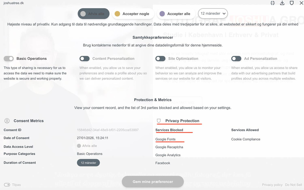
PS i can reproduce it – before consent – and after reload – one looks more condensed than the other one.
PPS: i recommend using a selfhosted font – by font-manager of Enfold
You must be referring to the arrows that open submenus. Unfortunately, none of the Enfold demos have this type of hamburger navigation. Otherwise, I could tell you the selectors based on that.
try this in child-theme functions.php:
function custom_replace_burger_anchor_with_button( $items, $args ){
    $pattern = '/(<li[^>]*class="[^"]*av-burger-menu-main[^"]*"[^>]*>)\s*<a([^>]*)>/is';
    $items = preg_replace($pattern, '$1<button type="button" $2>', $items);
    $items = preg_replace('/<\/a>(\s*<\/li>\s*$)/', '</button>$1', $items);
    return $items;
}
add_filter( 'wp_nav_menu_items', 'custom_replace_burger_anchor_with_button', 9999, 2 );
BUT: Please note that in this case, you will no longer need to assign all styles to the a tag, but rather to the button tag.
In this case, it might be better to use role=”button” and class=avia-button.function custom_enhance_burger_anchor_regex( $items, $args ) { $pattern = '/<a href="#" aria-label="(.*?)"/i'; $replacement = '<a href="#" role="button" class="avia-button" aria-label="$1"'; $items = preg_replace($pattern, $replacement, $items); return $items; } add_filter( 'wp_nav_menu_items', 'custom_enhance_burger_anchor_regex', 9999, 2 );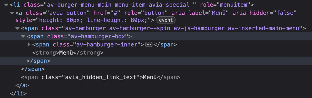
No CSS break: Since it remains an anchor-tag, all Enfold styles for the menu continue to work perfectly.
A11y-compliant: With role=”button,” we tell the screen reader: “Ignore that there is a link here; treat this element like a button.”maybe it is better to not add the class avia-button because it might come into conflict with some stylings.
use a different class there f.e.: avia-burger-button
then you can easily select it via this class.First of all, the icon is marked with aria-label=“Menu,” which is best practice.
And to understand your question correctly, they consider an anchor tag with such a label to be misleading?
So you would prefer it to be like this?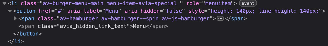
by the way – all enfold buttons do not have the button tag – they got that extra-class : avia-button
January 26, 2026 at 12:40 am in reply to: Having one toggle open at time across several accordions #1494300try in your child-theme functions.php:
function ava_custom_toggle_behavior(){ ?> <script type="text/javascript"> (function($) { $(window).on('load', function() { $('.toggler').on('click', function() { var $current = $(this); // Short delay so Enfold can set its own classes setTimeout(function() { if ($current.hasClass('activeTitle')) { // Find all other togglers on the page that are active $('.toggler').not($current).each(function() { if ($(this).hasClass('activeTitle')) { // Simulate click or remove classes manually $(this).trigger('click'); } }); } }, 100); }); }); })(jQuery); </script> <?php } add_action('wp_footer', 'ava_custom_toggle_behavior');and what about the next tab :
-
AuthorPosts