Forum Replies Created
-
AuthorPosts
-
November 28, 2024 at 2:59 pm in reply to: Animation starts when texts are visible in the browser #1472507
ich sehe doch das es funktioniert – die Klasse sichtbar wird dynamisch eingefügt/entfernt.
nur das css ist noch nicht vorhanden.Eventuell musst du das Merging von Enfold neu laden. ( unter Perfomance ganz unten – switch setzen und “Delete Old CSS And JS Files?” ausführen)
November 28, 2024 at 2:29 pm in reply to: Animation starts when texts are visible in the browser #1472505vergiss nicht das css ins quick css zu setzen.
.scrollanimation {
	opacity:0;
  transform: translateX(-50%);
	transition: opacity 5s ease, transform 2s ease;
}
.scrollanimation.sichtbar {
	opacity:1;
  transform: translateX(0);
}
November 28, 2024 at 2:01 pm in reply to: Animation starts when texts are visible in the browser #1472503eventuell kannst du noch abwarten bis das DOM geladen ist :
(das kann ich in den Developer Tools nicht testen)document.addEventListener("DOMContentLoaded", function() { var elements = [].slice.call(document.querySelectorAll(".scrollanimation")); if ("IntersectionObserver" in window && "IntersectionObserverEntry" in window && "intersectionRatio" in window.IntersectionObserverEntry.prototype){ let elementObserver = new IntersectionObserver(function(entries, observer) { entries.forEach(function(entry) { if (entry.isIntersecting) { entry.target.classList.add("sichtbar"); } else { entry.target.classList.remove("sichtbar"); } }); }, { root: null, threshold: 0.1, rootMargin: "-100px 0px -100px 0px", }); elements.forEach(function(element) { elementObserver.observe(element); }); } });November 28, 2024 at 1:58 pm in reply to: Animation starts when texts are visible in the browser #1472502oder damit man mal was sieht stattdessen:
.scrollanimation {
	opacity:0;
  transform: translateX(-50%);
	transition: opacity 5s ease, transform 2s ease;
}
.scrollanimation.sichtbar {
	opacity:1;
  transform: translateX(0);
}
November 28, 2024 at 1:30 pm in reply to: Animation starts when texts are visible in the browser #1472500nimm jetzt mal – ich beobachte jetzt nur noch das Element selbst – nicht mehr den Wrapper – da du die klasse mal im Textblock hast – mal als heading – dann wieder im Footer – egal so geht es:
bei dem Plugin könnte es sein, dass man <script> mit dabei haben muss? das kann ich dir nicht beantworten deshalb mal so wie du es vorhin hattest:var elements = [].slice.call(document.querySelectorAll(".scrollanimation")); if ("IntersectionObserver" in window && "IntersectionObserverEntry" in window && "intersectionRatio" in window.IntersectionObserverEntry.prototype){ let elementObserver = new IntersectionObserver(function(entries, observer) { entries.forEach(function(entry) { if (entry.isIntersecting) { entry.target.classList.add("sichtbar"); } else { entry.target.classList.remove("sichtbar"); } }); }, { root: null, threshold: 0.1, rootMargin: "-100px 0px -100px 0px", }); elements.forEach(function(element) { elementObserver.observe(element); }); }und ins quick css dann:
.scrollanimation {
	opacity:0;
	transition: opacity 5s ease;
}
.scrollanimation.sichtbar {
	opacity:1;
}
PS: 5s scheint mir recht lang
November 28, 2024 at 1:16 pm in reply to: Animation starts when texts are visible in the browser #1472498ich kann denke ich deutsch mit dir schreiben?
entferne mal bitte dein script. da du auch andere Texte die nicht im Textblock sind beieinflussen willst muss es noch ein wenig anders gemacht werden.
November 28, 2024 at 1:06 pm in reply to: Animation starts when texts are visible in the browser #1472496can you place instead :
	const wrappers = document.querySelectorAll(".av_textblock_section");
	const targets = document.querySelectorAll(".scrollanimation");
	const animClass = ["sichtbar"];

	const observer = new IntersectionObserver((entries, observer) => {
		entries.forEach(entry => {
			const currentIndex = Array.from(wrappers).indexOf(entry.target)
				if (entry.isIntersecting) {
					targets[currentIndex].classList.add(animClass);
				}
				else {
					targets[currentIndex].classList.remove(animClass);
				}
		})
	}, {
		root: null,
		threshold: 0.1,
		rootMargin: "-120px 0px -100px 0px",
	});

	wrappers.forEach(wrapper => {
		observer.observe(wrapper)
	});
you can change later the rootMargin to your needs.
PS: and sorry the selector on document.querySelectorAll should be with dot on classesNovember 28, 2024 at 12:52 pm in reply to: Animation starts when texts are visible in the browser #1472493dghdfgh
-
This reply was modified 1 year, 4 months ago by
Guenni007.
November 28, 2024 at 12:39 pm in reply to: Animation starts when texts are visible in the browser #1472490wo sind die Elemente, die die Klasse: scrollanimation haben
das sind die Text elemente ?
November 28, 2024 at 12:36 pm in reply to: Animation starts when texts are visible in the browser #1472489no – but your script had to be correct – see my hints above.
November 28, 2024 at 12:25 pm in reply to: Animation starts when texts are visible in the browser #1472483As mentioned above – i’m participant as you are – so i can not see private content messages.
November 28, 2024 at 12:23 pm in reply to: Animation starts when texts are visible in the browser #1472482by the way: not A One One
document.querySelectorA11
// guess you mean:
document.querySelectorAll
and where is your “eintrag” set?
November 28, 2024 at 12:16 pm in reply to: Animation starts when texts are visible in the browser #1472480for example my snippet for those h2 headings goes to child-theme functions.php:
function observe_headings_on_homepage() {
?>
<script type="text/javascript">
	const wrappers = document.querySelectorAll(".av-special-heading");
	const targets = document.querySelectorAll(".av-special-heading-tag");
	const animClass = ["in-view"];

	const observer = new IntersectionObserver((entries, observer) => {
		entries.forEach(entry => {
			const currentIndex = Array.from(wrappers).indexOf(entry.target)
				if (entry.isIntersecting) {
					targets[currentIndex].classList.add(animClass);
				}
				else {
					targets[currentIndex].classList.remove(animClass);
				}
		})
	}, {
		root: null,
		threshold: 0.1,
		rootMargin: "-120px 0px -100px 0px",
	});

	wrappers.forEach(wrapper => {
		observer.observe(wrapper)
	});

</script>
<?php
}
add_action( 'wp_footer', 'observe_headings_on_homepage' );
November 28, 2024 at 12:08 pm in reply to: Animation starts when texts are visible in the browser #1472479may i see your page too? As participant i can not see private content area – so if it is possible to post here …
see here for example an enfold page with implementing Intersection Observer ( scroll to “Dienstleistungen” ) –
big advantage is that each time the objects comes into viewport – animation starts again.by the way all h2 headings are animated that way.
where did you “inject” your script? – via child-theme functions.php ?
or – do you know that there are different ways to insert that divider. Maybe that is an alternative for you to have not so big dividers on mobile devices.
see the same divider – one with “auto – defined by svg viewport” – and then set to max-height: 150px
the other is set to 150px height.https://webers-testseite.de/svg-divider/
have a look to smaller screens – on normal desktop screen width – both seems to be the same.
for the full-width mega-div you can try now:
#top #header .avia_mega_div {
  position: fixed;
  width: 96vw;
  left: 1.5vw !important;    /*=== because of the scrollbar  not 2vw ===*/
  top: 120px;
}
or maybe with background styling:
#top #header .avia_mega_div {
  position: fixed;
  width: 96vw;
  left: 1.5vw !important;
  top: 120px;
  background-color: rgba(255,255,255,0.8);
  -webkit-backdrop-filter: blur(5px);
  backdrop-filter: blur(5px);
  border-radius: 0 0 15px 15px !important;
  border: 1px solid #FFF;
}

#top #header .avia_mega_div ul {
  background-color: transparent;
}
next release there will be for shrinking headers a variable value ( –enfold-header-height) which represents what it said – the dynamically header-height.
for then we can usetop: var(--enfold-header-height);for the rest i will look again to your example page.
can you post the link to that example page?
Is your header a shrinking one?
But how to declare a favorite? as a normal visitor i expect a button to set a favorite. ( by the way : as long i could not declare a favorite – i do not see that button ) – so i guess i had to be registered first.
ok – if i place those images with different links inside a text-block – i can force that behaviour by adding the link class: mfp-iframe and as rel: lightbox.
see the script – avia-snippet-lightbox.js –a[rel^="lightbox"]– is an autolink element (autolinkElements)Edit: a solution for masonry is shown on that test-page : https://webers-testseite.de/mixed-lightbox-content/
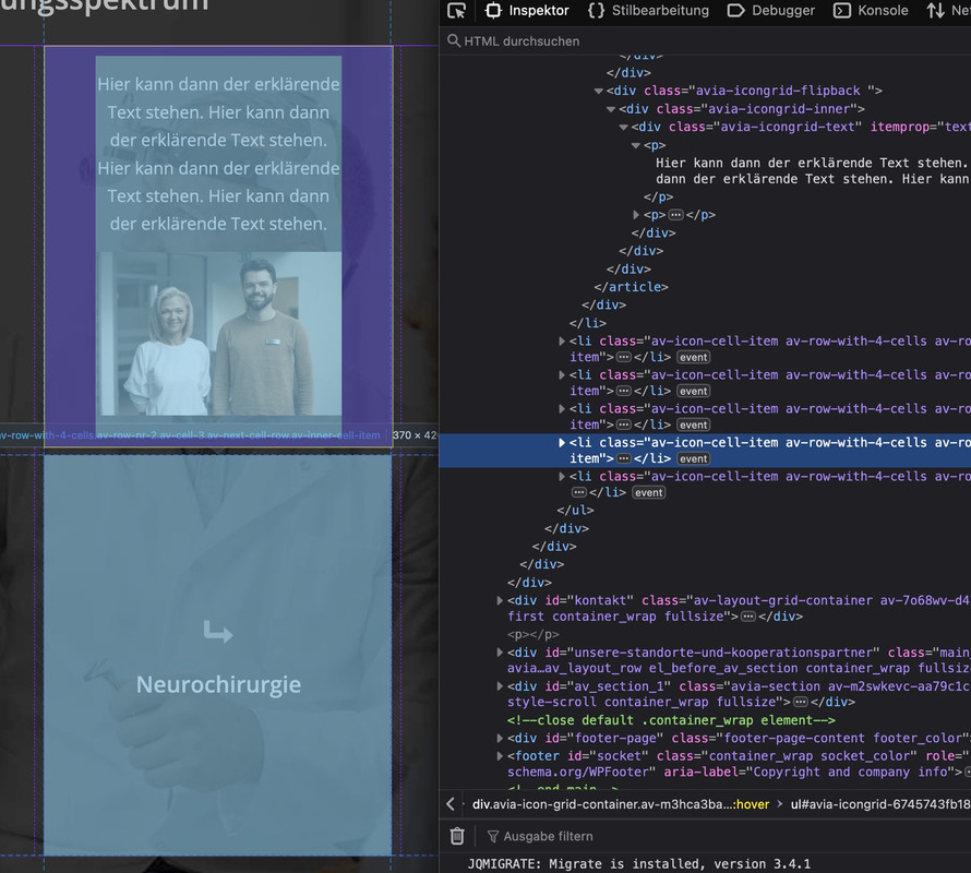
eventuell gehst Du bei diesem speziellen Iconbox Layout dazu über, das als Grid Layout zu gestallten; denn geh mal die responsiven Weiten des Elementes durch. Irgendwann wird es zu schmal.
Was ich meine ( jetzt mal nur für diesen Fall):
#top.postid-5503 #av-layout-grid-2  .avia-icongrid {
  margin: 0;
  padding: 0;
  gap: 0px;
  display: grid !important;
  grid-template-columns: repeat(auto-fit, minmax(350px, 1fr));
  grid-auto-flow:  row;
}

#top.postid-5503 #av-layout-grid-2  .avia-icongrid .av-icon-cell-item .avia-icongrid-flipback {
    padding: 0;
}

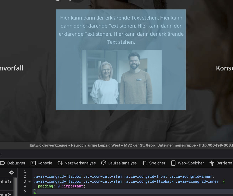
#top.postid-5503 #av-layout-grid-2  .avia-icongrid-flipbox .av-icon-cell-item .avia-icongrid-front .avia-icongrid-inner,
#top.postid-5503 #av-layout-grid-2  .avia-icongrid-flipbox .av-icon-cell-item .avia-icongrid-flipback .avia-icongrid-inner {
    padding: 10px 3em;
}
Wenn das Layout mit seinem Inhalt dann steht , könnte man noch einstellen das die letzte Zeile sich unten zentriert.
However, the real reason for the appearance is that all boxes have the same height. This height is then determined by the one box with the image with the corresponding padding. We then have the same height for all the others. This makes it look like a large distance. If you create the seventh box with the same content as above, you will see that the distance is not that big.
nicht sichern sondern die default werte ändern. (verkleinern)
kannst du mal das Merging für css abstellen. Dann kann ich das leichter inspizieren.
PS: aber alle Höhen richten sich einheitlich nach dem größten Content. Und mit den o.a. paddings – ist das nunmal bei dem article mit dem Bild ca. 400px
Wenn alle Iconboxes bilder haben wird es sich nach dem dann größten Content richten.-
This reply was modified 1 year, 4 months ago by
Guenni007.
hm – seems to be hard to mix images with website in iframes in one gallery.
images and videos work from the scratch – if you choose “use custom link and fallback is image”.the easiest way would be: if devs could create a conditional input field as soon as you have selected lightbox as the destination, in which you can enter the mfp type as a link class – because:
By default, Magnific Popup has four types of content: image, iframe, inline, and ajax ( classes: mfp-image, mfp-iframe, mfp-inline, mfp-ajas) . There is no any “auto-detection” of type based on URL, so you should define it manually.
But that had to be tested if that will be enough to rule the grouping between mixed content.First: i think you have an additional lightbox plugin working on that page. Nivo ?
Next: you can declare for an image a custom-link – on lightbox setting there is the option “custom-link fallback is image”
(The disadvantage is that this link is saved globally for the image, i.e. not exclusively for this element.)on magnific popup there seems to be possibilities to mix content types in one gallery ( e.g. images and video in iframes ) – but i guess you had to decide what lightbox plugin you like to use. the embedded magnificPopup script can do that. ( i hope ;) )
i will test it now on my test page …November 25, 2024 at 9:51 am in reply to: Allgemeines “Media Queries Sylesheet” für ENFOLD verfügbar? #1472118Thanks @ismael : it’s just for info – and my snippet stock – Of course I know that all the Media Query Css rules remain unaffected.
Footer with #footer and #socket or only the #socket.
By the way what you are talking about is a fixed positioning – sticky (as a css technical term) is something different.
It will be difficult to move an entire footer (including the #footer with its widget content) to a fixed position without making it difficult to use on mobile devices.
To have only the #socket in that position is easier to get:#socket { position: fixed; bottom: 0; width: 100%; z-index: 999; }benefit of svg Logo
( that is created like that (good Grouping inside and well documented with ID’s and classes ))see here what happens to your Logo on scrolling or making the screenwidth smaller: https://webers-testseite.de/aussie/
Edit: ok – i now remove it from that example page – seems that there is no interest of having a sharp logo ;)
the benefit of placing the code to my example page is – you can copy the code with one click: if you hover the css code field – there is on top right a copy button
this is a not so complex Logo – why don’t you make a svg from it. The advantage is – that it is a vector based Graphic. So it is always sharp.
The font is, i guess Trade Gothic – so only the branding is to create:Download it from here – and forget about sub logo text etc.
https://webers-testseite.de/wp-content/uploads/IVEY-logo.svg
You can contact me again in five years. ;)
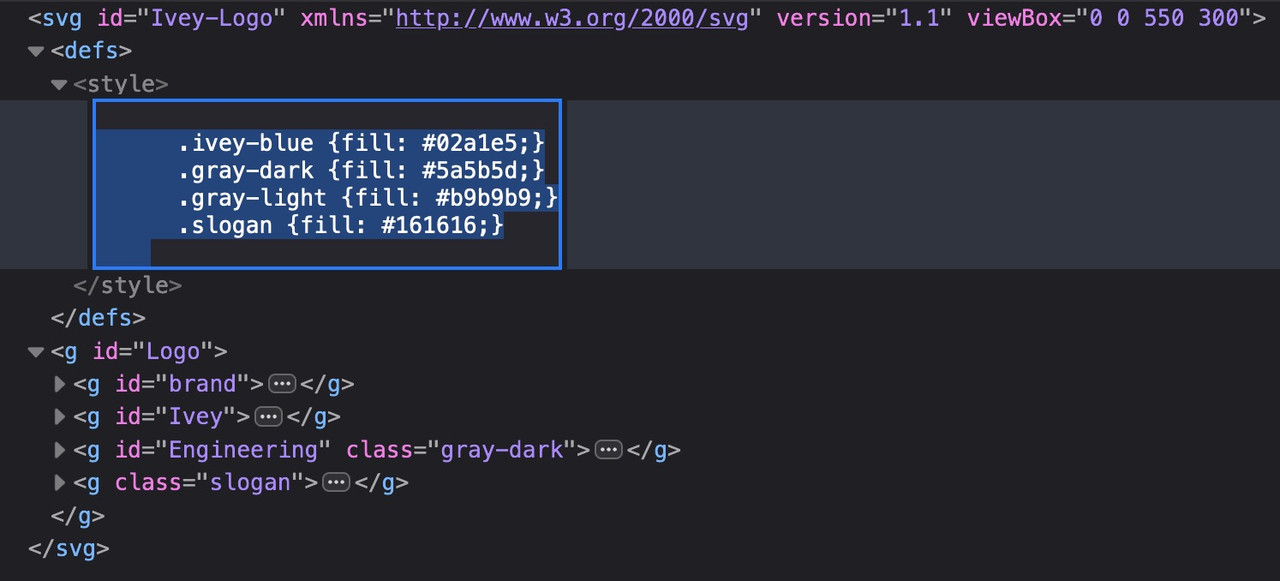
PS: if you like to have different colors – then open the svg with a good text editor (notepad ++ or sublime text) – you will see that the groups are ID’s and different colours are classes: – so it is easy to recolorise it:

-
This reply was modified 1 year, 4 months ago by
-
AuthorPosts


