Forum Replies Created
-
AuthorPosts
-
by the way here : http://www.pirol-hifi.de/
is the Listpoint “Aktivlautsprecher” this is a MegaMenu too. These Links of the Column Heading go to pages (but you can choose custom link too) and the “Navigation Label” are images! – and on “Merovinger” i set the mark at “this will start a new row.if you use for your Main Nav Listpoint in your Enfold Menu the mark for Mega Menu this will start the Megamenu Stile.
Then as your “Heading of the Column” you can use an custom link. If you do not see on the left side of your Menu this point you can make it visible if you go on top of this window there are “Screen Options” of that menu Window. Here you can choose that Menu Window shows different advanced options and what List Points to choose ( Categories, Pages, Posts, Custom Link, Portfolio, etc)

On That Custom Link you can insert as Linktarget “#” and the next is your “heading” of the column
so on that example Page these “Example Pages” “Slider” etc. are those Custom LinksPS: the blue arrow is if you want to give custom css classes even to every Navigation Point
you mean without entering some domains on that point?
Thanks – i will test it today.
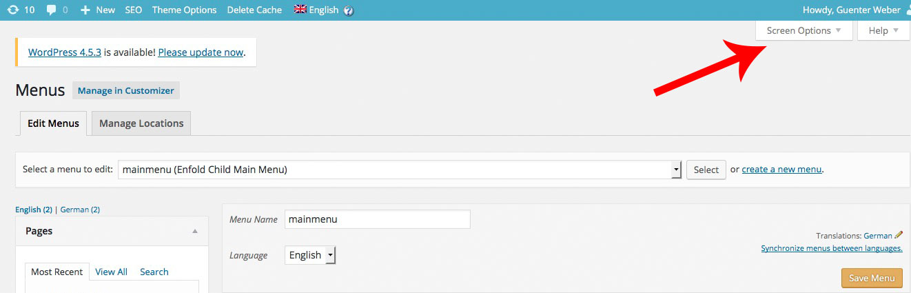
BTW it seems to be important that on the page we register the api key for maps – the server domains are verified!
if i only put in the server domains down the key :
this seems to be not enough.
on top there is a tab to verify the domains:
You are welcome.
OK – scheint ja nun zu klappen
It works – i see it on your site. Guess it can be closed now
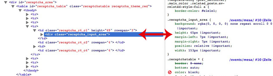
see here : on firebug i can simulate the effect by changing the code of your inline css rule. And this will result in the correct presentation of recaptcha.
So the point is to place that rule to the last position of loading ( because cascading style sheet)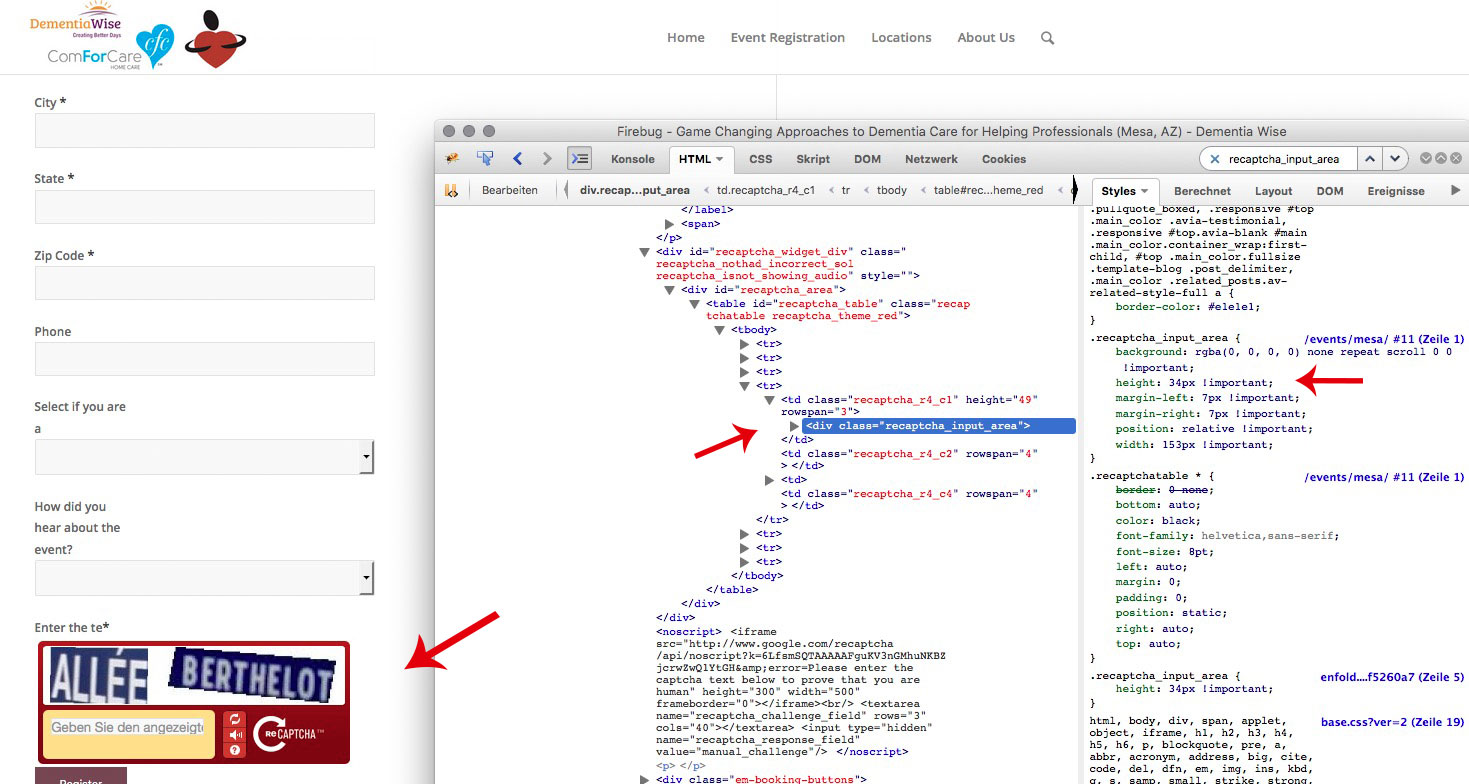
i only used sometimes the non pro version so i could not help you to find the right position of the css embedded there.
you have to find the css of the event because it seems to overwrite the quick css instruction. (it is set to important too)
The path to that css rule is on your installation: http://www.dementiawise.com/events/mesa/
because there are only recaptcha instructions in it it might be a setting of the recaptcha plugin. This might be an inline css code this is loaded last.
How do you embed the google code (Private key and public key etc) to your wordpress? Via Plugin ?i don’t know when custom.css (placed in /wp-content/themes/enfold/css) is loaded. Maybe it helped if you are placing that rule into it. (via ftp download/upload).
it seems that quick css is loaded before your rule settings on wp-content/themes/enfold/css is loaded.there is no changing on your css. The value is still set to 45px
.recaptcha_input_area { height: 34px !important; } or .recaptcha_input_area { height: auto !important; }-
This reply was modified 9 years, 9 months ago by
Guenni007.
And by the way did you changed on quick css the “.recaptcha_input_area ”
try to find it or set it to:
.recaptcha_input_area {
    height: auto !important;
}
or if auto does not work try it with a value under 34px instead
is it an older google captcha plugin ? because i often integrate the google captcha to contact form 7 and they have now those images to mark to a concerning question.
can you give me a link where this happens – maybe on demo of enfold.
i think on enfold this is called mfp
.mfp-title {
    display: none;
}
if you want it more specific than you have to set up a custom class for that masonry / gallery etc.
and if you want to get rid of the whole bar :
.mfp-bottom-bar {
    display: none;
}
to get rid of the tooltip when hovering the image is not an enfold matter – and i think even not a matter of wordpress.
It is one of the basic functions of browsers to show a tooltip if a title-tag is set.-
This reply was modified 9 years, 9 months ago by
eigentlich sollten da drei Dateien drin sein!
Alle drei Dateien sind in dem Ordner avia-shortcodes
und da hast du auch schon deine Antwort drauf, in der Datei wird das Setzen der Tag information geregelt.if(trim($title) != "") $title = "<{$custom_title_tag} {$title_styling} class='avia-caption-title' $markup_name>".trim(apply_filters('avf_slideshow_title', $title))."</{$custom_title_tag}>";Zeile 423 dann – da siehst du dann, dass die Abfrage aus den beiden anderen Dateien dann hier statt wie vorher h2 nun
{$custom_title_tag}seine Entsprechung findet.Aber bitte nochmal runterladen, weil ich hinten vergaß, den schließenden Tag auch zu verändern. (
</{$custom_title_tag}> statt </h2>)oh shi… the Vollbild Slider is named in English slideshow-fullscreen.php
here we go:
3 files have to be changed:
av-helper-slideshow.php, slideshow_fullscreen.php and slideshow_fullsize.php ( in your case only fullscreen is neccessary – but change the other too please)here is the archiv.zip with all three files.
you can see the result here: http://webers-testseite.de/ikom/neue-seite/but if you update this will be lost !
i only put in :
array(
"name" 	=> __("Caption Title Type", 'avia_framework' ),
"desc" 	=> __("Select which kind of heading you want to display. Leave empty to use the default", 'avia_framework' ),
"id" 	=> "custom_title_tag",
"type" 	=> "select",
"std" 	=> "h2",
"subtype" => array("H1"=>'h1',"H2"=>'h2',"H3"=>'h3',"H4"=>'h4',"H5"=>'h5',"H6"=>'h6')
	),
on the helper i than can put in the
$custom_title_tagfor that caption title headingalso ich habe nur die Stelle gefunden wo man es generell einstellen könnte.
Man könnte natürlich eine Abfrage im Backend ob man h1 oder h2 etc. für den Title haben möchte einführen.da müsste man im slideshow_fullsize.php was machen. Aber dafür bin ich zum einen nicht fit genug das schnell zu lösen – zum Anderen nicht involviert genug um lange Zeit hinein zu stecken.
Ab Line 190 von slideshow_fullsize.php wird der Caption Title abgefragt – dort könnte man natürlich in dem array die Abfrage platzieren. Und dann nachher in dem Helper das einfügen
ich muss mal schauen wie diese abfrage bei Headings geregelt ist (dort kann man ja wählen ob 1,2,3 etc)
dort ist ja eine select Entscheidung mit h3 als default geregelt und im array ein subtype mit der auswahl h1 bis h6 geregelt.July 7, 2016 at 1:21 pm in reply to: Enfold-App demo – grid fixed background images not showing on iPad #657997forget about ipadpeek.com these are not a genuine Image of the ipad behavior.
Only that with the hand is shown and only in a static view.


all 2/5 columns accept the one with the hand are missing (not shown) and the position of the hand is static in the one column
and IOS Version is 9.3.2 on my ipad. no support for fixed positioning at all!
and this is not a problem of enfold but of mobile Browser support on many OS-
This reply was modified 9 years, 9 months ago by
July 7, 2016 at 11:29 am in reply to: Enfold-App demo – grid fixed background images not showing on iPad #657899this is a problem of position : fixed
nearly all mobiles and there browsers got this problem.
This is the reason why on mobile case the 2/5 column is set to display noneBut on some ipad ( with retina ) this mobile option does not have an effect because the tablet option is set to 990px.
so for my installation i do this media querry on quick css:
@media only screen and (max-width: 1024px) {.responsive #top .av-hide-on-mobile, .responsive #top .av-hide-on-tablet {
    display: none !important;
}
}
see here for
Mobile CSS Fixed Positioning Support-
This reply was modified 9 years, 9 months ago by
hm alle headings sind seo relevant!
eine h1 sollte jedoch immer nur einmal pro Seite wie ich finde genutzt werden denn sie sollte das Thema der Momentanen Seite präsentieren.
In sofern wäre das automatische Setzen auf h2 schon sinnvoll, denn in deinem Slider sind die Überschriften die Merksätze zu den Vorteilen die Euer Unternehmen bietet.<h1>Überschrift mit Thema des Dokuments</h1> <h2>Einleitung</h2> <h2>Vorteile</h2> <h3>Ein Vorteil im Detail betrachtet</h3> <h2>Nachwort</h2>wenn es denn aus deiner Sicht sein muss, solltest du in enfold/config-templatebuilder/avia-shortcodes schauen. dort ist die Datei: av-helper-slideshow.php in Ihr ist das mit dem h2 (Linie 422 glaube ich ) festgelegt !
_______________
all headings are seo relevant. The h1 is dedicated to the whole content of the page/post.
The hierarchical mapping of headings in a document is:<h1>Heading for whole content of page</h1> <h2>heading to a summary</h2> <h2>Benefits </h2> <h3>A Benefit in detail</h3> <h2>Resume </h2>if you like to change it nevertheless than goto : enfold/config-templatebuilder/avia-shortcodes and find av-helper-slideshow.php – on line 422 there is the h2 mentioned – i guess this is the point of change.
this is a little bit off topic – but what is the benifit of those psd files?
For my webdesign i don’t use them at all.But if you are not a pro in wordpress please try to get familiar with child-themes. This is a realy nice thing to have – because if you update your parent theme (enfold) those changings are not lost.
See here: http://kriesi.at/documentation/enfold/using-a-child-theme/
than you can input those changings in your child-theme functions.php.
(Via Dashboard/Appearance/Editor you can add those snippets to your child-theme functions.php)
On the link above there is a download of the child-theme files)The functions.php is one of those files which do not react as most of the other wordpress files. If there is a functions.php file in your child theme the instructions and setting on that are added to the parent functions.php and do not completely overwrite those.
So Changings are not gone after updating your parent theme.
maybe this could help you:
https://kriesi.at/support/topic/different-logo-in-one-of-the-pages/#post-613359if you don’t use this Salsa Font on Enfold Options Dialog “Fonts” or on advanced styling by setting up a rule for any element with that font. This font isn’t automatically activated for the site like this in the head area:
<link id="avia-google-webfont" media="all" type="text/css" href="//fonts.googleapis.com/css?family=Raleway%7COpen+Sans:400,600%7CSalsa" rel="stylesheet">this code is missing till you do that mentioned above
you can do that by setting up any element (f.e. h6 or even all h2) with Salsa Font.
After that you can use Salsa Font in quick css.(or activate the font via functions.php of your child theme)
by the way – this is how i often substitute the home button on main menu with a little house icon. Then this no mega-menu
Well you can do the following: Dashboard/Menu – declare one Listpoint as Mega-Menu and fill in “Mega Menu Title” a img tag like:
<a href="http://webers-testseite.de/ikom/wp-content/uploads/play_store.png">
<img class="alignleft size-full wp-image-206" src="http://webers-testseite.de/ikom/wp-content/uploads/play_store.png" alt="play_store"  />
</a>
see the effect here on features menu point: http://webers-testseite.de/ikom/
the links on that page only leads to the media file but you can give it any link you want
did you change the content/sidebar ratio one option beneath?
June 29, 2016 at 6:10 pm in reply to: Description snippet of the page Yoast Seo not indexed by google #654954I do see those metas ( description etc.) on source code of my sites – so this might be definitly a matter of time.
and i see it on your site too:
<meta content="Specializzati in verniciatura mobili e infissi. Tecniche di pittura: all'acqua, laccatura, patinatura fiorentina foglia oro, argento, anticatura del legno." property="og:description">so be patiently
if you like to have a title tag on each image and the title tag of that specific image does not change. you can give it on dashboard/media/
a title-attribut and an alt-attributbut titles on fullwidth slider do allway move in – not a matter on hovering it.
By the way – the text moves in the image is not a “title-tag” but a caption and is placed as a h2-tagif you want to set it up but not to display you can not choose display: none for it because you want it readable for bots.
i’m not shure if bots do read content which is set to visibility: hidden.avia-caption-title { visibility: hidden !important; }the text-indent option often is a nice but i think from googles point of view “spam-like” behaviour:
.avia-caption-title { text-indent: -5000px; animation: none !important; }The fb-root id of the div above is indeed part of enfold but normaly it is empty and closed by default with no content.
But after that there are a lot of containers ( and with identical ids “lightbox”) – these are completely – so you might have done with that page.
Hope the mods here on board with admin access on your site may help -
This reply was modified 9 years, 9 months ago by
-
AuthorPosts