Forum Replies Created
-
AuthorPosts
-
November 15, 2016 at 8:47 pm in reply to: Disabled Lightbox on one page lead to blog posts not showing in slider & masonry #712581
well i know one method by having a header.php copy in the child-theme folder
Open that copy and look for: (it is in line 9 on actual enfold header.php)$av_lightbox= avia_get_option('lightbox_active') != "disabled" ? 'av-default-lightbox' : 'av-custom-lightbox';and replace it by :
$av_lightbox= avia_get_option('lightbox_active') != "disabled" && !is_page(990) ? 'av-default-lightbox' : 'av-custom-lightbox';perhaps there was a hook method – to do this.
November 13, 2016 at 7:31 pm in reply to: Change font color for icons inside the Google Maps marker tooltip #711672and you see that there is no alignment now because icons are different width – give the container a fix width:
#av_gmap_1 .av_font_icon {
    color: #9c27b0 !important;
    opacity: 1 !important;
    width: 36px !important;
}
thats it
November 13, 2016 at 7:23 pm in reply to: Change font color for icons inside the Google Maps marker tooltip #711671if you want it a bit bigger those icons:
#av_gmap_1 .av-icon-char::before {
    font-size: 24px;
    position: relative;
    top: 2px;
}
edit: or better place the icons with vertical align:
#av_gmap_1 .av-icon-char::before { font-size: 24px; position: relative; vertical-align: middle; }-
This reply was modified 9 years, 4 months ago by
Guenni007.
November 13, 2016 at 7:15 pm in reply to: Change font color for icons inside the Google Maps marker tooltip #711668yes i understand that but otherwise you have to wait til a mod is on your thread:
i don’t understand how you create this bubble info – because there are some color style informations on each and an opacity set.
you can change it all by :#av_gmap_1 .av_font_icon { color: #900 !important; opacity: 1 !important; }but i guess it is the opacity info which you want to get rid off – so only change that part of code
if you want a specific color for each tell us.
-
This reply was modified 9 years, 4 months ago by
November 13, 2016 at 6:29 pm in reply to: Change font color for icons inside the Google Maps marker tooltip #711659it would be much easier to help you with a link.
How did you place the fontello icon in that google map?zwei deutsche die sich englisch unterhalten :lol:
– ja das hatte ich ja ganz am Anfang für dich auch so gesetzt. Dann dachte ich das Pumpen wäre besser – in Kombination sieht es gut aus und ist in der Größe auch nicht so aufdringlich.
Wäre das nicht auch ne gute idee für dich. Auf der Testseite habe ich das Hamburger Menu für die gesamte Seite – also auch auf Mobile gesetzt und ich überdecke nicht die ganze Seite mit dem Menu sondern nur einen Teil (wobei man natürlich die Wahl hat wie das abgedeckt wird (dunkel – hell oder farbig etc. ):
http://webers-testseite.de/elegant
PPS: Mein Hoster hat momentan Probleme, deshalb könnten manche Seiten von mir momentan nicht erreichbar sein.
PPPS: :wink: du darfst mir aber gerne mal einen Tip geben worauf ich beim Umsteigen auf https achten muss. !Danke
E-Mail siehst du ja bei anklicken meines Avatares.-
This reply was modified 9 years, 4 months ago by
you can animate alot with those keyframes … colors, scale , rotation etc. pp
see here:
http://lea.verou.me/2012/12/animations-with-one-keyframe/
my code for the example page:
@keyframes pound {
	from, to { transform: none; }
	50% { transform: scale(1.4); }
}

.heart::before {
    content: "\e806 ";
    font-family: entypo-fontello;
    font-size: 14px;
    position: relative;
    top: 2px;
    animation: pound .7s infinite alternate;
    display: inline-block
    }
by the way on css you have to substitue the u in ue806 with that backslash – you find it by alt+shift+7
a quick and dirty way is to place the text in this way:
made with <span class="heart">in</span> Germanyand place the heart with
.heart:before…you can see that on webers-testseite.de/ikom in the socket
code:.heart::before { content: "\e806 "; font-family: entypo-fontello; font-size: 14px; position: relative; top: 2px; }hm i got this issue the first time of many installs now to.
I defintly found the grid.css line but in former times this container rule is overwritten by enfold options dialog ! entry.
I got now one installation where the grid.css rule seem to work like an important rule ??? what could it be.i can see the entries in my enfold-child.css at the bottom of it :
    .container {
        width: 100%;
    }
    .container .av-content-small.units {
        width: 70%;
    }
    .responsive .boxed#top,
    .responsive.html_boxed.html_header_sticky #header,
    .responsive.html_boxed.html_header_transparency #header {
        width: 1510px;
        max-width: 90%;
    }
    .responsive .container {
        max-width: 1510px;
    }
    #top #wrap_all .all_colors h1,
    #top #wrap_all .all_colors h2,
    #top #wrap_all .all_colors h3,
    #top #wrap_all .all_colors h4,
    #top #wrap_all .all_colors h5,
    #top #wrap_all .all_colors h6 {
        color: #425719;
        font-weight: normal;
    }
but it has no influence on it.
Edit: :lol a noob error. i didn’t close a media querrie rule at the end ! :yoo the missing second closing brace
-
This reply was modified 9 years, 4 months ago by
on bwp minify don’t forget to set up the “Cache age” this is often mentioned by gtmetrix that the minified css f.e. got a too near expires header. etc.
btw. i do not allways install wp-supercache. Sometimes it is a more and bigger benefit to have a good htaccess file on wordpress installation.
If your server supports gzip and or mod_deflate i have often
( don’t forget to include the original entries in your existing htaccess file – something like this:)
`# BEGIN WordPress
<IfModule mod_rewrite.c>
RewriteEngine On
RewriteBase /
RewriteRule ^index\.php$ – [L]
RewriteCond %{REQUEST_FILENAME} !-f
RewriteCond %{REQUEST_FILENAME} !-d
RewriteRule . /index.php [L]
</IfModule>
# END WordPress`here is a standard htaccess file i often use (even to get better results on those testing pages :lol: )
in addition to your existing entries !!! :
# Deny from <files wp-config.php> order allow,deny deny from all </files> # Directory Browsing Options All -Indexes # Keep-Alive <ifModule mod_headers.c> Header set Connection keep-alive </ifModule> # Gzip <IfModule mod_mime.c> AddType application/javascript js AddType application/vnd.ms-fontobject eot AddType application/x-font-ttf ttf ttc AddType font/opentype otf AddType application/x-font-woff woff AddType application/x-woff woff AddType image/svg+xml svg svgz AddEncoding gzip svgz </Ifmodule> # GZip Kompression <IfModule mod_gzip.c> mod_gzip_on Yes mod_gzip_dechunk Yes mod_gzip_item_include file \.(html?|txt|css|js|svg|php|pl)$ mod_gzip_item_include handler ^cgi-script$ mod_gzip_item_include mime ^text/.* mod_gzip_item_include mime ^application/x-javascript.* mod_gzip_item_exclude mime ^image/.* mod_gzip_item_exclude rspheader ^Content-Encoding:.*gzip.* </IfModule> # Browsercache <IfModule mod_expires.c> ExpiresActive On ExpiresDefault "access plus 1 month" ExpiresByType text/css "access plus 1 month" ExpiresByType text/javascript "access plus 1 month" ExpiresByType text/html "access plus 1 month" ExpiresByType application/javascript "access plus 1 month" ExpiresByType application/x-javascript "access plus 1 month" ExpiresByType application/x-font-ttf "access plus 1 month" ExpiresByType application/x-font-woff "access plus 1 month" ExpiresByType application/x-woff "access plus 1 month" ExpiresByType application/xhtml-xml "access plus 600 seconds" ExpiresByType image/gif "access plus 1 month" ExpiresByType image/jpeg "access plus 1 month" ExpiresByType image/svg+xml "access plus 1 year" ExpiresByType image/svg "access plus 1 year“ ExpiresByType image/png "access plus 1 month" ExpiresByType image/x-icon "access plus 1 month" </IfModule> # Deflate by FileType <IfModule mod_deflate.c> AddOutputFilterByType DEFLATE text/plain AddOutputFilterByType DEFLATE text/html AddOutputFilterByType DEFLATE text/xml AddOutputFilterByType DEFLATE text/css AddOutputFilterByType DEFLATE text/javascript AddOutputFilterByType DEFLATE image/svg+xml AddOutputFilterByType DEFLATE application/javascript AddOutputFilterByType DEFLATE application/xml AddOutputFilterByType DEFLATE application/xhtml+xml AddOutputFilterByType DEFLATE application/rss+xml AddOutputFilterByType DEFLATE application/atom_xml AddOutputFilterByType DEFLATE application/x-woff AddOutputFilterByType DEFLATE application/x-font-ttf AddOutputFilterByType DEFLATE application/x-font-woff AddOutputFilterByType DEFLATE application/javascript AddOutputFilterByType DEFLATE application/x-javascript AddOutputFilterByType DEFLATE application/x-shockwave-flash </IfModule> # ETag Header unset ETag FileETag None <FilesMatch "\.(ttf|otf|woff)$"> <IfModule mod_headers.c> Header set Access-Control-Allow-Origin "*" </IfModule> </FilesMatch>the footer has a gif file as background – no reason for that because there is no transparency at all.
the gif got over 500kb. the jpg 63kb !
klick on the images to see a bigger size
btw. proof your images.
You got wonderful images but on internet sometimes it is better to have small sizes of images.
on three images i can obtain big loss of space but with less loss of quality and use please with a higher compression level and progressiv instead of optimized
Chairs-around-outdoor-burning-fire-pit–1500×999.jpg : 173kb versus 500kb
Los-Altos-Hills-Guesthouse-Main-House-Pool-Firepit-at-Dusk-1500×991.jpg : 152kb. versus. 434kb
Modern-patio-next-to-swimming-pool-1500×999.jpg : 198kb. versus. 529kbsee here : only in the sky you see a bit more jpg artefacts
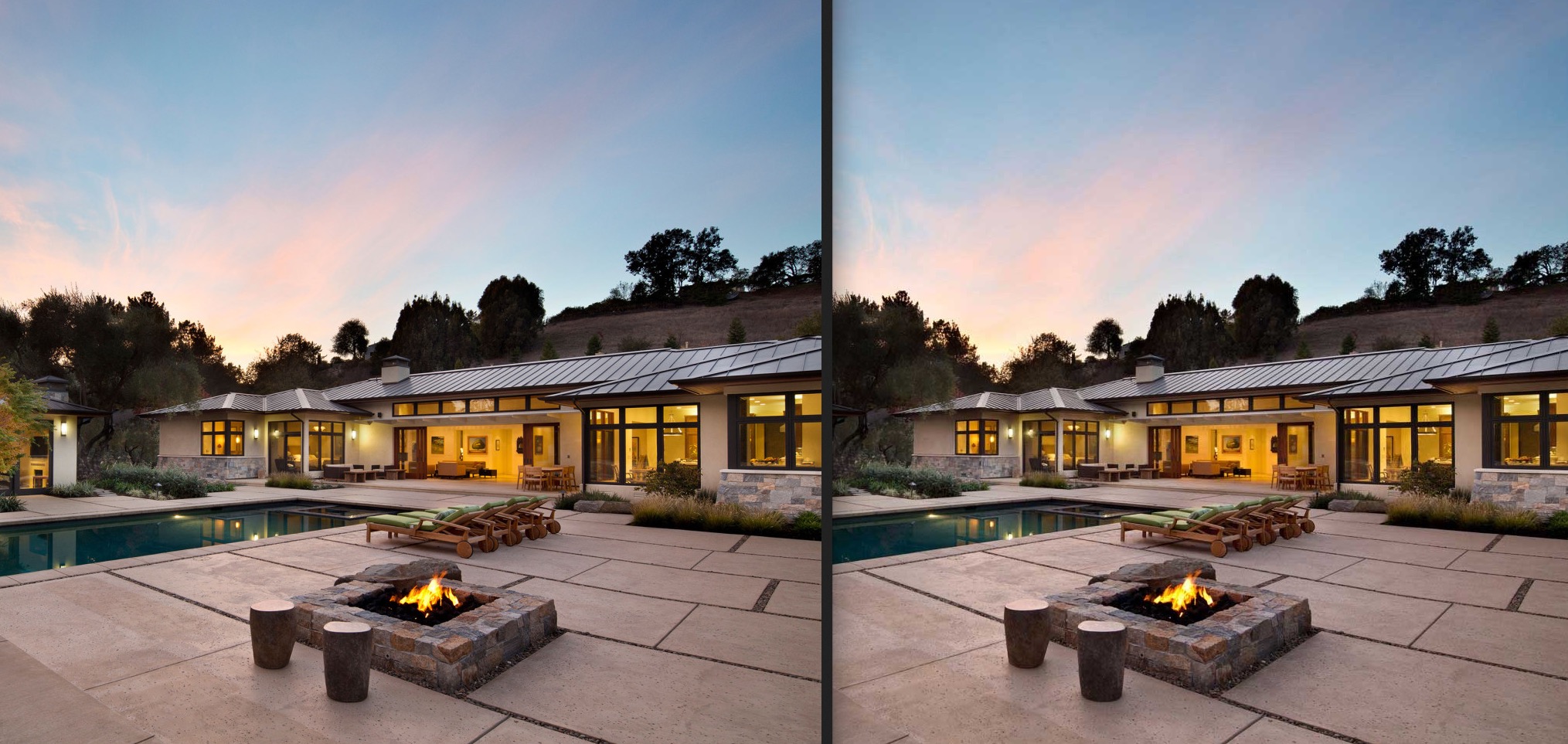
And keep in mind that this is a slideshow so these quality differences will not be easy to see in a few seconds.
btw i only do a new save with more compression and in progressiv mode thats all – the dimensions are exactly the same
you can use f.e. the plugin maintenance creates a nice Pluginpage ( you can upload your own background-image.) If you don’t like that logged-in users do something with your site you have to set them as Abonnent only!
Links erased now
i don’t want to have the site above offline for a long time ! even if it is only a playground for me.
So have a look to that little plugin – Link is behind maintenance word !-
This reply was modified 9 years, 4 months ago by
November 7, 2016 at 5:54 am in reply to: In search results remove the text "Wollen Sie sich lieber andere Artikel oder S" #709016do not forget to generate a mo file too. You have to upload both!
November 6, 2016 at 7:49 pm in reply to: In search results remove the text "Wollen Sie sich lieber andere Artikel oder S" #708936or if you want to hold that hint : tranlate it in your language files
edit: :lol
the original Text in english is: You might want to consider some of our suggestions to get better results:and is translated in the turkish lang files to the german translation ! ???
_____________________PS : that was the reason why i answered in english and german as well. – Sorry.
Normaly the untranslated files leave as they are – in englishNovember 6, 2016 at 6:39 pm in reply to: In search results remove the text "Wollen Sie sich lieber andere Artikel oder S" #708910i dont know where this comes from – but the fast an quick and dirty way was:
.search_not_found > p {
    display: none;
}
so in total the rule was:
.search_not_found h3, .search_not_found > p,
.search_not_found .widget.avia_combo_widget {
    display: none;
}
how do you obtain the multilingual site? A plugin?
Because this “If you are not happy with the results below please do another search” should be turkish too! if you use a good language switcher !well if you work with a child theme do the following in the child theme functions.php :
add_action('get_footer', 'add_div_before_footer');
function add_div_before_footer(){
	?>
	<div class="container_wrap" id="extracontainer">
		<div class="container">
                     Content
		</div>
	</div>
	<?php
}
the id is for styling your container than. The Content is what you like to position there ( Images or something else)
if you like to place some content which you built with the advanced layout builder – activate the debug mode – copy that code and place it inbetween instead of “Content”.
November 6, 2016 at 4:22 pm in reply to: In search results remove the text "Wollen Sie sich lieber andere Artikel oder S" #708867why don’t you use quick css:
.search_not_found {
    display: none;
}
warum nicht im Quick css . Es bleibt dann immer noch da stehen:
Suchergebnisse für: ……
Es konnte leider nichts gefunden werden
Entschuldigung, aber kein Eintrag erfüllt ihre Suchkriterien. Bitte starten Sie eine neue SucheIf you like to have the list with tips to find better results : get rid of the rule above and be more specific
Wenn du die Liste lieber behalten willst, wie man besser sucht: die obige Regel nochmal löschen und:.search_not_found h3, .search_not_found .widget.avia_combo_widget { display: none; }November 6, 2016 at 3:59 pm in reply to: How can I not show the suggested movies at the end of the popup youtube movies #708859?rel=0&iframe=trueas described abovethe first with ? the rest in combination with & and no space
and don’t takte the watch code – take the embed code
the iframe=true is the option for lightbox effectsee the test with
https://www.youtube-nocookie.com/embed/Rn8B6BoQD4M?rel=0&autoplay=1&iframe=true&vq=hd720 frameborder="0" allowfullscreenhere:November 4, 2016 at 4:27 pm in reply to: How can I not show the suggested movies at the end of the popup youtube movies #708302here you can see what i mean – sorry it is a german page – hope the google tranlator works well.
But think of it :in combination the second and following settings with & instead of ? and no space
http://www.sumago.de/10-nuetzliche-youtube-embed-code-tipps-fuer-dich/
-
This reply was modified 9 years, 4 months ago by
November 4, 2016 at 4:21 pm in reply to: How can I not show the suggested movies at the end of the popup youtube movies #708294
sometime it only works with the link with http (not https)
?rel=0 (no videos at the end)
&autoplay=1 (autoplay mode – choose & in combination with no space behind?rel=0 )
&iframe=true ( same here – no space and & if in combination for lightbox-effect)
&vq=hd1080 ( force the HD mode – it is not direct from the beginning of the video – and only if there is a HD (1080 or 720 mode))-
This reply was modified 9 years, 4 months ago by
November 4, 2016 at 4:07 pm in reply to: How can I not show the suggested movies at the end of the popup youtube movies #708277try it with this link:
i do often make a screenshot of the movie – place that image and give and set the link on that image
to have a litebox the parameter for it is iframe=true for HD force set the parameter etc etc. if you combine diferent parameters the first is with ? and the rest is with &https://www.youtube-nocookie.com/embed/Rn8B6BoQD4M?rel=0&autoplay=1&iframe=true&vq=hd1080 frameborder="0" allowfullscreen-
This reply was modified 9 years, 4 months ago by
sorry i had it in a text block element too – but not with the iframe tag – but in the manner above
edit: this is a test page. i placed an image (screenshot of the film) alb element and on the image with link settings to manually.
the link was than with all instructions:http://www.youtube-nocookie.com/embed/G0k3kHtyoqc?rel=0&vq=hd720&autoplay=1&iframe=true frameborder="0" allowfullscreenyou can link to it in this way too:
the trick is that you can combine those : autoplay rel and iframe by first a ? than with & – see example:
http://www.youtube-nocookie.com/embed/XWze2cCdt40?rel=0&autoplay=1&iframe=true frameborder="0" allowfullscreen-
This reply was modified 9 years, 4 months ago by
thanks vinay – i did this in avia-admin.css
– but your way over the child-theme functions php is much more elegant! Thanks.
PS : i did the button “save” also to the left and i think .avia_sidebar_active is not neccessary – it works good on small screens too.#avia_quick_css .avia_description { float: none; margin-bottom: 20px !important; padding-left: 0 !important; width: 98%; } #avia_quick_css .avia_control { float: left; max-width: 98% !important; width: 98% !important; } .avia_footer_links li { float: left; padding-right: 20px; } .avia_footer .avia_footer_save { float: left; }October 30, 2016 at 1:39 pm in reply to: Full Width Sub Menu sticks below frame with the fixed frame layout #705804great – thanks alot. This is than a little bug we found? On next update this is implemented or do i have to think on installation in the future?
October 26, 2016 at 11:02 pm in reply to: Full Width Sub Menu sticks below frame with the fixed frame layout #704560i did a duplicator backup – so if something went wrong – it is not so bad.
i did these variations of avia.js in the child-theme/js/ folder .
i only changed those things you mentioned above – nothing else.don’t look to intensiv to find a solution.
it works with the “avia_new.js (commenting the function out)Do you realy need the tab-titles not beeing there? or is it ok for you if they are invisible?
So you can link to the tab-titles without beeing there :lol.tab_titles (visibility: hidden)
?
-
This reply was modified 9 years, 4 months ago by
-
AuthorPosts