Forum Replies Created
-
AuthorPosts
-
maybe this is concerning to the WordPress 4.7.1 “bug” and svg files .
They changed in wp-includes/functions.php some functions – and the mime check was touched in a manor that svg files are not accepted as a mime type. Perhaps this collides with your :url(‘wp-content/fonts/AvenirLTStd-Book.svg#svgFontName’) format(‘svg’); /* Legacy iOS */
January 16, 2017 at 2:33 pm in reply to: JPEG Upload Error "http error" After switching to SSL #734046sometimes – after switching from http to https it helps – when you set in to your wp-config-php the absolute path to your wp-content directory in this manner:
define( 'WP_CONTENT_URL', 'https://url/wp-content' );you must replace the url with your domain
January 16, 2017 at 2:22 pm in reply to: please help in german ! Anker / Sprungmarken bei Textlinks #734032wenn du einen Anker gesetzt hast z.B “Wohnnot” dann ist der link dort hin:
http://su-enna.de/alleinerziehende-arme-starke-alltagshelden/#wohnnotwenn du also im Menu diesen Anker annavigieren möchtest musst du zumindest auch die Seite auf welcher der Anker erscheint mit nennen (absolut muss also nicht sein, aber wenigstens die Seite). also:
einen Individual Link ins Menu setzen und als Link das untere einsetzen.
/alleinerziehende-arme-starke-alltagshelden/#wohnnot_______________
PPS: es gibt so etwas wie eine Nettiquette. Ich als nicht Mod darf das mal sagen: Diese “Mein Problem ist das Wichtigste – Mentalität” finde ich persönlich gräßlich.
Wenn Du auch nur ansatzweise mal einen anderen Support erlebt hast, dann solltest du wissen, dass sowohl die Kompetenz als auch die Geschwindigkeit der Hilfestellung hier an Board exorbitant ist.ok –
ach noch eines – beim Impressum solltest du noch was nachbessern.
Selbst Einzelunternehmen müssen da an Kontaktinfos mehr liefern. Anbieterkennzeichung; Umsatzsteuer ID falls vorhanden DE, … etc. pp.
Bei Facebook und Instagram Links solltest du auch noch sicherheitshalber in der Datenschutzerklärung was hinzufügen.
Ganz ok ist zB der Impressums Generator von eRecht24.dehm last solution does work on all browsers – but on Ipad the buttons are very big . And the last is a bit shifted – i will make a research for it.
And hope to get a solution for it.Yes – thats very often that users forgot to do. If there is no such declaration the Hamburger Menu does not work.
But you do that – so there must be a different reason for it.go to Dashboard / Menu / and declare a Menu as Enfold Main Menu ! (Mark it at the bottom of the menu settings dialog)
If you got the standard Menu of WordPress it will not workJanuary 15, 2017 at 11:53 am in reply to: How to Add social media icon on Fullscreen Slider? #733720so here is a solution for more than two buttons:
ALB:
Fullscreenslider with custom class (in my case: socialbuttons3)
downunder a colorsection with a 1/1 container (with -400px on: “Custom top and bottom margin” ) and in it a text-block !
You now can place one image (all floating left) and again and again in the text-block. Set up your link Options and target Option to the ImagesThe Text-Block got a custom class: centerbutton
#fullscreen_slider_0.socialbuttons3 {
    z-index: 0;
}

.avia_textblock.centerbutton p {
    display: inline-block !important;
    left: 50%;
    position: relative;
    transform: translateX(-50%);
}

.avia_textblock.centerbutton a {
    display: inline !important;
    margin: 15px !important;
    opacity: 0.9;
    width: 120px;
}

.avia_textblock.centerbutton a:hover {
    transform: scale(1.1);
    opacity: 1;
    transition: all 0.4s ease-in-out;
}

.avia_textblock.centerbutton .image-overlay {
    display: none !important;
}
Result: https://webers-testseite.de/ikom/full-slider-with-content/
-
This reply was modified 9 years, 3 months ago by
Guenni007.
January 15, 2017 at 11:10 am in reply to: How to Add social media icon on Fullscreen Slider? #733711by the way if you have more than these two buttons – i will do that too with a fullscreenslider on top.
Underneath you put a color section – with the buttons.
the trick is not to make the z-index higher to the buttons – but to lower it on the slider:see here : https://webers-testseite.de/ikom/full-slider-with-content/
there might be a bit more css to solve – because you have to find a solution on small screens.The z-index for slider (i only set it for that page – or you give the fullscreen-slider a customclass to select it):
.page-id-3220 #fullscreen_slider_0 {
    z-index: 0;
}
i’m looking for you to a nice solution soon
January 15, 2017 at 10:48 am in reply to: How to Add social media icon on Fullscreen Slider? #733706Custom Class on allmost all ALB Elements: http://kriesi.at/documentation/enfold/turn-on-custom-css-field-for-all-alb-elements/
Yes i understand – but it is with enfold normal settings only a two button solution!
this is only the normal two buttons which can be choosed at slider settings. !
The text of those buttons was shifted out of viewport by text-indent (but this is nice because it can be red bei bots – seo advantage)
you see on the bottom of the normal fullscreen slider that i set up a custom class:
(klick on the image to enlarge)
than look to image/caption options of the sliderimage – you got the choice to have two buttons there !

the rest is css in quick css and to look for a nice Button
-
This reply was modified 9 years, 3 months ago by
or you place a button on the slider and do the following code to it:
i gave the fullscreen slider the class : socialbutton for better specified selection.socialbutton .avia-slideshow-button { background: rgba(0, 0, 0, 0) url("///wp-content/uploads/add-social-media-buttons.png") no-repeat scroll 0 0 / cover !important; border: 2px solid #fff !important; border-radius: 50% !important; height: 100px; text-indent: -5000px; width: 100px }see here: https://webers-testseite.de/ikom/fullscreen-slider/
or as two buttons ( with slider class: socialbuttons2 ):
.socialbuttons2 .avia-slideshow-button:nth-child(odd) { background: rgba(0, 0, 0, 0) url("/ikom/wp-content/uploads/add-social-media-buttons.png") no-repeat scroll center center / 100% 100% !important; border: 2px solid #fff !important; border-radius: 150% !important; font-size: 1px; height: 100px !important; text-indent: -5000px; width: 100px !important; } .socialbuttons2 .avia-slideshow-button:nth-child(even) { background: rgba(0, 0, 0, 0) url("/ikom/wp-content/uploads/twitter.png") no-repeat scroll center center / 100% 100% !important; border: 2px solid #fff !important; border-radius: 150% !important; font-size: 1px; height: 100px !important; text-indent: -5000px; width: 100px !important; } .avia-multi-slideshow-button { min-width: 100px; }-
This reply was modified 9 years, 3 months ago by
für das Responsive Verhalten, ist es glaube ich besser du nimmst die 1/3 columns ohne zwischenräume – musst dann umrechnen – Zielwert in der mitte bleibt. – Die Abstände verringern sich wohl bei schmalen Screens !
.av_one_third.outspace {
    width: 28.5% !important;
}

.av_one_third.midspace {
    width: 42.8% !important;
}
Im Grunde ein wenig rechnen. ich nahm jetzt die 1/3 columns mit zwischenraum. Der ist bei Enfold immer 6% – rest ist rechnen und den entsprechenden Containern dann die Breiten zuweisen:
.av_one_third.outspace {
    width: 22.5% !important;
}

.av_one_third.midspace {
    width: 43% !important;
}
damit es nicht zu genau ist die werte immer ein wenig abrunden. Denn manch ein browser rechnet zB Rahmenbreiten out of box oder in the box.
look here : https://webers-testseite.de/elegant/735-2/
ist es das was dir vorschwebt?
Es wäre um vieles leichter, mit der Seite als solches die Ratschläge zu erteilen.
Diese Beschreibungen sind ja ganz nett, aber um speziellen Code zu entwickeln ist es geradezu unablässing die Seite zu sehen.
Wenn du das nicht öffentlich machen willst – warum auch immer musst Du es im Privaten Bereich des Threads posten und auf einen Mod warten.is there a link where we can see the issue?
have you declared a menu to be the enfold main menu on Menu Options dialog?
January 12, 2017 at 2:17 pm in reply to: Is it possible to move copyright footer under navigation #732658you than can place any widget to that widget area ; if you only want to have here copyright info – than a text widget will do the job.
the rest is for quick css – by default the padding left of list points of navigation is 13% so i do it here for the text widget too:
#text-11.widget_text .textwidget {
    color: #fff;
    font-size: 11px;
    margin-left: 13%;
}
the only thing is that on your installation this is
#text-11to be replaced by your idJanuary 12, 2017 at 2:13 pm in reply to: Is it possible to move copyright footer under navigation #732653January 12, 2017 at 1:58 pm in reply to: Is it possible to move copyright footer under navigation #732642hm – TiVo and design your website. :wink
Please get familiar with working on child-themes. It is for working with codes snippets the best Solution – because updating the parent theme does not influence those changings!
Look here on enfold documentation:
Download a preset Child-Theme : http://kriesi.at/documentation/enfold/downloads/
Infos on how to: http://kriesi.at/documentation/enfold/using-a-child-theme/. with good instructions.the great advantage of child-theme functions.php ( if you download the preset- there is allready an empty one) is that it does not replace the parent-theme functions.php – it can add things to it.
( So if you got f.e. a copy of header.php file in your child theme folder it will totaly substitute the parent-theme file )On Enfold Documentation there are a lot of snippets which can help you to make some important changes. And a lot of hints and advices here on Support Forum do use this method.
_________________
This code snippet here:
add_action( 'ava_after_main_menu', 'enfold_customization_header_widget_area' );
function enfold_customization_header_widget_area() {
	dynamic_sidebar( 'header' );
}
comes to child-theme functions.php file. (you can make the changings via Dashboard/Appearance/Editor
on left side there are a list of files in child-theme folderTo input some broken codes here into functions.php can have the result that you only see a white page – than you only have the possibility to redo those entries by ftp down/upload the working file.
But if you do copy paste carefully the code it will work in most instances
So the code above registeres a widget area on a certain place (here i called it header)
if you than goto widgets and create the new widget (name: header) everything you put in that widget area goes to that area of enfold.Enfold got a lot of those possibilities to “hook” ( they often marked like:
do_action('xxxxxxxxx')) where we can insert some code
in this case it is thehelper-main-menu.phpbecause the place of your desired area was created here – i looked into that php.you see on that demo page that the 1/3 solution in front works to (if you set it to 26% its perfect)
By the way – on new enfold there is for each column the possibility to set a mobile behavior in options dialog.
and it has to be 2 1/5 ! Just a silly question why not 2 1/4
(it is easier to handle)you can manage the width than via custom class see here : https://webers-testseite.de/ikom/shadow/
i set up 4 1/4th columns and give each a custom class (the columns itself) you see the class inside as heading.
and than i setup a custom width for them ( just a bit maths)div .av_one_fourth.innen { width: 15% !important; } div .av_one_fourth.aussen { width: 26% !important; }the space between is set by enfold to 6%. so on 3 spaces you have to manage the rest to 82% (or for a pair of “innen” and “aussen” 41%) (26+15)
the normal width for a fifth column is 15.2%. so nearby.The only thing is you have to make some rules again for responsive case
( on that test page my mobile starts at 990px)
@media only screen and (max-width: 990px) { div .av_one_fourth.innen { width: 100% !important; } div .av_one_fourth.aussen { display: none !important; } }-
This reply was modified 9 years, 3 months ago by
And by the way – i uploaded your video to youtube – normal without beeing a special member – it works
and if you input the code in this way: https://videourl?rel=0&autoplay=1&loop=1&autopause=0
it works in safari.So thats all from me – i will now delete the youtube upload ! thanks for your patient listening!
And i delete the selfhosted upload now.Solution for you might be :
buy or wait til enfold updates Layerslider
upload your video free to youtube – very simple and embed the video with settings above.-
This reply was modified 9 years, 3 months ago by
well i got the Layerslider Vers. 6 – and on that (hope Enfold would soon update that part) it is possible to declare a video as Slider Background !
Look here the selfhosted video of your vimeo file. – I will delete it after you have seen it on Safari looping !
i will try now to look if a vimeo link will do the job too.https://webers-testseite.de/ikom/video/
Edit: it does not work with vimeo hosted file! on that solution
And great advantage is that the slider is responsive !-
This reply was modified 9 years, 3 months ago by
do you have a third party maps plugin working?
for detailed map i use Chris Richardsons Map Press Pro. but both are loading there own api on different places.
Some Event Plugins comes with Event Place and an own loading of google map api.
so i think first of all try to deactivate all plugins an look if it works.on google maps api registration – the inserted urls lost there asterix after the url. ( *abc.com/* ) after saving.
on input field you have to input the asterix and after it a spacebar ! this will avoid deleting the asterix.Allmost every installation of mine works well – but sometimes i had to input urls which are property prooved from google
i don’t know why – but sometimes it helps to get it run: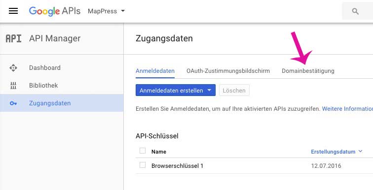
-
This reply was modified 9 years, 3 months ago by
January 10, 2017 at 2:04 pm in reply to: Can I change the info in the footer and take away the Enfold Kriesi name. #731554
i guess it is not important where the nolink – shortcode is placed
by the way – this snippet should be part of the enfold documentation – because the question occurs frequently
and btw 2 : the theme demo theme options download should be updated – only 10 of 26 are available yet
yes but as mod you have to be fast – and those demos with screenshots costs a lot of time.
Only other participants – maybe working on similar problems can do that.
Your welcomeJanuary 10, 2017 at 10:35 am in reply to: Is it possible to move copyright footer under navigation #731489see here : https://webers-testseite.de/weber/foto/
by the way this is part of a test of the medical theme demo ! Just for you – the switch to left navigation and dark. :lol
make some fun and press another button in menu. Enfold switches than to normal layout (only foto is styled that way)btw: for the responsive case – i think we have to find a different place ? shrink the window above to see
-
This reply was modified 9 years, 3 months ago by
by the way – i see that the column padding has no active link – so it might be better to have no padding here – and to set the padding to the content.
so i gave to those contents a custom class (columnlinkpadding) and gave the link a hover style:
.column-link a {
    display: block;
    height: 100%;
    width: 100%;
}

.column-link a:hover {
    box-shadow: 1px 1px 5px #333;
}

.column-link div {
    display: inline-block;
}

.column-link .columnlinkpadding {
    padding: 5px 30px;
}
But : A link in that column works but destroys the construction. (by the way a link in a link is not valide code)
-
This reply was modified 9 years, 3 months ago by
-
AuthorPosts

