Forum Replies Created
-
AuthorPosts
-
here is something i found on this thematic:
You can’t do this with HTML.
It’s a server-based solution. You have to stream the file so that the browser than triggers the save dialog.I’d advise not doing this. How a user interacts with a PDF should be left up to the user.
And i do agree to that on security reasons. (pdf bomb)
PS: on html5 now it seems to be able to do that . But on the security reasons i stay on my oppinion that it is a “no go” –
Link : https://developers.google.com/web/updates/2011/08/Downloading-resources-in-HTML5-a-downloadbut you can do it with zip files – than the user has the opportunity to have a first look to the downloaded zip file (Antivirus etc.)
-
This reply was modified 8 years, 12 months ago by
Guenni007.
Well is this really a question to enfold support? Because the iframe is not an advanced layout builder element. But on googling your question f.e. via: “making iframe responsive” there are a lot of solutions – even pure css ones.
the thing is to use a surrounding container and to define the hight via a padding-bottom of this container.
see here: LinkMay 2, 2017 at 1:00 pm in reply to: Image Lightbox is not working when image is within a Grid Row #786313hey Ismael i tried to achive this “the grid row is out of main” – i can not reconstruct that by only using alb. So how can this be?
by the way – if you have a big site and many pages to come – you can set those layout default values by adding some snippets to functions.php child-theme:
add_action( 'after_setup_theme', 'ava_enfold_builder_layout_mod' ); function ava_enfold_builder_layout_mod(){ add_filter('avf_builder_elements', 'avf_enfold_builder_layout_settings_mod'); } function avf_enfold_builder_layout_settings_mod($elements) { $counter = 0; foreach($elements as $element) { // Layout > Header visibility and transparency if($element['id'] == 'header_transparency') { /** * Available Options * No transparency = * Transparent Header = 'header_transparent' * Transparent Header with border = 'header_transparent header_with_border' * Transparent & Glassy Header = 'header_transparent header_glassy ' * Header is invisible and appears once the users scrolls down = 'header_transparent header_scrolldown ' * Hide Header on this page = 'header_transparent header_hidden ' **/ $elements[$counter]['std'] = 'header_transparent header_scrolldown '; } $counter++; } return $elements; }i think you are talking not about a bug but about one features of enfold.
the header behavior can be set to that what you described. Did you install your page over a demo import. Because on default this is not the standard behavior on headers.
But on each page/post – you can set this feature – look to the right side of your Editor Page there are different Input Fields. The one we are interesting in is layout: on bottom you find the features
By the way a little off topic: IF YOU ARE WRITING IN THIS WAY – it means commonly in internet foren and boards that you are shouting loud and this is seen as rude and considered impolite; – but i believe that you are not wanting to give that impression with your Thread Title
For headings and sloagans this is a common exceptionApril 29, 2017 at 8:43 am in reply to: Buttons auf gleicher Höhe in nebeneinander liegenden Layout-Elementen #784901keine ID die Möglichkeit eine Custom Class zu vergeben siehe bitte hier: http://kriesi.at/documentation/enfold/turn-on-custom-css-field-for-all-alb-elements/
und die Klasse müssen alle Columns die es betreffen soll erhalten (deshalb wäre eine ID auch falsch)Du kannst das in eine Color-Section setzen.
-
This reply was modified 9 years ago by
April 28, 2017 at 7:48 pm in reply to: Buttons auf gleicher Höhe in nebeneinander liegenden Layout-Elementen #784781Lol : Rechtschreibfehler dürfen behalten werden!
April 28, 2017 at 7:46 pm in reply to: Buttons auf gleicher Höhe in nebeneinander liegenden Layout-Elementen #784779Also die Columns so ( zum Vergrößern klicken):

und der Content zwei Elemente ein Button und ein Text (nicht wie bei dir im Textfeld den Button Platziert)

There must be something that deletes closing tags etc.
My presumption was that on editing the translation there is something going wrong. There are a lot of contradictions. The whole sitestructure is not as it should be – so just wait what happens after Yigit has done the changes.how does a layerslider (invisible but there) come above wrap-all container ? – this must be a manual influence – who ever did that
by the way did you ever try to use a different permalink for translated pages? WPML gives you the oportunity to change from domain/lang/ to something like domain/site?lang
what happens than – maybe there is some incompatiblity to your optimizer on that – because your spanish site do the same thing like your english on start page.-
This reply was modified 9 years ago by
my advice is – erase the page in english. open the page in original language and duplicate the page by using WPML window on top right position
click the image to enlarge:

then go and translate your content for each alb element.
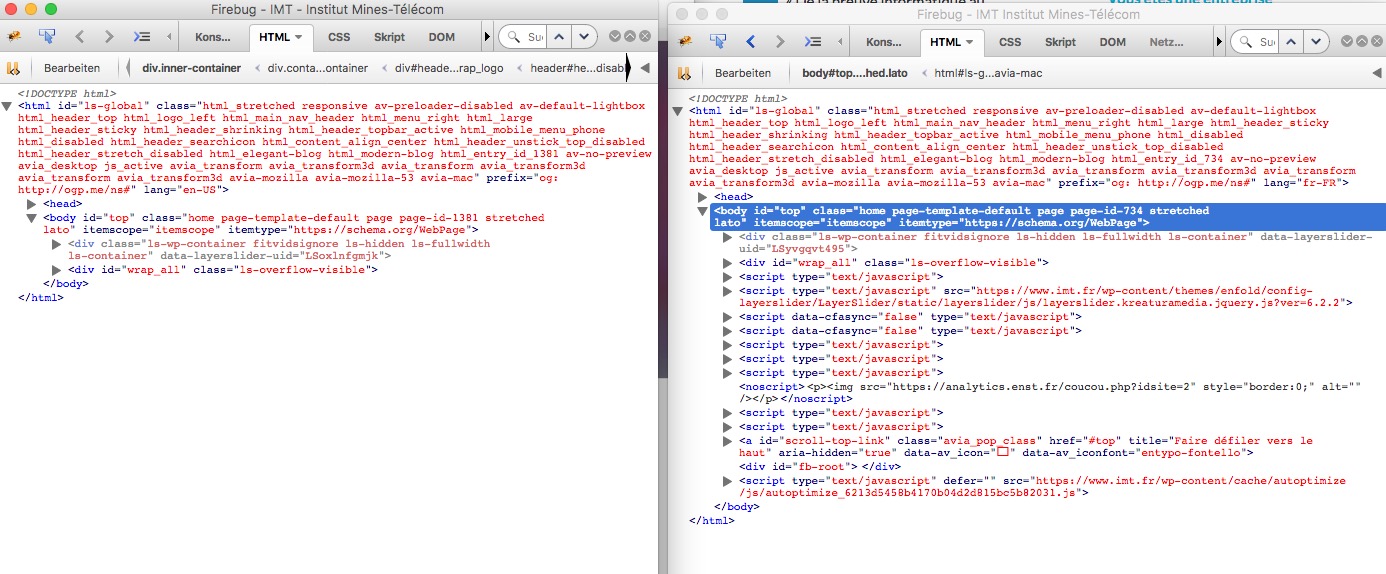
If you don’t like the grid-row element for the english translation – erase it via advanced layout builder (not via debug window)click to enlarge the firebug window of your source code:

you see on the right side the code you inserted. All strikethrough rules are overwritten by some other rules with more rights (more specific or other reasons. If you like to have it than set the rule to !important like:
.txtsh .av-special-heading-tag { font-family: "PT Sans","HelveticaNeue","Helvetica Neue",Helvetica,Arial,sans-serif; font-size: 17px !important; font-style: italic; font-weight: bold; line-height: 1.5em; margin-bottom: 8px; margin-top: 43px !important; padding-right: 6px !important; text-align: left !important; }-
This reply was modified 9 years ago by
it is because your custom class is one layer above the h3 so try to set the rules with:
.txtsh .av-special-heading-tag  {
here comes your code
}
somethings have to be set to !important
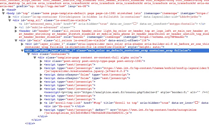
why are the scripts not before body tag closes on english version but they are in main container:
(by default they should be out of wrap-all container!click to enlarge:
Something like this could happen if you are in debug mode and try to edit or delete something within that debug code.
By dooing this there are a lot of possibilities to erase something incomplete ( closing tags etc.)yes that is true but we have to be a bit like Sherlock :lol
Lorsque vous avez éliminé l’impossible, ce qui reste, si improbable soit-il, est nécessairement la vérité.
Once you eliminate the impossible, whatever remains, no matter how improbable, must be the truth.
So my first view was : what is different –
second view : what could be the reason for differences between english and french version. (so a different cache status could be one reason)what is the thing with the scripts missing on english version? (look to the screenshot of source code)
1) And now i see you are using a caching tool (autoptimize codes are seen in css etc) are you shure to empty both cache?
2) And next difference is that your french site got a grid row element above the footer the english version not. Is that footer width different if you have on english Version too a grid-row element above the footer?
3) all your footer scripts are missing on english version now? !
-
This reply was modified 9 years ago by
well first of all – the whole Enfold Options Dialog has got his own settings for each flag on top.
Did you really have all your settings synchronized? f.e. you can have your own quick css for each language.By the way if i had to install a multilingual Site i allways do all the Settings for the main language after i’m happy with that – i export the theme settings file – switch the language on top of Enfold Options Dialog by choosing the other flags – and import the main language Theme-Settings file.
Wenn du nur einen bestimmten Slider ändern willst solltest du dem eine eigene Custom Class geben. how to Link
willst du generell bei allen fullscreen Slidern das ändern könntest du folgendes machen im quick css:
Es gibt da zwei Textvarianten – einmal der titel und einmal der Text darunter ( bie Buttons müssten wir nochmal genauer hinschauen).avia-fullscreen-slider .avia-caption-title { font-family: "Open Sans"; } .avia-fullscreen-slider .avia-caption-content { font-family: "Marck Script" }für die Button Schrift:
.avia-fullscreen-slider .avia-slideshow-button {
    font-family: Arial;
}
wobei dei Schriften auch im System aktiviert sein müssen.
Well that distance is extremly tight. the landscape mode comes with a width of 49.8% and the other modes with 24.9%
so for gap there are only 0.5% of width (on 1210px content width these are 6px
so on rounding errors there might be some inconsitences – if you like to have it a bit clearer (if there is a gap it is harder to see if +-1px is difference) try to set up:.av-masonry-entry { width: 24.8%; } .av-masonry-entry.av-landscape-img { width: 49.7%; }by the way on my mac and firefox there is that little gap – but if you like it precise first try to get same dimensions vor images.
The Sundhedshus and Nyt Plejehjem ved Vejle there is a height difference of nearly 90px
Best would be to have landscape double width of normal and portrait images – portrait images the double height of normal and landscape images.April 26, 2017 at 11:12 pm in reply to: Buttons auf gleicher Höhe in nebeneinander liegenden Layout-Elementen #783724die lösung oben ist die schwerere Variante mit Button im Center. Recht und links brauchst du dann nur right und left mit einem Wert festlegen
April 26, 2017 at 11:08 pm in reply to: Buttons auf gleicher Höhe in nebeneinander liegenden Layout-Elementen #783723ich würde die Buttons nicht in den Text mit einbauen, sondern als img alb element unter das Text Element.
Dadurch hast du die Möglichkeit das Image Element unabhängig vom Text zu positionieren.ich habe hier folgendes gemacht: 3 Columns, equal height, eine custom Class diesen Columns zuordnen (bei mir: column-mit-spezialbutton)
darunter ein Button Element und das absolut positionieren:https://webers-testseite.de/kokon/beispiel-seite/
oben das ist deine lösung – mit den Buttons innerhalb des Text-Elementes – das klappt nicht!.column-mit-spezialbutton .avia-button-wrap { bottom: 20px; left: 50%; position: absolute; transform: translate(-50%); } .column-mit-spezialbutton .avia_textblock { padding-bottom: 50px; }mti dem Abstand unterhalb des Textelementes musst du ein wenig spielen ob da 50px ausreichen.
it is hard to prove if conditonal mouse button is not usable
to get it into admin area is easy – i have to look where the strong comes from – than i can insert it via id : custom-logo-tag
add_filter('avf_option_page_data_init', 'custom_logo_tag', 10, 1); function custom_logo_tag($avia_elements){ $new_elements[] = array( "slug" => "avia", "name" => __("Tag for Logo-Container", 'avia_framework' ), "desc" => __("Select tag type for logo-container", 'avia_framework' ), "id" => "custom_logo_tag", "type" => "select", "std" => "span", "subtype" => array("H1"=>'h1',"H2"=>'h2', "div"=>'div', "span"=>'span', )); $avia_elements = array_merge( $avia_elements, $new_elements ); return $avia_elements; }thanks – can be closed
maybe this could help you (put in functions.php of your child-theme) :
function change_lightbox_size() {
    return "full";
}
add_filter('avf_avia_builder_helper_lightbox_size','change_lightbox_size', 10);
btw: this is only for single images – you need for the galleries the other rule too.
Did you have any caching tools installed (BWP Minify, Super Cache, W3TC etc ) ?
Try first to empty all cache and don’t forget the browser Cache.
Than we will see again.which one was on your experience slower ?
try to use better wordpress minify.
these are my standard settings:
# Deny from
<files wp-config.php>
order allow,deny
deny from all
</files>


# Directory Browsing
Options All -Indexes

# Keep-Alive
<ifModule mod_headers.c>
   Header set Connection keep-alive
</ifModule>

# Gzip
<IfModule mod_mime.c>
    AddType application/javascript          js
    AddType application/vnd.ms-fontobject   eot
    AddType application/x-font-ttf          ttf ttc
    AddType font/opentype                   otf
    AddType application/x-font-woff         woff
    AddType application/x-woff              woff
    AddType image/svg+xml                   svg svgz
    AddEncoding gzip                        svgz
</Ifmodule>

# GZip Kompression
<IfModule mod_gzip.c>
 mod_gzip_on       Yes
 mod_gzip_dechunk  Yes
 mod_gzip_item_include file      \.(html?|txt|css|js|svg|php|pl)$
 mod_gzip_item_include handler   ^cgi-script$
 mod_gzip_item_include mime      ^text/.*
 mod_gzip_item_include mime      ^application/x-javascript.*
 mod_gzip_item_exclude mime      ^image/.*
 mod_gzip_item_exclude rspheader ^Content-Encoding:.*gzip.*
</IfModule>


# Browsercache
<IfModule mod_expires.c>
 ExpiresActive On
 ExpiresDefault "access plus 1 month"
 ExpiresByType text/css "access plus 1 month"
 ExpiresByType text/javascript "access plus 1 month"
 ExpiresByType text/html "access plus 1 month"
 ExpiresByType application/javascript "access plus 1 month"
 ExpiresByType application/x-javascript "access plus 1 month"
 ExpiresByType application/x-font-ttf "access plus 1 month"
 ExpiresByType application/x-font-woff "access plus 1 month"
 ExpiresByType application/x-woff "access plus 1 month"
 ExpiresByType application/xhtml-xml "access plus 600 seconds"
 ExpiresByType image/gif "access plus 1 month"
 ExpiresByType image/jpeg "access plus 1 month"
 ExpiresByType image/svg+xml "access plus 1 year"
 ExpiresByType image/svg "access plus 1 year“
 ExpiresByType image/png "access plus 1 month"
 ExpiresByType image/x-icon "access plus 1 month"
</IfModule>


# Deflate by FileType
<IfModule mod_deflate.c>
 AddOutputFilterByType DEFLATE text/plain
 AddOutputFilterByType DEFLATE text/html
 AddOutputFilterByType DEFLATE text/xml
 AddOutputFilterByType DEFLATE text/css
 AddOutputFilterByType DEFLATE text/javascript
 AddOutputFilterByType DEFLATE image/svg+xml
 AddOutputFilterByType DEFLATE application/javascript
 AddOutputFilterByType DEFLATE application/xml
 AddOutputFilterByType DEFLATE application/xhtml+xml
 AddOutputFilterByType DEFLATE application/rss+xml
 AddOutputFilterByType DEFLATE application/atom_xml
 AddOutputFilterByType DEFLATE application/x-woff
 AddOutputFilterByType DEFLATE application/x-font-ttf
 AddOutputFilterByType DEFLATE application/x-font-woff
 AddOutputFilterByType DEFLATE application/javascript
 AddOutputFilterByType DEFLATE application/x-javascript
 AddOutputFilterByType DEFLATE application/x-shockwave-flash
</IfModule>

# ETag
Header unset ETag
FileETag None

<FilesMatch "\.(ttf|otf|woff)$">
<IfModule mod_headers.c>
Header set Access-Control-Allow-Origin "*"
</IfModule>
</FilesMatch>
be carefull not to overwrite the wordpress entries. between this :
# BEGIN WordPress# END WordPress
it has to do with that single dash – because the rule above is an inline rule – and on av_large or av_slim header this inline rule wasn’t set
I looked to it a bit deeper and the only thing in difference to the other megamenus is – that the columns got a real heading – and not a “-”
on menu there is the comment: (if you dont want to display a title just enter a single dash: “-” ) if there is a single dash than there is no span on top of the ul.sub-menu.
Look to my example what happens to a row if i set a heading . But the reason why this happens on that case “-” i don’t know
Edit: this rule fits on that case if a single dash is used:#top #header_main > .container, #top #header_main > .container .main_menu ul:first-child > li > a, #top #header_main #menu-item-shop .cart_dropdown_link { height: 120px; line-height: 120px; }maybe in the other case it is not the first-child but why does it work if header is not in custom pixel height value ?
-
This reply was modified 9 years ago by
-
This reply was modified 8 years, 12 months ago by
-
AuthorPosts