Forum Replies Created
-
AuthorPosts
-
read the post carefully- that script is adding a class to the #header
so you can play with the selector: #header.hide-header to do something with the header – see example page and the code listed there ;)f.e. (less complicated than a shift to top)
#header.hide-header, #header.hide-header + #main #sub_menu1 { opacity: 0; transition: opacity 2s ease; } #header:not(.hide-header), #header:not(.hide-header) + #main #sub_menu1 { transition: opacity 0.5s ease; }by this script inside your child-theme functions.php:
function hide_header(){
?>
<script>
(function($){
  'use strict';
  var c,
  currentScrollTop = 0,
  header = $('#header');
   $(window).scroll(function () {
      var a = $(window).scrollTop();
      var b = header.height();

      currentScrollTop = a;

      if (c < currentScrollTop && a > b  ) {
        header.addClass("hide-header");
      } else if (c > currentScrollTop && !(a <= b)) {
        header.removeClass("hide-header");
      }
      c = currentScrollTop;
  });
})(jQuery);
</script>
<?php
}
add_action('wp_footer', 'hide_header');
what does the script do: after a scrolldistance of the header height a class is added to the header : hide-header
it is up to you to neither the whole header goese to opacity: 0 or to set a translateY value etc.see: https://webers-testseite.de/bemodesign/
css values on that page depends on the given settings.it is working – and my snippet is working too. But i wouldn’t make that space between your navigation and the first section not by setting up a margin top/bottom on color section. This looks bad on responsive case.
you could have done this:#header_main_alternate { margin-bottom: 40px; }because header_main_alternate goes to display: none in responsive case – there will be no distance then between header and main.
By the way : nice to have a response on having success with the code ;)
no thanks is needed but just a success reportAre you shure that it is (breadcrumbs) not there? because on inserting that page to header – you had to adjust the padding-top of #main.
ok – then erase the given css code.
But for having the submenue sticky aswell there had to be hardcoded changes to enfold elements. This is not so easy as just css settings.but even 990px are not enought – your menue overlays the logo much earlier.
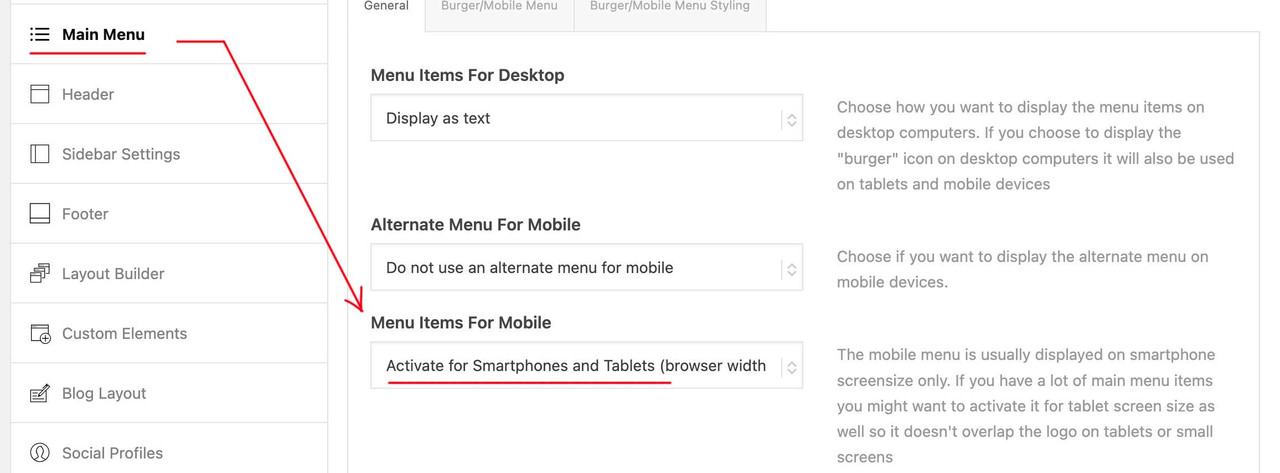
@media only screen and (max-width: 1080px) { #top #header .av-main-nav > li.menu-item:not(.menu-item-search-dropdown) { display: none!important; } #top #header .av-burger-menu-main { cursor: pointer; display: block!important; } }Do you only like to see the burger icon fixed – or do you like to have header too fixed on top?
by the way – if it is the page that belongs to your nick – it would be better to break at 990px to hamburger menu.
Then try this :
@media only screen and (max-width: 989px) { .responsive #top #wrap_all #header .container { width: 95%; max-width: 95%; } #header { position: fixed !important; height: 110px !important; max-height: 110px !important; } #top #header.av_header_transparency #header_meta { background-color: transparent; } #header_main { border-bottom: none; } .responsive #top .av-logo-container , .responsive #top .logo a, .responsive #top .logo img, .responsive #top .logo svg { height: 80px !important; max-height: 80px !important; line-height: 80px !important; } .responsive #top .av-main-nav .menu-item-avia-special a { height: 80px !important; line-height: 80px !important; } .responsive.html_mobile_menu_tablet #top #wrap_all .av_header_transparency { background-color: transparent !important; } #top .header_bg { background-color: transparent !important; } #top #header:not(.av_header_transparency) .header_bg { background-color: #edddc6 !important; } .responsive.html_mobile_menu_tablet #top .av_header_transparency .logo img.alternate, .responsive.html_mobile_menu_tablet #top .av_header_transparency .logo .subtext.avia-svg-logo-sub { display: block !important; } .responsive.html_mobile_menu_tablet #top .av_header_transparency.av_alternate_logo_active .logo a > img, .responsive.html_mobile_menu_tablet #top .av_header_transparency.av_alternate_logo_active .logo a > svg { opacity: 0; } /*** depends on your setting ***/ #top #header.av_header_transparency #header_meta .phone-info * { color: #FFF !important; } .html_mobile_menu_tablet .header_color #header.av_header_transparency div .av-hamburger-inner, .html_mobile_menu_tablet .header_color #header.av_header_transparency div .av-hamburger-inner::before, .html_mobile_menu_tablet .header_color #header.av_header_transparency div .av-hamburger-inner::after { background-color: #edddc6; } .html_mobile_menu_tablet .header_color #header.av_header_transparency .menu-item-search a:before { color: #FFF; } .responsive #top #main { padding-top: 110px !important; } .responsive #top #main .sticky_placeholder { height: 0px !important; } }give this a try:
@media only screen and (min-width: 990px) {
  .html_header_top.html_logo_center #top #header_main_alternate .main_menu {
    width: 100%
  }

  .html_header_top.html_logo_center #header_main_alternate .main_menu #avia-menu {
    display: flex !important;
    flex-flow: row nowrap;
    justify-content: space-evenly;
  }

  .html_header_top.html_logo_center #header_main_alternate .main_menu  .av-main-nav > li > a {
    padding: 0 !important;
    font-size: 19px !important;
  }
}
i guess you will set the header widget to display none on small screens
@media only screen and (max-width: 989px) {
  #header .widget {
    display: none;
  }
}
by the way: is it intentional that the container width is set to 1130px ?
Wie willst Du es haben: immer Bild zuerst – dann Text ?
In dem Fall müßtest du jetzt die Grid-Rows bearbeiten bei denen das Bild rechts ist.
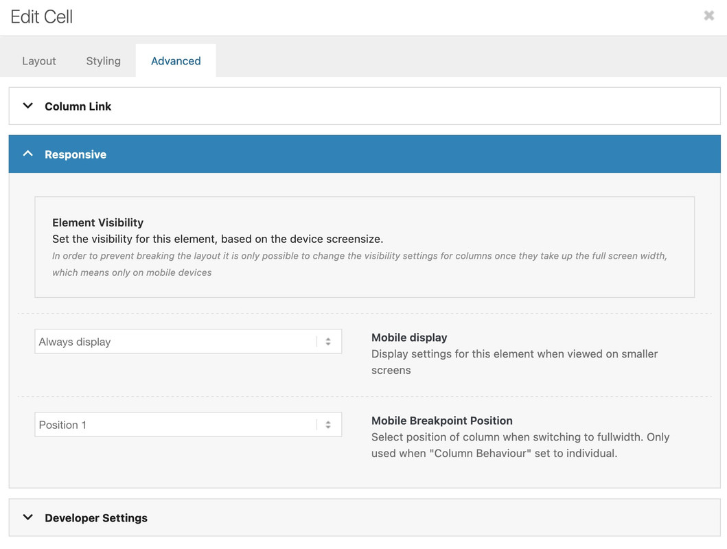
Die öffnest du im Editor, weiterhin dann die Zelle öffnen :

dort zu dem Advanced Tab und dort dann die Linke Zelle auf Position 2 und die Rechte Zelle auf Position 1 setzen.
Wenn du dort in den Zellen nur die Hintergrundbilder hast – entweder – wie schon geschehen einen min-height setzen.
ich bevorzuge in die Zellen einen Whitespace Separator zu ziehen. Wie du willst.December 27, 2024 at 5:58 pm in reply to: Change Search Icon to Search Field – only for expanded menu #1474305or just – activate the option in main menue to show search icon ( this is the one for ajax search )
and put this to your child-theme functions.php:
function add_search_to_main_menu($items, $args) {
    if ($args->theme_location == 'avia') {
        $search_form = '<li id="menu-item-search-desktop" class="menu-item av-medium-hide av-small-hide av-mini-hide" role="menuitem">' . get_search_form(false) . '</li>';
        $items .= $search_form;
    }
    return $items;
}
add_filter('wp_nav_menu_items', 'add_search_to_main_menu', 10, 2);
and this to quick css:
#avia-menu {
  display: flex;
  flex-flow: row nowrap;
  justify-content: space-between;
  align-items: center;
}
#top #searchform > div {
  position: relative;
  max-width: 220px;
  opacity: 1 !important;
  display: block !important;
}
/*=== synchronise it with your hamburger breakpoint ===*/
@media only screen and (min-width: 990px) {
  #menu-item-search {
    display: none;
  }
}
Advantage : Ajax Functionality is preserved for mobile case.
see: https://enfold.webers-webdesign.de/PS: after you have seen the demo page, I will remove it again, because it disturbs other demos on the site.
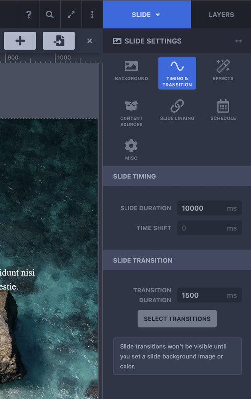
e.g. the one with left and right header layoutand you have found on top right the switch between Slide and Layers.
Go to Slide then navigate to Timing & Transition – and go to Slide Transitions – press Select Transitions – and choose the type you like to have.
You have to find these rules:
@media only screen and (min-width:768px) and (max-width:989px) {
  body,
  body .avia-tooltip {
    font-size:80px
  }
  h1 {
    font-size:60px
  }
  h2 {
    font-size:50px
  }
  h3 {
    font-size:42px
  }
}
@media only screen and (min-width:480px) and (max-width:767px) {
  body,
  body .avia-tooltip {
    font-size:66px
  }
  h1 {
    font-size:46px
  }
  h2 {
    font-size:37px
  }
  h3 {
    font-size:29px
  }
}
@media only screen and (max-width:479px) {
  body,
  body .avia-tooltip {
    font-size:53px
  }
  h1 {
    font-size:38px
  }
  h2 {
    font-size:28px
  }
  h3 {
    font-size:20px
  }
}
This is a very unusual scaling.
First of all, the value for the base (body) is set very high.
Even if you take the aspect of wai aria into account, a body font-size of 53 ( below 479px) is gigantic. For desktop screen widths, this is 13px.
Here I would rather go higher, e.g. to 16px.Because you have set a merging of the styles – i can not say where the rules comes from ( maybe it is a merging of W3total Cache ).
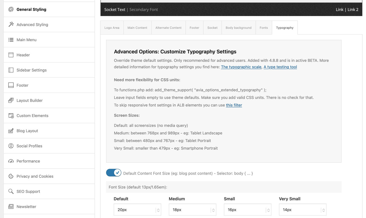
have a look if you have set on General Styling – Typography these values or in your quick css.

i’m participant as you are – so no private content for me. But now – seriously – now i’m out – first guest will arrive at 3pm
By the way – you can open svg files with good text editors. (Sublime Text on Mac – or Notepad++ on Windows)
That’s a first hint. I opened your logo in Illustrator and created meaningful groups. I then edited these in Sublime Text. Above all, I renamed the standard Illustrator group names (manually) and assigned IDs to the groups.But unfortunately I’ll have to put you off until after Christmas – from now on I’ll be in off-duty mode.
As I said, it’s always better for us who want to help to be able to analyze the page with the problems.by the way – this is as Rikard mentioned a color-section with 100% height :
https://webers-testseite.de/fullbackground/But surely you don’t want this background image to be compressed or stretched – you want to maintain the aspect ratio.
Enfold has it for a background image on: General Styling – Body Background.
If you have now selected a stretched layout, a pop-up will display a message: These options are only available if you select the ‘boxed’ or ‘framed’ layout. Your currently have a different layout selected.So this body background-image only makes sense if you use one of those ‘boxed’ or ‘framed’ layout.
If you got one background-image in that setting – set it to cover the page.There are possibilities to change that bg image on load by script.
__________
Mais vous ne voulez certainement pas que cette image d’arrière-plan soit comprimée ou étirée – vous voulez conserver le rapport hauteur/largeur.
Enfold l’a pour une image d’arrière-plan sur : Style général – Arrière-plan du body.
Si vous avez sélectionné une mise en page étirée, une fenêtre contextuelle affichera un message : Ces options ne sont disponibles que si vous avez sélectionné la mise en page « encadrée » ou « encadrante ». Vous avez actuellement sélectionné une mise en page différente.Cette image d’arrière-plan n’a donc de sens que si vous utilisez l’une de ces mises en page « boxed » ou « framed ».
Si vous disposez d’une image d’arrière-plan dans ces paramètres, réglez-la de manière à ce qu’elle couvre la page.Il est possible de modifier cette image de fond au chargement par script.
if this belongs to your belgium page – i can see the svg logo.
First – even if the text in your svg is a common font (helvetica) it might be better to convert those letters to path.try it with: https://webers-testseite.de/logo-top.zip
https://webers-testseite.de/logo-top.svg
by the way: you are not forced to have the logo inside that logo container – you can overlap the header area:
https://webers-testseite.de/overlapping-logo/December 24, 2024 at 3:45 am in reply to: Trying to create the same border and shadow on an image as on a button #1474211To give better advice, it is best to see the page. This also applies to the svg logo issue.
but you can use on those pages a custom shortcode for breadcrumb.
There is one for breadcrumb only on docu:function av_breadcrumbs_shortcode( $atts ) { return Avia_Breadcrumb_Trail()->get_trail( array( 'separator' => '/', 'richsnippet' => true ) ); } add_shortcode( 'av_breadcrumbs', 'av_breadcrumbs_shortcode' );
But if you like to have both – look further on that page: https://webers-testseite.de/breadcrumbs-shortcode/use an extra color-section (custom class with: breadcrumb-section) and styling background-color: alternate content.
i guess that page with no Title has a transparency header.
in functions-enfold.php there is:if( ! empty( $transparency ) ) { $header['header_title_bar'] = 'hidden_title_bar'; }December 23, 2024 at 4:14 am in reply to: Trying to create the same border and shadow on an image as on a button #1474158try to give an ID to the selector f.e.:
#top .blokje .avia-image-overlay-wrap a.avia_image {
  overflow: visible;
}
#top .blokje img.avia_image {
  border: 1px solid #005999;
  padding: 40px;
  box-shadow: 5px 5px 0px 0px #005999;
}
i placed here a different value so that you can clearly see that “shadow” will work – afterwards you can change back to your box-shadow.
and btw: https://kriesi.at/support/topic/changing-buttons-colors-to-gradient/#post-1473778
Try in your child-theme functions.php:
function custom_shrink_factor($shrink_factor){
  $shrink_factor = '95';
  return $shrink_factor;
}
add_filter('avf_header_shrink_factor', 'custom_shrink_factor');
because of avia-snippet-sticky-header.js :
const value = parseInt( shrink_factor );Inserting fractional numbers therefore makes no sense
or rather prevent their creation : Go to Blog Layout – Single Post Options – Disable Single Postnavigation

i contacted kreaturamedia – here is the answer:
Thank you for reaching out to us and for sharing your concerns about using LayerSlider with your current Content Security Policy (CSP) settings. We’re sorry to hear about the challenges you’ve encountered, and we truly understand your desire to implement stricter security measures on your website.
Unfortunately, for technical reasons, LayerSlider relies on inline scripts to function properly. This is a common practice in the WordPress ecosystem, as nearly all plugins, themes, and even WordPress itself make use of inline scripts. While limiting or disallowing inline scripts can offer certain security advantages, they serve an essential purpose, especially for dynamically generated content. Inline scripts are not inherently a security risk.
If you’re looking for a potential solution, you might consider using a third-party optimization plugin. These tools can consolidate and compress scripts, including inline scripts, into external files. This approach could help you achieve a balance between stricter CSP settings and maintaining the functionality of your website.
i asked them if it might be possible to include nonce to their inline scripts. Hope they will answer soon.
Even if it is possible – would it look nice inside a 30% width of a sidebar?
you can use that existing page-content alb shortcode. But using fullwidth elements inside that page will break your widget areaf.e. code:
[av_postcontent link='page,45527']December 20, 2024 at 5:18 pm in reply to: Use code tag for posting snippets … e.g. implementing google tag script #1474072This was intended for my dear colleagues (participants). Unfortunately, known errors are passed on again and again in this way. A code that is actually correct then becomes invalid.
It also makes the work of those who want to help more difficult. Tracking a code in the code tag is hard enough, but having to deal with whether all characters are correct …@ismael – maybe your snippet works with the add_attachment hook too? So to say on uploading new images.
Otherwise i found this snippet that creates title, alt and description by file name source:
(bring the first Letter of each work to uppercase (ucwords) – and removes the hyphens etc )function my_set_image_meta_upon_image_upload( $post_ID ) { // Check if uploaded file is an image, else do nothing if ( wp_attachment_is_image( $post_ID ) ) { $my_image_title = get_post( $post_ID )->post_title; // Sanitize the title: remove hyphens, underscores & extra spaces: $my_image_title = preg_replace( '%\s*[-_\s]+\s*%', ' ', $my_image_title ); // Sanitize the title: capitalize first letter of every word (other letters lower case): $my_image_title = ucwords( strtolower( $my_image_title ) ); // Create an array with the image meta (Title, Caption, Description) to be updated // Note: comment out the Excerpt/Caption or Content/Description lines if not needed $my_image_meta = array( 'ID' => $post_ID, // Specify the image (ID) to be updated 'post_title' => $my_image_title, // Set image Title to sanitized title 'post_excerpt' => $my_image_title, // Set image Caption (Excerpt) to sanitized title 'post_content' => $my_image_title, // Set image Description (Content) to sanitized title ); // Set the image Alt-Text update_post_meta( $post_ID, '_wp_attachment_image_alt', $my_image_title ); // Set the image meta (e.g. Title, Excerpt, Content) wp_update_post( $my_image_meta ); } } add_action( 'add_attachment', 'my_set_image_meta_upon_image_upload' );The mark on “Run as dry run” had to be unchecked if you like to change something to database. That was only a test run for checking if a color could be substituted this way.
by the way – i do not know if this extension does exist for other browsers – but you can install for Firefox this:
https://addons.mozilla.org/en-US/firefox/addon/content-security-policy-gen/
For Chrom Users: https://chromewebstore.google.com/detail/content-security-policy-c/ahlnecfloencbkpfnpljbojmjkfgnmdc?hl=en- Install the “Content Security Policy Gen” extension.
- Visit the website for which you want to generate CSP rules.
- Click on the extension icon in the browser toolbar to initiate the site scan.
The extension will scan the website and generate recommended CSP rules based on the resources present on the site.
Copy the generated CSP rules from the extension’s output.do not forget to add as last the upgrade-insecure-requests ( This is missing from the results )
The firefox seems to be a little bit more detailed. And does not add a report uri to the extension developer ;)Some features are deprecated – like block-all-mixed-content – just remove that. Do not this with upgrade-insecure-requests
without the
script-src 'unsafe-inline'the layerslider does not work – we should ask why
The biggest issue is that a number of plugins inject inline styles or scripts without nonces, which would require unsafe-inline. And that is sad!Do all images got Titles or Descriptions too? – and do they differ from Alt Text?
My question is that there might be a method to generate the alt text from one of the others. -
AuthorPosts


