Forum Replies Created
-
AuthorPosts
-
this: http://mmsmail.com/services/printing-services/large-format-printing/
edit : oh sorry that little small one
i can see this:
#top #wrap_all .main_color h1 {
    color: #666;
    font-family: Alice,"Helvetica Neue",Helvetica,Arial,sans-serif;
    font-size: 16px;
    font-weight: 400;
    text-transform: none;
}
and this is not what you want?
What is the thing you like to have? color, font-size, font-family, font-weight, letterspacing etc. ?-
This reply was modified 8 years, 10 months ago by
Guenni007.
hm looks as if it comes from the postslider.php.
im no pro – maybe a mod could help you here – (but isn’t it necessary to have a small separator here?)edit: no it seems to be something with woocommerce plugin and addon.
i try to install a demo shop and have a look laterBTW: what kind of alb is it ( content slider ?) and what blogstyle you use

-
This reply was modified 8 years, 10 months ago by
can you please offer a link to a page with h1 – the bold heading in the image is a pixel based image ! – no font
well i am not shure – if you are basing on a demo setup – if the settings of advanced styling are transfered to the other languages.
All other languages got the same font. Only your initial installed got the other one.
So have a look on your english version if there are entries in advanced layout settings.If so you can export them and by changing the language import this english settings to the other language (you have to do it for each lang.
get familiar with using developer tools – they give you the source code of your pages
the id of that page above is in your case: page-id-7111 so:.page-id-7111 .container .av-content-small.units { width: 70%; }what do you like to obtain?
Or what did you set and was ignored?-
This reply was modified 8 years, 10 months ago by
much easier to help with a real link. Impossible to help with only a screenshot
is it a secret link ? or can we take part of the solution?
May 31, 2017 at 8:51 am in reply to: contact form – how to restrict past dates in datepicker #801882and that little plugin comes with a settings option to choose the range of date and time which is possible
May 31, 2017 at 12:55 am in reply to: contact form – how to restrict past dates in datepicker #801732and btw: read here : link
May 31, 2017 at 12:14 am in reply to: contact form – how to restrict past dates in datepicker #801718there is a CF7 Datepicker addon ! Link
to get the submit button a bit bigger will be easy
.wpcf7-form-control.wpcf7-submit {
    font-size: 14px;
    padding: 16px 50px;
}
cf7 has its own field for the submit settings change it to:
[submit "Submit"]looks a bit different – but very nearby: https://webers-testseite.de/kokon/contact-form/
-
This reply was modified 8 years, 10 months ago by
May 29, 2017 at 8:45 pm in reply to: contact form – how to restrict past dates in datepicker #801242ok – but think of that on update these entries are lost
my entries here on functions.php of child-theme do not fade away ;)btw. please show me the link – i’m a participant as you but i often find a way to solve problems
May 29, 2017 at 6:39 pm in reply to: contact form – how to restrict past dates in datepicker #801187hm has anything changed on the form element ?
on an installation not so old: https://webers-testseite.de/kokon/flexbox/ it works like a charmEdit: it works after updating the kokon installation all works – so the other installation is corrupt.
-
This reply was modified 8 years, 10 months ago by
May 29, 2017 at 6:19 pm in reply to: contact form – how to restrict past dates in datepicker #801180Try this in functions.php of your child theme: https://kriesi.at/support/topic/datepicker-only-allow-dates-in-the-future/#post-774083
function my_datepicker_defaults() {
?>
 <script type="text/javascript">
	jQuery(document).ready(function(){
		jQuery.datepicker.setDefaults({
		minDate: 0,
		maxDate: "+12m"
       		});
  	});
 </script>
<?php
}
add_action('wp_footer', 'my_datepicker_defaults', 20);
minDate: 0 means only future Dates are possible.
maxDate: +12m means only 12 month are available to choose from today.
Rest of explanation read on the link above (a bit brainstorming)-
This reply was modified 8 years, 10 months ago by
i don’t know exactly those plugins but sometimes they will work only if a jpg / png is placed in the theme settings. f.e. if your logo is set to abc.jpg in Enfold dialog – those settings will replace it if there is a jpg called (Email address hidden if logged out) .
so your work will be to have an jpg and another one with 4times (double width and heights) resolution and fit in that nomenclatura.
Don’t know if the plugin will make it for you f.e. uploading an image with 4times resolution – name it with (Email address hidden if logged out) and create a xyz.jpg .-
This reply was modified 8 years, 10 months ago by
May 18, 2017 at 6:58 pm in reply to: Overlap background image of one color section over another color section #796090Your always wellcome
BTW : it is allways the same css code.
Only the image is changing
If you have that often – you can use that little button on every alb element – “save element as template” than the custom class and all the settings are inserted – you only have to replace the image inside. your grey curved thing could be done the same way – see my testpage.-
This reply was modified 8 years, 10 months ago by
May 18, 2017 at 3:48 pm in reply to: Overlap background image of one color section over another color section #795959only one thing has to come now on my part: on responsive case there is a shift – a little distance i have to find – so just wait a while.
Edit : no it was my fault i set up for the white curve image on the alb image-alignment : center there has to be no special alignment
-
This reply was modified 8 years, 10 months ago by
May 18, 2017 at 3:37 pm in reply to: Overlap background image of one color section over another color section #795949my layout on your problem would be:
click to enlarge:
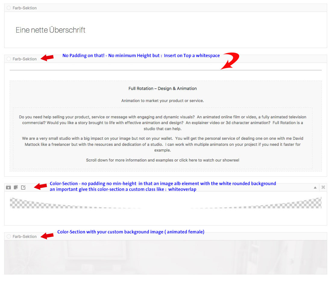
i made out of your dark-grey-curved-base-shape.png a white one and this is in that little colorsection in between as an image!
the rest is :
div.whiteoverlap {
    border-top: medium none;
    height: 0;
    min-height: 0;
    overflow: visible;
}

.whiteoverlap .container {
    margin: 0;
    max-width: 100% !important;
    padding: 0;
    width: 100%;
}

.whiteoverlap .content {
    padding: 0;
}

.whiteoverlap img {
    width: 100vw;
}
Result see here: https://webers-testseite.de/kokon/full-rotation-problem/
May 16, 2017 at 9:47 am in reply to: Color Section – Video Playback – how to make white background/bars ? #793775the loading.gif in images is a bit too small. Go on google search link and upload your own one via ftp to your server
The css you need is above because you set the white background with it: something like this f.e
#top .av-video-slide .avia-slide-wrap { background: #fff url("/wp-content/uploads/loading.gif") no-repeat scroll center center; }as a paritcipant as you – i can not see the link in private content field (if there are some). It would be nice to have one to help.
May 15, 2017 at 5:52 pm in reply to: Color Section – Video Playback – how to make white background/bars ? #793440if you don’t get it – nice tool (on Mac too) i can transform it for you (or download it now on my test page)
May 15, 2017 at 4:00 pm in reply to: Color Section – Video Playback – how to make white background/bars ? #793389what kind of video tool do you use?
i just downloaded yours and croped it by a littel Program called Xilisoft Video Converter.May 15, 2017 at 3:44 pm in reply to: Color Section – Video Playback – how to make white background/bars ? #793376no : borders are definitly on the video – see here your example from thread before (after you have seen it i will erase it)
https://webers-testseite.de/kokon/videobackground-on-slider/-
This reply was modified 8 years, 10 months ago by
May 15, 2017 at 3:19 pm in reply to: Color Section – Video Playback – how to make white background/bars ? #793361they are definitly on video – so cropping will be the fastest way – its only 50mb
and maybe it is nice to have the border on bottom not visible:
.page-id-3098 #after_section_1 { border-top: none; }-
This reply was modified 8 years, 10 months ago by
May 15, 2017 at 3:02 pm in reply to: Color Section – Video Playback – how to make white background/bars ? #793351and by the way you can shorten your url of background-image to :
https://colwayinternational.online/wp-content/themes/enfold/images/layout/preload-dark-grey-big.gif-
This reply was modified 8 years, 10 months ago by
or do a bit experimenting on that: https://kriesi.at/support/topic/info-grid-row-and-columns/
but you are familiar with Enfold Options Dialog?
Goto Dashboard – Enfold (Enfold-Child) – General Styling – Quick CSS on the bottom of the window : put in that input field:#after_layer_slider_1.container_wrap { border-top-style: none; border-top-width: 0 !important; }a screenshot is not enough to help you – a real link is best.
If you don’t want to make it public – bring it to private content of the thread you wrote. But then you have to wait til mods are hereby the way – what font is it? – you can use font-squirells webfont generator to get it into a webfont – and i think that will make it a bit easier to embed.
man kann bei poedit das so einstellen, das automatisch eine mo beim speichern der po datei mit erstellt wird.
-
This reply was modified 8 years, 10 months ago by
-
AuthorPosts