Forum Replies Created
-
AuthorPosts
-
in this case I would give you the advice to use instead Contact Form 7 with datepicker addon
They have a lot of presettings which comes to your wishes.looks this way – guess if the language is english it will show am or pm
April 18, 2018 at 5:39 pm in reply to: Getting rid of Enfold by Kriesi in footer copyright area #943687see here: https://kriesi.at/documentation/enfold/change-the-footer-text-and-link/
add to your footer
[nolink]______________________
just for info:
you can redefine the backlink via functions.php of your child theme
function new_nolink(){ $kriesi_at_backlink = "<a href='https://custom-link'>Custom Backlink</a>"; return $kriesi_at_backlink; } add_filter("kriesi_backlink","new_nolink");The code you have above ( and as i said erase the plus sign like in my code) is only to have on enfold options the possibility to set for body and for content text the font. The font added through this code can be found at the bottom of the list ( not sorted in alphabetical order )
Only if you set the code there the font will be activated.If you do not want to use the setting there – only to use with css and activated do this to functions.php of your child-theme:
(here the plus must be set as given from google font itself)add_action('wp_head', function() { ?> <link href="https://fonts.googleapis.com/css?family=Open+Sans:300,400,600,700,800&subset=latin-ext" rel="stylesheet"> <?php });what php code is it ? form a plugin …
there are a lot of hooks implemented in enfold – sounds like the
ava_after_content will do the job and for including it only in portfolio pages an if clause likeif( is_singular('portfolio') ) { …. will make itSo for your pages you only have to edit the gradient – the image on top is the same
here is a nice gradient creator online: http://www.cssportal.com/css-gradient-generator/
you only need two definitions the webkit and the normal one ( they are enough for all modern browsers)if you have that background more than once – maybe you give it better a custom class
let it shortly open :
you can give a container more than one background-imageyou can have here a look to what is possible ( it works with color-section too) : https://webers-testseite.de/multiple-background-images/
so you can do it via css to have the whole color-section a gradient and on top ( no-repeat) your 5-colored small line ( without the violett on the bottom) and set this image to contain !

I will give you a demonstration: https://webers-testseite.de/multiple-background-images/
on the bottom there is your color-section – if you shrink the window size you see that the small image with the colored fields is responsive and not cut of all color fields are seen !
the gradient is the other thing as described in the test page.
code for that colorsection (got id = confiance)#confiance { background-image: url(/wp-content/uploads/bandeau_1920.jpg ) , -webkit-linear-gradient(left, rgb(88,87,90) 0%, rgb(110,99,140) 100%); !important; background-image: url(/wp-content/uploads/bandeau_1920.jpg ) , linear-gradient(to right, rgb(88,87,90) 0%, rgb(110,99,140) 100%) !important; background-repeat: no-repeat; background-position: left top, center center; background-size: contain, cover ; }or even better to have for that image a width of 100% and a static height:
#confiance {
    background-image: url(/wp-content/uploads/bandeau_1920.jpg ) , -webkit-linear-gradient(left, rgb(88,87,90) 0%, rgb(110,99,140) 100%);
    background-image: url(/wp-content/uploads/bandeau_1920.jpg ) , linear-gradient(to right, rgb(88,87,90) 0%, rgb(110,99,140) 100%) !important;
    background-repeat: no-repeat;
    background-position: left top, center center;
    background-size: 100% 20px, cover;
}
April 18, 2018 at 10:33 am in reply to: How to remove the search icon from the menu on mobile devices only? #943522no that is not correct – the last entry of such a css code need no semicolon at all.
A lot of minimizer tools do that on default – the semicolon only separtes the attributes against each other. So the last one does not need it – but:A lot of people will do it out of habbit – and so you do not accidentally forget it when adding lines.
hm i do translate the pages / post the same way. i check duplicate and then change text and maybe images etc.
And that causes the lost of f.e colorsection background-colors ? or other style settings on that page –
On copy the content i thought that this was transformed too.By the way – i’m astonished that this construct does not influence sidebar behavior !
On default every color-section ( or tab-section) caused the sidebar to go down those segments !
but as you can see on my testpage : https://webers-testseite.de/weber/entry-with-audio/
this inserted color-section is under the sidebar !the thing is that my code implements allready the color section characteristics and settings with the container following
so only do the content of that color section in itbecause if you have this structure without surrounding containers :
add_action('ava_before_footer', function() {
	echo do_shortcode("
	   here the shortcode from debug mode including the surrounding color-section
	");
});
that does not work
you have to only do the content in it – you can use container elements like 1/2 etc:
so to get your insertion shortcode create a new page with your layout you like to have in that section – but without color-section:
click to enlarge:
this code comes to :
add_action('ava_before_footer', function() {
	echo '<div id="last-section" class="avia-section main_color special-one"><div class="container">';
	echo do_shortcode("
		 here comes only the shortcode of the content of that colorsection in it
	");
	echo '</div></div>';
});
PS the background-color has to be set via the id : last-section or the class: special-one
That it does not work with colorsection on that simpler code with no surroundigs has to do with their settings in it:
i think all alb elements that have this in their config:function shortcode_insert_button() { $this->config['type'] = 'layout'; $this->config['self_closing'] = 'no';color-sections and tab-sections are not self-closing containers !
a grid-row f.e. will work with that code – and will not break the footer:add_action('ava_before_footer', function() { echo do_shortcode(" here the shortcode from debug mode including the surrounding color-section "); });see results on : https://webers-testseite.de/weber/
One thing first to mention – please use on this board the code tag for code elements!
i want to test it now with your edited code – but i have to tranfer all exclamation marks back to code quotes that work.So more to com – if I have done that …
well i think if you gave to the surrounding container of that video the class: noLightbox
will do the job. But be carefull this is casesensitiv !April 17, 2018 at 3:02 pm in reply to: "If" conditional not working on google event tracker function #943131well if you only have one page get rid of array. – and btw. i think there is one round bracket missing
if(is_page(array(23))){
but try
if(is_page(23)){
April 17, 2018 at 2:58 pm in reply to: How to remove the search icon from the menu on mobile devices only? #943130Dear Bakbek – i’m a Participant as you – i can help if i can see f.e. a testpage or a link.
If your website has to be secret for the public here, then you only have to wait for a mod.
For me it only works with the left: 50% rule – but i do not see your setup.by the way – think of performance!
and if your are satisfied with only that font – maybe it is a good idea to load it localy from your servers !
https://www.smashingmagazine.com/2014/09/improving-smashing-magazine-performance-case-study/
Smashing Magazine did notice up to 700ms pagespeed on loading fonts localy!
Here is a liitle workaround with a small plugin to load google fonts local.:
https://kriesi.at/support/topic/disable-google-font-loading-via-google/
( maybe this is better for DSGVO – GDPR too ) no google servers at all in that case.and by the way – try it without that plus sign between font name:
(you don’t need the italic fonts ?)add_filter( 'avf_google_heading_font', 'avia_add_heading_font'); function avia_add_heading_font($fonts) { $fonts['Open Sans'] = 'Open Sans:300,400,600,700,800&subset=latin-ext'; return $fonts; } add_filter( 'avf_google_content_font', 'avia_add_content_font'); function avia_add_content_font($fonts) { $fonts['Open Sans'] = 'Open Sans:300,400,600,700,800&subset=latin-ext'; return $fonts; }April 17, 2018 at 1:41 pm in reply to: Automatically add current year to copyright in socket #943093do this to functions.php of your child-theme:
function year_shortcode() {
  $year = date('Y');
  return $year;
}
add_shortcode('year', 'year_shortcode');
after that you can input in the footer copyright field:
© Copyright - [year] - Company Name [nolink]April 17, 2018 at 1:35 pm in reply to: How to remove the search icon from the menu on mobile devices only? #943089mobile devices will have on html the class: avia_mobile
so you can try this:.avia_mobile #menu-item-search { display: none !important; }-
This reply was modified 8 years ago by
Guenni007.
ah – one thing to mention is : because of the inserted top container there is the scroll offset wrong on mobiles:
this will correct it for you:
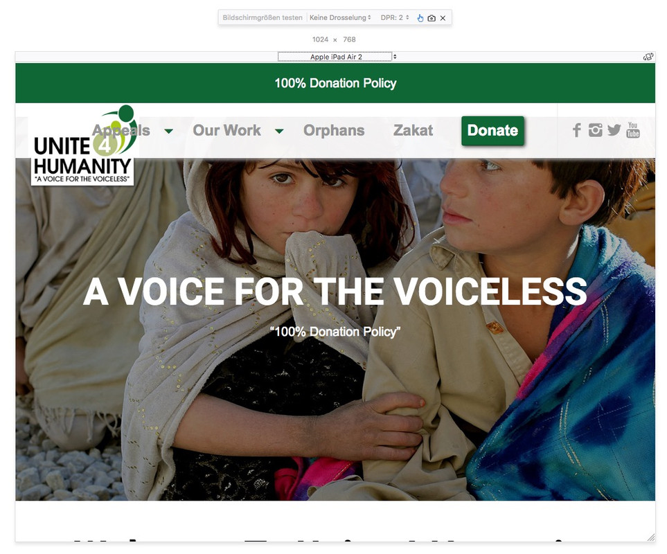
.html_header_top.html_header_sticky.avia_mobile #main { padding-top: 130px; }i do not see the english version of firefox yet – just a moment:
try: alt cmd M – it is in Extras / Web Developer /
on firefox there is a nice tool to view screen width and devices : so you see yourself that the css code is important for ipad 2 etc on landscape view:
click to enlarge
i wrote it in the topic above:
take the new code:
add_action('ava_main_header', function() {
if(wp_is_mobile()){
  echo '<div id="button-on-top">';
  echo do_shortcode("[av_button_big label='100% Donation Policy' description_pos='below' link='manually,https://mydonate.bt.com/events/unite4humanity/461708' link_target='_blank' icon_select='no' icon='ue800' font='entypo-fontello' custom_font='#ffffff' color='custom' custom_bg='#b02b2c' color_hover='custom' custom_bg_hover='#106736' custom_class='' admin_preview_bg=''][/av_button_big]");
  echo '</div>';
}
});
and to have not the donate button on menu ( for those mobiles with bigger screen sizes as 768/990px : ipad, ipad2 etc on landscape view) put this in quick css:
.avia_mobile #menu-item-668 { display: none; }just change code from above – because there is the wp_is_mobile check addition
don’t forget the css in quick css:
#top #button-on-top  .avia-button-fullwidth {
    padding: 20px 0px;
}
#button-on-top .avia_iconbox_title {
    font-size: 20px !important;
}
and :
add_action('ava_main_header', function() {
if(wp_is_mobile()){
  echo '<div id="button-on-top">';
  echo do_shortcode("[av_button_big label='100% Donation Policy' description_pos='below' link='manually,https://mydonate.bt.com/events/unite4humanity/461708' link_target='_blank' icon_select='no' icon='ue800' font='entypo-fontello' custom_font='#ffffff' color='custom' custom_bg='#b02b2c' color_hover='custom' custom_bg_hover='#106736' custom_class='' admin_preview_bg=''][/av_button_big]");
  echo '</div>';
}
});
you see the label= that is the text in the button
you see that in the code are custom_bg color and color_hover (hex-codes) so you can change yourself.and if this fits for you – it makes no sense that you have on mobile this donate menu button:
.avia_mobile #menu-item-668 { display: none; }isn’t it what you got ! before ???
this is under the header ( i changed the div to have an id too)
add_action('ava_after_main_title', function() { echo '<div id="button-on-top">'; echo do_shortcode("[av_button_big label='Donate' description_pos='below' link='manually,https://mydonate.bt.com/events/unite4humanity/461708' link_target='_blank' icon_select='no' icon='ue800' font='entypo-fontello' custom_font='#ffffff' color='custom' custom_bg='#b02b2c' color_hover='custom' custom_bg_hover='#106736' custom_class='' admin_preview_bg=''][/av_button_big]"); echo '</div>'; });can you please insert this into functions.php of your child-theme:
add_action('ava_main_header', function() {
  echo '<div class="button-on-top">';
  echo do_shortcode("[av_button_big label='Donate' description_pos='below' link='manually,https://mydonate.bt.com/events/unite4humanity/461708' link_target='_blank' icon_select='no' icon='ue800' font='entypo-fontello' custom_font='#ffffff' color='custom' custom_bg='#b02b2c' color_hover='custom' custom_bg_hover='#106736' custom_class='' admin_preview_bg=''][/av_button_big]");
  echo '</div>';
});
and this to quick css
#top .av-fullscreen-button .avia-button-fullwidth {
    border-radius: 0;
    padding: 30px 0px;
}
maybe this looks better even on desktop if it is on top
i do alway add the same thing as options behind the embed code – and that is very simple –
and we can insert a shortcode nearly whereever we wanti recognized this as the nice demo was new : https://kriesi.at/themes/enfold-visual-artist/
the only thing to accomplish on this was for me to have background scrolls.
See here my workaround – it is a bit complex – yes but at least to see the pictures and not just the background color that was a workaround.
First ( i described it at that page – i thought i set it via jQuery to background-attachement scroll – but this way does not work.)See the story here: https://kriesi.at/support/topic/playing-with-new-demos/#post-871865
and my visual artist settings here: https://webers-testseite.de/elegant/
by the way this was an experimental site with a lot of clip-path testings.If you can life with a background image scroll effect – this will be the simple way to have images on ipad in the background
it is allway a trouble with fixed positioning-
This reply was modified 8 years ago by
April 16, 2018 at 8:34 pm in reply to: How to overlap the logo over the bottom of the header on mobile #942748well as a participant as you are i do not see the private content – but it comes from the media query rule :
@media only screen and (max-width: 767px) {
.responsive #top .logo {
    display: table;
}
}
try to set this in quick css ( guess an !important is necessary )
@media only screen and (max-width: 767px) {
.responsive #top .logo {
    display: block;
}
}
you can see here a testpage: https://webers-testseite.de/cynthia/unite4-2/
this rule comes from shortcodes.css – but if you want only influence f.e. iconboxes with top icon we have to be more specific:
.iconbox .iconbox_content .iconbox_content_title {
    text-transform: none !important;
}
otherwise f.e. if you like only to have that for icon on top:
.iconbox.iconbox_top .iconbox_content .iconbox_content_title {
    text-transform: none !important;
}
try first without important ( this should always be an exception) – but sometimes it is necessary
Postscriptum: are you chemistry ? is it a buckminsterfullerene?
-
This reply was modified 8 years ago by
-
AuthorPosts