Forum Replies Created
-
AuthorPosts
-
this is inside the zip file downloaded from Google:
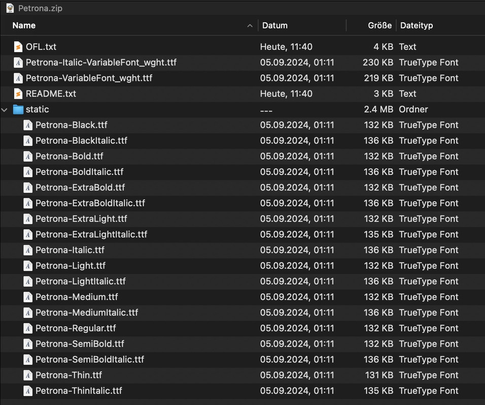
so you see the variable fonts – and inside the static folder the other fonts.
Enfold can handle both – but you had to upload them separately. So unzip that file – the varible fonts put in a Folder f.e. Petrona-variable and pull out that zip file the static folder and rename it to Petrona
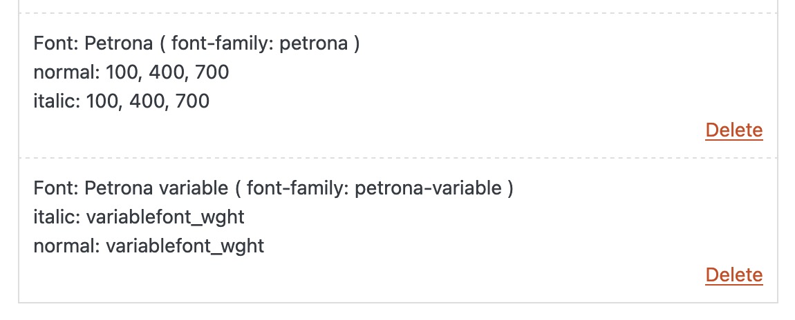
zip these two folders ( on Mac do not include Mac Meta data ). Now these zip files are ready to upload. Make a decision what you like to use.For testing purpose – if you only need 100,400,700 download: Link
and here is the variable font: LinkFirst test only the static fonts. Normal users rarely know how to use a variable font ;)
Enfold font manager:
Choose your font then in General Styling – Fonts – at the end of the list there are the uploaded fonts
all modern-quote headings (from enfold heading element) are set to font-weight 300 on default. You can insert this to have bold :
#top .modern-quote .av-special-heading-tag {
  font-weight: 700;
}
your headings inside text-block are handled different – so they are bold.
the above problem may have nothing to do with this, but you are aware that the downloaded Petrona.zip contains both static and variable fonts.
Google Petrona is one such variable font. The zip file you download from Google contains the variable font files and the static font files in a subfolder. Enfold also supports the use of variable fonts – but you need to upload them separately.
Now you has to decide if you like to use both – and the static font files as fallback solution ( that needs some additional conditional querries ) – or to use one kind of font file.
The static fonts contain a large number of styles (from 100 to 900 – regular and italic); you may want to make a selection here.
can you post the link (of your page) or to the law demo page based on your page attempt?
That pic in your 2/3 column is placed as background-image or as an image element?
In general, if an image is to respond to screen width and completely fill the surrounding container, the container height must match the image’s aspect ratio.
Ja, mit deiner Schrift hat die Umstellung jetzt funktioniert.
behalte deine als Lizenznachweis für Dich.
I don’t know if your company has to comply with the GDPR; I would prefer the self-hosted fonts option. Not least because then I can be sure that I am using woff2 fonts (no idea if it is not just ttf via Google). woff2 can be used in all common modern browsers and is much smaller in data volume due to Brotli compression.
If your question only belongs to the heading element, the DOM structure is as shown in the image above. And the CSS ruleset will then work as described above.
Can I see the page in question? – and that heading you like to have as Sacramento Font.
PS : du hast jetzt die container weite auf maximal 1000px gestellt ?
Na das hat sich dann ja richtig gelohnt, für die 10px unterschied das Menü zu stylen ;) bis (990px ) bis der Hamburger greift___________
PS : you have now set the container width to a maximum of 1000px ?
Well, that was really worth it to style the menu for the 10px difference up to (990px ) until the hamburger takes over ;)Change means not add !
you placed it on top of the quick css.but my settings are after your (top) insertion so the code is overwritten by mine.
i changed that code as mentioned.if you enlarge the logo (as mentioned on the other post ) you had to correct the padding-top of #main ( for that screen-width)
#top .header_color .av-hamburger-inner,
#top .header_color .av-hamburger-inner::before,
#top .header_color .av-hamburger-inner::after {
  background-color: #000;
}
so change the css rules for that too:
@media only screen and (max-width: 989px) { .responsive.html_header_top #top #main { /* padding-top: 320px !important; */ padding-top: 400px !important; } } @media only screen and (min-width: 768px) and (max-width: 989px) { .responsive.html_mobile_menu_tablet.html_header_top #top #main { /* padding-top: 320px !important; */ padding-top: 420px !important; } }With my first question, I just wanted to make sure that the font also works with your method. So you used the Enfold support for Google Fonts (something we should actually avoid in Europe because of GDPR requirements) and activated the font that way.
The second question is about whether you can avoid using the custom class if these headings could have something in common. For example, that you want to have all blog post titles with this font.Now – make shure that the custom class input field is filled without that dot for classes. On the heading element this custom class goes (as mentioned already) to the parent of the h tag. So the code will work for all heading tags (h1, h2 etc. ) with:
#top .av-special-heading.extralargedisplayfont .av-special-heading-tag {
  font-family: 'sacramento';
}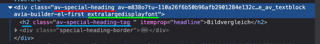
Zunächst sieh es dir jetzt nach meinen Veränderungen an den Headerbereich betreffend.
Aber du hebelst ja selbst mittels der “Engführung” des menu-items 96 die Gleichmäßigkeit aus:
#menu-item-96 a .avia-menu-text {
  line-height: 18px;
}
die Äquidistanz ist ja da wenn du die Einstellungen zurücknimmst.
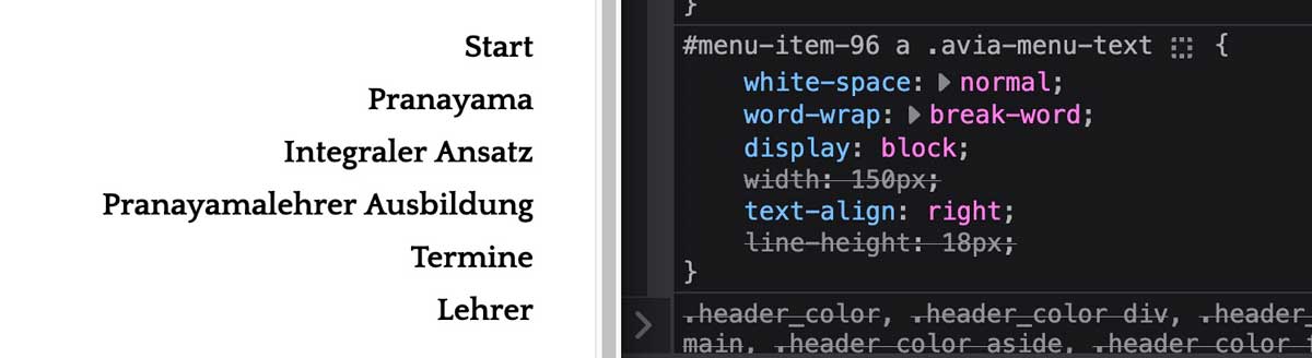
man könnte es erzwingen … indem du die fehlenden 9px / jetzt 5px ( der line-height – jetzt 20px ) oben und unten dazu gibst:
#menu-item-96 a .avia-menu-text {
  white-space: normal;
  word-wrap: break-word;
  display: block;
  width: 150px;
  text-align: right;
  line-height: 20px;
  padding: 5px 0;
}
Also allgemein line-height 30px – hier dann diesem Menüpunkt die 20px + 2x5px open /unten
PS: ich habe es mal reingesetzt. Dann siehst Du wie es sich verhält.
March 10, 2025 at 9:05 am in reply to: Enfold is somehow overriding Essential Grid’s lightbox #1479006But that is no Enfold Element – did you switch off the Enfold Lightbox Option?
It seems to be that – your lightbox Plugin comes into trouble with “infinite scroll” loaded images. the first one are opening in lightbox – but the delayed loaded images have sometimes that problem.Du könntest nun durch Ändern dieser Regelsatzes noch nach Bedarf die Logo Größe ändern:
(jeweils dann auch für die media-queries anpassen – momentan ist es auf 200px eingestellt)#header .inner-container .logo a, #header .inner-container .logo img { height: 240px !important; max-height: 240px !important; width: auto; }durch Ändern der Einstellung auf start werden die grid-items ( widget, logo, nav) dann oben bündig angeordnet:
(momentan steht align-self auf center – bedeutet die vertikale Zentrierung)#header .inner-container > * { align-self: start; width: auto !important; position: relative; }if you like – please send me your login data for that site via e-mail.
All data you can get via Profile linkas a participant i do not see your private content messages – but do you use WPML?
WPML does handle your language Settings even for those enfold options.
you got on top your lang flags :
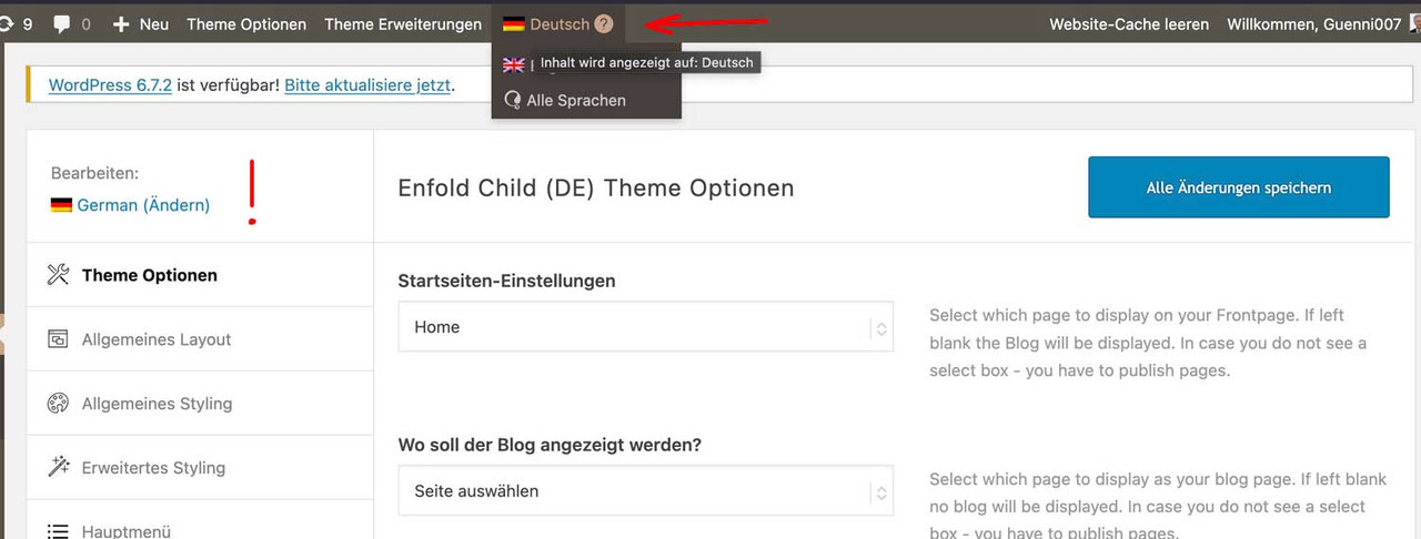
so if you like to have the same look – you had to synchronise these settings for each language.
read here https://kriesi.at/support/topic/implementing-the-same-theme-setting-to-all-languages-using-enfoldwpml/My advice: first style the page completely in your native language, then go via the theme settings. ( see link above)
First: how did you embed/activate that Sacramento Font to Enfold?
Next: what is common to those headings that should use the Sacramento Font? (maybe there is something we can use as selector)_______
If there is no commonality for these headings, you will need to do this manually.You should give a custom class to those heading elements. (f.e. sacramento – why not?)
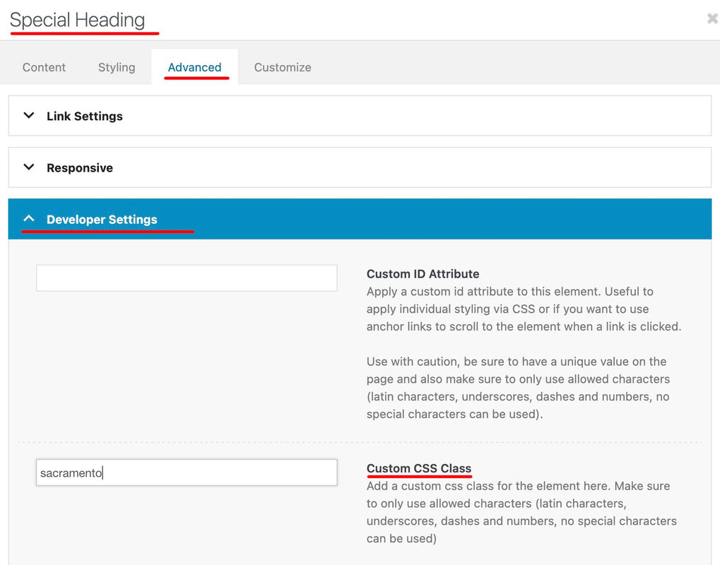
then you will have that custom class at the parent of your h-tags (av-special-heading-tag)
#top .av-special-heading.sacramento .av-special-heading-tag {
  font-family: 'sacramento';
  font-weight: 700
}
It may be necessary to force the font family by adding !important to this declaration.
ich habe dir jetzt zwei wege aufgezeigt.
zum Einen könntest du mit dem bisher erreichten ja den Code von Link mal einsetzen.Dann sieht die seite so aus:

zum Anderen – und ja klar wäre das ein Neuansatz – die Lösung über das Grid Layout.
Dazu wäre dann nötig den bisherigen Code zu entfernen, und den neuen Ansatz auszuprobieren.if you like to use a different font then it is better to use the image id
function avia_replace_default_icons($icons){
	$icons['svg__search'] =  array( 'font' =>'svg_wp-media-library', 'icon' => '40720');
		return $icons;
	}
add_filter('avf_default_icons','avia_replace_default_icons', 10, 1);
that above is an example with the new “font” of uploaded svg files to media-library
https://kriesi.at/support/topic/how-to-replace-standard-icons/
Advantage use media library multicolor svgs too.you can use on $sub html tags . f.e.:
function kriesi_logo_addition($sub)
{
  $sub .= "<span class='logo-title'>";
  $sub .= get_bloginfo( 'name', 'display' );
  $sub .= "</span>";
  $sub .= "<span class='logo-title logo-subtitle'>";
  $sub .= get_bloginfo( 'description', 'display' );
  $sub .= "</span>";
  return $sub;
}
add_filter('avf_logo_subtext', 'kriesi_logo_addition');
and if you can insert classes that way – you can have here alt and title too.
btw:
The required alt attribute specifies an alternate text for an image, if the image cannot be displayed.
The alt attribute provides alternative information for an image if a user for some reason cannot view it (because of slow connection, an error in the src attribute, or if the user uses a screen reader).
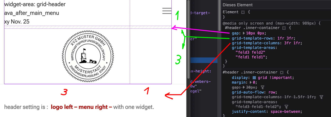
ich glaube nicht, das es mit einem shrinking header leicht zu realisieren sein wird. Man stößt auch mit dem flex layout an Grenzen.
Daher habe ich mal hier eine Seite erstellt, die ein grid layout nutzt. ( Viele der Einstellungen überschreiben die in dieser Installation mit einem shrinking header standard Einstellungen. Wenn du in den Optionen direkt das Shrinking abstellst, dann sind einige der Einstellungen überflüssig)
____I don’t think it’s going to be easy to do with a shrinking header. Even with the Flex layout there are limits.
So here is a page that uses a grid layout. (Many of the settings will overwrite the default settings in this installation with a shrinking header. If you disable shrinking directly in the options, some of the settings will be superfluous)https://enfold.webers-webdesign.de/grid-header/
Du kannst hier sehen, wie es dann responsive gesetzt wird ( fr = fraction)
You can see here how it is then set responsive ( fr = fraction)
Ok have changed the code for the burger menu.. It also works. The client wants 2 lines. was not able to talk hi out of it. He insists he likes it better with 2 lines.
yes – but on the opened hamburger with the original css rule the hamburger only get one line (looks like a slash)
with my code the burger got on closed burger menu 2lines and on opened burger too.you did not change the burger setting – it is still one line on opened burger menue.
enter on your quick css now the rules of: https://kriesi.at/support/topic/header-layout-in-mobile-view-needs-help/#post-1478652
container width is all up to you / your customer – but i just asked if this is what he likes to have.
You should clarify this somehow before you have then to rewrite a whole series of css rules.PS : please refresh after merging switch off the cache. On performance – “Delete Old CSS And JS Files?”
btw: https://kriesi.at/support/topic/burger-menu-12/
Why? – Look at opened burger menue.maybe this is better instead:
(remove that display none for burger after container and add this rule instead).responsive:not(.av-burger-overlay-active) .av-hamburger-inner:after { display: none; }there are older css rules inside that are not needed – so i could not find where f.e. the after pseudo-container of the hamburger is gone.
this is what it seems to get your style:
#top #header #header_main .container.av-logo-container .inner-container > * { align-self: center } .html_header_top.html_header_sticky #top #wrap_all #main { padding-top: 300px !important; } @media only screen and (max-width: 989px) { .responsive #top #header #header_main .container.av-logo-container .inner-container { height: inherit; position: relative !important; flex-flow: row wrap; justify-content: center; padding: 0; } .responsive #top #header #header_main .inner-container .logo { flex: 1 1 100% !important; order: 3; max-width: 100%; height: unset !important; } .responsive #top #header #header_main .inner-container .logo a { align-self: flex-start } .responsive #top #header #header_main .inner-container .main_menu, .responsive #top #header #header_main .inner-container .widget { flex: 1 1 48%; height: 120px !important; align-items: center } .responsive #top #header #header_main .inner-container .main_menu { order: 2; } .responsive #top #header #header_main .inner-container .widget { order: 1; } .html_header_top.html_header_sticky #top #wrap_all #main { padding-top: 350px !important; } #top #header #header_main .container.av-logo-container .inner-container .logo a img { max-height: 200px; } }Sorry – it was carnival here in the Rhineland (Germany) until yesterday, and that’s basically a public holiday week.
Next: it would be nice if you could disable merging in the Enfold settings until all your goals are met. It’s hard to review and give advice without using devtools.
Do you / your customer realy want that narrow content width vor desktop view?
It’s hard enough to reconcile this, but with such a narrow content area, as you’ve noticed yourself, very long menu items quickly become two-liners.hm – ich dachte es so gemacht zu haben. Egal – jetzt geht es. Vielen Dank !
wie gesagt – ich kann ganz gut mit den dev tools umgehen, und dein Hamburger war bei 1000px aktiv und die Lupe war auch nicht da.
Egal:schwarzer balken unten.
Gehe in die Einstellungen von Socket: General Styling – Socket dort wo du #111111 hast ändere es auf dein #ffffffMenü Farben:
#top #header .av-main-nav > li > a .avia-menu-text,
#top #header .av-main-nav > li > a .avia-menu-subtext {
  color: var(--enfold-main-color-primary);
}

#top #header .av-main-nav > li > a:hover .avia-menu-text,
#top #header .av-main-nav > li > a:hover .avia-menu-subtext {
  color: var(--enfold-main-color-secondary);
}
bei dem Headerlayout würde ich dir raten, bei 990px den Hamburger zu setzen.
Main Menu – General – Menu Items For Mobile …
Lupe entfernen: Main Menu – General – Append Search Icon To Main Menu (uncheck)danach geht es dann weiter…
ist jetzt nicht so eilig. Ich schaue mal ob ich es anders hinbekomme.
Deine Reihenfolge entfernt mir den main content – meine Reihenfolge die Footer Page.Es wäre schön, du richtest die Seite ein wie du sie haben möchtest. Denn eben war der Hamburger aktiv bei 1000px jetzt bei 768. Eben war auch keine Such Lupe dabei – jetzt schon. Wenn das feststeht sehe ich wieder drauf.
can you please post the full code – i do not see how to combine both if clauses.
because my solution removes the curtain footer from the footer page when i like to show the featured image.
February 25, 2025 at 12:35 pm in reply to: Post Navigation wird nicht angezeigt. Bitte um Support Hilfe #1477893long time ago that post of mine – hope it will still work.
what i see by first view – you maybe had to replace the selector #footer – because f.e. if you got a #footer-page or div.av-curtain-footer-containerin that line :
$('.postnav_new').detach().clone().insertBefore('.av-curtain-footer-container');it depends on your footer setting.
Or: you insert it by appendTo as last-child to main etc.
$('.postnav_new').detach().clone().appendTo('main:first'); -
AuthorPosts