Forum Replies Created
-
AuthorPosts
-
September 18, 2018 at 7:24 am in reply to: how to change header tag for Icon List and Icon Box #1011118
leave it a bit open, maybe he still needs help with the edited ALB elements
September 18, 2018 at 1:17 am in reply to: how to change header tag for Icon List and Icon Box #1011047No Plugin for creating a child theme please !!!
First: Enfold got a wonderful Documentation: https://kriesi.at/documentation/enfold/
Second : View here : https://kriesi.at/documentation/enfold/how-to-install-enfold-theme/ – there is a predefined Child-Theme !
Here are some infos on why a child-theme is a nice thing: https://kriesi.at/documentation/enfold/how-to-install-enfold-theme/#why-child-theme
September 17, 2018 at 10:27 pm in reply to: how to change header tag for Icon List and Icon Box #1011001or : https://webers-testseite.de/edited-enfold-alb-elements/
read carefully – scroll down to https://webers-testseite.de/edited-enfold-alb-elements/#iconsIf you got allready a lot of icon-boxes and icon-lists it maybe neccessary to edit them again just by opening and save them.
you will have then your input fields:

________
Dear Mods – please ask Günter if this could be integrated into Enfold.
It is indeed a missing feature. You are also welcome to adopt my code. And you can delete my comments in the code.To have on both sides a box-shadow you can add two rules to one:
this works this way because there is no place on top – bottom – if so you had to have 4 defintions for each side with background-color shadow to those sides which you don’t want to have shadow ( on white background it is than a white shadow.body#top { box-shadow: 5px 0 10px #666, -5px 0 10px #666; }first is x value, second y-value, third distance (it makes the blur) fourth is color
___________
or in your case because body and wrap-all are congruently
body { box-shadow: 5px 0 10px #666; } #wrap_all { box-shadow: -5px 0 10px #666; }you can find the child-theme download on the documentation: https://kriesi.at/documentation/enfold/how-to-install-enfold-theme/
Just upload the unzipped folder as a neighbouring folder to your enfold folderSeptember 14, 2018 at 10:44 am in reply to: problem with the mobile presentation of a video in a full-image slider #1009854https://webkit.org/blog/6784/new-video-policies-for-ios/
that html5 way seems to be at the moment the only way to do it. Advanced Layerslider can use this for selfhosted videos – so this will work on your iphone / ipad ( with IOS newer than 10)
advantage of that – it will be responsive too – like in the fullwidth slider of Enfold.September 14, 2018 at 8:52 am in reply to: Can I have two 1/2 screen areas in a full-widith section? #1009825can you make a sketch of what it’s supposed to look like?
Why don’t you try that with the grid-row element 1/1
https://kriesi.at/themes/enfold-2017/elements/grid-row/
click it to enlarge-
This reply was modified 7 years, 6 months ago by
Guenni007.
if you got your youtube link take the embed variant
https://www.youtube.com/embed/6jE1jxFB2Icyou can add different parameters to the link https://developers.google.com/youtube/player_parameters?hl=de/#Parameters
the first parameter after the videoID had to be introduced by a question mark – all following parameters added by an ampersand
so autoplay should make of the link on top:
https://www.youtube.com/embed/6jE1jxFB2Ic?autoplay=1for having the link in lightbox add the link manually to your target( image , text etc.) and add iframe=true
so first with question mark second parameter added by ampersand :
https://www.youtube.com/embed/6jE1jxFB2Ic?autoplay=1&iframe=trueSeptember 14, 2018 at 7:25 am in reply to: Color Section Background Image Placement and Positioning #1009811and if you are a bit familiar with css – a container can have multiple images with different sizes and repeat options etc. pp:
https://webers-testseite.de/multiple-background-images/
The only thing you have to do is to have a custom-class to your f.e color-section.see tutorial on w3schools: https://www.w3schools.com/css/css3_backgrounds.asp
or do you mean the background scroll when a lightbox is opend and you scroll ?
Try this instead in your functions.php of your child theme:
add_action('wp_footer', 'custom_lightbox_script');
function custom_lightbox_script(){
?>
<script type="text/javascript">
(function($) {
    function a() {
      $('body').on('click', '.lightbox-added', function() {
        if($('.mfp-bg').length >= 1) {
          $('html').css("overflow-y", "hidden");
        }
      });

      $('body').on('click', function() {
        setTimeout( function() {
          if($('.mfp-bg').length == 0) {
            $('html').css("overflow-y", "scroll");
          }
        },500);
      });
    }
  a();
})(jQuery);
</script>
<?php
}
you can see here normal Enfold Behavior: https://kriesi.at/themes/enfold-2017/elements/image/ – klick on the darkend image in the center and then scroll
you can see here behavior with that code: https://webers-testseite.de/lightbox-scroll-behavior/
there is on each page / post the possibility to choose a header-behavior on the right side of your editor:
Header visibility and transparency
Several options to change the header transparency and visibility on this page.there is one option: header is invisible and appears ones user scroll down etc.
Try that and have a look if this is near to your wishSeptember 13, 2018 at 11:05 am in reply to: problem with the mobile presentation of a video in a full-image slider #1009319this is a nice – very small self hosted video.
Use instead the advanced layerslider :
click to enlarge:
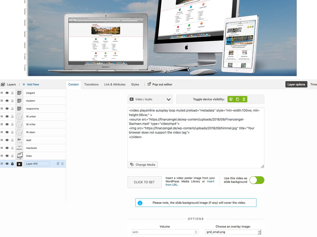
the code at the bottom ( do not on top a background-image) is the video which you can declare as background-video.
put in the code:<video playsinline autoplay loop muted preload="metadata" style="min-width:100vw; min-height:56vw;" > <source src="https://finanzengel.de/wp-content/uploads/2018/09/Finanzengel-Sachsen.mp4" type="video/mp4"> <img src="https://finanzengel.de/wp-content/uploads/2018/09/himmel.jpg" title="Your browser does not support the video tag"> </video>see here ( i will go back to my video as soon as you have seen and prooved it on your iphone) : https://webers-testseite.de/weber/
That is a youtube video – you can see it in the source code !
___
To the Mods : i do not see how this littel plugin do it – maybe you can have a look on it and implement that solution approach
Perhaps it is the use of the watch instead of the embed Youtube Version!maybe this is a selfhosted video – there are workaround for that. But a 120MB mp4 is to big for that. – Not only because of traffic but definitly because of performance reasons.
But consider if it is really necessary to show a video on mobile devices, or if a fallback image would not be enough anyway.
Most of the CMS and nearly all WordPress Themes got a lot of troubles with youtube background video playing on Mobile – especially on Iphone/Ipads.Nevertheless there is one thing i found vor Divi – which we can transfer to Enfold too. Divi has the same troubles to play those youtube videos as background.
If this corresponds to your ideas, then I can tell you how we can solve this with a small plugin. Check if the test page runs on your mobile phone or Ipad. : https://webers-testseite.de/carinda/
_________
Offtopic ?:
And by the way, you’re not the only one asking for help here. Also other participants here have the same desires as you. But difficult topics like yours are not as easy to answer as many other simpler questions.
For example, I have now searched 8 hours for the solution to your question. May i charge you for that. ;) :lol
Have you ever been to other support forums? Obviously not, because here you got help often with very complex php and javascript code is quite unusual on the other boards. Many topic creators don’t even have their own support forums, but only use those of the themes resellers.And if I didn’t need the solution for my customers as well, I wouldn’t be able to make such an effort for you either.
How much time do you think a mod can spend on one topic to make such a board fit for all? 5 minutes? !September 12, 2018 at 8:06 am in reply to: Removing arrow and white background on SVG hover does not work #1008782try this in quick css:
The thing is that you have to select the direct neigbour of an element with that ( + ).start-image + .image-overlay { display: none !important; }maybe you give to the image a hover effect that not only the pointer hand indicates a link
.start-image:hover { -webkit-filter: drop-shadow(2px 2px 3px #666); filter: drop-shadow(2px 2px 3px #666) }by the way Erin – your individual Links to f.e. about should have the absolute path – because if you are not on the landing page (f.e. on a portfolio page) the #about link has no function (maybe the /#about will work)
September 11, 2018 at 7:05 pm in reply to: How to make same page link work on open burger menu #1008522this topic is unsolved till now.
the link even to a #hash link ( anchor to color-section f.e.) even if you are on the parent page works now (Enfold 4.4.1) on default.
But the click on the link of the active page does not close the burger menu..sidebar .inner_sidebar { overflow: visible !important; padding: 0 10px 0 5px; }and i think a lot of trouble comes from your realy small page layout. Why did you change the default 1310px to 1010px ?
and you realy like to have the footer sticky – and not the socket ?
the trouble with this would be to have on main a padding-bottom to see all of the main content and for all screenwidth.or you take the grid-row and put in 2 1/2 Cells each 1/5 columns.
If you like to have then the grid-row not full-width there are possibilities to get this via functions.php.
See here ( for demonstration the 2 cells have a background-color: https://webers-testseite.de/10-columns/wie denn auch , das ist ein Bild oder?
Du meinst das hier:

nimm beim Einsetzen einfach das unbeschnittene Image
But Dude – this is the selfhosted video. No doubt – that works!
But did you try a vimeo video?yes – i tested it – works on that installation ( you know my webers-testseite is a bit full with code – maybe there is somesthing in conflict with it.
See : https://webers-testseite.de/weber/a-nice-entry/But: – with iframe for me its better because its with my Borlabs Cookie Plugin DSGVO konform.
https://webers-testseite.de/maskenzauber/no i’m working on it right now a lot – sorry
i give you a different page – maybe my webers-testseite is to full with custom codei think she is right – did not work on my end too:
for the moment take the html widget and use the iframe:
<iframe src="https://player.vimeo.com/video/46232172?autoplay=1" frameborder="0" webkitallowfullscreen mozallowfullscreen allowfullscreen></iframe>has on my end the advantage, that i can insert it DSGVO konform: https://webers-testseite.de/maskenzauber/
PS: wunderschöne Arbeiten – echt Klasse !
-
This reply was modified 7 years, 6 months ago by
did you read my posting carefully?
Give to the text-block to which this issue concerns a custom-class! in my case i set it to: hr-inlinetextthen the rules will work for all text-block elements from enfold with img inside and text floating around and that specific class:
see what happens( da die Klasse fehlt musste ich jetzt ohne den Code einfügen): Movie
– wenn du das Bild auf der eingestellten Größe läßt, dann bekommst du bei Screens knapp über den 768px ein extrem schmale Textleiste neben dem Bild.don’t know where your “split point” is when layout goes to mobile – but in most default cases it is 768px or 990px so:
@media only screen and (min-width: 768px){
	#footer .container {
	display: flex;
	align-items: flex-end;
	}

	#footer .container .textwidget p:last-child {
	margin-bottom: 0 !important;
	}
}
September 11, 2018 at 11:23 am in reply to: Problem with first picture in galleries and avia colums #1008330Also ich sehe das bei Pflanzbehälter nicht so wie in deinem Screenshot. Getestet an Mac OSX HighSierra : Firefox Developer, Chrome, Safari.
Leere mal sämtliche Browser Cache und falls du das Merging von Enfold nutzt – erneuere bitte auch diese Dateien.
______
So I don’t see it like in your screenshot with plant containers. Tested on Mac OSX HighSierra : Firefox Developer, Chrome, Safari.
Empty all browser caches and if you use Enfold’s merging – please update these files as well.gib dem Text-Block Element ein benutzerdefinierte Klasse – ich nahm : hr-inlinetext
.hr-inlinetext img {
    width: calc(50% - 20px);
}

.hr-inlinetext .hr {
    display: inline-block;
    width: calc(50% - 20px);
    float: none;
}

@media only screen and (max-width: 990px){
.hr-inlinetext img ,
.hr-inlinetext .hr { width: 100% }
}
die 20px kommen von der Definition der Custom hr :
.hr-custom.hr-icon-yes .hr-inner {
margin-left: 10px;
margin-right: 10px;
}das sind jeweils 4 lücken a 10px – die müssen in die Werte mit einfließen – sonst kannst du also mit den Prozentwerten die 100% haben – also 40/60 etc.
mit dem MediaQuery musst du schauen, ob das dein “Sprungpunkt” ist bei dem das Layout wechselt. Bei meiner Testinstallation war es 990pxNachdem ich dein Video gesehen habe ist klar: du willst das unbedingt so haben, weil du das Bild vom Text umflossen haben möchtest.
Denn die 100% Weite ist die des gesamten text-blocks und nicht des Textes neben dem Bild.Das funktioniert wenn man dem Bild auch relative Weite zuordnet:
Siehe hier: https://webers-testseite.de/maskenzauber/Wenn du interessiert bist poste ich wie es geht.
____________
After I have seen your video it is clear: you absolutely want it to be like this, because you want the text to flow around the image.
Because the 100% width is that of the entire text block and not the width of the text itself.This works if you also assign relative width to the image:
See here <a: https://webers-testseite.de/maskenzauber/If you’re interested, I’ll post how it goes.
Translated with http://www.DeepL.com/Translator
der x-wert verschiebt das ganze ja auch nach rechts.
Wenn du zB hättest:
.sidebar .widget {
    padding-left: 5px;
    box-shadow: 0 0 5px 2px #5c5c5d;
    margin-bottom: 20px;
}
dann sind zum einen die Widget Bereiche getrennt (margin-bottom) zum Anderen hast du dann einen Umlaufenden Schatten-Wurf.
bei deinem Padding-left scheint in der Quick css was schief gegangen zu sein.PS: manchmal verhindert auch ein overflow:hidden der umgebenden Container den Schattenwurf
-
This reply was modified 7 years, 6 months ago by
-
AuthorPosts