Forum Replies Created
-
AuthorPosts
-
September 28, 2018 at 5:01 pm in reply to: Adding caption to each slide in horizontal gallery #1015799
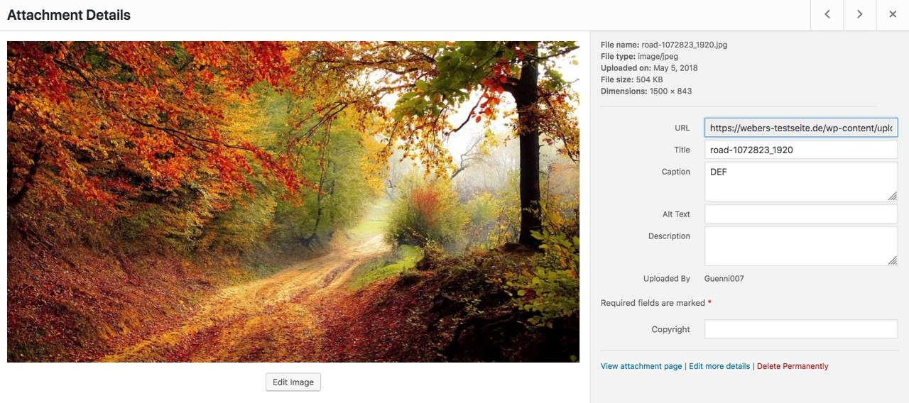
well you are talking about Caption – the Caption on horizontal Gallery is this field under the image:
(see the empty field on the left – and what happend then to the frontend.
click to enlarge:
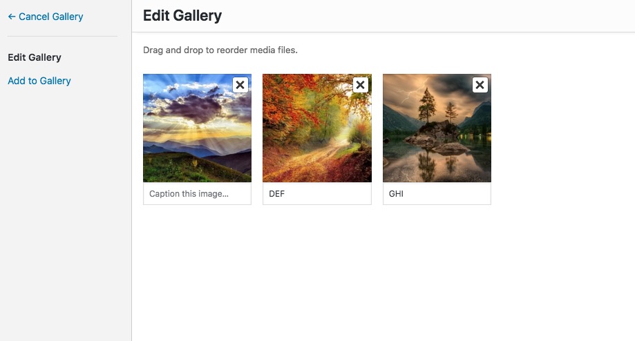
or on media library you can see where the caption is.
If yo like to have a different field – better tell me:
 September 28, 2018 at 3:16 pm in reply to: Adding caption to each slide in horizontal gallery #1015761
by the way – for screens under 768px:
@media only screen and (max-width: 767px){
	.text-under-image {
	    position: absolute !important;
	    background-color: #fff;
	    bottom: 0;
	    left: 50%;
	    transform: translateX(-50%);
	    padding: 0 30px;
	    margin: 0 !important;
	    text-shadow: 1px 1px 2px #aaa;
	    border-radius: 8px 8px 0 0;
	}
}
see example page: https://webers-testseite.de/horizontal-gallery/#next
Yes i see now – but I think that makes sense. To have a field that you can leave blank, because this way the 1st option is always included in the e-mail as a selection.
September 28, 2018 at 1:34 pm in reply to: Adding caption to each slide in horizontal gallery #1015735if you do not like to have this on all horizontal galleries :
give a custom class to the horizontal gallery like: subline-galleryfunction horizontal_gallery_subline(){ ?> <script> (function($){ $(window).load(function() { $('.subline-gallery').css("overflow", "visible" ); $('.subline-gallery .av-horizontal-gallery-link').each(function(){ var linkTitle = $(this).attr('title'); $(this).before('<p class="text-under-image">' + linkTitle + '</p>'); $('.text-under-image').css({ "text-align": "center", "margin": "0.2em 0", }); }); }); })(jQuery); </script> <?php } add_action('wp_footer', 'horizontal_gallery_subline');it is much more easy to give you an advice if there was a life link to the concerning page.
September 28, 2018 at 12:52 pm in reply to: Adding caption to each slide in horizontal gallery #1015728you can try this in your child-theme functions.php:
function horizontal_gallery_subline(){
?>
<script>
(function($){
    $(window).load(function() {
	   $('.av-horizontal-gallery-link').each(function(){
            var linkTitle = $(this).attr('title');
            $(this).closest('.av-horizontal-gallery').css("overflow", "visible" )
            $(this).before('<p class="text-under-image">' + linkTitle + '</p>');
            $('.text-under-image').css({
            	"text-align": "center",
            	"margin": "0.2em 0",
            });
        });
    });
})(jQuery);
</script>
<?php
}
add_action('wp_footer', 'horizontal_gallery_subline');
see here: https://webers-testseite.de/horizontal-gallery/
btw: this will work with active image style enlarge too
September 28, 2018 at 11:09 am in reply to: Close popop/modal using back button without changing url #1015697on my desctop ismaels code works : https://webers-testseite.de/fullbackground/
can you try if it is on mobile working too?
lies mal hier – vielleicht hilft das weiter: https://kriesi.at/support/topic/remove-archive-from-category-page-title/
für meine Begriffe ist hier der Plural richtig.
Aber ich glaube auch, dass dies eher von WordPress selber gesteuert wird – als vom Thema.
Sorry da musst du wohl auf einen der Coder hier warten.can you show me the place where Archiv is shown – i can not see either on en nor on de
even in source code no “archiv” found
or do you mean the body class? – it’s a cruel idea to translate the class namesedit: or is it in the head section the title tags ( and opengraph title tags ) ?
what do you expect is different on SEO point of view if there is “Allgemein Archiv” instead of “Allgemein Archive” ?-
This reply was modified 7 years, 7 months ago by
Guenni007.
no private content for me – i’m participant as you.
isn’t it on english : archives ? pl.
what is the plural of Archiv in german ? ;)and on singular:
english: archive
german: Archiv
_______
show me a link – maybe you are right .but be carefull with German lang files there is a “Du” and a formal “Sie” translation.
So first have a look what kind of salutation you have choosed in wordpress settings.
You then have to edit the formal or normal po filesGuess you choosed the “Sie” formal addressing – because this is not translated in de_DE_formal.po:
Choose the archive sidebar position here. This setting will be applied to all archive pagesbut i think Ismael that should be implemented as default if this field is a required one.
by the way : i can see your icons on my end here
and on one of the fixed background-images there is a 300x200px image (very blurry on this)First is : what do you prefer for your domain : the www or the non www version?
try to fix this too.I think it will be best to use a search and replace plugin for your database here.
I use for this: https://wordpress.org/plugins/search-and-replace/
actually quite easy to use.
But it’s better to backup the database first. This tool already offers that.
so on that
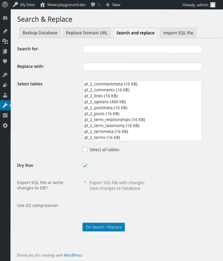
( that is the reason why i ask for www or not !!!) normaly i would search and replace for a part of thr urlsearch for: headstudios.com
replace with : zoebooth.comthe more specific the better – so if you prefer www then:
search for: http://www.headstudios.com
replace with : http://www.zoebooth.comto look for the whole domain with .au is protected (therefor the tool got “replace Domain url” – but this you allready done.
you can do a dry run or do it directly in all tables and write to databaseby the way i see this effect on Mac OSX ( firefox etc) too. Not only on mobile
following is shown if i want to open the image in the browser:
https://reneadventure.com/wp-content/uploads/2018/09/Peru-Machu-Picchu.jpg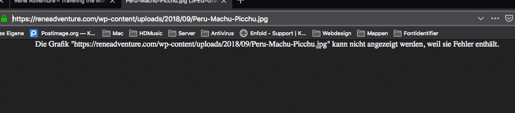
öffne die Bilder mal an deinem Desktop und schaue ob Sie da zu öffnen sind. Wenn ja- lade Sie nochmal hoch – eventuell gab es da Fehler bei der Übertragung
Da muss was mit dem Bild sein: auch hier: https://reneadventure.com/about/
ist das Bild nicht zu sehen ( auf Parallax gestellt)September 28, 2018 at 7:42 am in reply to: Filesize bigger than source of automatically scaled images #1015599i have on most my installations now:
function av_return_100(){ return 65; }
add_filter('jpeg_quality', 'av_return_100');
add_filter('wp_editor_set_quality', 'av_return_100');
it seems that the 65 is nearby the Photoshop jpeg 35 til 45 % Quality
September 28, 2018 at 7:40 am in reply to: Automatic Resized Upload-Images become more KB than the original #1015597i do have now on the most sites i create this to my child-theme functions.php :
function av_return_100(){ return 65; }
add_filter('jpeg_quality', 'av_return_100');
add_filter('wp_editor_set_quality', 'av_return_100');
it seems that this is more than a good compromise between performance and quality
you do not have the webfonts for it ?
eot, woff, woff2, svg, ttf
On most commercial downloads these fontfiles are included in the license.
if not – you can try to generate it here: https://www.fontsquirrel.com/tools/webfont-generator.
but the most adobe or linotype fonts can not be uploaded on fontsquirrel.hm board soft changes even under code tag the quotation marks – i make a screenshot that you can see what is the fact:
click to enlarge:

or for copy paste look here:
https://pastebin.com/gc8xNnQbso put this to your child-theme functions.php
September 27, 2018 at 6:45 pm in reply to: Changing CSS For Footer To Add An Image Background to The Top #1015441but what is wrong with your solution?
(by the way – posting a screenshot with E-Mail of the domain ? …
Personally, I think it’s bullshit to cover everything up anyway – and judging something on a live site is always better .i think this is an advanced layer slider on top.
You can get rid of that in Layerslider activate your slider – goto slider settings – navigation area – and there it is: slideshow timers.
you have activated : show circle timerin a source code teeming with quotation marks (double and single ones) I think it would be helpful to name the place.
and by the way – this comes from wordpress itself: media.php on line: 1819ff
“%s”. different lines – hard to find – even for a coder. ;)see next post
-
This reply was modified 7 years, 7 months ago by
September 27, 2018 at 4:13 pm in reply to: Close popop/modal using back button without changing url #1015356maybe this could help you: https://stackoverflow.com/questions/22229689/how-to-make-browser-back-close-magnific-popup
and look here – on that it seems to work : http://eugenedae.github.io/Magnific-Popup-History-API-Demo/
link to github: https://github.com/EugeneDae/Magnific-Popup-History-API-Demo
-
This reply was modified 7 years, 7 months ago by
i understand this here: I’ve activated your lightbox that has proofing system and other things that interest me
as you need the enfold lightbox for that.
so i use enfold lightbox on nextgen galleries without that doubled lightbox by deactivating the nextgen lightbox.

for those who likes to know how to make it and could not read the private content:
try this here:One possible method could be to do this by defining the type :
but the pdf has to be on your own server – does not work with global links from elsewhere:<a class="pdf-download" href="https://www.w3.org/2003/01/Consortium.pdf" target="_blank" type="application/octet-stream" download="Consortium.pdf"><img src="https://www.w3.org/2008/site/images/logo-w3c-screen-lg" alt="W3Schools" ></a>see here: https://webers-testseite.de/weber/direct-downlaod-a-pdf/
with download= : you can determine the default download name
with that class it is easier to style the link. f.e. remove overlay etc.see the right “button” with that class: pdf-download
.pdf-download { display: inline-block !important; overflow: visible !important } .pdf-download .image-overlay { display:none !important } .pdf-download::before { content: ""; background-image: url(https://webers-testseite.de/weber/wp-content/uploads/2018/09/PDF-Icon.png); background-repeat: no-repeat; background-size: 30%; background-position: 0 0 ; transition: all ease-in-out 1s; position: absolute; width: 100%; height: 100%; top: -30px; left: calc(100% - 40px); z-index: 5; } .pdf-download:hover::before { background-position: 0 20px !important; transition: all ease-in-out 1s; transform: scale(1.1); transform-origin: center center; -webkit-filter: drop-shadow(2px 2px 4px #333); filter: drop-shadow(2px 2px 4px #333); }-
This reply was modified 7 years, 7 months ago by
or disable the Next Gen Lightbox effect !
NextGen Galleries – Other options – Lightbox effectsSVG Support : activate the advanced mode –
with svg Support you can set a class on which svg placed by the img method is replaced through inline svg.
Means – if SVG Support find an image with the given class it will replace the<img src="" … />by the svg itself.you can see it here with the logo of the start page: https://webers-testseite.de/cynthia/
Otherwise i will not be able to set the hover effect only on one path.If you got your inline svg i hope that your animation will work then.
September 27, 2018 at 11:25 am in reply to: Custom caption title and content frames on full-width easy slider #1015224the creator of your example page: https://carboncredentials.com/
this page is an enfold page too. so with the help of developer tools of your browser you can see all sources used there.
And because he didn’t use the merging of Enfold – the css and js files are separated files.
So i look for what he had done – and the most rules from him are in custom.css.But this is not necessary – i did for a test these settings into my quick css input field.
by the way he had for the small screens some rules to hide f.e. the caption p tags:
@media only screen and (max-width: 767px) { .caption_framed .slideshow_caption .avia-caption-content p, .avia-caption .avia-caption-content p{ display: none; } .caption_framed .slideshow_caption .avia-caption-title, .avia-caption .avia-caption-title{ width: auto; padding: 10px 20px; line-height: 22px; } }One thing to ask here – i see that for the footer there was a compatibility update fix in: helper-compat-update.php
(enfold / includes / admin)
Do i have to set this two for the new column rows?My thought was that there weren’t any older second row footers to transform to the newer Enfold versions – so that I can leave that adjustment out.
-
This reply was modified 7 years, 7 months ago by
-
AuthorPosts