Forum Replies Created
-
AuthorPosts
-
i guess the enfold options goes to : ID = color-default_font_size
line 2541 in register-admin-options.php
but this will only end up in css concerning to body tag like:
body, body .avia-tooltip {
    font-size: 70px;
}
perhaps an !important is neccessary
sorry wrong part. it goes about the video starting from your button.
Hm that code worked on my enfold theme:
https://www.youtube.com/watch?v=Y_dteRICqzs?autoplay=1&iframe=true-
This reply was modified 7 years, 4 months ago by
Guenni007.
November 14, 2018 at 7:15 pm in reply to: how to address via jquery an element with attribute? #1033620yes but i did that by selecting the first-child.
i’d like to select it via the label – if there is Date or Datum (german)so i thought i could do it this way:
$('th[aria-label*="Dat"]').addClass('dateFormat-ddmmyyyy');
but it does not work on jQuery
per css i can select it this way to change color etc.
th[aria-label*="Dat"]maybe this could help : https://theeventscalendar.com/knowledgebase/altering-or-removing-titles-on-calendar-views/
by the way the binding word is often defined as a separator string
$sep or $separator – and on different cases the separator is defined individually.so now there is: Tapahtumat for marraskuu 2018?
This is certainly a composite form in the source code.
( By this I mean that the word “event” is translated individually followed by a binding word and then the months are translated individually and the whole thing is just put together. )
Therefore it would be unwise to replace the “for” with a hyphen in general. Then all occurrences of “for” on your whole website would be replaced.But you can try this in your functions.php of your child-theme:
function my_text_strings ( $translated_text, $text, $domain ){
switch ( $translated_text ){
	case 'for tammikuu':
		$translated_text = __( '- tammikuu', $domain );
	break;
	case 'for helmikuu':
		$translated_text = __( '- helmikuu', $domain );
	break;
	case 'for maaliskuu':
		$translated_text = __( '- maaliskuu', $domain );
	break;
	case 'for huhtikuu':
		$translated_text = __( '- huhtikuu', $domain );
	break;
	case 'for toukokuu':
		$translated_text = __( '- toukokuu', $domain );
	break;
	case 'for kesäkuu':
		$translated_text = __( '- kesäkuu', $domain );
	break;
	case 'for heinäkuu':
		$translated_text = __( '- heinäkuu', $domain );
	break;
	case 'for elokuu':
		$translated_text = __( '- elokuu', $domain );
	break;
	case 'for syyskuu':
		$translated_text = __( '- syyskuu', $domain );
	break;
	case 'for lokakuu':
		$translated_text = __( '- lokakuu', $domain );
	break;
	case 'for marraskuu':
		$translated_text = __( '- marraskuu', $domain );
	break;
	case 'for joulukuu':
		$translated_text = __( '- joulukuu', $domain );
    break;
  }
  return $translated_text;
}
add_filter('gettext', 'my_text_strings', 20, 3);
you have to do that for all 12 cases ( Month )
maybe this could work-
This reply was modified 7 years, 4 months ago by
Well i see that rule in your merged css:
#top .av_gmaps_browser_disabled, #top .av-maps-user-disabled .av_text_confirm_link {
    display: none;
}
if i deaktivate it virtually on my developer tools i can see the button on hovering the field:
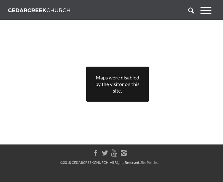
and by the way you have in your settings:
#top .av_gmaps_browser_disabled, #top .av-maps-user-disabled .av_text_confirm_link {
    display: none;
}
this was set by a new feature since Enfold 4.4 concerning to GDPR.
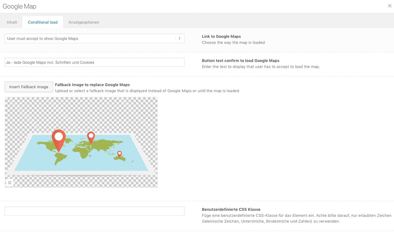
Open the Map Layout Element again and see:
it is called conditional load
click to enlarge:
I guess you have choosen the “only open google maps in new window”
a few weeks ago they changed something at the billing informations. Try to log in to your Google Account and renew or update/ confirm billing information.
The same thing happend to me when they did the trickif you like to see my result and social bookmark widget: https://kriesi.at/support/topic/social-bookmarks-widget-how-to/
Then you can place the social icons of your Enfold Options Social Bookmarks – into the column you like to have.
See here https://webers-testseite.de/#footer
Left side is shariff – in the mid column it is that social bookmarks widgetja – ich finde ohnehin das Standards wie Slider oder Masonry nicht übersetzt werden sollten.
there must be something wrong with your lang files – my testpage with 4.4.1 shows on German (Du) and formal German (Sie) only english and no translation.
On Enfold 4.5 there are translated phrases for that field but you can see the results on top. These Translations are o.k.
What kind of language you have choosen for your WordPress?
Try to upload the lang folder again.November 8, 2018 at 11:05 am in reply to: Apologies – I feel like an idiot – Getting server errors switching to Enfold #1031161Does it happen even if you activate a WP Standard Theme like twentyseventeen ?
November 7, 2018 at 7:31 am in reply to: Apologies – I feel like an idiot – Getting server errors switching to Enfold #1030708Let me understand you correctly; this is an existing page that you wanted to put on Enfold, and this leads to the problems.
Maybe there are custom entries in the htaccess file.i don’t know why you got this confusion of languages.
on newest Enfold i got this in tranlation file ( but than description is german too):
What version of Enfold do you have installed?
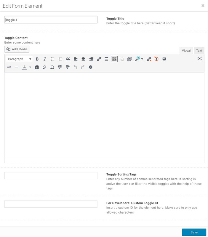
you want to give to each of the toggles a unique ID so you have to open on the alb element the single toggle – click on toggle 1 to enter that new popup window to put in your IDs
click to enlarge the image:
so maybe this would be for the next time a good combination to have minor updates (security relevant things) enabled and major core updates disabled till WP 5.0 is stable and all Plugins and Themes are fit for it
this to functions.php of your child-theme:add_filter( 'allow_major_auto_core_updates', '__return_false' ); add_filter( 'allow_minor_auto_core_updates', '__return_true' );But I also like to be convinced in other ways, if e.g. the mods don’t think this is necessary. I have always liked to have control over when and if I update. Mostly I wait for the first bugfixes.
If you are curious you should make a copy of your page with Duplicator and test the updates there.
i disabled on the moment the automatic updates at all via wp-config
f.e. :you can disable automatic updates in WordPress by adding this line of code in your wp-config.php file:
define( 'WP_AUTO_UPDATE_CORE', false );This will disable all automatic WordPress updates.
However if you want to receive minor core updates, but disable theme and plugin updates, then you can do so by adding the following filters in your theme’s functions.php file or in a site-specific plugin.
Disable automatic WordPress plugin updates:
add_filter( 'auto_update_plugin', '__return_false' );Disable automatic WordPress theme updates:
add_filter( 'auto_update_theme', '__return_false' );or on WP Codex: https://codex.wordpress.org/Configuring_Automatic_Background_Updates
Or nice summary : http://tutorialspage.com/enabledisable-wordpress-automatic-updates/
Sorry -for the missing example images and lost pages – but these tips are from January 18 – so test page is gone.
And some image hosters i used on that time are lost in space :lol
But i hope description is good enough to get the things to workThese nested layout is a nice thing – that is the reason for code above
PS the imagehoster changed to a different TLD from org to cc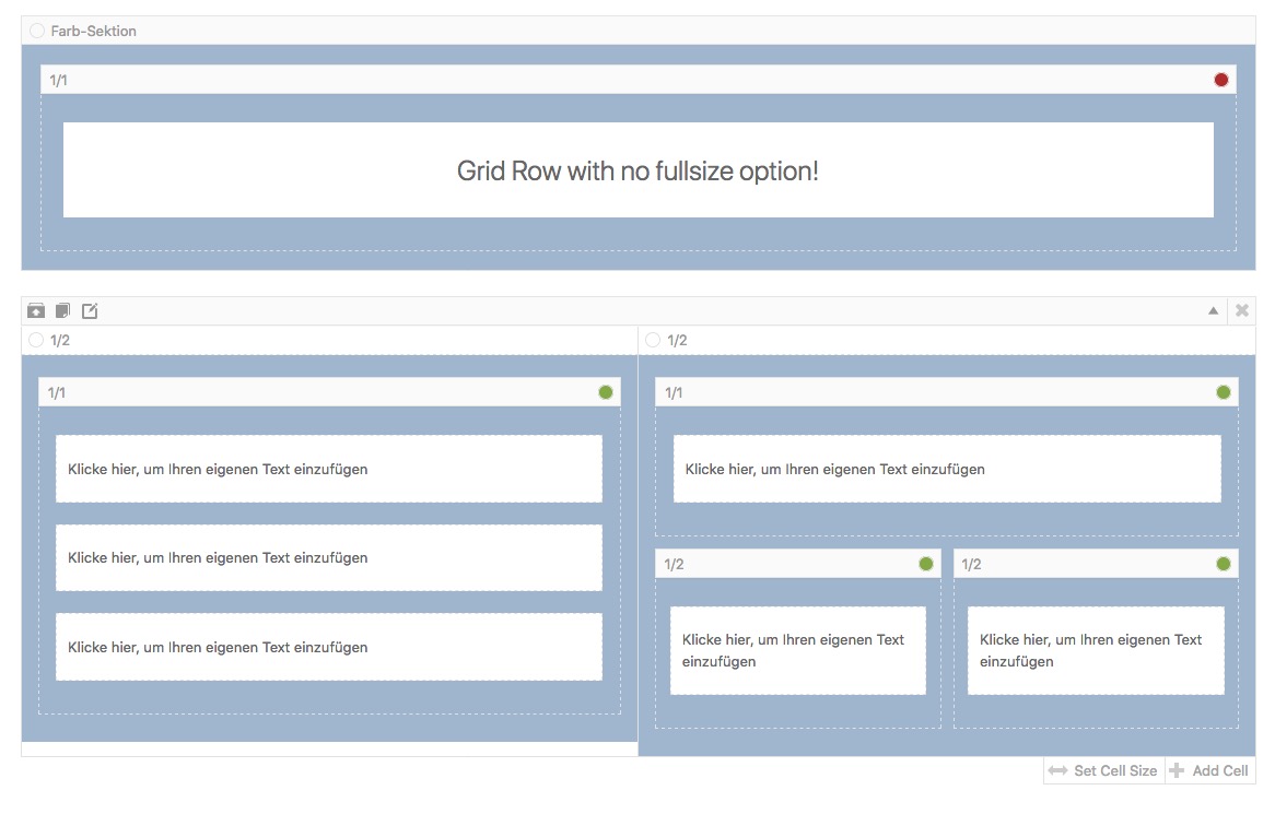 November 6, 2018 at 12:42 am in reply to: How to remove mysterious gray space between header and breadcrumbs on Shop page #1030124
Well i don’t know how your page setup is on that page, but there is a product description div. You can get rid on that page by:
.post-type-archive-product #av_product_description {
    display: none;
}
but have a look if you havn’t the chance on your shop settings to avoid generating that div
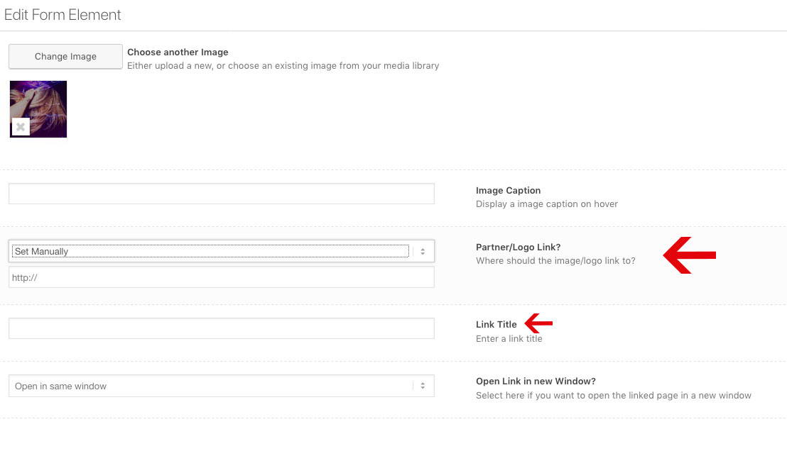
do you have links on your partner logos – f.e. to their webpages ?
Then there is an anchor to which the title tag can be set.But first fill in title tag then the url to which the logo link goes. Otherwise if there is an url the link title input field disappears:
 November 4, 2018 at 10:58 pm in reply to: A Bug: The content of "Masonry" is not available for Google bots #1029687
f.e. that page here: https://kriesi.at/themes/enfold-law/news/
And your claim is now that the content ( av-masonry-entry-content entry-content ) is not read by Google-Bot?
( The text under the featured Images )sorry my fault – i see that partner logo element works with background-image : so there is no alt and title tag at all because no img tag
go over the media library grid view – klick on one image and see the attachment details:
click to enlarge
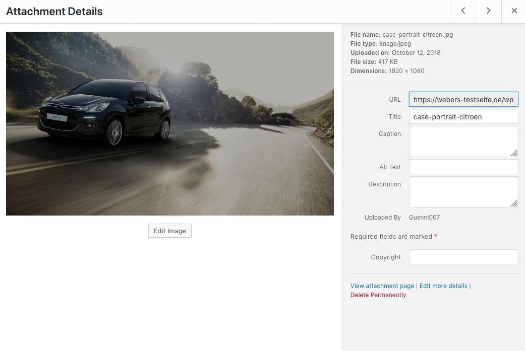
with arrows on top right you can go to the next image and fill in the desired infos etc.
Ok – the one thing that is neccessary for wordpress itself is something like this :
# BEGIN WordPress
<IfModule mod_rewrite.c>
RewriteEngine On
…  things WP need for example to set up permalink structure etc …
</IfModule>
# END WordPress
Everything else can be useful but is not necessary.
i use the htaccess file often to set up gzip or expiration date etc. for WordPress files.
or to redirect old page path to new ones (301 redirect instructions)did you generate a htpasswd?
Is the complet page not available or only the wp-login page of your page?Some guys like to password protect the Admin Area serverside. so that you have to enter a password before you can access the normal WP access.
Here is some info about htpasswd ( same as htaccess it is an invisible file with a dot in front: .htaccess and .htpasswd )
http://www.htaccesstools.com/articles/htpasswd/
The Protection then is an entry in htacces file like:# Auth protect wp-login.php <Files wp-login.php> AuthName "Restricted Admin-Area" AuthType Basic AuthUserFile /is/htdocs/wp1234567_EJ5MMWZBH6/www/.htpasswd Require valid-user </Files> # Deny access to important files <FilesMatch "(\.htaccess|\.htpasswd)"> Order deny,allow Deny from all </FilesMatch>you have to know the absolute path to the htpasswd to set this.
That’s a good thing, but annoying when logging into the WordPress backend.
But the advantage is that the attempts to hack into your admin area using a bot are already blocked on the server side, so that the brute force attack does not affect your site performance.Aha – i see it is only a firefox problem. But even then you have to fix it. On Safari and Chrome it works fine on firefox there is that behavior like the image above shows it.
October 30, 2018 at 9:47 am in reply to: How is the "Hover Circle" at kriesi.at homepage done? #1027917but if you are familiar with developer tools of your browser f.e. with the debugger you will find the kriesi.js file – in it all you need
allthough the rel parameter is still listed, but it seem not to work anymore.
zum Downloadbereich: befindet sich nach dem Einloggen unter deinem Nick dort:

-
This reply was modified 7 years, 4 months ago by
-
AuthorPosts