Forum Replies Created
-
AuthorPosts
-
you got this in your source code – mayby in your quick css:
because of the merged file i could not locate it where you got it..av_minimal_header .avia-menu-fx { display: none; }so get rid of that rule – and the underline on hover will work as you like
ja – genau so ist es. Hier wird dir auf jedenfall geholfen. Wobei ich mir nicht im klaren bin, wie das mit dem Support Stop funktionieren soll ;)
Da du ja hier keine Seriennummern bei der Registrierung angiebst, endet der Support demnach nicht nach 6Monaten – auch die Downloads kannst du jederzeit bei Envato wiederholen.
hier ist eine sehr schöne Dokumentation: https://kriesi.at/documentation/enfold/
Dort kann man zunächst schauen ob es nicht schon triviale Lösungen für dein Problem geben sollte.this image you see as background – is not a “slide background image” on top of the slide input.
- This is an image layer on the bottom of the first slide !
- On Transitions you can choose on opening transition on “other settings” : Keep this layer visible: Forever (the layer will never animate out).
- From now on you have on each new slide “Static Layers from other slides”
Thats the trick !
PS: this is a fullwidth slider you have linked to !
By the way – this font from parytype looks a bit like PtSans / Opensans or Lato – these fonts are designed too by Paratype – might be a good alternative.
Especially the Lato with bold and a light font !to identify a font you can use different services on the web. On that example it might be good to have more contrast on it:

F.e.:
https://www.fontsquirrel.com/matcherator
https://www.myfonts.com/WhatTheFonton the bold part above there are a lot of results because this seems to be a standard font style:
the most famous seems to be from FontFont : FF Mark Pro Mediumbut the results for the thin font gets one match with the bold type :
Stem from Paratype.
Stem Medium and Stem Extra Light.
https://www.myfonts.com/fonts/paratype/stem/webfont_preview.htmlDecember 18, 2018 at 12:43 pm in reply to: How to insert search form into header_posline next to phone number? #1046825You may open a new thread with the hint ( link ) to this started topic here.. Here really one of the moderators with admin access has to look into your developer installation.
You have also installed Uber-Menu and this shortcodefix is still haunting you. So everything else than Enfold Standard installation. I would only recommend you to update to the latest Enfold 4.5.1 version.Actually, I always get my help through to the solution. But in this case someone has to log in to really create order.
Well i’m German too – but i think you will get help sooner if you post your questions in english – not all of the mods can understand german language.
if you find it difficult to post your questions in English, you can use this service here: https://www.deepl.com/translator
The translations are definitely better than Google’s and you can make changes or improvements in your text afterwards.December 17, 2018 at 12:41 pm in reply to: How to insert search form into header_posline next to phone number? #1046278so sorry now – here stops my support.
i see there is on phone-info field always that shortcode inserted thing. Maybe this is from the do_php_shortcode_fix in your functions.php.
i guess you have to wait here for mods to login to your developement site to see what is the thing. On my test page it works this way – so there must be some inconsitencies. Sorry – i have to do my work now.December 17, 2018 at 12:26 pm in reply to: How to insert search form into header_posline next to phone number? #1046273December 17, 2018 at 12:23 pm in reply to: How to insert search form into header_posline next to phone number? #1046271first of all : on your code here there is the closing a – tag missing:
https://kriesi.at/support/topic/how-to-insert-search-form-into-header_posline-next-to-phone-number/#post-1046245December 17, 2018 at 12:21 pm in reply to: How to insert search form into header_posline next to phone number? #1046269please post your whole child-theme functions.php again
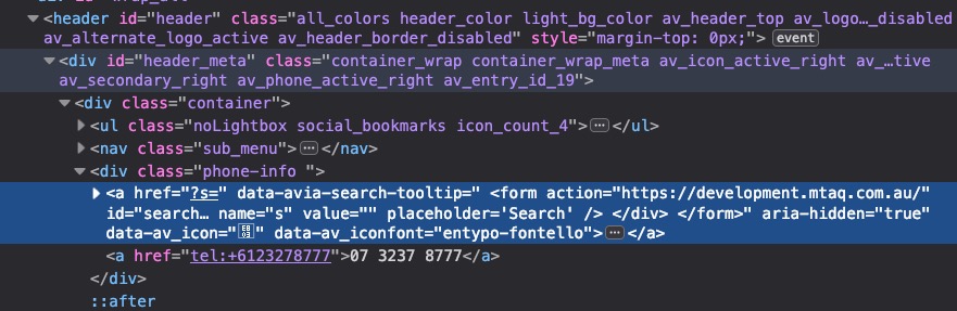
December 17, 2018 at 12:12 pm in reply to: How to insert search form into header_posline next to phone number? #1046266i can see here that there was an entry on phone-info field:
 December 17, 2018 at 12:10 pm in reply to: How to insert search form into header_posline next to phone number? #1046264
please – always think on caching and merged files of enfold ( Enfold / Performance tab ) – sometimes you see the changings not directly
December 17, 2018 at 11:53 am in reply to: How to insert search form into header_posline next to phone number? #1046259And you are still on enfold 4.4.1 i don’t know when it starts to name the top-menu avia2-menu but on your code there is no avia2-menu
so try to change the code above from
$('#header_meta #menu-item-search').prependTo('#avia2-menu');
to:
$('#header_meta #menu-item-search').prependTo('#header_meta .sub_menu');and see what happens
December 17, 2018 at 11:47 am in reply to: How to insert search form into header_posline next to phone number? #1046255can you post your functions.php again here as a copy ?
PS to style the small “good” one use this in quick css:
#header_meta #menu-item-search + a {
    font-size: 20px !important;
    position: relative;
    top: -10px;
    left: 8px;
}

#header_meta .avia-arrow-wrap {
    right: 20px !important;
}
December 17, 2018 at 11:45 am in reply to: How to insert search form into header_posline next to phone number? #1046253i can see your dev page – and that is definitly from the shortcode. Maybe it is an caching problem.
Look to the phone info input field and to your functions.phpDecember 17, 2018 at 11:40 am in reply to: How to insert search form into header_posline next to phone number? #1046251you see here the difference of both methods
shortcode:

functions.php as top-menu list point:

-
This reply was modified 7 years, 4 months ago by
Guenni007.
December 17, 2018 at 11:18 am in reply to: How to insert search form into header_posline next to phone number? #1046239you only have to use one of the methods. if you use the code above get rid of the shortcode function and remove from phonenumber input field the
[search]add_filter( 'avf_execute_avia_meta_header', '__return_true', 10, 1); add_filter( 'avia_meta_header', 'avia_append_search_nav_mod'); function avia_append_search_nav_mod(){ global $avia_config; ob_start(); get_search_form(); $form = htmlspecialchars(ob_get_clean()) ; $items .= '<li id="menu-item-search" class="noMobile menu-item menu-item-search-dropdown menu-item-avia-special"> <a href="?s=" data-avia-search-tooltip="'.$form.'" '.av_icon_string('search').'> <span class="avia_hidden_link_text">'.__('Search','avia_framework').'</span> </a> </li> <li class="phone-info"> <a href="tel:+6123278777">07 3237 8777</a> </li>'; echo $items; } function custom_shift(){ ?> <script> (function($){ $('#header_meta .phone-info').prependTo('#avia2-menu'); $('#header_meta #menu-item-search').prependTo('#avia2-menu'); })(jQuery); </script> <?php } add_action('wp_footer', 'custom_shift');And it is hard to say from a screenshot where it could come from. A life link – which you do not have now – will be more informative.
PS : for me it looks like the small one is from the code above and the other one from the shortcode.
You have to style the little one via css.
The code from me above with the phone number inserted this way is for having your search icon infront of the phonenumber. Then the phonenumber is part of the top menu. And you have to leave the phone info field empty on Enfold.-
This reply was modified 7 years, 4 months ago by
Oh yes – i didn’t read that: “I found how to replace the logo link in another topic”
so you can do it in that combination Yigit does.do you want it on the img itself or as an additional class to the span.logo ( this contains the link and the logo img) ?
if you like to have it on the img itself you can add this to your child-theme functions.php:
function add_class_to_logo_img(){
?>
<script>
(function($){
      $('.logo img').addClass('custom-class');
})(jQuery);
</script>
<?php
}
add_action('wp_footer', 'add_class_to_logo_img');
PS: by the way, the function name is arbitrary, but I always advise you to choose meaningful names, so that you remember afterwards what the code was still for.
If you want to replace it globlay and not on a specific h tag:
by the way – you definitly want to change the h-tag from h3 to h5
or do you only want to change the size in mobile devices ?
And do you like to have it definitly only for mobile devices or for smaller screens too?The reason why i asked this is that on mobile devices the enfold adds to the html tag a class called: avia_mobile
so if you like to influence only the mobile version of a tag you can always do it via this class infront of the needed rule f.e..avia_mobile h3 { font-size: 24px !important }if you want the tags to be different you have to do it via child-theme functions.php
you can use this nice replace tag with tag function and an if clause –function replace_tags_with_tags(){ if(wp_is_mobile()){ ?> <script> (function($) { function replaceElementTag(targetSelector, newTagString) { $(targetSelector).each(function(){ var newElem = $(newTagString, {html: $(this).html()}); $.each(this.attributes, function() { newElem.attr(this.name, this.value); }); $(this).replaceWith(newElem); }); } replaceElementTag('h3', '<h5></h5>'); // you can add here more lines like this semicolon separated }(jQuery)); </script> <?php } } add_action('wp_footer', 'replace_tags_with_tags');well Enfold includes for some animation allready the waypoint function. On some cases this will be a good thing to control animation on scroll position dependencies.
f.e. : you can see on this page that some h3 headings gets red font when scrolling down – scrolling up will make them again black.
On scrolling down some p-tags content is getting red: https://webers-testseite.de/datenschutzerklaerung/On this page the images ( sorry for the quick and dirty way – the resolution is bad on growing up) are sized to 100% container width.:
https://webers-testseite.de/ostler/beispiel-seite/the last page is with this code to guide you in that direction i think you can do some similar effects on scrolling down:
add_action('wp_footer', 'scroll_up_down_change', 9999);
function scroll_up_down_change() {
?>
<script>
(function($) {
    var element_to_animate = $('img.grow');
        element_to_animate.waypoint(function(direction) {
           if (direction === 'down') { $(this.element).css({
			'max-width': '100vw',
            'width': '100%',
			'transition': 'width 1s',
            });
         }
        }, { offset: '20%'});
    element_to_animate.waypoint(function(direction) {
           if (direction === 'up') { $(this.element).css({
			'max-width': '100vw',
            'width': '100px',
			'transition': 'width 1s',
            });}
        }, {offset: '20%'});
})(jQuery);
</script>
<?php
}
so maybe you can look what you can do with the waypoint function to create some new stunning effects
-
This reply was modified 7 years, 4 months ago by
December 16, 2018 at 4:16 pm in reply to: How to insert search form into header_posline next to phone number? #1045946by the way : for what is that
// fix for PHP shortcode
?
where did you get that code from?December 16, 2018 at 3:53 pm in reply to: How to insert search form into header_posline next to phone number? #1045925well if you use the shortcode only – you might not use the shift. Because the Position is on that method right.
so get rid of :
function custom_shift(){
?>
<script>
(function($){
    $('#header_meta #menu-item-search').prependTo('#avia2-menu');
})(jQuery);
</script>
<?php
}
add_action('wp_footer', 'custom_shift');
but the reason why i would use the other method is – the look and feel of the results list.
Try first that – as you like and see what i mean on your own installation.___________
PS: on top you have outcommented the part of header widget area:
the code is a whole part of:add_action( 'ava_main_header', 'enfold_customization_header_widget_area' ); function enfold_customization_header_widget_area() { dynamic_sidebar( 'header' ); }you have a # infront of the add_action part
____________
PPS:
you can have your own backlink instead fo kriesi ones by:function new_link(){ $kriesi_at_backlink = "<a href='https://your-new-link'>Your Text here</a>"; return $kriesi_at_backlink; } add_filter("kriesi_backlink","new_link");December 16, 2018 at 11:16 am in reply to: How to insert search form into header_posline next to phone number? #1045863if you can not post here a link to your site to see the setup. Provide for the mods here on Private Content Input Field Account Details that they can look for it.
December 16, 2018 at 11:11 am in reply to: How to insert search form into header_posline next to phone number? #1045861this is the fastest way – but the results list in the flyout div is not the nice styled one as if you got it in main nav menu: Link
this one here : Link provides the styled result window.
if you got troubles even with method 1 – there must be something wrong with your setup or input into the child-theme functions.php.
Because you see that it is working on my Enfold 4.5.1 and WordPress 5.0.1 installtion. Link
I tested the shortcode method too on that installation – the only thing that was bad is the mentioned styling of the ajax results list.
The reason seems to be that on an enfold menu the search item is styled – out of enfold menu it is not.yes – but it is hard for me to always change my settings on a test installation to have the same baseline situation.
if your setup is in the way this is: https://kriesi.at/themes/enfold-blog/
you can reach the things on quick css by:#top, #main { background-color: transparent; } .main_color { background-color: rgba(255,255,255,0.6); } .header_bg { opacity: 0.6; filter: alpha(opacity=60); }but it might be on your setup a bit different
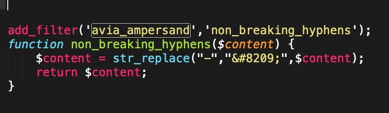
and again btw: – the newly introduced filter : avia-ampersand can be misused to have some other content substitutions.
F.e. to replace all hyphens to non-breaking hyphens etc. pp.add_filter('avia_ampersand','non_breaking_hyphens'); function non_breaking_hyphens($content) { $content = str_replace("-","‑",$content); return $content; }sorry Boardsoft directly changes the code even in code block:
just a moment – sorry i first misunderstood your request.
May I ask why the tags bother you when they have no effect on your appearance?if you like to get rid of the whole special treatment you
can test this on child-theme functions.php:if(!function_exists('avia_ampersand')){ function avia_ampersand($content){ // } }or if you only like to get rid of extra treatment for ampersand leave the quotes style in it
if(!function_exists('avia_ampersand'))
{
	add_filter('avia_ampersand','avia_ampersand');

	function avia_ampersand($content)
	{

		// quotes
		$content = str_replace("“","<span class='special_amp'>“</span>",$content); // left double quotation mark “
		$content = str_replace("”","<span class='special_amp'>”</span>",$content); // right double quotation mark ”
		$content = str_replace("„","<span class='special_amp'>„</span>",$content); // double low-9 quotation mark „

		return $content;
	}
}
by the way : every function introduced on wordpress via if(!function_exists
can be handled this way of substitution in child-themes functions.php-
This reply was modified 7 years, 4 months ago by
But a link to the new site will be helpfull.
First of all if your example page shows the aim of what you like to obtain – you have to change to the boxed layout first.
After that place a background-image on general layout – body background (it is in real a html background)
then we can start giving advice how to get your style. -
AuthorPosts