Forum Replies Created
-
AuthorPosts
-
but with absolute dimensions – it will overflow the slider on small screens – thats why i put it inside a media-Query –
if you do like to have that even on small screens – then use relative width / height combinations.now we had top better find settings for relative dimension for your overlay image. …
and maybe it is better to have that only on bigger screens?@media only screen and (min-width: 768px) { #top .avia-fullwidth-slider::after { position: absolute; display: block; content: ""; width: 18vw; height: 15.3vw; max-width: 300px; max-height: 255px; top: 80px; left: 5vw; background-image: url(/wp-content/uploads/2025/03/Gathering-Barn-Banner-Logo-.png); background-repeat: no-repeat; background-size: calc(100% - 40px) calc(100% - 40px); background-position:center center; background-color: rgba(159, 171, 154, 0.5); backdrop-filter: blur(4px); border-radius:20px; border: 2px solid #9fab9a; } }and for extra large screens it might be best to have a max-width/-height
always stay the aspect ratio of your inserted image (in your case 1/0.85)but you did not set the custom class!
use for now – only to see that it is workiing
and f.e. better with a dark background:#top .avia-fullwidth-slider::after { position: absolute; display: block; content: ""; width: 350px; height: 250px; top: 100px; left: 100px; background-image: url(/wp-content/uploads/2025/03/Gathering-Barn-Banner-Logo-.png); background-repeat: no-repeat; background-size: 240px; background-position:center center; background-color: rgba(0,0,0,0.2); backdrop-filter: blur(4px); border-radius:20px; }and perhaps use instead this rgba background
rgba(159, 171, 154, 0.5)Sorry – now i see that you used the fullscreen slider! why?
Anyway – this is similiar to the other slider – but then the video is cropped on some screen width.because your png isn’t transparent it does not make sense to have a limit of after pseudo-container:
#top .avia-fullscreen-slider:after {
  position: absolute;
  display: block;
  content: "";
  width: 100%;
  height: 100%;
  top: 150px;
  left: 50px;
  background-image: url(https://www.thegatheringbarn.co.uk/wp-content/uploads/2017/04/logo2.png);
  background-repeat: no-repeat;
  background-size: 200px;
  background-position: 20px 10px;
}
as menitoned above – use a custom class to better select.
PS: this page is transparent? why don’t you use the logo instead for “branding”
first of all – enter the aspect ratio of your video to :
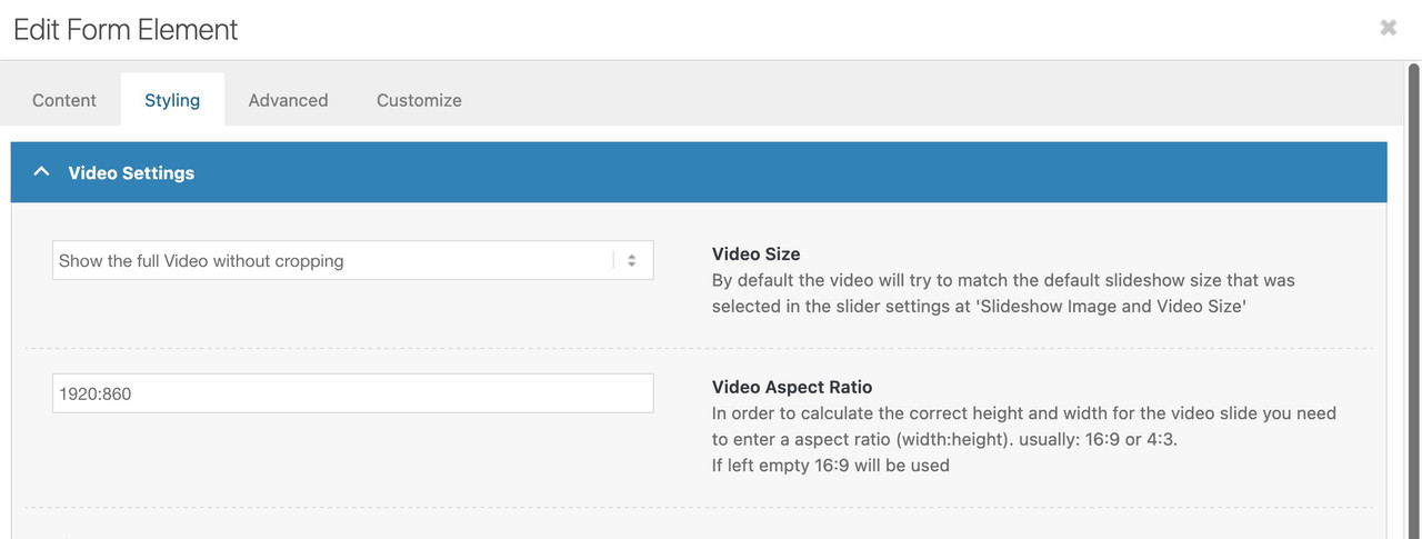
then you will not have the black bars on bottom/top.
Maybe give a custom class to your fullwidth slider – e.g.: logo-over-video
then see here full css code and example: https://webers-testseite.de/video-element/
did you try ismaels code?
in your div there is no id – only a data-sender-form-id thats why i ask.but: you see on ismaels code the callback – so this might be work as expected.
maybe a delegate : ‘a’,is missing – just try first the code above.
on the magnificPopup script you have that trigger class: inline_popup – did you set it on a parent-element of the button?
The button itself got an ID to open – did you think of to give the target that ID – f.e. on your div:<div id="target-ID" style="text-align: left" class="sender-form-field" data-sender-form-id="m8a4fv8kegj7l6vonkw"></div>please remember that ( this is definitly not the trouble with your scripts – but just to mention )
$(window).load(function() {is deprecated since jQuery 3.x
you had to use now:
$(window).on('load', function(){March 25, 2025 at 8:12 am in reply to: Trying to load website name and page-title in h1 tag #1480107but you do not want to combine those things mentioned on the other post?
see f.e.: https://enfold.webers-webdesign.de/impressum/
see text logo above , when you switch to other posts/pagesfunction use_text_logo_only($logo){ $link = apply_filters( 'avf_logo_link', home_url( '/' ) ); $logo_tag = "h1"; $logo_heading = "Webers Webdesign"; $alt = get_bloginfo( 'name' ); $title = get_bloginfo( 'name' ); $page_title = get_the_title(); if(is_search()){ $logo = '<a class="logo text-logo" href="'.$link.'" alt="'.$alt.'" title="'.$title.'"><'.$logo_tag.'>' .$logo_heading.' - Suchergebnisse</'.$logo_tag.'></a>'; } elseif(is_front_page()){ $logo = '<a class="logo text-logo" href="'.$link.'" alt="'.$alt.'" title="'.$title.'"><'.$logo_tag.'>' .$logo_heading.'</'.$logo_tag.'></a>'; } else{ $logo = '<a class="logo text-logo" href="'.$link.'" alt="'.$alt.'" title="'.$title.'"><'.$logo_tag.'>' .$logo_heading.' - '.$page_title.'</'.$logo_tag.'></a>'; } return $logo; } add_filter('avf_logo_final_output','use_text_logo_only');#top .logo.text-logo { display: flex; justify-content: left; align-items: center; width: auto; } #top .logo.text-logo h1 { margin: 0 !important; font-size: 30px; }March 25, 2025 at 3:15 am in reply to: Centering a line of 5 icons – if align center, they stack vertically #1480078or use those icons inside a text-block element: see example page at the bottom.
[av_textblock fold_type='' fold_height='' fold_more='Read more' fold_less='Read less' fold_text_style='' fold_btn_align='' textblock_styling_align='' textblock_styling='' textblock_styling_gap='' textblock_styling_mobile='' size='' av-desktop-font-size='' av-medium-font-size='' av-small-font-size='' av-mini-font-size='' font_color='' color='' fold_overlay_color='' fold_text_color='' fold_btn_color='theme-color' fold_btn_bg_color='' fold_btn_font_color='' size-btn-text='' av-desktop-font-size-btn-text='' av-medium-font-size-btn-text='' av-small-font-size-btn-text='' av-mini-font-size-btn-text='' fold_timer='' z_index_fold='' id='' custom_class='center-stars' template_class='' element_template='' one_element_template='' av_uid='av-psa03l' sc_version='1.0' admin_preview_bg=''] [av_font_icon icon='ue808' font='entypo-fontello' style='' caption='' size='40px' position='left' color='#eacf00' link='' link_dynamic='' linktarget='' title_attr='' sonar_effect_effect='' sonar_effect_color='' sonar_effect_duration='1' sonar_effect_scale='' sonar_effect_opac='0.5' animation='' id='' custom_class='' template_class='' element_template='' one_element_template='' av_uid='av-8z2voh' sc_version='1.0' admin_preview_bg=''][/av_font_icon][av_font_icon icon='ue808' font='entypo-fontello' style='' caption='' size='40px' position='left' color='#eacf00' link='' link_dynamic='' linktarget='' title_attr='' sonar_effect_effect='' sonar_effect_color='' sonar_effect_duration='1' sonar_effect_scale='' sonar_effect_opac='0.5' animation='' id='' custom_class='' template_class='' element_template='' one_element_template='' av_uid='av-27dcl9d' sc_version='1.0' admin_preview_bg=''][/av_font_icon][av_font_icon icon='ue808' font='entypo-fontello' style='' caption='' size='40px' position='left' color='#eacf00' link='' link_dynamic='' linktarget='' title_attr='' sonar_effect_effect='' sonar_effect_color='' sonar_effect_duration='1' sonar_effect_scale='' sonar_effect_opac='0.5' animation='' id='' custom_class='' template_class='' element_template='' one_element_template='' av_uid='av-1kvehwh' sc_version='1.0' admin_preview_bg=''][/av_font_icon][av_font_icon icon='ue808' font='entypo-fontello' style='' caption='' size='40px' position='left' color='#eacf00' link='' link_dynamic='' linktarget='' title_attr='' sonar_effect_effect='' sonar_effect_color='' sonar_effect_duration='1' sonar_effect_scale='' sonar_effect_opac='0.5' animation='' id='' custom_class='' template_class='' element_template='' one_element_template='' av_uid='av-4al7hd' sc_version='1.0' admin_preview_bg=''][/av_font_icon][av_font_icon icon='ue808' font='entypo-fontello' style='' caption='' size='40px' position='left' color='#eacf00' link='' link_dynamic='' linktarget='' title_attr='' sonar_effect_effect='' sonar_effect_color='' sonar_effect_duration='1' sonar_effect_scale='' sonar_effect_opac='0.5' animation='' id='' custom_class='' template_class='' element_template='' one_element_template='' av_uid='av-n9hech' sc_version='1.0' admin_preview_bg=''][/av_font_icon] [/av_textblock]March 25, 2025 at 2:38 am in reply to: Centering a line of 5 icons – if align center, they stack vertically #1480077use your code but wrap it by a column. That column got custom class – f.e. center-stars
– let them float left or center – not so important because positioning is part of flexbox layout:/* === put those icons inside a column - custom class is here : center-stars === */ #top .flex_column.center-stars { display: flex; flex-flow: row nowrap; justify-content: center; gap: 10px; } #top .flex_column.center-stars:before, #top .flex_column.center-stars:after { display: none; }see result (and code) on: https://webers-testseite.de/mie/
pay attention to the comments in the css ruleset on my site.March 24, 2025 at 1:28 pm in reply to: Special Heading “Heading Style Modern (left)” with light line #1480049btw: this handles visibility of that line:
#top .av-special-heading.blockquote .special-heading-border .special-heading-inner-border { opacity: 0.8; }March 24, 2025 at 12:25 pm in reply to: Special Heading “Heading Style Modern (left)” with light line #1480046ok – ich fand jetzt deine Seite – hilfreich wäre ein link gewesen:
/* === besides the heading === */ #top .av-special-heading.blockquote { display: grid; margin: 0; row-gap: 0px; /*=== influences the distance between heading and subheading ===*/ grid-auto-flow: row; grid-template-columns: auto 1fr; grid-template-areas: "area1 area2" "area3 area3"; } #top .av-special-heading.blockquote .av-special-heading-tag { grid-area: area1; padding-right: 20px } #top .av-special-heading.blockquote .special-heading-border { display: block; grid-area: area2; } #top .av-special-heading.blockquote .av-subheading_below { grid-area: area3; margin-top: -10px; /*=== if you like to have less distance between heading and subheading ===*/ }
und wie gesagt :
/* === besides the subheading : erase that rule if you like to have it besides the heading === */ #top .av-special-heading.blockquote { grid-template-areas: "area1 area1" "area3 area2"; } #top .av-special-heading.blockquote .av-subheading_below { margin-top: 10px; } March 24, 2025 at 12:09 pm in reply to: Special Heading “Heading Style Modern (left)” with light line #1480043
du hast auch nicht erwähnt, dass du die subline oberhalb der Headings hast.
für dich jetzt zum Testen :
#top .av-special-heading.blockquote { display: grid; margin: 0; row-gap: 10px; grid-auto-flow: row; grid-template-columns: auto 1fr; } #top .av-special-heading.blockquote .av-special-heading-tag { grid-area: area1; padding-right: 20px } #top .av-special-heading.blockquote .special-heading-border { display: block; grid-area: area2; } #top .av-special-heading.blockquote .av-subheading_above { grid-area: area3; margin-bottom: 20px; } #top .av-special-heading.blockquote { grid-template-areas: "area3 area3" "area1 area2"; }dann siehst du schon mal wie es wird.
_____________
um es selektiver zu gestalten müsstest du diesen Headings noch eine benutzer Klasse hinzufügen.
um für beide Fälle gewappnet zu sein.
z.B: subline-above oder subline-belowdann :
/* === besides the heading === */ #top .av-special-heading.blockquote.subline-above, #top .av-special-heading.blockquote.subline-below { display: grid; margin: 0; row-gap: 0px; /*=== influences the distance between heading and subheading ===*/ grid-auto-flow: row; grid-template-columns: auto 1fr; } #top .av-special-heading.blockquote.subline-above .av-special-heading-tag, #top .av-special-heading.blockquote.subline-below .av-special-heading-tag { grid-area: area1; padding-right: 20px } #top .av-special-heading.blockquote.subline-above .special-heading-border, #top .av-special-heading.blockquote.subline-below .special-heading-border { display: block; grid-area: area2; } #top .av-special-heading.blockquote.subline-below .av-subheading_below { grid-area: area3; margin-top: -10px; /*=== if you like to have less distance between heading and subheading ===*/ } #top .av-special-heading.blockquote.subline-above .av-subheading_above { grid-area: area3; margin-bottom: 10px; /*=== if you like to have less distance between heading and subheading ===*/ } #top .av-special-heading.blockquote.subline-above { grid-template-areas: "area3 area3" "area1 area2"; } #top .av-special-heading.blockquote.subline-below { grid-template-areas: "area1 area2" "area3 area3"; }March 24, 2025 at 8:48 am in reply to: Special Heading “Heading Style Modern (left)” with light line #1480029where do you like to have the heading border ? besides heading or besides the subline?
/* === besides the heading === */ #top .av-special-heading.blockquote { display: grid; margin: 0; row-gap: 0px; /*=== influences the distance between heading and subheading ===*/ grid-auto-flow: row; grid-template-columns: auto 1fr; grid-template-areas: "area1 area2" "area3 area3"; } #top .av-special-heading.blockquote .av-special-heading-tag { grid-area: area1; padding-right: 20px } #top .av-special-heading.blockquote .special-heading-border { display: block; grid-area: area2; } #top .av-special-heading.blockquote .av-subheading_below { grid-area: area3; margin-top: -10px; /*=== if you like to have less distance between heading and subheading ===*/ } /* === besides the subheading : erase that rule if you like to have it besides the heading === */ #top .av-special-heading.blockquote { grid-template-areas: "area1 area1" "area3 area2"; }important on animated gifs is that you enter the original file – not a recalculated smaller file.
if header scrolls away – think of correcting the padding-top for #main
_____________PS: I’m sure you’ll agree that it’s best to save this for another day, until the moment you have a clear idea of what your header should look like and how it should behave. I know you’re working on it, but just be aware that many of the solutions found wouldn’t work with a shrinking header. I’m sorry to say that I think we’ve lost time.
The next problem we might encounter is with mobile devices. Unfortunately, Enfold doesn’t provide a shrinking header for these, so it uses the scroll variant. But don’t worry, there’s a way around this! If we can adjust this (using a child theme avia-snippet-sticky-header.js), we can make sure your header reacts as you like it. So, what do you think, how big should it be at the start (maybe relative to the screen height)? And then, how small should it get?
Is this still the usual support we’re dealing with? You might want to consider getting in touch with a web design freelancer. ;)
Report please if google webmaster tools make a difference.
it is Bullinger site – so you decide what to use h1 a or vice versa
my css works – but on that page a lot of settings to force f.e. navigation to align middle are unnecessary. And some settings to logo container too.
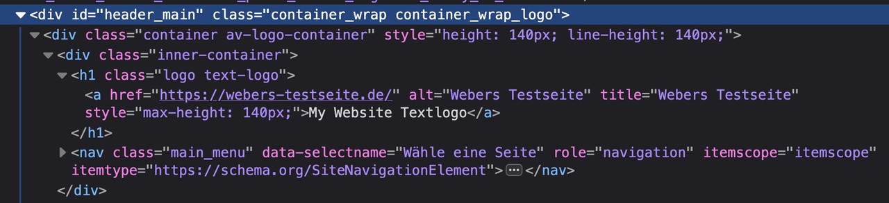
The more elegant method is to use display flex and a few other settings.by the way: on former times it is better to place the anchor-tag inside the heading-tag (as enfold do with f.e. entry-title etc.)
since html5 / xhtml this is not mandatory. You can have it vice-versa:function use_text_logo_only($logo){ $link = apply_filters( 'avf_logo_link', home_url( '/' ) ); $logo_tag = "h1"; $logo_heading = "My Website Textlogo"; $alt = get_bloginfo( 'name' ); $title = get_bloginfo( 'name' ); $logo = '<a class="logo text-logo" href="'.$link.'" alt="'.$alt.'" title="'.$title.'"><'.$logo_tag.'>' .$logo_heading. '</'.$logo_tag.'></a>'; return $logo; } add_filter('avf_logo_final_output','use_text_logo_only');to aline that heading with f.e. navigation to the right some css is needed:
#top .logo.text-logo  {
  display: flex;
  justify-content: left;
  align-items: center;
  width: auto;
}

#top .logo.text-logo h1  {
  margin: 0 !important;
  font-size: 30px;
}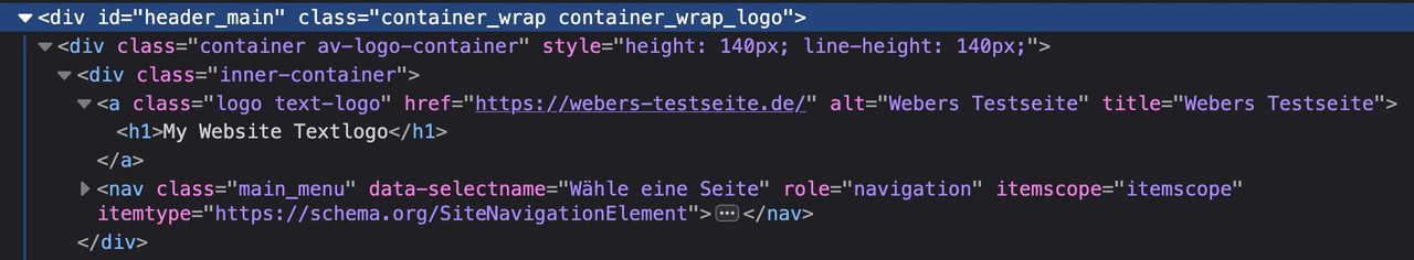
ps : the snippet below is without that condition – so you do not need to have an empty logo input field – because it will replace that anyway – and hamper img insertion:
here with alt and title attributesfunction use_text_logo_only($logo){ $link = apply_filters( 'avf_logo_link', home_url( '/' ) ); $logo_tag = "h1"; $logo_heading = "My Website Textlogo"; $alt = get_bloginfo( 'name' ); $title = get_bloginfo( 'name' ); $logo = '<'.$logo_tag.' class="logo text-logo"><a href="'.$link.'" alt="'.$alt.'" title="'.$title.'">'.$logo_heading.'</a></'.$logo_tag.'>'; return $logo; } add_filter('avf_logo_final_output','use_text_logo_only');now you can switch between the tags on entering above what you like to have ( h1, h2, div, p, span )
you can always place a given direct phrase e.g.$alt = "my Alt Text";you do not have to use the bloginfo name.
forget about that – use: https://kriesi.at/support/topic/how-to-make-the-text-logo-h1/#post-1479660
no subtext is needed!on shrinking header you need:
#top .logo.text-logo, #top .logo.text-logo a { display: flex; justify-content: left; align-items: center; width: auto; margin: 0 !important; }ok – i found deep in my notes :
but you see on the code : leave the logo input field empty !function change_logo_on_empty_logo_input($logo){ $link = apply_filters( 'avf_logo_link', home_url( '/' ) ); $logo_heading = "my logo title"; // you can have here f.e.: get_bloginfo( 'name', 'display' ) if(empty(avia_get_option('logo'))){ $logo = '<h1 class="logo text-logo"><a href="'.$link.'">'.$logo_heading.'</a></h1>'; } return $logo; } add_filter('avf_logo_final_output','change_logo_on_empty_logo_input');did you test that allready in a combination:
(on W3C it is allowed to have inside h-tag inline elements ( img, span …))PS: https://www.seo-suedwest.de/4490-google-es-ist-ok-das-logo-einer-webseite-als-h1-ueberschrift-auszuzeichnen.html
and
https://www.youtube.com/watch?v=ZKN8B3yeFAQ&t=3192syou can do that via jQuery – but if that is the right way to influence SEO ? – i guess on seo purpose the solution from https://kriesi.at/support/topic/how-to-make-the-text-logo-h1/#post-1479497
is ok.Edit : use the snippet on bottom.
there is only a filter to change the whole logo tag – but the subtext stays at span.
function new_avf_logo_headline($headline) {
  $headline = "h1";
  return $headline;
}
add_filter( 'avf_logo_headline', 'new_avf_logo_headline', 10, 1);
but: that is something different.
you only have the chance then to change it in source-code : function-set-avia-frontend.php line 621:
$sub = "<span class='{$subclass}'>{$sub}</span>";Please don’t be offended by this question. Not everyone on this forum is confident enough to navigate the wealth of Enfold options available.
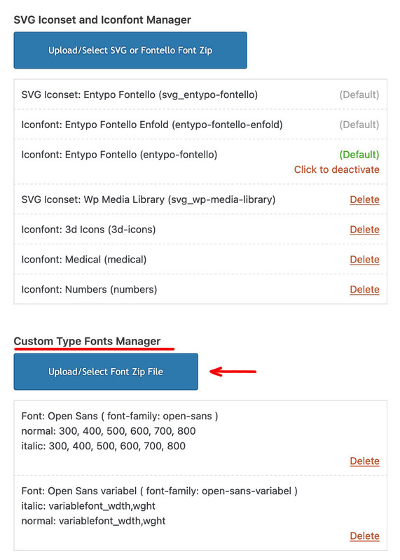
Just to be sure, you are uploading these zip files via the Custom Type Fonts Manager and not via the SVG Iconset and Iconfont Manager. As I see your screenshot, and in the background you can see this field of icon fonts.
Du kannst es mit einem Accordion auch gut hinbekommen ( mit nur einem Toggle ), und hast dann sogar im Element selber Einfluss auf die Animationsgeschwindigkeit. Ausserdem ist der Button ( so du denn einen möchtest ) wahlweise ober- bzw. unterhalb platzierbar.
Zugegeben das ist etwas sehr gestyled – aber hier siehst du mal beide Anwendungen nebeneinander:
https://webers-testseite.de/fold-unfold-toggler/Du kannst bei dem Fold/Unfold überigens den Verlauf wegnehmen; musst dann aber die Höhe so abpassen das ein Zeile nicht angeschnitten wird.
.avia-fold-unfold-section .av-fold-unfold-container::after { background: none !important; }concerning to svg ( that topic is closed ) you asked make svg – so i thought you do not have one.
You can use Illustrator to do so from an image – but this image redrawer is not 100% accurate, it depends mainly on the image and its resolution.By the way – I know this might be a lot of work – but it might help us if your demos were also up to date with the latest Enfold version, at least the big last main demo (unfortunately the one from 2017).
-
AuthorPosts