Forum Replies Created
-
AuthorPosts
-
where did you get that columns options ? – it is only present if you choose the “blog-grid” style – not in the single-big.
so maybe this is the reason for having troubles on that.Edit : i can reproduce the existance of columns ( it remains in the shortcode if you have set before a grid style) – changing back to single big does not remove it ( but on that case there will be no influence of that option.
i tested a similar code ( even with unneeded columns options ) but it still works on my Enfold widget.
I was already aware that you wanted the complete duplicator backup; but for copy right reasons this is not possible.
That plugin will work with boxed layout without any editing.
Only if this construction as shown on the test page it will be necessary to have a congruent copy of the whole:
( click to enlarge)
And this will only work if you change the source code of that plugin!
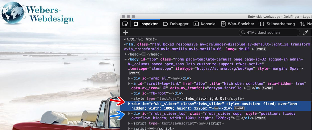
On default there will be only the red arrowed container with z-index -1
the copy ( green arrow) is set to the given height on top: f.e. 105px height and z-index: 500 and of course to overflow hidden.
Without this construct, the header would remain fixed, but the page content would reappear above the header when scrolling.To your question on a backup. : No
i will give you instead a good tutorial to obtain that simple boxed layout – but with header on top – no distance.
That is only css and that little plugin.
that edited plugin was hard work – so thats my unique selling point ;) – sorry.i switched to pseudo fixed frame – it is a boxed layout with #header and #main distance from top.
The trick here is as mentioned above that i have a copy of the “html” background on top with defined height and great z-index.
the copy on that background slider plugin – is only possible on changing the plugin code.
A slide change on the page during page will not work propperly – because there will be no synchronicity in the two containers
see test page.
Edit: to my great surprise, even this is going pretty well.
at least a few cycles-
This reply was modified 7 years ago by
Guenni007.
March 7, 2019 at 10:02 pm in reply to: Icon Grid Element – hide flipside content on small / mobile screens #1076121thanks
DankeSee here our results in comparison to default behavior:
https://webers-testseite.de/gridflip/i need to see your site
March 7, 2019 at 7:24 pm in reply to: Icon Grid Element – hide flipside content on small / mobile screens #1076094was gut wäre, wenn du den langen Überschriften mittels
­Soll-trennstellen einfügen könntest, denn die brechen nicht um.
Das kann man erzwingen, allerdings sind die Umbrüche die per css möglich sind nicht immer beliebt :lol:.av_icongrid_title.icongrid_title { hyphens: auto; }gemeint ist also sowas in die Eingabe zu geben:
Kosten­trans­parenz
denn wenn du nicht so oft dort text änderst ist das doch zumutbar, die Trennungen selbst zu bestimmen . dann ist autohyphens auch nicht nötig.PS : bei justify-content – kannst du mal was spielen: ( center sieht dann bei dir auch nicht schlecht aus)
da gibt es:- flex-start (default): items are packed toward the start line
- flex-end: items are packed toward to end line
- center: items are centered along the line
- space-between: items are evenly distributed in the line; first item is on the start line, last item on the end line
- space-around: items are evenly distributed in the line with equal space around them
- space-evenly: items are distributed so that the spacing between any two adjacent alignment subjects, before the first alignment subject, and after the last alignment subject is the same
bitte immer auch an die -webkit- definitionen mit denken
hier mal wie es wirkt: https://css-tricks.com/almanac/properties/j/justify-content/March 7, 2019 at 6:41 pm in reply to: Icon Grid Element – hide flipside content on small / mobile screens #1076082Du hast mich da auf eine Idee gebracht. Warum hier nicht die Weite flexibel nehmen. Ich denke da an das Flex Box ( Grid ) Modell.
.avia-icongrid {
	display: -webkit-flex;
    display: flex;
    -webkit-flex-flow: row wrap;
    flex-flow: row wrap;
    -webkit-justify-content: center;
    justify-content: center;
}

.avia-icongrid li {
    -webkit-flex: 0 1 240px;
    flex: 0 1 240px;
}

.avia-icongrid li .avia-icongrid-content {
    padding: 0 1.5em !important;
}

.avia-icongrid-numrow-5 li {
    width: 100%;
}
dann hat man sogar mehr als 5 Säulen bei breiten Screens!
March 7, 2019 at 6:08 pm in reply to: Icon Grid Element – hide flipside content on small / mobile screens #1076072Das passiert ja bei deiner Seite so bei 990px – es geht in die Zweispaltigkeit über, deshalb hast du dann auch immer eine Lücke.
Wenn du bei 4 startest wäre das halt nicht so.well i did here a playground for that.
to have a fixed frame layout with image above the header is very tricky – if you want to have a sticky header.
If header is allowed to scroll away that might be easier to style.See here with a little trick to obtain a “background” on top of a sticky header: https://webers-testseite.de/goldfinger
the background is in this case styled by a very old plugin – but still working – but you can do that by css too.
It is more or less playing with different transparencies – because the content had to be easily legible
PS: this here is a website with fixed framed : https://webers-testseite.de/bernhard/
and if you can work with developer tools you can see the extra div on top with higher z-index to cover the scrolling content.March 7, 2019 at 3:58 pm in reply to: Icon Grid Element – hide flipside content on small / mobile screens #1076026Um nicht solch hohe Säulen zu haben wäre eventuell gut wenn du das Padding generell etwas ändern würdest – also nicht bei kleinen Screenweiten sondern global:
.avia-icongrid-flipbox li .avia-icongrid-flipback .avia-icongrid-inner {
  padding: 10px !important;
}
wenn du das umgesetzt hast schaue ich nochmal über die Seite.
Edit: na mal sehen ob es was bringt – kann ich in den Developer Tools nicht so optimal simulieren.
March 7, 2019 at 3:43 pm in reply to: Icon Grid Element – hide flipside content on small / mobile screens #1076018Danke – ich denke wir können hier mal kurz deutsch parlieren.
die Distanz wird natürlich auch von dem Inhalt auf der Backside bestimmt, da die aber ja im responsiven Fall weg ist, kannst du das Padding dort auf weniger setzen als vorgesehen und –
da du keine Links auf den Icons hast , kannst du auch den Cursor auf den normal Wert setzen:
passe das Padding deinen Bedürfnissen an.@media only screen and (max-width: 767px) { .avia-icongrid-flipbox li .avia-icongrid-front .avia-icongrid-inner { padding: 2em 2em; } .avia-icongrid-flipbox li { cursor: default; } }PS: bei der Menge an Icons hätte ich wahrscheinlich trotzdem nur 1/4 columns genommen.
no phantasie on replacing the color to a hex-code color?
choose yourself: here.alternate_color.title_container { background-color: #176e0e; } .alternate_color.title_container * { color: #fff !important; }the asterisk defines all following childs with that font color: so title and breadcrumb are then influenced.
March 7, 2019 at 11:42 am in reply to: Icon Grid Element – hide flipside content on small / mobile screens #1075932try this in quick css:
@media only screen and (max-width: 767px) { .avia-icongrid-flipbox li article { display: inline } .avia-icongrid-flipback { display: none } }set the empty 1/3 column to “equal heights”
March 7, 2019 at 9:06 am in reply to: Enfold shortcode not rendering with The Event Calendar plugin #1075858Well Victoria – thanks on that – but i think the link to a complete enfold theme is not under the interest of Kriesi ;)
yes that code is for quick css and i guess this must be code with opacity:1 existing in your quick css already
(by default enfold got a opacity of 0.8)By the way, I’m very impressed by your pictures;
unfortunately I use my photo equipment very little for creative purposes. I do quite a few art reproductions with my Nikon D850. I am convinced that I could photograph much more than Rhenish Impressionism with it ;)By the way – a bit off topic but on your (@hokuspokus) page 22 of that slideshowthat’s just like Enfold uses his (predefinded) child theme.
– there is only functions.php and style.css ( and a little png/jpg for preview)
So from that aspect you don’t need to mention that security risk here.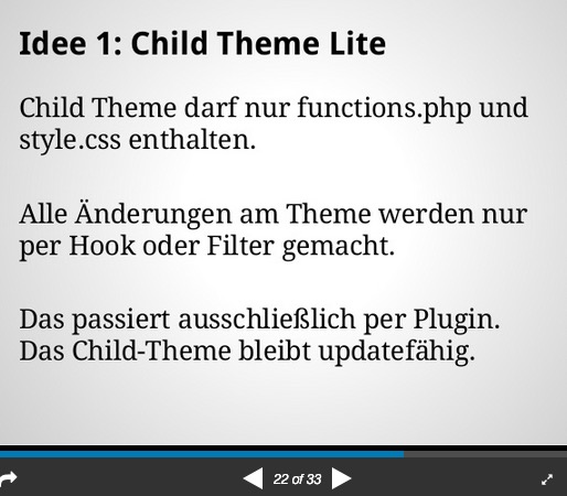
that new option works well on my side here:
( click to enlarge )
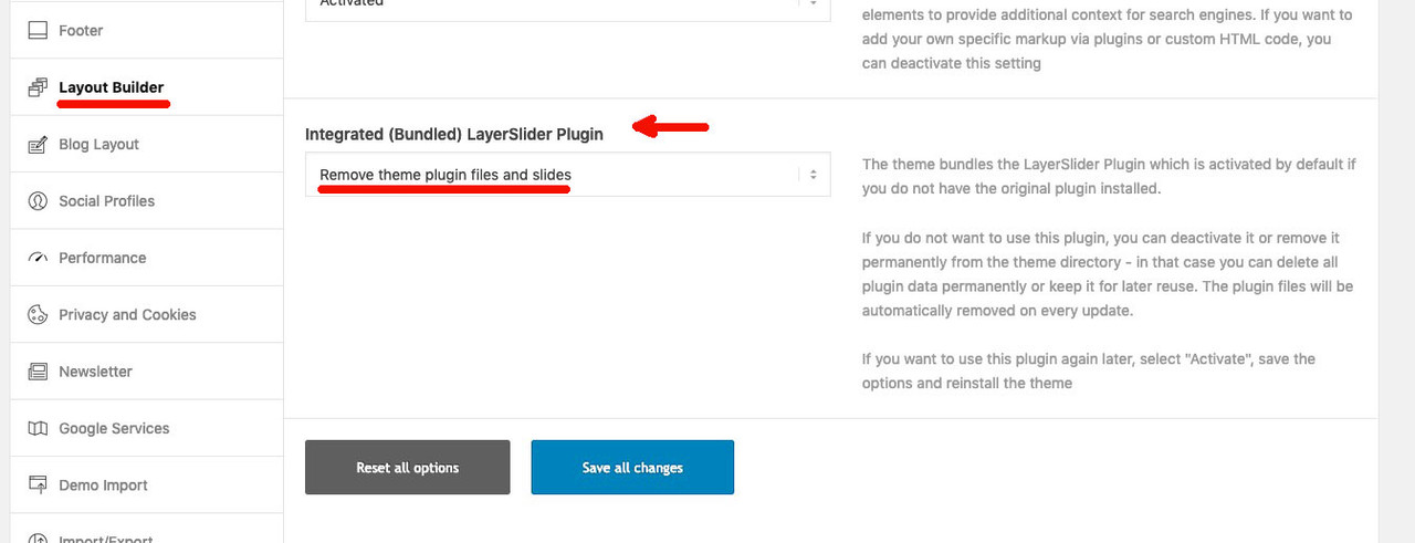
but if you want it completely removed you had to get rid of the alb element itself
so delete the folder : slideshow_layerslider in the avia-shortcodes folder.
because the alb loads the js and the css files via:function extra_assets() { //load css wp_enqueue_style( 'avia-module-slideshow-ls' , AviaBuilder::$path['pluginUrlRoot'].'avia-shortcodes/slideshow_layerslider/slideshow_layerslider.css' , array('avia-layout'), false ); //load js wp_enqueue_script( 'avia-module-slideshow-ls' , AviaBuilder::$path['pluginUrlRoot'].'avia-shortcodes/slideshow_layerslider/slideshow_layerslider.js' , array('avia-shortcodes'), false, TRUE ); }or deregister those scripts via child-theme functions.php
Or: put an empty slideshow_layerslider.php in to your child-theme shortcodes folder and activate substitution via child-theme functions.php by:
add_filter('avia_load_shortcodes', 'avia_include_shortcode_template', 15, 1);
function avia_include_shortcode_template($paths){
  $template_url = get_stylesheet_directory();
      array_unshift($paths, $template_url.'/shortcodes/');
  return $paths;
}
if you like – try to find here something with layerslider roots: https://webers-testseite.de/elegant/
thanks for response and feedback:
allthough i would like to know that i’m on a lightbox so maybe a little transpranency would be nice:
( but that’s up to you, of course – and a matter of preference ).mfp-zoom-in.mfp-ready.mfp-bg, .mfp-zoom-in.mfp-ready.mfp-preloader { opacity: 0.9 !important; background: black !important; }By the way : on your website the directory listing is possible so i can search in your uploads folder and download the bigger files.
I don’t think this can be in your interest.
There are different ways to disable that – i use for that htaccess file.
f.e. with thatOptions All -Indexes
please inform yourself in detail, this is already a security riskthanks Guenter –
danke eine einfachere Lösung als das ganze Manuell einzufügen wäre gut .can be closed.
no por eso – gracias por los retroalimentación
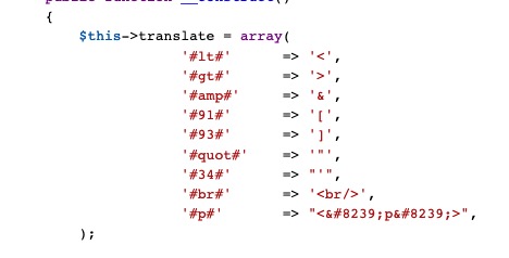
No sé si es español actual. Traducido aquí con DeepL ;)second note if you like to show a p-tag the plugin does not work without space between the p and the special characters
i added a p-tag case so i have now in my plugin:$this->translate = array( '#lt#' => '<', '#gt#' => '>', '#amp#' => '&', '#91#' => '[', '#93#' => ']', '#quot#' => '"', '#34#' => "'", '#br#' => '<br/>', '#p#' => "< p >", );the 8239 thing is a Narrow No-Break Space
edit – sorry it is transformed through board soft – here an image:
see here in action: https://webers-testseite.de/greater-than/
by the way – i’m interested in that blog – can you post that link ?
can you try this in child-theme functions.php :
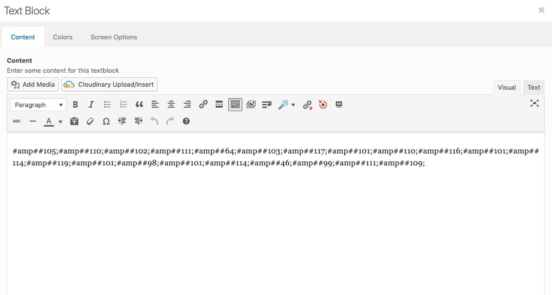
add_filter( 'widget_text', 'do_shortcode' );i copy & pasted the code for my e-mail adress and replaced the ampersand through #amp#
( as mentioned above i changed code a little of Günter to only have one # before and after )
so i got : ( and this text you can even enter in visual mode )
#amp##105;#amp##110;#amp##102;#amp##111;#amp##64;#amp##103;#amp##117;#amp##101;#amp##110;#amp##116;#amp##101;#amp##114;#amp##119;#amp##101;#amp##98;#amp##101;#amp##114;#amp##46;#amp##99;#amp##111;#amp##109;
click to enlarge the images:
i can edit those posts without any loss of the inserted code.
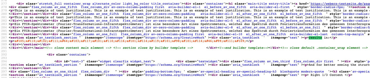
see here the result: https://webers-testseite.de/pages-2/
source code of that page (developer tools will show the “encrypted” text) :
i use “MailTo Links” that based on Rot13 method.
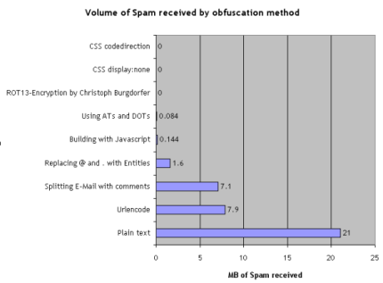
you can setup this plugin to encrypt even plain e-mails in text to crypted one.
by the way this is a very simple email obfuscation. There are better plugins with high encryption methods.
https://blog.mühlemann.ch/2008/07/20/ten-methods-to-obfuscate-e-mail-addresses-compared/EDIT : ah sorry i did not see your last link goes to Günters Plugin. But on my end this works as it shoud.
______
I believe that wealthyone is in principle already right there with his guess. If you write these tags yourself, then you have to enter them in the text mode there.There are some special characters you cannot use in Textblock and input fields because they break the internal structure – this is a known limitation in our builder.
They are unfortunately always evaluated as tag beginning or tag end. greater than or less than character ( etc.) .
Günter from the developer team had written a small plugin for this, so that you can use these characters in the text.
Please search for: avia-special-characters : linki just changed the code a bit not to have as many # but only one before one after the input – see here: https://kriesi.at/support/topic/in-content-crash-page/#post-1054980
si por lo general no desea ofrecer una búsqueda, ¿por qué no hacerlo directamente en las opciones de enfold?
Enfold (Niño) – Menú principal – Añadir el icono de búsqueda al menú principal.
( Lo siento, pero no veo las traducciones en español en mi tema )well – it seems that it is an effect caused by having a transparent header on wide screens and the change from opacity 0 to 1 and viceversa on header_bg.
there are two classes set or removed av_header_transparency and header-scrolled ( header-scrolled-full ) at the same time.
If you give to the header_bg a background-color to the given needs ( in my case it is white ) the opacity change will not be seen.
in my case the rule :@media only screen and (max-width: 768px) { .responsive #top .header_bg { background-color: #fff !important; opacity: 1 !important; } }solves the problem – and on that enfold-demo page it will do the trick too: https://kriesi.at/themes/enfold-2017/
It seems not to happen that conflict when we have a non-sticky header on wide screens.
Can be closed. -
This reply was modified 7 years ago by
-
AuthorPosts