Forum Replies Created
-
AuthorPosts
-
that is really strange – on the whole theme (only on my huge test page ) i found it but i do not use avf_dynamic_css_additional_vars ( nor avf_dynamic_css_after_vars) filter
but i can see :

But even if I had set a new definition through these filters or added new variables, they would not be listed there, but at a different location. They would be grayed out at the bottom of that list and appear in a new list.
try :
#top #searchform.av_disable_ajax_search  #searchsubmit {
  right: auto;
  left: 8%;
}

#top .cn-page-heading-container #searchform {
  background-color: #FFF;
}

#top .cn-page-heading-container #searchform > div {
  max-width: 320px;
  display: block;
  margin: 0 50px;
}

#top .cn-page-heading-container #searchform  #searchsubmit,
#top #avia-menu #searchsubmit,
#top #searchform #searchsubmit {
  right: 0px !important;
  left: auto;
}
and have a look to your search page itself – if this is o.k. for you too!
see : https://riseandshine.childrensnational.org/?s=webI see – that may be the crux of the matter.
can you check it with “copyright” on search please
this setting ismael mentioned comes from “General Layout”:

but that will change all container width to that dimension.
So if you only want to have that on the given page – put this to your quick css :.responsive #top.page-id-918 #main .container { max-width: 1100px; }well it is the same setting – but you placed on the other textblocks manual breaks:
see:
(click to enlarge the images)

and because of text-align: center – these phrases are not the full width:

on https://kriesi.at/support/topic/center-logo-with-burger-icon-on-right/#post-1481879 it is the setting now.
change font-size to 36px or something else.#top #wrap_all #av-burger-menu-ul li { font-size: 36px !important; }see: https://kriesi.at/support/topic/center-logo-with-burger-icon-on-right/#post-1481874
it does work on dev tools – so either it had to set something to !important or to have on a selector a higher specificity.
Try:
@media only screen and (max-width: 767px) { .responsive #top .avia-content-slider-element-container .avia-content-slider-inner .slide-entry-wrap { display: flex; flex-flow: row wrap; justify-content: space-between; } .responsive #top .avia-content-slider-element-container .avia-content-slider-inner .slide-entry-wrap .slide-entry { flex: 1 1 100%; margin: 0 0 20px !important; width: unset !important; } }font-size is now on :
#top #wrap_all #av-burger-menu-ul li {
  font-size: 40px;
}
just change that value
the logo positioning with 37% on the left is not so advisable.
i would first make the header fixed even in between 768 and 989 px.
then make for the nav a determined width – f.e. 170px#top .av-main-nav-wrap { float: right; position: relative; z-index: 3; padding: 0 !important; margin: 0 0 0 15px !important; } .header_color.av_header_transparency .av-hamburger-inner, .header_color.av_header_transparency .av-hamburger-inner::before, .header_color.av_header_transparency .av-hamburger-inner::after { background-color: #FFF !important; } #top .av_header_transparency .phone-info, #top .av_header_transparency .social_bookmarks li a { color: #FFF !important; } #top .av_header_glassy.av_header_transparency .avia-menu.av_menu_icon_beside { border: none !important; } #top .main_menu { width: 170px } #top .logo { width: calc(100% - 170px); left: unset; } #top .logo img { left: 50%; transform: translateX(-50%) } @media only screen and (min-width: 768px) and (max-width: 989px) { .responsive.html_mobile_menu_tablet #top #wrap_all #header { position: fixed; } } @media only screen and (max-width: 767px) { #header .social_bookmarks { display: none !important; } }First have a look at the burger opened layout – this is realy nearby your example page – isn’t is?
now your columns – best would be if the section got a custom class that no other sliders are influenced :
look for testing purpose:
@media only screen and (max-width: 767px) { #top .avia-content-slider-element-container .avia-content-slider-inner .slide-entry-wrap { display: flex; flex-flow: row wrap; justify-content: space-between; } #top .avia-content-slider-element-container .avia-content-slider-inner .slide-entry-wrap .slide-entry { flex: 1 1 100%; margin: 0 0 20px !important; } }this is the rule that is set :
.av-burger-overlay-bg {
  z-index: 3;
  opacity: 0.9;
  background: #000;
  display: block;
  position: fixed;
}
so play here with opacity or background-color – for quick css add #top to the selector for more selectivity:
#top .av-burger-overlay-bg { opacity: 0.7; background: #000; }And do you have code that make the Burger menu background More transparent? So I can see more of the image behind it?
does that belong to charter school page or to your priverproducts.com page?
sorry i thought you like to have that look of your example page.
So maybe you try :#top .av-burger-overlay-bg { z-index: 3; opacity: 1; background-image: url(https://sonoranwaters.armourcloud.io/wp-content/uploads/2025/04/Custom-Pool-Designer-and-Builder-in-Scottsdale-Sonoran-Waters-3-1.jpg); background-size: cover; background-position: center bottom; background-repeat: no-repeat; display: block; position: fixed; } #top .av-burger-overlay-inner { z-index: 3; opacity: 1; background-image: url(https://sonoranwaters.armourcloud.io/wp-content/uploads/2025/04/Sonoran-Waters-Logo_LONG.png); background-repeat: no-repeat; background-size: 450px; background-position: center top; background-color: rgba(0,0,0,0.4); backdrop-filter: blur(2px) }you header settings and logo behaviour should be corrected generally.
Overlapping with burger icon etc. – that is something we can do for burger overlay then too.and maybe this is nicer on transparency headers:
#top .av-main-nav-wrap { float: right; position: relative; z-index: 3; padding: 0 !important; margin: 0 0 0 15px !important; } .header_color.av_header_transparency .av-hamburger-inner, .header_color.av_header_transparency .av-hamburger-inner::before, .header_color.av_header_transparency .av-hamburger-inner::after { background-color: #FFF ; } #top .av_header_transparency .phone-info, #top .av_header_transparency .social_bookmarks li a { color: #FFF; } #top .av_header_glassy.av_header_transparency .avia-menu.av_menu_icon_beside { border: none !important; }find those entries in your css and korrekt them by:
@media only screen and (min-width: 768px) and (max-width: 989px) { .responsive.html_mobile_menu_tablet.html_header_top #top #main { padding-top: 70px !important; } } @media only screen and (max-width: 767px) { .responsive.html_mobile_menu_tablet.html_header_top #top #main { padding-top: 30px !important; } }The admin bar sometimes interferes with the setting of the frontend css.
have a look to this privacy page : https://webers-web.info/datenschutz/
if you scroll you see that the headings will be sticky til the next heading goes to top. if on that page the admin bar is present – the sticky moment seems to be wrong. – because those 50px are not concidered.
You can test it:
Go to your profile and turn off the “Show admin bar” to see that it has nothing to do with logging in and out.
This is something that normal users won’t see anyway.it is only on chrome and safari on Mac ( did not test PC browsers )
April 22, 2025 at 5:23 am in reply to: Indie record label looking for some quick help with our Enfold layout? #1481770have you installed an additional plugin to manage a menu styling or function?
There are two elements inside #header – that do not belong to enfold.
hide them ( or have a look what causes the insertion of those “menu” buttons )#advanced_menu_toggle, #advanced_menu_hide { display: none; }it is caused by the implementation of the “amazon pixel”
on firefox the dimension of 1×1 pixel seems to be enough to “hide” that element just before wrap_all opens.
That inline rule ( img#wpstats{display:none} ) does not work because there is no img with ID: wpstats )- so try:img[src*="amazon-adsystem"] { display: none; }Yesterday – on Easter Monday you (and also the participant in the linked post) posted a problem. Now – when does another company work on one of the most important holidays (holy days) there is?
In addition to this fact, you should also be aware that everyone else here is also entitled to support, so it may take some time for them to respond to your request. It’s only been one day since you reported a problem here. And I’m actually surprised that Rikard responded to your request so quickly.
Obviously, you must have had email contact with the team, because I don’t see any other support records from you.So if there is a reference to disabling the plugins (temporarily), it is to isolate the problem and help you figure out what the cause might be. It is not intended to be a solution to the problem.
If there has ever been such a “bug” in an Enfold version ( f.e.: see fix on Version 6.0.2 – compatibility with WP 6.6 fix for block editor hiding ALB button in header), it has been fixed. So first of all, you should have a current version of the theme installed. If this is the case, it is wise to find out where the problem lies by first seeing if the problem persists without plugins enabled. If this is not the case, then activating the plugins one by one and seeing when the problem occurs will help you identify which plugin might be the cause. A lot of other users do not have that problem.PS : I’m a participant like you, who just didn’t want to go back to sleep the day after Easter Monday.
Enfold offers for text-block alb that option – on styling tab : text-block styling
Edit: oh sorry you mentioned that. But i do not understand what you like to achieve. Can you make a sketch?
do you like to have separators between those columns:
#top .av_textblock_section .avia_textblock {
  column-rule: 2px solid #ddd;
}
April 17, 2025 at 3:14 pm in reply to: Change image of demo and have bad picture quality now #1481516hast du darauf geachtet welche Größe des vorhandenen Bildes du einsetzt?

The reason for it is that the magnifying icon of the search is on the right ( so to speak : 4 items right – 3 items left.
But first – upload a logo ( your png ) that has not so many space on the right side!

see your jpg : https://www.schlosswirtschaft-schwaige.de/wp-content/uploads/2021/05/Schlosswirtschaft-Schwaige_Logo.jpg
btw: If you insert the jpg as a test, you will see that it is now centered, but visually it is more disturbing; you notice the imbalance to the menu items rather than to the heading in the slider.
As I said, as a participant I cannot see your private message area, so I cannot see a link if it has been posted. The link would be necessary for verification – because a screenshot is not meaningful enough to give advice.
if that is your css – the
@media only screen and (max-width: 768px) {is nested with a nother media query.
your :@media only screen and (max-width:767px) { .responsive #top #header_main > .container .main_menu .av-main-nav > li > a { padding-left: 0; } }is inside another media query ( with the same settings )
next hint: use for the max-width media query the odd setting – and for min-width the even ones.I don’t know if the above leads to conflicts, but put this as code instead:
@media only screen and (max-width: 767px) { /* Add your Mobile Styles here */ .responsive #header_main_alternate { display: block; } .responsive #top #header .main_menu { width: auto !important; } #header_meta .phone-info-custom::before { background-color: #ffffff !important; } .responsive #top #wrap_all .main_menu { left: 0px !important; } .responsive #top .logo { width: 50% !important; } .responsive #top #wrap_all .container { float: right !important; } #header_meta .phone-info-custom { font-size: 15px; font-weight: 800; color: #000000; padding-top: 70px; } #header_meta .container { max-width: 50% ; margin-left: 0px; margin-right: 0px !important; padding-left: 0px !important; padding-right: 0px !important; } /*PHONE INFO*/ #header_meta .phone-info-custom::before { display: none !important; } .phone-info { padding-top: 5px !important; } /*LOGO*/ .responsive .logo img { float: right !important; } .responsive #top .logo { position: static; display: table; height: 80px!important; float: none; padding: 0; border: none; width: 95%; } .main_menu { margin-left: 0px !important; } a { padding-left: 0px !important; } .responsive #top #header_main > .container .main_menu .av-main-nav > li > a { padding-left: 0; } } /* 💻 TABLETTE (entre 769px et 1024px) */ @media only screen and (min-width:768px) and (max-width:989px) { .responsive #top #wrap_all .av_mobile_menu_tablet .main_menu { left: 0 !important; } }real mobile devices do not have a shrinking header! – i do not see your conversation on private content area – and i do not see your site – but if you got css rules with classes like header-scrolled – this will not work on mobile devices!
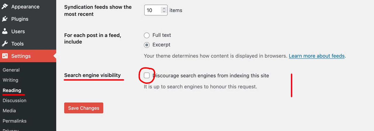
See line 81 in avia-snippet-sticky-header.js :if( shrinking && ! isMobile ){first question: under Dashboard – Settings – Reading -? Is there a mark on that checkmark?
it had to be not checked.
Next note: You are already aware that it can take a while for a SEO bot to scan your site.
You can trigger it manually in the Google Search Console ( Link ) , it would be good to upload a stored sitemap beforehand.Hint: have a look if you got a robots.txt on your site root directory.
(Edit: your robots.txt is o.k. 200 allowed)
And: have a look if you have all properties registered on Google Search Console
( by the way – your url is https://springen-conseil.fr/)thanks Ismael – and in that condition :
if( 'post' == $post->post_type )we now have to choose the cpt – if we only like to influence that post
It would be best if we could take a look at the site in question. If you can’t post the link, you’ll have to wait for the mods to look at it.
Reason: Basically it depends on what your logo looks like and what header layout you have chosen.yes give more info about the filter and what it is meant for. And how to use it in the sense of “for a specific post”
try :
#top .av-woo-purchase-button .product_meta { display: none; } -
AuthorPosts