Forum Replies Created
-
AuthorPosts
-
hm – when reading his topic i guess he will only hide the logo when scrolling – so maybe this in child-theme functions.php
will do the job ( but without seeing your site it is hard to give advice)function hide_logo_on_scrolling(){ ?> <script> (function($) { $(function() { $( window ).scroll(function() { $('.logo img').css({ 'opacity': '0', 'transition': 'all 1s ease', }); clearTimeout( $.data( this, "scrollCheck" ) ); $.data( this, "scrollCheck", setTimeout(function() { $('.logo img').css({ 'opacity': '1', 'transition': 'all 1s ease', }); }, 250) ); }); }); })( jQuery ); </script> <?php } add_action('wp_footer', 'hide_logo_on_scrolling');yes if you better like to use a plugin – this is one i use for it: https://habenicht.io/product/enfold-repeatable-content/
it is not too expensive and it is especially written for enfold.
You will have all “repeatables” on the left side in dashboard – and you can place them by alb.


on “Content Elements” there is that alb : “Page Content”
so if you create a whole page with all you need – and then you can insert that page content to different pages / posts.
When editing that page all pages will follow that changings.I can’t see the benefit of a copy in the child’s theme.
This was my approach, unfortunately it doesn’t work that way.function add_megamenu_touch_fix(){ ?> <script> (function($){ $('#avia-menu .menu-item-mega-parent .avia_mega_div a').on('touchstart', function () { setTimeout(function(){ $(this).closest('.menu-item-mega-parent').find('>a').removeClass('open-mega-a'); $(this).closest('.menu-item-mega-parent').css('overflow' , 'hidden'); $(this).closest('.avia_mega_div').css({ 'opacity' : '0', 'display': 'none', }); }, 500); }); })(jQuery); </script> <?php } add_action('wp_footer', 'add_megamenu_touch_fix');It can’t be the first time that a touch-friendly Mega Div solution has been demanded.
A Mega Div with Anchor submenu items is not unusual, is it? So please find a solution on that issueJuly 29, 2019 at 12:42 pm in reply to: Is there a way to make a button disappear on a page after it's been clicked on? #1122730if you realy want to get rid of that button – you can use remove for it – place that in child-theme functions.php
f.e. you placed an enfold button and give a custom class to it f.e.: button-customclassfunction remove_a_button_with_custom_class(){ ?> <script> (function($){ $(".button-customclass a").click(function(){ $(this).remove(); }); })(jQuery); </script> <?php } add_action('wp_footer', 'remove_a_button_with_custom_class');even if they are different – you wouldn’t realy recognize a difference.
But what version of WordPress and Enfold do you use?
see here : https://webers-testseite.de/color-transformation/
i can define both values – and they are not changed !what about :
[av_privacy_link]Datenschutzerklärung[/av_privacy_link]well everything you did is correct.
the direct parent element of the items gets the flex property. So you can have that on a color-section your class.
If you just want to do reverse, everything is ok.
So from 1,2,3 becomes 3,2,1However, if you want to determine the order, you can set it to the flex items
@media only screen and (max-width:767px) {
.column_flex_reorder .entry-content-wrapper {
    display: flex !important;
    flex-direction: column;
    flex-wrap: nowrap;
}
  .column_flex_reorder .av_one_third:nth-child(1) {
    order:2
  }
  .column_flex_reorder .av_one_third:nth-child(2) {
    order:3
  }
  .column_flex_reorder .av_one_third:nth-child(3) {
    order:1
  }
}
nice Articel here: https://css-tricks.com/snippets/css/a-guide-to-flexbox/
Test page: https://webers-testseite.de/defined-order/
July 27, 2019 at 11:30 am in reply to: How do I create H1 tag from the Caption Title in Fullscreen Slider element? #1122303if you only have that on the given page and do not need to have that elsewhere i recommend to use: https://kriesi.at/support/topic/how-do-i-create-h1-tag-from-the-caption-title-in-fullscreen-slider-element/#post-1122106
can not open your image in the way above.
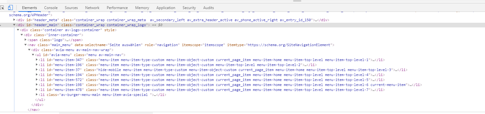
Can you please explain what you want to achieve with this?
The structure in your image is the default structure of logo left menu right ! except the hamburger menu is hidden when non-responsive menu is shown.this is one of mine:

a little effort:
$('#avia-menu').find('.menu-item-has-children:not(.menu-item-mega-parent).menu-item-top-level.current-menu-item .sub-menu a').on('touchend', iPadMenuFix);i placed another class to the selector so the mega-div does not hide the sublevel ul’s on touch now – but now we had to find a method to close the mega-div on touch any link in it !
maybe a toggle of the dynamically set of open-mega-a class could help…
i tried this first to see if i could be specific only to non mega-menu issue:
function add_touch_fix(){
?>
<script>
(function($){
	const iPadMenuFix = function() {
        $(this).closest('ul.sub-menu').delay(1000).animate({opacity: 0,},300, function() {
            $(this).css('visibility', 'hidden');
        })
    };

    $('#avia-menu').find('.menu-item-has-children:not(.menu-item-mega-parent).current-menu-item a').on('touchend', iPadMenuFix);
    console.log($('#avia-menu').find('.menu-item-has-children:not(.menu-item-mega-parent).current-menu-item a'));

})(jQuery);
</script>
<?php
}
add_action('wp_footer', 'add_touch_fix');
but it does not exclude the sub-menu hide on mega-div
this https://kriesi.at/support/topic/ipad-drop-down-menu-wont-tap-off/#post-1047074
works but has on mega-menu wrong behavior – because it hides the closest menu which is on most cases a second-level menu under mega-menu
see link on privage contenti have a similar problem – if the anchor-links in menu are submenu items in the dropdown.
Ipad – on ipad i have on landscape mode often the nicer main menu to see and not the hamburger.i can open the dropdown menu on ipad but after scrolling to the anchor the submenu does not close.
i tried this in functions.php:
function add_touch_fix(){
?>
<script>
(function($){
	$(document).ready(function(){
		$('.avia_mobile .main_menu ul .dropdown_ul_available .sub-menu li a').on('click touchend', function() {
		  	$(this).closest('.sub-menu').css({
			  	"opacity" : "0",
			  	"visibility" : "hidden",
			});
		});
	});
})(jQuery);
</script>
<?php
}
add_action('wp_footer', 'add_touch_fix');
but it does not do the trick. Even with a timeout function it does not work – any advice?
July 26, 2019 at 10:27 am in reply to: How to load a specific page as 'landing' for mobile visitors #1122120if you really mean that it is only for mobile devices you an use this into your child-theme functions.php:
add_action( 'wp_head', 'landingpage_for_mobile', 10 );
function landingpage_for_mobile() {
if(wp_is_mobile()){
?>
<script>
  if (window.location.pathname == '/' ) {
     window.location = "/imprint/";
  }
</script>
<?php
}
}
in this case the imprint page will be the landing page for mobile devices.
July 26, 2019 at 8:28 am in reply to: How do I create H1 tag from the Caption Title in Fullscreen Slider element? #1122106or if you do not like to use the edited alb elements you can replace only that specific heading by this function in child-theme functions.php:
function replace_tags_with_tags(){
?>
<script>
  (function($) {
      function replaceElementTag(targetSelector, newTagString) {
        $(targetSelector).each(function(){
          var newElem = $(newTagString, {html: $(this).html()});
          $.each(this.attributes, function() {
            newElem.attr(this.name, this.value);
          });
          $(this).replaceWith(newElem);
        });
      }
      replaceElementTag('.page-id-14 .avia-slideshow-1 .slide-1 h2.avia-caption-title', '<h1></h1>');
  }(jQuery));
</script>
<?php
}
add_action('wp_footer', 'replace_tags_with_tags');
you see that line:
replaceElementTag('.page-id-14 .avia-slideshow-1 .slide-1 h2.avia-caption-title', '<h1></h1>');you can add there as many lines as you like – if you are more specific with the selector you can be very strict in replacing
these lines must be semicolon separated.F.e. – if you have there :
replaceElementTag('.slide-1 h2.avia-caption-title', '<h1></h1>');every first slide in a slide-show will have a h1 tag then
July 26, 2019 at 8:13 am in reply to: How do I create H1 tag from the Caption Title in Fullscreen Slider element? #1122102if you like to set the heading tag on each slide in a different way – you can use my edited enfold alb elements.
But read carefully – on slider you need 4 files to substitute: https://webers-testseite.de/edited-enfold-alb-elements/July 26, 2019 at 8:07 am in reply to: How do I create H1 tag from the Caption Title in Fullscreen Slider element? #1122101you can put this into your child-theme functions.php:
function my_avf_customize_heading_settings( array $args, $context, array $extra_args = array() )
{
	if( $context == 'avia_slideshow' )
	{
		$args['heading'] = 'h1';
		$args['extra_class'] = 'is-h1';
	}
	return $args;
}
add_filter( 'avf_customize_heading_settings', 'my_avf_customize_heading_settings', 10, 3 );
just give that custom-class ( in my case it is : is-h1 ) to the fullscreen-slider
every slide-show with that class will turn the default h2 to h1 tag then.
if you are using a child-theme ( and i alway recommend that) you can replace the logo by adding something like this to your child-theme functions.php
add_filter('avf_logo','av_change_logo');
function av_change_logo($logo){
    if( is_page(121) ) {
    	$logo = "https://bright.itsomimedia.nl/wp-content/uploads/Bright_academy_bgwit3.png";
    }
    return $logo;
}
btw: you can have more substitutions like this way with all conditional possiblities you like:
add_filter('avf_logo','av_change_logo');
function av_change_logo($logo){
    if( is_page(121) ) {
    	$logo = "https://bright.itsomimedia.nl/wp-content/uploads/Bright_academy_bgwit3.png";
    }

    if ( is_page( array( 42, 54, 6 ) ) ) {
    	$logo = "http://www.domain.com/wp-content/uploads/logoforpage22.jpg";
    }

    if ( is_page() && !is_page(1307) )  {
    	$logo = "http://www.domain.com/wp-content/uploads/logoforpage23.jpg";
    }
    return $logo;
}
etc. pp.
none No capitalization. The text renders as it is. This is default
capitalize Transforms the first character of each word to uppercase
uppercase Transforms all characters to uppercase
lowercase Transforms all characters to lowercase
initial Sets this property to its default value.
inherit Inherits this property from its parent element.Sorry i thought this was clear where to replace!
#top #wrap_all .all_colors h1, #top #wrap_all .all_colors h2, #top #wrap_all .all_colors h3, #top #wrap_all .all_colors h4, #top #wrap_all .all_colors h5, #top #wrap_all .all_colors h6 { text-transform: none; }by the way: on wpml – this is the reason why i recommend finishing the styling of the main language and then synchronize these settings on each language version of the page.
That could be done by import/export : Export Theme Settings File / Import Theme Settings File.you can use :
text-transform : none ( maybe an !important is necessary )
it is possible – but the methods are different on some cases.
If you use WPML – ( some people say it is a bug : i think it is a feature ) every language has its own enfold options page.
So you could have different logos on those Input Fields ( you can see on top f.e.: Enfold Child (EN) Theme Options )
different quick css etc. pp.If you are using alternative language plugins – there must be equivalent methods – or you can do it via that filter: avf_logo
etc. pp. it would be nice to see the live-site link to give better advice.July 19, 2019 at 8:19 am in reply to: How to add something into the burger (mobile) menu on the fly? #1120095if your topmenu isn’t to big ( and i suppose that there is not enough place to have there a great menu) – wouldn’t it be easier and on performance reasons better to add those items manually to the main-menu and set those menu-items to display none on non-mobile case?
hm – i mean in this combination – i have altered the code above to :
function transfer_url_to_subject_field(){
?>
<script>
(function($){

    var urlQuery;
    var chopquery = function() {
        var match,
            pl     = /\+/g,  // Regex for replacing addition symbol with a space
            search = /([^&=]+)=?([^&]*)/g,
            decode = function (s) { return decodeURIComponent(s.replace(pl, " ")); },
            query  = window.location.search.substring(1);

        urlQuery = {};
        while (match = search.exec(query))
           urlQuery[decode(match[1])] = decode(match[2]);
    }

    chopquery();
    $('span.checkbox-403').find('input[value="' + urlQuery["trigger"] + '"]').prop("checked", true);
})(jQuery);
</script>
<?php
}
add_action('wp_footer', 'transfer_url_to_subject_field');
and the checkbox 403 has a lot of entries in my form ( see private Content)
is it possible to have an urlquery with multiple params in the link – and if : check both checkboxes.
July 15, 2019 at 8:46 pm in reply to: How is the "double button" at the KRIESI homepage done? #1118936if I had no respect for simple questions here, then I would be satisfied with hints at the solution approach. But I often mean to formulate precise instructions here. Some people may even be disturbed by the detail and illustrations – and many are not interested in a learning curve but just want to get the solution in the form of short snippets. But despite everything the questions are often not precise enough.
You presented me a picture of the slider above; then I mistakenly assumed that you wanted to achieve that. But in the end it’s not much different than the described procedure, because as the mods here already indicated, it’s not an ALB element, but just like I indicated above simple html insertion and css styling. So please always try to be as specific as possible in your question in order to avoid superfluous solutions.July 14, 2019 at 11:42 pm in reply to: How is the "double button" at the KRIESI homepage done? #1118630ps: on that case – you had to define the animation for those button container. That comes from slider description container. – but can be translated to it
July 14, 2019 at 11:39 pm in reply to: How is the "double button" at the KRIESI homepage done? #1118629And dear Gitte you aren’t able to transmit the more complicated case to an easier one?
the html code is above – put it in a text-block or code block element – the rest only had to be adjusted to not specific for sliders:.avia-double-buttons { margin-top: 30px; text-align: center; position: relative; } #top #wrap_all .avia-double-button, #top #wrap_all .avia-double-button { background: #000; background: rgba(0,0,0,0.4); border-color: #fff; color: #fff; padding-bottom: 11px; text-decoration: none; } #top .avia-double-button { letter-spacing: 1px; padding: 13px 20px; padding-bottom: 13px; text-transform: uppercase; font-size: 13px; text-align: center; min-width: 175px; display: inline-block; transition: all 0.4s ease-in-out; -moz-transition: all 0.4s ease-in-out; -webkit-transition: all 0.4s ease-in-out; -o-transition: all 0.4s ease-in-out; border: 4px solid #fff; border-top-color: rgb(255, 255, 255); border-right-color: rgb(255, 255, 255); border-right-width: 4px; border-bottom-color: rgb(255, 255, 255); border-left-color: rgb(255, 255, 255); text-decoration: none; } #top .avia-double-button-1 { border-top-left-radius: 100px; border-bottom-left-radius: 100px; border-right-width: 2px; } #top .button_or { position: absolute; display: block; height: 26px; line-height: 21px; width: 40px; text-align: center; top: 50%; left: 50%; margin: -13px 0 0 -22px; background: #fff; color: #666; border-radius: 100px; font-size: 12px; border: 2px solid #FFF; font-style: italic; font-weight: 600; z-index: 11; } #top .avia-double-button-2 { border-top-right-radius: 100px; border-bottom-right-radius: 100px; border-left: none; border-left-color: currentcolor; } #top #wrap_all .main_color .avia-double-button-1:hover, #top #wrap_all .main_color .avia-double-button-1:hover { background: rgba(0, 100, 190, 0.6); color: #fff; } #top #wrap_all .main_color .avia-double-button-2:hover, #top #wrap_all .main_color .avia-double-button-2:hover { background-color: rgba(200,0,120,0.6); color: #fff; } @media only screen and (max-width:480px) { .responsive #top .avia-double-button { width:50%; min-width:50%; margin:0 } }see test page
July 13, 2019 at 10:20 pm in reply to: Include icons with css [after] – not working for icons #1118408if you want to use a entypo-fontello font icon put in like that:
instead of the u in ue808 there must be a backslash..comment-header::after { content: "\e808"; font-familiy: entypo-fontello; … }if you are using win keyboards the back-slash got his own sign on keyboard
on mac keyboard you will find the backslash on :
⇑ ⌥ 7 : shift alt 7
(Alt could be named option key)-
This reply was modified 6 years, 9 months ago by
Guenni007.
-
This reply was modified 6 years, 9 months ago by
-
AuthorPosts