Forum Replies Created
-
AuthorPosts
-
this here differs a bit more on scroll direction – and has a nicer “goaway” effect:
it works with a toggle class – so you can more style that.
adjust the : //replace this value with the height of your header in px to your needsthis comes to quick css:
@media only screen and (min-width: 768px) {

 #header {
  -webkit-transform:  translateY(0px);
          transform:  translateY(0px);
  -webkit-transition: transform 1s ease;
          transition: transform 1s ease;
  }

  #header.hide {
      /* a little bit more than the header height */
  -webkit-transform:  translateY(-153px);
          transform:  translateY(-153px);
  -webkit-transition: transform 1s ease;
          transition: transform 1s ease;
}
}
this comes to child-theme functions.php:
function hide_header(){
?>
<script>
(function(){
    var doc = document.documentElement;
    var w = window;
    var prevScroll = w.scrollY || doc.scrollTop;
    var curScroll;
    var direction = 0;
    var prevDirection = 0;
    var header = document.getElementById('header');
    var checkScroll = function() {
     /** Find the direction of scroll ** 0 - initial, 1 - up, 2 - down */
      curScroll = w.scrollY || doc.scrollTop;
      if (curScroll > prevScroll) {  direction = 2;  //scrolled up
      }
      else if (curScroll < prevScroll) { direction = 1; //scrolled down
      }
      if (direction !== prevDirection) { toggleHeader(direction, curScroll);
      }
      prevScroll = curScroll;
    };
    var toggleHeader = function(direction, curScroll) {
      if (direction === 2 && curScroll > 150) {
        //replace this value with the height of your header in px

        header.classList.add('hide');
        prevDirection = direction;
      }
      else if (direction === 1) {
        header.classList.remove('hide');
        prevDirection = direction;
      }
    };
    window.addEventListener('scroll', checkScroll);
  })();
</script>
<?php
}
add_action('wp_footer', 'hide_header');
see here: https://webers-testseite.de/guenni/
Yes you have created one menu – and you set the mark for footer and top menu on that.
So this one menu ( each menu-item has now a unique id) is on each page/post once on top and once on footer.
so doubled.If you create a footer menu – and mark it as footer-menu
create a top menu and mark that as top menu
they could have the identical contentTo avoid double ids do not mark two fields in menu options:
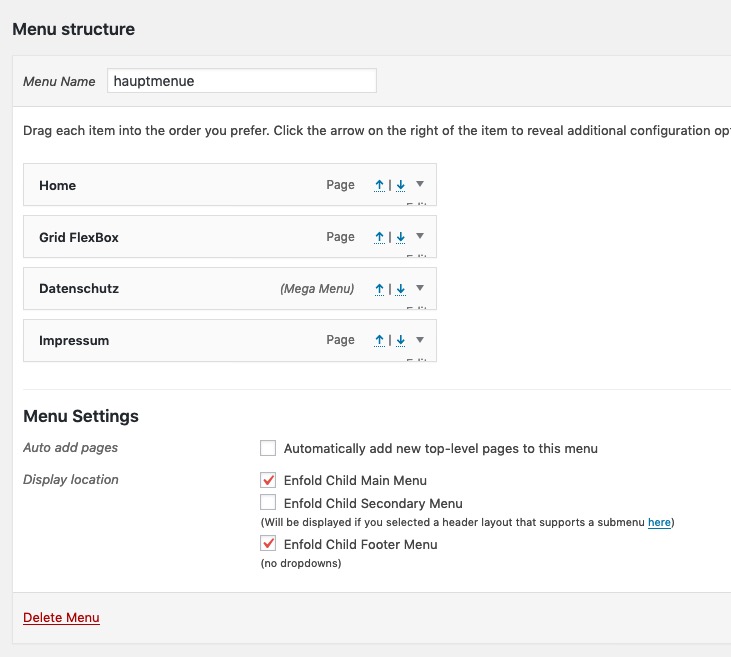
so let me guess that you have on Menu set two marks for the same Menu!
To avoid that – make a copy of your menu and set only one mark each.so now it looks good – but i guess 35px to add is better – then you see with your socket text its in the middle.
it seems to be not centered because your category list is left to the widget area and does not fill the whole space to the right.You can change that by centering that area (unordered list) by:
#footer .widgettitle {
    text-align: center;
}

#top #footer .widget ul {
  width: auto;
  display: inline-block;
  left: 50%;
  transform: translateX(-50%);
  position: relative;
}
_________________________________________
another elegant different method ( you then had to get rid of the css from above ) is only with quick css
set your footer to 3 columns and use the flexbox modell – put your image in the last footer column.@media only screen and (min-width: 767px) { #footer .container { display: flex; flex-flow: wrap row; justify-content: center; } #footer .flex_column { flex: 0 1 46%; margin: 2%; padding: 0; } }Result: https://webers-testseite.de/guenni/
-
This reply was modified 6 years, 7 months ago by
Guenni007.
thats why i wrote: If it is too much. there are possibilities to make it manually.
This above adds an additional widget! not a widget-area. So you only have to pull that widget to any footer widget area you like.
_________________another way is to create a shortcode for that social media icons – and that comes into child-theme functions.php too:
function social_bookmarks_shortcode() {
$social_args = array('outside'=>'ul', 'inside'=>'li', 'append' => '');
$social	= avia_social_media_icons($social_args, false);
return $social;
}
add_shortcode('social-bookmarks', 'social_bookmarks_shortcode');
this to quick css: ( just to show the list-items besides each other)
#footer .widget ul.social_bookmarks {
    display: inline-flex;
}
you can now put in a text widget (Any heading you like) : [social-bookmarks]
This is the fastest method – the one above in my first posting is elegant but maybe to complicated.
By the way you mean realy : #footer not #socket as Ismael asked here: https://kriesi.at/support/topic/how-to-add-social-media-icons/#post-1133902
for socket there is an option on Enfold Optionsschau bitte in deinen htaccess file auf dem Root Directory.
ftp client ( beim manchen muss man erst das Anzeigen der Versteckten Files aktivieren) und mal das .htaccess anschauen, ob dort eventuell was steht, was eine indexieren verhindern kann.Ps : wie alt ist deine Seite. – Es dauert erfahrungsgemäß ( ohne das man ein aktives scrawlen der Seite in den Google Developer Tools veranlasst ) schon einen Monat mindestens bis das was im index erscheint. Witzigerweise sind es in der Tat Bilder die häufig weit vor dem Content auftauchen in den Suchergebnissen.
from this time on – the first level under that item is declared as Column in the MegaMenu.
On Columns – you have the opportunity to say that the column starts a new row in MegaMenu etc. pp.
If you need more help – tell meGoto Dashboard – Appearance – Menus :
klick one of those littel arrows besides the MenuItem (first red arrow on my screenshot)
Mark the option (second red arrow on my screenshot)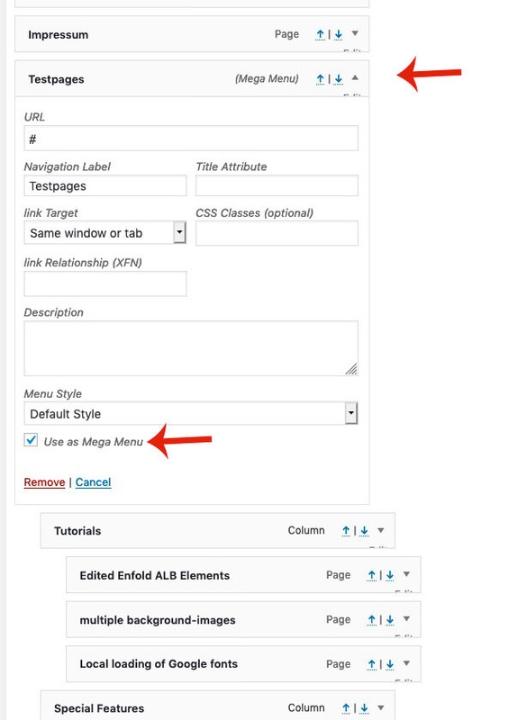
you see here the result in a little film when i add the code above in developer tools to your site:
But if I look at your page, you have also not been able to understand the above mentioned.
The one method to put the html code into the input field at Copyright is really a very fast uncomplicated method.
If you have done that – we can give you advice to absoluteley center it in perfection.
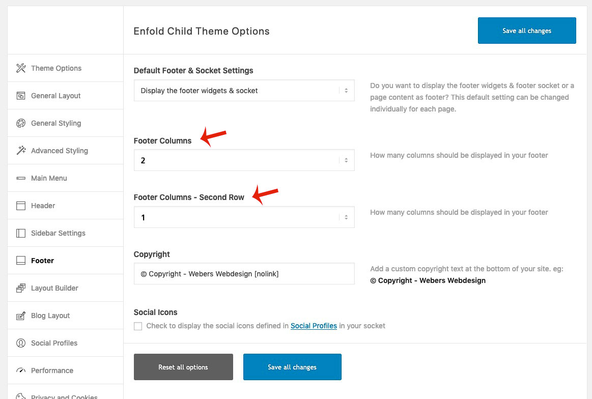
________________i don’t know if you are ready to generate an additional second footer widget area ?
then everything is easy for you (afterwards) you have in enfold then two footer rows.
You can set the first to 2 columns and the last to one column. see here result: https://webers-testseite.de/guenni/you will have on Enfold Options-Dialog then this:
If you like to know – i can show you how to.
but if you are a passionate fotographer – maybe a thirdparty plugin is a better way. there are exif addons – where you can sort the images on exif data.i tried some but no one supports Avia ALB or other image inserting on Enfold til now.
-
This reply was modified 6 years, 7 months ago by
Well : look at google font what is your prefered font there- maybe the font you use on your site.
look here: https://google-webfonts-helper.herokuapp.com/fonts
- only download the zip file –
- unzip the archive
- pick out the svg file. –
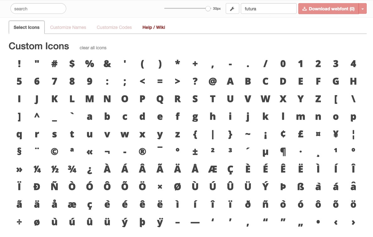
- goto fontello page http://fontello.com/
- drag&drop this svg file to the custom icons !!!
- Bingo – select the numbers and letters you like to have. –
- give a name to your new font –
- download from fontello –
- upload to your Import/Export Iconfont Manager
i did it with open sans 800 – thats what fontello made out of it:
 September 5, 2019 at 6:48 pm in reply to: Enfold 4.6 – Great job you did there again. My big compliment #1134573
Thanks for that fast fix to 4.6.1. !
Well more userfriendly than a whole code – only to copy and paste into the copyright input field?
Ok – glad we had talking about.Good luck to you.
so : Add an image banner between header and topbar sounds different for me.
if you could not even post the screenshots – then you had to wait til mods are here.Can you have a look to Dashboard – Settings – Reading : Search Engine Visibility if there is a mark – a robots text is set to not index the page.
September 5, 2019 at 2:53 pm in reply to: ? added: Developer tab to modal popup of alb elements #1134434Of course, I already saw this directly in the backend – after all, I was looking for the adaptations of what was adopted from edited Enfold ALB. Only the wording in the changelog was such that you could have expected something different.
Can be closedDanke – kann geschlossen werden!
By the way if you enter that pseudo content with :before and not :after the image will be over the top-bar !
by the way – you can even use it with shrinking header and on my test page: Link
i placed the now the same image in background-position : fixed – nice effect.The extra section above the top bar – is it part of header_meta? or is it an extra container?
The reason why i ask: if it is part of header_meta – everything works as it should
see here some declaration on that. The only thing to correct is main padding-top: https://kriesi.at/support/topic/add-an-image-banner-between-header-and-topbar/if you see my example page – you see that the avia-snippet-sticky-header.js calculates the header margin-top correct.
if it is only an image ( without content and other dynamic stuff)
you can simply add an image via pseudo-element: ( in my case it is page-id-3041)
the height you choose for that must be in addition to the normal main: padding-top value
(my testpage has a header-height of 130px + 250px = 380px.page-id-3041 #header_meta:after { content: ""; background-image: url(/wp-content/uploads/macro.jpg); background-repeat: no-repeat; background-size: cover; width: 100vw; height: 250px; position: relative; left: 0; bottom: 0; } .page-id-3041 #header_meta { display: grid; } .html_header_top.html_header_sticky #top.page-id-3041 #wrap_all #main { padding-top: 380px; }since it is part of header_meta, the height has already been taken into account by avia-snippet-sticky-header.js script:
topbar_height = header.find('#header_meta').outerHeight(),see result here: https://webers-testseite.de/datenschutzerklaerung/
on all pages or only for one?
This is still working even with Enfold 4.6. : https://kriesi.at/support/topic/social-bookmarks-widget-how-to/. – do not forget the css code!
If it is too much. there are possibilities to make it manually.Vielleicht funktioniert das aber nicht mehr mit dem Load More Button – keine Ahnung
For Masonry Gallery – try this in child-theme functions.php:
if(!function_exists('avia_change_posts_query')){
	function avia_change_posts_query($query, $params){
	    if(!empty($query['orderby']) && $query['orderby'] == 'post__in'){
                   $query['order'] = 'ASC';
                   $query['orderby'] = 'title';
	    }
	    return $query;
	}
add_filter('avia_masonry_entries_query', 'avia_change_posts_query', 10, 2);
}
ASC ( from A to Z )
DESC ( from Z to A )don’t know if there is a child-theme functions.php snippet to change that.
This is for Image Galleries:
well you can find in gallery.php ( enfold ▸ config-templatebuilder ▸ avia-shortcodes ▸ gallery )
on line 256 :'orderby' => 'post__in'
change it to'orderby' => 'title'you can have your own shortcode in child-theme – : https://kriesi.at/documentation/enfold/intro-to-layout-builder/#add-elements-to-alb
Even a preview image ( youtube thumbnail ) is against GDPR (DSGVO) – only if you are willing to download those images and present self-hosted is a safe way.
By the way – Borlabs Cookie (vers.2) has that option to show thumbnail by downloading the files to host it yourself.Thanks Colorit – i will save it in my snippets archiv. You never know if you might need it after all.
September 4, 2019 at 3:59 pm in reply to: Enfold 4.6 – Great job you did there again. My big compliment #1133900It’s great that you can put the ideas into practice so quickly. Many thanks to you
-
This reply was modified 6 years, 7 months ago by
-
AuthorPosts