Forum Replies Created
-
AuthorPosts
-
September 11, 2019 at 10:58 am in reply to: multiline Menu with shrinking header – tutorial #1136976
sorry – prematurely shot – here comes a new setting – but first think of all Enfold settings.
-
This reply was modified 6 years, 7 months ago by
Guenni007.
so – i’m Participant as you – you had to wait now
We had to see it – what you mean – maybe a screenshot to see what you like to achive and a link to site would be great.
If you can not make your links public – post it in private content area. then you had to wait til mods are hereAnd – did you have any luck to that.
did you set the custom class on those menu-items? ( 2. Add a custom CSS class name “multilineItem” to the menu item )
and ad the code to quick cssWie sieht es aus? Hats damit geklappt?
Open that masonry element and save it again – save page again.
on my test installation it works this way perfectlySeptember 10, 2019 at 12:29 pm in reply to: Easy way to address an external button to choose slides or tabs ? #1136514thanks – that was the right idea – with trigger click
Go and get rid of these two entries please.
Wenn das eine “ReallySimpleSSL” ein Plugin ist deactiviere das mal.
( Wenn auch du keinen Zugang mehr zu dem Backend hast, kannst du in das mysql hinein? ) Beim Hoster Backend mal anmelden.
https://help.one.com/hc/de/articles/115005593985-Deaktivieren-Sie-WordPress-Plugins-in-phpMyAdmin
_________
Lade dir das htaccess file runter – lösche die oben erwähnten Einträge mal. Benenne das Original file auf dem ftp um in zB: htaccess.bak (ohne punkt davor)
lade das veränderte file hoch.
ich denke, dass sich die beiden redirects loopen.
Wenn es das nicht ist kannst du ja wieder das file löschen und das bak zurück benennen ( dann mit punkt davor – und ohne dateiendung )-
This reply was modified 6 years, 7 months ago by
Sorry thought this was the snippet that works so far.
which version of enfold do you use?
goto: enfold ▸ config-templatebuilder ▸ avia-shortcodes ▸ av-helper-masonry.phpon Enfold 4.6.1 there is on line 612 :
$img_size = 'masonry';change masonry to : full. so that there is:
$img_size = 'full';Save that av-helper-masonry.php to your desktop ( or where you can find it easy )
to not lost this changing – use a child-theme shortcode folder : https://kriesi.at/documentation/enfold/intro-to-layout-builder/#customization
make a folder called shortcodes in your child-theme folder and put in this edited av-helper-masonry.php
that snippet from the documentation page comes to child-theme functions.php:add_filter('avia_load_shortcodes', 'avia_include_shortcode_template', 15, 1); function avia_include_shortcode_template($paths) { $template_url = get_stylesheet_directory(); array_unshift($paths, $template_url.'/shortcodes/'); return $paths; }from now on – the child shortcode with same name in that folder replaces the parent theme files.
du hast jetzt das wichtigste schon erreicht. Leider sind in deinen svgs die Klassen oft gleich, deshalb verändert sich auch die Füllung für cls-1 in beiden svgs (Schwimmer und Gewichtheber) – du musst daher einen Selector finden der nur für das eine svg zutrifft.
damit kommst du wieder zurück auf deine ursprüngliche Füllung.
Das SVG Support Plugin nummeriert die ersetzten imgs auf der seite durch.
Daher :#svg-replaced-0 .cls-1 { fill: #3d7cc9 !important; }leider legt zB auch Illustrator stets mit st die klassen an ( st0, st1, etc) ich bearbeite diese Klassen immer nach, um sowas zu vermeiden.
you can add even media queries for print-style to your quick css like:
@media print { #header, #footer, #socket { display: none !important; } }you can insert this to your child-theme functions.php:
function avia_change_masonry_thumbnail_link($size){ return "full"; } add_filter('avf_avia_builder_masonry_lightbox_img_size', 'avia_change_masonry_thumbnail_link', 10, 1);deutsch hat da vier files drin : jeweils zwei po/mo kombinationen – die eine ist für die formelle Ansprache : “Sie” die andere für das “Du”
und wenn du den entsprechenden file bearbeitet ( den po file bitte öffnen ) hast, dann solltes du diesen über dein Child-Theme laden.dieses kleine Snippent in der child-theme functions.php:
function overwrite_language_file_child_theme() {
    $lang = get_stylesheet_directory().'/lang';
    return $lang;
}
add_filter('ava_theme_textdomain_path', 'overwrite_language_file_child_theme');
dazu legst du in deinem child-theme einen Ordner lang an und packst den bearbeiteten lang file dort rein.
Dann gehen die Veränderungen auch nicht verloren.Trotzdem mal nachgefragt: was genau willst du ändern?
Wenn es nur von Du nach Fromal Sie gehen soll – dafür gibt es im lang ordner extra das de_DE_formal.po ( /mo) file etc. pp. einfach mal genauer beschreiben wohin die Reise gehen soll.Wenn ich mir zB das de_DE.po mit zB poedit öffne sehe ich die Sachen ziemlich alle an der gleichen stelle:
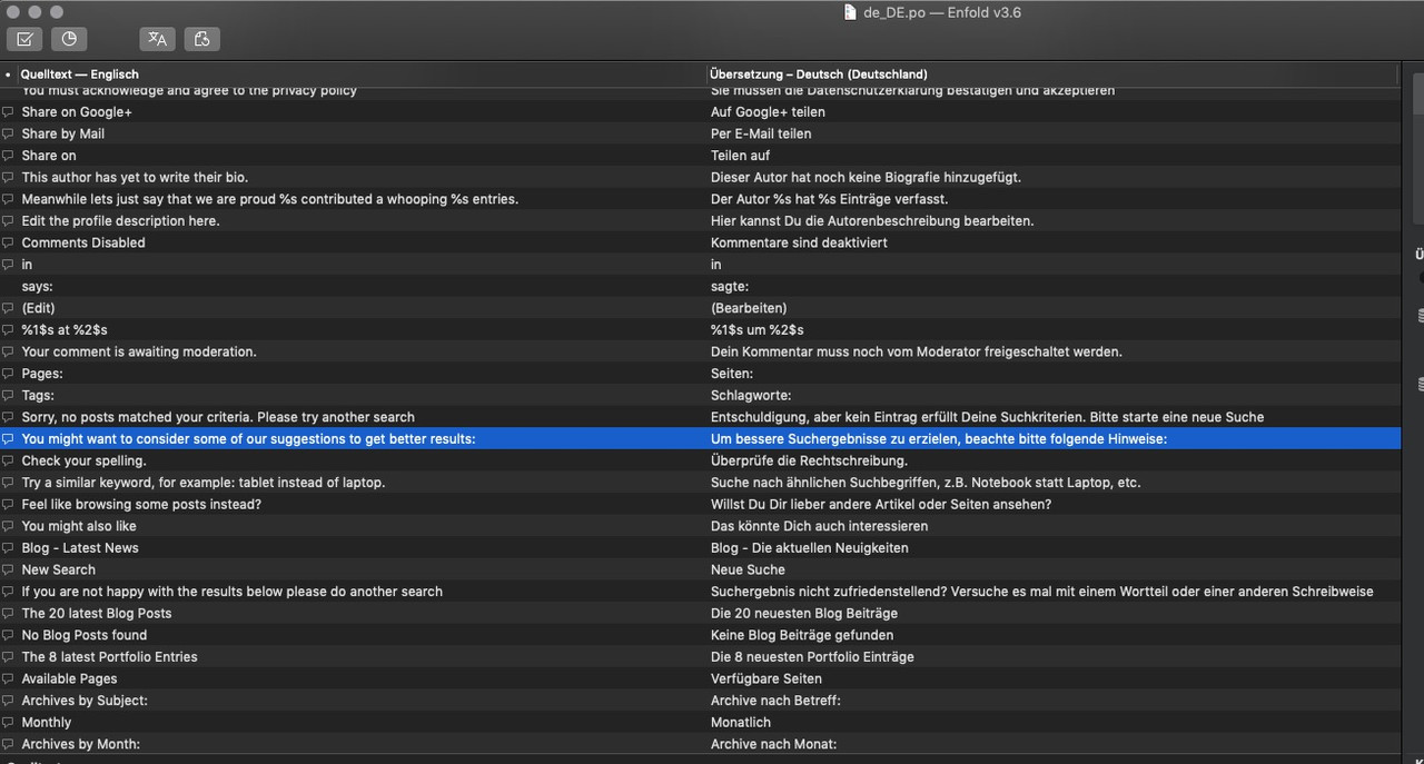
Mit poedit kann man die Sachen bearbeiten (die Übersetzungen) und dann speichern. Beide Files müssen dann in child-theme/css/ rein.-
This reply was modified 6 years, 7 months ago by
By the way – maybe this is also interesting for you:
https://kriesi.at/support/topic/only-have-header-show-when-user-scrolls-up/#post-1136162
if you run into conflict with your hamburger shift – we had to make the shift of header by postion top!
Edit: Alternative Method – with always have fixed header and scroll away header.
Script for child-theme functions.php :
( maybe on some cases it is necessary to have on document ready function – my test page works without )function hide_header(){ ?> <script> (function($){ 'use strict'; var c, currentScrollTop = 0, header = $('#header'); $(window).scroll(function () { var a = $(window).scrollTop(); var b = header.height(); currentScrollTop = a; if (c < currentScrollTop && a > b + b) { header.addClass("hide"); } else if (c > currentScrollTop && !(a <= b)) { header.removeClass("hide"); } c = currentScrollTop; }); })(jQuery); </script> <?php } add_action('wp_footer', 'hide_header');this to quick css:
( values depends on our header setting).html_header_top.html_header_sticky #header, .responsive.html_mobile_menu_tablet #top #wrap_all #header, .responsive #top #wrap_all #header { position: fixed !important; } #header { top: 0px; -webkit-transition: all 0.5s ease-in; transition: all 0.5s ease-in; } #header.hide { -webkit-transition: all 0.5s ease-in; transition: all 0.5s ease-in; } @media only screen and (min-width: 990px) { #header.hide { transform: translateY(-153px); } } @media only screen and (max-width: 989px) { #header.hide { transform: translateY(-95px); } .responsive #top #main { padding-top:80px !important; margin:0; } }by the way – if you have nav below logo – the nav stayes visible if you like
see testpage: https://webers-testseite.de/guenni/maybe – from this point of view – there had to be a different way to have logo top menu below.
on logo left menu besides – the ul is unique because the hamburger is part of that menu- not in an extra header child container.no – i see on a test installation with that setup – with nav below logo – the id of the ul ( and all others list-items ) are doubled.
So might be not necessary – but better to substitute this in the futur with only classes.Yes – and thats why i ask what version of Enfold you have installed – that of the demo is 4.4 !!!
so look if you got an older one too!You are absolutely right – this will end up in a non valide html markup
Maybe in the future all could be done by classes ?the header fixed on mobile works nice – but only without that script. i do not know why
so media query from 990px on (min-width: 990px) and below header : fixed works. See example pagefirst of all – sorry i did not post all the code on the css you need i forgot to close the one rule and to close the media-query.
So two curly brackets at the and are missing on initial post. I now corrected the css code above.
please correct your css entries too and see if that is ok for you.( if you have choosen to switch your hamburger at 990px you had to adjust this code too to 990px)
Do you see my test page?
Otherwise it would be great to see your site to help____________
edit: you always use the burger – all the time ?
this will not work – because navigation ( and hamburger is part of that) will not work in combination with header: fixed on default
the header : fixed ended at switch to hamburger and goes to scroll away. (postiion relative or absolute ) – if you force on that case a position fixed – hamburger had to be adjusted – maybe this is possible – but at the moment I can’t deal with it.-
This reply was modified 6 years, 7 months ago by
September 8, 2019 at 12:22 pm in reply to: URGENT!! V 4.6 Problem: Videos Not Appearing In Color Sections-NEED ROLLBACK #1135604this is Enfold 4.6.1 and it works on my site:
https://webers-testseite.de/guenni/selfhosted-video-as-background/
so maybe a different thing to look for.on my Enfold 4.6.1 the hamburger Menu-Items do not get an ID – the main nav have f.e.: ID : menu-item-22 will end on the hamburger analogon as a class : menu-item-22
but even if it is handled in the past this way – yes they got the same ids – but if the one is visible – the other menu is at display: none – and vice versa.
Even the offical W3C Validator did not get it as Error ( maybe a warning)by the way the subheading und “ne” – guess it would be better readable if it is a Myriad Pro light ( not thin ) ( just for web )
and not to loose the legibility on that little dimensions – try to insert svg instead – and because your background on landing page is nearby the blue of the two circles you had to change them into a different color – or maybe let all black and only change these two circles to white
https://webers-testseite.de/Neo_logo.svg
and
https://webers-testseite.de/Neo_logo_white.svgbut with svg you can change that easily – open the svg files with a good text-editor (not word) ( sublime-text on mac and notepad++ etc on PC)
you can see the head-section of the svg :<?xml version="1.0" encoding="utf-8"?> <svg version="1.1" id="Neo_Logo" xmlns="http://www.w3.org/2000/svg" xmlns:xlink="http://www.w3.org/1999/xlink" x="0px" y="0px" viewBox="0 0 1084 510" style="enable-background:new 0 0 1084 510;" preserveAspectRatio="xMinYMid meet" xml:space="preserve"> <style type="text/css"> .st0{fill:#000000;} .st1{fill:#1B87EA;} </style>the class st1 are these two circles the rest is class st0
so if you change here the colors as you like to haveyou can see the logo if you put this to quick css – but there is the reason for that rule on default with opacity = 0
the alternate logo will be shown instead and that input field has a non visible entry
on Default is that if that input field is empty the logo from logo input field is shown. But there must be something went wrong on doing that.#top .av_header_transparency.av_alternate_logo_active .logo a > img { opacity: 1; filter: alpha(opacity=100); }is it a transparent header. because av_alternate_logo_active is on header as class.
Try to put in that options field of Enfold: Header – Transparency Options – a logo
what i can not believe is – if there is no logo in.- the normal Logo would not became the opacity of 0.
So – guess you have inserted one to see whats happening. but you did not erase that field completely.
Because if this field is empty the normal logo will be shown even on transparent header pages.Off Topic:
if you are interested in a child-theme usage – and maybe you read even why it is a good idea to have one :
https://kriesi.at/documentation/enfold/child-theme/
or on WordPress Codex : https://developer.wordpress.org/themes/advanced-topics/child-themes/ (by the way dear mods – change that in your documentation – new link)these snippets here on board which helps to customize a theme – are better placed to a child-theme. Not only because those changings are not lost after an update of the parent-theme.
In principle it is of course also possible to place the snippets in the original file functions.php ( at the very bottom of it – just after that comment ),
/*
 *  register custom functions that are not related to the framework but necessary for the theme to run
 */
but I don’t find it advantageous, because the functions.php of a child-theme is empty at first, so it is much easier to fill it. You can add comments to the snippets so that you can keep track of them.
A short comment in a php file can be achieved by // these to slashes in front of a comment .
If you got more than oneliners you see often this f.e. ( part of the top of original functions.php):/* * if you run a child theme and dont want to load the default functions.php file * set the global var below in you childthemes function.php to true: * * example: global $avia_config; $avia_config['use_child_theme_functions_only'] = true; * The default functions.php file will then no longer be loaded. You need to make sure then * to include framework and functions that you want to use by yourself. * * This is only recommended for advanced users */Unlike style.css, the functions.php of a child theme does not override its counterpart from the parent. Instead, it is loaded in addition to the parent’s functions.php. (Specifically, it is loaded right before the parent’s file.)
etc. – i would advice you to use a child-theme.
First : if it is an acitve site – do not update without a full backup.
On WordPress – there is a nice backup Plugin called “Duplicator” – which is good for a backup – and to migrate a site completely.
( it will create two files – an installer.php file and a zip file with all of your site – including database etc. pp)if you want to be on the save site – with a rollback solution: https://kriesi.at/support/topic/some-hints-and-advice-to-update-enfold/#post-1056107
i do not know where these entries are from :
you got here 3 mod_rewrite.c rules.# BEGIN rlrssslReallySimpleSSL rsssl_version[3.2.3] <IfModule mod_rewrite.c> RewriteEngine on RewriteCond %{HTTPS} !=on [NC] RewriteRule ^(.*)$ https://%{HTTP_HOST}/$1 [R=301,L] </IfModule> # END rlrssslReallySimpleSSLand: (seem to be from your Provider )
############HTACCESS W4Y START############
<IfModule mod_rewrite.c>
RewriteEngine On
RewriteCond %{HTTPS} !=on
RewriteRule ^ https://%{HTTP_HOST}%{REQUEST_URI} [R=301,L]
</IfModule>
#############HTACCESS W4Y END#############
du wirst irgendwann mal auf https umgestellt haben
Aber eigentlich benötigt man diese Einträge nicht zwingend. Beide bewirken meiner Meinung nach ähnliches, nämlich das http nach https umgeleitet wird.
Wenn du in deinem Backend dort auf https umgestellt hast wird die Seite auch so angezeigt.Das ist das von WordPress gesetzte:
# BEGIN WordPress <IfModule mod_rewrite.c> RewriteEngine On RewriteBase / RewriteRule ^index\.php$ - [L] RewriteCond %{REQUEST_FILENAME} !-f RewriteCond %{REQUEST_FILENAME} !-d RewriteRule . /index.php [L] </IfModule> # END WordPress -
This reply was modified 6 years, 7 months ago by
-
AuthorPosts