Forum Replies Created
-
AuthorPosts
-
September 13, 2019 at 11:29 pm in reply to: Removal and/or edit of text in Enfold Theme Footer #1138230
put in that field:
©2011-2019 St. Andrew’s Presbyterian Church Streetsville [nolink]why don’t you add the phone-number as custom-link to your menu-items.
Dashboard – Appearance – Menus.
Just add a custom-link to your menu and insert .
As Link you put in your: tel:+490654311234567
As Navigation Label what you like f.e. Telephone 06543 – 11234567SyberKnight – thats what i just wanted to post. but my list is a bit smaller – thanks for the update.
postiing from 2016 . https://kriesi.at/support/topic/font-list-for-enfold/#post-649394September 13, 2019 at 11:15 pm in reply to: Different Logo for different websites (subpages) #1138227but if you like you can do it manually too over an array ( if the amount of pages isn’t so big)
you can use all conditonal tags you know – the tree solution is above – for categories there ar is_category, in_category or has_category etc. pp)add_filter('avf_logo','av_change_logo'); function av_change_logo($logo){ if( is_page(21) ) { $logo = "http://www.domain.com/wp-content/uploads/logoforpage21.jpg"; } elseif ( is_page( array( 42, 54, 6 ) ) ) { $logo = "http://www.domain.com/wp-content/uploads/logoforpage22.jpg"; } elseif ( is_page() && !is_page(1307) ) { $logo = "http://www.domain.com/wp-content/uploads/logoforpage23.jpg"; } return $logo; }September 13, 2019 at 11:10 pm in reply to: Different Logo for different websites (subpages) #1138226the last one should work – but as i can read your topic the right way you look also for a solution to change the logo for a whole tree.
So to speak for page-id-9 f.e and all subpages.this here is to define the tree function:
function is_tree($pid)
{
global $post;

   $ancestors = get_post_ancestors($post->$pid);
   $root = count($ancestors) - 1;
   $parent = $ancestors[$root];

   if(is_page() && (is_page($pid) || $post->post_parent == $pid || in_array($pid, $ancestors))){
     return true;
    }
   else
   {
     return false;
    }
};
after that you can change logo for page and subpages.
add_filter('avf_logo','av_change_logo');
function av_change_logo($logo){

      if (is_tree(515)) { $logo = "[logo url]";}
  elseif (is_tree(509)) { $logo = "[logo url]";}
  elseif (is_tree(530)) { $logo = "[logo url]";}

   return $logo;
}
change that:
[logo url]the whole expression with your link to your logo url (including brackets)ps i use this – when i want to nest ALB Elements but with the same width as the other content:
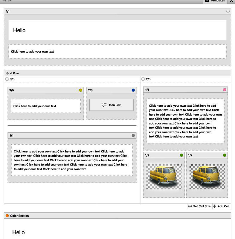
In principle yes, but you have no container div inside as surrounding container for content
the av-layout-grid-container could be set to but this conflicts with the background on the left and right of the reduced grid row.
To avoid this it will be nice to have a surrounding container which has the same settings as a color-section containing a 1/1 container in color relation.This comes to child-theme functions.php:
• Give to the grid-row element a custom-class: grid-notfull
Adjust it to your needs / settings on max-width of container width.
// Grid-Row Alb not set to full width but like container to max-width from default setting
function grid_layout_notfull(){
?>
<script>
(function($){
    $('.av-layout-grid-container.grid-notfull' ).wrap( '<div class="main_color notfullsize color1"></div>');
    $('.notfullsize').css({"clear": "both", "width": "100%" , "float": "left" , "position": "static" , "min-height": "100px" });
    $('.grid-notfull').css({"max-width": "1310px", "margin": "0 auto" , "padding": "0 50px"});
})(jQuery);
</script>
<?php
}
add_action('wp_footer', 'grid_layout_notfull');
the 1310px is the default value of Enfold – if you have a different one – adjust this value
After that you have a surrounding container with class: notfullsize and on default with background-color of : main_color
the code provides another class : color1 – if you want to adjust this.read here: https://kriesi.at/support/topic/insert-picture-in-mobile-menu/
in addition mark that extra field of description on menu to show.
That is the text under the list-items.see here : https://webers-testseite.de/ on hamburger
Well on Menu ( Dashboard – Appearance – Menus ) you can
add an additional home link.
you can add html code to the “Navigation Label” of that menu-item.do you know how to make those extra infos visible on menu options?
There is a flyout menu on top “Screen Options” mark css-classes too!
on each menu-item there is a little arrow on the right: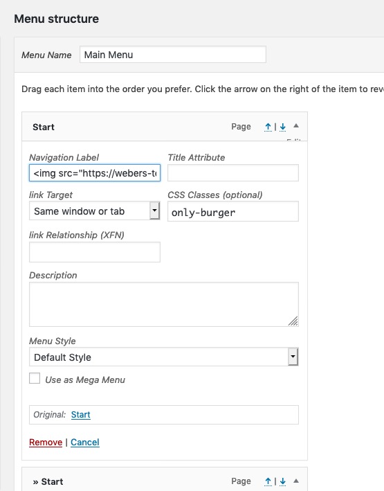
insert in navigation label the html vor your logo
f.e.
<img src="/wp-content/uploads/logo.png" />maybe an absolute path is necessary
give to that menu item a custom-class: only-burgernow – to see the doubled Home-Menu-item Link only on hamburger:
#avia-menu .only-burger.menu-item {
    display: none;
}
so this image is the first list item on your hamburger – and has direct link to home. – bingo
September 13, 2019 at 9:55 pm in reply to: Search Results to appear as an excerpt with searched term highlighted/bolded #1138203Well look here for example: https://webers-testseite.de/?s=Wordpress
this is a styled Search Results Page on editiing the loop-search.php
If a search item has a featured image it will be shown.
and some css – and that little Plugin: Highlight Search Terms
This highlights not only in the search results – it even highlights the term in the links you click on from that search results page.-
This reply was modified 6 years, 7 months ago by
Guenni007.
seem to be an outline problem on avtive or focus state:
try:
.tab.active_tab { outline: none !important; }by the way – to insert an svg this way over prepend / append the svg code must not have line breaks in it – thats why the code above is only in one line.
you see the element above on : https://webers-testseite.de/guenni/impressum/#av_section_2
the rest is quick css styling to make it lower in height just give to the svg a height value
to have fullwidth : give to the svg a width of 100vw. etc. pp
by the way: i would always do it this way – even the simple slanting line – because with this method you can have on the side where the svg is transparent have even diagonal gradients or patterns etc.Example Code: put this to your child-theme functions.php
function insert_dividers(){
?>
<script>
(function($){

	$('.avia-section.divider.top1').prepend('<svg width="100%" class="top" version="1.1" id="faecher" xmlns="http://www.w3.org/2000/svg" xmlns:xlink="http://www.w3.org/1999/xlink" x="0px" y="0px" viewBox="0 0 1500 300" preserveAspectRatio="none"><g fill="#990000"><path class="st0" d="M250,296" fill-opacity=".5"/><polygon class="st1" points="1500,250 750,84.9 0,250 0,0 1500,0 " fill-opacity=".2"/><polygon class="st2" points="1500,191.6 750,81.5 0,191.6 0,0 1500,0 " fill-opacity=".4"/><polygon class="st3" points="1500,133.1 750,78.1 0,133.1 0,0 1500,0 " fill-opacity=".6"/><rect y="0" class="st4" width="1500" height="74.4" fill-opacity="1"/></g></svg>');

	$('.avia-section.divider.bottom1').append('<svg width="100%" class="bottom" version="1.1" id="faecher" xmlns="http://www.w3.org/2000/svg" xmlns:xlink="http://www.w3.org/1999/xlink" x="0px" y="0px" viewBox="0 0 1500 300" preserveAspectRatio="none"><g fill="#990000"><path class="st0" d="M250,296" fill-opacity=".5"/><polygon class="st1" points="1500,250 750,84.9 0,250 0,0 1500,0 " fill-opacity=".2"/><polygon class="st2" points="1500,191.6 750,81.5 0,191.6 0,0 1500,0 " fill-opacity=".4"/><polygon class="st3" points="1500,133.1 750,78.1 0,133.1 0,0 1500,0 " fill-opacity=".6"/><rect y="0" class="st4" width="1500" height="74.4" fill-opacity="1"/></g></svg>');

	})(jQuery);
</script>
<?php
}
add_action('wp_footer', 'insert_dividers');
now go to your ALB and open a color-section:
give a custom-class to this color-section: divider top1 bottom1put this to quick css:
.divider svg {
    position: relative;
    z-index: 5
}

.divider svg.top {
    top: -2px !important;
}

.divider svg.bottom {
    bottom: -11px !important;
    -webkit-transform: rotateX(180deg);
    transform: rotateX(180deg);
}
look now what happens to your front-end.
you see on this svg that there is only one class with a lot oft opacity set. there is a group around all ( normal nomenklatur will be g for group) with a fill color of #990000 ( a red )
this svg has an ID of : faecher
so if you want to change the fill color of that svg ( one side is open and transparent )#av_section_1 #faecher svg.top g { fill: #222 } #av_section_1 #faecher svg.bottom g { fill: #fff }but that depends on your svg –
elementor and divi got mostly simple svgs – with one fill-color and different opacities ( sometimes overlaying layers ) – but only one fill-color.One last tip : open your created svg files to see the classes in there too.
Illustrator allways uses st ( st0, st1, st2 etc. ) this is not so nice if you have more than one svg on your page. because if you like to colorize a part of that svg to adjust it to your next section the other svgs might be influenced too. So give a unique ID to the svg, to have a chance to better select.
See again the footer sectiion of the example page above. one part of the inserted svg had to be set to the background-color of the footer (#222)-
This reply was modified 6 years, 7 months ago by
if themes use this feature ( and i think it might be time that enfold will get this option too ) make it via svg – and to be precise with inline svg. Because you had to influence the colors in it to adjust it to your section before or after it. These “fill” attribute can be done via css.
The best place on Enfold in Color-Section would be just before, and after the color-sections container – so you will have :<div class="avia-section … <svg ( inline for the top ) </svg> <div class="container">… </div> <svg ( inline for the bottom ) </svg> </div>this could be done via child-theme functions.php
f.e.
$(‘.avia-section.divider.top1’).prepend(‘<svg class=”top” ……… preserveAspectRatio=”none”></svg>’);
$(‘.avia-section.divider.bottom1’).append(‘<svg class=”bottom” ……… preserveAspectRatio=”none”></svg>’);it will be best for that on having svgs with no concrete AspectRatio – then you can style it the way you like.
the …….. is your rest of the svg code.you can see here some examples on using this method: https://webers-testseite.de/guenni/
f.e. see footer areaIf you look how elementor f.e. does the trick – it is very similar to that. (and maybe you find some interesting svgs there ;)
to use the code for a nice style svg – you can use transform (rotate 180deg) to use it for the bottom – so one svg for bottom and top.
you can transformY 180deg for a mirror form of that.The classes above are now nice to have – because if you give to a color-section these classes – it will automatically add the inline svg to your DOM. The rest is Quick CSS to positionen and colorize parts of the svg.
September 13, 2019 at 12:38 pm in reply to: Easy way to address an external button to choose slides or tabs ? #1137979i prepared the slideshow.js for it.
but if you new an easier way ( more independent from having another edited ALB ) it would be niceI still haven’t understood how to transfer a dynamically added class to another element.
I must read myself probably nevertheless more into the matter of the Script programming.September 13, 2019 at 9:10 am in reply to: Easy way to address an external button to choose slides or tabs ? #1137833my aim is if the slideshow is set to play automatic the circles have to have the active state too. Like the dots in the slideshow.
That is the problem. To change it from hover to click is surely the next step.
the one with the Kriesi circle is just an example. I’m thinking about using a button row or other elements for this navigation.But i did it via a child-theme avia.js to remember me to the changings i made.
Is that the correct code? a lot has changed since my last child-theme avia.js :add_action( 'wp_enqueue_scripts', 'child_theme_avia_js', 10 ); function child_theme_avia_js() { wp_deregister_script( 'avia-default' ); wp_enqueue_script( 'avia-default-child', get_stylesheet_directory_uri().'/js/avia.js', array('jquery'), $vn, true ); }Thanks – works – as always.
I can only advise anyone to follow this path, especially if it’s a major update. You always have the roll-back in the background.
For smaller updates I recently also use the “update plugin and themes via zip” plugin, which works similar on request ( settings ).I have rarely had such problems as here some of my fellow users. I have to say, however, that I have never done the theme updates via the WordPress updateroutines, especially when it comes to major updates ( 4.5.x to 4.6.x). Actually I have always updated customer sites via ftp. ( In this way )
Recently I’ve also updated about this plugin. Since it probably proceeds quite similarly as I do this with ftp.September 12, 2019 at 12:35 pm in reply to: how to transfer the format ( single-format-video ) to the avia-content-slider #1137496Maybe this is a nice feature for the next update.
September 12, 2019 at 11:02 am in reply to: how to transfer the format ( single-format-video ) to the avia-content-slider #1137471Sorry found it in the alb Element postslider.php line 500 (Enfold 4.6.2)
on loop-index.php i found that$post_formatfor post-format on that (line 144)
i replaced this line with:$output .= "<article class='slide-entry flex_column {$style} {$post_class} {$grid} {$post_format} {$extraClass} {$thumb_class}' $markup>";so now i had a new edited ALB Element
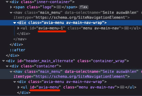
September 12, 2019 at 9:13 am in reply to: Logo not displayed in the browser Mozilla Firefox and Safari #1137426on first load – there is a big fat script behind this logo – do you realy believe that it is necessary to have it here for a 25kb image? (Pagespeed script)
i shortly tested it on my webers-testseite.de with:
but both menus ( in header_main and header_main_alternate) are identical due to helper-main-menu.php.so a simple change of one ID with f.e. jQuery leads to the same ID of both – allthough selector is specific only for one of them. A remove of ID works ( too on both) – but will end in a non working hamburger.
So we had to solve it via source code. –
that is for all heading typs the same:$avia_theme_location = 'avia'; $avia_menu_class = $avia_theme_location . '-menu';and following:
'menu_id' => $avia_menu_class,i do not know how to solve this
this f.e. is always synchronized allthough specific
document.querySelector('#header_main_alternate #avia-menu').id = "newid";-
This reply was modified 6 years, 7 months ago by
First dear darryllevine : hamburger is part of nav.main_menu so no conflict to nav.main_menu
Only the visibility changes between first part of navigation and hamburger – hamburger is child of ul#avia-menuBut
Yes Ismael – but because the header setting ( logo top – menu under it ) there is that header_main_alternate – which ends as i mentioned above to a nav.main-menu in a display:none. both ul in those containers got the ID: avia-menuIt’s formally a nonvalidity. Because even a display:none does not override this rule.
On hamburger case – the header_main_alternate goes to display none – so no difference here.Only if header setting is logo besides navigation there is no conflict – because hamburger is part of nav.main_menu and no header_main_alternate is present.
You could avoid that on renaming the ID f.e. to
<ul id="avia-menu-alternate" class="menu av-main-nav">
As far as i can see are all css rules set to the classesDas ist jetzt schon die 3. Seite von der ich hier sehe, dass es hie und da wohl mit dem Rocket Plugin Probleme geben könnte.
Das Lazy_Load schein da nicht ganz so zu funktionieren in Verbindung mit Enfold.
Die Seite hat auf Firefox auch noch ein paar Unstimmigkeiten. Muss mal schauen, ob es in einen Testinstallation auch so ist bei mir.
Die Tooltips sind in Firefox nichtrichtig platziert (verschoben – weg von den Punkten) im Chrom sind Sie korrekt platziert.well your image above : https://www.screencast.com/t/thuzomVKxdA
Main Q: For the icon boxes: How do I add numbers instead of image icons.
shows iconlists and boxes – and your question was how to put in numbers instead of icons or images!
Thats my answer about.An elegant way is to add to Enfold an icon-set with numbers so you can use them from the Enfold ALB Elements as the other icons too.
geh in die Einstellungen Dashboard – Einstellungen – Allgemein : Sprache Der Webseite : dort “Deutsch Sie” umstellen
September 11, 2019 at 6:48 pm in reply to: Easy way to address an external button to choose slides or tabs ? #1137180Well i did it in a different way now – your second thought i detached these dots and cloned them into the circles
-
This reply was modified 6 years, 7 months ago by
-
AuthorPosts