Forum Replies Created
-
AuthorPosts
-
this is a matter of header_bg it has on default an opacity of 0.95
set it to 1.off topic: and by the way – This is a prime example to use the flex-box model here.
because 8 images besides each other on a mobile phone ?try on your example page that css: and see what happens on smaller screens:
@media only screen and (max-width:650px) {
  .page-id-715 #after_full_slider_1 .avia-gallery-thumb {
    display: flex;
    flex-flow: row wrap;
    justify-content: space-around;
  }

  .page-id-715 #after_full_slider_1 .avia-gallery-thumb a {
    flex: 0 1 100px;
    margin: 1%;
  }
}
September 24, 2019 at 9:46 am in reply to: This element was disabled in your theme settings #1141297can you please create a new post and place an image alb there.
Afterwards check if you can use then the Image ALB on your CPT
How did you activate for your custom post type the ALB Usage – maybe there is the point of interest.September 24, 2019 at 9:23 am in reply to: This element was disabled in your theme settings #1141287So what do you like to have on that performance settings: “Load only used elements”
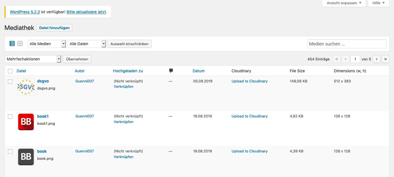
Thats what i have there. And have never Troubles on that images.September 24, 2019 at 9:16 am in reply to: display image size and weights in media library screen #1141281don’t know whats happening on your site – i got a search field on list-view:
 September 24, 2019 at 8:59 am in reply to: How can I change position of "Display a scroll down arrow" #1141267
by the way the scroll-down-link button is absolute positioned – but in relation to bottom.
If you cancel that rule and set a top postion you can play with that values.
PS: If you are still designing your website, my recommendation is that all merging – caching etc. should be switched off until you are done with the layout.
Otherwise you’d have to empty the cache, reset the merging, etc. with every small change#top .scroll-down-link { top: 70%; bottom: initial }PPS: wouldn’t it be nicer to set the background-images to cover the elements? You can set this in the color-section options dialog.
I now have over 5400 contributions here – of which just under 70 are requests for help on my part. So far I have found each of the mods here competent. But you can also find a lot of help here on board by using the board search. Each of the mods here has his special fields.
Impatience has always been a wrong friend. Some people think he has special privileges and must get an answer before others. This is naturally not possible in such a large support forum.und wp-supercache auch die Cachefiles löschen
ich glaube wir können deutsch miteinander kommunizieren?
ich sehe, dass dein Enfold mit merging eingestellt ist. Also bitte die Files neu mergen lassen!
Enfold – Leistung – “Alte CSS- und JS-Dateien löschen?” speichern
Browser Cache löschen-
This reply was modified 6 years, 5 months ago by
Guenni007.
here everyone is trying to help – so please follow the forms of politeness – there is such a thing as nettiquette.
Is there a link that you can post publicly here; sometimes even participants can help or find a good solution.
September 23, 2019 at 4:33 pm in reply to: How can I change position of "Display a scroll down arrow" #1141049First – i do not see any “scroll down arrow” on your page.
Then i do not understand what you like to achive – because on the second screenshot – there is no scroll-down arrow.
so please try to specify your request.why not a new topic?
Maybe this is interesting for others too – which do not enter this post because it doesn’t quite cover the subject here.ich persönlich hätte jedem svg eine Eindeutige und Einmalige ID gegeben, bevor ich es uploade.
Dazu öffnet man das svg mit einem guten Texteditor ( sublime text für Mac – notepad++ für Windows zB)Dein Kurse svg sollte dann so in etwa oben anfangen:
<?xml version="1.0" encoding="utf-8"?>
<svg id="Kurse" xmlns="http://www.w3.org/2000/svg" viewBox="0 0 100 100"  class="">
<defs>
<style>
.cls-1{fill:#6bc4e8;}
.cls-2{fill:#fff;}
.cls-3{fill:none;stroke:#fff;stroke-miterlimit:10;stroke-width:1.2px;}
</style>
</defs>
…
Das ist denke ich besser als jetzt via page-id-x ( findet sich immer als Klasse bei body (#top)
dann kann man bequem über diese ID definieren und es kommt dann auch nicht dazu, das es auf anderen Seiten umgefärbt wird.nahezu jeder Browser hat sogenannte Developer Tools.
Meist ruft man die mittels der Kontext Taste der Maus auf (oft die rechte Taste).
man richtet die Maus aus auf dem Element , welches man untersuchen möchte – klickt das Kontextmenu an, und klickt je nach Browser dann auf sowas wie “Element untersuchen”.Es öffnet nun ein Infofenster, wo zum Einen das html Markup gezeigt wird und meist in einem anderen Frame css Eigenschaften
(ich lasse es immer in einem eigenen Fenster öffnen – kann man einstellen)
mache ich dies zB auf deinem Avatar hier an Board, so sehe ich das:
Klicke um es zu vergrößern
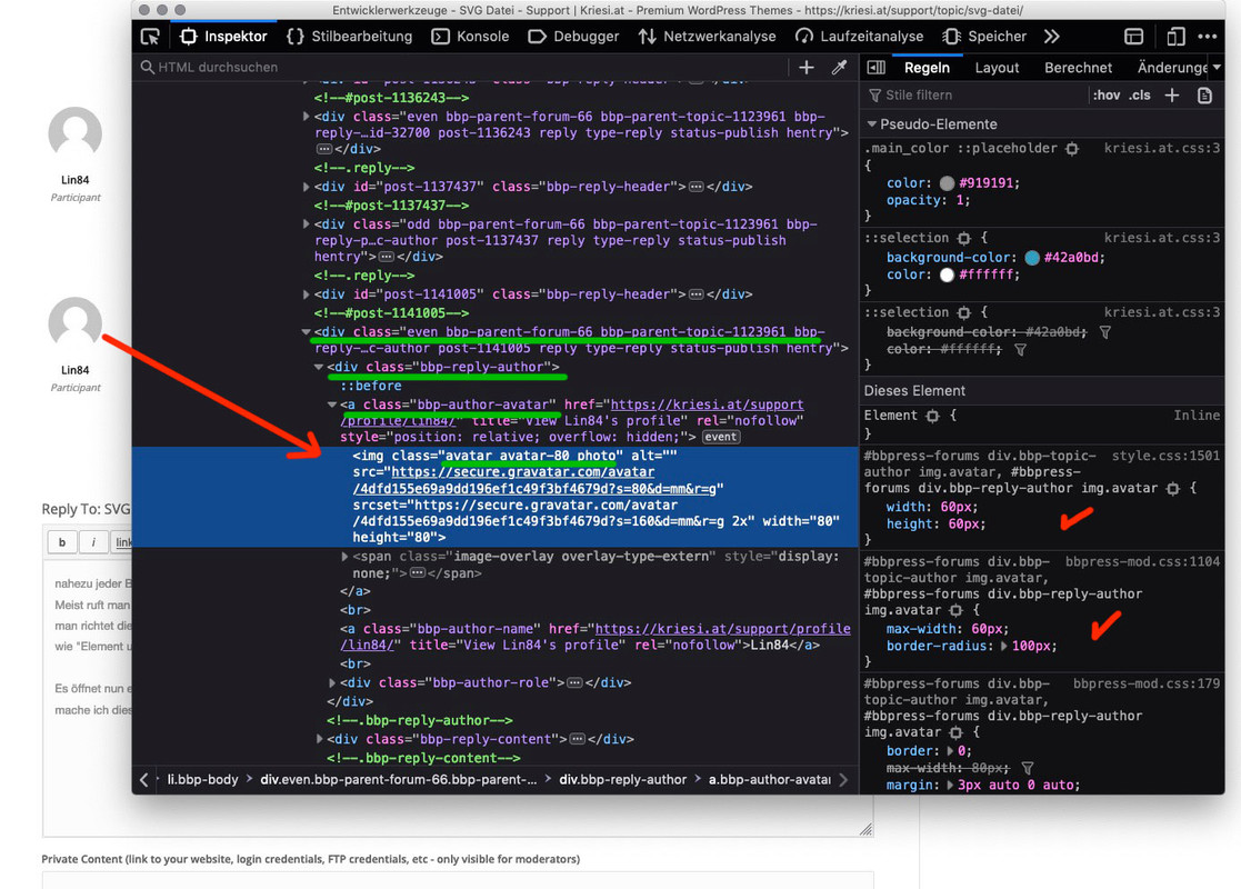
jetzt siehst du links auch die Klassen die zB dem img (Bild) zugehörig sind
in welchem Elternelement das ganze steckt etc.Was nützt dir das jetzt bei deinen svgs:
Das Plugin gibt jedem ersetzten Image diese ID: #svg-replaced-x
wobei x ein index ist, der von 0 an hochgezählt wird. darüber kannst du jetzt die Regeln bestimmen
Siehe oben das war das erste svg welches für das img eingesetzt wurde.
Das geschieht ja auch nur, weil in deinen svgs gleiche Klassennamen vergeben wurden.
Das kannst du auch wie oben bestimmen mit den Developer tools.
( Wenn du mit Safari arbeitest, muss man den Menupunkt Developer Tools erst in den Einstellungen aktivieren)can you send me the link please Günter?
Thanksplease give us a link to your site. I got a good idea on that – but it is best to test it on your live site in developer tools
you can play with the transparency value of header_bg ( default value is 0.1) :
#top .av_header_glassy.av_header_transparency .header_bg { opacity: 0.2; filter: alpha(opacity=20); }by the way – on your homeslider images – the logo with black font will be better legible anyway.
maybe you take for both logo vairants the same logo with black font.
Or for the transparency option a logo with realy white font.possibly these two variants are to be seen well everywhere on the slider:

and:

But your not transparent logo is just a jpg.
You misunderstand a little the function of the transparent logo. It will be presented to you until the header has reached its default setting. With the shrinking header this is the case when the shrinking is finished. Then the normal logo will be shown.The header_bg color has a little opacity – thats why you see then the white surroundings of the jpg.
just take your logo with the black font and make of it a png with transparency – instead of the jpg.
click to enlarge the image.
 September 23, 2019 at 9:43 am in reply to: How to give different text/ icon blocks a different color? #1140912
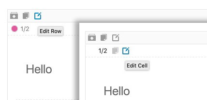
Great! Thanks. But what then? How/ where can I set a different color for each of the blocks, as in the example? Can I do this for these blocks separately or can this only be done via Enfold Child > Website styling > Main content and Alternate content? Please advise. Thanks again!
yes you can hover the edit buttons on that element – it has two : one for the row and one for the cell:
 September 23, 2019 at 9:36 am in reply to: display image size and weights in media library screen #1140901
i just look to make the filesize row sortable – But that’s not the first thing on my todo list right now.
yes- I’ll get back to you via e-mail.
First of all : would a header be possible for you, where logos and menus are left and right outside: “Let logo and menu position adapt to browser window” – and if you can live with a little bigger header things with multiline menu will be nicer – espacially if you have a shrinking header. F.e. 160px to 80px shrink
Now we can set the Multiline Menu ( but with these changings above the values can then be more generous, and the distances are more elegant.) :/**** Multiline Menu ***/ @media only screen and (min-width: 767px) { .av-main-nav-wrap { height: 100%; } .main_menu { max-width: 65%; } ul.menu.av-main-nav { display: flex !important; flex-direction: row; flex-wrap: wrap-reverse; justify-content: flex-end; align-items: center; top: 50%; transform: translateY(-50%); } .av-main-nav > li > a { line-height: 30px !important; height: 30px !important; } }the one blue sign (logo) – this is a kind of quality seal and you don’t want to emphasize it like the actual logo. For example, it may be slightly smaller in height?
September 22, 2019 at 7:23 am in reply to: Trying to add floating button but it's not showing up #1140571The only time I could get it to show up was when the child theme was the activated one. Then I could see the button, but not when Enfold was the theme. Any insight would be appreciated!
That sounds to me like you think that the child theme is just there to take up changes and then reactivate the parent theme. But that’s not the case. The child theme remains constantly activated and takes over all the functions of the parent theme, and only adds new ones to the styling.
September 21, 2019 at 12:47 pm in reply to: Easy way to address an external button to choose slides or tabs ? #1140447I’ll test it this way and then let you know. Thanks for the hint.
September 21, 2019 at 9:54 am in reply to: display image size and weights in media library screen #1140431or if you like to have file-size aswell and dimensions:
delete the above snippet and add:
add_filter( 'manage_media_columns', 'media_columns_filesize' );
function media_columns_filesize( $posts_columns ) {
	$posts_columns['filesize'] = "File Size";
	$posts_columns["dimensions"] = "Dimensions (w, h)";
	return $posts_columns;
}

add_action( 'manage_media_custom_column', 'media_custom_column_filesize', 10, 2 );
function media_custom_column_filesize( $column_name, $post_id ) {
	if ( 'filesize' !== $column_name ) {return;}
	$bytes = filesize( get_attached_file( $post_id ) );
	echo size_format( $bytes, 2 );
}

add_action( 'admin_print_styles-upload.php', 'filesize_column_filesize' );
function filesize_column_filesize() {
	echo'<style>#filesize.column-filesize {width: 10%;}</style>';}

add_action( 'manage_media_custom_column', 'wh_value', 10, 2 );
function wh_value( $column_name, $post_id ) {
	if ( 'dimensions' !== $column_name ) {return;}
    $meta = wp_get_attachment_metadata($post_id);
           if(isset($meta['width'])){
           echo $meta['width'].' x '.$meta['height'];}
}
September 21, 2019 at 9:10 am in reply to: display image size and weights in media library screen #1140428
if you are satisfied with w x h info there is a little snippet for child-theme functions.php:
function wh_column( $cols ) {
    $cols["dimensions"] = "Dimensions (w, h)";
    return $cols;
}
function wh_value( $column_name, $id ) {
    $meta = wp_get_attachment_metadata($id);
           if(isset($meta['width']))
           echo $meta['width'].' x '.$meta['height'];
}
add_filter( 'manage_media_columns', 'wh_column' );
add_action( 'manage_media_custom_column', 'wh_value', 10, 2 );
you can see then in list-view the width and height of the images
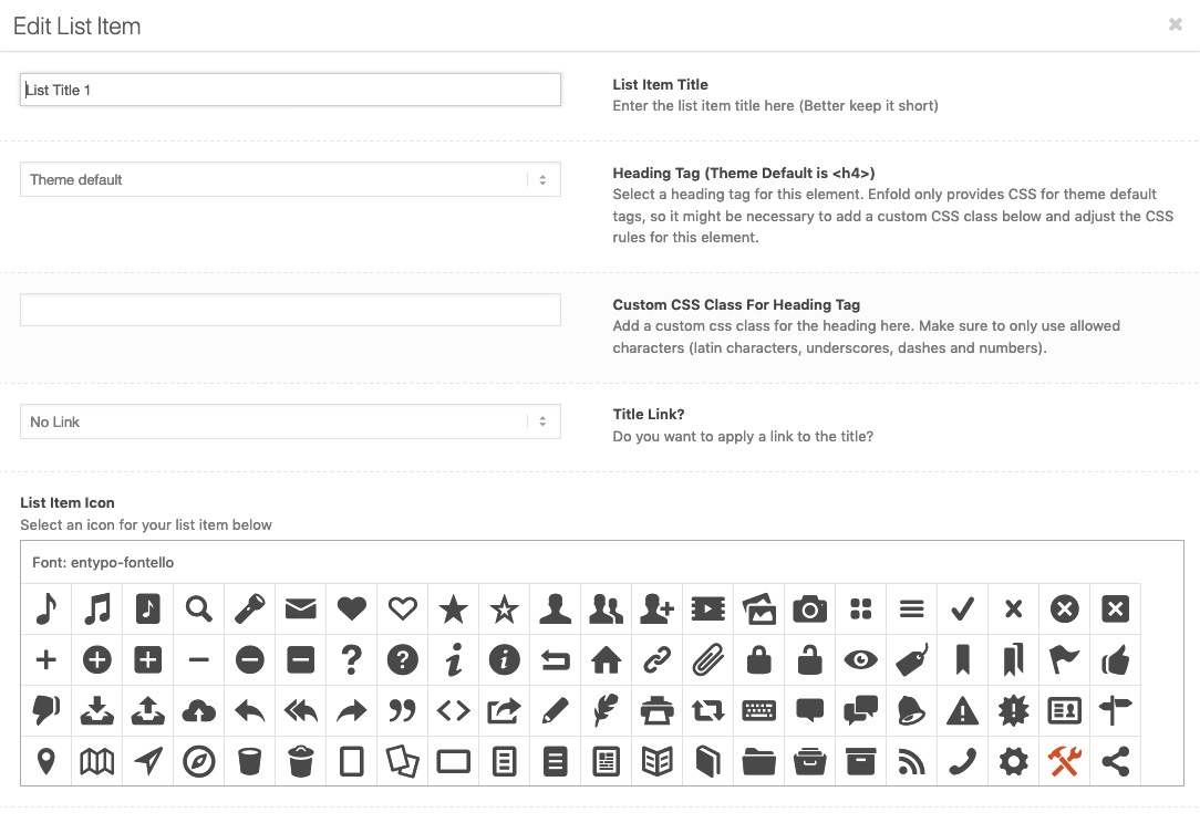
September 21, 2019 at 9:04 am in reply to: Change default H4 heading to H3 in iconlist title #1140427Hallo Vinay – if he/she is on Enfold 4.6.x. you could choose the heading tags now via the Developer Tab on nearly each ALB Element.
He only had to activate it here:
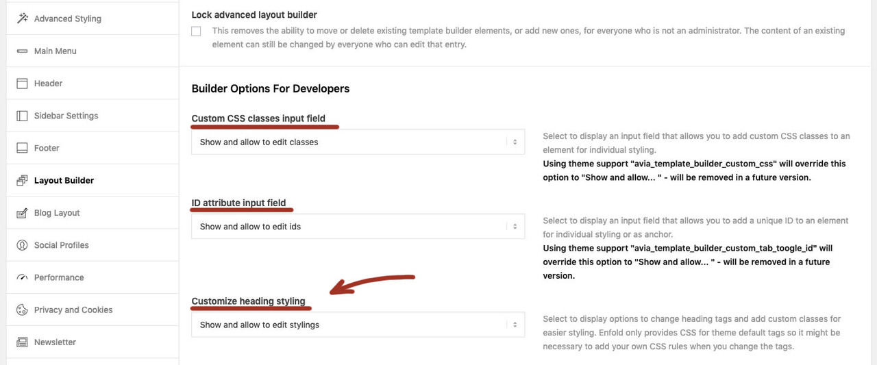
you can change it then on each icon-list element :
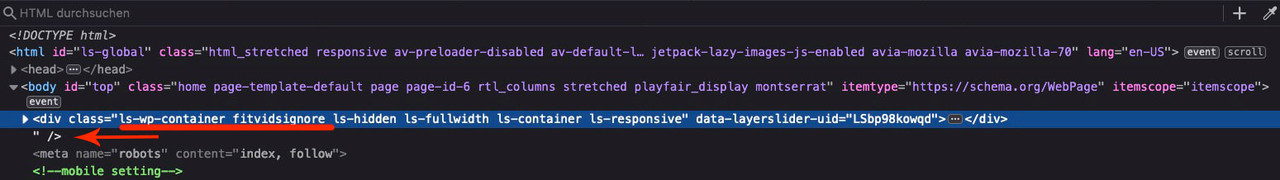
first find that error above!
you see that extra signs and if you scroll you see the main content over the header_meta:
______________________it is similar but a bit different.
first, as I tried to explain above, this is my header test page. Here I played around with some different header types.
So it’s very hard for me to pick out the specific code there, because it could already be a css rule for another page.
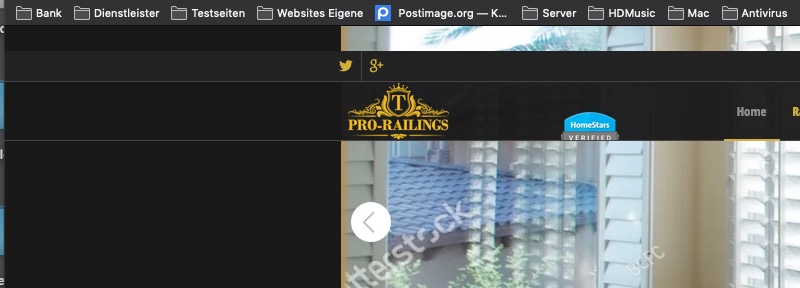
e.g. it wouldn’t be necessary for you to add two additional logos. You use the one regular Pro-Railings logo in the normal place and just add another logo.
In order for the two logos to line up on the left, it is important that they both have the same z-index.My suggestion – we’ll work it out live together.
Please make a backup of your page first. Recommendation : Duplicator Plugin.Then we start with the menu first.
for the logo only use:
function add_logos($logo) { $logo .= '<span class="logo second-logo"><a href="https://homestars.com/companies/2885376-Exterior-Aluminum-Railings" target="_blank">' ; $logo .= '<img src="/wp-content/uploads/2019/09/TorontoProRailings-logo-linked-to-Homestars-verified.png"/>'; $logo .= '</a></span>'; return $logo; } add_filter('avf_logo_final_output', 'add_logos');-
This reply was modified 6 years, 6 months ago by
-
This reply was modified 6 years, 5 months ago by
-
AuthorPosts