Forum Replies Created
-
AuthorPosts
-
do you have a yoast seo installed and perhaps a premium version? Because there is a beta tool:

but i think the allready placed p-tags had to be removed manually
maybe other plugins with AI support can cause this too (Rank Math or an AI content helper)June 10, 2025 at 4:08 pm in reply to: Before – After Slider : Button Translations for bilingual websites #1485286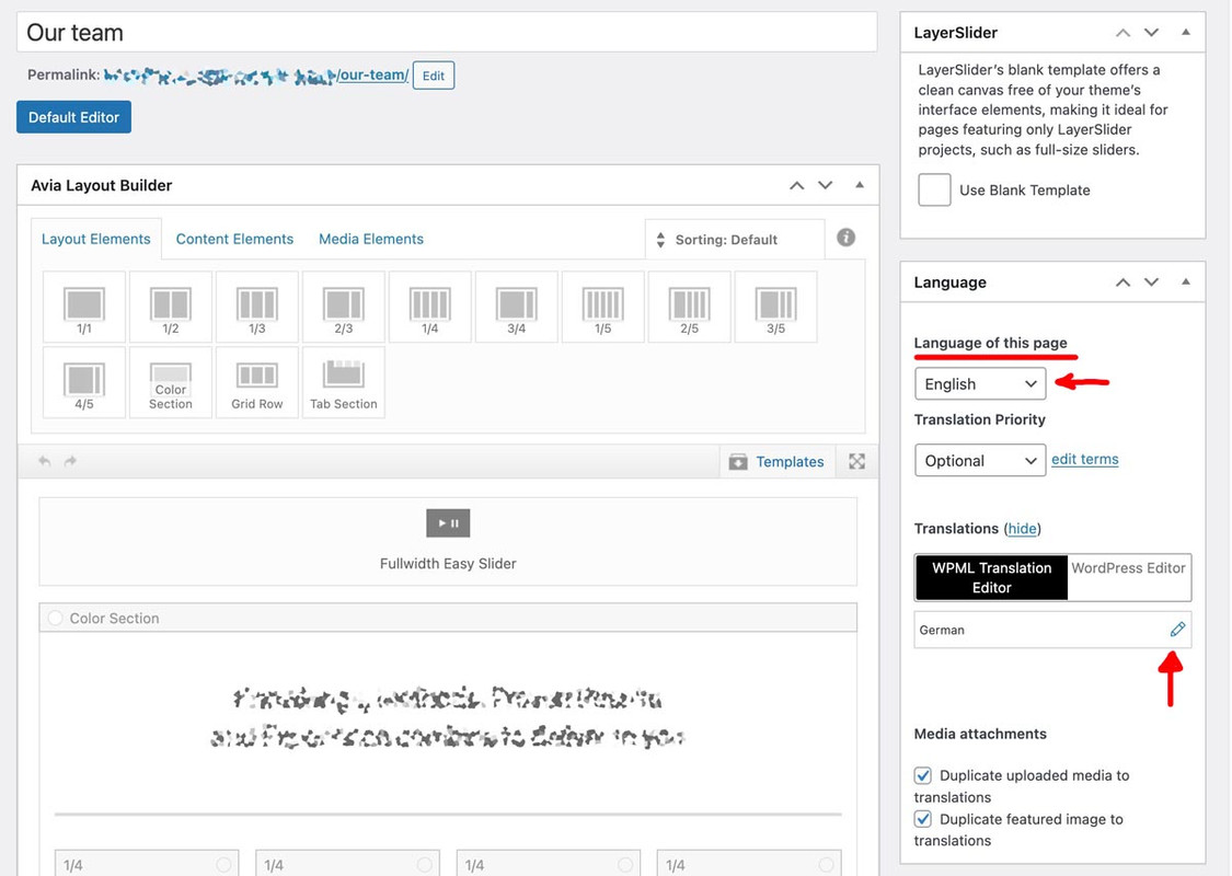
Of course, there are different ways to incorporate translations in WPML.
For smaller sites, I prefer to call up the page I want to edit in my default language and edit everything there until I am satisfied, rather than using the individual modules of WPML. On the right-hand side of the editor page, I can now see which language I am currently using. I can then choose whether to translate the page or click on the pencil icon to edit the translation in another language. A clone of the English page now opens. I can then set the translations there (content) but, if you open the element you mentioned above now, you can also edit those texts there.June 10, 2025 at 9:43 am in reply to: Before – After Slider : Button Translations for bilingual websites #1485269you can edit the element itself. On WPML there should be for each language a separate page.
Open the element and look for : Content – Buttons : “Before Button Text” and. “After Button Text” – you can enter your own phrase on that. And because of separate pages for each language you can have your own translated text there.maybe you had to synchronize it with the border-top-width color and width.
#top .av-main-nav > li > ul
and mega-div – because if there are sub-level dropdown menues – they will have a border too.on default there are allready these lines : https://kriesi.at/themes/enfold/portfolio/
maybe you set it to display: none ? search for selector .avia-menu-fx
you then can influence by – f.e.:
#top .header_color .avia-menu-fx { height: 4px } #top .header_color.av_header_transparency .menu-item a:hover .avia-menu-fx { background: red } #top .header_color:not(.av_header_transparency) .avia-menu-fx { background: green }in most cases these columns will be inside a color-section. Inside that section the one that should scroll has to be with huge content. the other one with less.
Do not use the equal height option on the coluns!i would give a custom class to that section! f.e. : sticky-parent (this is not the direct parent of those columns. But we can address now better – and use it for that case generally.
The column that should stick got the custom class: sticky-elementthen we have:
(we can have the overflow setting inside the media query too – it only needs to work there)
NB: the media query min-width depends on your setting where the columns should go to 100% width – if it is 989px then change that value@media only screen and (min-width: 767px) { .responsive #top { overflow-x: visible !important; } .responsive #top #wrap_all { overflow: visible !important; } #top .sticky-parent .entry-content-wrapper { display: flex; } #top .sticky-element { height: unset !important; width: unset !important; position: -webkit-sticky !important; position: sticky !important; top: 80px; align-self: flex-start; min-width: 40%; } }again – see: https://webers-testseite.de/sticky-elements/
da es immer hierzu eine Berechtigung geben muss seitens der Seite die eingebunden werden soll – wird es in den seltensten Fällen gehen.
Es sei denn diesen Seiten ist es komplett egal was Sicherheitsfragen anbelangt. Da wirst du heute aber kaum noch Seiten find, die alle Tore und Türen öffnen. Einträge wie:
Header set Access-Control-Allow-Origin: *oderEine Seite einlesen und selbst Listen erstellen – via php ?. Wenn Du z.B. auf einer Seite all h3 Überschriften sammeln möchtest und diese als Liste auf deiner Seite dann ausgeben möchtest.
z.B:
function external_headings_shortcode( $atts ) {
    // Standardattribute festlegen
    $atts = shortcode_atts(
        array(
            'url'  => '', // Die URL der externen Seite
            'tag'  => 'h2', // Der HTML-Tag der Überschrift (z.B. h1, h2, h3)
        ),
        $atts,
        'external_headings'
    );

    $url = esc_url_raw( $atts['url'] );
    $tag = sanitize_text_field( $atts['tag'] );

    // Überprüfen, ob eine URL angegeben wurde
    if ( empty( $url ) ) {
        return '<p style="color: red;">Fehler: Bitte gib eine URL für den Shortcode "external_headings" an.</p>';
    }

    // Überprüfen, ob der Tag gültig ist (z.B. h1-h6)
    if ( ! preg_match( '/^h[1-6]$/', $tag ) ) {
        return '<p style="color: red;">Fehler: Ungültiger HTML-Tag. Bitte verwende h1 bis h6.</p>';
    }

    // Inhalte von der externen URL abrufen
    $response = wp_remote_get( $url );

    // Fehlerbehandlung
    if ( is_wp_error( $response ) ) {
        return '<p style="color: red;">Fehler beim Abrufen der URL: ' . $response->get_error_message() . '</p>';
    }

    $body = wp_remote_retrieve_body( $response );

    // HTML parsen
    $dom = new DOMDocument();
    // Fehler beim Parsen unterdrücken (z.B. für nicht-wohlgeformtes HTML)
    libxml_use_internal_errors( true );
    $dom->loadHTML( $body );
    libxml_clear_errors(); // Fehler wieder löschen, um Speicher freizugeben

    $xpath = new DOMXPath( $dom );
    $headings = $xpath->query( '//' . $tag ); // Alle Elemente des angegebenen Tags finden

    $output = '';

    if ( $headings->length > 0 ) {
        $output .= '<ul>';
        foreach ( $headings as $heading ) {
            $output .= '<li>' . esc_html( $heading->textContent ) . '</li>';
        }
        $output .= '</ul>';
    } else {
        $output .= '<p>Keine ' . esc_html( $tag ) . '-Überschriften auf der Seite gefunden.</p>';
    }

    return $output;
}
add_shortcode( 'external_headings', 'external_headings_shortcode' );
wird dann z.B. so auf der Seite eingebunden:
[external_headings url="https://eine-domain-url" tag="h3"]ok now you got 2columns besides each other.
if you follow my link for the instructions – you see that the direct parent had to be the flex container.just for you to test ( better would be to use custom classes to be more specific.
.responsive body#top.blog, .responsive body#top.wp-singular { overflow-x: visible !important; } .responsive body#top.blog #wrap_all , #top.wp-singular #wrap_all{ overflow: visible !important; } @media only screen and (min-width: 767px){ #after_section_1 .av-column-wrapper-individual { display: flex; } #after_section_1 .av-column-wrapper-individual .flex_column:nth-child(2){ height: unset !important; position: -webkit-sticky !important; position: sticky !important; top: 180px; align-self: flex-start; flex: 0 1 40% } }I think the partner/logo element comes closest to this. However, the slide behaviour differs slightly from that on your example page. Here the whole block with the partner logos slide out of the image; this means that if you place five logos next to each other, for example, they are replaced manually or automatically by the next five logos. They are not moved one logo at a time as you did.
P.S. This slide option would certainly be useful!June 5, 2025 at 9:50 pm in reply to: Can you please consider adjusting the Quick CSS section? #1485125
-
This reply was modified 10 months, 3 weeks ago by
Guenni007.
June 5, 2025 at 7:32 pm in reply to: Can you please consider adjusting the Quick CSS section? #1485120maybe a mod knows a better way to shift the quick css input field to top of the styling options section.
(I was familiar with that filter because I had used it before to place a new input field for Apple Touch icons behind the favicon.)/** * Custom function to reorder Enfold theme options. * Moves the 'Quick CSS' input field above the 'Color Scheme' selector. * Assumes both 'quick_css' and 'color_scheme' elements are always present. */ function custom_enfold_reorder_styling_options($avia_elements) { $quick_css_option = null; $color_scheme_option_index = -1; $quick_css_option_index = -1; // Find the 'quick_css' and 'color_scheme' options and their original indices. foreach ($avia_elements as $index => $element) { if (isset($element['id']) && $element['id'] === 'quick_css') { $quick_css_option = $element; $quick_css_option_index = $index; } if (isset($element['id']) && $element['id'] === 'color_scheme') { $color_scheme_option_index = $index; } } if ($quick_css_option_index > $color_scheme_option_index) { // Remove the 'quick_css' option from its original position. array_splice($avia_elements, $quick_css_option_index, 1); array_splice($avia_elements, $color_scheme_option_index, 0, [$quick_css_option]); } // Return the modified array of theme options. return $avia_elements; } // Hook into Enfold's option page data initialization filter. add_filter('avf_option_page_data_init', 'custom_enfold_reorder_styling_options', 10, 1);June 5, 2025 at 6:53 pm in reply to: Can you please consider adjusting the Quick CSS section? #1485118can you put this to your child-theme functions.php:
function admin_head_mod() {
echo '<style type="text/css">
  #avia_quick_css .avia_description {float: none;margin-bottom: 20px !important;padding-left: 0 !important;width: 98%}
  #avia_quick_css .avia_control {float: left;max-width: 98% !important;width: 98% !important}
  .avia_footer_links li {float: left;padding-right: 20px}
  .avia_footer .avia_footer_save {float: left}
  .avia_reset {display: none !important }
  #avia_options_page { max-width: 3000px!important}
  #avia_options_page textarea {border: 3px solid #2271b1;min-height: 500px; height: unset}
</style>';
}
add_action('admin_head', 'admin_head_mod');
i think there is now an option to hide the reset button – but it is inside this code too.
Es wird so nicht funktionieren. Man könnte sogar auf deiner Seite das in einer Lightbox aufrufen. Hier wäre dann ein Popup vom type:’ajax’ nützlich. – Leider hängt das Einbinden von externen Seite sehr davon ab, was die abgefragte Seite für Sicherheiten eingerichtet hat:
Fehlermeldung ist dann z.B.:
Quellübergreifende (Cross-Origin) Anfrage blockiert: Die Gleiche-Quelle-Regel verbietet das Lesen der externen Ressource auf https://www.kleinanzeigen.de/s-anzeige/moderne-doppelhaushaelfte-mit-keller-in-ruhiger-lage-kueche-geschenkt-/3077951470-208-6482/. (Grund: CORS-Kopfzeile ‘Access-Control-Allow-Origin’ fehlt). Statuscode: 403. 2
Das kannst Du eben nicht beeinflussen. Auch ich richte meist auf meinen Seiten genau das ein, das niemand die Seite einbinden kann.
via htaccess bei apache Servern.Die gegenseite müsste dann deiner Seite erlauben:
Header set Access-Control-Allow-Origin "https://deine-domain.de"Wenn man via iframe eine Seite einbinden will muss die Gegenseite die X-Frame-Options für dich erlauben
bzw. : moderner den CSP Header so einrichten, das die Seite als frame-ancestor gelistet ist.Also – wenn es denn Eure Bilder sind – lade die auf deiner Seite hoch und gestalte dann mit Enfold deine Galerie
i do not see my css code in your page!
have you read my post? i told you that it will not work if there are elements below.
Sticky elements do only hold there place inside the direct parent container. so there must be a column with huge content and the column besides with less height. This could be a sticky element then.Insert my code above and look to your blog page: https://institutionofelectronics.ac.uk/news/
or more impressive then : https://institutionofelectronics.ac.uk/2025/05/30/designing-power-supplies-for-industrial-functional-safety-part-1/
or did you want something other than a sticky element. e.g. a fixed element, possibly even a draggable element?this could be a nice usage – but the stickyness only belongs to the direct parent container.
https://webers-testseite.de/sticky-elements/
Some explanations are shown here:
https://webers-testseite.de/sticky-sidebar/you are talking about the news sites?
but if there are additonal columns below – what should happen?

have a look to one of your news pages or the blog page itself:
.responsive body#top.blog,
.responsive body#top.wp-singular {
  overflow-x: visible !important;
}

.responsive body#top.blog #wrap_all ,
#top.wp-singular #wrap_all{
  overflow: visible !important;
}

@media only screen and (min-width: 767px){
  .responsive body#top.blog .sidebar_right .container,
  #top.wp-singular .sidebar_right .container{
    display: flex;
  }

  .responsive body#top.blog .sidebar ,
  #top.wp-singular .sidebar{
    position: -webkit-sticky !important;
    position: sticky !important;
    top: 180px;
    align-self: flex-start;
    flex: 0 1 30%
  }
}
but that does not work with following sections under the sticky container.
If you use more specific selectors, you can style “strong” differently.
if you want it only on some words in a textblock you had to use the way above from Rikard.
for example if you like to have a different color for them only on one page – use the page ID :#top.page-id-12345 strong { color: black; }sometimes it might be necessary to have an !important on the value. (black !important;)
PS: if you are editing text-blocks the editor could do that for you
this will create an inline-style:
<span style="color: #ff0000;"><strong>Important</strong></span>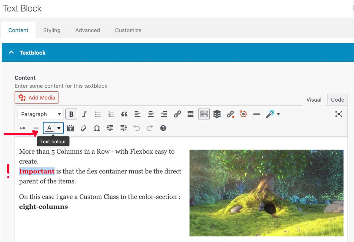
so it should be possible to have a burger menu on placing f.e. a code-block element with html code:
<nav class="datenschutz-menu" role="navigation"> <div class="container av-menu-mobile-active"> <a href="#" class="mobile_menu_toggle no-scroll" aria-hidden="true" data-av_icon="" data-av_iconfont="entypo-fontello"> <span class="av-current-placeholder">Datenschutz</span> <span class="subnav-hamburger subnav-hamburger--spin-r"> <span class="subnav-hamburger-box"> <span class="subnav-hamburger-inner"></span> </span> </span> </a> [menu name="datenschutz"] </div> </nav>and then influencing it by:
function subnav_hamburger_first(){
?>
<script>
(function($){
    var $subham = $(".mobile_menu_toggle");
    $subham.on("click", function(a) {
		$subham.find(".subnav-hamburger").toggleClass("is-active");
		$subham.next(".menu-datenschutz-container").find('#menu-datenschutz').toggleClass("av-open-submenu");
    });
	$('#menu-datenschutz li').on("click", function(b) {
		$(this).addClass('selected').siblings().removeClass('selected');
		$(this).parents('#menu-datenschutz').toggleClass('av-open-submenu');
		$(this).parents('.av-menu-mobile-active').find('.subnav-hamburger').toggleClass('is-active');
	});
})(jQuery);
</script>
<?php
}
add_action('wp_footer', 'subnav_hamburger_first');
and a lot of css thensee on https://webers-web.info/hamburger/
PS: sorry i had to reinstall the whole website – so Privacy page is still not that way discussed above – i will change that today.
see here on very small screens: https://webers-web.info/datenschutz/
that sidebar menu on the left goes to a hamburger on top right on small screen width.you see on the link above (https://jonsuh.com/hamburgers/) – and (on enfold main burger DOM ) what are the class names – i used them too – because then a predefined look is allready present.:
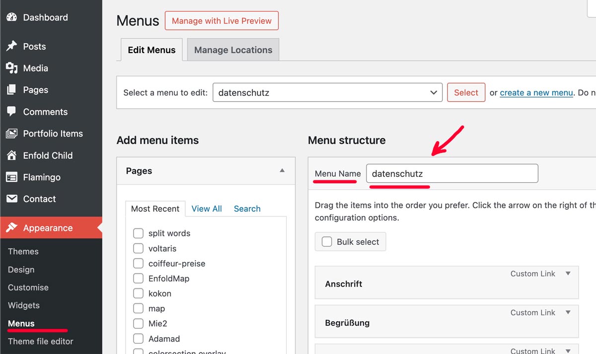
and the script to manage the burger is allready loaded(page-id-3 – is my privacy page)
add_action('ava_after_main_menu', function() { if ( is_page(3)){ echo '<nav class="datenschutz-menu" role="navigation">'; echo '<div class="container av-menu-mobile-active">'; echo '<a href="#" class="mobile_menu_toggle no-scroll" aria-hidden="true" data-av_icon="" data-av_iconfont="entypo-fontello"><span class="av-current-placeholder">Datenschutz</span>'; echo '<span class="subnav-hamburger subnav-hamburger--spin-r"><span class="subnav-hamburger-box"><span class="subnav-hamburger-inner"></span></span></span>'; echo '</a>'; echo do_shortcode('[menu name="datenschutz"]'); echo '</div>'; echo '</nav>'; } });on that line:
echo do_shortcode('[menu name="datenschutz"]');you see the usage of that menu shortcodenow i got that extra subnav-hamburger (this name is set by me – it only reminds me that this is subnavigation on privacy page )
now i have to have the same behaviour on that second burger menu:function subnav_hamburger_first(){ if(is_page(array( 3))){ ?> <script> (function($){ var $subham = $(".mobile_menu_toggle"); $subham.on("click", function(a) { $subham.find(".subnav-hamburger").toggleClass("is-active"); $subham.next(".menu-datenschutz-container").find('#menu-datenschutz').toggleClass("av-open-submenu"); }); $('#menu-datenschutz li').on("click", function(b) { $(this).addClass('selected').siblings().removeClass('selected'); $(this).parents('#menu-datenschutz').toggleClass('av-open-submenu'); $(this).parents('.av-menu-mobile-active').find('.subnav-hamburger').toggleClass('is-active'); }); })(jQuery); </script> <?php }} add_action('wp_footer', 'subnav_hamburger_first');This is not a trivial request, which is why there are several paid plugins available. To grasp the complexity of a multilevel burger menu, take a look at the avia-snippet-hamburger-menu.js code.
Your explanation makes sense to me.
i did it this way with the edited child-theme files
(just erased the && ! isMobile ):function wp_change_sticky_header_script() { wp_deregister_script( 'avia-sticky-header' ); $vn = avia_get_theme_version(); $options = avia_get_option(); $child_theme_url = get_stylesheet_directory_uri(); $min_js = avia_minify_extension( 'js' ); // $min_css = avia_minify_extension( 'css' ); for that js - file not needed to mention here $condition = ( isset( $options['header_position'] ) && $options['header_position'] == 'header_top' ); $condition2 = ( isset( $options['header_sticky'] ) && $options['header_sticky'] == 'header_sticky' ) && $condition; avia_enqueue_script_conditionally( $condition2 , 'avia-sticky-header-child', "{$child_theme_url}/js/avia-snippet-sticky-header{$min_js}.js", array('avia-default'), $vn, true); } add_action( 'wp_enqueue_scripts', 'wp_change_sticky_header_script', 100 );but allways to do this on all pages where i like to have a shrinking header on mobile devices too – and to generate allways the minified file from the actual avia-snippet-sticky-header.js file – is a lot of work.
A filter set by you would be a great time saver here
using something like this :
add_filter('avf_shrinking_header_on_mobile', '__return_true');
😉 I am of course aware that a filter has no place in a script file. But maybe there is a trick that could regulate it differently.you can see here an example on using that shortcode including the existing classes from enfold to handle a hamburger menu – if you look to the DOM – it is very nearby the setup from : https://jonsuh.com/hamburgers/
because all scripts are allready implemented to enfold – you have to find a way how to insert that DOM Structure<button class="hamburger hamburger--collapse" type="button"> <span class="hamburger-box"> <span class="hamburger-inner"></span> </span> </button>but try to find a plugin ( yes the good ones are not free) that handles the hamburger insertion with a given WordPress menu.
you find the menu names on :
Remember, this is an older theme from 2022. Many new features have been added since then. Some of the instructions in the explanations are now outdated.
I have just noticed that the 20s setting does not work outside of unanimated columns either.
or a little more choice:
<?php
function custom_named_menu_shortcode( $atts ) {
    extract( shortcode_atts( array(
        'name' => '', // Default to an empty menu name
        'class' => 'custom-menu', // Default CSS class
        'depth' => 0, // Default depth (0 for unlimited)
    ), $atts ) );

    if ( ! empty( $name ) ) {
        return wp_nav_menu( array(
            'menu'            => $name,
            'menu_class'      => $class,
            'container'       => 'nav', // You can change this to 'div', false, etc.
            'container_class' => $class . '-container',
            'echo'            => false, // Important: returns the menu HTML instead of printing it
            'depth'           => $depth,
        ) );
    }
    return ''; // Return empty if no menu name is provided
}
add_shortcode( 'named_menu', 'custom_named_menu_shortcode' );
?>
and use the shortcode like that:
[named_menu name="your-menu-name" class="my-custom-menu" depth="2"]First : i’m using this shortcode to insert a named menu from wordpress menu options:
maybe an example of mine helps you to find your own way to do it.
function print_menu_shortcode($atts, $content = null) {
    extract(shortcode_atts(array( 'name' => null, ), $atts));
    return wp_nav_menu( array( 'menu' => $name, 'echo' => false ) );
}
add_shortcode('menu', 'print_menu_shortcode');
maybe the menu-shortcode will help you – and f.e. here : https://jonsuh.com/hamburgers/
there are some plugins to test. …
hail brave new AI world
New snippet
see in Action here: https://webers-testseite.de/impressum/it is a draggable Window:
this is for child-theme functions.php:
see code here on paste bin: https://pastebin.com/zc4fvX1w
because of a innerHtml (lines 158-176) it is not possible to post it here – (maybe mod knows how)

and here is the style for quick css
/* --- Draggable Search Window --- */
#gcmSearchUIContainer { /* Changed ID for clarity */
  position: fixed;
  top: 100px; /* Initial position from the top */
  left: 50%;  /* Start horizontally centered */
  transform: translateX(-50%); /* Adjust for true centering */
  width: 380px; /* A suitable width for a small window */
  background-color: #f9f9f9;
  border: 1px solid #ccc;
  border-radius: 8px;
  box-shadow: 0 5px 15px rgba(0,0,0,0.25);
  z-index: 100001; /* Ensure it's on top, slightly higher than before if needed */
  overflow: hidden; /* To contain rounded corners with header */
}

#gcmSearchUIContainer.hidden {
  display: none;
}

#gcmSearchUIHeader {
  padding: 10px 15px;
  background-color: #e8e8e8;
  border-bottom: 1px solid #ccc;
  cursor: move; /* Indicates this area is draggable */
  border-top-left-radius: 8px; /* Match container's radius */
  border-top-right-radius: 8px; /* Match container's radius */
  display: flex;
  justify-content: space-between;
  align-items: center;
}

#gcmSearchUIHeader .gcm-title {
  font-weight: bold;
  font-size: 1.1em;
  color: #333;
}

#gcmSearchUIHeader #gcmCloseSearchBtnDraggable { /* Specific ID for close button in this context */
  background: none;
  border: none;
  font-size: 1.3em;
  font-weight: bold;
  color: #777;
  cursor: pointer;
  padding: 0 5px;
}
#gcmSearchUIHeader #gcmCloseSearchBtnDraggable:hover {
  color: #000;
}

#gcmSearchUIBody {
  padding: 15px;
  display: flex;
  flex-direction: column; /* Stack elements vertically */
  gap: 10px; /* Space between elements in the body */
}

#gcmSearchUIBody #gcmSearchInputDraggable { /* Specific ID for input */
  width: 100%;
  padding: 10px;
  border: 1px solid #ccc;
  border-radius: 4px;
  box-sizing: border-box;
}

#gcmSearchUIBody .gcm-controls-row {
  display: flex;
  justify-content: space-between; /* Space out controls */
  align-items: center;
  gap: 8px; /* Space between buttons in a row */
}

#gcmSearchUIBody .gcm-navigation {
    display: flex;
    gap: 5px;
}

#gcmSearchUIBody button {
  padding: 8px 12px;
  border: 1px solid #aaa;
  border-radius: 4px;
  background-color: #e7e7e7;
  cursor: pointer;
  min-width: 40px; /* For Next/Prev buttons */
  text-align: center;
}

#gcmSearchUIBody button:hover {
  background-color: #d7d7d7;
}

#gcmSearchUIBody #gcmSearchBtnDraggable { /* Specific ID */
    flex-grow: 1; /* Allow Find button to take more space if needed */
}

#gcmSearchUIBody .gcm-results-count-draggable { /* Specific ID */
  font-size: 0.95em;
  color: #333;
  white-space: nowrap; /* Prevent wrapping */
}

/* --- Highlighting Styles (remain the same) --- */
.custom-highlight {
  background-color: yellow;
  color: black;
  font-weight: bold;
}

.custom-highlight.current-custom-highlight {
  background-color: orange;
  outline: 1px solid red;
}
Do not forget to remove the leading php on that downloaded snippet before you insert it to your child-theme functions.php
Download: https://pastebin.com/dl/zc4fvX1w
try this in your child-theme functions.php:
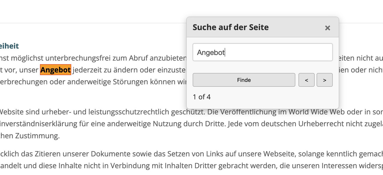
see the better solution on bottom!
Directly and reliably opening the browser’s own “Search in page” dialog (typically activated by Ctrl+F or Cmd+F) via an HTML button is generally not possible due to security restrictions and the lack of a standardized web API.
-
This reply was modified 10 months, 3 weeks ago by
-
AuthorPosts