Forum Replies Created
-
AuthorPosts
-
Off topic – by the way Ismael: it maybe a nice thing if the “read-more” ($permalink) button will not be part of the excerpt. Because f.e. on influencing the_excerpt length the read-more link is cut-off.
_________
PS : i tried that on single.php and single-portfolio.php and had no luck on that. Where to place this best?
-
This reply was modified 6 years, 5 months ago by
Guenni007.
September 27, 2019 at 7:48 am in reply to: How do I make my logo appear half on and half below my header? #1142585without a link to the live page – it’s hard to give concrete advice.
see comment above: i’m participant as you
if you are not willing to make the link public – then you have to wait for mods help.first: where does that rule come from? ( child quick css line 5 and 408)
#top .grid-sort-container .media-library_sort {
    display: none;
}
get rid of that rule and you will see 9 videos and 4 Elements on the other page
September 27, 2019 at 7:14 am in reply to: Not able to add rel='nofollow' attribute in outgoing links #1142582;). sometimes the description belongs to the solution as well as the given code.
In the solutions I offer here from time to time there is often something about : set the custom-class : abc etc. pp.
This will be overlooked in general.this here was my solution – but someone here on board (cg) told me that a jQuery insertion of these attributes has no effect on bots…etc. (and the reasoning immediately made sense to me.)
https://kriesi.at/support/topic/enfold-button-nofollow-shortcode/#post-1108256these are the entypo-fontello icons Enfold uses. Is there an icon that fits your needs?
https://webers-testseite.de/enfold-entypo/i think he/she is talking about the background behind the lightbox – the state of overflow-y : scroll on active lightbox.
try this in your child-theme functions.php:
add_action('wp_footer', 'no_background_scroll_on_lightbox_open'); function no_background_scroll_on_lightbox_open(){ ?> <script type="text/javascript"> (function($) { function a() { $('body').on('click', '.lightbox-added', function() { if($('.mfp-bg').length >= 1) { $('html').css("overflow-y", "hidden"); } }); $('body').on('click', function() { setTimeout( function() { if($('.mfp-bg').length == 0) { $('html').css("overflow-y", "scroll"); } },500); }); } a(); })(jQuery); </script> <?php }and another question – did you adjust the code above to your needs ( did you change the page-id ?
is the class the same as on my end ?September 26, 2019 at 9:29 pm in reply to: Kriesi Blog Posts Discovered on Client's Website #1142501i think this is Mail-Spoofing – i get from my own e-mail address – per day aprox. 10 E-Mails.
i think he has his offical e-mail : office(at)kriesi(.)atWenn es möglich ist, wie willst du entscheiden ob Mann oder Frau. Sprich wie soll die Anrede sein?
Oder fillst du eine Selectbox setzen für Herr/Frau/Prof./Dr. etc pp. ? – ist ne nette Idee, aber wie gesagt – wie willst du das nur zB mit dem Namen entscheiden.something like this: https://webers-testseite.de/sticky-elements/
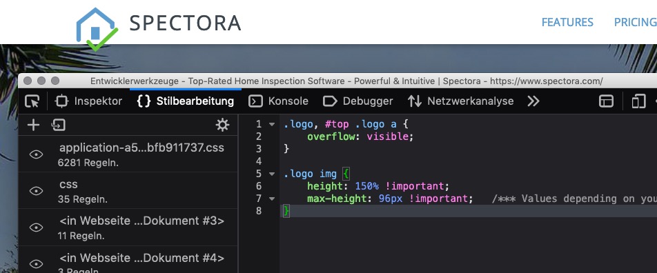
übrigens – wenn du die Vollauflösung in der lightbox anzeigen willst – setze das hier in die child-theme functions.php:
Masonry Lightbox Bilder Größe
function avia_change_masonry_thumbnail_link($size) {
  return "full";
}
add_filter('avf_avia_builder_masonry_lightbox_img_size', 'avia_change_masonry_thumbnail_link', 10, 1);
und das für das Galerie Lightbox Size:
function avia_change_gallery_thumbnail_link($link, $attachment, $atts, $meta){ $link = wp_get_attachment_image_src($attachment->ID, "full"); return $link; } add_filter('avf_avia_builder_gallery_image_link', 'avia_change_gallery_thumbnail_link', 10, 4);if you like to redefine an existing one:
function custom_modified_thumb_sizes( $size ){
  $size['square'] = array('width'=>344, 'height'=>344 );
  return $size;
}
add_filter('avf_modify_thumb_size', 'custom_modified_thumb_sizes', 10, 1 );
PS ich komme mal vorbei und hole mir einen schönen Blumenstrauß ab. Schöne Grüße aus Buschdorf/Bonn
You can redefine an existing Format – but then you had to regenerate thumbnails ( there are plugins for that – force regenerate thumbnails ).
or you can add a custom format- for example create a new bigger-square format:this comes to functions.php of your child-theme:
shorter form:
add_image_size( 'bigger_square', 344, 344, true );
add_filter( 'image_size_names_choose', 'my_custom_sizes' );
function my_custom_sizes( $sizes ) {
    return array_merge( $sizes, array(
        'bigger_square' => __('Bigger Square','avia_framework'),
    ) );
}
even here you had to regenerate Thumbnails.
-
This reply was modified 6 years, 5 months ago by
this is the result on that page : https://gtmetrix.com/reports/webers-testseite.de/H1Qv5gQ2
no error on that!
This page is a testpage with a child-theme functions.php with 2180 lines
( thats the reason for F’s because of a lot of extra javascript in it)
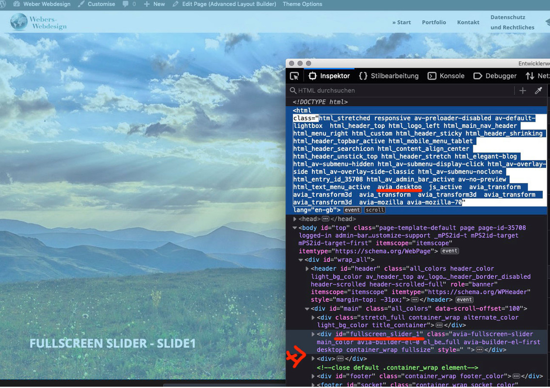
the quick css has 3000 lines ! my absolute text environment.you see my test page . -look to the DOM :
it is only one slider at a time there
 September 26, 2019 at 5:49 pm in reply to: How do I make my logo appear half on and half below my header? #1142434
well you had to wait til mods are here – i’m participant as you
on your site (not Enfold) this code above allready works too -but on enfold the overflow option is necessary.
Gerne
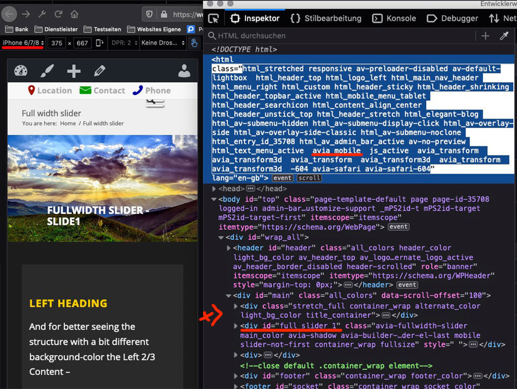
da ich aber viele Sachen die mit gleichartigen listen nebeneinander zu tun haben immer lieber im flexbox modell mache habe ich mich um die 3,4,5 columns nicht gekümmert.September 26, 2019 at 4:22 pm in reply to: How do I make my logo appear half on and half below my header? #1142346we had to see the site.
on most cases (it is only to set the logo to overflow:visible and set the image size f.e..logo, #top .logo a { overflow: visible; } .logo img { height: 150% !important; max-height: 96px !important; /*** Values depending on your header dimensions ***/ }If you have a svg instead (inline svg) there had to be additional adjustment to make
ja – bitte – aber wie gesagt ich finde das große Logo schöner, solange die Fläche darunter sich nicht mit verkleinert.
Siehe Beispielseite: https://webers-testseite.de/cynthia/fixed-header-on-mobile/September 26, 2019 at 3:58 pm in reply to: Enfold Photography – original quality picture in full screen slider/ #1142323Please have a look at your source code to see if you really get the full resolution of the Lightbox pictures.
To set the source for the thumbnails there is, as far as I know, no filter that would make our work easier.
But you can put a copy of the av-helper-masonry.php in the Child-Theme folder ( best in a subfolder: shortcodes ), and then edit this copy.search for the function prepare_loop_from_entries
( on Enfold 4.6.2 it is line : 601) – you will find on 612 :$img_size = 'masonry'; //change to : $img_size = 'full';to load the edited ALB elements put this to child-theme functions.php
add_filter('avia_load_shortcodes', 'avia_include_shortcode_template', 15, 1);
function avia_include_shortcode_template($paths){
  $template_url = get_stylesheet_directory();
      array_unshift($paths, $template_url.'/shortcodes/');
  return $paths;
}
refresh all cachings – merging – performance tools.
Look to your page.September 26, 2019 at 3:33 pm in reply to: Enfold Photography – original quality picture in full screen slider/ #1142305I wish I could put original quality picture on my home page full screen slider. I want to be full size, full quality. Now the quality it’s lower than original picture.
on fullscreen-slider the height is the decisive value here. If the proportions do not correspond exactly to the set screen aspect ratio, then the image must be enlarged until the height fits. So the image will be trimmed.
But it takes (if you have choosen on Slideshow Image and Video Size – Choose image and Video size for your slideshow.: No scaling) the full resolution images – ?
On Masonry Gallery : is it the Masonry Portfolio or Posts – or do you mean the Masonry Gallery for Images?
if these are icons from ALB elements ( Iconbox, Iconlist etc. pp) you have the possiblity to define your custom colors on the extra Tab and choose
Icon Colors. and “define custom colors” set all colors to identical values.On a standalone icon these settings are missing. But …
you can use Iconbox with big icon above – and no Title no Content !https://webers-testseite.de/guenni/inline-buttons/
-
This reply was modified 6 years, 5 months ago by
The function above is ok – only in dependence to the device but a function with resize and reload etc. ?Anyway – I think such a script reduces the performance more than loading two sliders – especially since the images are probably identical and in the cache.
Well i think the one possibility to have on mobile only one and on desktop only one is possible.
But on resize the screenwidth it is hard to get back the removed slider.see here an example page ( you have to look on a real device or on a good browser simulation – and reload the page )
(this is only for that example page 35708) : https://webers-testseite.de/full-width-slider-2/function only_one_slider(){ if( is_page(35708) ) { ?> <script> (function($){ $('html.avia_mobile #fullscreen_slider_1').remove(); $('html.avia_desktop #full_slider_1').remove(); })(jQuery); </script> <?php } } add_action('wp_footer', 'only_one_slider');you see that enfold got on html for the device an extra class: avia_mobile and avia_desktop
maybe we could start a reload of the page on resize when it is under a given screen-width value. Then we had to work with custom class f.e. on the sliders.
I check that ( but a debounce function should be included – because otherwise this would be a function high in performace)-
This reply was modified 6 years, 5 months ago by
dear peterolle – if you have seen my testpage please tell me because i want to switch back to the status before.
PS : on Impressum Page you can see that you can ignore elements.
The top section is dark on default – so :#top.page-id-230.darkmode--activated #av_section_1 { isolation: isolate; }will do the trick
this is a small script of 6kb – you can host it on your server ( on GDPR Reasonst might be better ) – then you can split those child-theme functions.php entry:
function darkmode_js_script() { wp_enqueue_script( 'Darkmode', get_stylesheet_directory_uri().'/js/darkmode.min.js', '1.4', true ); } add_action( 'wp_enqueue_scripts', 'darkmode_js_script' ); function add_darkmode(){ ?> <script> new Darkmode({ bottom: '64px', // default: '32px' right: 'unset', // default: '32px' left: '32px', // default: 'unset' time: '0.5s', // default: '0.3s' mixColor: '#fff', // default: '#fff' backgroundColor: '#fff', // default: '#fff' buttonColorDark: '#100f2c', // default: '#100f2c' buttonColorLight: '#fff', // default: '#fff' saveInCookies: false, // default: true, label: '🌓', // default: '' autoMatchOsTheme: true // default: true }).showWidget(); </script> <?php } add_action('wp_footer', 'add_darkmode');and the script could also implemented (darkmode.js)
but all uses mix-blend-mode – and that is something not all browser will support.
See here a quick embedding via child-theme functions.php:function add_darkmode(){ ?> <script src="https: (Email address hidden if logged out) /lib/darkmode-js.min.js"></script> <script> new Darkmode({ bottom: '64px', // default: '32px' right: 'unset', // default: '32px' left: '32px', // default: 'unset' time: '0.5s', // default: '0.3s' mixColor: '#fff', // default: '#fff' backgroundColor: '#fff', // default: '#fff' buttonColorDark: '#100f2c', // default: '#100f2c' buttonColorLight: '#fff', // default: '#fff' saveInCookies: false, // default: true, label: '🌓', // default: '' autoMatchOsTheme: true // default: true }).showWidget(); </script> <?php } add_action('wp_footer', 'add_darkmode');now there will be a little button on your page.: see here (not totaly styled): https://webers-testseite.de/guenni/
the script toggles one class to body ( #top) : darkmode–activated – so you can use it for styling your changings on activate state.
it now depends on your page what to style – and what mix-blend-mode you use.Well the rules are different to that what you post on top:
and one rule (.paddinghomenoleggiogommonititolo) is missing in your css.
These rules are in your code – and they do have effect on those p-tags..test-padding-testo-servizi-noleggio-gommoni { padding-left: 20px; padding-right: 20px; } .test-padding-testo-servizi-charter-di-pesca { padding-left: 20px; padding-right: 20px; } .test-padding-testo-servizi-charter-di-pesca { padding-left: 20px; padding-right: 20px; } .test-padding-testo-servizi-eventi-organizzati { padding-left: 20px; padding-right: 20px; }you can shorten this code to( and add the missing one) :
.paddinghomenoleggiogommonititolo,
.test-padding-testo-servizi-noleggio-gommoni,
.test-padding-testo-servizi-escursioni-guidate,
.test-padding-testo-servizi-charter-di-pesca,
.test-padding-testo-servizi-eventi-organizzati {
    padding: 0 20px !important;
}
by the way – the other headings have no such class (paddinghomenoleggiogommonititolo)
Läuft – eventuell hatte es schon mit dem entpacken der vorherigen Version nicht geklappt, und ich habe es nicht bemerkt.
Denn Keka entpackte nämlich und brachte dann nur eine Fehlermeldung raus.Wie auch immer. Es schein jetzt alles Gut zu laufen.
September 25, 2019 at 7:48 pm in reply to: Make blog post previous and next Featured Image bigger #1141966these two will do the job. The one is only to have instead of the 80px thumbnail a 180px square as image
ich hatte noch eine Child-theme avia.js drin – eventuell lags daran.
Ich lade jetzt die Neue hoch.
Edit: Entpacken fehlgeschlagen. – werde mal einen Windows Entpacker testen.
Edit: mit WinRar am PC gings jetzt. -
This reply was modified 6 years, 5 months ago by
-
AuthorPosts