Forum Replies Created
-
AuthorPosts
-
a bit offtopic but sometimes it is nice to use instead an image. You can use exactly the same code-snippet to register a new social share icon but with images ( png’s f.e.)
see documentation: https://kriesi.at/documentation/enfold/social-share-buttons/#gist85414748see here in my footer the usage of png file: https://webers-testseite.de/#footer
___________________________________
PS : entypo-fontello ( standard Enfold font icon set has that little paper-airplane too) :
function avia_add_custom_icon($icons) { $icons['telegram'] = array( 'font' =>'entypo-fontello', 'icon' => 'ue8b7'); return $icons; } add_filter('avf_default_icons','avia_add_custom_icon', 10, 1); function avia_add_custom_social_icon($icons) { $icons['Telegram'] = 'telegram'; return $icons; } add_filter('avf_social_icons_options','avia_add_custom_social_icon', 10, 1);hm – on a fresh install i see now that the checkbox to deactivate the jqmigrate is missing?
OK – i see – it only is visible if plugins are installed.well i think it is because your av-layout-tab has only the data-tab-section-id – and maybe this i due to your Enfold Version 4.6.2
on 4.7.3 these av-layout-tab get the ID ( on your case nails)
You can do : update to newest version or put this to your child-theme functions.php:function tab_section_add_id(){ ?> <script> (function($){ $(window).load(function() { $('.av-layout-tab').each(function(){ var dataID = $(this).data('tab-section-id'); $(this).attr("id", dataID); }); }); })(jQuery); </script> <?php } add_action('wp_footer', 'tab_section_add_id');it will do the job that 4.7.3 did allready.
i would advice you to update : see here some hints: https://kriesi.at/support/topic/some-hints-and-advice-to-update-enfold/#post-1056107Please Mike – do not think i have not tested even a pure virginal install – see login data for you in private Content.
https://webers-testseite.de/pureinstall/Even my standard security entries in htaccess file are missing here. Quick CSS only has one entry. child-theme functions.php is without active input – just comments as on child-theme download of enfold-docu site.
Maybe you are using a beta-version or 4.7.3.1 ;)
Tell me when you are ready to proove – because i want to make these htaccess entries as soon as possible
Edit: sorry couldn’t wait to insert some security positions in htaccess.i did it on a playgrond page of mine
everything – including code is there.Setting is that no past day can be selected. To-Day had to be after From-Day
https://webers-testseite.de/3columns/you can style the unselectable days with f.e.:
.ui-datepicker-unselectable.ui-state-disabled { opacity: 0.2; }You mean a datepicker like from – to datepickers where the second datepicker can only choose dates after the first date set?
And even more – if you select the second one first, at most only this date can be selected before or even up to today in the first one.Eben weil es zuviele Webseiten Einstellungen jeder einzelnen Seite gibt, kann das Thema das nicht komplett leisten.
Siehe hier mein Kommentar: https://kriesi.at/support/topic/header-security-entries/#post-1153969
Mein Einwand war, auf einem Frischinstalliertem Enfold ohne Google Services etc. Ohne Plugins – wohl aber mit Inline ( child-theme functions.php) Scripten die Header set Content-Security-Policy Diese Scripte obwohl ja auch auf meinem https laufend blockiert.
???
_____________Precisely because there are too many web page settings of each page, the theme can’t do it entirely.
See here my comment: https://kriesi.at/support/topic/header-security-entries/#post-1153969
My objection was, that on a freshly installed Enfold without Google Services etc. Without plugins – but with Inline ( child-theme functions.php) scripts the Header set Content-Security-Policy blocks these inline scripts without the allowance to be unsafe-
This reply was modified 6 years ago by
Guenni007.
maybe it has changed in the meanwhile – and uses now the srcset for those images too.
The flter allready exists and let you influence what generated image-size is used for those widget thumbnails.
You can style these images with css – but on former enfold versions ( it only resizes the 36px or 80px thumbnail ) there is always defined a thumnail size as source for those (featured)-images
I talk about the sidebar widget images. This filter can redefine the source for it.-
This reply was modified 6 years ago by
What does the code above do:
the register-admin-options.php rules the outlook of our enfold options page.
every tab has its own slug ( avia, layout, styling … header … etc.)
now the slug is searched (in this case: header) and it looks for a given ID – (in this case: header_replacement_logo)
if this is found the whole avia_elements is splittet at that point – the new arrays are inserted – and then the rest will be addad afterwards ( Kind of CRISPR for jQuery)
if the ID could not be found – the new array will be inserted as last elements in the slug
The new elements are only input fields for alt and title attribute.
And because the id’s are used ( see code here ) they were inserted in the frontend
_______
For Main Logo
aha it is function-set-avia-frontend.php – and the alt is set to the bloginfo name there is a filter for it but on title it is missing there
Edit : No the filter allready exist – but was on a different place!we can influence the logo by this:
function avf_change_logo_alt($alt) {
   $alt = "New Alternate Text Here";
   return $alt;
}
add_filter('avf_logo_alt', 'avf_change_logo_alt');

function avf_change_logo_title($title) {
   $title = "The new Title is here";
   return $title;
}
add_filter('avf_logo_title', 'avf_change_logo_title');
If I should make a decision, I would either go for this manual input solution via register-admin-options.php – or for a filter solution for both logos.
So the attachment alt and title attributes can be used in content – but in this position as logo – we can input a unique texti guess there was something with that filter : avf_hide_transparency_logo_meta
For Now:
i used the id’s from above to insert on that enfold options some input fields to manual insert alt and title attribute :
This comes to child-theme functions.php:function my_transparent_logo_attributes( array $avia_elements = array() ) { $slug = "header"; $id = 'header_replacement_logo'; $new_element_1 = array( "slug" => "header", "name" => __( "Alt for the Transparency Logo", 'avia_framework' ), "desc" => __("Put in your Alt Attribute for Transparency Logo", 'avia_framework'), "id" => "header_replacement_logo_alt", "type" => "text", "std" => "" ); $new_element_2 = array( "slug" => "header", "name" => __( "Title for the Transparency Logo", 'avia_framework' ), "desc" => __("Put in your Title Attribute for Transparency Logo", 'avia_framework'), "id" => "header_replacement_logo_title", "type" => "text", "std" => "" ); $found = false; $index = 0; foreach( $avia_elements as $key => $element ){ $index++; if( isset( $element['id'] ) && ( $element['id'] == $id ) && isset( $element['slug'] ) && ( $element['slug'] == $slug ) ) { $found = true; break;} } if( ! $found ) { $avia_elements[] = $new_element_1 ; $avia_elements[] = $new_element_2 ; } else { $avia_elements = array_merge( array_slice( $avia_elements, 0, $index ), array( $new_element_1, $new_element_2 ), array_slice( $avia_elements, $index ) ); } return $avia_elements; } add_filter( 'avf_option_page_data_init', 'my_transparent_logo_attributes', 10, 1 );Looks this way:
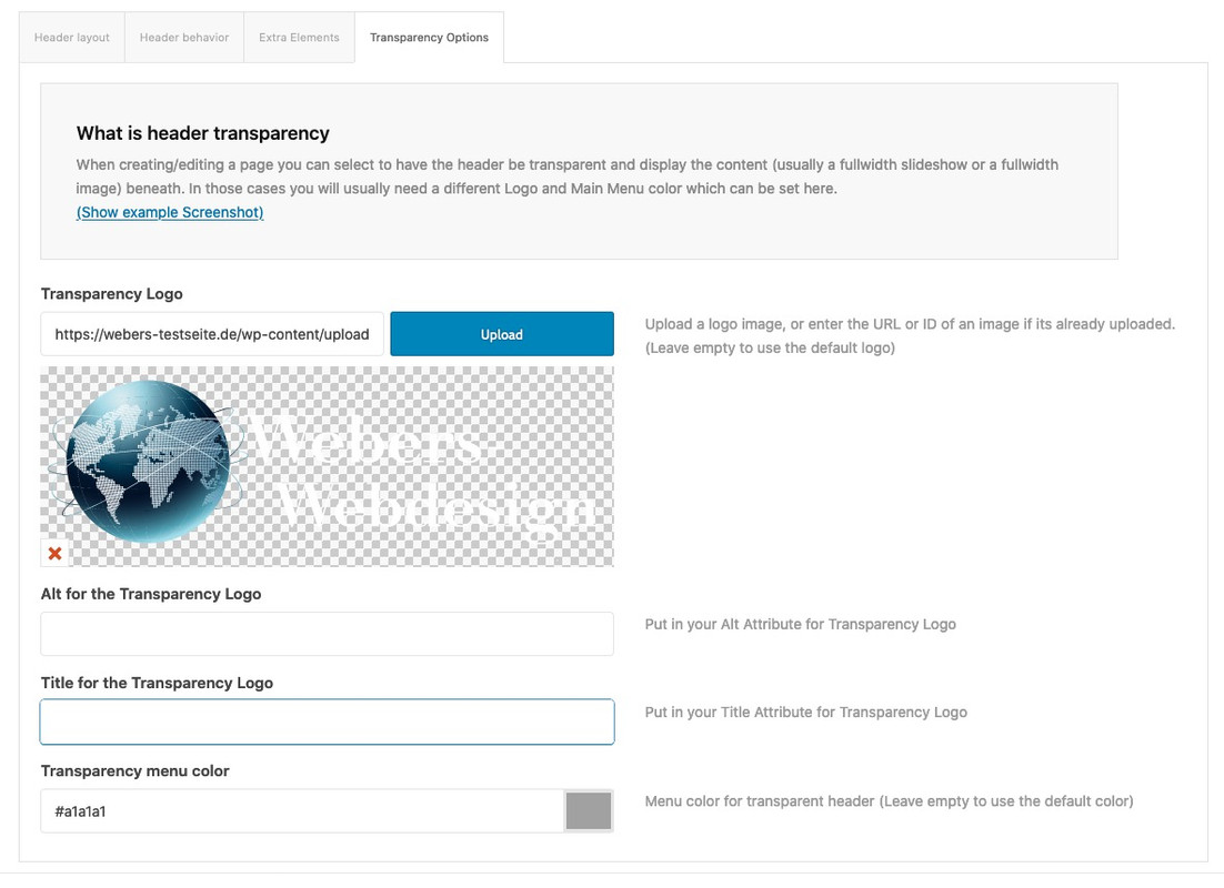
that works – maybe this will be a good way to have here on both logo and alternate logo
is there another way of code here
if the element is not found – it should place the new elements at the end of the header avia_subpage_container
Maybe a mod knows how to set it in better way : but this is academic because the element ( slug and id is found )just for info : besides the image size in the widget areas ( if they are latest news or latest portfolio) – it would take alswas that thumbnail sized image as source – but
there is a filter : avf_newsbox_image_size which can manage that to have another source for that widget thumbnail.
so maybe you like to take instead the square images (180px x 180px) you only had to know what newsbox or portfoliobox you like to select:function my_avf_newsbox_image_size( $image_size, array $args, array $instance ){ if( $args['widget_id'] == ( 'portfoliobox-3' || 'newsbox-2' || 'newsbox-4' ) ){ $image_size = 'square'; } return $image_size; } add_filter( 'avf_newsbox_image_size', 'my_avf_newsbox_image_size', 10, 3 );i did this before the new filter on having a child-theme : av-helper-masonry.php
and on line 627 i did :$loop_excerpt = $entry->post_excerpt;
but i do agree now it has to work with that new filterwith the code of ismael mentioned here: Link
and my little added selector
the whole sidebar is colorized ( till footer) : ( you have only to adjust the percentage to your enfold width options.
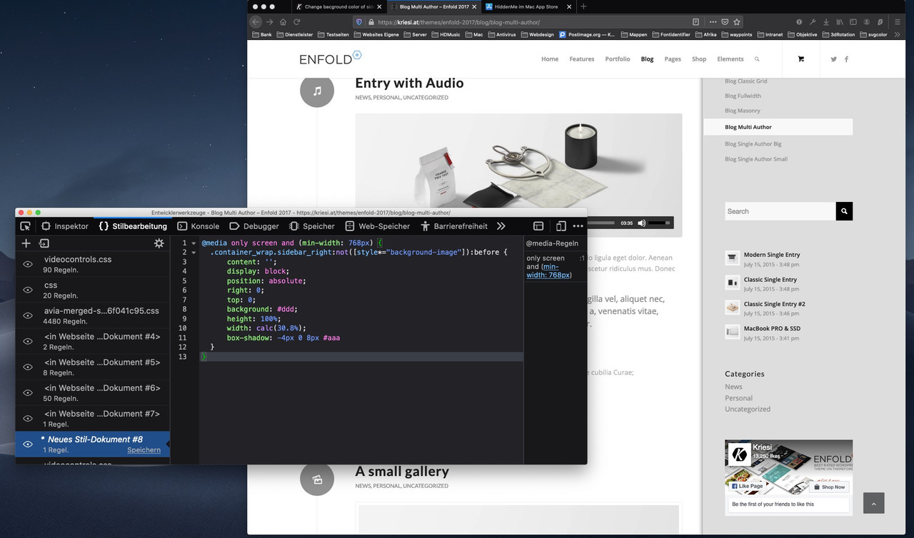
open your Enfold 4.7.3 functions-enfold.php with a good text-editor ( be aware there is in parent enfold folder a functions.php and functions-enfold.php )
( for Mac OS X f.e. sublime-text or on Windows notepad++ )
find
/* AJAX SEARCH */ … rules what you like to influence.
you can replace functions-enfold.php in your parent theme by an edited one – but then the next update will overwrite these changes.That is the great benefit of a child-theme. And – as I mentioned above – these pluggable functions can be replaced by a copy of the content in between.
on line 246ff there is:
if(!function_exists('avia_ajax_search')) {
…
}
so everything in between this wrapping if clause can be copied and transfered to your child-theme functions.php
on the next update of the parent theme, this will not be lost.The disadvantage is that any changes within this function (in your example it is avia_ajax_search ) are not reflected in the update of the parent theme.
The best would certainly be if there was a hook or filter that you could apply to the content here.
But this must always be already implemented in the theme to be able to use it in the child theme.See here for example the usage of some existing filters to influence search:
https://kriesi.at/documentation/enfold/search/Unfortunately I don’t see ( maybe one of the Mods or Devs ) if you can add the Comment Counts in an easier way. But as you see in my example playground that it works this way.
by the way – you see there are some filters in that function f.e.: avf_ajax_search_function
maybe a mod knows a filter solution for that ?so it is not so easy but because on functions-enfold.php the ajax search function is a “pluggable function” you can have here a child-theme solution. Otherwise you had to have a complete functions-enfold.php in your child.
Every function surrounded by:if(!function_exists('…')){ … }can be substituted by child-theme function with same name! – because child-theme functions are loaded first – when it comes to the function with the same name in parent theme it does not load the parent function ( because of the if not exists clause)
i have edited that function (on base of enfold 4.7.3) and you can copy & paste that part to your child-theme functions.php
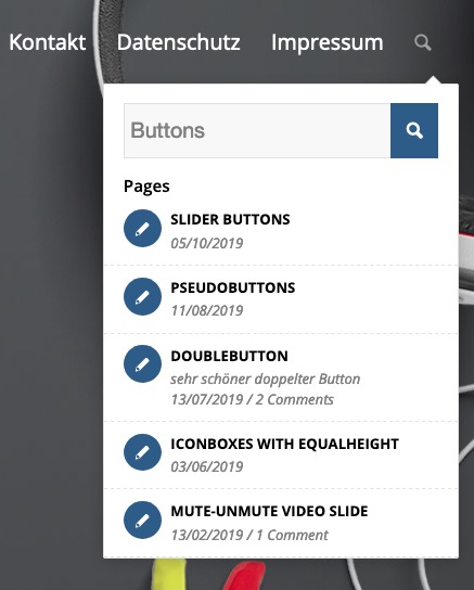
add_action( 'wp_ajax_avia_ajax_search', 'avia_ajax_search' ); add_action( 'wp_ajax_nopriv_avia_ajax_search', 'avia_ajax_search' ); function avia_ajax_search() { global $avia_config; unset($_REQUEST['action']); if(empty($_REQUEST['s'])) $_REQUEST['s'] = array_shift(array_values($_REQUEST)); if(empty($_REQUEST['s'])) die(); $defaults = array('numberposts' => 5, 'post_type' => 'any', 'post_status' => 'publish', 'post_password' => '', 'suppress_filters' => false, 'results_hide_fields' => ''); $_REQUEST['s'] = apply_filters( 'get_search_query', $_REQUEST['s']); $search_parameters = array_merge($defaults, $_REQUEST); if ( $search_parameters['results_hide_fields'] !== '' ) { $search_parameters['results_hide_fields'] = explode(',', $_REQUEST['results_hide_fields']); } else { $search_parameters['results_hide_fields'] = array(); } $search_query = apply_filters('avf_ajax_search_query', http_build_query($search_parameters)); $query_function = apply_filters('avf_ajax_search_function', 'get_posts', $search_query, $search_parameters, $defaults); $posts = (($query_function == 'get_posts') || !function_exists($query_function)) ? get_posts($search_query) : $query_function($search_query, $search_parameters, $defaults); $search_messages = array( 'no_criteria_matched' => __("Sorry, no posts matched your criteria", 'avia_framework'), 'another_search_term' => __("Please try another search term", 'avia_framework'), 'time_format' => get_option('date_format'), 'all_results_query' => http_build_query($_REQUEST), 'all_results_link' => home_url('?' . http_build_query($_REQUEST)), 'view_all_results' => __('View all results','avia_framework') ); $search_messages = apply_filters('avf_ajax_search_messages', $search_messages, $search_query); if(empty($posts)) { $output = "<span class='av_ajax_search_entry ajax_not_found'>"; $output .= "<span class='av_ajax_search_image ".av_icon_string('info')."'>"; $output .= "</span>"; $output .= "<span class='av_ajax_search_content'>"; $output .= "<span class='av_ajax_search_title'>"; $output .= $search_messages['no_criteria_matched']; $output .= "</span>"; $output .= "<span class='ajax_search_excerpt'>"; $output .= $search_messages['another_search_term']; $output .= "</span>"; $output .= "</span>"; $output .= "</span>"; echo $output; die(); } //if we got posts resort them by post type $output = ""; $sorted = array(); $post_type_obj = array(); foreach($posts as $post) { $sorted[$post->post_type][] = $post; if(empty($post_type_obj[$post->post_type])) { $post_type_obj[$post->post_type] = get_post_type_object($post->post_type); } } //now we got everything we need to preapre the output foreach($sorted as $key => $post_type) { // check if post titles are in the hidden fields list if ( ! in_array('post_titles', $search_parameters['results_hide_fields'] ) ) { if(isset($post_type_obj[$key]->labels->name)) { $label = apply_filters('avf_ajax_search_label_names', $post_type_obj[$key]->labels->name); $output .= "<h4>".$label."</h4>"; } else { $output .= "<hr />"; } } foreach($post_type as $post) { $image = ""; $extra_class = ""; // check if image is in the hidden fields list if (!in_array('image', $search_parameters['results_hide_fields'])) { $image = get_the_post_thumbnail($post->ID, 'thumbnail'); $extra_class = $image ? "with_image" : ""; $post_type = $image ? "" : ( get_post_format($post->ID) != "" ? get_post_format($post->ID) : "standard" ); $iconfont = $image ? "" : av_icon_string($post_type); } $excerpt = ""; // two new lines here $the_id = $post->ID; $commentCount = get_comments_number($the_id); // check if post meta fields are in the hidden fields list if ( ! in_array('meta', $search_parameters['results_hide_fields'] ) ) { if(!empty($post->post_excerpt)) { $excerpt = apply_filters( 'avf_ajax_search_excerpt', avia_backend_truncate($post->post_excerpt,70," ","...", true, '', true) ); $excerpt .= "<br class='linebreak'/><span>".get_the_time( $search_messages['time_format'], $post->ID )."</span>"; if ( $commentCount != "0" || comments_open($the_id) && $entry->post_type != 'portfolio') { $link_add = $commentCount === "0" ? "#respond" : "#comments"; $text_add = $commentCount === "1" ? __('Comment', 'avia_framework' ) : __('Comments', 'avia_framework' ); $excerpt .= "<span class='sep'> / </span><span>{$commentCount} {$text_add}</span>"; } } else { $excerpt = apply_filters( 'avf_ajax_search_no_excerpt', get_the_time( $search_messages['time_format'], $post->ID ), $post ); if ( $commentCount != "0" || comments_open($the_id) && $entry->post_type != 'portfolio') { $link_add = $commentCount === "0" ? "#respond" : "#comments"; $text_add = $commentCount === "1" ? __('Comment', 'avia_framework' ) : __('Comments', 'avia_framework' ); $excerpt .= "<span class='sep'> / </span><span>{$commentCount} {$text_add}</span>"; } } } $link = apply_filters('av_custom_url', get_permalink($post->ID), $post); $output .= "<a class ='av_ajax_search_entry {$extra_class}' href='".$link."'>"; if ($image !== "" || $iconfont) { $output .= "<span class='av_ajax_search_image' {$iconfont}>"; $output .= $image; $output .= "</span>"; } $output .= "<span class='av_ajax_search_content'>"; $output .= " <span class='av_ajax_search_title'>"; $output .= get_the_title($post->ID); $output .= " </span>"; if ($excerpt !== '') { $output .= " <span class='ajax_search_excerpt'>"; $output .= $excerpt; $output .= " </span>"; } $output .= "</span>"; $output .= "</a>"; } } $output .= "<a class='av_ajax_search_entry av_ajax_search_entry_view_all' href='".$search_messages['all_results_link']."'>".$search_messages['view_all_results']."</a>"; echo $output; die(); }because there was a css rule in enfold that sets the breaks in ajax search to display:none
you had to put this in additon to quick css#top #searchform br.linebreak { display: block; }you can test it here on my playground – put in search : buttons
https://webers-testseite.de/What do you mean by publication date – the date is shown allready – if there is no excerpt !
So you want to have Excerpt and Time and comment count?
like this:
always try – if css tips do not work – with !important:
#top div .av_ajax_search_entry_view_all { display: none !important; }on inline svg i can include the alt and title attribute directly to the xml code – so I did not notice the lack
i can not proove it because all my installations got an inline svg file as logo. But if you look at helper-main-menu.php there is on line 126ff:
$addition = false;
if( ! empty( $headerS['header_transparency'] ) && ! empty( $headerS['header_replacement_logo'] ) )
{
	$addition = "<img src='{$headerS['header_replacement_logo']}' class='alternate' alt='{$headerS['header_replacement_logo_alt']}' title='{$headerS['header_replacement_logo_title']}' />";
}
and on functions-enfold.php on line 1186ff:
if( false === apply_filters( 'avf_hide_transparency_logo_meta', false, $header_replacement_logo_id ) )
{
	$header['header_replacement_logo_title'] = get_the_title( $header_replacement_logo_id );
	$header['header_replacement_logo_alt'] = get_post_meta( $header_replacement_logo_id, '_wp_attachment_image_alt', true );
}
so it has to work for png –
What about the usage of the filter: avf_hide_transparency_logo_metaEdit: i tested it on a playground – it does not work as it should with png/jpg files
I got an alt-attribute but no title ! on logo
I got neither alt nor title on alternate logoThat is the reason why i explained the code.
Blurry Images can have a lot of reasons. One is the source image. If this is not blurry : the common reason is the the used image in the frontend is a recalculated image. That can have more than one reason – one is the responsive reaction on the give space.
so if you put in a 1500px wide image and it is resized to 900px because there is no space for it – it could cause blurry results.so first try this in child-theme functions.php:
function change_lightbox_size() {
    return "full";
}
add_filter('avf_avia_builder_helper_lightbox_size','change_lightbox_size', 10);
refresh all cachings and look what happens to the lightbox image.
the size of the lightbox is configured via:
in Quick Css:.mfp-image-holder .mfp-content { max-width: 80vw; }correct the padding-top of #main
On every page/post edit – on the right side where you publish the page a field with : page-attributes:
there you can choose : no header – no footer.
If you only want to get rid of header :
On the right side again there is from Enfold: Layout –
: Header visibility and transparency
Several options to change the header transparency and visibility on this page.you can choose there to have: “Hide Header on this page”
how to influence the lightbox size itself:
.mfp-image-holder .mfp-content { max-width: 80vw; }how to avoid downscaling when column only can show a scaled version of an image ( not the lightbox )
you can not avoid scaling on responsive case – you only can hope that an image in the srcset fits best to the given space for it.
But you can create your own image-size for best fitting on non responsive case.
…
filter: image_size_names_chooseadd_image_size( 'new-size', 2000, 500, true ); function my_custom_sizes( $sizes ) { return array_merge( $sizes, array( 'new-size' => __( 'New Size' ), ) ); } add_filter( 'image_size_names_choose', 'my_custom_sizes' );Enfold on Default takes for the lightbox-images not the full but the large images. These image formats are defined in functions.php on lines 174ff
( i just removed the comments) just for info:$avia_config['imgSize']['widget'] = array('width'=>36, 'height'=>36); $avia_config['imgSize']['square'] = array('width'=>180, 'height'=>180); $avia_config['imgSize']['featured'] = array('width'=>1500, 'height'=>430 ); $avia_config['imgSize']['featured_large'] = array('width'=>1500, 'height'=>630 ); $avia_config['imgSize']['extra_large'] = array('width'=>1500, 'height'=>1500 , 'crop' => false); $avia_config['imgSize']['portfolio'] = array('width'=>495, 'height'=>400 ); $avia_config['imgSize']['portfolio_small'] = array('width'=>260, 'height'=>185 ); $avia_config['imgSize']['gallery'] = array('width'=>845, 'height'=>684 ); $avia_config['imgSize']['magazine'] = array('width'=>710, 'height'=>375 ); $avia_config['imgSize']['masonry'] = array('width'=>705, 'height'=>705 , 'crop' => false); $avia_config['imgSize']['entry_with_sidebar'] = array('width'=>845, 'height'=>321); $avia_config['imgSize']['entry_without_sidebar'] = array('width'=>1210, 'height'=>423 ); $avia_config['imgSize'] = apply_filters('avf_modify_thumb_size', $avia_config['imgSize']);these image-sizes are generated from Enfold on uploading it to media-library.
WordPress itself generates 3 additional image-sizes:Thumbnail (on default : 150px square or 80px)
Medium (on default : maximum 300px width and height)
Large (on default : maximum 1024px width and height)
Full (full/original image size you uploaded)
But: Enfold has some filter to change the format of this image for the different uses.
One is: avf_avia_builder_helper_lightbox_size
Another one is: avf_avia_builder_masonry_lightbox_img_size
Or: avf_avia_builder_gallery_image_linkHow to use the filter : over child-theme functions.php:
function change_lightbox_size() {
    return "full";
}
add_filter('avf_avia_builder_helper_lightbox_size','change_lightbox_size', 10);
function avia_change_masonry_thumbnail_link($size){ return "full"; } add_filter('avf_avia_builder_masonry_lightbox_img_size', 'avia_change_masonry_thumbnail_link', 10, 1);function avia_change_gallery_thumbnail_link($link, $attachment, $atts, $meta){ $link = wp_get_attachment_image_src($attachment->ID, "full"); return $link; } add_filter('avf_avia_builder_gallery_image_link', 'avia_change_gallery_thumbnail_link', 10, 4);do not forget to empty all caching plugins and if you merge js and css files in Enfold to regenerate these files.
March 9, 2020 at 4:12 pm in reply to: Burger/Mobile submenu links / How can I add a further colour for the… #1191558Das CSS ist kein Hexenwerk, wenn man sich mal mit den Browser eigenen Developer Tools beschäftigt (nahezu alle bringen da mehr oder weniger gute mit – bei Safari muss man das in den Einstellungen allerdings aktivieren).
siehe mal hier mein Kommentar unten: https://kriesi.at/support/topic/arrange-to-middle/#post-1094963Da kann man ganz gut vergleichen was an Klassen zB an einem aktivem Menu Punkt anliegt.
Man kann dort “virtuell” css code einfügen, und die Veränderung beobachten – bevor man es überhaupt in das Quick CSS einfügt.
#top .avia-datepicker-div.ui-datepicker .ui-datepicker-prev span, #top .avia-datepicker-div.ui-datepicker .ui-datepicker-next span {
    color: transparent;
}
So if you also want to consider selecting these text fields :
then set them to display: none#top .avia-datepicker-div.ui-datepicker .ui-datepicker-prev span, #top .avia-datepicker-div.ui-datepicker .ui-datepicker-next span { display: none }“The video itself actually contains the black bars or space. ”
so re-render your film : https://webers-testseite.de/wp-content/uploads/testbackground.mp4
this is than 16/9 Format.
and give to the color-section : “Custom-height in % …” : 56%
See: https://webers-testseite.de/fullvideo-background/you can see here how to change the placeholder and to substitute these prev. next text:
https://kriesi.at/support/topic/change-contact-formular-field-date-prefilled-dd-mm-yy-in-tt-mm-jj/#post-1185401
I prefer the : use signs as << and >> -
This reply was modified 6 years ago by
-
AuthorPosts