Forum Replies Created
-
AuthorPosts
-
My interest in seeing the SVG was because you might not need an alternative logo. Why is there a construct with alternative logos in Enfold for transparent headers? In most cases, the only issue is the logo’s contrast with the background. However, since it is very difficult to influence a PNG or JPG in this respect, a second logo was used. As above, white text on a dark background.
With an inline SVG, however, I can achieve this by changing the elements within the SVG using external CSS.if you only need these classes in the mobile case (header-scrolled or header-scrolled-full) to have a different logo, you can also change your logo via the class (av_header_transparency).
can you post the link to that page? I would like to have a look to that svg.
And what have you changed inside sticky header script?
____________________btw: see here a testpage: https://webers-testseite.de/
because it is an inline svg i do not use the transparency logo – i change the fill colors by css – if header is transparent or not..html_header_transparency #header:not(.header-scrolled) .buchstabe { fill: #FFF; }did you see my test page:
https://webers-testseite.de/8col-flex/
the colum on the right side – has a -100% – this is as if it is fixed a -150% will have that effect you described.I change it for now to 150% in that function: link
short version with no comments and only with the changing of desktop parallax speed:
( Do not forget to set the custom ID: myID1 to the column )function my_custom_all_parallax_settings_preserving_others() { ?> <script> window.addEventListener("DOMContentLoaded", function () { const container = document.getElementById('myID1'); if (container) { const currentParallaxData = container.getAttribute('data-parallax'); let parallaxObject = {}; try { parallaxObject = JSON.parse(currentParallaxData || '{}'); } catch (e) { console.error('Error parsing existing data-parallax attribute:', e); parallaxObject = {}; } const changesToApply = { "av-desktop-parallax": "bottom_top", // Desktop "av-desktop-parallax_speed": "-150", // Desktop: Speed }; Object.assign(parallaxObject, changesToApply); const newParallaxData = JSON.stringify(parallaxObject); container.setAttribute('data-parallax', newParallaxData); } }); </script> <?php } add_action('wp_footer', 'my_custom_all_parallax_settings_preserving_others');it is because the padding of 1.5em on .av-image-caption-overlay-center is too big for those small images.
try:
#top .av-image-caption-overlay-center {
  padding: .5em;
}
or in additon: bring those image to grow:
.avia-image-container.avia-align-center .avia-image-container-inner,
.avia-image-overlay-wrap a.avia_image img {
  width: 100% !important;
}
June 30, 2025 at 5:37 pm in reply to: How to change single post featured image size to show full image in 16:9 ratio #1486162you can influence in post-slider depending on context
add_filter("avf_post_slider_args", function($atts, $context) {
	if( $context == "index" ) {
		$atts['type']  = 'grid';
		$atts['columns']  = 3;
		$atts['preview_mode'] = 'custom';
		$atts['image_size'] = 'gallery';
		$atts['contents'] = 'excerpt_read_more';
	}
	if( $context == "archive" ) {
		$atts['type']  = 'grid';
		$atts['columns']  = 4;
		$atts['preview_mode'] = 'custom';
		$atts['image_size'] = 'gallery';
		$atts['contents'] = 'excerpt_read_more';
	}
	if( $context == "tag" ) {
		$atts['type']  = 'grid';
		$atts['columns']  = 3;
		$atts['preview_mode'] = 'custom';
		$atts['image_size'] = 'entry_with_sidebar';
		$atts['contents'] = 'excerpt_read_more';
	}
	return $atts;
}, 10, 2);
June 30, 2025 at 5:30 pm in reply to: How to change single post featured image size to show full image in 16:9 ratio #1486161the thumbs used in elements ( masonry, or news widget, blog etc.) can be influenced by filters.
f.e.:
function custom_post_featured_image_link( $image_link, array $current_post, $size ){
  if(is_single()){
    $image_link = get_the_post_thumbnail( $current_post['the_id'], 'medium' ); /**** or medium, square etc. ***/
  }
  return $image_link;  // echo $image_link;  if you want to get rid of link function
}
add_filter( 'avf_post_featured_image_link', 'custom_post_featured_image_link', 10, 3 );
or in widgets ( just inspect what number they get on the sidebar)
function my_avf_newsbox_image_size( $image_size, array $args, array $instance ){
  if( $args['widget_id'] == ( 'portfoliobox-3' || 'newsbox-2' || 'newsbox-4' ) ){
    $image_size = 'square';
  }
  return $image_size;
}
add_filter( 'avf_newsbox_image_size', 'my_avf_newsbox_image_size', 10, 3 );
in combo-box:
function custom_avf_combo_box_image_size( $size, $args ){
  return 'square';
}
add_filter( 'avf_combo_box_image_size', 'custom_avf_combo_box_image_size', 10, 2 );
June 30, 2025 at 4:49 pm in reply to: How to change single post featured image size to show full image in 16:9 ratio #1486158where did you found that filter: avf_post_featured_image_size ?
to bring that new added image format to the lists where you can choose the source you can use:
Edit: ok. there seems to be changed a lot on those filters – on my actual enfold theme my solution brings some errors.
add_action( 'after_setup_theme', 'my_custom_enfold_image_sizes' ); function my_custom_enfold_image_sizes() { add_image_size( 'custom-16-9-hero', 1280, 720, true ); } add_filter( 'image_size_names_choose', 'my_custom_enfold_image_size_names' ); function my_custom_enfold_image_size_names( $sizes ) { return array_merge( $sizes, array( 'custom-16-9-hero' => __( 'My Custom Featured Image' ), ) ); }by the way – for color-sections there is a filter to influence the parallax speed of the background-image:
and : a negative ratio makes no sense.function avia_change_parallax_ratio($ratio, $id){ if($id == 'myid'){ $ratio = "0.3"; return $ratio; } } add_filter('avf_parallax_speed','avia_change_parallax_ratio', 10, 2);as i understood him it is the column not the section – so my way was to give the ID to the column.
The column has the parallax attribute. And i think he is talking about the parallax effect on element itself – not the background-image of the column. there is no option for that on columns.I tested it on an existing testpage of mine ( so the codes there have nothing to do with the solution here ). but see the right column with that image.
https://webers-testseite.de/8col-flex/
see what happens when hamburger is active – the direction is then the other way round (+50)my fault is that i do not preserve the rest of the existing settings – here a corrected code:
function my_custom_all_parallax_settings_preserving_others() {
?>
<script>
window.addEventListener("DOMContentLoaded", function () {
    const container = document.getElementById('myID1');

    if (container) {
        // 1. Get the current value of the data-parallax attribute
        const currentParallaxData = container.getAttribute('data-parallax');

        // 2. Parse the string into a JavaScript object
        let parallaxObject = {};
        try {
            // Attempt to parse existing data. If it's empty or invalid, start with an empty object.
            parallaxObject = JSON.parse(currentParallaxData || '{}');
        } catch (e) {
            console.error('Error parsing existing data-parallax attribute:', e);
            // If parsing fails, ensure parallaxObject is an empty object to avoid errors
            parallaxObject = {};
        }

        // 3. Define the changes you want to apply.
        //    Only the properties listed here will be updated or added.
        //    Existing properties not listed here will be preserved.
        const changesToApply = {
            "parallax": "bottom_top",       // Standard Parallax
            "parallax_speed": "-150",       // Standard Parallax Speed

            "av-desktop-parallax": "bottom_top", // Desktop
            "av-desktop-parallax_speed": "-100",  // Desktop: Speed

            "av-medium-parallax": "bottom_top",  // Medium Tablet
            "av-medium-parallax_speed": "50",   // Medium Tablet Speed

            "av-small-parallax": "no_parallax", // Parallax off
            "av-small-parallax_speed": "no_parallax", // no speed needed

            "av-mini-parallax": "no_parallax", // Mobil Parallax
            "av-mini-parallax_speed": "no_parallax" // No Speed needed
            // Do NOT include "parallax-container" here, as we want to preserve its original value
        };

        // 4. Merge the changes into the existing parallaxObject.
        //    Object.assign() overwrites existing properties and adds new ones.
        //    Properties in 'parallaxObject' that are NOT in 'changesToApply' will remain untouched.
        Object.assign(parallaxObject, changesToApply);

        // 5. Convert the modified object back into a JSON string
        const newParallaxData = JSON.stringify(parallaxObject);

        // 6. Set the new value of the data-parallax attribute
        container.setAttribute('data-parallax', newParallaxData);

        console.log('Data attribute for parallax settings updated successfully!');
        console.log('New data-parallax value:', container.getAttribute('data-parallax'));
    } else {
        console.error('Container with ID "myID1" not found.');
    }
});
</script>
<?php
}
add_action('wp_footer', 'my_custom_all_parallax_settings_preserving_others');
btw: on 3. read that comment:
        // 3. Define the changes you want to apply.
        //    Only the properties listed here will be updated or added.
        //    Existing properties not listed here will be preserved.
so if you only want to influence the desktop parallax speed then only change it in the code above and do not mention the other settings there
and the parallax speed of -30% is not enough?
only values less than -100% have that effect you described – but this option does not exist …(by the way – a value of -100 means that the column is quasi in fixed position )
give a unique ID to that Column. Set all your parallax options ( -30% is not enough for you ) and set these setting by child-theme functions.php for that ID:
function my_custom_all_parallax_settings() {
?>
<script>
window.addEventListener("DOMContentLoaded", function () {
    const container = document.getElementById('myID1');

    if (container) {
        // Create a new JavaScript object with ALL the desired parallax settings
        // You can customize any value here as you need it.
        const newParallaxSettings = {
            "parallax": "bottom_top",       // Standard Parallax
            "parallax_speed": "-150",       // Standard Parallax Speed

            "av-desktop-parallax": "bottom_top", // Desktop
            "av-desktop-parallax_speed": "-100",  // Desktop Speed

            "av-medium-parallax": "bottom_top",  // Medium Tablet
            "av-medium-parallax_speed": "-50",   // Medium Tablet Speed

            // only change those values that you can not set by Enfold Options Dialog

            // "av-small-parallax": "no_parallax",
            // "av-small-parallax_speed": "no_parallax",

            // "av-mini-parallax": "no_parallax",
            // "av-mini-parallax_speed": "no_parallax"
        };

        // Convert the new object into a JSON string
        const newParallaxData = JSON.stringify(newParallaxSettings);

        // Set the new data-parallax attribute
        container.setAttribute('data-parallax', newParallaxData);

        console.log('Data attribute for all parallax settings changed successfully!');
        console.log('New data-parallax value:', container.getAttribute('data-parallax'));
    } else {
        console.error('Container with ID "myID1" not found.');
    }
});
</script>
<?php
}
add_action('wp_footer', 'my_custom_all_parallax_settings');
However, be aware that high parallax speed values may cause the element to “jerk” while scrolling.
The plugin allows you to add code snippets to your WordPress installation. Therefore, there must be an input field that contains code snippets. Just look at what you have tried to implement there. You can also insert such code snippets directly via child-theme functions.php. So if you don’t have a child theme, it would also explain the need for such a plugin.
In the meantime, I no longer use a captcha solution at all. There are very good honeypot versions that reduce spam to almost zero. I personally use the extended version of WP-Armour. However, the free version is also very effective. Over 300000 installations and over 1000 – 5 star ratings speak for themselves: Link
June 28, 2025 at 9:53 am in reply to: Bug Report: Gallery Image Subtitle Changes to “null” on Scroll / Reload #1486068if it is a script like this:
function temporary_removal_title_tags(){
?>
<script>
  window.onload = function() {
    var elementsWithTitle = document.querySelectorAll('a, img, *[title]');
    for (var i = 0; i < elementsWithTitle.length; i++) {
        var element = elementsWithTitle[i];

        element.setAttribute("data-original-title", element.title);

        element.addEventListener("mouseenter", function() {
            this.title = "";
        });

        element.addEventListener("mouseleave", function() {
            this.title = this.getAttribute("data-original-title");
        });

        element.addEventListener("mousedown", function() {
            this.title = this.getAttribute("data-original-title");
        });
    }
  };
</script>
<?php
}
add_action('wp_footer', 'temporary_removal_title_tags');
then the mousedown (click) should bring the title back to the element. And lightbox had to show it.
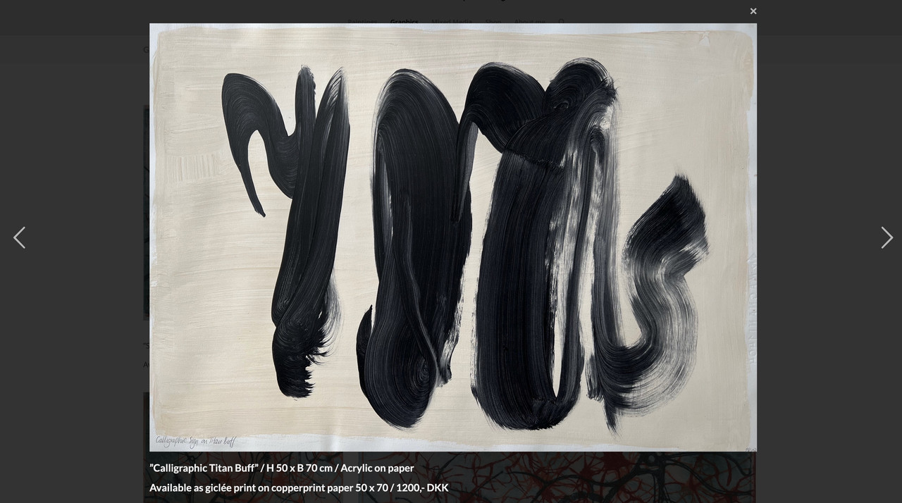
by the way – sometimes the original image is missing – f.e. :
https://www.ullaheegaard.dk/stg_6019f/wp-content/uploads/2018/01/Tillid.jpg
– only thehttps://www.ullaheegaard.dk/stg_6019f/wp-content/uploads/2018/01/Tillid-700x700.jpgexists.
Therefore, I changed the code above so that it only displays the full resolution of images in the lightbox if they are available.the code snippet will work on your page for all images. Even on that graphics page.
But if you create these images in a different way – and i see some Enfold Lightbox on paintings page we had to find then a different solution.
But if you use the same way like on mixed media and graphics page – the code will work there too.But as mentioned – it would be nice to have a fallback for the bottom-bar title on lightbox. my advise – and not only for seo purpose – give an alt tag to your images via media library.
and use that snippet with fallback alt -tag as title inside bottom-bar:
Edit
this checks if original image is present and if widget-text or alt is present :function mixed_media_lightbox() { ?> <script type="text/javascript"> window.addEventListener("DOMContentLoaded", function () { (function($){ $('.widget_media_image').magnificPopup({ delegate: 'img', type: 'image', removalDelay: 500, // to allow animated closing in ms mainClass: 'avia-popup mfp-zoom-in mfp-image-loaded mixed-media', midClick: true, gallery: { enabled:true, preload: [1, 1] , }, image: { titleSrc: false, markup: '<div class="mfp-figure">'+ '<div class="mfp-close"></div>'+ '<div class="mfp-img"></div>'+ '<div class="mfp-bottom-bar">'+ '<div class="mfp-title"></div>'+ // '<div class="mfp-counter"></div>'+ '</div>'+ '</div>', }, callbacks: { elementParse: function(item) { var originalSrc = item.el.attr('src'); var fullSizeSrc = originalSrc.replace(/-\d+x\d+\./, '.'); // Create a temporary image object to check whether the full resolution exists var img = new Image(); img.onload = function() { item.src = fullSizeSrc; }; img.onerror = function() { item.src = originalSrc; }; img.src = fullSizeSrc; item.src = originalSrc; }, markupParse: function (template, values, item) { var title = ''; // Initialize title as an empty string. This is our default fallback. // 1. Highest Priority: Check for content from a nearby .widget_text element var textWidget = item.el.closest('.panel-grid-cell').find('.widget_text'); if (textWidget.length && textWidget.html().trim() !== '') { title = textWidget.html(); } else { // 2. Second Priority: If no text widget, check the image's alt attribute var altAttribute = item.el.attr('alt'); if (altAttribute && altAttribute.trim() !== '') { // Checks if exists AND has non-empty content title = altAttribute; } else { // 3. Third Priority: If no alt, check the image's title attribute var titleAttribute = item.el.attr('title'); if (titleAttribute && titleAttribute.trim() !== '') { // Checks if exists AND has non-empty content title = titleAttribute; } } } // Finally, assign the title to values.title, wrapping it in <h3> ONLY if there's content if (title) { values.title = '<h3 class="heading">' + title + '</h3>'; } else { values.title = ''; // If no title was found at all, ensure nothing is displayed } }, }, }); })(jQuery); }); </script> <?php } add_action('wp_footer', 'mixed_media_lightbox', 9999);And
#top .mixed-media .mfp-image-holder .mfp-content { max-width: 1200px; box-sizing: border-box; padding-bottom: 90px; vertical-align: middle; } #top .mixed-media .mfp-bottom-bar { margin-top: -36px; position: absolute; top: 100%; left: 0; width: 100%; cursor: auto; background-color: rgba(0,0,0,0.3); backdrop-filter: blur(4px); padding: 5px 10px; } #top .mixed-media .mfp-bottom-bar .mfp-counter { right: 5px } #top .mixed-media .mfp-content img.mfp-img { width: auto; max-width: 100%; max-height: 90vh !important; height: auto; display: block; line-height: 0; box-sizing: border-box; padding: 40px 0 40px; margin: 0 auto; } #top .mixed-media .mfp-content .mfp-title .heading * { font-weight: 400 !important; } #top .mixed-media .mfp-content .mfp-title .heading p { margin: 0.3em 0; } #top .widget_media_image img { cursor: pointer; }Now – what you have to do. : not all your images do have that widget_text
See Paintings Page. Or you have tried to do it with enfold lightbox implementation there. ?the script is working – but the shown title is not allways defined. the reason – see above.
Best would be to set an alt or title tag as fallback to all of your images. For SEO purpose it might be better to use the alt tag.
then you had to change the else condition to:values.title = '<h3 class="heading">' + item.el.attr('alt') + '</h3>';this is the main crux:
elementParse: function(item) {
          item.src = item.el.attr('src').replace( /-\d*x\d*\./, '.' );
},
in the callback function. The image link comes now from the src attribute.
because of that extra class on mainClass you can individually set :
see final solution at: https://kriesi.at/support/topic/lightbox-issues-2/#post-1486042not familiar with site origin – but with the magnificPopup script ;)
but you can have your own lightbox script for those pages – using the magnificPopup :
Edit: see final solution at: https://kriesi.at/support/topic/lightbox-issues-2/#post-1486042
your img tags have no title nor alt attributes – but we can use the following description.
You are still using an outdated version of Enfold there. You should update the theme to match the current WordPress version, which uses a newer jQuery. You might want to get help with this. Enfold 4.5.7 and 7.1.1 are quite different, so you may need to customize it further then. At the very least you should have a full backup of your site. I recommend updating as follows: https://kriesi.at/support/topic/some-hints-and-advice-to-update-enfold/#post-1056107
see here example with “burger” always visible – and with #footer-page as overlay.
https://basis.webers-testseite.de/
if you are interested in that – i gave you a step by step guide.
see here an example page ( only with a color-section on that page that represents the footer-page )
https://webers-web.info/navigation/
for that menu item in the main nav i gave a custom-class to that menu-item: pseudoburger and used the label :
<span class="av-hamburger custom-burger av-hamburger--spin"><span class="av-hamburger-box"><span class="av-hamburger-inner"></span></span></span>– this is exactly the usage of the enfold burger icon – plus a custom-class (custom-burger).the color-section got the ID: pseudoburger. (#pseudoburger)
( or if you use the footer-page for that – then you had to adjust all to that ID : #footer-page )i placed now a snipptet to my child-theme functions.php:
function a_pseudo_burger_menu(){
?>
<script type="text/javascript">
	(function($) {
		$('body').on('click', '.pseudoburger > a',  function() {
			$('#pseudoburger').toggleClass('visible-page');
			$('.custom-burger').toggleClass('is-active');
		});
	})(jQuery);
</script>
<?php
}
add_action('wp_footer', 'a_pseudo_burger_menu');
and on quick css:
#top #pseudoburger { position: fixed; top: var(--enfold-header-height); left: 0; z-index: 50; height: 100%; opacity: 0; visibility: hidden; transition: opacity 1s ease; } #top #pseudoburger.visible-page { opacity: 1; visibility: visible; transition: opacity 1s ease; } #top .header_color .custom-burger.is-active .av-hamburger-inner, #top .header_color .custom-burger.is-active .av-hamburger-inner::before, #top .header_color .custom-burger.is-active .av-hamburger-inner::after { background-color: darkblue !important; }to get a “footer-page” with dynamically feed menues – you can use the menu shortcode :
function custom_named_menu_shortcode( $atts ) {
    extract( shortcode_atts( array(
        'name'  => '', // Default to an empty menu name
        'class' => 'custom-menu', // Default CSS class
        'depth' => 0, // Default depth (0 for unlimited)
        'title' => '', // New: Default to an empty title
        'title_tag' => 'h2', // New: Default title HTML tag
        'title_class' => 'menu-title', // New: Default title CSS class
    ), $atts ) );

    $output = ''; // Initialize output variable

    // If a title is provided, add it to the output
    if ( ! empty( $title ) ) {
        $output .= '<' . esc_attr( $title_tag ) . ' class="' . esc_attr( $title_class ) . '">' . esc_html( $title ) . '</' . esc_attr( $title_tag ) . '>';
    }

    if ( ! empty( $name ) ) {
        $output .= wp_nav_menu( array(
            'menu'            => $name,
            'menu_class'      => $class,
            'container'       => 'nav', // You can change this to 'div', false, etc.
            'container_class' => $class . '-container',
            'echo'            => false, // Important: returns the menu HTML instead of printing it
            'depth'           => $depth,
        ) );
    }
    return $output; // Return the accumulated output
}
add_shortcode( 'named_menu', 'custom_named_menu_shortcode' );
it is used like this:
[named_menu name="your-menu-name" class="my-custom-menu" depth="2" title="Our Main Menu"]then you can setup your layout with codeblock elements – each of them represents a menu ( or different shortcode – f.e. social-media )
but for that i wouldn’t use the enfold burger icon – instead i would place a custom Button – perhaps a fixed button to toggle a class to hide/show this page.
Look to your example page of thedive.com – its footer is exactly the burger content ;)
so maybe styling a footer-page and redeclare the hamburger icon with a different event that brings that footer to fullscreen and to fixed position ( left: 0 ; top: var(–enfold-header-height) ) is a possible solution. ( no automatic menü – but that way you like to have it)if you like to bing those arrows to the center of the gallery height:
#top div .avia-gallery { position: relative; } .avia-gallery.av-slideshow-ui .avia-slideshow-arrows { width: 100%; height: 60px; top: calc(50% - 30px); } #top .avia-slideshow-arrows a { top: 0; }have you refreshed all cachings (maybe you got a caching/optimization plugin) – did you “Delete Old CSS And JS Files?” on Enfold – Performance?
Next Hint:
These settings are nearly the last that are loaded – even after quick css – so if you got a mistake on quick css ( missing closing brackets , komma instead of semicolon etc. they will be not loaded. So check your quick css.If you got a link to that page – we can check what happens.
maybe put each of those elements in a separate 1/1 container. The icon-box and the gallery.
or try in quick css:
#top div .avia-gallery { position: relative; }or – more flexible in styling for complete control over the whole screensize ranges – working with grid layout:
#top #wrap_all .avia-custom-gallery .avia-gallery-thumb {
  display: grid;
  grid-template-columns: repeat(auto-fit, minmax(180px, 1fr));
  grid-auto-flow: row;
  gap: 20px;   /*** if you like to have a space between the images ***/
}

#top #wrap_all .avia-custom-gallery .avia-gallery-thumb a {
  width: unset !important;
}
when images are less than 180px – a new row will be created
on 6 items besides each other the setting vor less than 767px is allready set to 33% – and this looks nice to me.
Maybe you only like to influence the range inbetween:
@media only screen and (min-width: 768px) and (max-width: 989px) { #top .avia-custom-gallery .avia-gallery-thumb a { width: 25% !important; } }best would be to have a custom class on that element f.e. bg-colored-sub-menu
#top .av-submenu-container.bg-colored-sub-menu {
  background-color: lightblue;
}
this will only have an effect on the submenu – if you like to have the same bg-color for the list items:
#top .av-submenu-container.bg-colored-sub-menu a { background-color: lightblue; color: #000; border-color: darkblue } -
AuthorPosts