Forum Replies Created
-
AuthorPosts
-
hm strange because on woocommerce the aside is on default in the container.
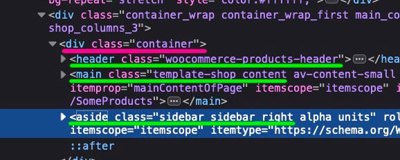
Don’t know where the mismatch comes from ?
But your “aside” is outside that container:
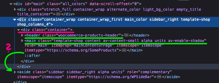
Have you used some hooks to influence some woocommerce settings in your functions.php?-
This reply was modified 5 years, 11 months ago by
Guenni007.
It is really fun to share ones knowledge here. ;)
The reason why i ask for block editor ( Gutenberg ) is that some other users here got troubles in using both Enfold ALB and Gutenberg.
It seems that some users got the same behavior on having a scroll down when dragging the element down to the place where they want to go.
https://kriesi.at/support/topic/how-to-hide-shortcode-section-above-avia-layout-builder/#post-1209040If you are having problems with scrolling down below the fold when dragging an element and the Block Editor is active, then please try adding this to your functions.php file:
They have extra shortcodes visible in the frontend and they could not scroll down in editor.
So again : did you use the block-editor too on your enfold options dialog?
Next suggestion : are you using block editor on enfold options?
zunächst ist dein Header ja fixiert – er shrinkt halt nur. Ausserdem hast du ja wohl dieses Headerlayout in der Seite gewählt:
transparent oder ich schätze – eher glassy style. Das geht auf der Seite wo du im Editor Modus bist – rechte Leiste : dort steht irgendwo diese Option zur Verfügung.
Wenn das aber so gewollt ist, und du nach dem shrinken allerdings nur einen voll weißen Header haben möchtest musst du ein wenig Quick css dazu setzen um den Header HIntergrund zu setzen..header-scrolled .header_bg { opacity: 1 !important; }Another hint: on very long page layouts i prefer to use the fullscreen layout of the alb.
The tools are fixed on top in this case! – And you don’t have to pull them the whole way down to the end of the page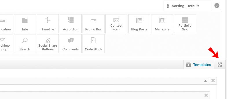
is it that you can not drag them or not drop them.
The reason for my question is that if you can’t drag, then it’s probably a deeper problem.
If you can’t place it everywhere, there can be several reasons for that.
One of them is that not all elements can be placed in every other element. There are elements that are pronounced drag and drop elements – others are not. For example, you cannot place 1/2 column into a 1/1 column.For example, I can’t think of any element in the “Content Elements” tab that allows you to place other elements in there.
Maybe you first describe what you want to achieve.
kannst du mal das hier ausprobieren: https://kriesi.at/documentation/enfold/icon/#troubleshoot
Meist werden die Hoster wohl eine Apache Server haben, deshalb wäre wohl dann die erste Lösung angebracht.
die .htaccess Datei ( mit dem . vor dem namen und ohne Dateityp) befindet sich im Root Verzeichnis deiner Installation.
Die Ftp Programme zeigen nicht immer in den Standardeinstellungen diese versteckten Dateien an. Das kann man in den Einstellungen aktivieren. ( bei filezilla ist das über: Server/Auflistung versteckter Dateien erzwingen).
Normalerweise sieht so eine Standard .htaccess Datei in etwa so aus:# BEGIN WordPress RewriteEngine On RewriteBase / RewriteRule ^index\.php$ - [L] RewriteCond %{REQUEST_FILENAME} !-f RewriteCond %{REQUEST_FILENAME} !-d RewriteRule . /index.php [L] # END WordPressda fügst du dann bitte nichts dazwischen ein sondern ausserhalb dieser Anweisung gerne auch drüber:
<FilesMatch ".(ttf|otf|woff)$">
<IfModule mod_headers.c>
Header set Access-Control-Allow-Origin "*"
</IfModule>
</FilesMatch>
bitte richtig verstehen nur als beispiel , was bei dir also drin steht könnte anders aussehen – bitte nicht verändern – nur den Code hinzufügen
thanks Ismael -but it wasn’t so much a question of whether it would work this way, but rather if it would be a useful setting that could be included in one of the next updates. The best way to do this is to have an input array in the sliders.
I can work it out now – but then I would have to consider repeating it every time I update.Versuche mal das hier in deiner Child-Thema functions.php:
Pass nur auf, deine Anführungszeichen waren nicht geeignet zur Übernahme in die functionsfunction add_script_to_head(){ ?> <script type="module" src="XXXXXX"></script> <?php } add_action('wp_head', 'add_script_to_head');i will try that !
how about the influence on transitionSpeed via child-theme functions.php ?
The animation method and intervall can be influenced the way above. – why not the speed:lol – btw: this is only seen if you use the high resolution magic mouse. –
in that moment my magic mouse is not charged – so i use a logitech wheel mouse – no effect is seen ???
however – the workaround on top is a good solution –
i change now the setting for the testpage.-
This reply was modified 5 years, 11 months ago by
try:
#footer .social_bookmarks {
    display: inline-flex;
}
and if you like to get rid of the border and colorize the icons to white:
#top #footer .social_bookmarks li { border-right: none !important; } #top #footer .social_bookmarks li a { color: #fff !important; }Enable the debug mode for Enfold: https://kriesi.at/documentation/enfold/intro-to-layout-builder/#debug-mode
After that you got under each page/post generated with the Advanced Layout Builder an additional field with all the shortcodes enfold generates for the page content.
You can copy/paste the whole thing and tranfer to another enfold installation – same way : create that new page – goto advanced layout builder and paste that code to the analog field – save page.
_____________
Or for newest enfold:
save that page as template ( give to it a unique name ).
Go to Enfold Options: Import/Export – Export Layout Builder Templates –
This file could be imported on the other installation. You will then have under templates these saved pages.April 28, 2020 at 10:20 am in reply to: Change heading for entry title for category and tags page from H2 to H3 #1207731Thats why i asked for the layout – it is possible to change the headings tag on all these without having edited ALB elements.
but i had to know the selectors to give advice.-
This reply was modified 5 years, 11 months ago by
A lot of people use the 100% jpg option which is not necessary.
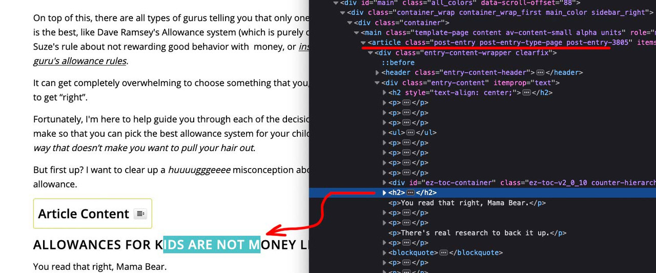
On Photoshop i use 35 til 55% jpgs – depends on the motive. For contrast rich photos the 35% is often ok. for monochromatique or fine gradients ( like skin tones ) there must be a bit more.April 27, 2020 at 8:56 pm in reply to: Change heading for entry title for category and tags page from H2 to H3 #1207610Are you familiar with using developer tools?
Then please have a look what classes you do have on article
On the article we have the layout type
multi-big
single-small
single-big
blog-grid
bloglist-simple
bloglist-compact
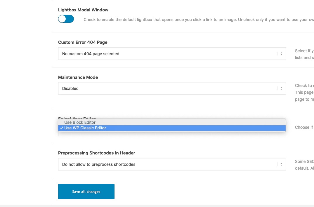
bloglist-excerptMaybe it’s because it’s classic editor that I don’t see the special heading area?
;)
These Headings are made by Classic Editor like … and not via Advanced Layout Builder (ALB) – these settings for Headings only exist if you are using the Advanced Layout Builder
I can’t see your page – but I guess your background images are set to “cover” and the “background attachment” is set to fixed.
There are known problems with the background image display with Safari on Desktop-Macs.to the mods: The best way to see the effect is to quickly switch from scrolling up and down on such backgrounds.
For mobile phones these wallpapers are set to : Scroll anyway.
But since the position: fixed for divs is not as buggy as the background-attachment: fixed is the trick to replace exactly that.
So try for color-sections : give a custom-class to your color-section f.e.: bg-fixed
then place this code to your quick css:
.bg-fixed {
  clip-path: inset(0 0 0 0);
  background-size: 0 !important;
}

.bg-fixed:before {
  background-image: inherit !important;
  background-repeat: no-repeat;
  content: "";
  position: fixed;
  width: 100%;
  height: 100%;
  top: 0;
  left: 0;
  background-size: cover;  /*** depends on your wanted settings ***/
  will-change: transform;
}
see here: https://webers-testseite.de/background-fixed/
by the way this workaround for background-images of flex_cells works too.
but it might be better to style it a bit different – f.e. background-size: containSee on that test-page home: https://webers-testseite.de
I deleted on that home page the background-size: 0px for the attachment fixed image – so you see both images !
the jittering one is the background-attachment: fixed !
Later i will reinsert that rule to have a non buggy home page again.-
This reply was modified 5 years, 11 months ago by
Well first on my end it works a little bit faster. but your slider has images with aprox 500kb and some 900kb – allthough they have smaller dimensions (1200px x 800px)
see here if these are optimised for web f.e. with photoshop:
https://webers-testseite.de/sblanc/Do you realy see a difference ?
See here main reasons for it: https://gtmetrix.com/reports/www.sblanc.com/Fub9rGGG
-
This reply was modified 5 years, 11 months ago by
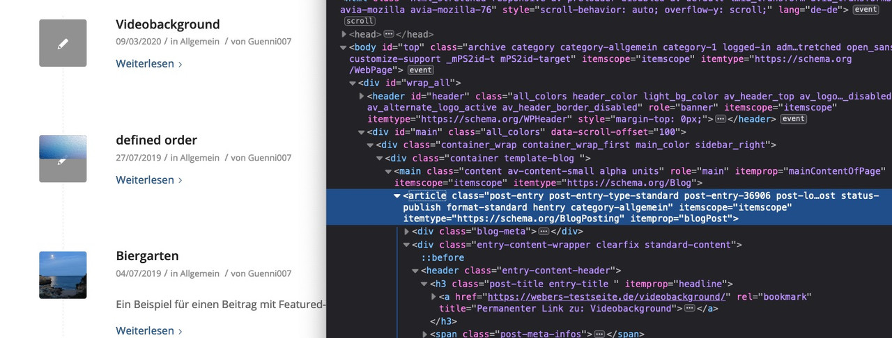
on your page : https://www.moneyprodigy.com/allowance-for-kids/
the whole content seems to be part of one post / portfolio made with classic editor ( articles gave the hint here that it is content of a post)
These Headings are made by Classic Editor like

and not via Advanced Layout Builder (ALB) – these settings for Headings only exist if you are using the Advanced Layout Builder Element : Headings
like you did on your homepage with: “Money Prodigy Manifesto” etc.
by the way i wouldn’t use more than ONE h1 per page.
Maybe i’m oldfashioned and the rule is a : “The Pre HTML5 Single <h1> Tag Rule”these settings are only seen if you choose the modern style!
if you like to have the look alike of standard style to modern headings ( bold and with border to the right )
Take the modern left style and give to those headings a custom-class f.e: standardlook.standardlook .av-special-heading-tag { font-weight: bold !important; float:left !important; } body .av-special-heading.standardlook .special-heading-border { display: block; } .standardlook .special-heading-inner-border { opacity: 0.3; filter: alpha(opacity=30); }the default value of opacity is 0.15 (15%) but this seems to be nearby invisibility. ;)
Ah i see now –
add_action(‘wp_footer’, ‘add_lightbox_effect’…well these are basic includings in WordPress. ( Hooks and Filters)
add_action or apply_filters. These are mostly related to the theme or also to WordPress implemented possibilities to change or add settings.
If you browse Enfold folder content for do_action you can find the hooks you can “hook” into to execute code.
wp_footer() , wp_head(), wp_loaded() etc. are such points set by WordPress where you can add code.
And that’s exactly what happens in the case we add a script in the DOM using child-theme functions.php.The second part in the statement:
add_action('wp_footer', 'popup_from_avia2_menu');
is only the function name – you can write anything you want there – some characters are not allowed ( I avoid umlauts in the german alphabet) or a hyphen ( therefore the underscores ) is not allowed to separate words there.
This is the repetition of the function name you gave above:
function popup_from_avia2_menu() {have a look to footer.php of enfold at the bottom
	/* Always have wp_footer() just before the closing </body>
	 * tag of your theme, or you will break many plugins, which
	 * generally use this hook to reference JavaScript files.
	 */

wp_footer( );
?>
</body>
</html>
_______
So the functions name is arbitrary. But it should always be used once in the whole code.
Many of the small snippets here by the moderators are called ava_custom_script or ava_custom_script_mod by default.
Then using more than one of these snippets would lead to an error message. So I try to give very detailed names that give you a hint what the function does. : popup_from_avia2_menu
This menu on top is stored in the DOM with the ID: avia2-menu.
A popup should open from there.that function reacts on a given custom class: inline-popups
every anchor link following that class reacts in that manner.But sometimes you have to combine different scripts.
in this case a class set by:
mainClass: 'mfp-3d-unfold',
defines the way a popup opens and closes. – maybe aremovalDelay: 500,is set in addition.
By the way, it’s worth reading through the API of magnific Popup ;)Well – as far as i can see it works on : https://gti.wittekopf.net/ with contact.
that code here: https://kriesi.at/support/topic/secundary-menu-no-modal-possible/#post-1206071 only styles the iframe dimension ( substitute code on the functions. file to: )function popup_from_avia2_menu() { ?> <script type="text/javascript"> (function($){ $(document).ready(function() { $('.menu2iframe').magnificPopup({ delegate: 'a', type: 'iframe', iframe: { markup: '<style>.mfp-iframe-holder .mfp-content {max-width: 1310px;height:90vh} </style>'+ '<div class="mfp-iframe-scaler" >'+ '<div class="mfp-close"></div>'+ '<iframe class="mfp-iframe" frameborder="0" allowfullscreen></iframe>'+ '</div></div>' } }); }); })(jQuery); </script> <?php } add_action('wp_footer', 'popup_from_avia2_menu');and the other thing in quick css only for hover color and dimension on close button
maybe you go and scale the iframe in the code above to:
these are your settings of width from enfold container.{max-width: 1310px;height:90vh}and adjust the hover state of iframe close button
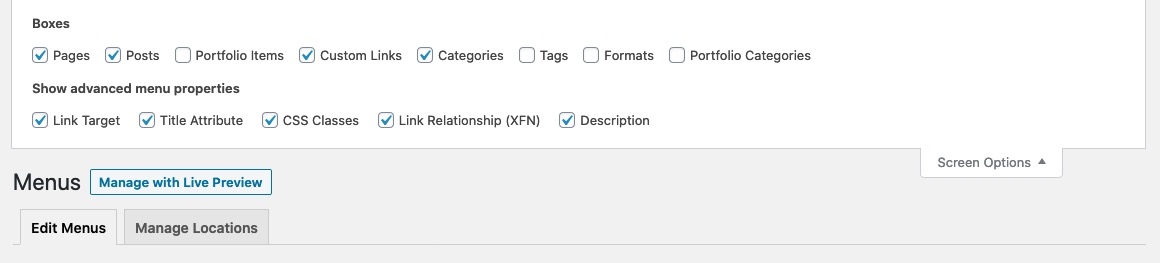
.mfp-arrow:hover, .mfp-close:hover { background-color: #7ec346; } .mfp-image-holder .mfp-close, .mfp-iframe-holder .mfp-close { right: 0; }On top of that window – there is a flyout menu: “Screen Options” press that button.
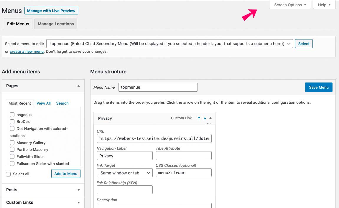
There you are: Choose what you like to have on Menu Options.
-
This reply was modified 5 years, 11 months ago by
PS : you do not need to have the custom markup – you can use Enfold Predefined Markup. Just get rid of that part:
function popup_from_avia2_menu() { ?> <script type="text/javascript"> (function($){ $(document).ready(function() { $('.menu2iframe').magnificPopup({ delegate: 'a', type: 'iframe', }); }); })(jQuery); </script> <?php } add_action('wp_footer', 'popup_from_avia2_menu');you can influence the magnific popup to a given anchor link
just create your normal top-menu ( avia2-menu) – do not add that addendum ?iframe=truegive to the list-item you like to open in an iframe a custom class in the menu ( f.e.: menu2iframe )
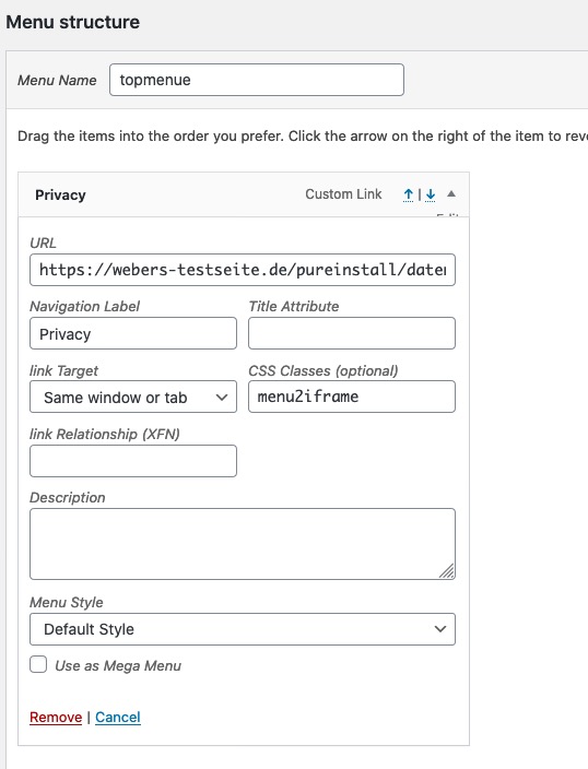
add this to your child-theme functions.php:
function popup_from_avia2_menu() {
?>
<script type="text/javascript">
(function($){
  $(document).ready(function() {
    $('.menu2iframe').magnificPopup({
    	delegate: 'a',
        type: 'iframe',
        iframe: {
            markup: '<style>.mfp-iframe-holder .mfp-content {max-width: 80vw;height:80vh}</style>'+
                    '<div class="mfp-iframe-scaler" >'+
                    '<div class="mfp-close"></div>'+
                    '<iframe class="mfp-iframe" frameborder="0" allowfullscreen></iframe>'+
                    '</div></div>'
        }
    });
  });
})(jQuery);
</script>
<?php
}
add_action('wp_footer', 'popup_from_avia2_menu');
if you like – style your own markup
see here an example page ( right top menu – privacy): https://webers-testseite.de/pureinstall/ -
This reply was modified 5 years, 11 months ago by
-
AuthorPosts