Forum Replies Created
-
AuthorPosts
-
unter meinem Nick oder Avatar auch , verbirgt sich bei denen die es mit angaben eine HomeUrl – da hast du meine Kontaktdaten.
Gerne auch per E-Mail – wenns nicht ausufert. ;)Ich entferne jetzt mal wieder die Bilder und das Logo – lasse andere Bilder und Text drin.
June 4, 2020 at 12:35 pm in reply to: Where can I activate the advanced shortcodes in the editor (most are missing)? #1219353OK Now i got it.
This is only if you are not working with the advanced layout builder ( f.e. on posts ).Somehow this makes sense; otherwise you would have the chance to place a 1/1 container in a p-tag which is even in a 1/2 container and so on.
Lieber Franz – gerne helfe ich weiter, aber du hast offensichtlich noch nicht verstanden, das wir beide nur Teilnehmer hier sind.
Wenn du die Links nicht veröffentlichen kannst, weil der Kunde das nicht möchte oder du bedenken hast, dann geht es nur über diesen Private Content, dann kann ich dir aber nciht weiterhelfen, denn diese Inhalte sehe ich nicht.
Sorry – dann musst du auf Moderatoren hier warten.könnten wir die Lösung besser deutsch weiter diskutieren?
Vorschlag : https://webers-testseite.de/pureinstall/negele/
ist aber nicht ganz einfach umzusetzen.
Wobei die fixierte Navigation wenn Sie den oberen Rand erreicht nicht unbedingt sein muss. Die also mit wegscrollt.______
If someone is also interested in the solution and doesn’t understand German, please let me know – I will translate it as good as I can.
first:
please remove these login-datas as soon as possible.
the link itself is for me enough !!!put it in the private content area that only mods can see the login datas.
please remove these login-datas as soon as possible.
the link itself is for me enough !!!___________
then : do you realy need the slider as advanced layer-slider. It seems that an Enfold Slider ( maybe a full-width slider ) would be more than good for the setting.
____________
what should happen on scrolling down: header should be seen and fixed on top – but slider is above?
-
This reply was modified 5 years, 10 months ago by
Guenni007.
you like to have 6 1/6 columns besides ?
in one custom-section?give a custom ID or custom-class to your color-section : on top you have #custom-section ( custom-section in the unique ID field )
drag 6 containers in the color-section ( it’s a matter of taste what you take. I put 6 1/5 containers in there. But in the end it doesn’t matter, because the width is generated differently) .Give a custom-class to those containers f.e.: one-sixth
and do not set it to equal-height : this also is done bei flex-layout
align-items: stretch is normal behavior.on this test-page i decided to have und 990px 3col besides and 2 rows
under 768px 2cols besides and 3 rows
under 480px one col full width:#custom-section .entry-content-wrapper { display: flex !important; flex-flow: row wrap; justify-content: space-between; } #custom-section .entry-content-wrapper::before, #custom-section .entry-content-wrapper::after { display: none !important; } #custom-section .entry-content-wrapper .flex_column { flex: 0 1 auto; margin: 0 0 4% !important; width: unset !important; } #custom-section .entry-content-wrapper .flex_column.one-sixth { flex-basis: 16%; } @media only screen and (max-width: 989px) { #custom-section .entry-content-wrapper .flex_column.one-sixth { flex-basis: 30%; width: unset !important; } } @media only screen and (max-width: 767px) { #custom-section .entry-content-wrapper .flex_column.one-sixth { flex-basis: 48%; width: unset !important; } } @media only screen and (max-width: 479px) { #custom-section .entry-content-wrapper .flex_column.one-sixth { flex-basis: 100%; width: unset !important; } }see here: https://webers-testseite.de/cynthia/macika/
-
This reply was modified 5 years, 10 months ago by
The only thing i want to mention is that i’m willing and able to help – but i do not see links if they are in private content.
That field under the input field :Private Content (link to your website, login credentials, FTP credentials, etc – only visible for moderators)
so if you couldn’t make your example page public you had to wait til mods are here.
June 3, 2020 at 10:10 am in reply to: Where can I activate the advanced shortcodes in the editor (most are missing)? #1218992And please provide the solution not only in private content area!
i recognized the same – first i believed that it is caused by Setting on Performance – only load elements when needed. But that does not work.
Again : if there is private content – i can not see – because i’m participant as you are.
if there is private content – i can not see – because i’m participant as you are.
But maybe you can make the link public or – find f.e. a demo page of enfold where the situation is like on your pagenearly impossible to have this responsive – and if the text line will break to a two-liner it is gone.
Ich denke das ist schwer zu realisieren. Auf deiner Beispielseite wird auch feige sehr früh in einen One-Column umgebrochen.
First : the topic is a little bit confusing: the download works ! if you click on that green button.
Second: Child-Theme folder and Parent-Theme folder are siblings on the themes-folder! – Is that in your installation that way?
Third: you didn’t rename the Parent-Theme folder?4th: how did you install the child-theme. : i just upload that folder to the themes folder via ftp.
What kind of header setting you have choosen?
Logo left menu below ?by the way: why is the right column set smaller than the others?
: there you have on that column set :Element { padding: 0px 10px 0px 10px; border-radius: 0px; }On the others not !
That’s just a tangled web.
Another way to achieve this and in your case where it is now suddenly possible to publish the page link, the only chance is to imitate the iconbox.
Because you like to have an image background with heading on top. Then flex layout will not work properly.Enfold provides the tools to give columns the same height. So why not use this tool to create an iconbox.
We just put the iconbox in the column like you did, but give the iconbox a transparent background and no border!
To have now a look-alike iconbox we can shift the whole iconbox over the top-border of the column.
The rest is a bit of Enfold styling options : background-color, border, and border-radius etc.You can see here what is the trick at the bottom – you see the iconboxes that are with different height.
But if you make them transparent and shift it to the top they will look like iconboxes.See here: https://webers-testseite.de/equal-height/
Solution is in Source-Code ;)give to the columns or to a parent-container a custom-class f.e: equalboxes
/**** play a bit with the shift values ***/ .equalboxes .iconbox.iconbox_top { position: relative; top: -100px; margin-bottom: -100px; padding-bottom: 60px; background-color: transparent !important; } /**** maybe for buttons to have them on the bottom ***/ .equalboxes .avia-button-wrap.bottom-button { position: absolute; bottom: 0; right: 10px; } /****** media-query depends on your breaking-point for responsive layout ************/ @media only screen and (max-width: 767px){ .equalboxes { margin-bottom: 80px !important; } }on documentation page it nearly allways quick css.
if you are using logo left – menu right – you can have a multiline menu!
https://kriesi.at/documentation/enfold/menu/#multiline-menuBut with a lot off sublevel menu it is best if you place the first-level menus without submenu on top
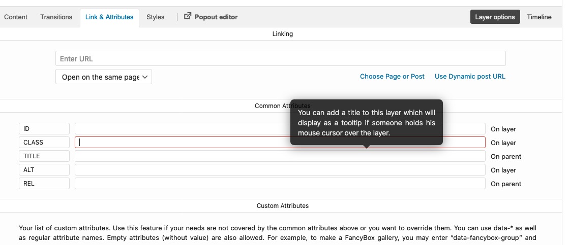
übrigens unter dem Tab: Link und Attributes – kannst du klasse und ID einem Layer zuordnen. Fiel mir gerade ein. Dann kann man sich das abzählen sparen:
schick mir doch mal den Link bitte dann schau ich rein.
Wie es geht weiss ich. Nur der Selector weicht bei jedem Layerslider halt ab.Der Layerslider macht je nachdem aus Textblöcken einzelne Zeilen!
Dann kommt da ein div noch extra hinzu – wie es oben Rikard schon erwähnte mit der Klasse: line
Du musst aber spezifisch bleiben, da die auch bei fetten überschriften etc. greift.
Also bleibt einem nur, dann die div.ls-wrapper:nth-of-type(x) oder child methode um es selektiv zu haben .hier zB macht er das nicht mit den lines: https://layerslider.kreaturamedia.com/sliders/architecture-slider/
-
This reply was modified 5 years, 10 months ago by
June 1, 2020 at 7:28 am in reply to: Gallery with four thumbnails above and one big image below #12183353.) the layout above isn’t a gallery – it is 5 single images – I only mentioned it for the sake of completeness.
1.) No – now seriously – I will not comment further on this nitpicking. Do you really believe that someone sits down at his mobile phone and compares it with the display on his desktop PC? Honestly?
And if someone does, would you like to call him your customer?Everything else about further support you should then clarify with a freelancer, who rightly gets money for such fine-tuning.
I once had a customer here who seriously wanted to discuss with me that a border color in Internet Explorer has a little more magenta compared to the Safari browser. Believe me – to leave such customers directly to others – that saves nerves and time and therefore money.
___________
Actually, the flex layout only makes sense anyway, if only one column is shown in the responsive case, i.e. set the code via mediaquery above only for larger screens.
A little hint when it comes to mobile devices, you can use the class: avia_mobile and avia_desktop that are set from enfold on html.responsive to establish different rules.this is my advice : https://kriesi.at/support/topic/some-hints-and-advice-to-update-enfold/#post-1056107
so you will have less offtime. If there are some troubles – you can switch back to the old version in seconds.
May 31, 2020 at 9:40 am in reply to: Gallery with four thumbnails above and one big image below #1218151border-radius of images are part of enfold setting:
.avia-image-container-inner,
.avia_image,
.av-image-caption-overlay {
    border-radius: 3px;
    display: block;
    position: relative;
    max-width: 100%;
}
so you had to change that – if you only like to do it on that images :
.flex4on1 .avia-image-container-inner,
.flex4on1 .avia_image,
.flex4on1 .av-image-caption-overlay {
    border-radius: 0;
}
But border-radius has no influence on image distance. Only the center point will be gone where all images meet.
put this to your child-theme functions.php:
for single images with lightbox:function change_lightbox_size() { return "full"; } add_filter('avf_avia_builder_helper_lightbox_size','change_lightbox_size', 10);for image source for light-box in a gallery
function avia_change_gallery_thumbnail_link($link, $attachment, $atts, $meta){ $link = wp_get_attachment_image_src($attachment->ID, "full"); return $link; } add_filter('avf_avia_builder_gallery_image_link', 'avia_change_gallery_thumbnail_link', 10, 4);-
This reply was modified 5 years, 10 months ago by
do the image containers have links?
do they all have links? – anywayI thought it might be done in your way – but it is harder to reach than i can imagine. Maybe a Mod knows an easier way.
I only got a solution with 3 nested flex containers.you can see all on this page: https://webers-testseite.de/elenapoliti/
css code and alb layout including.Do not choose the columns to be equal height on Enfold ! – we will do that with flex settings.
In that color-section with your setting – do not place additional Elements in it – not even separators.
Inside the columns you can place other elements – the image has to be the last one.
Notice: I would only do these settings to be active for non-responsive case. Depends on your settings
Synchronize the breakpoint of the columns with that rules: Edit column – Row screen options – Fullwidth Break Point-
This reply was modified 5 years, 10 months ago by
Give this a try get rid of all code above – it will be included here in a whole bunch.
On mobile or responsive case this header stayes fixed – on very small screens your headline will be in 3 lines:
@media only screen and (min-width: 768px) { .logo img { float:left } #top .logo, #top .logo a { overflow: visible !important; } #top .subtext { float:left; position:relative; padding-left: 18px; top:50%; -webkit-transform: translateY(-50%); transform: translateY(-50%); } #top .subtext .logo-title h1 { margin-bottom: 0 !important; transition: all 0.5s ease } .header-scrolled .subtext h1 { font-size: 18px; transition: all 0.5s ease } } /****** no conflict with Main Menu and Logo *************/ @media only screen and (min-width: 768px) and (max-width: 840px) { .subtext h1 { font-size: 24px !important; transition: all 0.5s ease } } /****** responsive case when burger is visible *************/ @media only screen and (max-width: 767px) { .responsive #top #wrap_all .container { width: 95%; max-width: 95%; } #header { position: fixed !important; height: 80px !important; max-height: 80px !important; } .responsive #top .logo { display: flex !important; } .responsive #top .av-logo-container , .responsive #top .logo a, .responsive #top .logo img { height: 80px !important; max-height: 80px !important; } .responsive #top .av-main-nav .menu-item-avia-special a { height: 80px !important; line-height: 80px !important; } .logo img { float: left } #top .subtext { float:left; position:relative; padding-left: 18px; top:50%; -webkit-transform: translateY(-50%); transform: translateY(-50%); } #top .subtext .logo-title h1 { font-size: 18px !important; margin-bottom: 0 !important; transition: all 0.5s ease; font-size: 22px !important; } } /****** Very Small Screens Iphone 5 etc *************/ @media only screen and (max-width: 399px) { #top .logo, #top .logo a { overflow: visible !important; } #top .subtext .logo-title h1 { word-wrap: break-word !important; white-space: normal !important; } .logo img, #top .subtext { float: none } #top .subtext { position: absolute; padding-left: 80px; top:50%; -webkit-transform: translateY(-50%); transform: translateY(-50%); } }.logo, .logo a { overflow: visible !important; }and – sorry Victoria – maybe this is a little more elegant:
– so get rid of :.subtext { display: block; left: 120px; position: relative; top: -65px; } .header-scrolled .subtext h1 { font-size: 18px; }and instead – and maybe only for non-responsive case
@media only screen and (min-width: 768px) {
  .logo img {
    float:left
  }

  #top .logo,
  #top .logo a {
    overflow: visible !important;
  }

  #top .subtext {
    float:left;
    position:relative;
    padding-left: 18px;
    top:50%;
    -webkit-transform: translateY(-50%);
    transform: translateY(-50%);
  }

  #top .subtext .logo-title h1 {
    margin-bottom: 0;
  }

  .header-scrolled .subtext h1 {
    font-size: 18px;
    transition: all 0.3s ease
  }
}
after that we will see how to style the small screens.
best would be to include the heading font-size with shrinking amount – but that will be done only with a child-theme avia-snippet-sticky-header.js file
I am a participant like you and therefore do not see the hidden content.
Bumping here in the posts has rather the opposite effect. Your Urgent in the topic is indicative enough for the mods.May 30, 2020 at 11:14 am in reply to: Gallery with four thumbnails above and one big image below #1217946This here is the title of your start posting – and the title of your topic: Gallery with four thumbnails above and one big image below
On your testpage https://webers-testseite.de/4on1-flexbox-model/, you have four thumbnails in a row. But on my page, I only want to have two thumbnails in a row.
So this was described correctly but inadequately.
Also this one: “Two galleries, one above with four thumbnails and one below with one big image” doesn’t exactly lead me to assume it could be 2 rows and 2 lines. Anyway –That my approach is not only theoretically correct but also works practically can be seen on my test page.
If you like to have the behavior of 2 small images in two rows and then one big your can see on the media-query with the 50%.
just get rid of that media query on 989px and set the first rule to :.flex4on1 .avia-image-container { flex: 0 1 calc(50% - 2px); margin: 0 0 4px; }Why : on two containers there should be a distance of 4px. Both containers are set to space-between – So outer edges are left resp. right-justified. You have then for both containers a width of : (100%-4px) so each Container has a width of : (50%-2px)
on 4 images besides ( and I apologize for any inaccuracy ) you have there you have three spaces all should have 4px ( 12px )
same play: (100%-12px) each image then : (25%-3px)I just switched my test page now to that setting – and changed the code-block content too.
I hope you can recreate my situation on your testpage and find a way to correct the vertical white space.
No i can’t – because i do not have this issue
So if something doesn’t work on your installation, i would have now to look for the reason on this page;
since I can’t do that, you will have to wait for mods.But i guess your 50% – 4px is the reason for
-
This reply was modified 5 years, 10 months ago by
so you had to wait til a mod is here.
ne heute nicht mehr – der Büro Rechner ist aus.
Das hier läuft alles über mein Arbeitstier: den Mac. – Da rufe ich keine E-Mails ab.PS: ja mach mal, kann ich ja im Web-Client einloggen!
-
This reply was modified 5 years, 10 months ago by
-
This reply was modified 5 years, 10 months ago by
-
AuthorPosts