Forum Replies Created
-
AuthorPosts
-
So it wasn’t about finding the solution, but to have it installed from Dev-Team directly as a fix for next update, so that it works correctly depending on the setting. So why don’t you write it down this way?
July 2, 2020 at 10:42 am in reply to: Nur Burger Menu auf bestimmten Seiten | only Burger Symbol on specific pages #1227431you can insert this to your child-theme functions.php:
function custom_burger_menu_active( $active, $context ){
  if( is_page(3) ) {
    return true;
  }
  return $active;
}
add_filter('avf_burger_menu_active', 'custom_burger_menu_active', 10, 2 );
if you got more than 1 page it should work use any conditional tag you like : https://codex.wordpress.org/Conditional_Tags
f.e.:if(is_page(array( 3041, 29934, 36532 ))){ …this is not an exclusive enfold trouble – it is the old “diagonal submenu hover problem” – and google on that – it is a well known problem of multi-level drop-down menus.
Maybe this is a nice first info on it: https://css-tricks.com/dropdown-menus-with-more-forgiving-mouse-movement-paths/
to have it perfect ( the separator exactly on the center too !
.html_elegant-blog #top .post-entry .post-meta-infos,
.html_elegant-blog .avia-content-slider .slide-meta {
  display: flex !important;
  flex-flow: row nowrap;
  justify-content: center;
  float: none !important;
  margin-top: 80px;  /*** to have the same distance as before ***/
  max-width: 100% !important;
}

.html_elegant-blog #top .post-entry .post-meta-infos > * {
    width: 150px;  /*** just play a bit with this that it does not break at mobile screen-width ***/
}

.html_elegant-blog .post-entry .post-meta-infos .text-sep,
.html_elegant-blog .post-entry .slide-meta .slide-meta-del {
    width: 0 !important;
}
this is how it looks on justify-content: space-evenly:
1 ) use position flex instead:
.html_elegant-blog #top .post-entry .post-meta-infos,
.html_elegant-blog .avia-content-slider .slide-meta {
  display: flex !important;
  flex-flow: row nowrap;
  justify-content: center;
  float: none !important;
  margin-top: 80px;  /*** to have the same distance as before ***/
  max-width: 100% !important;
}
By the way: see what happend if you got on justify-content : space-evenly or space-around or space-between
of course it would be better to see the blog page in question.
2) i think you can only have one or the other?
or is it possible to show for one entry the post-meta infos and for the other not?
so if you do not like to have two separators here – remove one of them ( border-top f.e.)-
This reply was modified 5 years, 8 months ago by
Guenni007.
And which one you are interested in?
There are a lot of hover effects on that page.yes it works good – i use them too- but:
To understand what the tool really does, it is necessary to take a close look at the law.
I don’t think that the link to your Facebook page et al. is the problem. It’s these buttons you can press to share an article or a page. There, information about the page and the IP address of the person who clicks on it are forwarded directly.
Similar to the button that leads to a GoogleMap page – even to a map in an iframe – does not violate the GDPR (DSGVO – for the German speaking countries).
When a map is embedded it is different. And so it is with the Share Buttons.
Shariff Wrapper does exactly that – it prevents the personalized transfer of data from the person who presses the Share Button.
That means you can already use Enfold’s social buttons, which only provide the link to the page.
But you should leave this function to the Shariff Wrapper.
where on your page should this happen – maybe a screenshot where you like to show those icons.
It would help if you were willing to follow the instructions. It’s uncertain if it will solve the problem, but at least it will help you to avoid writing mistakes or orphaned older files.
Through this procedure, I think I’ve explained it well, you have exactly this safety in the backhand – to return to the previous state.
The trick on this is not to overwrite the existing enfold folder but to upload a new one with a different name ( enfold-new). When this is done only a double renaming on the ftp folder does change the enfold parent themes. The existing is renamed to enfold-old and the newly uploaded now is renamed to enfold. From this moment the newest is the source for the enfold-child ( because that is the reference : then name of the folder: enfold ).After all, I gave you the links to help you get ahead here.
My kind of help is always the help for self-help – under the aspect of the steep learning curve. If you always want to be dependent on help from others, you can do so.
Dito: Have a great rest of your week and take care!Yes – Thats why i post the link: https://kriesi.at/support/topic/some-hints-and-advice-to-update-enfold/#post-1056107
See documentation how it’s generally done. Easy – drag&drop. : https://kriesi.at/documentation/enfold/install-enfold-theme/#ftp-install
if you are on the layer where enfold and enfold-child folder are siblings ( on your client see image press: “Up one level” )
you can do it like in my link said:Update via ftp.
- Rename the downloaded newest version to enfold-new
- Upload that enfold-new folder to the themes folder
- Rename your enfold folder to f.e. enfold-old
- Rename your enfold-new folder to enfold
- Check if all your existing settings work to your full satisfaction.
Yes – then stop here
No ( rollback ) –
- rename back the enfold folder back to enfold-new
- rename the enfold-old folder back to enfold
July 1, 2020 at 7:27 pm in reply to: Blog Posts ALB with Portfolio – do not work as expected #1227322Ok
I set the page to “under construction”
and even that link is not able to post on public?
This site was built by a consultant back in 2016 and handed off to us to manage.
Are you familiar with using a ftp client? Please go to your ftp folder of enfold-child and have a look if there are other files than :
style.css , functions.php and screenshot.png – if so – please tell us what folders/files are in additon on the server.
Maybe that consultant has created some own child-theme files.
Updating via the dashboard does not overwrite these files ( and that is among other things the advantage of a child theme ) – but sometimes when essential files are updated the child-theme files had to be adjusted.
F.e. some users got an own child-theme header.php – there was a time where the lightbox implementation changes on Enfold Parent Theme ( and that is in header.php) – so after updating the lightbox does not work anymore.
it would help if we knew if such extra child files existed.Next assumption: Updating via the dashboard does not always work correctly. It seems to finish the update process successfully, but it has left write errors.
i do always update via ftp this way: https://kriesi.at/support/topic/some-hints-and-advice-to-update-enfold/#post-1056107
This also has the advantage that there is always a rollback in case of inconsistencies.If you have your child-theme – than you can try that if it brings back a working textblock alb. ( except there are the given : Maybe on top )
i thought to that first – but my guess was that if it is used elsewhere in the whole site – the scripts are loaded. And because of the same site/domain this would mean that the slider scripts are loaded.
That is one trick i use often when inserting a shortcode to other alb elements f.e.: an icon-list in an accordion slider.
for those elements i have an extra page which i do not link in my page and excluded from SEO and Search Results. Only for that kind of usage.i have that blue on your site no white font on white background:
thats what my developer tools gives for your site:::selection { background-color: #3c5db1; color: white; }if you want to have a different setting do not forget to set for moz selection
-
This reply was modified 5 years, 8 months ago by
and you really want to change the logo only for mobile devices – or do you mean for small screen widths?
for mobile devices put this to your child-theme functions.php
add_filter('avf_logo','av_change_mobile_logo');
function av_change_mobile_logo($logo){
    if(wp_is_mobile()){
      $logo = "/wp-content/uploads/mobile-logo.png";
    }
    return $logo;
}
and if you want to have on mobile devices a different transparency logo:
function av_change_mobile_transparency_logo($header){ if(wp_is_mobile()){ $header['header_replacement_logo'] = "/wp-content/uploads/mobile-transparent-logo.png"; } return $header; } add_filter('avf_header_setting_filter','av_change_mobile_transparency_logo');the code above is complete?
every opening tag – needs a closing one – so every<ul> needs a </ul>
but why three lists ?
i guess this will be enough code:<ul class="icon-bullets"> <li class="icon-location"><a href="https://google-maps-link" rel="nofollow">Address</a></li> <li class="icon-phone"><a href="tel:+000000000" rel="nofollow">(+000) 000 000 000</a></li> <li class="icon-mail"><a href="mailto: (Email address hidden if logged out) " rel="nofollow"> (Email address hidden if logged out) </a></li> </ul>and:
ul.icon-bullets li {
	list-style: none;
}

ul.icon-bullets li {
	padding-left: 8px;
}

ul.icon-bullets li::before {
    font-family: 'entypo-fontello';
    font-size: 23px;
    font-weight: normal;
    position: absolute;
    left: -6px;
    width: 30px;
    text-align: center;
}

ul.icon-bullets li.icon-location:before { content: '\e842' }
ul.icon-bullets li.icon-phone:before { content: '\e854' }
ul.icon-bullets li.icon-mail:before { content: '\e805' }
with text-align you decide where the icons are in the before containers.
can not test your icon code
June 29, 2020 at 10:24 pm in reply to: Activate drop-down in menu using keyboard for disabled users #1226610One big trouble is that it is different on every browser.
On that it would be easy to set a :focus state for the links – but f.e. my firefox browser only switches on top in the menu line ( browser menu line) by tab navigation. But i guess people with physical disabilities will have special browsers in this case.
A reader is already implementedOn Submenu – the arrow keys should indeed be activated for the menu: see here some good hints for the devs ;)
https://www.w3.org/TR/wai-aria-practices/examples/menubar/menubar-1/menubar-1.html-
This reply was modified 5 years, 8 months ago by
yes that would be nice – the mathematic is very ease and the avia-snippet-sticky-header.js could be as it is only these two factors had to be in relation to an input field ( f.e. shrink_factor – with standard : 2 ) on register-admin-options.php – this input field has dependency like custom height only visible when custom height is choosen.
f.e.:
  $avia_elements[]  =  array(
					"slug"	=> "header",
					"name" 	=> __("Header Shrink Factor", 'avia_framework'),
					"desc" 	=> __("Choose a custom shrink factor - two digits f.e. 2.85", 'avia_framework'),
					"id" 	  => "header_shrink_factor",
					"type" 	=> "text",
					"std" 	=> "2",
					"required" => array('header_size','custom') );
the custom height is not important on those calculations – because it can be shortend
one could also rearrange this formula, since division by a quotient is equal to multiplication by the reciprocal value
on line 64 :
if(st < el_height*(shrink_factor-1)/shrink_factor
on line 76 :newH = el_height/shrink_factor;
thats all.-
This reply was modified 5 years, 8 months ago by
June 29, 2020 at 9:28 pm in reply to: How to set specific Header sizes for Desktop and Mobile #1226599sometimes a relative font-size ( f.e. the given settings for screenwidth relation fit well 4vw means 4% of screen width )
June 29, 2020 at 9:22 pm in reply to: How to set specific Header sizes for Desktop and Mobile #1226596if it is only for a few headings – open that page and open that heading ( if the page is made with the advanced layout builder)
Sadly only the other heading styles not the standard style got this option on Style tab to set for 4 different screen width a font-size:
-
This reply was modified 5 years, 8 months ago by
we only see the one image – not your screenshot examples!
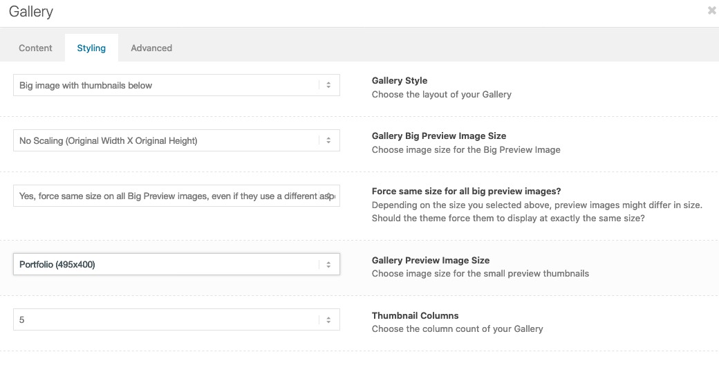
Guess these are image galleries thumbnails under big image.
on that alb you can see the options to choose image quality of big image – and image quality for thumbnails.
( click to enlarge)
you found the solution yourself?
i do not see the issue on your site!
otherwise you can influence the hilite color by:::selection { background: #fff67a !important; color: #000 !important; } ::-moz-selection { background: #fff67a !important; color: #000 !important; }the new Enfold works perfectly under newer php version. What is your hoster? On most cases you can switch yourself the php version to newer versions on Hoster Backend.
on masonry or on image alb element?
On Masonry there is an option on advanced tab – image effect: greyscale effect.On images as Victoria has already said : they have to be uploaded and inserted as colored images first – then they were set to grayscale by css.
if you do not want to have it on all images ( see jordans css with #main as first selector ) – i would give a custom class like: gray-to-color to the image element – then this to quick css:.avia-image-container.gray-to-color img { -webkit-filter: grayscale(1); filter: grayscale(1); } .avia-image-container.gray-to-color img:hover { -webkit-filter: none !important ; filter: none !important ; }and yes – if you got a link on them – remove the overlay :
.gray-to-color .image-overlay { display: none !important; }What version of Enfold do you use? There was on one former version a little bug with text-block element.
only change the size ( start height and end height should be bigger ) but the shrink ration stayes the same : 1/2
or do you intend to change that too?Introduction:
https://kriesi.at/support/topic/shrinking-of-header-amount-an-info/and here vor actual solution : https://kriesi.at/support/topic/shrinking-of-header-amount-an-info/#post-1044887
Edit: no – could not be the solution – it is the same page.
Is it reproducable the error? Means on all posts or portfolio pages the slider is not there?i think a mod had to login to your backend and see if there is on your constellation a reason why only on posts/portfolios the shortcode is hampered on that field.
It is not a standard setting – your code works even on posts in my test environment. With or without transparent headers.-
This reply was modified 5 years, 8 months ago by
i think it will be best to have a child-theme masonry-entries.js file and load that via child-theme functions.php:
function wp_change_masonry_animation() {
   wp_deregister_script( 'avia-module-masonry' );
   wp_enqueue_script( 'avia-module-masonry-child', get_stylesheet_directory_uri().'/js/masonry_entries.js', array( 'avia-module-isotope' ), false, true );
}
add_action( 'wp_enqueue_scripts', 'wp_change_masonry_animation', 100 );
i think we even can load that only for specific sites by if-clauses.
then put the edited masonry-entries.js – into the child-theme/js/ folder
change the line 257 to f.e.:
masonry.waypoint(start_animation , { offset: '95%'} );ps – i found a solution to change it on general via child-theme function:
all credits goes @mensmaximus : https://kriesi.at/support/topic/animations-trigger-too-late/#post-651948you can do it as @mensmaximus described as external script or i think it could be done via child-theme functions.php as internal script.
Maybe this is nice – because you can load that with if clauses only on pages where you like to change it.But i think because of the extra setting on masonry-entries.js – this is not influenced.
– just brainstorming now to found a child-theme solution on changing the offset value for masonries. -
This reply was modified 5 years, 8 months ago by
-
AuthorPosts