Forum Replies Created
-
AuthorPosts
-
August 5, 2020 at 5:15 pm in reply to: Full width AND bottom aligned Read more button in Post Slider #1235472
if you like to have those containers in equal height – the flexbox modell is helpfull here.
Unfortunately the articles are grouped according to the settings in 3, 4 etc columns. Without this grouping it would be even better with the flex-box model.
I’ll see if I can collect all articles and put them into one slide-entry-wrap.only this:
corrected code including the fix for the submenu@media only screen and (min-width: 768px){ #wrap_all { padding-bottom: 400px; } #main > div:not(.av-submenu-container) { z-index: 3; position: relative !important; } #main #vidde { position: fixed !important; bottom: 0; z-index: 0 !important; height: 400px; width: 100%; } }just remove all you inserterd and copy again that corrected code here: https://kriesi.at/support/topic/fixed-background-color-section-doesnt-work/#post-1235431
remove the rule outside that media query: ( only the code above)
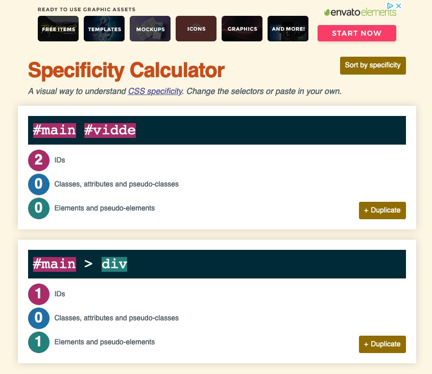
#main > div { z-index: 3; position: relative !important; }there is two ID’s on that rule:
  #main #vidde {
      position: fixed !important;
      bottom: 0;
      z-index: 0 !important;
      height: 400px;
      width: 100%;
  }
The reason is: #main > div is a rule with one ID and an additonal element
so it is more specific than a rule with only one ID – because #vidde is a #main > div ( it is a div that follows directly the #main container) – the postion : fixed could not overwrite the #main > div rule.
If an element fullfills more than one selector – the more specific will win that run !See here f.e. a specifity calculator: https://specificity.keegan.st/
remove your css code please and change the rule to !imporant:
  #main > div {
      z-index: 3;
      position: relative !important;
  }
And look above on
#main #vidde {the width is not as on color sections. because you gave to the grid-cells a padding.
– the padding of the border cells should have no padding to the border:
left cell
padding: 0px 15px 0px 0 ;
right cell:
padding: 0px 0 0px 15px;Cancel all said above and look to this solution:
here we go with your example page: https://tuddal.one/
put this to your quick css:
@media only screen and (min-width: 768px){
  #wrap_all {
      padding-bottom: 400px;
  }

  #main > div {
      z-index: 3;
      position: relative !important;
  }

  #main #vidde {
      position: fixed !important;
      bottom: 0;
      z-index: 0 !important;
      height: 400px;
      width: 100%;
  }
}
But
there are parts of the content ( grid rows ) where you have set to non full width – but there is a better way to have that – because you leave the space left and right to the grid row : transparent.If i use a grid-row and does not want to have a full-width grid-row – i have a little snippet on that !
( So remove your settings for those grid-rows f.e.: #av-grid-custom-width ) and put this to your child-theme functions.php )
and give to those grid-rows that should not be a fullwidth one the custom-class: grid-notfull/******** Gridlayout not fullsize - give a custom-class to the grid-row element: "grid-notfull" *********/ /**** adopt the 1310px to your setting on enfold - general Layout - dimensions ****/ function grid_layout_notfull(){ ?> <script> (function($){ $('.av-layout-grid-container.grid-notfull' ).wrap( '<div class="main_color notfullsize color1"></div>'); $('.notfullsize').css({"clear": "both", "width": "100%" , "float": "left" , "position": "static" , "min-height": "100px" }); $('.grid-notfull').css({"max-width": "1310px", "margin": "0 auto" , "padding": "0 50px"}); })(jQuery); </script> <?php } add_action('wp_footer', 'grid_layout_notfull');you see what the code above does: it will give the grid-row itself the styling of a
.main-color .containerand wrap it with a fullwidth container with styling of a color-section.EDIT : i try to find now a simpler solution. – As i studied your example page above – i checked another way.
Edit Edit: i did recognized now that the sections etc. are set to position static – with that it does not work
if you can live with a given height to your footer ( not calculated ) then this will be the easiest way:-
This reply was modified 5 years, 7 months ago by
Guenni007.
i did that with a child-theme footer.php
that is fast done .see here what i have done with footer i shifted the end main div to the top
see on top the extra container
and the commment at line 275the extra container gives me the possiblity to fill the gap that a fixed footer would create as fixed container.
It is like a spacer with variable calculated height – because we had to react to the variable footer/socket height.function add_curtain_footer_effect(){ ?> <script type="text/javascript"> (function($) { $(window).bind("load resize", function() { setTimeout( function() { var socketh = $('#socket').outerHeight(); var footerh = $('#footer').outerHeight(); var spacerh = socketh + footerh - 5 ; $('#distance').css('height', spacerh ); $('#footer').css('bottom' , socketh); }, 150) }); })(jQuery); </script> <?php } add_action('wp_footer', 'add_curtain_footer_effect');i did this only for home page on that example
/********* curtain effect***********/

.home #main > div  {
    z-index: 3 !important;
    position: relative !important;
}

.home #footer {
    left: 0;
    width: 100%;
    z-index: 2;
   position: fixed
}

.home #socket {
    bottom: 0;
    left: 0;
    width: 100%;
    z-index: 2;
    position: fixed
}

.home #main #distance  {
    clear: both;
    z-index: 0 !important;
}
the clearing on #distance is very important.
so this is then the Structure: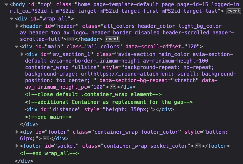
and the #distance height is calculated on load and resize-
This reply was modified 5 years, 7 months ago by
so this is done?
August 4, 2020 at 4:59 pm in reply to: Full width AND bottom aligned Read more button in Post Slider #1235119For better instructions it would be nice to see the page. There are too many styling options on blog grid – that the selectors might be a bit different.
i have had a similar problem – the thing why this is not as easy as it seems to be is that the read-more link is part of the excerpt.
So i wrote this little script to rearange the DOM Structure
This comes to child-theme functions.php:function wrap_read_more_link(){ ?> <script type="text/javascript"> (function($) { $(window).load(function(){ $('.read-more-link').each(function() { $(this).parent().parent().append($(this)); }); $('.slide-entry').each( function() { $(this).find('.slide-content .entry-content-header').append($(this).find('.entry-footer')); $(this).find('.more-link' ).wrapInner('<span class="more"></span>'); }); }); })(jQuery); </script> <?php } add_action('wp_footer', 'wrap_read_more_link');( i wrapped the more-link in a span to have more styling options)
After that the read-more link is last div in slide-content and could be placed absolute in the surrounding container:
this for quick css:.read-more-link { position: absolute; bottom: 10px; right: 10px; } .avia-content-slider .slide-entry-excerpt { padding-bottom: 40px; }Resultspage: https://webers-testseite.de/blog-posts-in-list-view/
i now go and have a look if it is better to edit the alb element for that DOM Structure.
-
This reply was modified 5 years, 7 months ago by
August 3, 2020 at 10:10 pm in reply to: Add text above scroll down arrow (color section & fullscreen slider) #1234984or you can use the pseudo container after:
#top .scroll-down-link:after {
  content:"click here";
  font-size: 15px;
  text-align: left;
  line-height: 10px !important;
  position: absolute;
  top: 0;
  left: 8px;
  color: cyan;
}
on slider you need to shift the avia-slideshow-dots
https://kriesi.at/support/topic/4-7-6-update-adding-quotations-under-slider/#post-1232550
from: July 23 ;) just use the search function ;)To be honest, I really don’t understand it anymore.
There is a call to hurry, it can’t go fast enough. It is clear that we could have easily made the appointment, but now there is no hurry anymore and I don’t get an answer anymore.
Is that super grateful?
I really don’t want any thanks, but at least the haste demanded at the beginning should then also find an equivalent from you.it will not be a good solution if you have a fixed and sticky header even on mobile view when in responsive case the next line is created.
if this will be the case we had to find a different solution. This works til iphone5 (320px screenwidth)see again : https://webers-testseite.de/pureinstall/impressum/
just create a top navigation on dashboard – menus ( do not forget to check on the bottom that field: “Enfold Child Secondary Menu ”
then click on the link “Will be displayed if you selected a header layout that supports a submenu” you will be redirected to the header – header extra elements – Header Secondary Menu.then this comes to your quick css:
/******** Tabs in top-menu *************/
#header_meta.container_wrap {
    background-color: #000f36 !important;
}

.responsive #header_meta .container {
    width: 100% !important;
    max-width: 100% !important;
    padding: 0;
    margin: 0;
}

#header_meta .sub_menu {
    padding: 0 10px 0 50px !important;
}

ul#avia2-menu {
    margin: 0;
    margin-top: 2px !important;
    padding: 0;
    height: 40px;
    float:left;
}

ul#avia2-menu li {
    list-style: none;
    float:left;
    padding: 0 1px !important;
    height: 40px;
    border: none !important;
    text-align: center;
    background: -webkit-gradient(radial, 50% 100%, 10, 50% 50%, 90, from(rgba(31,169,244,1)), to(rgba(0,28,78, 1)) );
    background: -moz-radial-gradient(center 80px 45deg, circle cover, rgba(31,169,244,1) 0%, rgba(0,28,78, 1) 100%);
}

ul#avia2-menu li a,
#top #wrap_all .av_header_transparency .sub_menu ul#avia2-menu li a {
    border-radius:  20px 20px 0 0 !important;
    color: #fff;
    display: block;
    padding: 0 20px;
    text-align: center;
    text-decoration: none;
    line-height: 40px;
    background : -webkit-gradient(linear, left top, left bottom, from(rgb(168,168,168)), to(rgb(69,69,69)));
    background : -moz-linear-gradient(top, rgb(168,168,168), rgb(69,69,69));
    -webkit-transition-property: background;
    -webkit-transition-duration: 700ms;
    -moz-transition-property: background;
    -moz-transition-duration: 700ms;
}

ul#avia2-menu li a:hover,
#top #wrap_all .av_header_transparency .sub_menu ul#avia2-menu li a:hover,
ul#avia2-menu li.current-menu-item a,
#top #wrap_all .av_header_transparency .sub_menu ul#avia2-menu li.current-menu-item a {
    opacity: 1;
    background: -webkit-gradient(radial, 50% 100%, 10, 50% 50%, 90, from(rgba(31,169,244,1)), to(rgba(0,28,78, 1)) );
    background: -moz-radial-gradient(center 80px 45deg, circle cover, rgba(31,169,244,1) 0%, rgba(0,28,78, 1) 100%);
}

ul#avia2-menu li.current-menu-item a,
#top #wrap_all .av_header_transparency .sub_menu ul#avia2-menu li.current-menu-item a,
ul#avia2-menu li.current-menu-item a:hover,
#top #wrap_all .av_header_transparency .sub_menu ul#avia2-menu li.current-menu-item a:hover  {
    background: #fff;
    color: #000 !important;
}

ul#avia2-menu li a:hover {
    color: #fff !important;
}

@media only screen and (max-width: 767px) {
   #header_meta .sub_menu {
       padding: 0  !important;
   }

    ul#avia2-menu li a {
        padding: 0 10px;
    }

   ul#avia2-menu {
       margin-top: 0 !important;
    }
}
i like this glooming hover effect – but you can change it to a background-color.
that it has that tab feeling the active state ( current item ) should have the same color as header bg-color.
On transparency header it is hard to find a similar effect.Ja – muss schauen, ob das einsetzen der anderen inputs ( auch des versteckten ) nur an ein input feld gebunden ist.
( die avia_google_recaptcha_api.js ist da leider eindeutig. )
Da dort dann eben button steht , setzt der wohl die Elemente nicht.Den Button brauchte ich auch nur um das teil zu stylen – auf inputs kann man schlecht before und after elemente etc. pp. setzen.
-
This reply was modified 5 years, 7 months ago by
also – habe ich jetzt Stück für Stück die child-theme functions.php aufgefüllt.
Es ging mal darum diesen Input Button mit einem Slide Effekt beim Hovern zu füllen.Das Script:
function change_input_to_button_tag(){
?>
<script>
  (function($) {
      function replaceElementTag(targetSelector, newTagString) {
        $(targetSelector).each(function(){
          var inputvalue = $(this).attr('value');
          var newElem = $(newTagString, {html: $(this).html()});
          $.each(this.attributes, function() {
            newElem.attr(this.name, this.value);
          });
          $(this).replaceWith(newElem);
          newElem.addClass('specialbutton');
          newElem.append('<span class="zustimmen">'+inputvalue+'</span>');
        });
      }
      replaceElementTag('input.button', '<button></button>');
  }(jQuery));
</script>
<?php
}
add_action('wp_footer', 'change_input_to_button_tag');
macht mir aus meinem Input einen Button – mit allen attributen die Ursprünglich dran sind. Daher sollte auch die Klasse: av-verify-recaptcha-0
mit übergeben werden. Das muss ich noch testen ob es nur an der Reihenfolge des ladens liegt.Kann erstmal geschlossen werden – wenn sich was wesentliches hier ergibt, dann poste ich in den gleichen post hinein.
Danke für deine Mühe.ich hatte natürlich auch alle Plugins deaktiviert und auch eine leere Functions getestet.
Entweder sind die Cachings der Browser jetzt hartnäckiger geworden ( deshalb teste ich dann immer mit Chrome – da ist das Löschen schneller erledigt) – bei mir kam reproduzierbar dieser Fehler immer.
Mein kleines Script:function prohibit_google_recaptcha( $prohibited ){ global $post; if( ! $post instanceof WP_Post ){ return $prohibited; } /*** Get content to check (ALB or normal content) ***/ $content = Avia_Builder()->get_post_content( $post->ID ); $prohibited = ( false !== strpos( $content, '[contact-form-7 ' ) || false !== strpos( $content, '[av_contact ' ) ) ? false : true; return $prohibited; } add_filter( 'avf_load_google_recaptcha_api_prohibited', 'prohibit_google_recaptcha', 10, 1 );hatte ich zunächst in Verdacht, aber wie gesagt ich testete auch mit einer leeren functions.php ( child-theme selbstredend ).
If it does not work at the moment – a mod is in that installation to look for a little bug with google recaptcha.
BUT : my advice is to hamper that behavior on small screens – because you can not scroll inside the footer content.
If the height of the footer content is higher than the given f.e. mobile-device height – then you can not see all content !!!Well there is a solution to put those two containers as siblings to #main – inside warp_all.
You only have to edit footer.php and load it as child-theme footer. And a bit of jQuery in functions.php.See result ( in this case only for home page ): https://webers-testseite.de/pureinstall/
if this is what you like to have – i will show you how.the problem stays the same as footer or as a different containter – fixed Elements does not leave a gap in the page where it would normally have been located. this “Gap” had to be there that the page could scroll this amount to show the overlaped fixed container.
It seems that this is not the right understanding of fixed or parallax background.
On your example page that effect is called “curtain-effect” and is commonly used on the footer.
how to achieve this. the main point is that the footer position is set to fixed and bottom: 0 – and has a z-index less than the content scrolling over it.
But: On Enfold it is difficult to obtain , because #footer is part of #main. But there are ways to get the right solution for it in a different way.
But to give you better support it might be usefull to see your page.August 2, 2020 at 8:41 am in reply to: Notice: Undefined variable: kriesi_at_backlink in /home/….. #1234573did you change something in footer.php to get rid of kriesi backlink info?
you only need to insert to footer copyright info field at the end: [nolink]or redefine this little function via child-theme functions.php to have your own backlink.
function new_nolink(){ $kriesi_at_backlink = "<a href='https://webers-webdesign.de'>Webers WordPress Webdesign</a>"; return $kriesi_at_backlink; } add_filter("kriesi_backlink","new_nolink");Thats what i said – set .av-outer-tab-title to display none
i can reproduce it if i do not enter tab titles to show only images
and i see that you have allready set the .av-outer-tab-title to display none – so put in some titles to look if that behavior is gone afterwards.Hi Mike and dear participants – i see there is a fix on github : https://github.com/KriesiMedia/enfold-library/tree/master/temp_fixes/Enfold_4_7_6_1/template_builder
concerning to : avia-tab-section.js : i don’t know if this is related to your problems – but maybe you test that new js file.Edit: must be something different. I can not reproduce the “flickering” on tab change.
could this be a way you like – these are only styled top menus: https://webers-testseite.de/impressum/
but i have no time now to style the responsive case on that.-
This reply was modified 5 years, 7 months ago by
PS : i changed the code above on this: https://kriesi.at/support/topic/closed-tabs-on-mobil/#post-1234335
if you are satisfied with : https://webers-testseite.de/impressum/
( i just did it for that page ) then i will post the css you need.Well you can use the top-header on that :
Enfold Child – Header – Extra Elements Tab and : Header Secondary Menu
you have to define one menu as: Enfold (Child) Secondary Menu ( don’t know if you are using a child-theme)
to style them as “tabs” like in your example page should be possibleI am only kidding – I am of course a proponent of democracy, and as such for universal, direct, free, equal and secret elections!
______
As said before – i do not see private Content Area – if you could not manage it yourself – you had to wait til mods are here.
Or you describe your problem with the description above.______
Under my nick there is a contact info about me. If you give me the datas via E-Mail i would install it for you – but it has to be admin account.
-
This reply was modified 5 years, 7 months ago by
-
AuthorPosts