Forum Replies Created
-
AuthorPosts
-
by the way – the line in textblock.php is now on the newest enfold on line 222.
the wpautop had to be erased – so from$params['innerHtml'] = "<div class='avia_textblock avia_textblock_style' data-update_with='content'>".stripslashes(wpautop(trim(html_entity_decode( $params['content']) )))."</div>";to
$params['innerHtml'] = "<div class='avia_textblock avia_textblock_style' data-update_with='content'>".stripslashes(trim(html_entity_decode( $params['content']) ))."</div>";if you are working on a child-theme you can have a whole edited textblock.php on your child-theme/shortcodes/ folder by having this little snippet in your child-theme functions.php:
function avia_include_shortcode_template($paths){ $template_url = get_stylesheet_directory(); array_unshift($paths, $template_url.'/shortcodes/'); return $paths; } add_filter('avia_load_shortcodes', 'avia_include_shortcode_template', 15, 1);-
This reply was modified 5 years, 4 months ago by
Guenni007.
off topic : it would be nice to have on a backside image link – for the image a title attribute too.
these images on backside linking to lightbox do not have a title.ok on an absolute fresh install – it will have effect – but only with pseudo before container setting. But Overlay images are not well placed then.
with:
.avia-icongrid-borders-all li .avia-icongrid-wrapper::before,
.avia-icongrid-borders-between li .avia-icongrid-wrapper::before {
	z-index: -1 !important;
}
with:
.avia-icongrid-borders-all li .image-overlay,
.avia-icongrid-borders-between li .image-overlay {
    left: 0;
    top: 0;
}
the overlay are positioned correct on hover.
These settings are on .image-overlay-inside but that seems to be not enoughyou can try to have here a flexed container – and the li’s as flex-items.
Try on quick css:#avia-menu { display: flex !important; flex-flow: row wrap; justify-content: space-between; }this could end up in a multi line menu – but i guess the hamburger state will be effective before that happens
in order to get a responsive background, you have to include the aspect ratio of your image in the height calculation of the container.
So if you use an image in 16:9 format as a background, set the color-section to this relative height.
The best way is to give the color-section a custom class or a unique ID like on my test page: https://webers-testseite.de/responsive-colorsection/#responsive-bg { width: 100vw; height: 56.25vw; }on that the background is perfectly responsive – But what would you like to do if the container height does not offer enough place for the content?
You have to have on that case less content or totaly responsive content inside that container. That may lead to too small and non legible font-sizes.
See heading on mobile view f.e 375px screen width.does not solve my filp-card behavior – i did all hard-refresh i can do.:
on standard case without the css settings in icongrid.css there are only :before rule – so what should do an :after rule solve?
– without content, positioning etc. pp for the after-rule there will be no effect only with z-index setting.
https://webers-testseite.de/flipcards/even setting it to !important and replacing the before construction with the after container does not solve it
and setting the before containers to -1 will work for the links – but then the borders are partially gone ( not seen)
.avia-icongrid-borders-all li .avia-icongrid-wrapper::before,
.avia-icongrid-borders-between li .avia-icongrid-wrapper::before {
	z-index: -1 !important;
}
Do you have an example page where your css hack does work ?
-
This reply was modified 5 years, 4 months ago by
With the normal blog functionality, you can specify a page to include the blog. This is done under Enfold : Theme Options.
Then you can choose between different blog themes – Enfold : Blog Layout.
There are three predefined styles and some layouts.
If you choose Gridlayout the whole thing looks like this: https://webers-testseite.de/pureinstall/beitrags-blogseite/
there are ways to have more than 3 Columns on the Grid-Layout even here or-you can also use the Blog-Alb element or the Gallery or Masonry elements to create different layouts without setting the page under Theme-Options.
the layout itself is not so hard to style – but the dot-navigation on the left ( or right) it is a bit more complex.
See here with a lot of code: https://webers-testseite.de/pureinstall/dot-navigation-with-colored-sections/
Mine has the active section as title and on hover the othersOctober 27, 2020 at 8:50 pm in reply to: Change H2 to H1 in full screen slider via PHP seems not to work, as it did once #1256220these “edited Alb Elements” are deprecated.
Since a lot of these options are now standard from Enfold. Thanks to Günter.October 25, 2020 at 7:22 am in reply to: wie Schatten an Artikelbox in Artikelliste, mit Avia´s Produktraster #1255469mir würde schon reichen, wenn du eine analoge Seite in den Demos verlinken könntest.
z.B. sowas hier: https://kriesi.at/themes/enfold-shop/shop/
da dort viele der drüberliegenden Container mit overflow: hidden gesetzt sind müsste man das aufheben um den ja aussenliegenden Schatten zu sehen.div .products .product a, .product .inner_product, .product .thumbnail_container, div .products .product a img { overflow: visible; } .woocommerce-LoopProduct-link:hover .attachment-shop_catalog { box-shadow: 2px 2px 8px #888; }
oder man gibt dem entsprechenden Container der den Schatten hat soviel margin, dass der Schatten wieder innerhalb desselben liegt:.woocommerce-LoopProduct-link .thumbnail_container { margin: 10px !important; } .woocommerce-LoopProduct-link:hover .thumbnail_container { box-shadow: 2px 2px 8px #333; transition: all 0.3s ease; }October 24, 2020 at 2:53 pm in reply to: wie Schatten an Artikelbox in Artikelliste, mit Avia´s Produktraster #1255420liegt meist daran, dass man vergisst den übergeordneten Containern ein overflow: visible zu geben.
Mit einer Linkseite wäre ein besserer Tip in Form von css code möglichmaybe this little snippet in child-theme functions.php helps you to have on body (#top) the page/post name as new class:
function add_slug_body_class( $classes ) {
global $post;
  if ( isset( $post ) ) {
    $classes[] = $post->post_type . '-' . $post->post_name;
  }
  return $classes;
}
add_filter( 'body_class', 'add_slug_body_class' );
f.e.
a page “Contact” will have then the class at body: page-contact
a portfolio “news” will get portfolio-news
etc.maybe it is best to ask the plugin developer why the page-ids change on that.
1) is it an absolute width (px) or a relative one( 30%, 3em etc )?
– some browsers need here an absolute value.
2) on svg-support – did you have the standard settings or do you mark the “Force Inline SVG” ?
if support-svg inserted for the img the inline svg – an img rule will not work for that.
you have to make a rule vor svg with an absolute value of width.-
This reply was modified 5 years, 4 months ago by
i do have this drop-down menu not inside the viewport often on mega-menus.
i just gave them a max-height value that is in relation to the viewport height so that if the screen-height is less than the drop-downlist height the content is scrollable:#top #header .avia_mega_div { max-height: calc(100vh - 20px); overflow: auto !important; }there must be a similar solution for normal drop-down menu.
#top #header .avia_mega_div, #avia-menu li > ul.sub-menu { max-height: calc(100vh - 20px); overflow: auto !important; }if you layout Image Elements in columns ( on my test page there are 4 1/4 columns with image elements in it)
the images have custom captions and the caption is shown allways.
( Again this is site-specific – maybe a class on one of the surrounding containers would be better)#top.page-id-34956 .av-image-caption-overlay-position { height: 50%; background-color: rgba(0,0,0,0.4); top: 50%; } #top.page-id-34956 .av-caption-image-overlay-bg { opacity: 0 !important; } #top.page-id-34956 .main_color .avia-image-container a .av-image-caption-overlay-position, #top.page-id-34956 .main_color .avia-image-container a .av-image-caption-overlay-position p, #top.page-id-34956 .main_color .avia-image-container a .av-image-caption-overlay-position p strong, #top.page-id-34956 .main_color .avia-image-container a img { transition: all 0.5s ease; color: #FFF } #top.page-id-34956 .main_color .avia-image-container a img { filter: grayscale(0.8); } #top.page-id-34956 .main_color .avia-image-container a:hover img { filter: grayscale(0); } #top.page-id-34956 .main_color .avia-image-container a:hover .av-image-caption-overlay-position { background-color: orange; } #top.page-id-34956 .main_color .avia-image-container a:hover .av-image-caption-overlay-position p, #top.page-id-34956 .main_color .avia-image-container a:hover .av-image-caption-overlay-position p strong { color: #000; }yes f.e. if you got a masonry-gallery element – you can decide to show title and excerpt allways.
so you can style on hovering the images the other elements – but here it is only title and excerpt.
( This is site-specific for my test-page only) : https://webers-testseite.de/gallery/#top.page-id-34956 .av-masonry-entry:hover .av-masonry-image-container { filter: hue-rotate(180deg); } #top.page-id-34956 .av-masonry-entry:hover .av-inner-masonry-content.site-background { background-color: orange; } #top.page-id-34956 .av-masonry-entry:hover .av-inner-masonry-content-pos * { color: #000; }i will see if it is possible with image-alb element
besides the posibility to change it via css styling.
Enfold offers that as a global setting as highlight-color:
(click to enlarge)
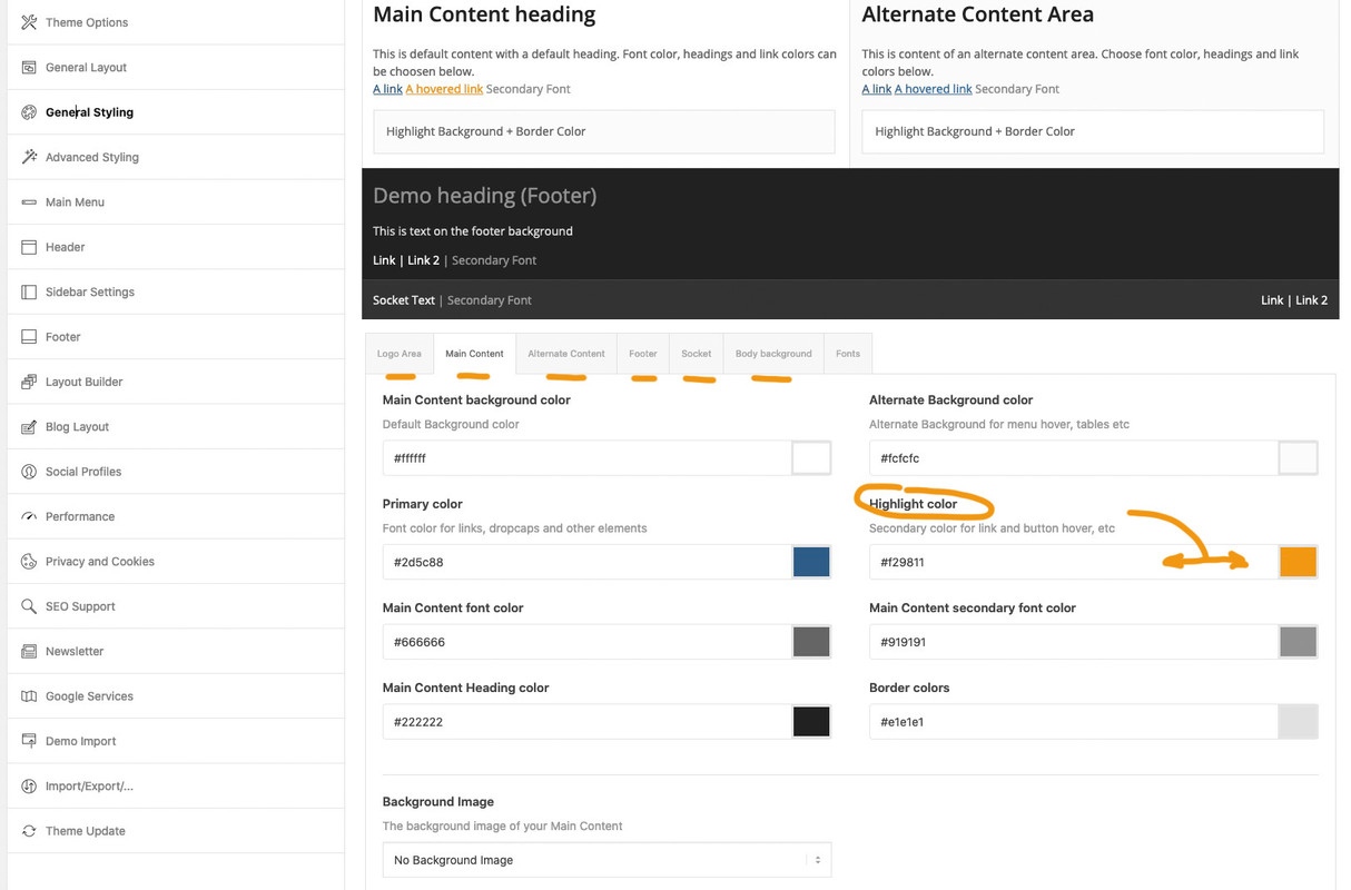
this is for anchor-links.If you like to highlight something else you had to set a rule for the hover state on that selector.
off topic: if you like to highlight selected text phrases in a custom color:
::selection {
  background: #f29811 !important;
  color: #000 !important;
}
::-moz-selection {
  background: #f29811 !important;
  color: #000 !important;
}
October 23, 2020 at 10:09 am in reply to: How to prevent text to be copied from website pages #1255203go to the text mode and surround these phrases by a span tag:
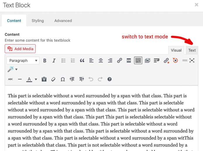
f.e.:
<span class="nocopy"> Copyright </span>
or in a heading you can use tags too:
A Heading with <span class="nocopy">unselectable</span> partssee test page again
the form-row with
– Profilo
– Indica il prodotto…
do not closethese missing two closing div tags are near the end ( you do not want to nest here – i think)
so close the form-row divs mentioned above – and get rid of these two closing div tags at the end
surrounding<div class="wpcf7-response-output" aria-hidden="true"></div>ending up in:
<div id="responsive-form" class="clearfix"> <div class="form-row"> <div class="column-half first">Nome (*)<br><br> your spans inside </div> <div class="column-half">Cognome (*)<br><br> your spans inside </div> </div> <div class="form-row"> <div class="column-half first">Mail (*) <br><br> your spans inside </div> <div class="column-half">Telefono (*) <br><br> your spans inside </div> </div> <div class="form-row"> <div class="column-full">Profilo (*)<br><br> a lot of nested spans </div> </div> <div class="form-row"> <div class="column-full">Indica il prodotto a cui sei interessato (*)<br><br> a lot of nested spans </div> </div> <div class="form-row"> <div class="column-full">Come possiamo aiutarti (*)<br><br> a lot of nested spans </div> </div> <div class="form-row"> <div class="column-full"> a lot of tags including GDPR Compliance </div> </div> <p><input type="submit" value="Invia la tua richiesta" class="wpcf7-form-control wpcf7-submit" disabled=""> <span class="ajax-loader"></span> </p> <div class="wpcf7-response-output" aria-hidden="true"></div> </div>Another hint : if a div is opend – it should be closed too.
i do not see the whole but proove that – the two first containers of<div class="form-row">open – but do not close
on the bottom there is one closing div etc.
Can you post the whole code you got her ( please use the code-tag) then we can look on that.how did you create your layout of the product pages – did you use the enfold layout builder – and did you use color-sections or other full-width elements (grid-row etc.)?
October 22, 2020 at 8:37 pm in reply to: How to prevent text to be copied from website pages #1255092give a class to the container that should be “protected” f.e.: nocopy
or as part of a sentence surround that with a span with that class:.nocopy *, .nocopy { -webkit-user-select: none; -khtml-user-select: none; -moz-user-select: none; -ms-user-select: none; -o-user-select: none; user-select: none; }left side with class – right side without: https://webers-testseite.de/abc/
By the way : right click on that page an choose select all ! ;)
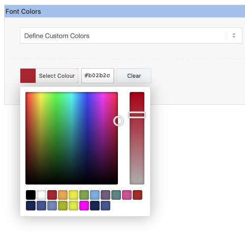
But if you are familiar with developer tools nothing can really hamper users to select and copy thingsOctober 22, 2020 at 8:27 pm in reply to: Color Section for Elements – Please include a Set of "Branded colors" #1255089ok – for those who are interested in my interims solution all to child-theme functions.php:
function custom_colorpicker_colors( array $colors ){ $colors = array( '#000000', '#ffffff', '#B02B2C', '#edae44', '#eeee22', '#83a846', '#7bb0e7', '#745f7e', '#5f8789', '#d65799', '#4ecac2', '#125', '#459', '#78b', '#ab0', '#de3', '#f0f', '#125', '#ab331c'); // these are the additional colors ( max 11) return $colors; } add_filter( 'avf_colorpicker_colors', 'custom_colorpicker_colors', 10, 1 ); function color_picker_styles() { echo '<style type="text/css"> .avia-style .wp-picker-holder {height: 255px !important;} .avia-style .wp-picker-holder, .iris-picker {height: 245px !important;} .avia-style .wp-picker-holder, .iris-picker {height: 245px !important;} .avia-style .wp-picker-holder, .iris-picker.av-iris-picker-rgba {height: 275px !important;} .iris-picker-inner, .iris-slider.iris-strip {height: 182px !important;} .iris-palette-container {width: calc(100% - 20px) !important;display: flex !important;flex-flow: row wrap;justify-content: flex-start;} .iris-picker.av-iris-picker-rgba .iris-palette-container {bottom:42px;} .iris-palette {width: 19px !important;height: 19px !important;margin: 1px !important;padding: 0;} </style>'; } add_action('admin_head', 'color_picker_styles');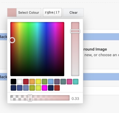 October 22, 2020 at 5:19 pm in reply to: Color Section for Elements – Please include a Set of "Branded colors" #1255018
so if you add this to your child-theme functions.php:
function custom_colorpicker_colors( array $colors ){
	$colors = array( '#000000', '#ffffff', '#B02B2C', '#edae44', '#eeee22', '#83a846', '#7bb0e7', '#745f7e', '#5f8789', '#d65799', '#ab331c',
	'#125', '#459', '#78b', '#ab0', '#de3', '#f0f', '#125', '#459');
	return $colors;
}
add_filter( 'avf_colorpicker_colors', 'custom_colorpicker_colors', 10, 1 );
and:function admin_head_mod() { echo '<style type="text/css"> .avia-style .wp-picker-holder { height: 255px !important; } .avia-style .wp-picker-holder, .iris-picker { height: 245px !important; } .iris-picker-inner, .iris-slider.iris-strip { height: 182px !important; } .iris-palette-container { width: calc(100% - 20px) !important; display: flex !important; flex-flow: row wrap; justify-content: flex-start; } .iris-palette { width: 19px !important; height: 19px !important; margin: 1px !important; padding: 0; } </style>'; } add_action('admin_head', 'admin_head_mod');you can see this:
with alpha-wrap there must be other settings. but just to brainstorm here a bit – and for discussion starting on that.
That will be a great thing to have on Enfold Options – General Styling an input field with f.e. 6 additional color palette inputs.
-
This reply was modified 5 years, 5 months ago by
October 22, 2020 at 5:11 pm in reply to: Color Section for Elements – Please include a Set of "Branded colors" #1255017yes it is possible to change the default color picker palette by a filter –
and that will be the best way for the moment to have own color-palette. You can have 11 pre-defined colors – black and white shoud be there so 9 could be replaced – put this to child-theme functions.php:function custom_colorpicker_colors( array $colors ){ $colors = array( '#000000', '#ffffff', '#B02B2C', '#edae44', '#eeee22', '#83a846', '#7bb0e7', '#745f7e', '#5f8789', '#d65799', '#ab331c'); return $colors; } add_filter( 'avf_colorpicker_colors', 'custom_colorpicker_colors', 10, 1 );i’m looking for a method to style that pickerfield by the total length of the picker areas determines the amount of rows added under each other –
but that script had to be inserted on a special moment – i guess wp-footer is the wrong place for it !if you like to have the same buttons as Enfold offers for the header-top or the socket – you can create your own shortcode for these by putting this to child-theme functions.php:
function social_bookmarks_shortcode() {
$social_args = array('outside'=>'ul', 'inside'=>'li', 'append' => '');
$social = avia_social_media_icons($social_args, false);
return $social;
}
add_shortcode('social-bookmarks', 'social_bookmarks_shortcode');
then use a text-widget to place the shortcode :
[social-bookmarks]
to have the icons besides each other a bit css is needed:#footer .widget .social_bookmarks li { clear: right !important; }The same with share buttons : go to a test-page and style the content element: social share buttons with option “use a custom set”
go and copy the shortcode from debug mode:
F.e.:[av_social_share title='Share this entry' buttons='custom' share_facebook='aviaTBshare_facebook' share_twitter='aviaTBshare_twitter']put the shortcode to a textwidget.
on gdpr ( DSGVO) reasons there is a nice plugin like shariff wrapper will create a widget for it and you can either place the global share buttons or customize them by shortcode f.e.:
[shariff services="facebook|twitter|mailto" theme="round" borderradius="50"]October 21, 2020 at 9:13 am in reply to: Aligning the logo in header with left margin of the page #1254585Goto Enfold Options – Header – Header behavior (tab) and look if you got this enabled: “Let logo and menu position adapt to browser window”
remove that activationmy solution:
do not use for that the pseudo-content : before !
make your setting for borders as usual and :
for borders all this could be a solution.avia-icongrid-borders-all li .avia-icongrid-wrapper::before, .avia-icongrid-borders-between li .avia-icongrid-wrapper::before { display: none; } .avia-icongrid.avia-icongrid-borders-all { border-bottom: 1px solid; } .avia-icongrid.avia-icongrid-borders-all li .avia-icongrid-wrapper { border: 1px solid ; }for borders between it will be more difficult – we can achieve it by outline but then the whole wrapper must have overflow: hidden – and that will disturb the flip effect to be visible outside.
Responsible for that behavior is the construction of the border via pseudo-container box-shadow and a z-index of that higher than the z-index of the content.
.avia-icongrid-borders-all li .avia-icongrid-wrapper:before,
.avia-icongrid-borders-between li .avia-icongrid-wrapper:before {
 content:"";
…
 z-index:8
}
we had to find a solution on that
-
This reply was modified 5 years, 4 months ago by
-
AuthorPosts