Forum Replies Created
-
AuthorPosts
-
on one installation the shrinking header was set to a fixed height with the same line-height. – and what was annoying was that it was set to the smallest value after shrinking. So both classes header-scrolled and header-scrolled-full were set directly
No – php8 is not yet available at my provider (AllInkl)
-
This reply was modified 5 years, 3 months ago by
Guenni007.
i have disabled on most of my installations – the automatic updates.
I do wait – because the new embedded jQuery ( v3.5.1 ) will cause on a lot of themes and plugins conflicts.
If the installation is allready done – try to install Enable jQuery Migrate Helper and set to legacy 1.12.4 jQuery
until fixes are availableDecember 9, 2020 at 1:06 pm in reply to: Problems with Enfold in combination with WordPress 5.6 #1265977maybe they did an update fo jQuery. in Preparation to php8
On one of my installation the shrinking header script does not work after that WP5.6 install.Try to test the Enable jQuery Migrate Helper Plugin in this case.
After Installation under Tools – jQuery Migrate and switch to Legacy 1.12.4 – and test if that helps til fix is availableDecember 9, 2020 at 10:21 am in reply to: have icon youtube or vimeo link open up in a lightbox and not a new tab #1265947Yes try in manual link option of the icon alb:
https://www.youtube.com/watch?v=G0k3kHtyoqc?iframe=true&autoplay=1for Logo try it with the filter in your child-theme functions.php:
function avf_change_logo_alt($alt) {
   $alt = "New Alternate Text Here";
   return $alt;
}
add_filter('avf_logo_alt', 'avf_change_logo_alt');

function avf_change_logo_title($title) {
   $title = "The new Title is here";
   return $title;
}
add_filter('avf_logo_title', 'avf_change_logo_title');
and for alternate logo ( logo if you set transparency logo) try:
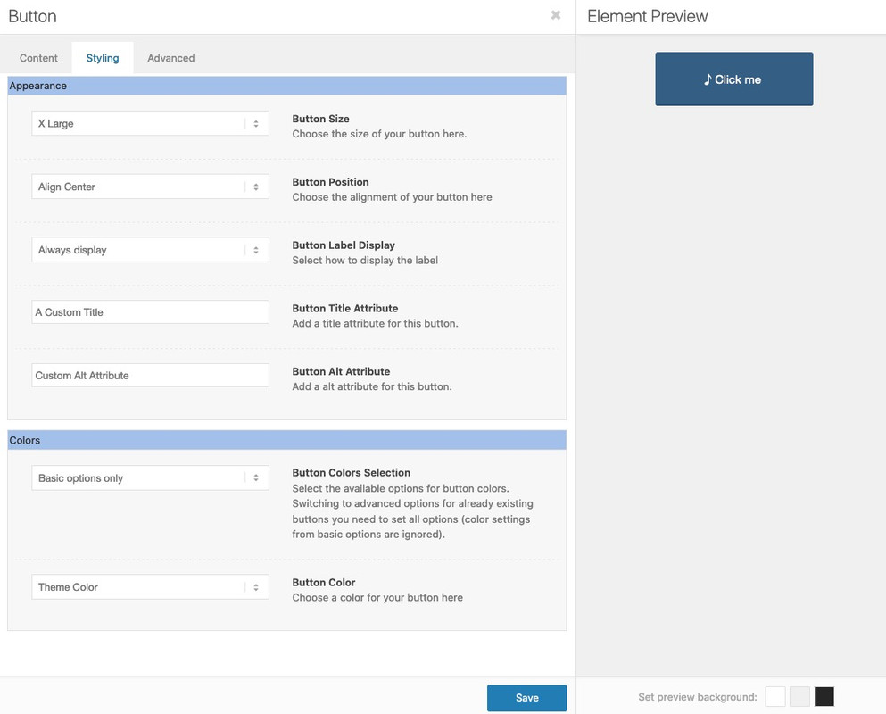
function my_custom_attributes_for_alternate_logo($header_filtered){ $header_filtered['header_replacement_logo_title'] = 'Alternate Logo Title'; $header_filtered['header_replacement_logo_alt'] = 'Alternate Logo Alt'; return $header_filtered; } add_filter( 'avf_transparency_logo_data', 'my_custom_attributes_for_alternate_logo' );Well – i don’t remember that this has been implemented before. But a custom title attribute input field is still there! –
But to my opinion it is better positioned at the anchor itself than on the parent container.
{$title_attr}could be inserted to the output on the anchor:
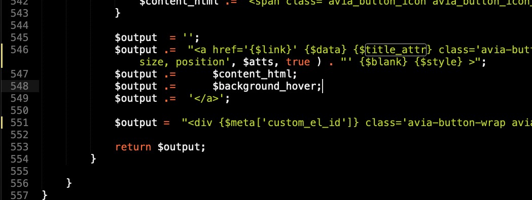
A custom-field for alt should be as easy to have here too.f.e.: https://pastebin.com/HqE8KKgP
Download: LinkThe alt attribute input field is not attached to display title field it is alway there if a custom-alt is inserted
to have your own child-theme alb elements see here: https://kriesi.at/documentation/enfold/intro-to-layout-builder/#add-elements-to-alb
 December 7, 2020 at 11:05 pm in reply to: invert order layout element between mobile and desktop visualise #1265631
use flex-model for it.
Are these layouts grid-row elements or columns?if you have grid rows – just give a custom-class to your grid-row element that should break reverse.
f.e. : reverse-orderjust copy to your quick css:
@media only screen and (max-width: 989px) {
  .av-layout-grid-container.reverse-order {
    display: flex !important;
    flex-flow: row wrap-reverse;
  }
  .av-layout-grid-container .flex_cell {
    min-height: 350px
  }
}
( if you have the break-point set on grid-row element at 768 just change the media querry value to 767px )
the last rule is just to not loose the background-images in my example : https://webers-testseite.de/reverse-order/
December 7, 2020 at 10:29 pm in reply to: Set Google Anaytics cookie as essential cookie load by default #1265627But – it is not an essential cookie!
This would contradict the GDPR.
You would invite your visitors to admonish you. It is almost the prime example of a cookie with data collection rage.-
This reply was modified 5 years, 3 months ago by

the other question is : how to loop only in the same category …
use search function with : “same_category”den stellt man bei “Allgemeines Styling” Schriften ein.
Wie gesagt das erbt der p-tag vom body-tag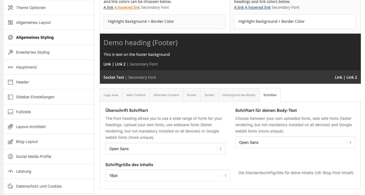
Ein Inline-Style schlägt mit Spezfität : 1,0,0,0 zu buche (https://css-tricks.com/specifics-on-css-specificity/)
warum der inline-style einen Selector mit 0,1,1,1 nicht überbietet kann ich momentan nicht sagen – normalerweise ist ein inline-style immer der Sieger!
_______________
An inline style is rated with specificity : 1,0,0,0 (https://css-tricks.com/specifics-on-css-specificity/)
why the inline-style does not outbid a selector with 0,1,1,1 is something I cannot say at the moment – normally an inline-style is always the winner!
-
This reply was modified 5 years, 3 months ago by
PS : jetzt weiss ich es – du hast unter advanced styling den p-tag definiert.
diese anweisungen erscheinen dort hinter der besagten Stelle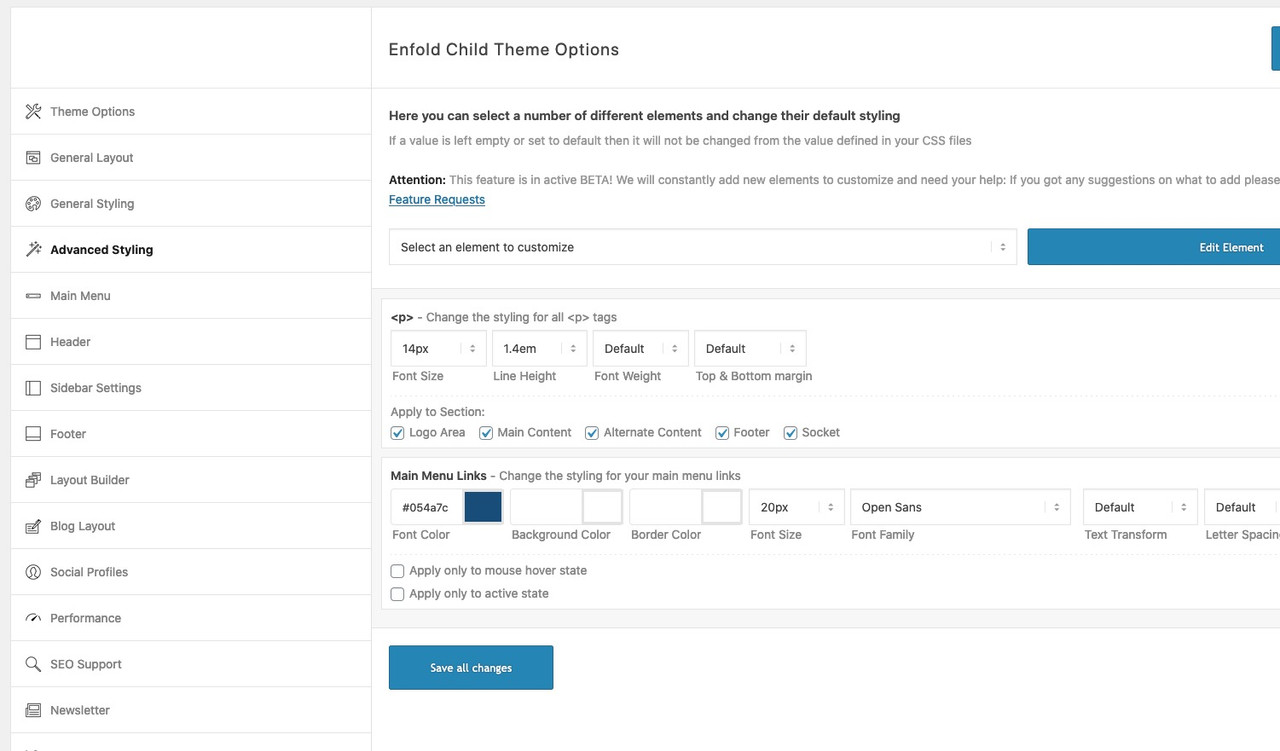
du hast im enfold.css folgende Regel erstellt:
#top .header_color p,
#top .main_color p,
#top .alternate_color p {
    font-size: 18px;
    line-height: 1.4em;
}
eigentlich erbt der p-tag die Schriftgröße (und Zeillenhöhe) vom body tag!
diese css Regel habe ich nicht in meinem css. Daher dürfte das der Knackpunkt sein.Allerdings ist mir noch unklar wie du es eingefügt hast. Denn normalerweise befinden sich die Einträge in der Quick css vor
diesen Einstellungen im css ( das sind die Enfold Optionen des general stylings..container {width:100%;} .container .av-content-small.units {width:73%; } .responsive .boxed#top , .responsive.html_boxed.html_header_sticky #header, .responsive.html_boxed.html_header_transparency #header{ width: 1310px; max-width:90%; } .responsive .container{ max-width: 1310px; }durch die höhere Spezifität der css Regel ( 1ID, 1Klasse, 1 Element) wird das inline css nicht umgesetzt.
sorry bin auch nur “Participant” – aber eben mit einer Menge an css und javascript Erfahrung.
Sonst schick mir doch mal nur den Link ( Zugangsdaten brauche ich nicht ) via E-Mail zu – Daten sind unter meinem Nick hinterlegt.kannst du mal den link zur testseite posten?
this is strange because on my end it works well. On your preview it looks as if the value goes to the line-height value only.
do you have the newest Version of Enfold? but, as far as I know, such a bug did not occur yet.yes – as far as i can see –
or do you mean those signs on the first column – did you try to insert on menu label an image ( maybe gif )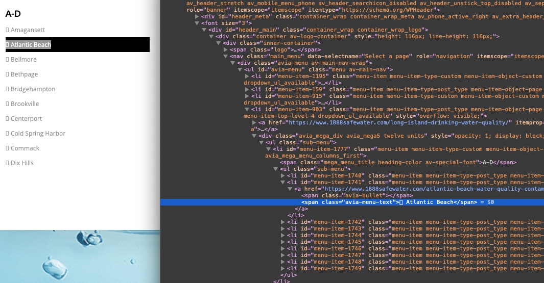
________________
if you like to have a little extra :#top #header .avia_mega_div > .sub-menu > li > ul > li a:hover .avia-menu-text { padding-left: 10px; -webkit-transition: all 0.5s ease; transition: all 0.5s ease; color: white; } #top #header .avia_mega_div > .sub-menu > li > ul > li a .avia-menu-text { -webkit-transition: all 0.5s ease; transition: all 0.5s ease; }-
This reply was modified 5 years, 3 months ago by
well the given css has one selector more than the above – and then it is more specific :
Try:div .mfp-title { font-size: 20px; }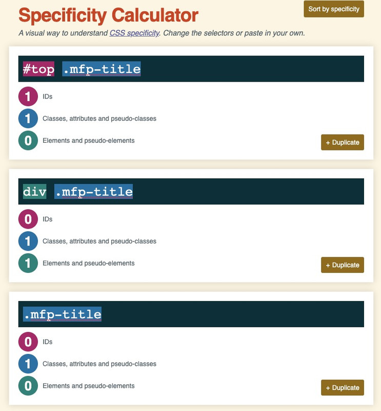
you see that the rule with the div wins that competition ;)
and if you want to be sure that your custom css overrules the given one take the #top rulebut I think there is a problem of understanding. A background image per se can’t be responsive, because the content decides the size of the container.
To display the complete content the container height has to be adjusted flexibly. No image in the world meets such criteria.
I have here a color-section forced by css to be responsive to the background image.
You see what happens to the content when the screen width is narrow?
https://webers-testseite.de/responsive-colorsection/Now to the sliders – if you choose the fullscreen slider that is similar to that issue.
The Slider is forced to have a 100% of screen height : 100vh.
what should an image do that is landscape on a portrait format hold phone?If you take the full-width slider – that reacts responsive – but content of it should have enough place.
Try on a copy of that f.e. startpage the full-width slider.Thanks – On which of the pages is the problem described by you
what exactly do you mean by “strange characters” ?
these are indicators that there is an unordered list – just “bullet points”if you do not like to have them – just set them to display:none
.avia_mega_div .avia-bullet {
    display: none;
}
and if you do not like to have the list points with offset to the left:
#top #header .avia_mega_div > .sub-menu > li > ul > li a { padding: 3px 12px 3px 0px; }So publish the page here for everyone;
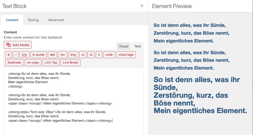
sometimes non-mods can help, tooand how did you want to achieve these different text-sizes? Are these textblock alb elements – and you have set the font-size via the styling tab of the textblock alb:
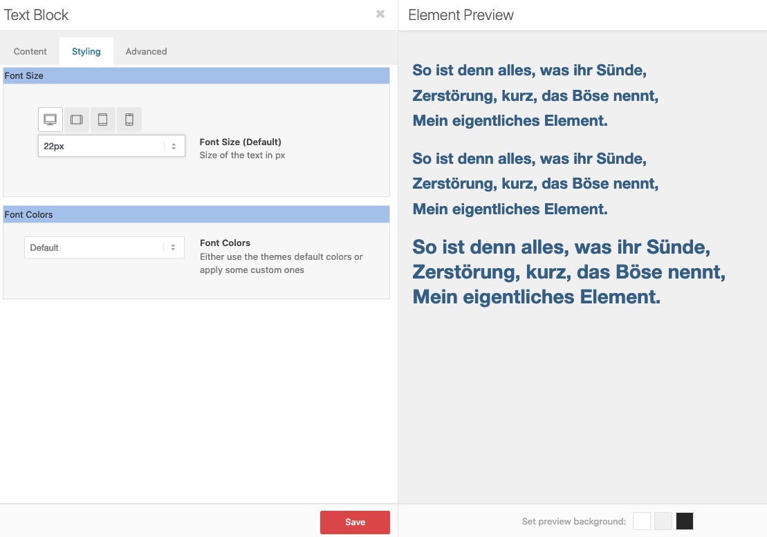
– or did you insert inline css – like:
use the little plugin from Günter: https://github.com/KriesiMedia/enfold-library/tree/master/integration%20plugins/Enfold/Special%20Character%20Translation
and add as many special characters you like to have in that php –
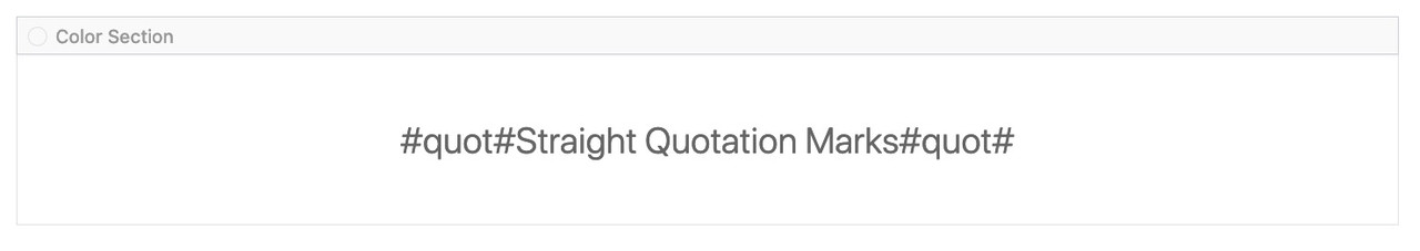
( i changed my version to only use one # before and after the signs )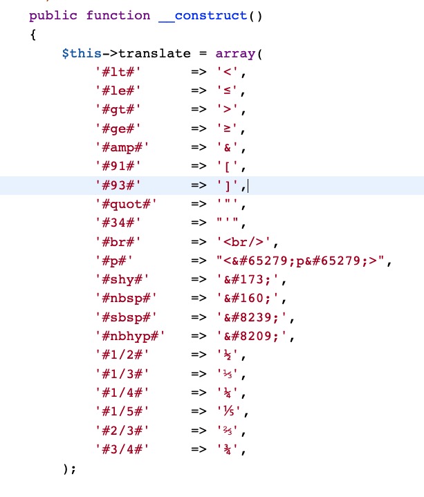
see example : https://webers-testseite.de/straight-quotation-marks-in-headings/
and layout looks this way:
In principle I would also welcome a vision of where the journey is destined to go.
But if you have ever worked with Elementor, e.g. the theme Jupiter comes along with this editor, you will appreciate the intuitive use of Enfold’s Drag&Drop. – Yes, Elementor is a powerful tool – but I get a similar layout result much faster with Enfold via drag&drop.
Leaving this principle would be completely wrong – it would mean that Enfold would give up a unique selling point.
The majority of users are not web design experts here, who by the way also appreciate the haptic quality, but private users, or at least only small to medium sized companies, who design their sites themselves.
I also get along quite well with Divi Builder, but even here a quick implementation of an own layout is not as possible as it is with Enfold. Not without reason there are 100s of templates that you can import.If you really want to go there and use Elementor – please open a new theme with it and keep Enfold as it is.
If something is missing for non-professionals, it would be the element of dividers.
Those of you who know how to do it, can do it already – and have their own svg instead to style section dividers._______
about bugs and bug-fixes:
it is a fact that a constantly changing world needs to experience new adaptations of proven methods.
The development of a WordPress theme is no exception.
The implementation of the GDPR was such a thing that the developers were approached.
Closing security gaps against constantly new cyber attacks is always a new challenge. WordPress code enhancements have to be adopted and any bugs that arise have to be fixed.I think that the team offers fast and good work also here.
Strangely enough, with Microsoft operating systems, no one gets upset anymore about the fact that bug fixes have to follow all the time. Unfortunately this is also the case with OSX.
the parameter to change is only background-size
the (pseudo-) container itself had to stay on 100% (height and width) ( that is the exact dimension of the parent container)
you can play with different values relative or absolute values.
you can try :
background-size: contain ( or cover )
or – if you like to have it perfect – you can set different values for different screen-width ( media-query rules)try first : background-size: contain
maybe thats what is best.I think I can remember, is this not a everytime problem of css – to center a graphic in the horizontal?
: not at all ;)
so I don’t know where you tested it, maybe you should empty the cache of all involved systems, but on 4 of the browsers I use so your svg is centered.
You might not use a relative unit of measurement for the size of your svg, but set the background size to a fixed value (350px)
– or background-size : containNovember 26, 2020 at 7:39 pm in reply to: Google Maps Shortcode issue in a non-GDPR country #1263344Legally I’m afraid, that if visitors from one of the countries in which the GDPR (DSGVO – for German speaking countries) is valid can reach your website – this website must also comply with the laws.
So if I now search for a property in this region, and I come to your site, the site would not comply with the law even though it is located in the USA.
November 26, 2020 at 7:31 pm in reply to: New Version? – No Change log in Download, Themeforest or Kriesi-Page? #1263335It is probably just a Black Friday hint. – without that there really is a new version. – Envato likes to do that.
November 26, 2020 at 5:35 pm in reply to: Enfold Latest-News Sidebar Widget: reduce Excerpt Length and insert "read more" #1263307here is the edited class-framework-widgets.php
see lines 1020ff
Pastebin Linkthen you only need the excerpt shortener in additon to this:
function custom_news_excerpt(){ ?> <script> (function($){ function trimByWord(sentence,wordcount = 5) { var result = sentence; var resultArray = result.split(" "); if(resultArray.length > wordcount){ resultArray = resultArray.slice(0, wordcount); result = resultArray.join(" "); } return result; } $(document).ready(function(){ $('.news-content').each(function() { var newsLink = $(this).find('.news-link').attr('href'); $(this).find('.news-excerpt').text(function(index, currentText) { return trimByWord(currentText); }); }); }); })(jQuery); </script> <?php } add_action('wp_footer', 'custom_news_excerpt'); -
This reply was modified 5 years, 3 months ago by
-
AuthorPosts