Forum Replies Created
-
AuthorPosts
-
Oh, sorry. Since I work with a German user interface, I didn’t think about this progress bar (Fortschrittsbalken). The “Reading Progress Bar” isn’t translated in my German version, but the progress bar element is. That’s why it didn’t occur to me.
Yes background-color is better set on that options dialog of the Element. But you had to open the second popup for each item (bar) there is the background-color option.
__________And just to mention – you can have gradients on that too by css
f.e. for the first bar in your element:#top .avia-progress-bar-container .avia-progress-bar:nth-child(1) .bar { background-image: linear-gradient(90deg, rgba(255, 255, 0, 1) 0%, rgba(0, 188, 212, 1) 50%, rgba(238, 130, 238, 1) 100%); background-size: contain; animation-iteration-count: 1; }you can even change the height of that bar – or have some patterns as background-image
#top #header .header-reading-progress {
  height: 10px !important;
  background-image: linear-gradient(to right,  #96b642 0%,#3f3f87 100%);
  background-size: auto 10px;
  z-index: 0;
}
by the way: there is no right side bar to colorize. The width is calculated of that bar.
August 1, 2025 at 9:24 am in reply to: Grid width, color outside of left and right grid margins #1487450you have set this css rule to not have the full-width of the grid element.
#av-grid-custom-home {
  max-width: 960px;
  margin: 0 auto;
}
the quick and dirty way is to set the background-color to your #f3f3f3 – but it influences the whole installation.
#top #main {
  background-color: #f3f3f3;
}
__________________
so remove your setting from above …
A more flexible approach is to wrap the grid-row element in a div that has all the properties of a standard color-section.
set a custom class on those grid-row element : grid-notfull
now to get a not fullsize grid-row element i have the following snippet in my child-theme functions.php :function grid_layout_notfull(){ $responsive_size = avia_get_option('responsive_size'); ?> <script> (function($){ $('.av-layout-grid-container.grid-notfull' ).each(function() { var notfullID = $(this).attr('id'); $(this).hasClass('main_color') ? $(this).wrap('<div class="main_color notfullsize '+notfullID+'"></div>') : ''; $(this).hasClass('alternate_color') ? $(this).wrap( '<div class="alternate_color notfullsize '+notfullID+'"></div>') : ''; }); $('.notfullsize').css({"clear": "both", "width": "100%" , "float": "left" , "position": "static" , "min-height": "100px" }); $('.grid-notfull').css({"max-width": "<?php echo $responsive_size; ?>" , "margin": "0 auto" , "padding": "0 50px"}); })(jQuery); </script> <?php } add_action('wp_footer', 'grid_layout_notfull');Well the logo itself is place as inline svg. But nevertheless – you can handle it like an image – and influence the space arround that svg with padding.
in the footer there is a img tag with svg
so try:
#top .logo.avia-svg-logo svg { padding: 5px; } @media only screen and (max-width: 767px) { #footer-page .flex_column.first .avia_image { max-width: 180px; left: 50%; transform: translateX(-50%); } }by the way there is one obsolete curly bracket in your snippet!
try instead:
(if you do not need it on checkout page etc. – adjust the conditionals)function widget_area_above_footer_woocommerce() { // Check if we are on a WooCommerce page. if ( class_exists( 'WooCommerce' ) && ( is_woocommerce() || is_cart() || is_checkout() || is_account_page() ) ) { // If it's a WooCommerce page, display the widget area. dynamic_sidebar( 'footer-widget' ); } } add_action( 'ava_before_footer', 'widget_area_above_footer_woocommerce' );on my end here there is on Version 18.5 (20621.2.5.11.8) no problem with your setting. No stretching of the buttons.
ok – if you like to have on default a sidebar header – and on homepage only the header top position.
( for that scenario we need than a bit different css too if you like to have slide-out from left to right)1 set your enfold child to header top and make all your decisions you like to have for that header ( height, logo left or right, navigation position, shrink or not, etc pp )
2 Go to your homepage editor and make your decision there – f.e. if it should have transparency etc.
3 Look now to your homepage with dev tools of your browser. Note your ID of that page and look what classes are set on #header
e.g.: ( all_colors header_color light_bg_color av_header_top av_logo_right av_main_nav_header av_menu_left av_custom av_header_sticky av_header_shrinking av_header_stretch av_mobile_menu_tablet av_header_searchicon av_header_unstick_top_disabled av_bottom_nav_disabled av_header_border_disabled )4 now switch back to your header left position.
put this to your child-theme functions.php:
(remove options you do not need – or replace – f.e. header_size and header_custom_size and replace by header_size: ‘slim’ / or large )
you can find those corresponding header settings in : avia_header.phpfunction av_change_header_style($header){ if(is_page(array( 17, 123456))){ $header['header_position'] = "header_top"; $header['header_layout'] = 'logo_right main_nav_header menu_left'; $header['header_size'] = 'custom'; $header['header_custom_size'] = 140; $header['header_shrinking'] = 'header_shrinking'; $header['header_sticky'] = 'header_sticky'; $header['header_unstick_top'] = 'header_unstick_top'; $header['header_stretch'] = 'header_stretch'; $header['header_transparency'] = 'header_transparency header_glassy'; $header['header_class'] = " all_colors header_color light_bg_color av_header_top av_logo_right av_main_nav_header av_menu_left av_custom av_header_sticky av_header_shrinking av_header_stretch av_mobile_menu_tablet av_header_searchicon av_header_unstick_top_disabled av_bottom_nav_disabled av_header_border_disabled"; } return $header; } add_filter('avf_header_setting_filter','av_change_header_style');here in this example there are two pages (ID’s) replaced with that different layout – adjust to your home page ID
this filter has a lot more options. Enter on$header['header_class']your noted classes from point 3.see example page: https://clean.webers-testseite.de/
maybe a plugin can help you: https://wordpress.org/plugins/ajax-load-more/
see info and demos on : https://connekthq.com/plugins/ajax-load-more/examples/default/
Ultimately, this amounts to an infinite scroll page, doesn’t it? For such a page to have good SEO, the meta information must be readable, and only the performance-relevant elements should be read when necessary.
well you got a page like this for your layout: https://kriesi.at/themes/enfold-photography/
try:
@media only screen and (max-width:767px) { #top .av-logo-container .inner-container { display: grid !important; grid-template-columns: 1fr 1fr; grid-template-areas: "nav logo"; } #top .av-logo-container:after, #top .av-logo-container .av-sidebar-social-container { background-color: gray; } .responsive #top #header .logo { grid-area: logo; width: unset !important; justify-self: end; } .responsive #top #wrap_all .main_menu { grid-area: nav; justify-self: start; width: unset !important; left: 0; right: unset; position: relative; } } /* === change the width values to your needs f.e. 500px instead of 350px === */ /* === burger slide-out from the leftside === */ .av-burger-overlay-scroll { width: 350px; left: -350px; max-width: 100%; transition: all 0.5s cubic-bezier(0.75,0,0.25,1); } .html_av-overlay-side .av-burger-overlay-scroll { left: 0; max-width: 100%; transform: translateX(-350px); transition: all 0.5s cubic-bezier(0.75,0,0.25,1); } /* === hide header on home page === */ @media only screen and (min-width:768px) { .html_header_sidebar #top.home #header { display: none !important; } .html_header_left #top.home #main { margin-left: -2px !important; /* === to ensure there aren't any white flashes on the left === */ position: relative; } }but you are loading some fonts – how do you load them. I see f.e. a roboto-slab – this is not inside the default drop-down for available fonts.
Try to upload those fonts – by using the font-manager.i can see this console warning : downloadable font: glyf: empty gid 164 used as component in glyph 165 (font-family: “Roboto Slab” style:normal weight:100..900 stretch:100 src index:0) source: https://fonts.gstatic.com/s/robotoslab/v35/BngMUXZYTXPIvIBgJJSb6ufN5qWr4xCC.woff2
_____
a similar Problem?
btw. : have a look at: https://kriesi.at/support/topic/deprecation-warnings-clogging-up-my-error_log-file/and maybe then it would be nice to get rid of that small border too:
.avia_transform .av-extra-border-element.border-extra-diagonal.border-extra-diagonal-inverse .av-extra-border-inner { background-color: #FFF; } #top .container_wrap { border-top-style: none; }But main reason is that it is not a 16/9 aspect ratio video.
Enter on that Video Aspect Ratio Field : 1920:814and remove that object-fit: cover rule – and even the background-color could be removed – everything fits with the right aspect-ratio
July 25, 2025 at 3:26 pm in reply to: Stretch background image to edge of screen on half column #1487230Looks nice!
U bent van harte welkomonly one thing : the one ruleset inside the media query (see Link ) : the hyphens: auto had to be set to !important
hyphens: auto !important;you can upload that font-file in a separate zip. i offered it here : https://webers-testseite.de/OpenSans-Variable.zip
you can choose it the same way as the static font on the bottom of that dropdown list.

could you please insert the needed Rest of css Code :
https://kriesi.at/support/topic/flip-box-behavior-all-wrong/#post-1487126
can you see in DOM that those classes are added?
how did you insert your snippet ot wordpress?f.e. in child-theme functions.php:
btw. you place your sbi shortcode to your content – why don’t you give the parent element (f.e. color-section a custom class: noLightbox ) – i did it that way !function add_noLightbox_class_to_sbi_link(){ ?> <script> window.addEventListener("DOMContentLoaded", function () { (function($){ $('.sbi_link').addClass('noLightbox'); })(jQuery); }); </script> <?php } add_action('wp_footer', 'add_noLightbox_class_to_sbi_link');maybe it is best to give the class to one of its parents ( not the anchor element itself)
f.e.:
jQuery(document).ready(function() { jQuery('.sbi_link').addClass('noLightbox'); });by the way – is it intentional that you have both menu-items and burger menu icon – on large screens?
it is much easier to have multiline main menu on displaying it as flex box.Can you see your child-theme functions.php on: Dashboard – Appearance – Theme File Editor ? click on the right side the “Theme Functions” functions.php and see what is the content on line 32 and following.
May be you post that block you have entered there.
Yes that is a nice idea.
and in addition – some magic of “container-type” property and font-size adjust via cqi
to have more legible font sizes!@media only screen and (max-width: 989px){ #top .gridded-flipbox .avia-icongrid-flipback .avia-icongrid-inner { padding: 20px !important; } #top .gridded-flipbox .avia-icongrid-flipback { container-type: inline-size; } #top .gridded-flipbox .avia-icongrid-flipback p { hyphens: auto; font-size: 9cqi; line-height: 1.5em } }so first try this in addition to my code from example page:
#top .gridded-flipbox .avia-icongrid-wrapper, #top .gridded-flipbox .article-icon-entry { width: 100%; height: 100%; min-height: unset !important; } @media only screen and (min-width: 990px){ #top .gridded-flipbox .avia-icongrid-flipback .avia-icongrid-inner { padding: 10px !important; } #top .gridded-flipbox .avia-icongrid-flipback p { hyphens: auto } }i found your site – and i see that you have set the min-height option – remove that
See on the element on Styling – Grid Styling – “Minimum Height – For Flipbox Only”Unfortunately, few of my fellow participants have the courage to publicly post links to their websites here. Otherwise, it would surely have been resolved by now.
you only had to adjust that one rule:
#top .gridded-flipbox .avia-icongrid-wrapper, #top .gridded-flipbox .article-icon-entry {
  width: 100%;
  height: 100%;
  min-height: unset !important;
}
and maybe you set the gap a bit smaller than 30px
have you set the custom class on the element?
the element (Icon/Flipbox Grid) itself got that custom class: gridded-flipbox
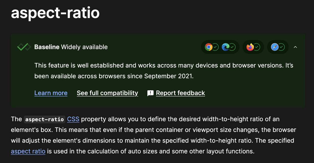
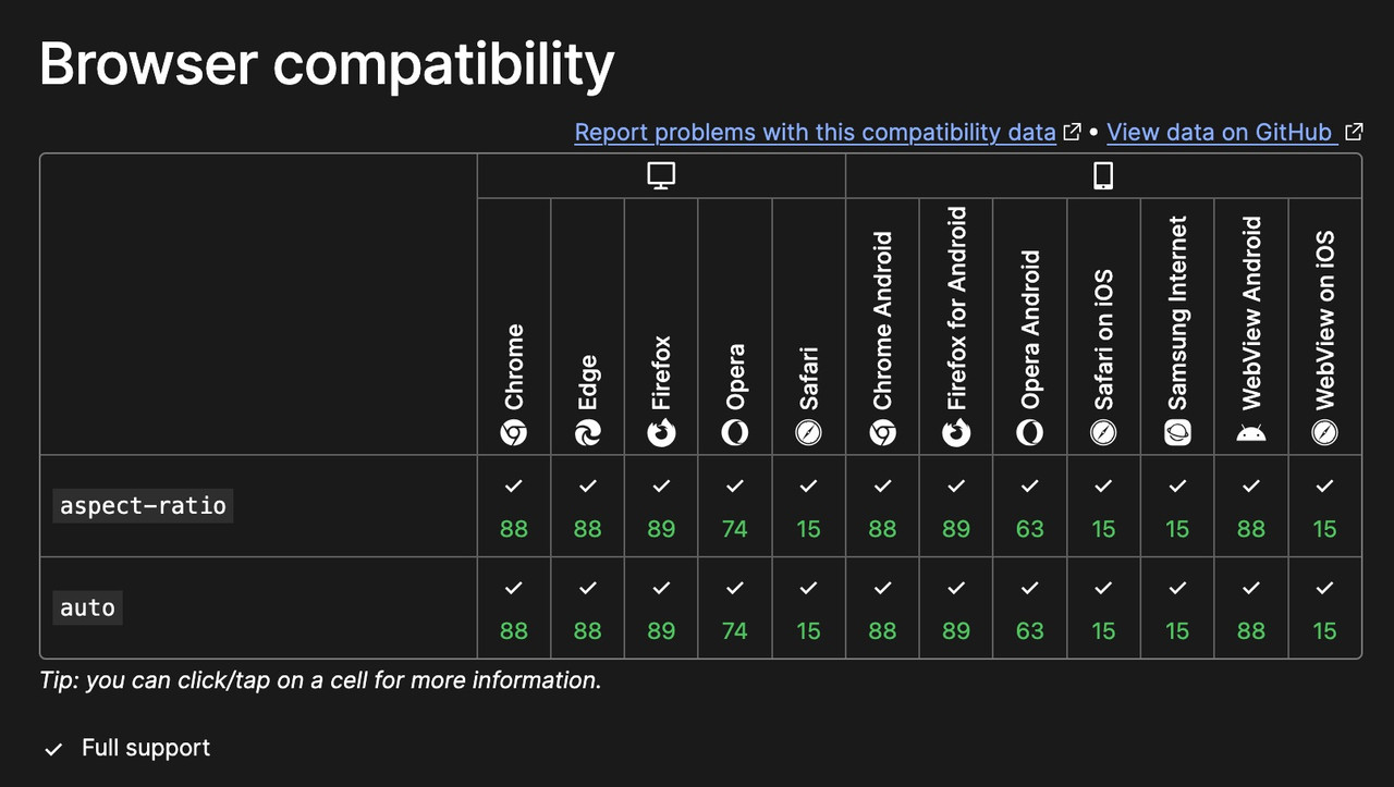
and if aspect-ratio does not exist, why does it work on my site? (Enfold 7.1.1)
there is a porperty : aspect-ratio – see:https://developer.mozilla.org/en-US/docs/Web/CSS/aspect-ratio
btw: the declaration is :
aspect-ratio: width/height;
but there is a shortform – that if there is no height value – height is 1so :
aspect-ratio: 1/1 can be written as aspect-ratio: 1All is based on the square source images – grid layout and – background-size: contain.
have you seen my page: https://webers-testseite.de/gridflip/
because i do not see any cover on your page- do you solve it?
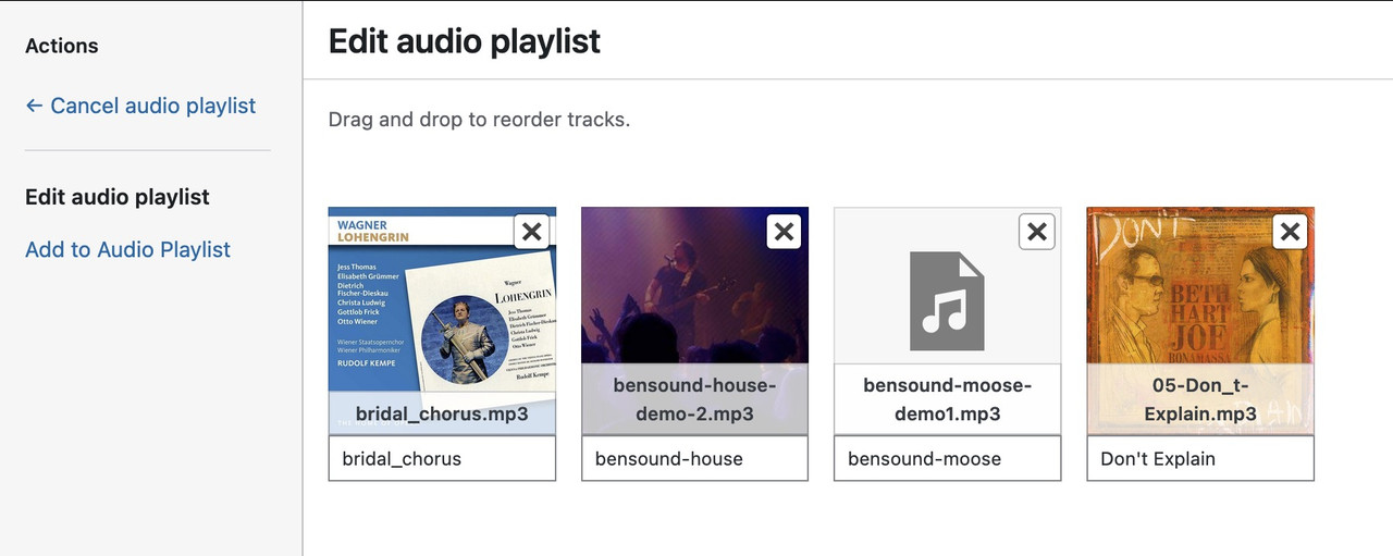
#top .wp-playlist-current-item img {
  display: none;
}
___________
or do you mean : how to show them?
if you like to have cover:
on element (audio player) – player tab: do not enter a cover image ( only if you like to have for all items in the playlist the same cover)
on “Media Icon/Album Cover”
now your audio files must have an embedded cover. – you can see if the file got an embedded cover on media-library popup – when you choose your files:
i embed a cover to your file and uploaded it to my text page – :

see again that example page with a possible solution. Using display: grid seems to be the best for that.
Read carefully – you had to give the Icon/Flipbox Grid a custom class. The css code you need is on that page.But – If the text is very long, it could cause problems on narrow screens when the site becomes responsive.
I have now updated all of my installations to PHP 8.3 or higher. Some of my customer providers already offer PHP 8.4. I have never had any problems switching. Therefore, I assume there is high compatibility with current PHP versions. My overloaded test site runs under PHP 8.4.7. For example, the child-theme functions.php has over 5,000 lines, and the quick CSS is already over 9,700 lines long. (webers-testseite.de).
Why don’t you try going back to smaller PHP versions one at a time? It may take a while for this to take effect. Then, see if your installation works with your provider.
-
AuthorPosts


