Forum Replies Created
-
AuthorPosts
-
click to enlarge:
the rule that is responsible for the little dashed line is:
.avia-timeline-vertical .av-milestone-icon-wrap::after {
    content: "";
    height: 1000%;
    width: 1px;
    position: absolute;
    top: 0;
    left: 50%;
    border-left-style: dashed;
    border-left-width: 1px;
}
if you want to change something that will be the first startpoint for it.
For border-style see f.e.: https://developer.mozilla.org/en-US/docs/Web/CSS/border-style#valuesto put instead a dynamic Date inbetween these spaces is hard to obtain.
on the advanced layout builder you got under Content Elements : Widget Area
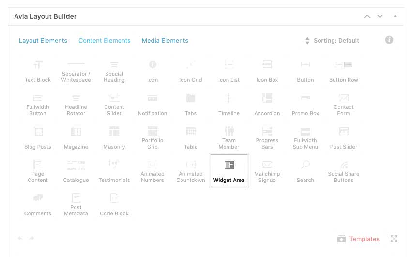
so place it where ever you like
goto Dashboard – Appearance – Widgets – Enfold Child Custom Widget Area
put in a unique name for your child-theme widget Area and press : “Add widget Area”This Area you can show with the above mentioned in your content.
can you try this in your child-theme functions.php:
function my_avf_customize_heading_settings( array $args, $context, array $extra_args = array() ){
  if( $context == 'avia_masonry' ){
    $args['heading'] = 'h4';
  }
  return $args;
}
add_filter( 'avf_customize_heading_settings', 'my_avf_customize_heading_settings', 10, 3 );
change h4 if you better like span or p tags
empiric : just count how many you have – sorry better word is probably : pragmatic
I’m just not a native english-speaking participant here. ;)or you use some filters on that:
// for image lightbox setting function change_lightbox_size() { return "full"; } add_filter('avf_avia_builder_helper_lightbox_size','change_lightbox_size', 10); // this for masonry-galleries function avia_change_masonry_thumbnail_link($size){ return "full"; } add_filter('avf_avia_builder_masonry_lightbox_img_size', 'avia_change_masonry_thumbnail_link', 10, 1); // Guess this will work too for galleries and masonries function avia_change_gallery_thumbnail_link($link, $attachment, $atts, $meta){ $link = wp_get_attachment_image_src($attachment->ID, "full"); return $link; } add_filter('avf_avia_builder_gallery_image_link', 'avia_change_gallery_thumbnail_link', 10, 4);hm – now i know – the calculation takes the entry_count form alb items input field ! and not a calculated items count !
The entry-number : All expresses “-1”Solution now: you had to know how many items there are ;)
(you can see that on category or portfolio categories list)
– and set this in the postslider alb yourself in :
“Entry Number
How many items should be displayed?”________
* but great difficulty is : if you show more than one category – and they have items with both categories; if you have more than one postslider on a page and have offset activated … etc pp.
so best would be if there is a calculation of items – don’t know if it is possible. – but – see asterisk above ? – if that would be possible?Guess the empiric method would be the easiest way for now.
-
This reply was modified 4 years, 12 months ago by
Guenni007.
yes – and even if the calculation is this way ( which seems to be more logical ) – because slidenumber should be an integer value:
entry_count and columns-count should also be integers aswell – per definition.$entry_count = $this->atts['items']; $slidenumber = (int)($entry_count / $this->atts['columns']); $slidenumber = $entry_count % $this->atts['columns'] ? ( $slidenumber + 1) : $slidenumber;the slidenumber is for 1 column wrong and for the rest +1 ? i see not the error ?
by the way: on some postsliders it works – on others not – and i do not see the difference between these two postsliders yet. …
As far as i see – it is dependent on the column count – if you got only 1column – it will not work that way ?
Guess the ternär Operator with remainder ( % ) had to be calculated a bit different.but i do not see why a column count 1 has as result a zero slide number:
$slidenumber = $entry_count / (int) $this->atts['columns'];
$slidenumber = $entry_count % (int) $this->atts['columns'] ? ( (int) $slidenumber + 1)  : (int) $slidenumber;
f.e case 5 items 1 column
remainder comes to
5/1 = 5 no rest
so ternär operator goes to last setting ( and does not add one slide more for the rest ) is slidenumber is 5 – but it does not show the dots in this case.See here the same postslider – left one only one column – right 3 Columns.
https://webers-testseite.de/jakob/And: on the right post-slider the slidenumber calculation is wrong! there are 7 items and 3columns.
7/3 = 2 Rest 1 so there must be 2+1 slidenumbers – but there are 4 ?-
This reply was modified 4 years, 12 months ago by
you see that this is the name of the docx that is shown. It is the original title of the source you used for the pdf. Well if you have generated the new pdf on bases of that old 2020 docx – this will be part of the pdf. This is the way all distillers – pdf generators work – they implement the source name as title of the pdf.
If you open a pdf on your desktop – and open Setting on Acrobat (sorry it is my german version ) you will see this:
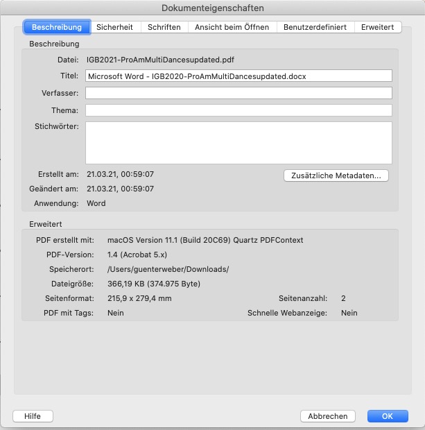
The Title of the source is your old docx
So if you rename the docx to the 2021 Variant – and generate afterwards your pdf – this will be the way you want it.
But is it really neccessary? I have a lot of layouts based on Indesign docs that are much older – and that will be allways part of the pdf that are generated.
PS: if you got the Acrobat ( not reader ) you can change it on that settings field – without generating again the pdf – only type in what you like to have. see here: https://webers-webdesign.de/IGB2021-ProAmMultiDancesupdated.pdf
(after you checked my edited pdf – i will erase it)
PPS: this is only shown on chrome. Either firefox nor Safari shows it.-
This reply was modified 4 years, 12 months ago by
March 25, 2021 at 9:36 pm in reply to: Show Copyright for images in Standard Editor Blog Posts #1290453is it possible to discuss publicly things that might interest other participants?
Maybe your link could be informative for others too!please try this in the video input field:
https://www.youtube.com/watch?v=GaQZiEjfstA?autoplay=1&cc_load_policy=1&enablejsapi=1&end=41&loop=1&playsinline=1&start=3&color=white&iv_load_policy=3Any page we can see the issue?
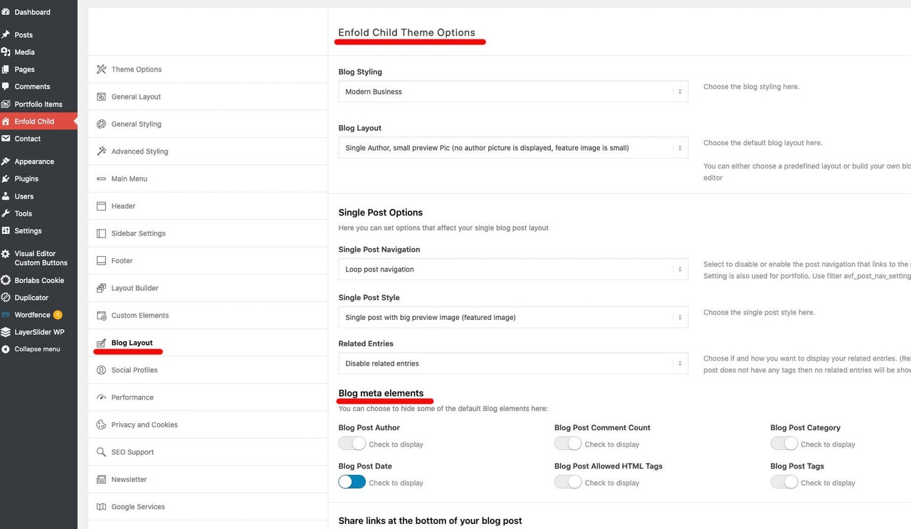
can you please go to your enfold options : blog-layout : “Blog meta elements”
select what you like to preserve.If that does not help – we will find a different way. Is this on your page the list-layout simple ?
March 24, 2021 at 1:08 pm in reply to: Scroll to top button – Change it to a specific section #1290098please try this in your child-theme functions.php:
function change_scroll_top_link(){
?>
<script type = "text/javascript">
(function($){
	$('#scroll-top-link').attr('href', '#newID');
	$('#scroll-top-link').attr('title', 'Get in touch');
	$('#scroll-top-link .avia_hidden_link_text').text('Get in touch').css({
		'display': 'block',
		'position': 'absolute',
		'top': '-40px',
		'left': '-40px',
		'width': '120px',
		'font-size': '14px',
	});
})(jQuery);
</script>
<?php
}
add_action( 'wp_footer', 'change_scroll_top_link' );
But: maybe it is enough if you have the title to have “Get in touch” – and to have that on hover
Then remove the css partif you had to do it only for one page:
function change_scroll_top_link(){
if(is_page(5)){
?>
<script type = "text/javascript">
(function($){
        // same as above
})(jQuery);
</script>
<?php
}
}
add_action( 'wp_footer', 'change_scroll_top_link' );
or for more than one page replace it with an array of pages
if(is_page(array( 1396, 1617, 1629))){Thanks Günter – that should be discussed for now. I haven’t quite been able to understand their (WordPress) reasoning yet (it’s probably also about the screen reader functionality); maybe WordPress will reconsider putting the title back.
Can be closeddoes not matter
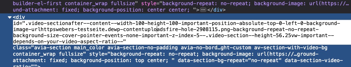
dear Ingo, what please is so hard about copy&paste? https://kriesi.at/support/topic/video-behind-gif-png-picture/#post-1289654
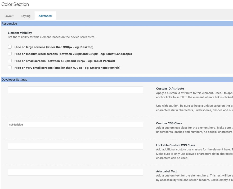
If I copy my code from above and paste it into the developer tools as css it is as you want it. Why are things forgotten to take over?where is the background-size = 0 on the color-section ? (.avia-section.not-fullsize )
where is the :after rule on the color-section ? ( .avia-section.not-fullsize::after )Well Enfold-User – you are not the creator of this topic – so it would be good I could develop some code based on your site. This is actually always the best approach, since as in the case of the example above there was no title at the anchor – a standard markup would not have been useful there.
Sadly it is closed the issue.
you had to remove the ?iframe=true addon or better now give to the color-section the custom-class: noLightbox – this hampers the enfold lightbox.you can see that on my text-page: https://webers-testseite.de/protom/ on “besorgt” – allthough it got that addendum ?iframe=true – the enfold classes are not built on the anchor.
PS: wenn es sich nur um diese Seite ( bzw ist ja ein single post) könnten wir das ganze noch nur für diese Seite setzen.
z.b#top.postid-3432 .mfp-top-bar
undif(is_single(3432)){ … }und da du ja ohnehin noch in alle nochmal rein musst (ist momentan ja nur das Angst Video zu sehen) , um die Links zu setzen, – du brauchst hierfür nicht mehr das addendum “?iframe=true” setzen, da wir ja unseren eigenen Trigger zur Auslösung der Lightbox definiert haben. Für SEO wäre es schon besser du würdest dann auch den Title richtig setzen – obwohl wir Ihn ja momentan nicht benötigen.
Innerhalb der Text Box reicht es wenn du die Begriffe so setzt:<a href="/wp-content/uploads/Future-12917-1.mp4" target="_blank" rel="noopener">etwas anderes</a>
PPS:
– die spans benötigst du auch nicht, das würde ich über quick css auf einmal setzen:#after_submenu .avia_textblock p { font-weight: bold; font-size: 14pt; font-family: verdana, geneva, sans-serif; }– damit die Video Galerie nun nur innerhalb eines Anfangsbuchstaben rotieren ( loop ) können wir Gruppen setzen.
We will have a top-bar then – and to preserve the default terminology i have in it the mfp-title.
First insert this to quick css:#top .mfp-top-bar { position: absolute; top: -60px; background-color: rgba(0,0,0,0.3); padding: 10px 20px 5px; z-index: 2000; }then go to your child-theme functions.php and add:
(This is the code for your setting now – if you gave to that color-section a unique ID replace the “#after_submenu” )function lightbox_fuer_gebaerden_filme() { ?> <script type="text/javascript"> (function($){ $(window).on('load', function () { $('#after_submenu .avia_textblock').magnificPopup({ delegate: 'a', type: 'iframe', iframe: { markup: '<div class="mfp-iframe-scaler">'+ '<div class="mfp-close"></div>'+ '<div class="mfp-top-bar">'+ '<div class="mfp-description">'+ '<div class="mfp-title"></div>'+ '</div>'+ '</div>'+ '<iframe class="mfp-iframe" frameborder="0" allowfullscreen></iframe>'+ '</div>', }, closeOnContentClick: false, midClick: true, gallery: { enabled: true, }, callbacks: { change: function() { $(this.content).find('.mfp-title').html('<h2>' + $(this.currItem.el).text() +'</h2>'); }, }, }); }); })(jQuery); </script> <?php } add_action('wp_footer', 'lightbox_fuer_gebaerden_filme');Now the content of your text will go as h2 above the iframes – if you like to have different tags there – just replace h2
first – to have a high specific selector it might be better to have a unique ID or Class at one parent-element of all those links – f.e. a custom iD to the color-section that is now named : after_submenu and contains all your links.
can you please post the inserted phrase in the text-block – did you do that all manually?
i see on all the titel=”Text” – why don’t you give the correct title to each post? – but we don’t need it for a custom lightbox markuphttps://webers-testseite.de/protom/
After that i will adjust the code for you .
-
This reply was modified 5 years ago by
on firefox i do not see the video ( only that black background with start-button – but not start on click )
on the bottom no slider “Ultime dal Blog”on chrome and safari – yes – all is there.
if your width is 1920px the height had to be : 1080px ( 1920 x 9 / 16 )
and mediaquerries switch point must be adjusted too.so it had to be instead:
.avia-section.not-fullsize { background-size: 0; height: 56.25vw } .not-fullsize .avia-slideshow { width: 100%; max-width: 1920px; margin: 0 auto !important; } .avia-section.not-fullsize::after { content: ""; position: absolute; top: 0; left: 0; width: 100%; height: 100%; background-image: inherit !important; background-repeat: no-repeat; z-index: 5 !important; will-change: transform; pointer-events: none; } @media only screen and (min-width: 1920px){ .avia-section.not-fullsize::after { background-size: 1920px 1080px; background-position: center center; } .not-fullsize .avia-slideshow, .avia-section.not-fullsize { height: 1080px !important; } } @media only screen and (max-width: 1919px){ .avia-section.not-fullsize::after { background-size: 100vw 56.25vw; background-position: center center; } }You shouldn’t give up so soon; on your pages I see now that you don’t even let the lightbox open anymore – that’s not how it was meant. Well – I have to take care of my things slowly. Good luck with it.
btw. you can use normal pdf browser viewer and embed a pdf like this:
https://webers-testseite.de/pdf-on-website/https://kriesi.at/support/topic/zoom-into-high-resolution-graphics-to-view-text/#post-1289371
yes – you are right – on firefox it works on chrome and safari not – so i sitched the function from css zoom to transform scale.
see again : https://webers-testseite.de/jean/
( maybe you had to refresh browser cache)but even if the zoomed image is there – it will be no good solution for mobile screens ( even if i put a scroll to x direction ) the scaling is still in relation to the source image.
first: if there is css code posted ? – on default the normal place to insert is quick css – you put it as ID ???
_______
A normal support of the team here should not really exceed the 10min. However, special requests are sometimes so complex that this time can not be kept here. – I do this on a whim, if I have time for it, and if it is an interesting question.
The approximation to your request should be sufficiently fulfilled with the following answer. I don’t feel like including the padding at the moment.So the second of my example color sections has your video and a background graphic (your png) – both to be set as usual via the color section ALB element.
Please give the Color-Section the class: not-fullsize
and the following settings on alb element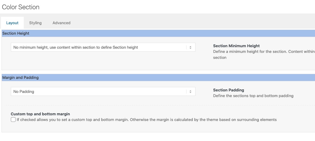
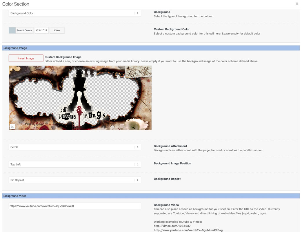
The construction of the “background” is to go over the pseudo-container :after – which inherits the background of the color-section –
the section height has to be in relation to the video aspect ratio..avia-section.not-fullsize { background-size: 0; height: 56.25vw } .not-fullsize .avia-slideshow { width: 100%; max-width: 1410px; margin: 0 auto !important; } .avia-section.not-fullsize::after { content: ""; position: absolute; top: 0; left: 0; width: 100%; height: 100%; background-image: inherit !important; background-repeat: no-repeat; z-index: 5 !important; will-change: transform; pointer-events: none; } @media only screen and (min-width: 1410px){ .avia-section.not-fullsize::after { background-size: 1410px 793px; background-position: center center; } .not-fullsize .avia-slideshow, .avia-section.not-fullsize { height: 793px !important } } @media only screen and (max-width: 1409px){ .avia-section.not-fullsize::after { background-size: 100vw 56.25vw; background-position: center center; } }see again: https://webers-testseite.de/video-behind-a-hole/
you had to adjust the value of 1410px to your needs
my test page got 1510px and a padding of 50px left right. so a normal container width of the 1/1 container would be 1410pxif the video got the 16:9 aspect-ratio
for screens >= 1410px a video-width of 1410px so the height is : 1410*9/16 = 793px
for screens <= 1409px the video-width is 100vw (100% videoscreen-width) the height is then = 56.25vwis there a link to your page where you tested this?
Think of – i’m not mod – participant as you – i do not see your private content messages.but nevertheless – i resetted one of my testpages – with enfold avia_reset button.
i emptied my child-theme functions.php – when i insert a new gallery – even make the setting of “Lightbox image description text” before inserting the images to the gallery – the lightbox shows the title. It seems that the lightbox images still take the title from the img and not from the anchor-tag. (and that is normal behavior on magnific popup titleSrc.
Again : i would have expected that there is no text in the lightbox.
_____________
@rob:
div .mfp-title { display: none !important;}
is working on that testinstall ( WP5.7/Enfold4.8.1) – and – yes you had to refresh all merging and browser cache etc. pp. if there are other caching tools too.btw. rob an error like this in your konsole : Uncaught TypeError: e.indexOf is not a function

often comes if the new jQuery 3.5.1 is confrontrated with script like$(window).load(function(){
– that is deprecated code
replace instead :$(window).on('load', function(){
.click(function() with .on('click', function()you got it in:
jQuery(window).load(function(){
	jQuery('#wrap_all a').removeAttr('title');
	jQuery('#wrap_all img').removeAttr('title');
	jQuery('.av-masonry-image-container').removeAttr('title');
});
have a look if there are other places you use the mentioned above.
-
This reply was modified 4 years, 12 months ago by
-
AuthorPosts