Forum Replies Created
-
AuthorPosts
-
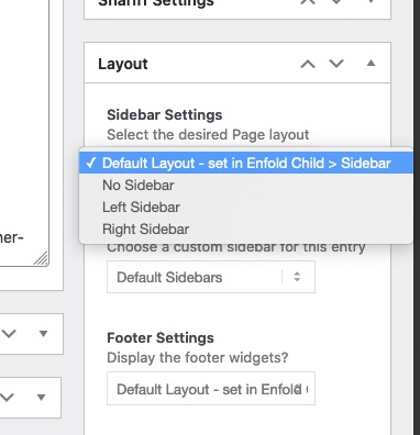
if you want it in general that there is no sidebar on single post –
goto Enfold (child) – Sidebar Settings – and then make your choice at “Sidebar on Single Post Entries”Otherwise – these are alb generated single posts – so you have the choice to set it in the editor mode of that post – on the right sidebar there is:
But it was definitely not due to my code
please show me a link to your site!
This is nothing concerning to avia-post-nav – and you misled me a bit with your hint to the functions-enfold.php.
markup:

so this must be a slider.
If it is a postslider the lines are in postslider.php lines 996ff/** * @since < 4.0 * @return string */ protected function slide_navigation_arrows() { $html = ''; $html .= "<div class='avia-slideshow-arrows avia-slideshow-controls'>"; $html .= "<a href='#prev' class='prev-slide' " . av_icon_string( 'prev_big' ) .'>' . __( 'Previous', 'avia_framework' ) . '</a>'; $html .= "<a href='#next' class='next-slide' " . av_icon_string( 'next_big' ) . '>' . __( 'Next', 'avia_framework' ) . '</a>'; $html .= '</div>'; return $html; }yes you are right – but on absense of a title the src Attribute will be read ? and that is realy strange
But my intention of having titles is for those images with light-box link.
Even the image alb element of Enfold got no titles on the link – and the lightbox bottom-bar is filled on default with the title attribute of the img.
Yes i know we can change that.
So the best thing would be – if there is a link to img – the title tag of the img should be passed to the anchor – and the lightbox then gets the caption from this title tag.here is mine: https://pastebin.com/fciSv0n7
download: https://pastebin.com/dl/fciSv0n7as mentioned above my code has that little adjustments to the calculation – the original will work too – but column-count should always be integer.
this is the folder structure:
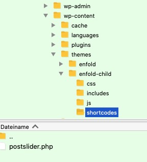
PS: do you have this little extra snippet in your child-theme functions.php – that child shortcodes overwrite parent one and are in that shortcodes folder ? i do often forget to mention that because that is one of my first shortcodes i insert on may installations.
(https://kriesi.at/documentation/enfold/intro-to-layout-builder/#add-elements-to-alb)function avia_include_shortcode_template($paths){ $template_url = get_stylesheet_directory(); array_unshift($paths, $template_url.'/shortcodes/'); return $paths; } add_filter('avia_load_shortcodes', 'avia_include_shortcode_template', 15, 1);Am besten …
as said here allready: https://kriesi.at/support/topic/modify-previous-next-code/#post-1291130
functions-enfold.php lines 635ff
and as a pluggable function ( these are indicated by
if( ! function_exists('name' ){…)
you have not to remove the parent-theme entry but you can insert an empty function in child-theme functions.php:function avia_post_nav( ){ }but test yourself first: https://kriesi.at/support/topic/modify-previous-next-code/#post-1291132
The anchors of avia-post-nav are not in the DOM !
jetzt also
On every of my installations the edit button is there. Well I think your installation of Enfold is faulty then.
Do you work with a child-theme? Then you can try to reupload enfold again.The selector for that is:
#top .avia_search_element #searchsubmit {
    background-color: red !important;
    color: #000 !important;
}
but you had to find the fault anyway
-
This reply was modified 4 years, 11 months ago by
Guenni007.
What do you like to modify?
functions-enfold.php lines 635ff
there ares some filters you can use to modify the output.but you are logged in as admin ?
click to enlarge:

if you insert on a text-block a media ( which might often happen on blog posts that are only made via the classic editor) or on text-block alb.
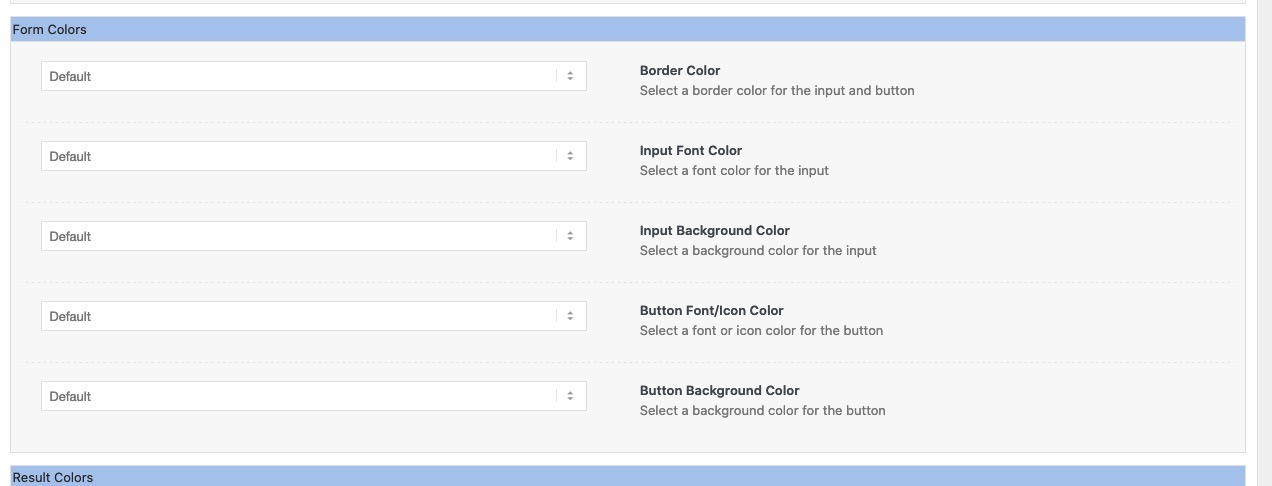
these images will have no title tag. Where does a double title tag comes from on that images ?you placed the Layout Builder Element : Search in your Layout.
Go and edit this Element – a popup arises and you have on that popup different setting options.
On Top you see four tabs :

Press the Styling Tab and scroll to “Form Colors” ! If you have toggles ( you can switch of that toggles on Enfold Options to always have opend all toggles)
open that toggle and see- the image from above : https://kriesi.at/support/topic/change-search-widget-search-button-color/#post-1290959
The last one is for “Button Background Color”
Next idea
mittels secondary_image = trueAnd you do not have on styling tab of the search alb the “form colors” – “Button Background Color”
_______________
totaly off topic :lol:
but nevertheless the calculation formula is wrong for that part$slidenumber = $entry_count / (int) $this->atts['columns']; // and should be correct: $slidenumber = (int)($entry_count / $this->atts['columns']);a slidenumber has to be integer so if items are 7 and column count is 3 – the old calculation will bring it to slidenumber of : 2,3333 ?
first devision than integer.
After that you don’t need the int() in
$slidenumber = $entry_count % $this->atts['columns'] ? ( $slidenumber + 1) : $slidenumber;
all values are integer allready ;)Pippi Longstocking: ( PS – i see in english this calculation is not present in the song – so Germans tend to be know-it-all ;) )
2 x 3 makes 4 – Widdewiddewitt – and 3 makes 9 !!! ;)the titles itself got a padding top/bottom of 15 change it to your needs:
#top .fullsize .template-blog .post-title {
    padding: 10px 0 0;
}
on nomenklatura of css – if you do not declare padding-top padding-right padding-bottom padding-left
one value ( all have the same value)
two values ( top/bottom left/right)
tree values ( top right/left bottom)
four values ( top right bottom left)PS and the entry-content-header has too a padding with big values. Change to your needs to f.e.:
.bloglist-simple .entry-content-header {
    padding: 15px 60px 0 0;
}
March 28, 2021 at 9:52 am in reply to: Show Copyright for images in Standard Editor Blog Posts #1290830well if you look to enfold functions-enfold.php you will find this on lines 2336ff
that allready exists – with little adjustments to enfold nomenklatura – and was the way enfold includes that extra field to media library.well Lustria itself has only a font-weight native of 400.
If you go and choose 500 – it will be displayed but rendered by the browser.you have a shadowed rule : maybe this is a good place to set the rule as google does only with serif fallback:
.shadowed h1 {
    font-weight: 500 !important;
    text-shadow: 2px 2px 20px #000000;
    font-family: 'Lustria', serif;
}
or:
h1, h2, h3, h4, h5, h6 { font-family: 'Lustria', serif !important; font-weight: 400; }the title tag was not supported by WordPress anymore.
that was a surprise for me too. But if you look in (not enfold !- wordpress) wordpress / wp-admin / includes / ajax-actions.php line: 3251:$title = ''; // We no longer insert title tags into <img> tags, as they are redundant.i discussed it with Günter to get back the attachment title to the images inserted via “Add Media” in text-block : https://kriesi.at/support/topic/images-with-link/
we/he found a way to newly inserted images via an existing filter – but allready inserted Images are not touched by this.:
https://kriesi.at/documentation/enfold/image/#add-title-attribute-to-new-inserted-image-via-add-media-buttonwas mich halt wundert, ist dass ich garnichts einsetze, und es ist das erste (früheste) bild in der Media-Library dann als hintergrund festgelegt.
i too can not see the reason for it
on the code i do not see any setting for screen element visibility. As you can set on Advanced Tab of the testimonial element itself.
But i do see your testimonial on an iphone 8
maybe it is on your end a caching problem – go to your iphone settings – safari and empty the browser cache.by the way : can you have a look on your testimonials if you set up this to your quick css:
(you had to download the “3d shadow” from my server – and change the url in the css – but for first test it will work ).av-large-testimonial-slider .avia-testimonial_inner { background-color: #ecf6ff; display: inline-table; padding: 40px; border: 1px solid #aaa; position: relative; box-shadow: 0 3px 10px -8px #333; -webkit-transform: skew(-3deg); transform: skew(-3deg); } .av-large-testimonial-slider .avia-testimonial_inner::before { content: "\e833"; font-family: entypo-fontello; font-size: 70px; position: absolute; top: -15px; left: 15px; -webkit-filter: drop-shadow(2px 2px 3px #666); filter: drop-shadow(2px 2px 3px #666); color: #3579b4 } .av-large-testimonial-slider .avia-testimonial_inner::after { content: " "; background-image: url("https://webers-testseite.de/wp-content/uploads/testimonial-shadow.png"); background-repeat: no-repeat; width: calc(100% + 60px); height: 100%; position: absolute; left: 0; top: 0; background-position: bottom right; overflow: visible !important; background-size: 60px; opacity: 0.3; } #top .av-large-testimonial-slider .avia-slideshow-arrows a { margin-top: 50px !important; } .responsive #top .av-large-testimonial-slider.avia-testimonial-wrapper .avia-testimonial { padding: 0px 10px; } .responsive #top .avia-slideshow-controls a { display: block; } .avia-slideshow-arrows a { overflow: visible !important; text-indent: -5000px !important } .avia-slideshow-arrows a.prev-slide::before { left: -110px; } .avia-slideshow-arrows a.next-slide::before { left: 80px; }March 27, 2021 at 7:52 am in reply to: New Footer Widget – Full length on the bottom of every page #1290701well you can do it this way in quick css:
.page-id-25 #footer {display: none}but it is better if you avoid generation on your page with id 25:
add_action('ava_before_footer','avia_footer_top_column');
function avia_footer_top_column(){
	if(!is_page(25)){
		ob_start();
		dynamic_sidebar( 'footertop' );
		$footertop = ob_get_clean();

		$output  = "<div class='container_wrap footer_color' id='footertop'>";
		$output .= "<div class='container'>";
		$output .= $footertop;
		$output .= "</div>";
		$output .= "</div>";
		echo $output;
	}
}
if you got more than one exclude an array:
if(!is_page(array( 25, 29, 102))){the exclamation mark is a logical “not” – if it is not page with id=25 do …
replace this line ( it is deprecated in jQuery 3.5.1)
jQuery(window).load(function(){with that line:
jQuery(window).on('load', function(){and if you got a click event on your child-theme function.php
replace it in the same way with// old: .click(function () { // new: .on('click', function() {take this for the first try:
<div id="timeline"> <div class="timeline-block"> <div class="timeline-date"> <h3><em>Text</em> Date <em> after Date </em></h3> </div> <div class="timeline-content"> <h3>Title</h3> <p>Text-block</p> </div> </div> <div class="timeline-block"> <div class="timeline-date"> <h3><em>Text</em> Date <em> after Date </em></h3> </div> <div class="timeline-content"> <h3>Title</h3> <p>Text-block</p> </div> </div> <div class="timeline-block"> <div class="timeline-date"> <h3><em>Text</em> Date <em> after Date </em></h3> </div> <div class="timeline-content"> <h3>Title</h3> <p>Text-block</p> </div> </div> <div class="timeline-block"> <div class="timeline-date"> <h3><em>Text</em> Date <em> after Date </em></h3> </div> <div class="timeline-content"> <h3>Title</h3> <p>Text-block</p> </div> </div> <div class="timeline-block"> <div class="timeline-date"> <h3><em>Text</em> Date <em> after Date </em></h3> </div> <div class="timeline-content"> <h3>Title</h3> <p>Text-block</p> </div> </div> </div>sorry – remove those comments which are not suitable for html
PS this is the right way for comments in html docs:
<!-- this is a comment in a html doc --><div id="timeline"> <div class="timeline-block"> <div class="timeline-date"> <h3><em>Text</em> Date <em> after Date </em></h3> </div> <div class="timeline-content"> <h3>Title</h3> <p>Text-block</p> </div> </div> </div>and this is the part that is duplicated for each timeline item:
<div class="timeline-block">
        <div class="timeline-date">
          <h3><em>Text</em> Date <em> after Date </em></h3>
        </div>
        <div class="timeline-content">
            <h3>Title</h3>
            <p>Text-block</p>
        </div>
</div>
surrounded only by one :
<div id="timeline"> … here comes the timeline-items( once , twice, etc. pp.) </div>i do not see private message content – i’m participant as you are.
there are ways with jQuery to get a timeline ALB to something like this – but – that is too complicated i think:
the code above is clear enough – and pure html – and very fast to add a lot of timeline-blocks
better you forgot the next !!!child-theme functions.php:
function timeline_reconstruction(){
?>
<script>
(function($) {
	$('.av-milestone-date').each( function() {
	     var mstoneDate = $(this).html();
	     $(this).find('.av-milestone-indicator').html('<div class="sign"></div>');
	     $(this).siblings('.av-milestone-icon-wrap').html(mstoneDate);
	     $(this).css('opacity', '0');
	});
})(jQuery);
</script>
<?php
}
add_action('wp_footer', 'timeline_reconstruction');
.av-milestone-indicator { position: absolute; content: ""; top: 100px; left: 0; width: 100%; height: 100%; background-image: url(/wp-content/uploads/a-nice.svg); background-repeat: no-repeat; } .av-milestone-icon-wrap strong { font-size: 24px }and you may have this only for the non responsive case in a media query with min-width.
h- hhh – clears throat – and why not cloneing ? ;)
put a codeblock element in a column (1/1)
and insert that html pasted from that page:<div id="timeline"> <!-- opening tag of the timeline --> <!-- So this is the always the same block --> <div class="timeline-block"> <div class="timeline-date"> <h3><em>Text</em> Date <em> after Date </em></h3> </div> <div class="timeline-content"> <h3>Title</h3> <p>Text-block</p> </div> </div> <!-- End of timeline item --> </div> <!-- Closing tag of the whole timeline -->quick css for that:
#timeline { margin: 30px 30px 80px; position:relative } #timeline .timeline-block { width:100%; float:left; position:relative } #timeline .timeline-block:before { content:''; position:absolute; top:0; left:15%; height:100%; width:1px; background:#433322; margin-left:-1px; z-index:-1 } #timeline .timeline-date { float:left; text-align:center; width:30%; height:100%; background:url('/wp-content/uploads/separator-2.svg') no-repeat #f5ede2; background-position:center bottom 10px; background-size:auto 10px; padding:10px 0 30px 0; margin-top:5px } #timeline .timeline-date h3 { margin:0 } #timeline .timeline-date h3 em { font-style:normal; font-size:1.2rem; display:block } #timeline .timeline-content { width:70%; float:right; position:relative; padding:20px 0 80px 0; box-sizing:border-box } #timeline .timeline-content:last-child { padding-bottom:0 } #timeline .timeline-content h3 { text-align:left } @media only screen and (min-width:960px) { #timeline .timeline-block { width:58.8%; float:right } #timeline .timeline-block:nth-child(even) { float:left } #timeline .timeline-block:nth-child(even):before { left:auto; right:15%; margin-left:0; margin-right:-1px } #timeline .timeline-block:nth-child(even) .timeline-date { float:right } #timeline .timeline-block:nth-child(even) .timeline-content { float:left } #timeline .timeline-block:nth-child(even) .timeline-content, #timeline .timeline-block:nth-child(even) .timeline-content h3 { text-align:right } } -
This reply was modified 4 years, 11 months ago by
-
AuthorPosts
