Forum Replies Created
-
AuthorPosts
-
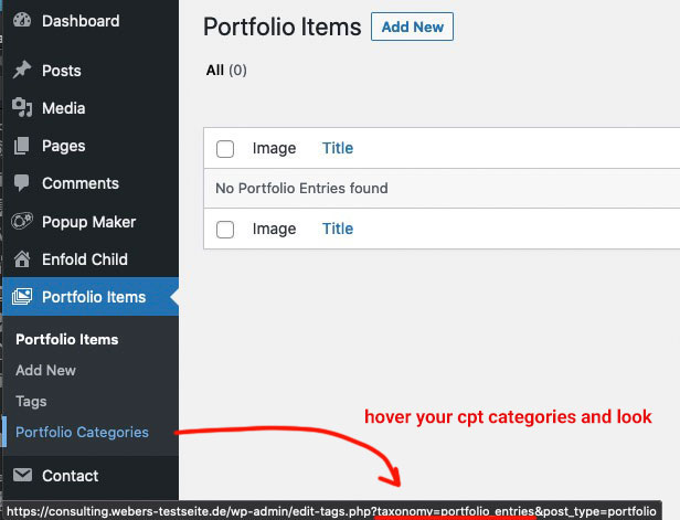
That was exactly what I suspected, that you had not correctly determined the taxonomy of your CPT, hence why I wrote: if it is as you suspect: publication_post.
on post-type : portfolio it is portfolio_entrieswhen you hover on dashboard your CPT “Categories” what is shown on your browser for taxonomie as you can see here by portfolio:
this is the analogon in your code above – if it is as you suspect: publication_post
try:function avf_change_which_archive($output){ $term = get_term_by( 'slug', get_query_var( 'term' ), get_query_var( 'taxonomy' ) ); if(is_tax('publication_post')){ $output = __('Search for:','avia_framework')." ".$term->name; } else { $output = __('Archive for:','avia_framework')." ".$term->name; } return $output; } add_filter('avf_which_archive_output','avf_change_which_archive', 10, 3);Da gibt es für mich einige Unstimmigkeiten in deinem Quellcode – warum gibt es ein bootstrap.css ?
irgendwo wird für mfp-wrap oder das img in der Lightbox auf eine immense Höhe gesetzt, die wesentlich größer ist als es normalerweise im magnific Popup passiert. Leider kann ich dir nicht mehr sagen. Eventuell ein eigenes magnific popup script?Till a solution is found you can place the publishing date manually to your popups as:
<span class="date-published">xx.xx.2021</span>The date will than be inserted automatically to your list.
See here : https://wordpress.org/support/topic/echo-get_the_date-in-popup-window/
Now let’s check the feasibility first, and then do the styling.
if you takte this as shortcode :function shortcode_for_publishing_date_of_posts(){ return get_the_date( 'd.m.Y', get_the_ID($post->ID) ); } add_shortcode( 'post_published', 'shortcode_for_publishing_date_of_posts' );but it is alway the publishing date of the page where the popup is placed
but there must be a possibility, because when I look at a blog page from Enfold, there is also the publishing time of the single blog page displayed and not that of the blog page.
I hope a mod can answer this question, because I have to take care of my business now.i started a question on support forum of pum
i do not know why the code ( get_the_date) does not take the publishing date of the popup but only from the page where it is opened.
but i guess that this is not the publishing date of the pupup – but the date of the page where it is placed.
i do not know ( for now ) how to change that. Still brainstormingnow try this in your child-theme functions.php:
function show_date_of_popup(){
?>
<script type="text/javascript">
(function($) {
	$(document).ready(function(){
		$('.pum-trigger').each(function() {
			var pumPopup = $('.pum').css('display');
			var trigger_name = $(this).attr('class').split(' ')[0];
			var publishingDate = $(this).closest('#top').find('#'+trigger_name+' .date-published').text();
			var date_published = $('<span class="puplished">'+publishingDate+'</span>');
			$(this).append(date_published);
		});
	});
})(jQuery);
</script>
<?php
}
add_action('wp_footer', 'show_date_of_popup', 9999);
i can not see if the container of the pum-trigger will grow if the span is inserted.
after that we had to find the right cssPS : don’t know why your extra class is at the beginning – on my test installation it is after pum-trigger
try:
.pum-trigger {
  display: grid;
}
.pum-trigger .puplished {
    position: relative;
    padding: 3px 0 0;
    text-align: right;
}
PPS: can you change one publishing date of the popup to a different one.
and place that function on your child theme functions.php after the shortcode function of the datesee here from a demo page of popupmaker:
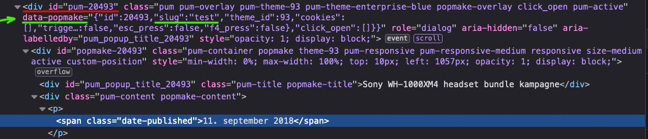
What I don’t understand is why the standard trigger classes are no longer available. Normally a trigger on PUM is defined as class eg: popmake-2023 the opening popup has then the ID: pum-2023 ; this would be much easier to select than via a slug that hides in a data-attribute.
yes but – now we have in the popup the correct date.
The trigger of the popup is correlated to a class give to the trigger-class in additon:
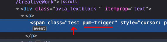
this “test” class ( on the others you gave 1,2,3 etc.) corresponds to a very complicated construct of that plugin as data attribute with slug:
we had now to find a way in an each function over all classes to find the publishing date in the corresponding popup and insert it the way above
by prepend.The difficulty is to find the right selectors and to have a each function over all additional classes on those div.pum-trigger
PS : and remove that code from above to insert the date of today
now the popups do not work.
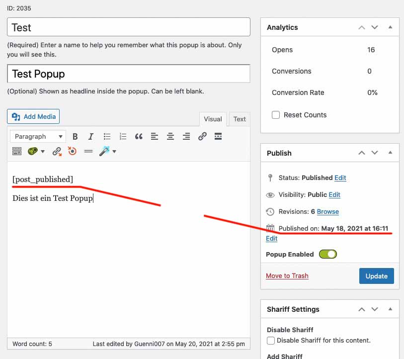
To be precise : put in that image from above:

under “Hej alle”
the shortcode :<span class="date-published">[post_published]</span>What might be usefull is if on your popup the publishing date is noted ( you can set it to display: none if you like ) but it has to be in the DOM.
if you add this to your child-theme functions.phpfunction shortcode_for_publishing_date_of_posts(){ return get_the_date(); } add_shortcode( 'post_published', 'shortcode_for_publishing_date_of_posts' );you can insert this shortcode to the post ( your popups ) by :
<span class="date-published">[post_published]</span>now you will have on your popups the publishing date.
now i can see that there are classes given to the trigger : 1, 2, 3 etc. if i click the p tag with class 1 – the popup with a given data-popmake with slug=1 will open.
i will have a look if i can use that! – but it is first a manual insertion with that shortcode above. – If you do not want to do that – i see no chance to get it.
so can you do that on f.e. the first “Sony WH-1000XM4 headset bundle kampagne ” where there is now “10. marts 2021” with that shortcode – after that i can try on developer settings if my selectors will work.
Guess the same thing here:
( click to enlarge: )

@Sclark91 – his logo is a svg-logo – that is the point. If you see his edited logo now here : https://webers-testseite.de/Pioneer-Final-Logos_RGB-Green-03.svg and pull the screen height to smaller sizes – you see that it is shrinking to the left side of the screen. On default a svg does that center center.
The trick is to add this to the “head” section of the svg:preserveAspectRatio="xMinYMid meet"
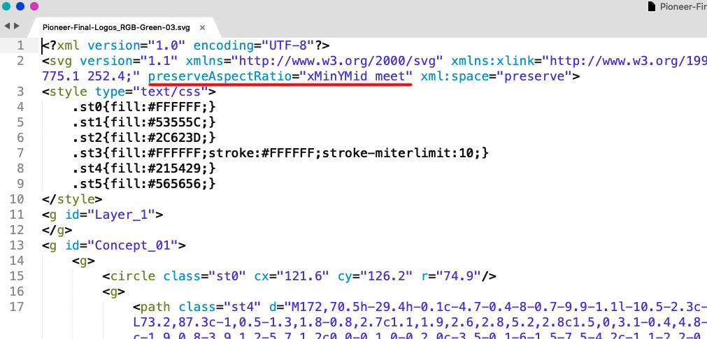
@cloaker : your logo is a svg file too – you can influence the shrink behavior by adding some code to the svg itself. See above
Open in a good text-editor ( mac f.e. Sublime Text on win: notepad++) your logo. You will see on top a similar code.
Insert on that place ( with space between the surrounded code ) :preserveAspectRatio="xMinYMid meet"
xMinYMid means that on horizontal align it is minimized to the left – and vertical align it is centered
( pay attention the x is small letter – Y is with big letters )PS: good text-editors do not insert or add meta infos to the texts. They do what they had to do and nothing else. ( in oposite to word ;) )
PPS: then you can forget about the negative margins – get rid of all that stuff – and see if there might be small adjustments – e.g. if your svg has a lot of space around the path in it.
PPPS: :) if your svg is generated in Illustrator : i do change the default classes to something else – because if you got more than one svg on that page and refill a path by its class – all .st1 etc. pp will be influenced. So to stay unique i do change it to something meaningfull. and different to “st” nomenklatura.
I will now try to explain it again.
When I click a link, I usually see a link target inside the DOM. I can follow this link target and try to find something there, which gives me the possibility to find out the publication date of the entry.
It already starts with the fact that I don’t even see which popup it will open with the popup maker.
There is no hint for it in the DOM.
So this is now going to curb even my enthusiasm to read into the plugin/script to offer you a solution. Here ends now my support for you for this request.
Sorryif that date isn’t listed in the DOM – from where should i take the info?
Now there is only one popup opening.I did the same on the text block next to (a-j)
where do i see that – what is a-j
show it with screenshots where to find what you mentioned – show me in the DOM where to find that “publishing date”read here an interesting article: https://css-tricks.com/how-do-you-do-max-font-size-in-css/
maybe you can use on quick css :
#top #wrap_all .main_color h1, #top #wrap_all .alternate_color h1 {
    font-size: min(max(36px, 10vw), 80px);
    line-height: 1.2em;
    font-weight: 900;
    text-transform: uppercase;
    hyphens: auto;
}
min(max(36px, 10vw), 80px);means max font-size is 80px – ( it starts shrinking when 80px is the 1/10 of the screen width (800px) )
if you got 5vw ( it starts shrinking when the 80px is 1/20 of the screen width ( it is 1600px )
36px is the min font-sizethe popup has a date and for the first popup it is 10. marts 2021 and that should be the date on the box?
Where is the info of which popup has to be opend? – Now it is always the same popup ! ?
When you have layouted it completely – that will be the time to discuss how to obtain that.
That should be possible because the popups are allready in the DOM.Test this on your site – if it is what you like to have:
(in child-theme functions.php)function open_popup_and_show_date(){ ?> <script type="text/javascript"> (function($) { $(document).ready(function(){ $('.pum-trigger').one('click', function(){ var today = new Date(); var dd = ("0" + today.getDate()).substr(-2); var mm = today.getMonth()+1; var monthNames = ["Januar", "Februar", "März", "April", "Mai", "Juni","Juli", "August", "September", "Oktober", "November", "Dezember"]; var MM = monthNames[mm-1]; var yyyy = today.getFullYear(); var hour = today.getHours(); var minutes = ("0" + today.getMinutes()).substr(-2); var seconds = ("0" + today.getSeconds()).substr(-2); var now = dd + ". " + MM + " " + yyyy+ " — "; $(this).prepend(now); }); }); })(jQuery); </script> <?php } add_action('wp_footer', 'open_popup_and_show_date');You still need to replace the month names with the equivalents in your local language
on var now you can insert like on my testpage the timeyou see in the code there is only a :
.one('click',is only will do that once – another click will do nothing on the same linkif you got this structure:
<span class="test pum-trigger" style="cursor: pointer;"><span class="lastClick"></span>Telmore gennemfører en prisændring på kunder</span>
we can have everytime you click a newly inserted date ( – but that would only be important if you got time in that date too )See here some Info on date and javascript: https://www.w3schools.com/jsref/jsref_obj_date.asp
you mean this date in the box:

if the lightbox is opend – the date in the box should be inserted of the current date.
So if you see my – test page click on the button- a lightbox is opend – and the current date is shown under the button in the box.
you don’t want to have the date in the lightbox added but in the source box where the link is clicked?no – i’m participant as you so no private content for me – and with the other subject I did not mark them down. – Sorry
is it something like this:
https://webers-testseite.de/iconbox-with-popup/Show me the page it concerns
na dann geb ich mal meinen Senf dazu: zunächst hast du ja die aktuellen Versionen : warum hast du dann jQuery Migrate noch aktiv?
Welche php Version hast du für die Seite bei deinem Provider gewählt?
Für mich hören sich dort einige Fehler dananch an, dass eventuell plugins nicht aktuell sind und mit jQuery 3.5.1 nicht kompatibel sind.Hast du Einträge in der child-theme functions.php ? – Wenn ja – schau bitte ob dort benutzt wird:
$(window).load(function () {
oder
.click(function(){beides muss ersetzt werden, da nicht mehr gülitig in jQuery 3.5.1
$(window).on("load", function () {
und
.on("click", function (){PS:
Die einzige Fehlermeldung die hier in den Developer tools noch angezeigt wird ist die mit den entypo-fontello schriften.Eventeull ersetzt du mal komplett den enfold Ordner via ftp. wie zB hier beschrieben: https://kriesi.at/support/topic/some-hints-and-advice-to-update-enfold/#post-1056107
nächste Idee: hast du in der htaccess Datei eventuell Extra Security Headers gesetzt?
ich habe zB auch teilweise Content-Security-Policy einträge. Dort muss man ganz schön aufpassen keine Quellen zu blockieren, die man benötigt für die Seite. Poste doch mal den Inhalt der htaccess datei.( bitte nutze den code tag beim einsetzen)well – that happens occasionally – but it must have taken a mod to make you believe it. ;)
Or – by the way : you can use a filter to redefine the source for those images
you can do that box wise:
f.e. these widgets will use instead the square images ( 180px x 180px )function my_avf_newsbox_image_size( $image_size, array $args, array $instance ){ if( $args['widget_id'] == ( 'portfoliobox-3' || 'newsbox-2' || 'newsbox-4' ) ){ $image_size = 'square'; } return $image_size; } add_filter( 'avf_newsbox_image_size', 'my_avf_newsbox_image_size', 10, 3 );May 11, 2021 at 9:21 am in reply to: 4 column portfolio grid displays as 3 columns on large monitor (27 inch) #1299605the only rule i see in your css that has a large min-width setting is:
@media only screen and (min-width:1800px) {
	.responsive.html_stretched .av-masonry-col-flexible .av-masonry-entry,
	.responsive.html_av-framed-box .av-masonry-col-flexible .av-masonry-entry {
		width: 16.6%
	}
	.responsive.html_stretched .av-masonry-col-flexible .av-masonry-entry.av-landscape-img,
	.responsive.html_av-framed-box .av-masonry-col-flexible .av-masonry-entry.av-landscape-img {
		width: 33.2%
	}
}
but that does not influence your cottages page.
i always have on your cottages page on larger screens a 4 column layout – and only under 990px it is a 3 column layout.May 10, 2021 at 6:46 pm in reply to: Hide header when scrolling down, show when scrolling up #1299476if you like to have that only in dependency of the scroll direction – Mikes Demo will do the job ( only some responsive adjustments had to be done )
May 10, 2021 at 2:12 pm in reply to: Hide header when scrolling down, show when scrolling up #1299368may i see your site?
____________
if you have a shrinking header – and an overlapping logo – you can use these two classes added on the header id. ( header-scrolled and header-scrolled-full)
See for example that page here: https://webers-testseite.de/header-im-off/
My header is set to a custom height of 140px – the relative height of the logo is the guarantee that the logo will follow the shrink amount.
my logo on that page is set to :#top.page-id-39906 .logo a { max-height: 210px !important; height: 150%; } #top.page-id-39906 .logo, #top.page-id-39906 .logo a { overflow: visible; }so it is overlapping the header with 50% of its height
on normal shrink factor of 1/2 the logo will end on a height of 105px – my header_meta is set to scroll away – that will cause a margin-top of -33.5px
when this point is reached the class : header-scrolled-full is added.
From now on the header had to get a margin of 105+33.5 = 138.5px – so my solution is:#top.page-id-39906 #header.header-scrolled-full { margin-top: -138.5px !important; transition: margin-top 1s ease; } #top.page-id-39906 #header.header-scrolled { transition: margin-top 1s ease !important; }Please report what it actually was, because I already mentioned all the usual suspects above.
-
AuthorPosts