Forum Replies Created
-
AuthorPosts
-
and you definitly have a fontello icon set ? – and that has the new icons for your new definitions.
( the standard enfold fontello set is: entypo-fontello )Did you place it in your functions.php on the right place? right before that
line 844 :require_once( 'functions-enfold.php');Did you refresh all cachings – refresh the merging of Enfold on Performance Settings ?
you have still some rules concerning to padding-top of #main in your css set to !important
you got this rule in your css:
@media only screen and (min-width: 787px) {
	#header_meta { display: none !important; }
	.html_header_top.html_header_sticky #top #wrap_all #main {
	    padding-top: 170px !important;
	}
}
the rule of a blank page layout :
#top.avia-blank #wrap_all #main {
    padding-top: 0 !important;
    margin: 0;
}
comparing the selectors – the first has one class more than the second – so it will win the game ;)
is the first rule a custom rule in your quick css ?you can overwrite that rule by:
.html_header_top #top.avia-blank #wrap_all #main {
    padding-top: 0 !important;
    margin: 0;
}
BUT
The first rule is an enfold rule but not set to !important on default.
is there any reason to set it this way?But now you have decided to have the stretched Layout:
_____
Yes – you have to think about that, and it happens even with experienced users.
So my recommendation: as long as you are still working on the site, trying out different stylings and css settings, turn off all caching you have influence on. So the merging of the css and js files in Enfold and also turn off caching plugins. The browser cache can be hard refreshed relatively quickly with key combinations depending on the browser.
As soon as this phase is finished, you can take care of the performance.PS: Any image larger than 2560px will be scaled by wordpress during upload and saved as original with the name xyz-scaled.jpg.
So in order not to inflate your upload unnecessarily, you should not upload images larger than 2560px.
And you should choose a higher compression rate in your graphics program when saving.
Unfortunately, the Enfold calculated image formats have no more compression, so it can happen that the original file has less filesize than the 1500px image from Enfold.There are only a few images ( monochrome gradients – like sunsets or skin tones )where it could really be noticeable.
But you gain quite a bit in performance. It is of little use if your pictures look sharp and beautiful, but take 10s to load. Then the viewers of the pictures are already gone.There are some snippets to avoid that and define a compression rate for those recalculated Images on upload.
This snippet in your child-theme functions.php set the compression rate to 55 ( instead of 100 : no compression )add_filter("avf_jpeg_quality", "avf_set_quality_mod", 9999, 1); add_filter("avf_wp_editor_set_quality", "avf_set_quality_mod", 9999, 1); function avf_set_quality_mod($quality) { $quality = 55; return $quality;}give this a chance ( remove the other code ):
html.html_av-framed-box { padding-top: 0 !important; } .av-frame.av-frame-top.av-frame-vert { height: 0 !important; }remove all css rules trying to get rid of the headers of that page. The mentioned template will do the job and will think of the right padding for #main
a page popup is done easily by the page link followed by ?iframe=true
f.e.: see here a demo page : https://webers-testseite.de/my-website/
on the right button i have inserted as link :https://webers-testseite.de/under-construction?iframe=true
that is my “Maintenance Mode” Page
Left is an external page of mine.we can surround the weekday by some html with a class. Those extra letters had to be escaped.
Replace the whole code with:
function add_date_time_popup_content( $content ) {
	if ( ! function_exists( 'pum_get_popup_id' ) ) return;
	$popup_id = pum_get_popup_id();
	return "<p class='date-published'>" . get_the_date( '\<\s\p\a\n \c\l\a\s\s\=\"\w\e\e\k\d\a\y\"\> l \<\/\s\p\a\n\> \d. d.m.Y' , $popup_id ) . "</p>" . $content  ;
}
add_filter( 'pum_popup_content', 'add_date_time_popup_content' );

function show_date_of_popup(){
?>
<script type="text/javascript">
(function($) {
	$(document).ready(function(){
		$('.pum-trigger').each(function() {
			var pumPopup = $('.pum').css('display');
			var trigger_name = $(this).attr('class').split(' ')[0];
			var publishingDate = $(this).closest('#top').find('#'+trigger_name+' .date-published').html();
			var date_published = $('<span class="puplished">'+publishingDate+'</span>');
			$(this).append(date_published);
		});
	});
})(jQuery);
</script>
<?php
}
add_action('wp_footer', 'show_date_of_popup', 9999);
and put this to quick css:
.puplished .weekday, .date-published .weekday { text-transform: capitalize; }But this does not belong to the code i gave to you.
What do you see if you go to dashboard – general – Date Format : if you choose custom and put in : l \d. d.m.Y on preview:
________
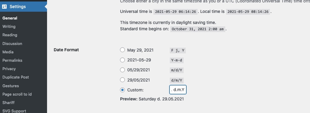
you see here that the normal format is for Weekday a capitalized result.
btw: you don’t want all letters uppercase – just the first one?EDIT: sorry didn’t see that you like to have that as popup – so read the next Answer
___________________
But if your visitors want to navigate further on your page – how do you want to offer that?you can place a button for instance that will go back in browser history – just place a button and give a custum-class to it: goback
this to child-theme functions.php:function go_back_button(){ ?> <script type = "text/javascript"> (function($){ $('.goback').on('click', function(e){ e.preventDefault(); window.history.back(); }); })(jQuery); </script> <?php } add_action( 'wp_footer', 'go_back_button' );You do not think about the padding-top of #main caused by a header calculation height.
But:The solution is actually very simple, by not selecting the default template, but “Blank – no header no footer”.
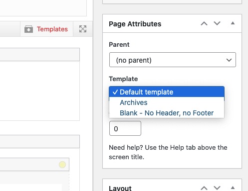
You open the editor for this page and right at the meta boxes you see Template.if you like to have some binding words in that date do it this way:
The backslash will show the code that it does not stand for the day but to have text here'l \d. d.m.Y'But think of – you want the publishing date of the popup to show – i can see now different manual dates on that:
https://kriesi.at/support/topic/date-appearance-in-text-box/page/2/#post-1301398
first you told me it is too long!
Replace the part of the function above:
function add_date_time_popup_content( $content ) {
	if ( ! function_exists( 'pum_get_popup_id' ) ) return;
	$popup_id = pum_get_popup_id();
	return "<p class='date-published'>" . get_the_date( 'l, d.m.Y' , $popup_id ) . "</p>" . $content  ;
}
add_filter( 'pum_popup_content', 'add_date_time_popup_content' );
that part: ‘l, d.m.Y’ is responsible for it:
see here foramting options: https://wordpress.org/support/article/formatting-date-and-time/-
This reply was modified 4 years, 9 months ago by
Guenni007.
ok – you got it now
But – now you have to remove in your popups the shortcode :<span class="date-published">[post_published]</span>if you do not want to show the published date in the popups content – you can hide it there.
or you can shift it to the bottom of the popup content.this in the code above
var trigger_name = $(this).attr('class').split(' ')[0]will search for the classes – split the class list on spaces and will take the first class ( it starts at 0 )
this is what i got on the test:
( click to enlarge )

i got the id at the second position !
on your triggers : you have the classes ( f.e.)
popmake-21659 pum-triggeron my testinstallation i would have:
pum-trigger popmake-21659we need that popmake-21659
so just replace the whole code by:
// this is now the code to insert the popup publishing date - // all credits goes to a guy that helped me from wp-popupmaker : Mark Chaves ! function add_date_time_popup_content( $content ) { if ( ! function_exists( 'pum_get_popup_id' ) ) return; $popup_id = pum_get_popup_id(); return "<p class='date-published'>" . get_the_date( 'd.m.Y' , $popup_id ) . "</p>" . $content ; } add_filter( 'pum_popup_content', 'add_date_time_popup_content' ); //----------------- // this is the known script function show_date_of_popup(){ ?> <script type="text/javascript"> (function($) { $(document).ready(function(){ $('.pum-trigger').each(function() { var pumPopup = $('.pum').css('display'); var trigger_name = $(this).attr('class').split(' ')[0]; var publishingDate = $(this).closest('#top').find('#'+trigger_name+' .date-published').text(); var date_published = $('<span class="puplished">'+publishingDate+'</span>'); $(this).append(date_published); }); }); })(jQuery); </script> <?php } add_action('wp_footer', 'show_date_of_popup', 9999);yes sorry – on my testinstallation i have first the pum-trigger class than the id
so i corrected the second code to split on [0]
(var trigger_name = $(this).attr('class').split(' ')[0];this is different to my installation – you had to take the first part of the class list )replace it
hi Telmore – have a look at https://kriesi.at/support/topic/date-appearance-in-text-box/page/2/#post-1302576 – it works
here is the solution to it:
remove the shortcode function so that you only have on child-theme functions.php:
// this is now the code to insert the popup publishing date - // all credits goes to a guy that helped me from wp-popupmaker : Mark Chaves ! function add_date_time_popup_content( $content ) { if ( ! function_exists( 'pum_get_popup_id' ) ) return; $popup_id = pum_get_popup_id(); return "<p class='date-published'>" . get_the_date( 'd.m.Y' , $popup_id ) . "</p>" . $content ; } add_filter( 'pum_popup_content', 'add_date_time_popup_content' ); //----------------- // this is the known script function show_date_of_popup(){ ?> <script type="text/javascript"> (function($) { $(document).ready(function(){ $('.pum-trigger').each(function() { var pumPopup = $('.pum').css('display'); var trigger_name = $(this).attr('class').split(' ')[0]; var publishingDate = $(this).closest('#top').find('#'+trigger_name+' .date-published').text(); var date_published = $('<span class="puplished">'+publishingDate+'</span>'); $(this).append(date_published); }); }); })(jQuery); </script> <?php } add_action('wp_footer', 'show_date_of_popup', 9999);here are some other overlapping samples:
https://webers-testseite.de/overlapping/
or https://webers-testseite.de/overlap-to-followed-section/you see here too – that you can even use the animation of enfold for those overlapping columns.
here is a layout made for another participant : https://webers-testseite.de/steviger/
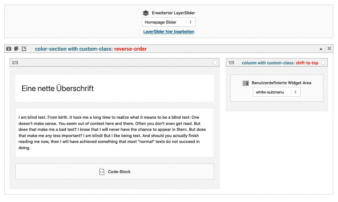
The Reverse Order is only to have the second column ( with that navigation in it ) on top in responsive case.
die einfachste Methode funktioniert auch : im Backend – deaktivieren
das bootstrap scheint über dein Mobile.de zu kommen. Sollte es daran liegen, musst du wahrscheinlich dann die “Krücke” verwenden.
Denn darauf wirst du ja nicht verzichten können.Eine andere Idee noch: wo lädst du das jQuery ; bei Enfold gibt es ja unter Leistung die Einstellung es im Footer zu laden, was zwar eventuell die Ladezeit einer Seite verringert, aber auch zu Problemen führen kann wenn die Reihenfolgen dann nicht eingehalten werden.
Versuch doch mal das jQuery im Header zu laden.it correlates with scroll speed – so no animation / transition speed here.
Slower scrolling is the solutionor if you like this – maybe it is a satisfiing solution for you:
#top #header, #top .av-logo-container , #top #header .av-main-nav > li > a, .logo a, .logo a img { transition: all 3s ease !important; }you can find here some solutions on that. https://kriesi.at/support/topic/bulleted-list-dots-quick-css/
I could of course give more precise advice with a link to the appropriate page.Different Approach
Wenn wir die Pfeile innerhalb des content containers setzen laufen Sie ja mit der Verschiebung.
Dazu müsstest du dies hier in die child-theme functions.php setzen:function popup_arrows_change() { ?> <script type="text/javascript"> (function($){ $(window).on('load', function(){ $('.av-masonry-entry.lightbox-added').magnificPopup({ type: 'image', mainClass: 'avia-popup mfp-zoom-in mfp-image-loaded', closeOnContentClick: false, midClick: true, gallery: { enabled: true }, callbacks: { buildControls: function() { // re-appends controls inside the main container this.arrowLeft.appendTo(this.contentContainer); this.arrowRight.appendTo(this.contentContainer); }, }, }); }); })(jQuery); </script> <?php } add_action('wp_footer', 'popup_arrows_change');und das ins quick css:
.mfp-arrow {
  margin: 0 -90px;
  margin-top: -55px;
}

.mfp-arrow:active {
    margin-top: -55px;
}
ABER: Wichtiger – richtiger wäre den Fehler zu finden.
Eventuell musst du die Einstellungen noch auf !important setzen, wenn es nicht auch so funktioniert:
Leider ist das nicht responsive – da absolute Werte. Das ist ja das geniale vorher , dass es die Teile auf die Hälfte der errechnenten Höhen setzt.
Nur sind diese bei dir viel zu hoch – ein script oder ein Script eines Plugins wird das wohl veranlassen.
Hast du probiert die Plugins so wie oben beschrieben auszutesten?.mfp-arrow { top: 350px; margin-top: 0; } .mfp-arrow:active { margin-top: 0; }welche Header Variante hast du gewählt?
bei normalen Header ( Logo im Kopfzeilenbereich – unter Enfold – Allgemeines Layout – “Logo und Hauptmenü” ) – sind die ausgeblendet:.avia-menu-subtext { display:none; }wenn du die auf display : block setzt, werden sie angezeigt. – Die musst du dann nur noch stylen, denn viel platz ist ja nicht da.
Ist aber bei z.B. einem shrinking header nicht trivial !Das ist eigentlich so wie Rikard oben schon anmerkte mit dem Link – nur bei “Sidebar links oder rechts” gedacht
Wenn ihr im Dashboard – Menüs seid, dann ist ganz oben am Fenster ein Flyout Menu zu finden Der Button heißt: “Ansicht anpassen” den mal bitte drücken.
In dem flyout dann wählen, was angezeigt werden soll.
Hier findet sich auch “Beschreibung” und die CSS Klassen für einzelne Menupunkte
-
This reply was modified 4 years, 10 months ago by
Please switch off the merging of the js and css files anyway, then it will be easier for us to find the possible errors in the css.
Enfold (Child) – Leistung – “…Datei-Zusammenführung und -Komprimierung”
yes – there is just this calculation to determine the middle of the height. And these heights that are calculated are much too high on your lightboxes.
You could now set the position to top to make it temporarily visible.My assumption is therefore that a plugin is involved here.
Therefore, I would first test now: Turn off all plugins and also turn off the merging. Then check if the lightbox works.
If yes – activate the plugins again step by step, and check each time when this miscalculation takes place. Possibly then the causer shows up.Or: What I also noticed is that you have all the latest versions, but still have jQuery Migrate enabled. Try turning that off. ( in the options of Enfold – Performance).
If we don’t find a solution with this, you can temporarily make this setting in Quick css:
.mfp-content { vertical-align: top !important; }zudem musst du unbedingt etwas an deinen DSGVO Einstellungen ändern.
Ohne dass ich auf deiner Seite etwas geantwortet habe – oder schlimmer noch indem ich nur notwenigen Cookies zustimmte, wird google analytics und google tag manager geladen ( schrift lato ohnehin auch )
Wenn unsere Kollegen hier aus dem internationalen Ausland das machen ok, aber wir in Deutschland ( oder EU ) müssen uns daran streng halten ohne Opt-In hier nichts zuzulassen.
Deine Seite ist höchst abmahn-gefährdet deshalb. -
This reply was modified 4 years, 9 months ago by
-
AuthorPosts