Forum Replies Created
-
AuthorPosts
-
wenn du bei der Bildlösung bleibst ändere noch dein svg – weil nach exklusiv kein Zwischenraum ist.
you can have that with text and inline svg aswell:
add_action('ava_after_body_opening_tag', function() {
    if (is_page(array(2))){   // add your conditions here , for more pages : separate by commata
        echo '<div id="fullscreen-overlay"><div class="overlay-content"><svg title="QueensGym" xmlns="http://www.w3.org/2000/svg" xml:space="preserve" fill-rule="evenodd" stroke-linejoin="round" stroke-miterlimit="2" clip-rule="evenodd" viewBox="0 0 340 85"><path fill="#fff" fill-rule="nonzero" d="M229.42 21.558c9.745 0 16.113 5.096 16.893 13.392h-6.068c-.708-4.887-4.594-7.663-10.824-7.663-7.088 0-10.988 4.076-10.988 11.477v7.358c0 7.4 3.9 11.478 10.988 11.478 9.08 0 10.987-4.944 10.987-9.09v-1.547h-9.929V41.54h15.967v6.97c0 9.004-6.683 14.82-17.025 14.82-10.501 0-17.026-6.594-17.026-17.208v-7.358c0-10.612 6.525-17.206 17.026-17.206m0-1.12c-10.79 0-18.144 6.619-18.144 18.326v7.358c0 11.707 7.354 18.327 18.144 18.327 10.972 0 18.144-6.252 18.144-15.939v-8.09H229.36v7.662h9.93v.428c0 5.152-3.065 7.97-9.87 7.97-6.435 0-9.868-3.556-9.868-10.358v-7.358c0-6.804 3.433-10.357 9.869-10.357 5.945 0 9.563 2.697 9.807 7.661h8.277c-.307-9.93-7.725-15.63-18.084-15.63m51.354 12.336-11.61 44.042h-6.04l2.91-9.942.072.297.714-2.989.413-1.404h-.075l.036-.153 7.15-29.851h6.43Zm-22.908 0 7.15 29.851.037.153h-5.866l-7.757-30.004h6.436Zm24.361-1.12h-8.767l-7.354 30.71-7.358-30.71h-8.764l8.336 32.244h7.418l-4.109 14.037h8.4l12.198-46.28Zm36.747.57c6.73 0 11.078 4.01 11.078 10.217v20.337h-5.423V44.036c0-4.193-2.663-6.697-7.126-6.697-4.03 0-6.636 2.63-6.636 6.697v18.742h-5.423V44.036c0-4.193-2.663-6.697-7.127-6.697-4.032 0-6.637 2.63-6.637 6.697v18.742h-5.423V32.774h5.423v2.815l1.806-1.394c1.26-.974 3.027-1.971 6.548-1.971 3.682 0 6.651 1.199 8.588 3.468l.824.964.854-.937c2.148-2.353 4.984-3.495 8.674-3.495m0-1.12c-5.456 0-8.214 2.45-9.5 3.862-2.146-2.516-5.457-3.862-9.44-3.862-3.924 0-5.885 1.163-7.234 2.206v-1.655h-7.663v32.243h7.663V44.036c0-3.248 1.961-5.577 5.517-5.577 4.597 0 6.008 2.76 6.008 5.577v19.862h7.662V44.036c0-3.248 1.96-5.577 5.516-5.577 4.599 0 6.006 2.76 6.006 5.577v19.862h7.663V42.44c0-7.17-5.272-11.337-12.198-11.337M70.866 31.6h7.662v20.963c0 7.174-5.09 11.832-13.608 11.832-8.52 0-13.609-4.658-13.609-11.832V31.6h7.663v20.107c0 4.045 2.39 5.639 5.946 5.639 3.556 0 5.946-1.594 5.946-5.639V31.6Zm11.941 19.433v-6.622c0-8.334 5.948-13.361 14.16-13.361 8.215 0 14.099 5.027 14.099 13.361v6.439h-20.78v.549c0 4.476 2.76 6.255 6.681 6.255 3.311 0 5.946-1.41 6.253-3.864h7.723c-.735 6.683-6.376 10.606-13.976 10.606-8.212 0-14.16-5.028-14.16-13.363m20.78-6.192v-1.165c0-3.309-2.696-5.7-6.62-5.7-3.922 0-6.681 2.084-6.681 5.7v1.165h13.302Zm11.453 6.192v-6.622c0-8.334 5.946-13.361 14.16-13.361s14.098 5.027 14.098 13.361v6.439h-20.781v.549c0 4.476 2.759 6.255 6.683 6.255 3.31 0 5.945-1.41 6.252-3.864h7.725c-.738 6.683-6.376 10.606-13.977 10.606-8.214 0-14.16-5.028-14.16-13.363m20.779-6.192v-1.165c0-3.309-2.696-5.7-6.62-5.7-3.923 0-6.682 2.084-6.682 5.7v1.165h13.302ZM148.007 31.6h7.663v1.655c1.346-1.04 3.618-2.206 7.54-2.206 6.925 0 12.258 4.168 12.258 11.341v21.454h-7.662v-19.86c0-2.82-1.531-5.58-6.129-5.58-3.679 0-6.007 2.33-6.007 5.58v19.86h-7.663V31.6Zm31.007 21.333h7.663c.06 2.084 1.655 4.23 6.008 4.23 4.107 0 5.821-1.535 5.821-2.944 0-1.226-.611-2.328-3.125-2.696l-6.376-.859c-4.78-.613-8.704-3.739-8.704-9.5 0-5.457 5.025-10.115 12.75-10.115 7.848 0 12.873 4.78 12.873 10.728h-7.662c-.063-2.146-2.268-3.679-5.21-3.679-2.82 0-4.72 1.348-4.72 2.882 0 1.225.858 2.267 2.759 2.512l6.741.92c6.743.918 8.827 5.456 8.827 9.44 0 5.393-4.966 10.545-13.974 10.545-7.602 0-13.547-3.986-13.67-11.464M46.283 38.71c0-11.706-7.355-18.327-18.142-18.327-10.79 0-18.146 6.62-18.146 18.328v7.356c0 11.709 7.356 18.328 18.146 18.328 4.351 0 8.214-1.105 11.155-3.187l6.987 5.885 4.245-5.325-6.575-5.71c1.473-2.696 2.33-6.068 2.33-9.99V38.71Zm-8.273 7.357c0 1.654-.185 3.125-.613 4.413l-.01-.007c-.802 2.546-2.363 4.33-4.545 5.327l.018.014c-.129.06-.272.101-.407.154l-.347.134c-.194.066-.392.129-.593.186a8.318 8.318 0 0 1-.503.128c-.177.04-.353.08-.535.114-.225.04-.461.069-.699.098-.142.017-.28.04-.428.053-.392.032-.793.053-1.207.053a14.9 14.9 0 0 1-1.21-.053c-.148-.014-.285-.036-.428-.053a13.43 13.43 0 0 1-.7-.098c-.181-.034-.356-.074-.533-.114a9.86 9.86 0 0 1-1.095-.314l-.35-.134c-.133-.053-.275-.094-.405-.154l.018-.014c-2.182-.996-3.745-2.781-4.546-5.327l-.007.007c-.431-1.288-.614-2.76-.614-4.413v-7.356c0-6.989 3.738-10.358 9.87-10.358 6.128 0 9.869 3.369 9.869 10.358v7.356Z"/></svg><br><h2 style="text-align: center; color: #FFF;">KAMPF- UND KRAFTSPORT IN</h2><h2 style="text-align: center; color: #FFF;">WIESBADEN - EXKLUSIV FÜR FRAUEN</h2></div></div>';
    }
});
the other snippet is the same.
and :
#fullscreen-overlay {
    position: fixed;
    display: flex;
    justify-content: center; /* Zentriert horizontal */
    align-items: center;    /* Zentriert vertikal */
    top: 0;
    left: 0;
    width: 100%;
    height: 100%;
    background-color: #000;
    z-index: 9999;
    opacity: 1;
   transition: opacity 1s ease-in-out, visibility 0s linear 1s;
}

#fullscreen-overlay.hidden {
    opacity: 0;
    visibility: hidden;
    pointer-events: none; /* Disable interaction when hidden */
}

#top .overlay-content {
padding: 20px;
}

#top .overlay-content h2 {
  font-size: min(max(24px, calc(1.5rem + (72 - 24) * ((100vw - 320px) / (1500 - 320)))), 72px);
  min-height: 0vw;
  line-height: 1.5em;
}
see my test page : https://basis.webers-testseite.de/
try with your current solution:
#fullscreen-overlay { position: fixed; top: 0; left: 0; width: 100%; height: 100%; background-color: #000; background-image: url('https://houseoffreedom.de/2025/wp-content/uploads/2025/08/QueensGym-Logo-2.svg'); background-repeat: no-repeat; background-size: contain; z-index: 9999; opacity: 1; transition: opacity 1s ease-in-out,visibility 0s linear 1s; background-position: center center; }can you post here please the path to your logo svg file?
it is best to have here your logo and the text part as text and img – and have a black background then.
first : i think the layerslider shortcodes will only work in different places – if you got the standalone layerslider registered.
but even if you got one – i wouldn’t do that on performance reasons.But you can insert f.e. the shortcode for easy slider. You know how to style this easy slider on a page and get the enfold shortcode for that?
Next idea is : use the enfold option to show a page as footer. Then you can style that page with all the enfold elements – and with sliders too.
f.e. – on my test page i do only have set it for front-page and impressum:
add_action('ava_after_body_opening_tag', function() {
    if (is_page(array(330,1128))){
        echo '<div id="fullscreen-overlay"></div>';
    }
});

function timed_overlay_fullscreen_image(){
if (is_page(array(330,1128))){
?>
<script>
  document.addEventListener('DOMContentLoaded', function() {
    setTimeout(function() {
        var overlay = document.getElementById('fullscreen-overlay');
        if (overlay) {
            overlay.classList.add('hidden');
        }
    }, 5000); // 5000 milliseconds = 5 seconds
  });
</script>
<?php
}
}
add_action('wp_footer', 'timed_overlay_fullscreen_image');
btw: if you like you can have page-title or different text included to that hook
replace f.e. to :
echo '<div id="fullscreen-overlay"><h1>'.get_the_title().'</h1></div>';see example page from above with get_the_title (and only 3 seconds)
#fullscreen-overlay { position: fixed; display: flex; justify-content: center; align-items: center; top: 0; left: 0; width: 100%; height: 100%; background-color: #000; /* Example: black background */ background-image: url(/wp-content/uploads/2016/07/corporate-buildings-m.jpg); background-repeat: no-repeat; background-size: cover; z-index: 9999; opacity: 1; transition: opacity 1s ease-in-out, visibility 0s linear 1s; } #fullscreen-overlay.hidden { opacity: 0; visibility: hidden; pointer-events: none; } #fullscreen-overlay h1 { font-size: 4em; color: #FFF; margin: 0; padding: 20px; text-shadow: 2px 3px 5px #000; }try inside your child-theme functions.php:
// Inject the HTML overlay into the body
add_action('ava_after_body_opening_tag', function() {
    echo '<div id="fullscreen-overlay"></div>';
});

function timed_overlay_fullscreen_image(){
?>
<script>
  document.addEventListener('DOMContentLoaded', function() {
    setTimeout(function() {
        var overlay = document.getElementById('fullscreen-overlay');
        if (overlay) {
            overlay.classList.add('hidden');
        }
    }, 5000); // 5000 milliseconds = 5 seconds
  });
</script>
<?php
}
add_action('wp_footer', 'timed_overlay_fullscreen_image');
and in quick css:
#fullscreen-overlay {
    position: fixed;
    top: 0;
    left: 0;
    width: 100%;
    height: 100%;
    background-color: #000;
    background-image: url(/wp-content/uploads/2016/07/corporate-buildings-m.jpg);
    background-repeat: no-repeat;
    background-size: cover;
    z-index: 9999;
    opacity: 1;
   transition: opacity 1s ease-in-out, visibility 0s linear 1s;
}

#fullscreen-overlay.hidden {
    opacity: 0;
    visibility: hidden;
    pointer-events: none; /* Disable interaction when hidden */
}
see: https://basis.webers-testseite.de/
if you just want to have that on your front page – than we had to adjust those snippets.
what kind of image is it – like in your example – or could it be set to cover (but then it is maybe cropped) or should it be set to background-size : contain – with background-color around ?
August 27, 2025 at 10:41 am in reply to: Gallery image large with lightbox – change icon to camera or gallery icon #1488596Admittedly, this is a very specific replacement for the usual \e869 icon. But that is probably what is meant by a CSS (not CMS) solution. For a simpler replacement, \e80e does not look quite as complicated.
https://webers-testseite.de/popup-gallery/
but i think now these icons are svg ones – so the simple method to replace the font-icon by just doing:
#top .image-overlay .image-overlay-inside::before { content: "\E80E" !important; font-family: entypo-fontello; font-size: 42px; font-weight: 400; }you can use f.e. the filter: avf_logo_final_output
using the settings on bloginfo and the page-titlefunction use_text_logo_only($logo){ $link = apply_filters( 'avf_logo_link', home_url( '/' ) ); $logo_tag = "h1"; $logo_heading = "Your Text for Logo"; $alt = get_bloginfo( 'name' ); $title = get_bloginfo( 'name' ); $page_title = get_the_title(); if(is_front_page()){ $logo = '<a class="logo text-logo" href="'.$link.'" alt="'.$alt.'" title="'.$title.'"><'.$logo_tag.'>' .$logo_heading.'</'.$logo_tag.'></a>'; } else{ $logo = '<a class="logo text-logo" href="'.$link.'" alt="'.$alt.'" title="'.$page_title.'"><'.$logo_tag.'>' .$logo_heading.'<span class="page-title"> - '.$page_title.'</span></'.$logo_tag.'></a>'; } return $logo; } add_filter('avf_logo_final_output','use_text_logo_only');you see that here are some conditionals
here the front-page shows only the bloginfo – all other pages both blog-info and page-titlefit it to your needs .
Some css will finish the setting then – but it will be best to see the page it belongs to.
f.e.
#top .logo.text-logo  {
  height: auto;
  display: block;
  margin: 0 !important;
  position: absolute !important;
  top: 50%;
  transform: translateY(-50%);
}

#top .logo.text-logo h1  {
  margin: 0 !important;
  font-size: 42px;
}
see here example: https://basis.webers-testseite.de/
there had to be some adjustments for responsive styling – because i will change it after you have seen the page – i do not want to do that.
you know the absolute url of your svgs – what if you do open it in your browser – can you see them?
e.g.
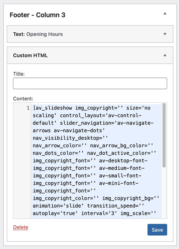
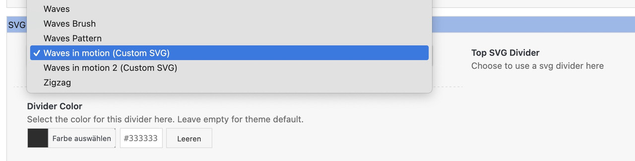
https://your-domain.com/wp-content/uploads/avia_custom_shapes/waves-in-motion.svgBy the way, I now always upload these SVG files through the media library. In list view, I determine the ID of the attachment and add it to the array. As far as I know, neither the key nor the name needs to be specified then in the snippet.
SVG files in WordPress and Enfold are not converted to other sizes when uploaded to the media library. There are no disadvantages in this regard.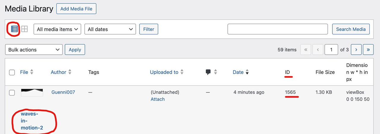
function custom_avf_custom_svg_shapes( array $custom_shapes ) {
  $custom_shapes = array(
    'waves-in-motion'       => array(
              'title'       => __( 'Waves in motion', 'avia_framework' ),
              'has_flip'    => true,
              'has_width'   => false,
              'attachment'  => 1562,
              ),
    'waves-in-motion-2' => array(
              'title'       => __( 'Waves in motion 2', 'avia_framework' ),
              'has_flip'    => true,
              'has_width'   => false,
              'attachment'  => 1565,
              ),
    );
    return $custom_shapes;
}
add_filter( 'avf_custom_svg_shapes', 'custom_avf_custom_svg_shapes', 10, 1 );
August 26, 2025 at 2:59 pm in reply to: Cannot access kriesi.at please unblock our IP addresses #1488541It also affected me for about five days.
here on that page you can achieve this by:
(the old way – because using font-icons)#top .main_menu { right: 145px; /* === A correction value for the now broader social_bookmarks === */ padding-right: 10px; } #header_main .social_bookmarks { margin: 0; height: 40px; top: 50%; transform: translateY(-50%); } #top .social_bookmarks li { width: 36px; } #top .social_bookmarks li a { width: 40px; line-height: 40px; min-height: 40px; } #top .social_bookmarks li a:before { font-size: 24px }Perhaps it needs to be adapted for your website. As a participant, I cannot see any private content, so I’m afraid I can’t offer any better advice.
NEXT: now the bookmarks are svg icons – so the css had to be different.
But i do not find an example page to do so. I had to look on one of my installatons to have that different css.#top .avia-menu.av_menu_icon_beside { border-right: none; padding-right: 10px; margin-right: 10px; } #top nav .social_bookmarks { position: relative; transform: translateY(-50%); margin: 0 !important; height: 40px !important; } #top .social_bookmarks li { width: 40px; margin-left: 3px } #top .social_bookmarks li a { width: 40px !important; line-height: 40px; border-radius: 10px !important; min-height: 40px; } #top .social_bookmarks li.avia-svg-icon img[is-svg-img="true"], #top .social_bookmarks li.avia-svg-icon svg:first-child { height: 1.5em; width: auto; margin-top: 5px; }if you have started by using a demo installation. F.e. https://kriesi.at/themes/enfold-one-page-portfolio/
This homepage behaves as you described.This option of header you can choose to have on the page editor. Have a look to the layout and find: “Header visibility and transparency”
That dropdown :
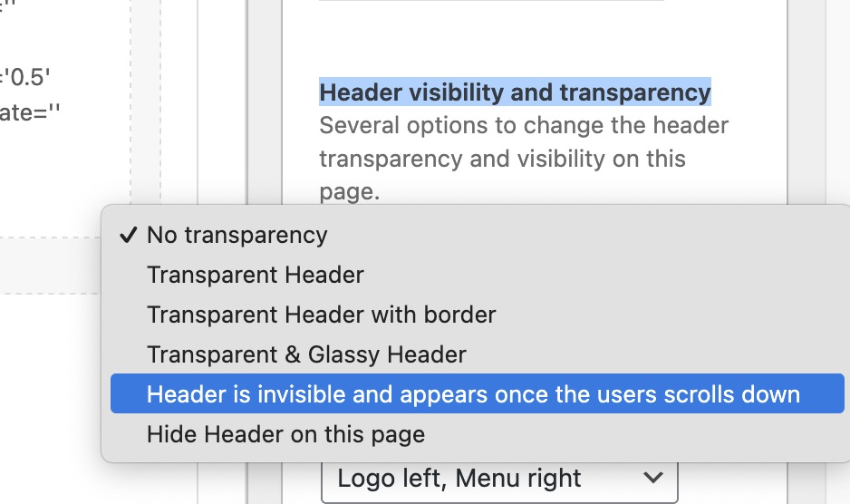
Make your selection there.
August 21, 2025 at 6:12 pm in reply to: Duplication of information at bottom of each page on site #1488379how did you insert those full_sliders ? because they are twice on your site as your told us above.
some are out of wrap_all ? so your footer is there – but over these copied sliders!
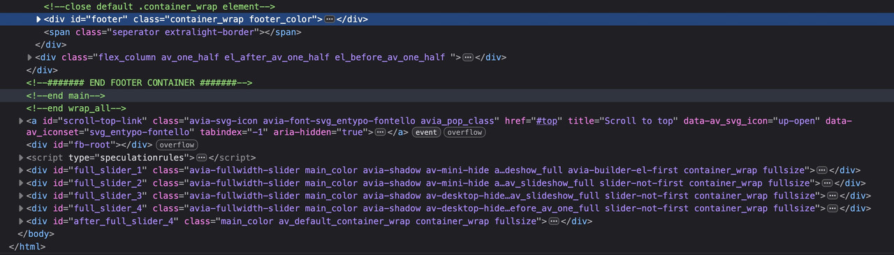
see your footer here: https://eustasis.com/#footer
or without uploading – just with base 64 data uri:
#av-cookie-consent-badge:before {
  display: block;
  position: relative;
  content: "";
  width: 100%;
  height: 100%;
  top: 10px;
  left: 10px;
  background-image: url(data:image/svg+xml;base64,PHN2ZyBpZD0iQ29va2llcyIgeG1sbnM9Imh0dHA6Ly93d3cudzMub3JnLzIwMDAvc3ZnIiB4bWw6c3BhY2U9InByZXNlcnZlIiBwcmVzZXJ2ZUFzcGVjdFJhdGlvPSJ4TWlkWU1pZCBtZWV0IiB2aWV3Qm94PSIwIDAgMzAwIDMwMCI+CiAgPGNpcmNsZSBjeD0iMTgzLjMiIGN5PSIyNC45IiByPSIxNy41Ii8+CiAgPGNpcmNsZSBjeD0iMjIzLjIiIGN5PSI3My41IiByPSIxMi4yIi8+CiAgPGNpcmNsZSBjeD0iMjU2LjUiIGN5PSIxMjUuMyIgcj0iMTAuNyIvPgogIDxjaXJjbGUgY3g9IjI2My44IiBjeT0iNTkuMyIgcj0iOC43Ii8+CiAgPHBhdGggZD0iTTI3OS4xIDE1Mi45Yy02LjcgNi4zLTE1LjcgMTAuMS0yNS42IDEwLjEtMjAuNyAwLTM3LjUtMTYuOC0zNy41LTM3LjUgMC02LjcgMS43LTEyLjkgNC44LTE4LjMtMTcuMy0yLjMtMzEuMi0xNS0zNS4zLTMxLjctMS4yLjEtMi40LjItMy43LjItMjMuMiAwLTQyLTE4LjctNDIuMi00MS44QzcyLjkgMzkuMyAyMC41IDk1IDIwLjUgMTYzLjFjMCA3MS41IDU4IDEyOS41IDEyOS41IDEyOS41czEyOS41LTU4IDEyOS41LTEyOS41YzAtMy41LS4xLTYuOC0uNC0xMC4yek02OS4yIDE3OS41Yy05LjcgMC0xNy41LTcuOC0xNy41LTE3LjVzNy44LTE3LjUgMTcuNS0xNy41IDE3LjUgNy44IDE3LjUgMTcuNS03LjkgMTcuNS0xNy41IDE3LjV6bTQ1LTk4LjhjOS43IDAgMTcuNSA3LjggMTcuNSAxNy41cy03LjggMTcuNS0xNy41IDE3LjUtMTcuNS03LjgtMTcuNS0xNy41IDcuOS0xNy41IDE3LjUtMTcuNXptMy4xIDE2OS4xYy05LjcgMC0xNy41LTcuOC0xNy41LTE3LjVzNy44LTE3LjUgMTcuNS0xNy41IDE3LjUgNy44IDE3LjUgMTcuNS03LjkgMTcuNS0xNy41IDE3LjV6bTU3LjktNzAuM2MtOS43IDAtMTcuNS03LjgtMTcuNS0xNy41czcuOC0xNy41IDE3LjUtMTcuNSAxNy41IDcuOCAxNy41IDE3LjUtNy44IDE3LjUtMTcuNSAxNy41em0zMy45IDcyLjNjLTkuNyAwLTE3LjUtNy44LTE3LjUtMTcuNXM3LjgtMTcuNSAxNy41LTE3LjUgMTcuNSA3LjggMTcuNSAxNy41LTcuOCAxNy41LTE3LjUgMTcuNXoiLz4KPC9zdmc+);
  background-size: 30px;
  background-repeat: no-repeat;
}
by the way – here is a huge amount of usefull path – with the option to get the base 64 data uri:
https://www.svgviewer.dev/svg-to-data-uriEnter f.e. cookie on search input field.
upload that svg to your media library: Cookie SVG
and put this to your quick css:
#av-cookie-consent-badge:before {
  display: block;
  position: relative;
  content: "";
  width: 100%;
  height: 100%;
  top: 0;
  left:0;
  background-image: url("/wp-content/uploads/cookie.svg");
  background-size: contain;
  background-repeat: no-repeat;
}
adjust the url with your path
As a participant i could not see private content.
i did not check your selectors if they are correct but in your media query
@media only screen and (max-width: 767px) {
  .avia-data-table.avia_pricing_minimal td,
  .avia-data-table.avia_pricing_minimal th {
  padding: 0px;
  }
} /* === here is one missing curly bracket === */
do not forget the closing bracket ( two opening brackets – only one closing )
___________
Next : if you got a pricing-table – there are no table layouts (body, th, td etc) these are created as lists!
so if you got a pricing table – then the selectors are not o.k.PS: i didn’t know that even minimal data tables – got that class: avia_pricing_minimal
so with that one missing closing bracket your codes seems to working.why do you think that there is something wrong?
is on your dropdown list no custom svg ?
 August 20, 2025 at 12:36 pm in reply to: How to enable Image instead of icons/name for “Tabs (Tabbed Content Area) “ #1488305
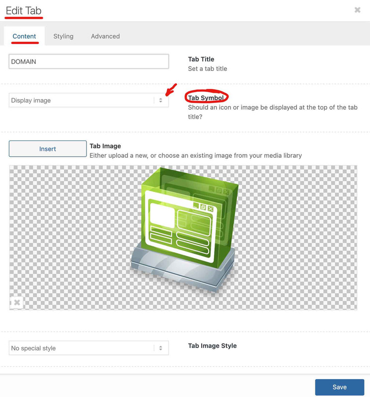
you have mixed two elements here on your page – the one is the tab-section
and the images belong to these av-section-tab-title
the other element is inside your content of the tab-section element. (Tabs) – and indeed they only have the option to show icons!
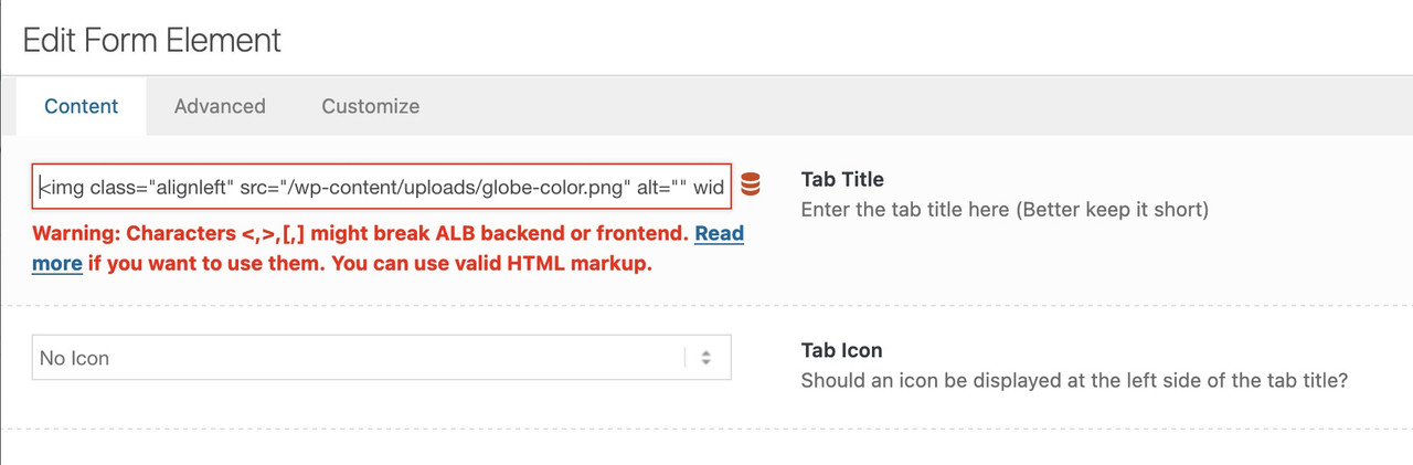
but – if you got svg images – you could place these files by choosing wordpress media library as source for your icons.next hint: no one hampers you to insert left to the tab title :
<img class="alignleft" src="/wp-content/uploads/globe-color.png" alt="" width="40" height="40" />you can horizontally center these images with the tab-titles by:
.tabcontainer .tab_titles .tab {
  display: flex;
  align-items: center;
}
there will be warnings – but you can ignore them – it works!
you know how to have a child-theme replacement script?
maybe it is a working way to have an explicite mobile menu – because the other solution is to have a child-theme avia-snippet-hamburger-menu.js file.
____________________________________________
you have to look for this part inside:
if( cur_menu.length )
{
  if( cur_menu.get(0).hash == '#' || 'undefined' == typeof cur_menu.attr('href') || cur_menu.attr('href') == '#' )
  {
    // eventhandler conflict 'click' by megamenu (returns false) - ignore all handlers
    if( subitems.length > 0 || megacolumns.length > 0 )
    {
      clone_events = false;
    }
  }
}
and replace it by:
// AVOID CONFLICT: Keep events for the GTranslate menu item
if( ! current.hasClass('menu-item-gtranslate') )
{
  if( cur_menu.length )
  {
    if( cur_menu.get(0).hash == '#' || 'undefined' == typeof cur_menu.attr('href') || cur_menu.attr('href') == '#' )
    {
      // eventhandler conflict 'click' by megamenu (returns false) - ignore all handlers
      if( subitems.length > 0 || megacolumns.length > 0 )
      {
        clone_events = false;
      }
    }
  }
}
August 20, 2025 at 11:16 am in reply to: How to enable Image instead of icons/name for “Tabs (Tabbed Content Area) “ #1488297you have found the solution on the element itself? – because i see images on your tabs.
 August 20, 2025 at 7:48 am in reply to: increase size of logo and burger icon on mobile view #1488285
All seems to work now!
but please: https://kriesi.at/support/topic/use-code-tag-for-posting-snippets-e-g-implementing-google-tag-script/to check your code it would be easier if you use the code tag here on the board.
is this a transparent header on desktop view?
then you had to adjust on fixed non-transparent header the padding-top of #mainAugust 20, 2025 at 7:28 am in reply to: Time-sensitive: Why has text changed to question marks in elements? #1488283It would be helpful to determine whether the issue is specific to Enfold or if it is a more widespread problem. I suggest temporarily activating one of the standard WordPress themes and checking whether these replacement characters are still displayed in the editor.
August 19, 2025 at 7:21 am in reply to: increase size of logo and burger icon on mobile view #1488232but for your trials to have sticky header on mobile – my advice is to erases the code and replace it with ( It is difficult to identify the issue with the existing code. Therefore, I would prefer to start over.) :
@media only screen and (max-width: 1023px) {
    #header {
        position: fixed !important;
        height: 120px !important;
        max-height: 120px !important;
    }

    #top #header.av_header_transparency #header_meta {
        background-color: transparent;
    }

    #header_main {
        border-bottom: none;
    }

    #header:not(.av_header_transparency) #header_main {
        box-shadow: 0 5px 5px rgba(182,182,182,0.75);
    }

    .responsive #top .av-logo-container ,
    .responsive #top .logo a,
    .responsive #top .logo img,
    .responsive #top .logo svg {
        height: 120px !important;
        max-height: 120px !important;
        line-height: 120px !important;
    }

    .responsive #top .av-main-nav .menu-item-avia-special a {
        height: 120px !important;
        line-height: 120px !important;
    }

    .responsive.html_mobile_menu_tablet #top #wrap_all .av_header_transparency {
        background-color: transparent !important;
    }

    #top .header_bg {
        background-color: transparent !important;
    }

    #top #header:not(.av_header_transparency) .header_bg {
        background-color: #FFF !important;
    }

    .responsive.html_mobile_menu_tablet #top .av_header_transparency .logo img.alternate,
    .responsive.html_mobile_menu_tablet #top .av_header_transparency .logo .subtext.avia-svg-logo-sub {
    display: block !important;
    }

    .responsive.html_mobile_menu_tablet #top .av_header_transparency.av_alternate_logo_active .logo a > img,
    .responsive.html_mobile_menu_tablet #top .av_header_transparency.av_alternate_logo_active .logo a > svg {
    opacity: 0;
    }

    /*** das hier individuell anpassen je nach dem  ***/
    #top #header.av_header_transparency #header_meta .phone-info * {
        color: #FFF !important;
    }

    .html_mobile_menu_tablet .header_color  #header.av_header_transparency div .av-hamburger-inner,
    .html_mobile_menu_tablet .header_color  #header.av_header_transparency div .av-hamburger-inner::before,
    .html_mobile_menu_tablet .header_color  #header.av_header_transparency div .av-hamburger-inner::after {
        background-color: #FFF;
    }
    .html_mobile_menu_tablet .header_color  #header.av_header_transparency .menu-item-search a:before {
        color: #FFF;
    }
    .responsive.html_header_top.html_mobile_menu_tablet  #top #main {
        padding-top: 120px !important;
    }
    .responsive.html_header_top.html_header_transparency.html_mobile_menu_tablet  #top #main {
        padding-top: 0 !important;
    }
}
and next: synchronise the switch point of your burger menu with those settings for your header.
means@media only screen and (max-width:1023px) { #avia-menu .menu-item { display:none } .av-burger-menu-main.menu-item-avia-special { display:block } }for your content inside the first section there should be more distance to header on smaller screens! …
in addition :@media only screen and (max-width:767px) { .responsive.html_header_top.html_header_transparency.html_mobile_menu_tablet #top #main #av_section_1 .content { padding-top: 150px } }August 19, 2025 at 7:14 am in reply to: increase size of logo and burger icon on mobile view #1488231on #main you set the padding-top to zero for all headers – so add that rule in your media query setting
@media only screen and (max-width:1024px) {
  .responsive .logo img,
  .responsive .logo svg {
    max-height:120px
  }
  .responsive #top #wrap_all .main_menu {
    height:120px
  }
  .responsive #top #header_main>.container .main_menu .av-main-nav>li>a,
  .responsive #top #wrap_all .av-logo-container {
    height:120px;
    line-height:120px
  }
  .responsive.html_header_transparency #top #main {
    padding-top: 0 !important
  }
  .responsive:not(.html_header_transparency) #top #main {
    padding-top: 120px !important
  }
}
August 19, 2025 at 6:22 am in reply to: Time-sensitive: Why has text changed to question marks in elements? #1488228and what if you switch temporarly to a standard theme. Do the wp-admin buttons show the same problem?
do you have only standard entries in your htaccess file – or are there additional custom rules inside?
-
AuthorPosts