Forum Replies Created
-
AuthorPosts
-
There is no cuatom class on that menu-item so you can do that :
#menu-item-7484 .avia-menu-fx { display: none; }Thanks – Ismael – it seems to be a problem with the special font – “scripter” – that a “web designer” sent me. It is displayed in the frontend, but not in the backend for reasons still unknown to me – when I switch to another self-hosted font I don’t have these problems. – So now I’m going to search for this font myself.
November 7, 2021 at 11:30 am in reply to: can't delete enfold 4.5.7, preventing install of latest version #1328101Now – how did you implement your child-theme – just over the downloadable preset Child-theme – or do you have additional Settings in your child-theme functions.php like:
function child_theme_styles() {
	wp_enqueue_style( 'parent-style', get_template_directory_uri() . '/style.css' );
	wp_enqueue_style( 'child-theme-css', get_stylesheet_directory_uri() .'/style.css' , array('parent-style'));
}
add_action( 'wp_enqueue_scripts', 'child_theme_styles' );?>
PS The above does not lead to conflicts – but it is just an example how a child and a parent could be correlated.
__________
Just of topic: On Filezilla you can show hidden files by activating that option by menu – Server – List hidden files
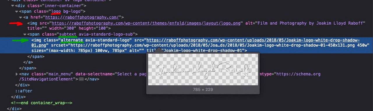
Just to be sure that there are no other files/folders in the themes folder.My guess was that the normal logo was removed ( that’s why the Enfold Standard logo is placed there ), but just not the logo at ” header – transparency options – Transparency Logo”.
But since all pages are those with transparent header, only the “alternate” logo is displayed in the subtext ( because no shrinking and fixed header is set) , which is just this what we see in the frontend.
_______________
_______________
What you can do too – is remove the logo from Transparent Logo input field. And place your wanted logo on the logo input field. That will work too. Because if there is no logo set for transparency – Enfold will only use the normal logo set on theme options.
_______________
PS: However, if you want to replace with writing (font) it doesn’t matter anyway. The css will hide all .logo img/svg.here is a gallery with 9 columns – https://webers-testseite.de/gallery-with-8-images/ using flexbox model. ( Gridmodel is very complex – but a mighty tool too ). ( Sorry for page – title it was before a 8 column flex constuction )
But floating text from one container to another one is hard to get with column layout – and even with table layout.
One thing you can achieve is a single-column layout, divided into column numbers:
https://webers-web.info/textblock/And Ismaels idea of using grid-row is to nest columns : https://webers-testseite.de/nesting/
please show me a good looking 12 column layout ;)
the ” !important;” is really outside that curly bracket ? ;)
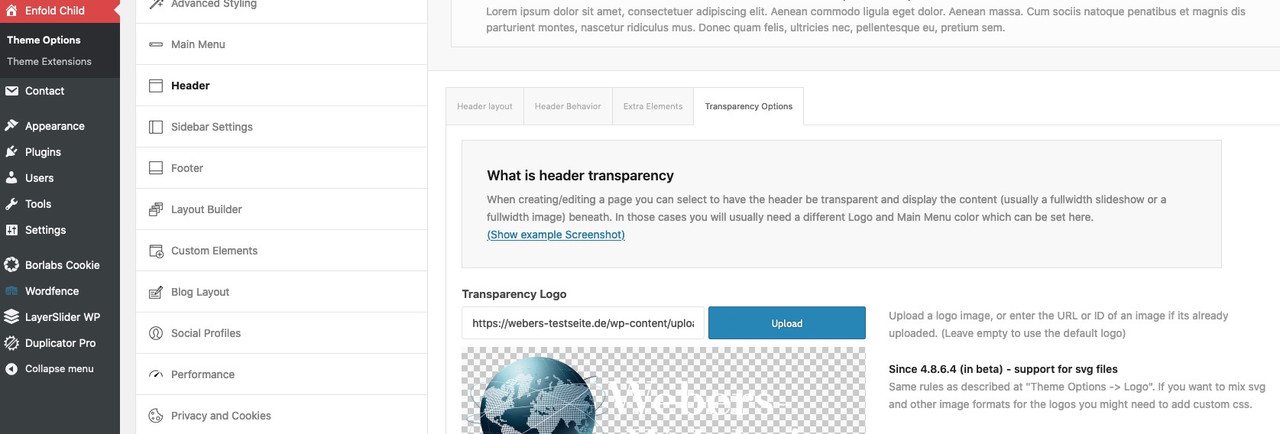
And where did you replace on Enfold Options that logo ?
for transparency headers : header – transparency options – Transparency Logo
or for non transparent Headers on : Theme Options – Logo________
you can use the logo subtext for that in child-theme functions.php
f.e. showing bloginfo name ( that is the text you insert on apearance – customise for Site Title )function kriesi_logo_addition($sub){ $sub .= "<span class='logo-title'>"; $sub .= get_bloginfo( 'name', 'display' ); $sub .= "</span>"; return $sub; } add_filter('avf_logo_subtext', 'kriesi_logo_addition');OR use any text you like in additon:
function kriesi_logo_addition($sub){
  $sub .= "<span class='logo-title'>";
  $sub .= "Your LogoText";
  $sub .= "</span>";
  return $sub;
}
add_filter('avf_logo_subtext', 'kriesi_logo_addition');
Then on quick css:
.logo img, .logo svg {
  display: none;
}

.logo .subtext .logo-title {
  font-size: 36px;
  font-weight: 700;
  color: #fff
}
/*** if you need different colors on your text after scrolling on shrinking header ***/
.header-scrolled .logo .subtext .logo-title {
  color: #000
}
if you do not have shrinking header you can differ between transparent and non transparent header on that header class: av_header_transparency
-
This reply was modified 4 years, 4 months ago by
Guenni007.
November 4, 2021 at 3:26 pm in reply to: SVG logos in sticky header not rendering correctly after 4.8.7.1 update #1327803November 4, 2021 at 10:10 am in reply to: Layout changes when inserting code to lose date and time #1327749but on your Quick css code you got a closing bracket on this rule ?
Small addendum: I don’t really care that much about seeing the font I host myself in the preview. It would be enough for me if I could pre-select a font for the backend display, which is then also displayed.
November 2, 2021 at 12:56 am in reply to: Difference on filters – concerning Google Recaptcha ? #1327358Thanks for clarification.
from which version you have updated?
in detail – you don’t need additional css at the beginning – so if there should be older rules to adjust the output of the svg – try to remove this first and then test.
(make a backup copy of your css you delete).October 28, 2021 at 11:23 pm in reply to: Add file-size and dimensions to Media Library – with sortable file-size column #1326905this might be possible if we split that column to width and height.
For me the file-size is more important to know. Sometimes i forgot to optimize my images before uploading – so this is a good control.October 28, 2021 at 9:30 pm in reply to: Add file-size and dimensions to Media Library – with sortable file-size column #1326899shure?
you had to hover file-size to see that little arrow!October 28, 2021 at 3:43 pm in reply to: Uncaught ValueError: Unknown format specifier "S" (Enfold 4.8.7 + PHP 8) #1326871i can not reproduce that – i got no errors on console log file:
i use it in this way to determine a conditional loading – but it might work with global setting too: Link
October 28, 2021 at 2:01 pm in reply to: I can't figure out how to add background images for the color sectiions #1326837Are you working with Block Editor on your pages ? Do you see those layouts like mine from above? And you only can not open the popup Editor windows?
October 28, 2021 at 8:58 am in reply to: I can't figure out how to add background images for the color sectiions #1326770( Click the images to enlarge them )
You are in the edit mode of the corresponding page. And you see this or a similar image. There are in a Onepage mostly Color-Sections as parent container to include other elements like columns or headlines etc.pp ( via drag & drop ).
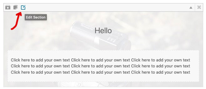
If you move the mouse over the small icons in the upper left corner (see first picture) you will see small tooltips that show you what can be done with the element. The right one of these icons opens an editmode to the color-section ( second picture ).
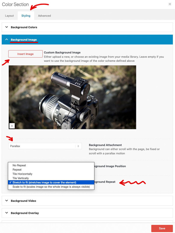
At the top of the popup window are tabs – click the styling tab.
In the default case you will see several toggles – one of them is : Background-Image. If you are working with demo files, then there might be images already available. In this case click on the image to insert another one. If not, click the “Insert Image” button. Now you can choose one from the Media Library – or even upload one here.
The settings below show you the possibilities for the background image.
You wanted Parallax – then select that in the Background-Attachment. Also you should choose for Background-Repeat : stretch to fit.
Now don’t forget to save your settings: Save
And update the page afterwards: Update on the left are the metaboxes.ok – thanks – that is very usefull. And it is as option in dropdown on Styling Tab “Color Section”
Are there any ALB other than Color-Section and Grid-Row that have the “Background-Color” option?Edit : ok – and i tested that nomenklatura is free of use f.e.:
function guennis_color_set($color_sets){
	$color_sets['guennis_color'] = 'Guenni';
	return $color_sets;
}
add_filter( 'avf_color_sets', 'guennis_color_set', 999, 1 );
;)
wo erwartest du das Favicon zu sehen in Safari? – weil ich ( jedenfalls auf deiner Homepage ) sehe dein favicon – wenn auch im Darkmode zu wenig Kontrast vorhanden ist.:
where do you expect to see the favicon in Safari? – because I ( at least on your homepage ) see your favicon – even if there is too little contrast in darkmode:

hier in der Übersicht werden die aber mittels Apple Touch Icon dargestellt – das ist etwas anderes als das FavIcon.
here in the overview, however, are represented by means of Apple Touch Icon – that is something different than the FavIcon.

_____________
PS: obwohl ich sehe, dass du Borlabs Cookie nutzt, öffnet sich das Popup bei deiner Homepage in meinem Firefox nicht – ausserdem sind die Dienste aktiv – auch ohne Zustimmung.
maybe this in the upcomming fixes will give you a hint:
- fixed: svg logo broken when svg tag in multiple lines
- fixed: svg logo not displayed for non logged in users
that is possible – but then every click – elsewhere on your popup will close the popup – with that trigger – it will only close clicking on that anchor link
is it an inline popup or how did you get the anchor link into the popup – please post it here:
this could be a function that will do the job – you can choose any trigger class for it you like
  $(document).on('click', '.popup-modal-dismiss', function (e) {
    $.magnificPopup.close();
  });
this could be part of your inline-popup script or an extra snippet – easier to give advice if i see your code.
look here : https://kriesi.at/support/topic/graceful-transition-for-pop-up-modals/#post-1205887
can you give to that link the class: popup-modal-dismiss and see if that is enough to do
the function on magnific popup doku to close the popup is: $.magnificPopup.close();
may i see your function of the popup?first – did you copy&paste it?
because the code here: Link has wrong quotation marks.The code above can’t affect the logo area.
The function ( trimByWord ) that is defined there is exclusively then applied below to selectors that are not used in the logo or even header.please just let a mod look into your installation. I suspect that it is due to something completely different.
My support on this topic is now over.btw – if you load the jQuery in the footer:
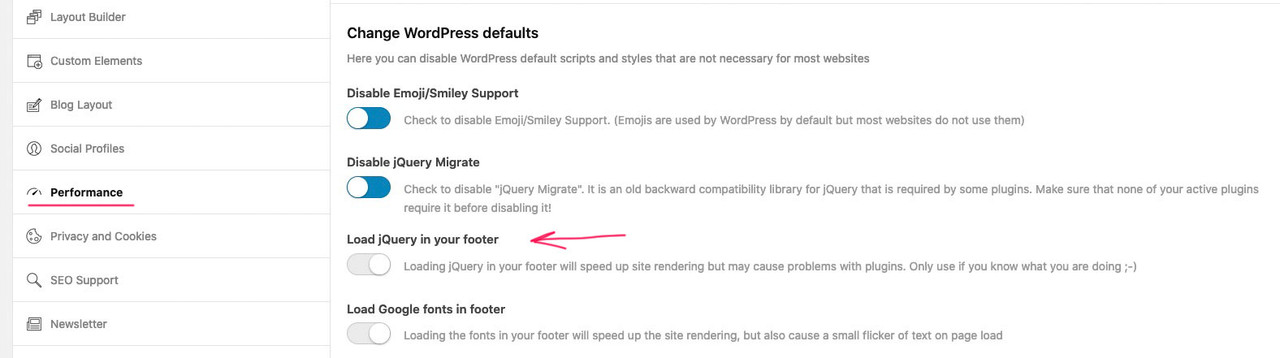
then you must change the code by loading it in the wp_footer too! – last line:add_action('wp_footer', 'custom_excerpt_setting');you only got this in your child-theme functions.php ?
without on top the
<?phpthe snippets comes below that starting line
and you copy&pasted it from here : Link ? because there are wrong quotation marks
I know that you write above that it was not so with the previous version. But often you forget that you have also run other plugin updates. – If you restore the older version now, do you not see the problems anymore?
_______
well if you look at: https://gtmetrix.com/reports/cdmercercontractors.co.uk/T9HHuSwk/you see that the TTFB ( Time to first byte ) is large – contact your provider and ask what could be the reason for it.
maybe look to your site’s current memory limit – it is set in the wp-config.php file and may not match the limit allowed by your provider.
you can look into Layerslider WP – Options – System Status – Server Settings:
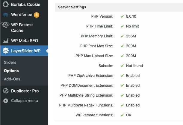
if it might be too low – put this code to the appropriate position ( f.e. under the WP_DEBUG setting ) :
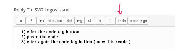
define( 'WP_MEMORY_LIMIT', '256M' );could you please post the whole functions.php of the child theme here! – but please use the code tag so we can check it better.
no hurry – I just wanted to bring it up once because the topic came up now – and I honestly never checked that the manually pasted excerpts were not affected.
Many thanks as always -
This reply was modified 4 years, 4 months ago by
-
AuthorPosts