Forum Replies Created
-
AuthorPosts
-
October 2, 2025 at 9:26 am in reply to: How to replace H3 with P (or span) in related articles titles #1489745
try Mikes Solution – did not know why the content-slider.php does not rule that – see next post
on google ratings:
.ti-next:before, .ti-prev:before { display: none !important; } .ti-next:after, .ti-prev:after { display: flex; position: absolute; justify-content: center; align-content: center; align-items: center; width: 100%; height: 100%; border-radius: 100%; transition: all 200ms ease-out; font-size: 24px; font-family: "entypo-fontello"; color: var(--enfold-header-color-color); } .ti-prev:after { content: "\E874" !important; } .ti-next:after { content: "\E875" !important; } .ti-prev:hover:after, .ti-next:hover:after{ color: #FFF !important; background-color: var(--enfold-header-color-color); }try instead:
these are the bold versionsfunction avia_replace_default_icons($icons){ $icons['svg__scrolldown'] = array( 'font' =>'svg_entypo-fontello', 'icon' => 'down-open'); $icons['svg__prev'] = array( 'font' =>'svg_entypo-fontello', 'icon' => 'left-open'); $icons['svg__next'] = array( 'font' =>'svg_entypo-fontello', 'icon' => 'right-open'); return $icons; } add_filter('avf_default_icons','avia_replace_default_icons', 10, 1);add to the snippet from above the missing instructions:
function avia_replace_default_icons($icons){
 $icons['svg__scrolldown'] =  array( 'font' =>'svg_entypo-fontello', 'icon' => 'down-open');
 $icons['svg__prev'] =  array( 'font' =>'svg_entypo-fontello', 'icon' => 'left-open-big');
 $icons['svg__next'] =  array( 'font' =>'svg_entypo-fontello', 'icon' => 'right-open-big');
 return $icons;
}
add_filter('avf_default_icons','avia_replace_default_icons', 10, 1);
after that – we had to see if position had to be adjusted.
ok – but even if you like to replace those icons:
.carousel-slider.arrows-outside .owl-nav svg {
  display: none
}

.carousel-slider.arrows-outside .owl-nav .owl-prev:before,
.carousel-slider.arrows-outside .owl-nav .owl-next:before {
  font-family: 'entypo-fontello';
  font-size: 52px;
}

.carousel-slider.arrows-outside .owl-nav .owl-next:before {
  content: "\E875";
}

.carousel-slider.arrows-outside .owl-nav .owl-prev:before {
  content: "\E874";
}
now the other ones …
are these icons – enfold mangaged icons?
Or do they belong to your carousel plugin or instagram plugin ;)
btw. i do not see if you have set this rule yourself ( merged styles ):
@media only screen and (min-width: 485px) and (max-width: 1023px) {
  .html_av-submenu-hidden .av-submenu-indicator {
    margin-right: 175px;
    opacity: 100% !important;
    font-weight: bold !important;
  }
}
the margin-right value causes the icon to be overlaid with the text.
ok then i misunderstood your aim.
you like to change these icons here:
these are font-icons and could be replaced by css
(inside your quick css):.html_av-submenu-hidden #top .av-submenu-indicator::before { content: "\E875"; font-family: 'entypo-fontello'; font-size: 24px; }September 25, 2025 at 1:26 pm in reply to: cookie consent message popup does not open on firefox #1489575with that filter ?
add_filter( 'avf_default_lightbox_no_scroll', '__return_true' );________
if i like to place an unlock button e.g. for youtube:
[av_privacy_accept_button wrapper_class="" id="" class=""]accept Youtube[/av_privacy_accept_button]where to get the correct Id’s for each service?
is it only possible to unlock both external Video Hosters? (aviaPrivacyVideoEmbedsDisabled)September 25, 2025 at 12:58 pm in reply to: cookie consent message popup does not open on firefox #1489573i have removed all child-theme functions.php entries – and now it works – so i will try to find what is causing this.
it is the :
add_filter( 'avf_default_lightbox_no_scroll', '__return_true' );but why does chrome and safari open the popup and only firefox not?
or – if you like to replace it by a different svg graphic – you can do it by an uploaded graphic to media-library:
function avia_replace_default_icons($icons){
 $icons['svg__scrolldown'] =  array( 'font' =>'svg_wp-media-library', 'icon' => '50913');
 return $icons;
}
add_filter('avf_default_icons','avia_replace_default_icons', 10, 1);
change the icon ID to your file id
____________________________________________________________________________________________________
you can find the attachment-ID best in media-library list-view –
or in grid-view if you open the attachment-details ( look to the url that is opened )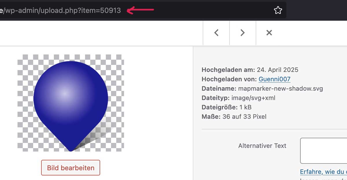 September 25, 2025 at 10:14 am in reply to: Critical Error on Website Caused by the Child Theme Plugin #1489561
Have you updated from a slightly older version of Enfold to the latest version?
And do you have on your child-theme custom header.php or footer.php ?These would be extra files in your child theme folder. If you have updated from an older version, a lot has changed in these files. You would then need to know why they were placed there in order to reincorporate these reasons into a current header.php or footer.php.
or the arrow thought even more demanding ;)
:root { --burger-main-icon-width: 40px; /* === adjust to your needs === */ } @media only screen and (max-width:1150px) { .av-hamburger {display: none} #header #avia-menu li.av-burger-menu-main.menu-item-avia-special, #top #wrap_all #header .av-small-burger-icon a:before{ width: var(--burger-main-icon-width); } #top #wrap_all #header .av-small-burger-icon a { display: flex; justify-content: center; align-content: center; align-items: center; } #top #wrap_all #header .av-small-burger-icon a:before { content: "\e873"; font-family: "entypo-fontello"; font-size: var(--burger-main-icon-width); color: var(--enfold-main-color-primary); text-align: center; } .av-burger-overlay-active #top #wrap_all #header .av-small-burger-icon a:before{ font-size: calc(1.5 * var(--burger-main-icon-width)); /* === only if you like it === */ color: #FFF; content: "\e877 \A \e873"; line-height: 0.35em; animation: avia_fade_move_down 2s ease-in-out infinite; } }this burger menu is not a font icon or a svg icon. These are simple containers with a given width and height.
The top and the bottom lines are pseudo-containers (before and after).try in quick css: see next post for better solution ;)
on my installation it works without any problem – if you use the webp images from media-library!
https://webers-testseite.de/webp-lightbox/or: next suggestion – you are using a plugin that replaces jpgs by webp images ( f.e. from shortpixel – automatic calculation of jpgs to webp- and replacement in DOM )
As mentioned above
var defaults = { groups : ['.avia-slideshow', '.avia-gallery', '.av-horizontal-gallery', '.av-instagram-pics', '.portfolio-preview-image', '.portfolio-preview-content', '.isotope', '.post-entry', '.sidebar', '#main', '.main_menu', '.woocommerce-product-gallery'], autolinkElements : 'a.lightbox, a[rel^="prettyPhoto"], a[rel^="lightbox"], a[href$=jpg], a[href$=webp], a[href$=png], a[href$=gif], a[href$=jpeg], a[href*=".jpg?"], a[href*=".png?"], a[href*=".gif?"], a[href*=".jpeg?"], a[href$=".mov"] , a[href$=".swf"] , a:regex(href, .vimeo\.com/[0-9]) , a[href*="youtube.com/watch"] , a[href*="youtube.com/shorts"] , a[href*="screenr.com"], a[href*="iframe=true"]', videoElements : 'a[href$=".mov"] , a[href$=".swf"] , a:regex(href, .vimeo\.com/[0-9]) , a[href*="youtube.com/watch"] , a[href*="youtube.com/shorts"] , a[href*="screenr.com"], a[href*="iframe=true"]', exclude : '.noLightbox, .noLightbox a, .fakeLightbox, .lightbox-added, a[href*="dropbox.com"], .pagination a' },a[href$=webp]is an autolinkElement – so there must be something that hampers this on your installation.In my opinion, webp makes sense if you use it as a replacement for png. If you have an image without transparency, jpg is just as good.
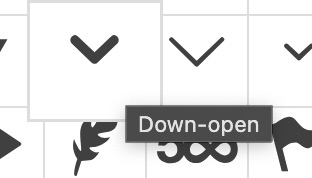
ok – you are right that on that icon the down-open-mini is used ! – you can change it by code snippet inside your child-theme functions.php:
function avia_replace_default_icons($icons){
 $icons['svg__scrolldown'] =  array( 'font' =>'svg_entypo-fontello', 'icon' => 'down-open');
 return $icons;
}
add_filter('avf_default_icons','avia_replace_default_icons', 10, 1);
you find those settings including the filter in init-base-data.php
there you see that the scrolldown icon is correlated with the down-open-mini svg.charmap can be found in: charmap-svg.php
Isn’t it just a question of size? Wouldn’t specifying the width/height alone lead to the same result?
PS: in your case you are already use the svg icons. if someone uses the font-icons the snippet will be different –
and correlation is on default by:
'scrolldown' => array( 'font' => 'entypo-fontello', 'icon' => 'ue877' ),Would you like to have an upward arrow to indicate a downward movement? … ( on top you are talking about scroll-top-link )
Does that really make sense?if you only want to turn arround :
#top .scroll-down-link.avia-svg-icon svg:first-child {
  transform: scaleY(-1)
}
but now you are talking about down-open arrow – but isnt it the down-open arrow on default?
try f.e.:
#top .scroll-down-link {
  height: 50px;
  width: 50px;
  bottom: 50px;
  background-color: rgba(255,255,255,0.3);
  border: 1px solid var(--enfold-socket-color-border);
  backdrop-filter: blur(4px);
  border-radius: 10px;
  /*** animation: none; ***/
}
#top .scroll-down-link.avia-svg-icon svg:first-child {
  height: 50px;
}

#top .scroll-down-link:hover {
  background-color: rgba(255,255,255,0.8);
}

#top .scroll-down-link svg path {
  fill: var(--enfold-main-color-primary);
}
if you do not like the animation – just get rid of the outcommenting /*** ***/
well i thought that webp is allready included to autolinkElements in avia-snippet-lightbox.js – there is a[href$=webp] in the list.
So what version of enfold do you run on that page? i guess it is in there since newer Enfold Versions.try the code-block element instead – be shure you have choosen on advanced tab “Add Codeblock to content”
Right-aligned to what? At the moment, it looks as if they are right-aligned to the line above. Or should it be right-aligned with the page content again, as is actually standard with Enfold?
(See here on the blog on the bottom)i think google likes to see an aria-label on that links.
function ava_script_mod() {
?>
<script type="text/javascript">
jQuery(function($){
  $('.scroll-down-link').each(function() {
    $(this).attr('aria-label', 'Passer à la section suivante');
  });
});
</script>
<?php
}
add_action( 'wp_footer', 'ava_script_mod', 9999 );
by the way this:
jQuery(function($){ // is shorthand for jQuery(document).ready(function($) {where did you insert those snippets above? (child-theme functions.php ?)
what about my question: Can you insert the icon as symbol if you place an element ( icon ) to a page?
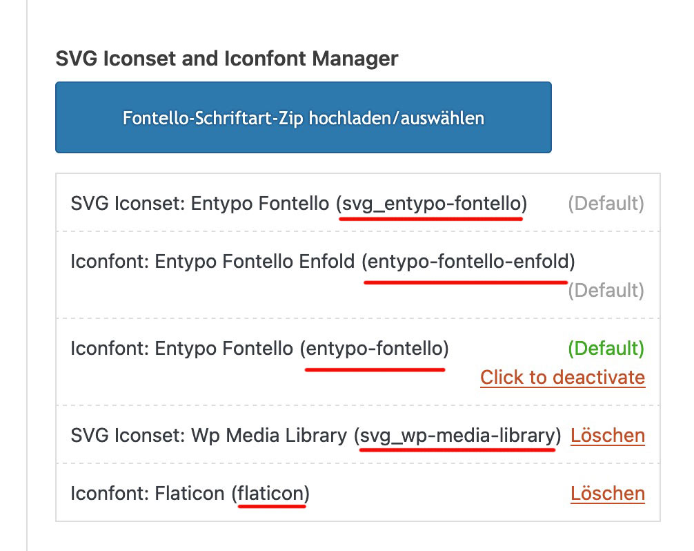
if this is not possible – then the upload or the creation on fontello is not well done.What font-name do you see on Font-Manager (red underlined names) for that uploaded font:
At the very least, it would be good to know your header settings (logo left, menu below, etc.). For example, when I work on the new version with (logo left, menu right), the social bookmarks are located within main_menu. When I look at the board at the top here, they are located next to main_menu. – That depends on where I place the flex container.
so it all depends on your setting . so it will be the best to see the concerning site.
f.e. if you got a setting that the burger is visible from the beginning – like in freelancer demo
then you had to remove the media-query setting for screens above 768px.
btw. your code sometimes leads to show the social icons twice. Because the example of medical demo has the navigation below the logo container.
Then we have those social icons twice in the DOM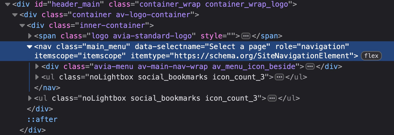
Therefore (menu below the logo) , it is better to define your code as follows:
( for those settings where the social bookmarks are not visible below 767 you had to adjust that code)@media only screen and (max-width: 479px) { .responsive #top #wrap_all #header .main_menu > .social_bookmarks { display: block; } }try
@media only screen and (max-width: 989px) {
  .responsive #top #wrap_all .main_menu {
    display: flex !important;
    flex-direction: row-reverse;
    align-items: flex-start;
    height: 100% !important;
  }
  #top #wrap_all .social_bookmarks {
    padding-right: 20px;
    border-right: 1px solid var(--enfold-header-color-meta);
  }
}

@media only screen and (min-width: 768px) and (max-width: 989px) {
  .responsive.html_mobile_menu_tablet #top .avia-menu.av_menu_icon_beside {
    border: none;
    padding-right: 0px;
  }
}

@media only screen and (max-width: 767px) {
  .responsive #top #wrap_all #header .main_menu > .social_bookmarks {
    display: block !important;
    top: 40px
  }
  .responsive #top #wrap_all .av_mobile_menu_tablet .main_menu {
    align-items: flex-start;
  }
  .responsive #top .av_seperator_big_border .avia-menu.av_menu_icon_beside {
    padding-right: 0;
    margin-right: 0;
    border: none;
  }
}
and check please the style on screens less than 767px if that fits for you. on medical demo it works well.
if you like to have that on Enfold – Blog Layout – to choose the icons for “share on …”
function avia_add_social_share_link_arguments($args){ $tripadvisor = array('tripadvisor' => array("encode" => true, "encode_urls" => false, "pattern" => "https://www.tripadvisor.com/", 'label' => __("Share on Trip Advisor", 'avia_framework'))); $args = array_merge($tripadvisor, $args); return $args; } add_filter('avia_social_share_link_arguments', 'avia_add_social_share_link_arguments', 10, 1);So you uploaded your own symbols to Fontello? You didn’t enter a name for the font at the top of the Fontello page. That’s the one way to get the font name fontello.
Can you insert the icon as symbol if you place an element ( icon ) to a page?
Have you choosen that icon on Enfold Options – Social Profiles : at the end of that dropdown list your new entry?
next – i do not know it you can choose every string on that – because these settings will end in a class e.g. (social_bookmarks_tripadvisor and av-social-link-tripadvisor) if you got a space inside $icons[‘tripadvisor’] it might be broken. ( you can have Tripadvisor)
( the display_name is the Name that is shown on hovering that icon )try:
function avia_add_custom_icon($icons) { $icons['tripadvisor'] = array( 'font' =>'fontello', 'icon' => 'uf262', 'display_name' => 'Trip Advisor'); return $icons; } add_filter('avf_default_icons','avia_add_custom_icon', 10, 1); // Add new icon as an option for social icons function avia_add_custom_social_icon($icons) { $icons['tripadvisor'] = 'tripadvisor'; return $icons; } add_filter('avf_social_icons_options','avia_add_custom_social_icon', 10, 1);here are some rulesets that belong to your question.
#top #header_main_alternate,
#top #header .av-main-nav > li > a {
  background-color: #aaa;
}

#top #header .av-main-nav > li > a,
top #wrap_all #header #menu-item-search > a{
  border-color: #fff  !important;
}

#top #header .av-main-nav > li > a .avia-menu-text {
  color: #333
}

#top #menu-item-search a.avia-svg-icon svg {
  z-index: 1;
  fill: #333 !important;
}
_____________
btw. dear mods : why is the search icon set to z-index: -1 on header_main_alternate on default ? -
AuthorPosts